What is Shopee?
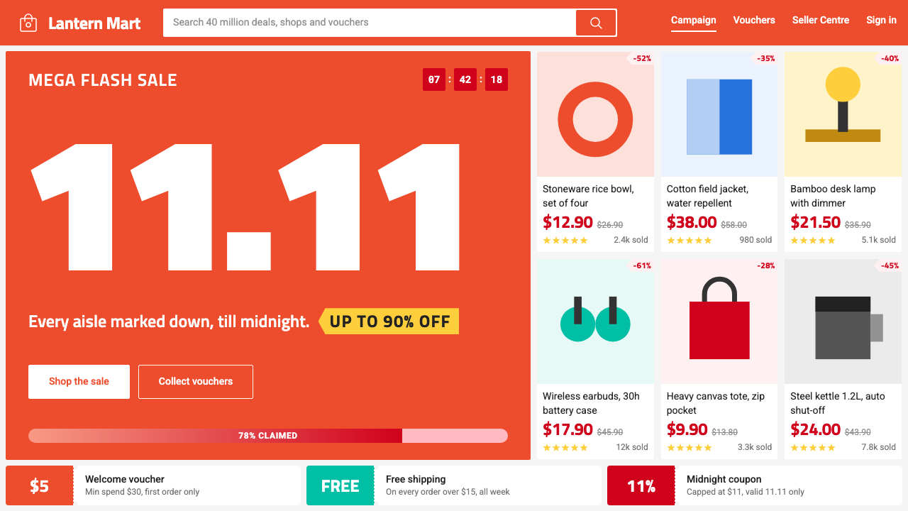
Shopee looks like a night-market stall floor rebuilt in a grid: an orange header, a flat grey ground, and hard-edged white tiles that all shout their price at once.
Shopee in brief
Shopee Orange Marketplace is the interface language of Shopee, the mobile-first e-commerce platform that launched in Singapore in 2015 and spread across Southeast Asia and Taiwan. Its look has become something close to a default for online shopping in the region: an orange band at the top, a pale grey ground, and a dense field of white product tiles.
The personality of the system is that every tile is selling. A single small card carries a discounted price in a loud red, the original price struck through beside it, a percentage chip, a row of yellow stars, a sold count and a free-shipping stamp. Flash-sale zones add countdown blocks and stock bars. Yet the whole thing stays disciplined, because the structure behind the noise is a very orderly grid.
Aesthetically, it is a deliberate rejection of airy minimalism. Where luxury e-commerce uses space to signal value, Shopee uses density to signal abundance and good deals. Nothing is shadowed, corners are barely rounded, and the grey gutter between tiles does the separating work. It is lively, but it behaves like a well-run market with clearly marked stalls.

Where does Shopee come from?
Shopee was launched in 2015 by Sea Group, the Singapore-based company led by Forrest Li. Sea had grown out of gaming and digital entertainment, and the launch of Shopee marked a bet that Southeast Asia's next wave of commerce would take place on the phone rather than on the desktop. Chris Feng is the executive most closely associated with running Shopee itself, and the design work has been carried out by Sea Group's in-house design team rather than by an outside studio.
The region shaped the interface. Southeast Asia is made up of many countries with different languages and currencies, yet it shared a tendency to shop on mobile devices, to compare many options quickly, and to enjoy the social energy of markets and bargaining. Shopee grew across Indonesia, Vietnam, Thailand, Malaysia, the Philippines and Taiwan, and the interface had to be recognisable in each place while handling long product titles, many scripts and many price formats. A strict grid with flexible tiles made that possible.
The visual identity is a good example of mobile-first marketplace UI, where every element is sized for a thumb and a small screen. It also reflects flash-sale and gamified commerce, the style of selling that turned shopping into events. Campaigns around big dates such as the double-number sales days, notably in 2018, brought countdown timers, stock bars, vouchers and mini-games into the standard vocabulary. The look of the app as most people know it today is generally dated from around 2021 to 2024.
The third influence is dense card-grid commerce, a lineage that runs through the large Asian marketplaces. These interfaces assume users want to see as many items as possible and judge them at a glance. They compress information into tiles and treat white space as a cost. Shopee's contribution was to apply discipline to that density: a single orange, a single red for price, a single grey for the ground, and no decorative shadows. That discipline is why a busy screen still feels easy to scan.
What defines the Shopee look?
Orange header band
A saturated orange band runs across the top of the screen. It holds an outlined shopping-bag mark and the search field, and sometimes cart and chat icons. The orange is the brand's single loud identifier, appearing in the header, key buttons and active tabs, and it gives every page a recognisable top edge even when the content below changes completely.
Flat grey ground with white tiles
Beneath the header, the page is a flat light grey on which white product tiles sit edge to edge. The grey is the gutter: a thin gap that separates tiles without borders or shadows. On a phone the grid has two columns; on a desktop it opens up to about six. The structure is the same everywhere, which is what lets the noise feel organised.
Campaign red for price
The discounted price is set in a strong campaign red, while the original price sits beside it in muted grey with a strike-through line. Red is reserved for money and urgency: prices, discount chips and sale labels. Because it is used for nothing else, the eye learns that wherever red appears, there is a deal.
Stacked trust signals
Each tile packs several proof points: a yellow star row for ratings, a sold count for popularity, a small stamp for free shipping, and sometimes a label for a verified or preferred seller. Together they answer a buyer's questions in one glance, so no further tapping is needed to decide whether to explore.
Hard-edged, shadowless cards
Tiles have almost square corners and no drop shadows. The edge is crisp and the surface is flat white. This choice serves density, since shadows would take space and blur small text, and it evokes a market stall's plain counter. Depth is communicated only through the grey gutter and, in a few places, a thin line.
Flash-sale furniture
Sale zones add countdown blocks, progress bars showing how much stock has been claimed, and bold banner strips. These pieces borrow the vocabulary of game interfaces, with timers, bars and rewards, and they turn a catalogue into an event. They are still built on the same grid and colors, so the experience stays coherent.
Short, legible product titles
Product names are set in plain sans-serif, clipped to two lines, and sized small enough to fit many tiles on a phone. The type does not try to be expressive. Its job is to carry multilingual product names across several scripts, and its neutrality is what lets the colors and badges do the shouting.

Who shaped Shopee?
Founder and leader of Sea Group, the company that built Shopee. His decision to move from gaming into e-commerce in 2015, with an emphasis on mobile, set the product direction that produced this interface.
Executive associated with leading Shopee as a business. He represents the operational side that expanded the platform across countries and drove the campaign culture that shaped its look.
The anonymous team that carried out the product design. Their work balanced density with order, adapting a single system to many markets, languages and campaign calendars.
How do you use Shopee today?
For slides, this style is best for retail, marketplace and consumer-growth presentations. A cover can use a strong orange band across the top and a grid of white tiles below, with the title set in plain bold sans-serif. Content slides can borrow the tile structure for product or feature overviews, while data slides can use red for the key number and grey for comparisons, mirroring price and struck-through price. Keep the grey ground flat and let the tiles carry the information.
For web and app interfaces, the language suits catalogues, deal pages, coupons, delivery apps and any service where users compare many items. Build a strict tile grid with a thin grey gutter, put the price first, and add only the trust signals that matter. Dashboards can use the same card logic for sales or inventory, with orange for navigation and red only for urgent or negative figures. Keep controls large enough for thumbs and ensure titles can clip gracefully.
For editorial and marketing, the system fits campaign banners, newsletter promotions and social posts. Combine a bold orange field, a handful of tiles, a countdown or voucher shape and one short line of copy. The mood is energetic and communal, so playful wording works, but each piece should still follow the grid to keep the sense of a tidy market.
A common mistake is to add soft shadows, large rounded corners or gradients to the tiles, which makes the density look messy and takes away the stall-like crispness. Another is to use red everywhere, which destroys its meaning as the color of deals. A third is to remove the clutter in the name of minimalism, which turns the system into a generic store and loses its sense of abundance. Finally, do not let tiles vary wildly in size or alignment; the order of the grid is what keeps the noise readable.

Shopee — FAQ
Why does Shopee look so crowded compared with other e-commerce sites?
Because density is the intent. The interface follows the logic of dense card-grid commerce and a market stall: show many items, let users judge at a glance, and signal abundance. The crowding is controlled by a strict grid, one orange, one red and flat grey gutters, so it feels busy but still orderly.
What do the orange and red each mean?
Orange is the brand color and appears in the header, key buttons and active states. Red is reserved for prices and urgency, such as discounted prices and sale chips. Keeping their jobs separate lets users read the page quickly: orange says where you are, red says where the deals are.
Is the grid the same on phone and desktop?
The structure is the same but the number of columns changes: two across on a phone and about six on a desktop. The tile design, spacing and color rules stay identical, which keeps the experience consistent across devices and markets.
Can this style be used for a premium brand?
Generally not. The system communicates value through quantity and promotion, which is the opposite of how premium brands signal worth. It is a better fit for marketplaces, grocery, deal-focused apps, and any product whose users are comparing and hunting for bargains.
Which trust signals are essential on a tile?
The price comes first, followed by whatever reassures the buyer fastest: ratings, a sold count and a shipping promise. Not every tile needs every element, but the placement should be consistent so users learn where to look. Too many badges crowd out the product image and title.
Related design styles
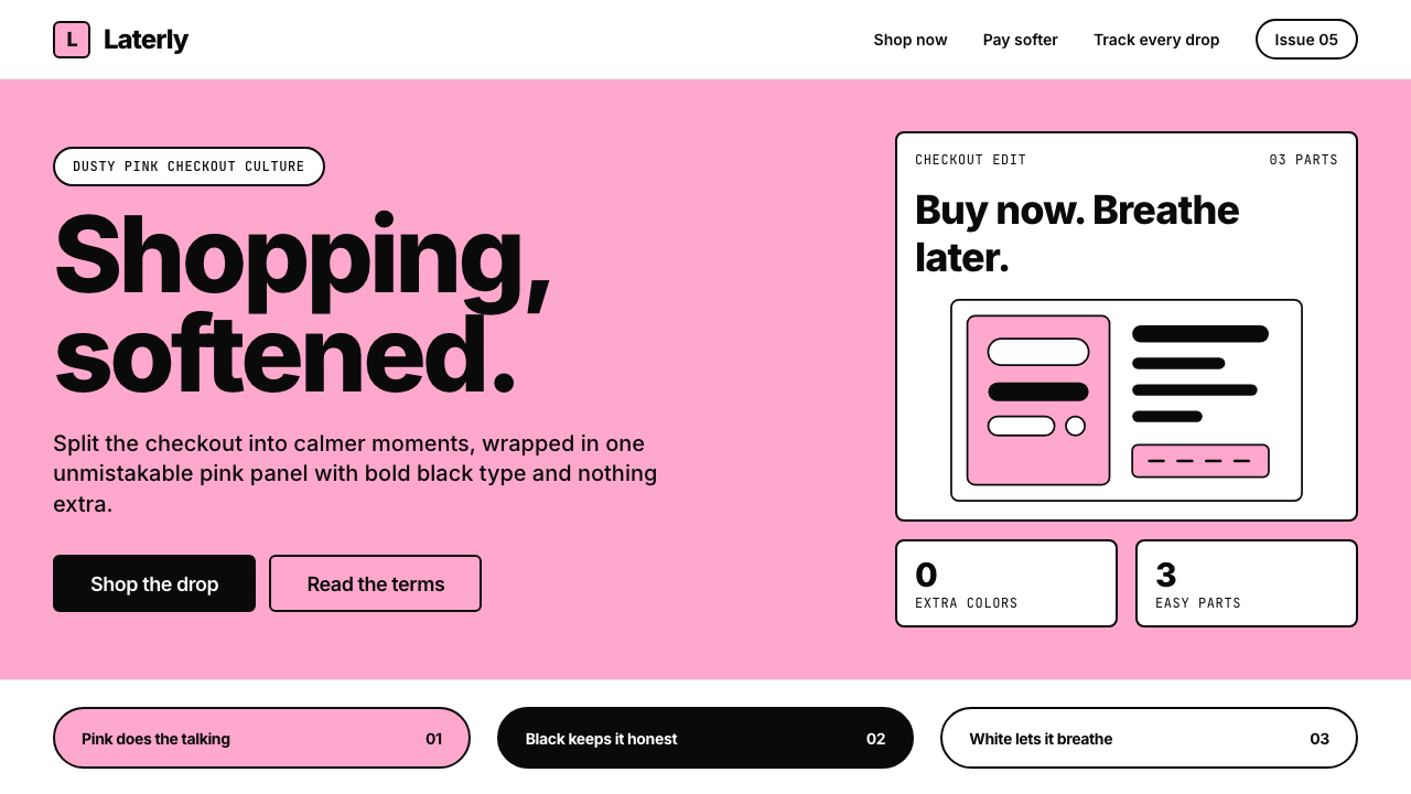 KlarnaFintech turns fashion-editorial. Dusty bubblegum pink, black Inter, and white…
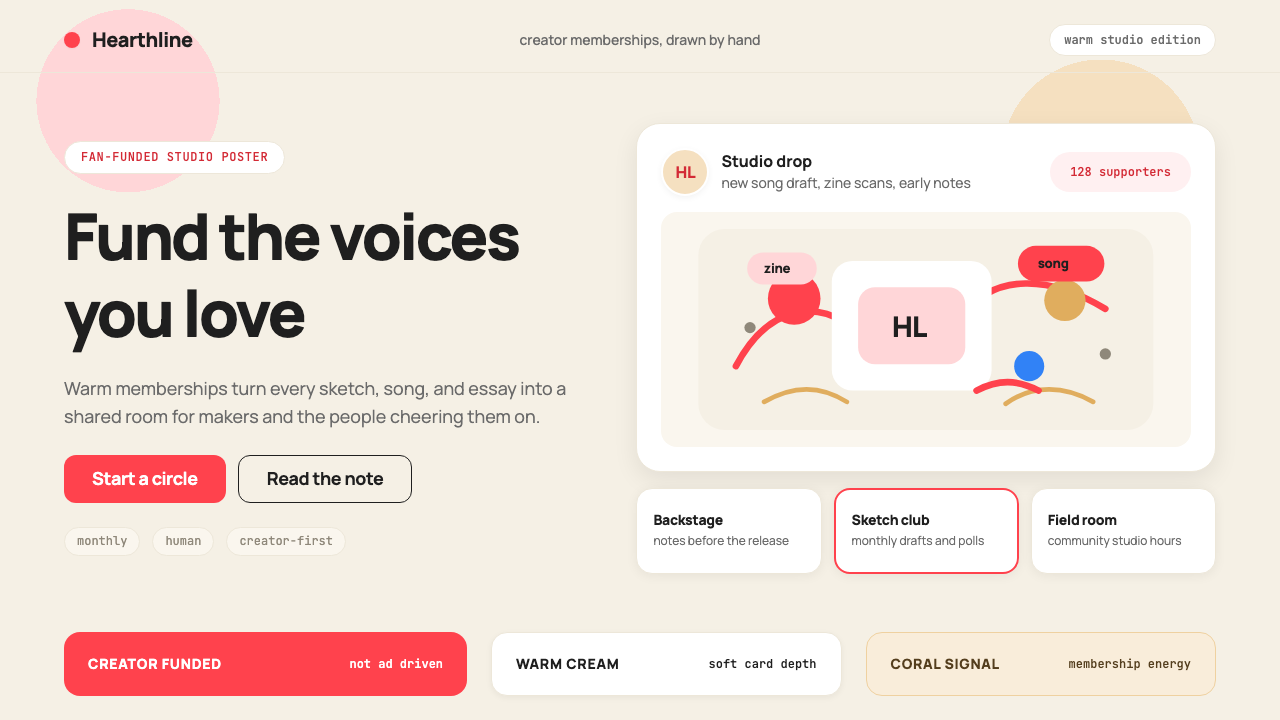 Patreon 2017Creator funding feels human. Coral CTAs on warm cream, rounded cards, hand-dr…
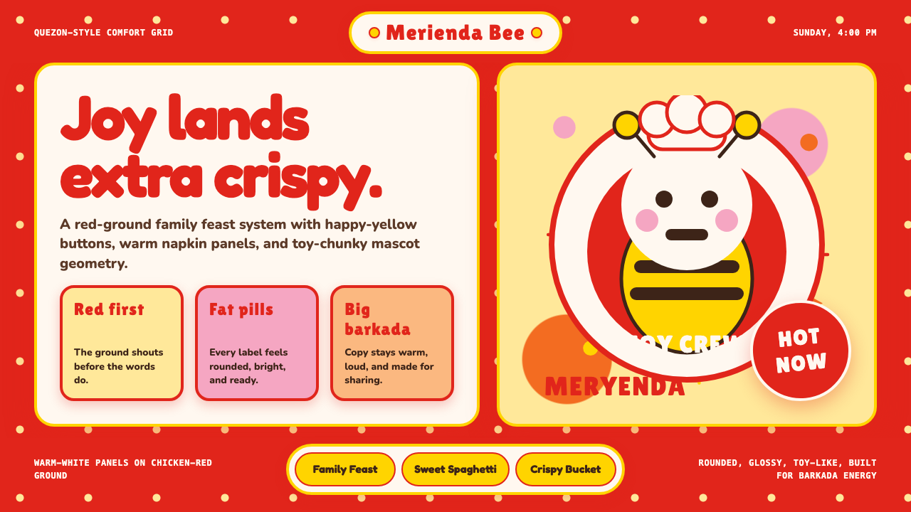 Philippines Jollibee Bee MascotJoy shouts first. Red ground, Fredoka curves, yellow pills, chunky grid.
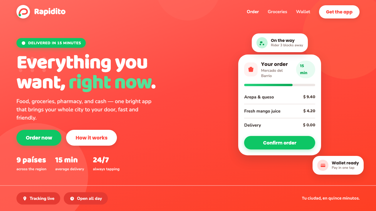 Rappi DeliveryOrdering, made joyful. A hot red-orange wash floods the page; white pill card…
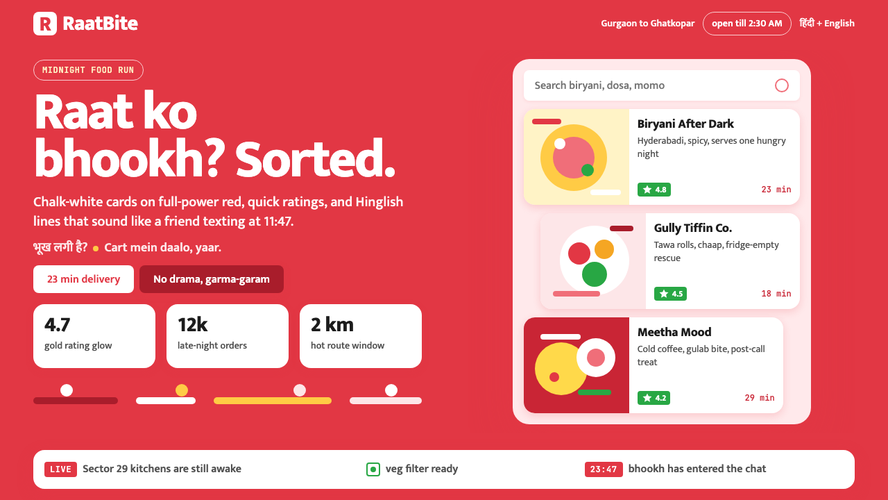 Zomato India DeliveryOwns the midnight scroll. Saturated red, Mukta Hinglish, white cards and gold…
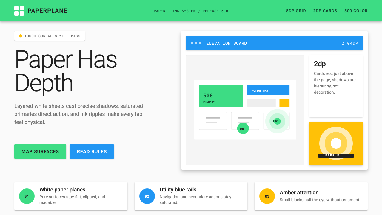 Android Lollipop (Material 1.0)Paper becomes physical. Roboto, green FABs and sharp shadows give white cards…