What is Shaker Hassan Al Said?
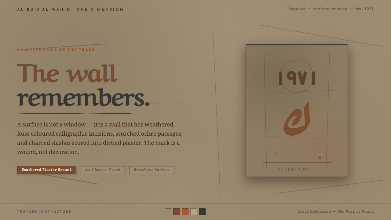
Shakir Hassan Al Said turns the interface into a wounded city wall, where rust-coloured calligraphic traces carry memory through dirtied plaster, scars, and silence.
Shaker Hassan Al Said in brief
Shakir Hassan Al Said is an Iraqi painter-theorist whose mature work abandoned the polished separateness of easel painting for what he called the rugged aesthetic of the urban wall. The resulting visual language is not about making a surface look old for atmosphere. It treats age, abrasion, and damage as active visual evidence. A wall becomes a record of contact: cracked, burnt, scratched, and slashed, with marks that appear accumulated rather than composed.
This design system translates that position into a screen-based vocabulary. Its ground is warm, dirty ochre-grey, closer to weathered plaster than to a clean interface background. Across it sit rust-coloured calligraphic scars, incised marks, and graffiti-like Arabic letters and numerals. The marks should feel embedded in the surface, as though discovered beneath dust or cut into a wall, rather than placed above it as ornamental graphics.
The governing idea is an aesthetics of the trace. Texture is structure, and the mark is a wound rather than decoration. Nothing should feel brightly polished, frictionless, or freshly manufactured. The visual atmosphere stays restrained within earth colours: sand ochre, limestone grey, and rust red. The result is light-grounded but not pristine, tactile but not theatrical, and expressive without becoming visually loud.
Where does Shaker Hassan Al Said come from?
The source places this visual language within Iraqi modernism in the Middle East, centered on Baghdad, and within the broad period from 1950 through 1990. Its central figure is Shakir Hassan Al Said, born in 1925 and deceased in 2004. He is described not only as a painter but also as a theorist, which matters to the design system: the surface is not merely an image to imitate, but a proposition about how marks, material, and memory can organize perception.
The decisive turn was his abandonment of easel painting for the rugged aesthetic of the urban wall. This shift changes the role of the picture plane. Instead of behaving like a neutral support for an image, the surface carries its own history. Cracks, burns, scratches, and slashes are not background effects added after composition; they are the visual substance through which the work speaks. Arabic letters and numerals enter this surface as graffiti-like traces, retaining the force of writing while resisting the cleanliness of ordinary typesetting.
One Dimension, or al-Bu'd al-Wahid, is identified as a key movement in this context and was founded in 1971. The name provides an important conceptual anchor for the design system, whose visual world is built around a single continuous condition: wall, mark, damage, and sign belong to the same field. The screen should therefore read as a material surface first and as a collection of interface parts second.
The approved context also includes the Baghdad Modern Art Group, Iraqi modernism, and Hurufiyya. These names establish the cultural and artistic territory in which the system should be understood. They should not be reduced to a generic distressed style or to an imported grunge effect. The specific character comes from the combination of Baghdad, the urban wall, Arabic letter traces, earth-bound colour, and the idea that visible damage can become a form of structure.
What defines the Shaker Hassan Al Said look?
Weathered Ground
The background behaves like dirtied ochre-grey plaster rather than paper, glass, or a neutral digital canvas. Its warmth comes from earth and dust, while its grey quality keeps the colour quiet and mineral. The ground may carry unevenness, faint abrasion, or areas that feel rubbed back, but it must remain calm enough for the marks to retain authority.
The Mark as Wound
Calligraphic marks are incisions, not ornaments. Their edges should suggest pressure, scraping, or removal from the surface. Rust red gives them a bodily and metallic presence, but the colour should remain embedded in the wall rather than glowing above it. Every mark needs to feel consequential, as though it records an action.
Arabic Trace
Arabic letters and numerals appear in a graffiti-like register, where writing is recognized as gesture before it is read as text. Forms may be partial, weathered, or difficult to decipher. The system values the presence of language as a visible trace, not the polished authority of a fully composed typeface.
Material Abrasion
Cracks, burns, scratches, and slashes are treated as structural events. They should interrupt a field, expose a change in surface, or give a sign somewhere to lodge. Abrasion is not a decorative noise layer spread evenly across everything. It needs a relationship to the wall and to the marks that inhabit it.
Earth-Bound Palette
The palette stays close to sand ochre, limestone grey, and rust red. It is warm but never bright, aged but never muddy to the point of losing hierarchy. Rust works as the expressive accent; ochre-grey provides the field; deeper neutral marks can support reading without competing with the material atmosphere.
Light, Not Pristine
Because the system is light-grounded, it should not be treated as a dark interface with a distressed overlay. The open ground gives the scars room to register and keeps the composition legible. Light here means exposed plaster and available air, not clinical whiteness. The tension comes from placing damage inside a readable field.
Who shaped Shaker Hassan Al Said?
The Iraqi painter-theorist is the central figure of the system. His move away from easel painting toward the rugged aesthetic of the urban wall supplies both the subject and the method: a surface can carry cracks, burns, scratches, slashes, letters, and numerals as an aesthetics of the trace.
Founded in 1971, One Dimension is a named movement in the source context. For this design language, it serves as a conceptual frame for treating wall, trace, damage, and sign as parts of one continuous visual field rather than as separate decorative layers.
The Baghdad Modern Art Group places the system within the city named by its artistic origin. Its presence in the source keeps the visual language tied to Baghdad and to Iraqi modernism, rather than allowing the surface to drift into an unlocated distressed aesthetic.
Hurufiyya is one of the named movements in the approved context. Its inclusion reinforces the importance of Arabic letters as visible forms and traces within the system, where writing may be sensed through gesture, abrasion, and presence before it is treated as ordinary text.
How do you use Shaker Hassan Al Said today?
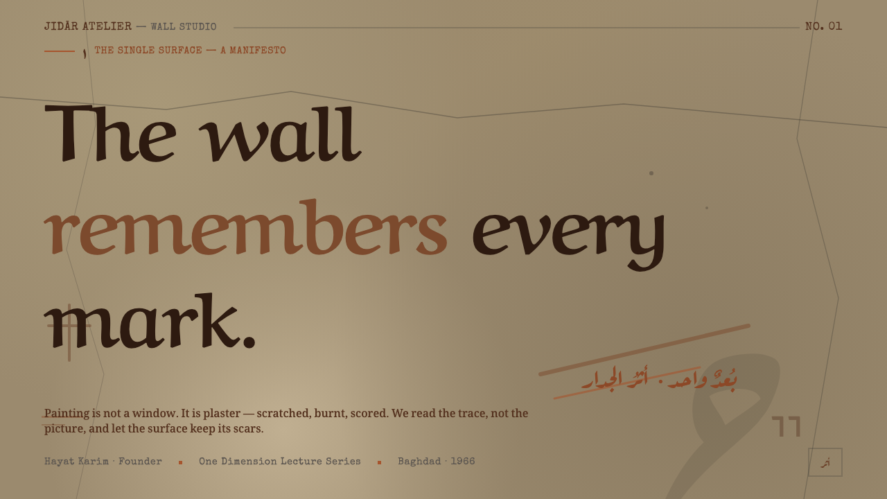
For presentation slides, use the weathered ochre-grey ground as the field for a cover title and let a restrained rust-coloured incision establish the visual entry point. Content slides should keep their hierarchy quiet and allow each section to feel like a new exposed patch of wall. On data slides, numerals can take on the character of archaeological marks: visible, emphatic, and materially grounded, but never so distressed that the information becomes uncertain.
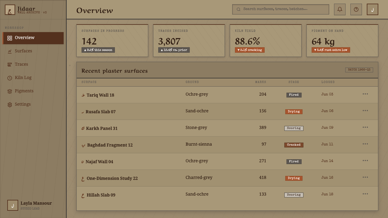
For web interfaces, the system suits dashboards and pricing pages that need a strong identity without a glossy technology aesthetic. Keep the main reading field open and use rust marks to signal active states, important figures, or selected tiers. Panels can feel like plaster areas within the larger wall, while calligraphic traces remain reserved for emphasis. The interface should remain light and readable; texture is there to establish material presence, not to compete with controls or data.
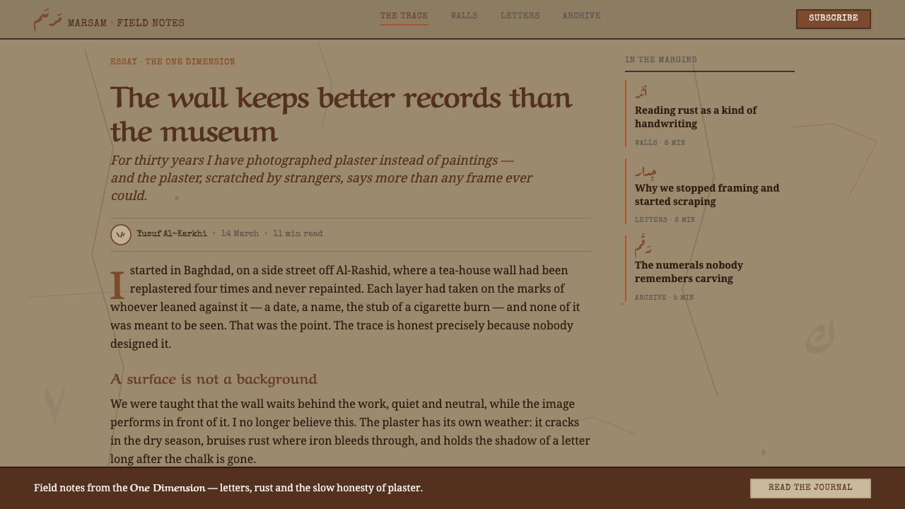
For editorial and marketing work, the style supports a distinctive article opening, campaign page, or cultural feature. A headline can sit against a broad quiet field with a scar-like mark crossing or anchoring the composition. Section transitions may be expressed through changes in abrasion or exposed ground rather than ornamental rules. Marketing work benefits from the system's sense of evidence: the product or message feels placed within a lived surface, not presented on an immaculate stage.
The common mistake is to confuse this system with generic grunge. Spreading scratches uniformly, adding random stains, using bright red, or treating every letter as a decorative graffiti sticker removes the logic of the wall. Another failure is making the texture so dense that the page becomes visually dirty and the marks lose meaning. Use weathering selectively, keep the earth palette disciplined, and ensure that each scar has a reason to occupy the surface.
Shaker Hassan Al Said — FAQ
Is this simply a distressed or grunge style?
No. Generic grunge uses damage as atmosphere, often spreading noise without a material or cultural logic. This system treats the wall as the primary structure and the mark as a trace of action. Its identity depends on the relationship between dirtied plaster, rust-coloured calligraphy, Arabic letters and numerals, and the restrained earth palette. Remove that relationship and only a surface effect remains.
Can the style work in a light interface?
Yes. The system is explicitly light-grounded, but its lightness is the exposed colour of plaster rather than immaculate white. A warm ochre-grey field gives the rust marks room to register and prevents the work from becoming an overly dark industrial treatment. The important distinction is between openness and cleanliness: the surface can be bright enough to read while still carrying dirt, abrasion, and age.
Should the Arabic letters and numerals be fully readable?
Not always. In this system, writing operates as both language and visible trace. Some marks may be recognizable as letters or numerals while remaining partial, weathered, or difficult to decipher. When actual information matters, preserve clear text in the reading layer and let the scarred forms occupy the expressive layer. The two roles should support each other rather than compete.
Does every component need visible texture?
No. If every panel, label, and control is equally cracked or scratched, the surface loses hierarchy and the wall becomes visual noise. Texture works best when it establishes the larger field, frames a meaningful mark, or distinguishes a major section. Quiet areas are essential because they create the contrast that allows a scar to feel intentional.
What kinds of products suit this design language?
It suits cultural, editorial, archival, artistic, and identity-led products that can carry a sense of place and material memory. It is especially effective when the work needs to feel human, historical, and resistant to polished abstraction. It is less suitable when the product depends on immaculate neutrality, bright commercial energy, or extremely clean technical presentation. The style should be chosen because the product can sustain the idea of the wall, not merely because the texture looks distinctive.
Related design styles
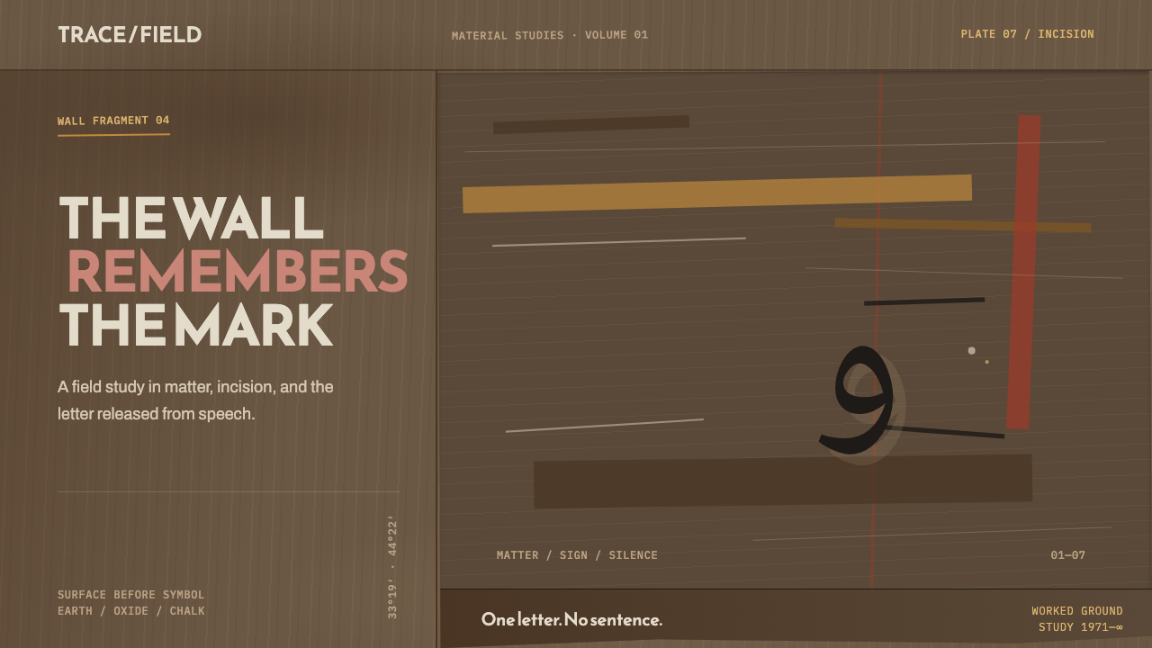 Hurufiyya MovementThe wall carries the meaning. Ochre scars and one off-axis letter break a fie…
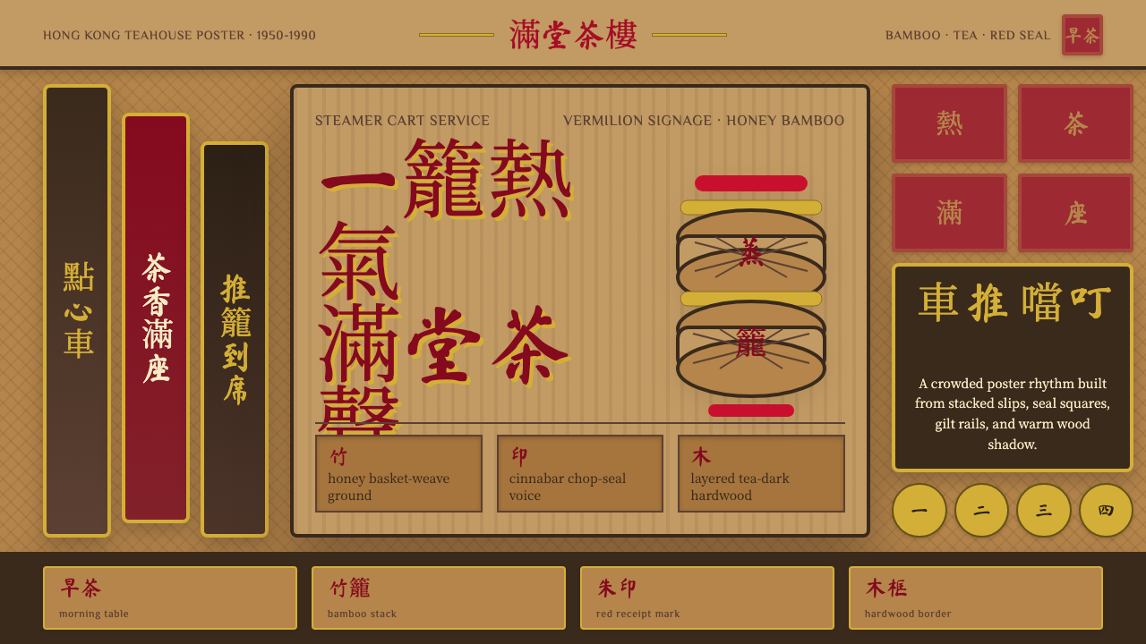 Dim Sum CartWarm clutter sings. Vermilion seals, bamboo weave, and brush type stack like…
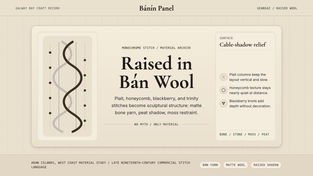 Irish Aran Island Cable KnitMaterial honesty raised in wool. Bone ground, moss ink, and cable columns cas…
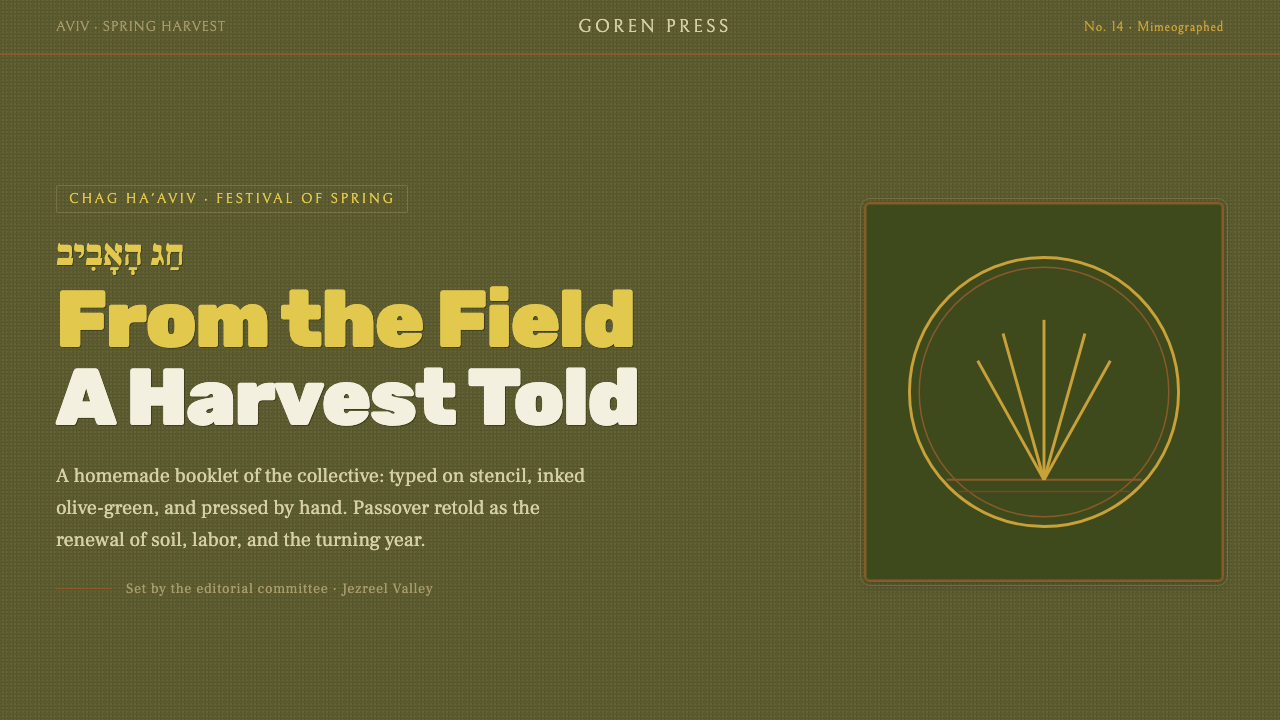 Kibbutz HaggadahHandmade harvest page. Olive stencil stock, wheat serif, deckled linocut geom…
 Vietnamese Bamboo BasketryThe basket remembers the smoke. Tan-brown woven ground, concentric splint rin…
 Afoxé Filhos de GandhyA procession that refuses to hurry. Cotton white and bead blue repeat in a me…