What is Hurufiyya Movement?
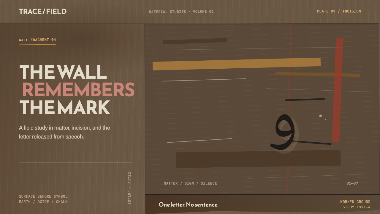
Hurufiyya pulled the Arabic letter out of the page and into the wall — one incised mark on a field of scarred, smoke-dark earth.
Hurufiyya Movement in brief
Hurufiyya is a modern art current, centered on Baghdad, that treats the Arabic letter not as a vehicle for legible text but as an abstract form in its own right. It broke the letter away from the centuries-old discipline of calligraphy — where every stroke exists to serve a readable word — and repositioned it as a shape that could carry weight, tension, and mood purely through its silhouette, exactly the way a circle or a triangle does in a Western abstract painting. A single letter, isolated and enlarged, becomes the entire subject of the work.
The movement's most radical proposition was not stylistic but material. Its founding figures rejected the smooth, prepared canvas and the enclosed world of the easel studio in favor of what they described as the rugged aesthetic of the urban wall: mud-brick and raw concrete, surfaces that had been worked over by weather, by hands, by time. A painting made in this spirit does not sit apart from a wall — it behaves like one, carrying stains, scores, and repeated gestures as if it had been standing in a Baghdad street for years rather than painted in a single sitting.
This design system inherits that logic directly. The page itself is cast as a mid-dark earthen wall — stained, scored, never clean. Ochre and rust-oxide arrive as streaks and washes rather than solid blocks of color, and pale chalk-white is rationed out as a single scratch rather than a background tone. Against this large, largely silent field sits one small incised event, pushed off-center. The wall does as much communicative work as the mark it carries; nothing here is decorative in the ordinary sense, because nothing exists except the surface and the single gesture cut into it.
Where does Hurufiyya Movement come from?
Baghdad's modern art scene took organized shape in 1951 with the founding of the Baghdad Modern Art Group, a circle of painters and sculptors — among them Jewad Selim — who set out to build an Iraqi visual language that was neither an import of European modernism nor a retreat into folkloric decoration. That circle became the seedbed from which several later currents grew, letterism among them, as artists searched for forms rooted in local material and local script rather than in styles borrowed wholesale from Paris or London.
The decisive break came two decades later. In 1971, the painter Shakir Hassan Al Said founded al-bu'd al-wahid — the One Dimension Group — and with it gave the letterist impulse a manifesto and a name. Al Said argued that the Arabic letter, freed from the obligation to spell a word, could function as a self-sufficient visual event: a single stroke capable of carrying the same expressive charge as an entire calligraphic composition, but stripped down to one mark on one surface. He backed this argument with a change in practice as much as theory, moving his own work away from the framed, gallery-ready canvas toward materials and gestures borrowed from the street.
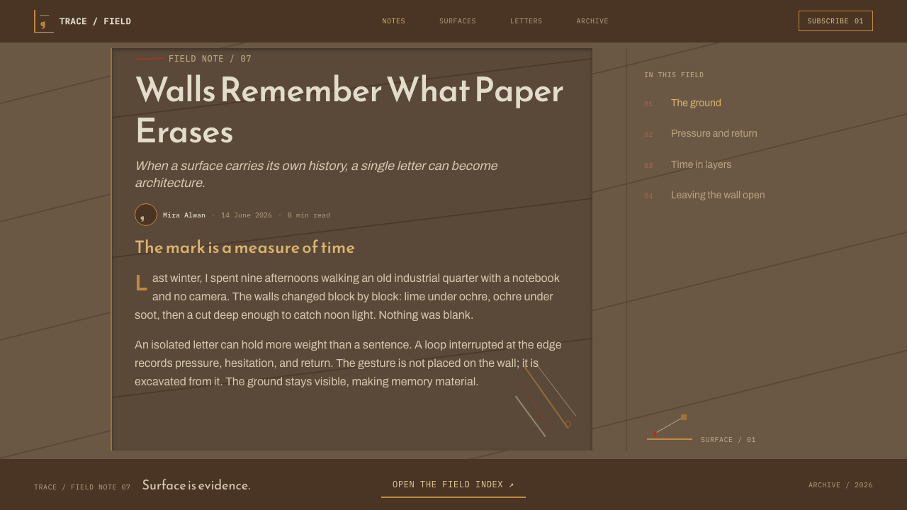
That shift toward the wall was deliberate and literal. Al Said described the aesthetic he wanted as that of the aged urban surface — mud-brick, plaster, raw concrete — worked over with repetitive gestures and lacerations, with a single letter scratched into it the way graffiti is cut or scrawled into a wall rather than painted with a brush on prepared linen. The canvas, in this framework, stopped pretending to be a window and started behaving like the surface it resembled.
The current matured through the 1970s and 1980s, its vocabulary carried forward by artists such as Dia Azzawi, who extended Iraqi modernism's reach as it gained wider international visibility, and figures such as Madiha Omar, whose work is grouped alongside Al Said's within the same letterist current — all of them working the isolated Arabic letter into abstraction outside the bounds of classical calligraphic practice. Across nearly four decades, from the Baghdad Modern Art Group's founding in 1951 through mature One Dimension canvases in the 1980s, the movement held to its central conviction: that the wall, not the page, was the honest ground for the Arabic letter once it had been let loose from the word.
What defines the Hurufiyya Movement look?
Ground Color
The field is a mid-dark earthen tone, never a clean neutral. It reads as worked mud-brick or aged concrete rather than a flat design background, and it occupies nearly the entire visible area — this is a system where the ground carries most of the meaning, not the mark on top of it.
Ochre and Oxide
Where color appears beyond the earthen ground, it arrives as ochre and rust-oxide, applied as streaks and irregular washes rather than as solid geometric fills. These tones behave like stains that have seeped into a wall over years, not like swatches chosen from a palette.
The Scratch of White
Chalk-white never functions as a background or a large field — it is rationed to a single scratch or incised line, the visual equivalent of a mark cut into plaster. Its scarcity is what gives it force; a system that used white generously would lose the tension this style depends on.
The Letter as Isolated Mark
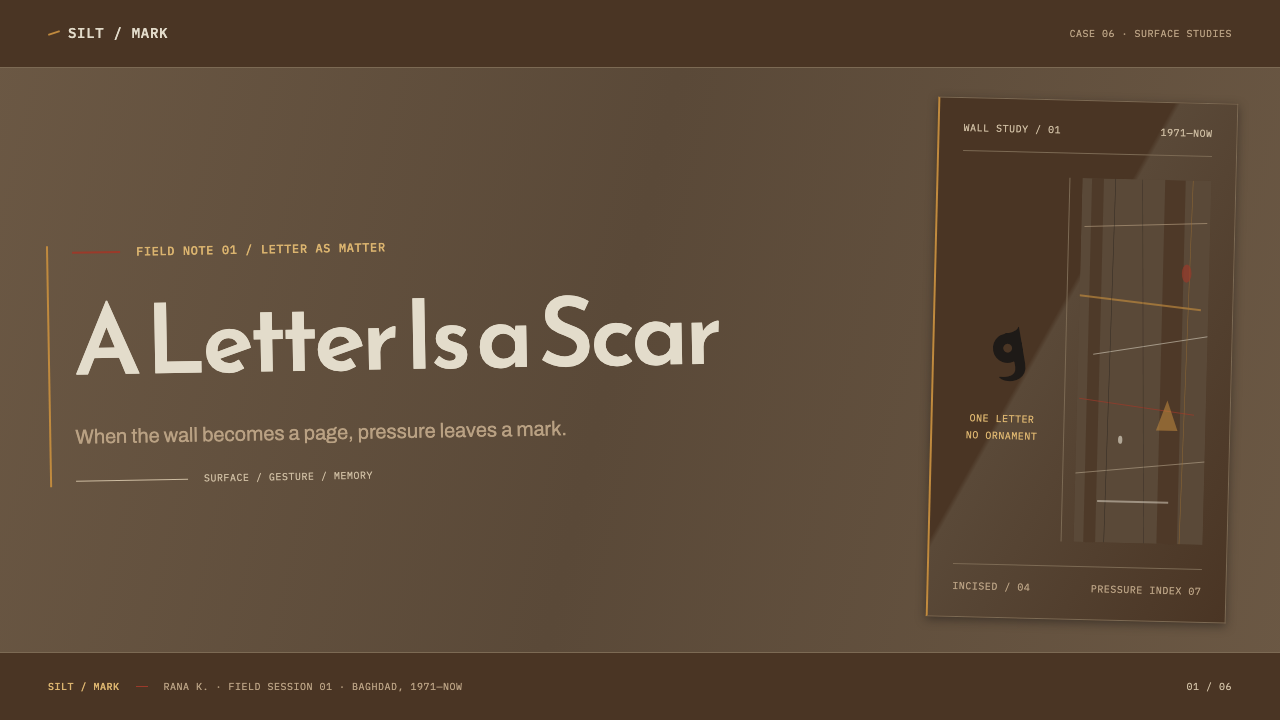
A single Arabic letter, extracted from any word it might have belonged to, functions as the sole figurative event on the page. It is not set as legible text and it does not repeat as a pattern; it appears once, off-axis, the way a single scratched sign appears on a real wall.
Composition and Placement
The layout is dominated by a large, quiet, inert field with one small event pushed off-center. There is no symmetry to speak of and no attempt at conventional balance — the composition depends on the contrast between a vast silent surface and one deliberate interruption.
Worked Surface, Not Flat Digital Plane
Texture is scored, lacerated, and repetitively gestured rather than smooth. The surface should look handled — worked over by a tool or a hand — rather than rendered as a clean, untouched digital plane, echoing the raw concrete and mud-brick the movement drew from directly.
Who shaped Hurufiyya Movement?
Al Said founded al-bu'd al-wahid, the One Dimension Group, in 1971, giving the letterist current its manifesto and its name. He argued that the Arabic letter, freed from the obligation to spell a word, could stand alone as a self-sufficient visual event, and he moved his own practice from framed canvas toward materials and gestures borrowed from the aged urban wall — mud-brick, concrete, repetitive scoring and lacerations, with a single letter scratched in like graffiti.
Selim was among the founding generation of the Baghdad Modern Art Group, established in 1951, the circle from which Iraq's search for a modern visual language rooted in local material — rather than borrowed European or folkloric styles — first took organized shape. That circle became the seedbed from which the later letterist current, Hurufiyya, would grow.
Omar's work is grouped within the same letterist current as Al Said's, part of the broader effort to give the isolated Arabic letter a place in modern abstract painting outside the bounds of its traditional calligraphic role — treating the letterform as shape and gesture rather than as a carrier of legible text.
Azzawi carried the letterist vocabulary developed in Baghdad forward through the movement's mature decades, as Iraqi modern art gained wider international visibility in the 1970s and 1980s, extending the reach of a current that began with Al Said's 1971 manifesto.
How do you use Hurufiyya Movement today?
Hurufiyya's core discipline — one dominant, worked ground and one small, deliberate mark — translates cleanly into digital interfaces because it is fundamentally about restraint and contrast rather than about reproducing calligraphy. Applying it well means resisting the urge to fill space; the entire expressive weight of the system rests on how much silence surrounds the single incised event, not on how much detail is packed into the frame.
In presentation slides, this style suits a cover or a section-break slide far better than a dense data page. A cover works best as a large, dark, textured field with a single small graphic mark — a letterform, a scratch, a fragment — placed off-center, with the title set quietly rather than boldly, letting the wall-like surface do the emotional work. Data-heavy content slides should be handled with restraint: a single accent stroke of ochre to mark a key number, everything else left in the dark earthen field, rather than distributing color across every chart element.
For web interfaces, this system is best suited to a landing page, an about page, or a cultural or editorial project rather than a dense dashboard. A hero section built on a large dark, textured background with one small off-center graphic element and sparse, quiet type can carry real emotional weight. Interactive elements — buttons, links — should use the ochre or oxide tones sparingly, as isolated accents rather than as a recurring interface color, echoing the system's insistence that color marks a single event rather than a category.
In editorial and marketing layouts, the style rewards a wide margin of untouched dark ground around a small amount of type, and pull quotes or section markers treated as a single incised stroke rather than a decorative rule. It resists busy multi-column grids; a long, quiet single column bordered by generous dark space is closer to the movement's spirit than a tightly packed magazine layout.
The most common mistake in applying this system is treating the earthen ground as merely a dark theme and then filling it with ordinary interface density — multiple accent colors, full-width imagery, dense navigation. That approach keeps the palette but loses the discipline that makes Hurufiyya legible: a vast, worked, largely silent field interrupted by exactly one small event. Overcrowding the page with marks defeats the entire logic of the system.
Hurufiyya Movement — FAQ
Is Hurufiyya the same thing as Arabic calligraphy?
No — they are related but built on opposite premises. Calligraphy exists to make a word beautifully legible; every stroke serves the sentence it belongs to. Hurufiyya, as founded by Shakir Hassan Al Said in 1971, deliberately breaks the letter away from that obligation, isolating a single letterform and treating it purely as an abstract shape with no requirement to spell anything. It borrows the letter's silhouette while discarding calligraphy's core purpose of legibility.
Why is the background treated like a wall instead of a plain page?
Because the movement's founders explicitly rejected the smooth, prepared canvas in favor of what they called the rugged aesthetic of the urban wall — mud-brick and concrete worked over with repetitive gestures and lacerations. Treating the digital background as a stained, scored surface rather than a clean plane is not decoration; it is the same material argument the original artists made when they moved away from the easel.
Can this style work with a light background instead of a dark one?
The source material describes a mid-dark earthen field as the standard ground, and the contrast between that darkness and a single pale scratch is central to how the system reads. A light-background version would need to invert the logic carefully — keeping the ratio of a vast, quiet, worked field to one small incised mark — rather than simply swapping dark for light and keeping everything else the same.
What kind of projects suit this style, and which ones should avoid it?
It suits cultural, editorial, and narrative projects that benefit from gravity and restraint — a cover page, an about section, a project that wants to feel weighted and considered rather than energetic. It is a poor fit for dense, data-heavy dashboards, e-commerce grids, or any interface that depends on scanning many equally-weighted elements at once, because the entire system depends on there being exactly one small event to focus on, not many.
Related design styles
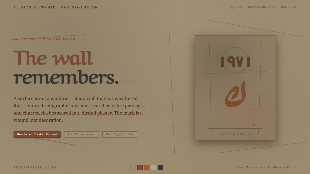 Shaker Hassan Al SaidThe mark is a wound, not decoration. Rust calligraphic scars incised into dir…
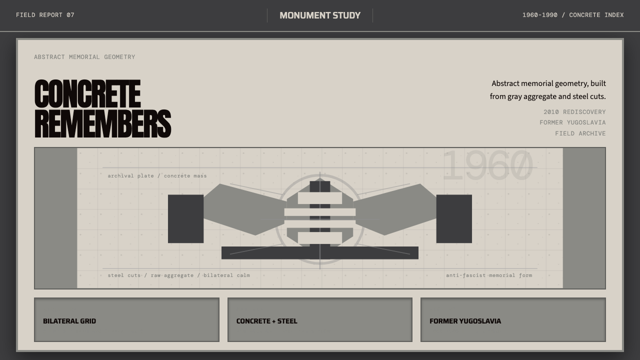 Spomenik Yugoslav Monument (1960)Memory, stripped bare. Gray symmetry and winged concrete geometry.
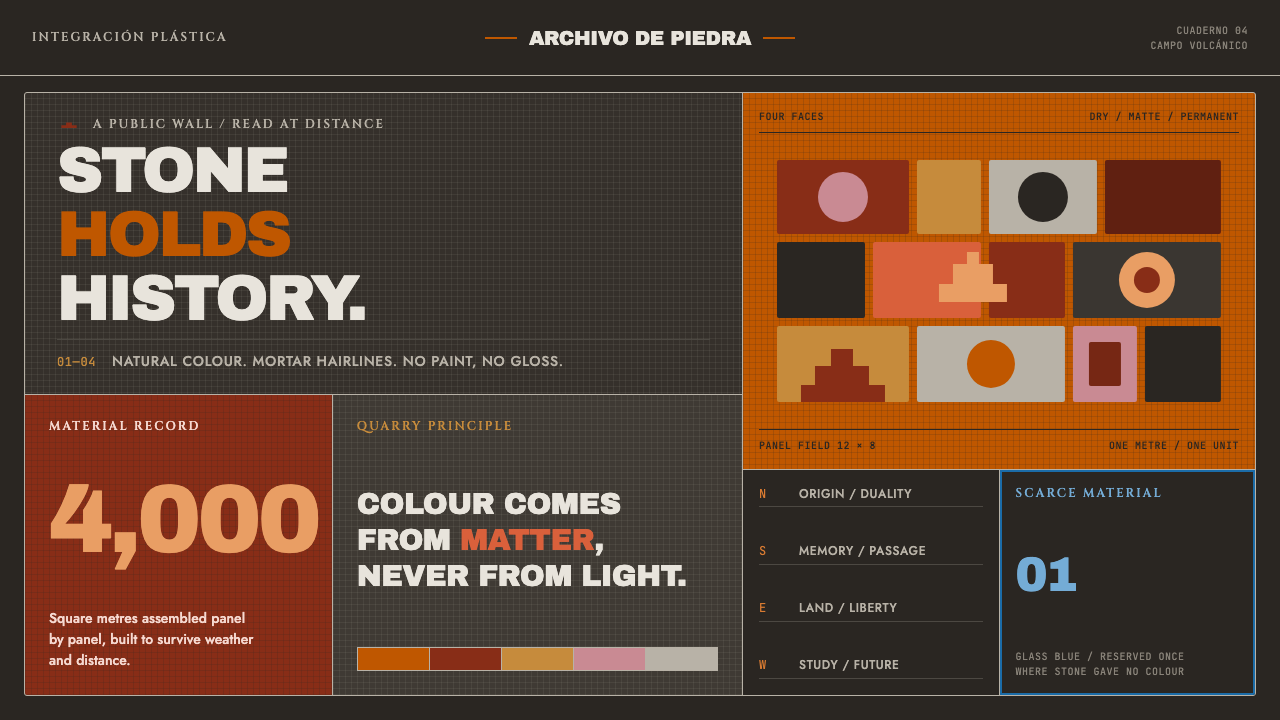 UNAM Library MosaicStone outlasts paint. Burnt-orange panels lock across volcanic gray with one…
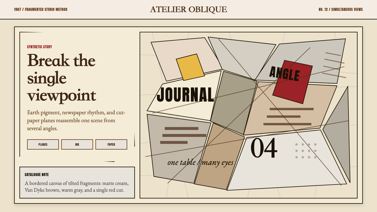 Picasso CubismSingle sight is shattered. Cream collage paper fractures brown-gray planes wi…
 Seurat — Grande Jatte PointillismThe eye does the painting. Cream, green, magenta, and cobalt mix in a frozen…
 Arcosanti ArcologyArchitecture becomes desert. Ochre concrete, circular apertures, and bronze a…