What is Arcosanti Arcology?
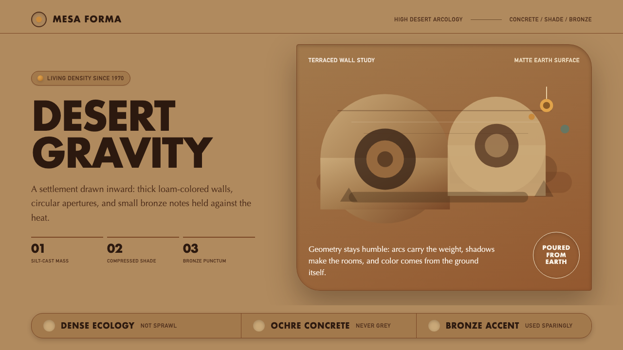
Arcosanti Arcology makes architecture behave like desert terrain: ochre mass, circular openings, and shade held inside forms that seem poured from the ground.
Arcosanti Arcology in brief
Arcosanti is Paolo Soleri’s experimental arcology in the Arizona high desert, under construction since 1970 as a living argument that architecture and ecology belong to the same discipline. Its visual language does not attempt to stand apart from its setting. The buildings take their color, texture, and apparent weight from the desert ground, making settlement, climate, material, and landscape read as one continuous system.
The defining forms are silt-cast, tilt-up concrete apses and half-domes. They were poured directly against earthen molds, so their surfaces emerged already marked by the earth that shaped them. Rather than polished architectural finish, the result is warm, matte, hand-cast concrete with the saturated ochre-tan character of desert loam. The construction method is visible in the finished appearance; surface and process are inseparable.
Against this earthen mass, Arcosanti uses very few accents. Circular apertures interrupt thick walls, creating pockets of darkness and controlled views. Cast bronze wind-bells, sold to fund construction, bring a rare metallic note, while occasional pastel marks soften selected interior surfaces. Geometry remains humble rather than decorative. Its purpose is to gather shade, frame air and light, and make the desert’s own palette feel sufficient.
Where does Arcosanti Arcology come from?
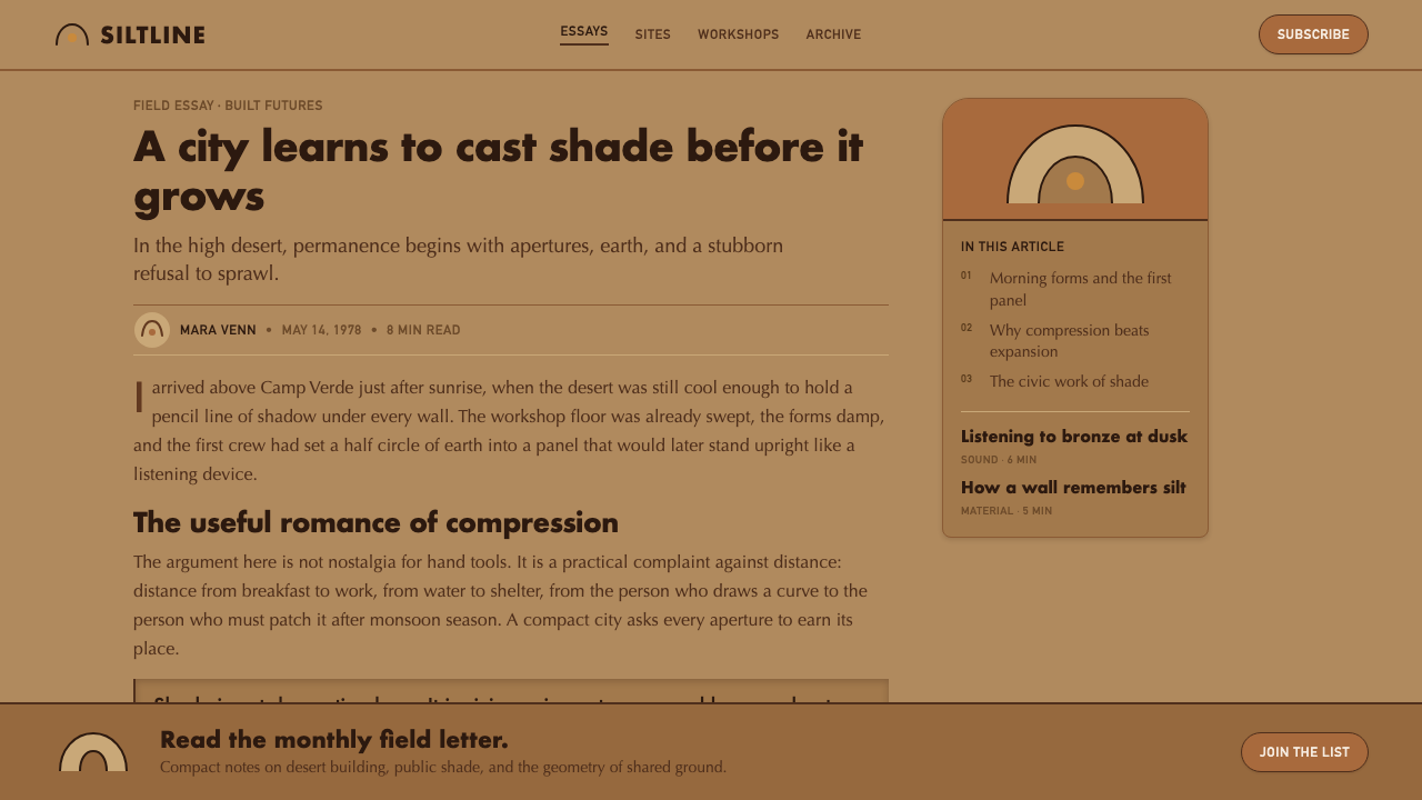
Arcosanti emerged from Paolo Soleri’s idea of arcology, a term and approach joining architecture with ecology. The project treats settlement as an environmental question rather than an isolated object-design problem. In the Arizona high desert, that premise becomes visible through compact massing, shaded openings, and construction methods that allow the architecture to carry the visual character of its site rather than importing an unrelated finish.
Construction began in 1970 and continued across the period associated with ecological and experimental architecture, while also retaining a relationship to mid-century modernism. Yet Arcosanti does not present modernism as a smooth, universal machine aesthetic. Its concrete is earthy rather than pristine, its geometry is monumental but incomplete-looking, and its spaces depend on thick boundaries, deep recesses, and the contrast between sunlit surfaces and shelter.
The Cosanti Foundation is inseparable from the project’s material story. Cast bronze wind-bells were sold to fund construction, turning a small crafted object into both an economic support and a visual emblem of the larger experiment. This relationship between architecture, handwork, and ongoing building helps explain why Arcosanti feels less like a finished monument than a sustained proposition: a place where construction, livelihood, ecology, and aesthetic identity remain visibly connected.
What defines the Arcosanti Arcology look?
Earthen Concrete
The primary material reads as warm ochre-tan desert loam rather than neutral construction concrete. Its matte, hand-cast surface avoids polish and visual refinement for their own sake. Because the concrete was formed against earth, the building’s finish carries an impression of contact with the site: imperfect, granular, heavy, and materially direct.
Apses and Half-Domes
Curving concrete apses and half-domes establish the style’s architectural silhouette. These forms are not ornamental flourishes placed on a conventional box. They make mass feel excavated, gathered, or lifted from the land, and they give the architecture a protective quality suited to a setting defined by exposure and intense sun.
Compression and Shade
Arcosanti’s drama comes from the relationship between thick mass and enclosed darkness. Shade is not an afterthought added by screens or surface effects; it is held inside walls, recesses, and curved volumes. Bright exterior planes become more powerful because they border deep, cool-looking apertures and sheltered interiors.
Circular Apertures
Circular openings provide a simple but recurring counterpoint to the larger concrete masses. They puncture walls with concentrated darkness and make the eye notice thickness, depth, and enclosure. Used sparingly, they turn an opening into a spatial event rather than a repeated decorative motif.
Restricted Accents
Bronze wind-bells and occasional pastel interior marks supply the few departures from the earthen field. Bronze introduces density, craft, and a restrained metallic warmth without competing with concrete. Pastel appears as a rare human trace inside the architecture, not as a comprehensive decorative palette.
Humble Geometry
The geometry is recognizable but never treated as graphic spectacle. Curves, circles, and large planes are tied to enclosure, construction, and shadow rather than visual novelty. This keeps the forms grounded: they feel like responses to desert conditions, not symbols imposed on the landscape.
Who shaped Arcosanti Arcology?
Soleri is the architect behind Arcosanti and its arcology premise. His project frames architecture and ecology as one discipline, and that premise governs both the settlement’s experimental purpose and its appearance. The earth-formed concrete, compact visual mass, shaded apertures, and refusal of superficial finish all make the idea visible rather than merely theoretical.
The Cosanti Foundation is a key institutional figure in Arcosanti’s continuing construction story. Its association with the production and sale of cast bronze wind-bells reveals a practical dimension often missing from architectural imagery: the site’s visual culture was linked to an ongoing means of funding the work, not separated from it.
Arcosanti itself functions as the central figure of the experiment: an inhabited architectural argument in the Arizona high desert. Its unfinished, accumulated character matters. The site communicates arcology through repeated material decisions — earthen concrete, sheltered voids, restrained accents, and the persistent integration of construction with the desert landscape.
How do you use Arcosanti Arcology today?
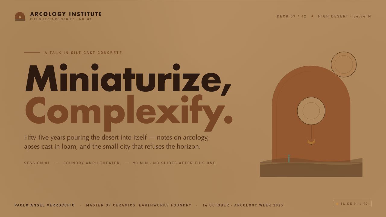
For presentation covers, borrow Arcosanti’s sense of a single protective mass rather than copying its buildings literally. Use a warm earthen field, one large curved or arched form, and a concentrated dark opening to establish the title area. Keep the composition quiet and weighty. The cover should feel sheltered by its geometry, with a bronze-like accent reserved for one small focal detail.
Content and data slides benefit from the style when information needs to feel grounded rather than corporate-polished. Treat headings as carved into a broad field of space, and group body text inside large, calm regions rather than many floating cards. For data, use heavy bars, arcs, or circular cutouts as structural shapes, allowing contrast between light surfaces and deep dark voids to carry hierarchy. Avoid turning every chart into a decorative dome.
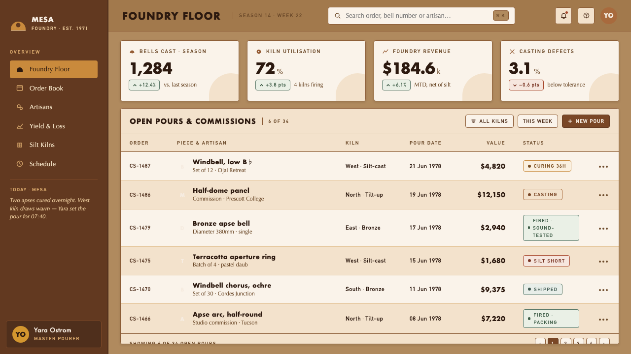
For web interfaces, the language works best in dashboards, planning tools, environmental products, and pricing pages that need a strong sense of permanence. Build panels as thick visual planes with deeply recessed sections, and use circular openings or curved boundaries only where they organize navigation, status, or focal content. Keep the dominant atmosphere matte and earthy. Bronze-like accents should signal a meaningful action or selected state, not provide general ornament.
For editorial and marketing work, Arcosanti supports long-form stories about place, material, climate, or making. Let generous quiet areas surround narrow columns of text, then use an arching image crop or dark circular interruption to mark a chapter change. Marketing pages can alternate expansive earthen sections with shaded, high-contrast passages, but their tone should remain contemplative and tactile rather than aggressively futuristic.
The common mistake is reducing Arcosanti to desert colors plus random arches. That produces a themed surface without the project’s environmental logic. The style depends on compression, material honesty, and useful shade: each curve should appear to support enclosure or shelter, each dark area should feel spatial rather than merely decorative, and each accent should be scarce enough to preserve the authority of the concrete mass.
Arcosanti Arcology — FAQ
Is Arcosanti Arcology simply a desert version of mid-century modernism?
It is connected to mid-century modernism, but its central claim is more ecological and experimental. Arcosanti does use concrete, bold massing, and simplified geometry, yet it rejects the detached, smooth, universally transferable appearance often associated with modernist work. Its surfaces, colors, and shaded forms are deliberately tied to the Arizona high desert and to the act of ongoing construction.
Why are the concrete surfaces so important to the style?
Because the concrete was poured against earthen molds, its appearance records the project’s construction method and its relationship to the ground. Replacing that surface with polished stone, glossy coating, or perfectly smooth neutral concrete would remove the sense that the architecture has been shaped by the land. The rough matte finish is not a rustic accessory; it is the material evidence of the idea.
Can this style work without an actual desert setting?
Yes, if its environmental logic is retained. The transferable qualities are shelter, material restraint, warm earth-derived color, and the contrast between exposed planes and protected voids. In another context, the palette and material cues should respond to the local setting rather than mechanically imitating Arizona. The goal is not desert cosplay; it is architecture that appears accountable to climate and ground.
How should bronze be used in an Arcosanti-inspired design?
Use it as a rare, crafted counterpoint to the dominant earthen field. The bronze wind-bells matter because their material density and cultural role are specific: they helped fund construction. In a contemporary interface or graphic system, a bronze-like accent should therefore mark something intentional, tactile, or consequential. If it appears everywhere, it loses the contrast that makes it meaningful.
Related design styles
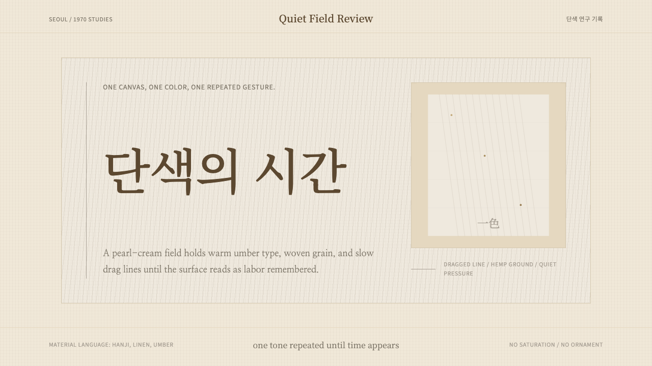 Korean Dansaekhwa MonochromeLabor becomes stillness. Umber serif type and drag lines on pearl cream.
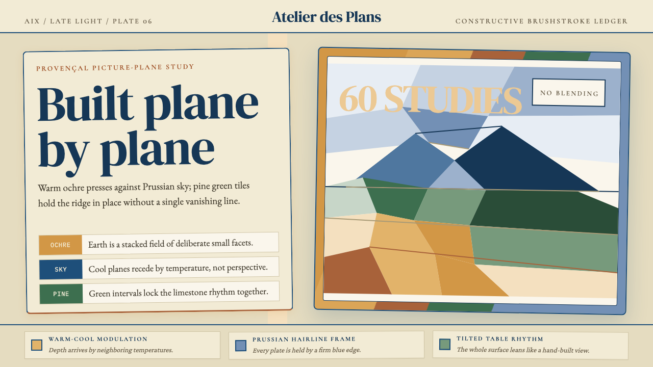 Cézanne — Mont Sainte-VictoireBuilt, not blended. Ochre, Prussian blue, and pine facets tilt into a constru…
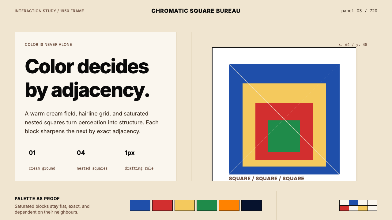 Josef Albers — Homage to the SquareColor becomes event. Warm cream, cobalt-red-yellow nested squares, exact hair…
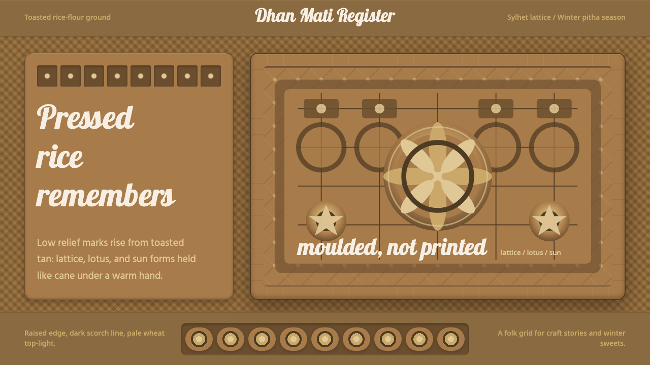 Bangladeshi Nakshi Pitha MotifsWarm relief, never print. Galada type and tan lattice press rice-flour craft…
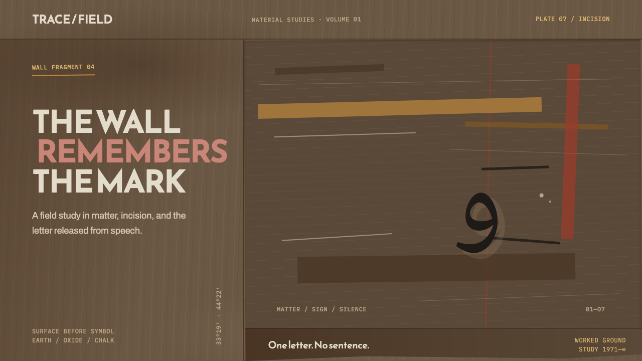 Hurufiyya MovementThe wall carries the meaning. Ochre scars and one off-axis letter break a fie…
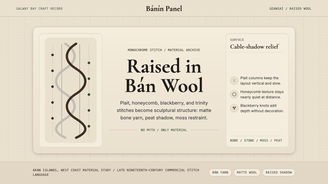 Irish Aran Island Cable KnitMaterial honesty raised in wool. Bone ground, moss ink, and cable columns cas…