What is Severance Lumon?
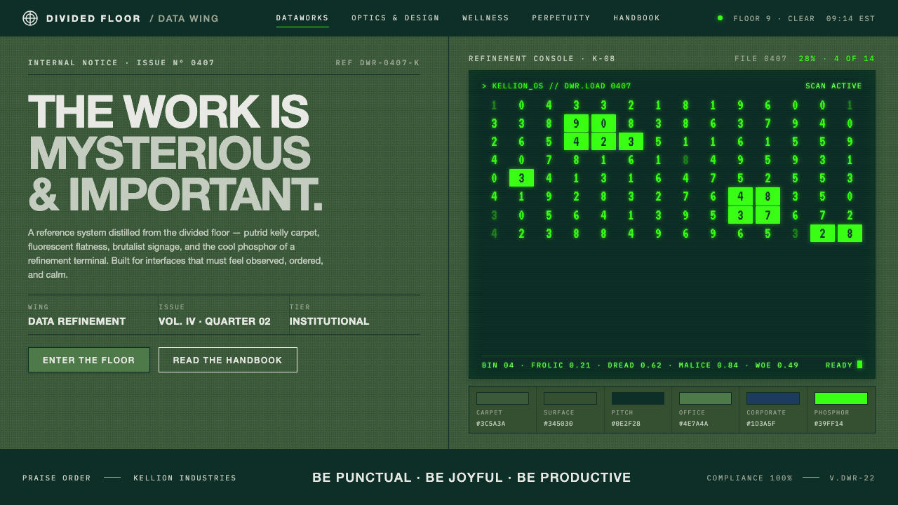
Severance Lumon turns the office into a fluorescent uncanny valley — putrid green carpet, brutalist signs, and phosphor terminals where corporate order becomes quietly terrifying.
Severance Lumon in brief
Severance Lumon is a retro-futurist corporate style built from institutional unease. Its world combines endless putrid kelly-green carpet, cold fluorescent light, stark white linoleum corridors, brutalist signage, and green-on-black CRT terminals. The result feels familiar enough to resemble an office, yet stripped of the warmth, variation, and human scale that make an office feel lived in.
The style depends on contradiction. Green is ordinary, even comforting, because it is among the colors most familiar to the eye; here, that familiarity becomes oppressive through repetition and clinical lighting. White corridors suggest cleanliness but feel severe rather than welcoming. The terminal glow promises information while isolating the user inside a small field of phosphor light. Every surface performs a corporate function, but the total environment reads like a childlike playground designed by an institution that does not understand children.
Visually, Severance Lumon is less about decoration than controlled atmosphere. Its forms are blunt, its signs are emphatic, and its palette is narrow enough to make small shifts feel consequential. The design language borrows from mid-century modernism, corporate brutalism, and retro-futurism, then pushes those references toward psychological discomfort. Use it when the goal is sterile authority, procedural mystery, or the sensation that a perfectly organized system is hiding something.
Where does Severance Lumon come from?
Severance Lumon belongs to a timeless retro-future corporate imagination rather than to a historical design movement with a fixed manifesto. Its setting is Lumon Industries, a fictional North American workplace organized around the severed floor. The series was released in 2022, but the visual world refuses to feel located in a single decade. It looks like a future imagined through the materials, colors, and institutional confidence of an earlier office culture.
The style draws from mid-century modernism through its clean surfaces, controlled geometry, and belief that an environment can be rationally organized. It draws from corporate brutalism through blunt signage, institutional scale, and the sense that communication has been reduced to commands and systems. Retro-futurism supplies the temporal dislocation: the space appears technologically advanced in concept but materially dependent on carpet, linoleum, fluorescent tubes, and CRT screens.
Production designer Jeremy Hindle chose the green deliberately. His stated reasoning was that green is the most common color to the eye, which allowed the environment to feel immediately legible while remaining eerie. The choice transforms a familiar office color into a psychological instrument. Spread across the carpet and repeated through the terminal glow, green becomes less a decorative accent than the emotional weather of the workplace.
The resulting design system distills sterile institutional dread into a usable visual language. Dull office greens establish the physical environment, corporate blue supplies a cooler organizational counterpoint, and phosphor terminal green marks the technological interior. Black provides the void from which terminal information emerges, while white corridors and surfaces create harsh interruptions. The system is effective because its references do not compete: modernist order, corporate severity, and retro-futurist technology all serve the same atmosphere of disciplined unreality.
What defines the Severance Lumon look?
Putrid Green
Green is the emotional anchor of the style, but it should feel institutional rather than botanical. The preferred impression is dull, slightly contaminated, and repeated over a large field, especially carpet. Green becomes unsettling through persistence: it is not an accent that draws attention once, but a background condition that the viewer cannot escape.
Corporate Blue
Corporate blue acts as the cooler, more administrative member of the palette. It can separate departments, labels, or informational layers without introducing warmth. Against the dominant green, blue should feel procedural and distant, reinforcing the impression that the environment was designed for organizational efficiency rather than personal comfort.
Brutalist Signage
Signs are blunt, legible, and institutionally confident. They should look like permanent instructions rather than friendly wayfinding, with heavy forms, clear directional logic, and little visual softness. The sign is not an invitation to explore; it is evidence that the building already knows where everyone belongs.
Fluorescent Severity
Lighting is cold, even, and emotionally unhelpful. It reveals surfaces without flattering them and removes the shadows that might make a room feel intimate. A Severance Lumon composition should therefore avoid cozy pools of light or atmospheric warmth. Visibility is constant, but reassurance is absent.
Phosphor Contrast
The CRT terminal introduces the sharpest contrast in the system: green information suspended on black. This is not a luminous digital gradient but a concentrated, limited glow. Use it for data, status, or machine activity, keeping the surrounding field quiet enough that the terminal feels like a small portal into an otherwise sealed institution.
Endless Repetition
The style gains its dread from repetition without release. Similar corridors, repeated carpet, recurring signs, and consistent terminal glow make the workplace feel larger than memory and less human than architecture. Repetition should establish order first, then gradually make that order feel like confinement.
Who shaped Severance Lumon?
Jeremy Hindle is the key figure explicitly connected to the visual decision that defines the system: choosing green because it is among the colors most familiar to the eye. That decision gives the environment its childlike yet eerie quality, turning an ordinary office color into a sustained atmosphere of corporate dread.
Ben Stiller is identified as one of the key figures in the Severance Lumon origin. Within this style article, his importance belongs to the wider creative constellation that shaped the fictional severed workplace and its carefully controlled retro-futurist corporate identity.
Dan Erickson is also named among the key figures associated with Severance Lumon. His place in the source material reinforces that the style is not merely a palette, but part of a larger fictional environment where space, institution, technology, and unease operate as one system.
How do you use Severance Lumon today?
Severance Lumon works best when atmosphere is treated as a structural requirement. Begin with a dark field, establish a dominant office green, and introduce white, blue, or phosphor green only when each has a clear institutional or informational role. The style becomes convincing when every color feels assigned by a department, a system, or a building rule rather than selected for visual variety.
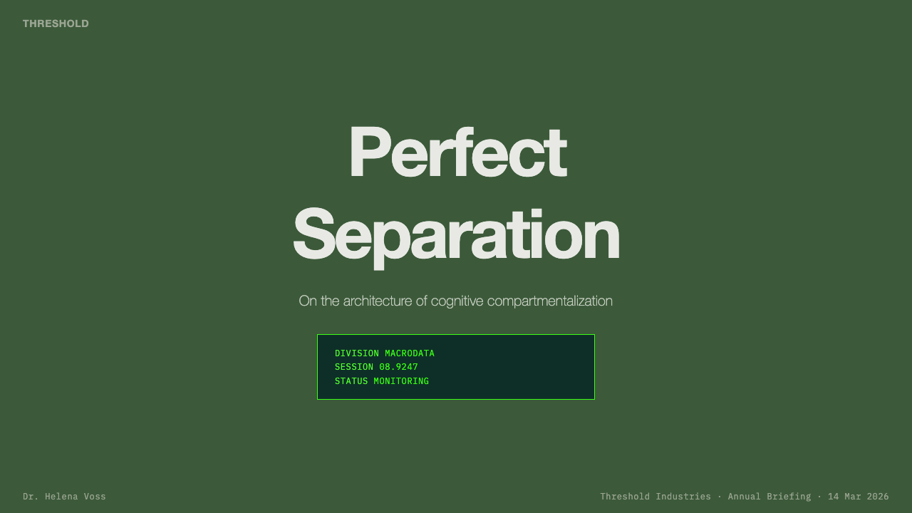
For presentation slides, the cover should feel like an entrance into a controlled facility: a dark ground, an emphatic title, and a broad field of dull green or a severe white interruption. Content slides should preserve the sense of institutional repetition through consistent alignment, restrained labels, and stark blocks of information. Data slides are especially effective when charts resemble terminal readouts or administrative forms, using phosphor green for active information and corporate blue for secondary classification.
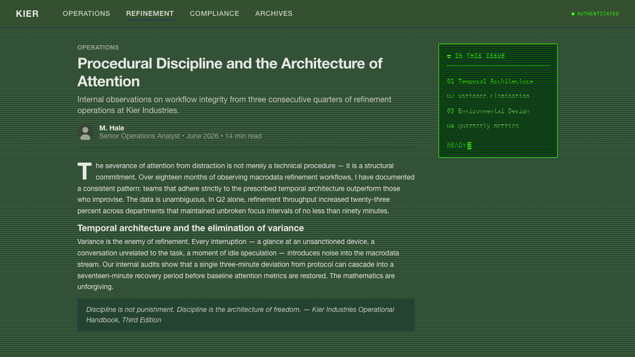
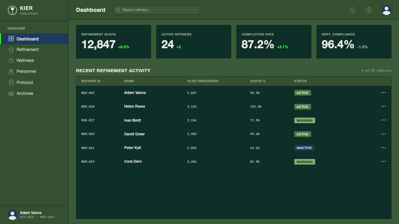
For web interfaces, the style suits dashboards, monitoring tools, internal systems, and pricing pages that want to communicate procedural authority. Use dark surfaces for the application shell, office green for selected areas or persistent environmental framing, and phosphor green only for live states, machine output, or confirmed activity. Pricing tiers can feel like organizational departments rather than friendly consumer packages, but readability must remain immediate; the atmosphere should support hierarchy, not obscure it.
For editorial and marketing work, the style can turn ordinary corporate language into a compelling visual narrative. Articles benefit from narrow text measures, stark headings, institutional metadata, and large quiet fields that suggest empty corridors. Marketing pages can alternate black terminal-like sections with pale linoleum-like sections, using green as the recurring environmental signature. Campaign imagery should feel observed, catalogued, or displayed inside a facility rather than warmly staged for an audience.
The common mistake is making the style merely neon, retro, or sinister. Bright green on black alone produces generic cyberpunk; adding random vintage computer references produces costume. Severance Lumon depends on the tension between familiar office order and emotional wrongness. Keep the green dull where it describes the institution, reserve phosphor glow for the terminal layer, and let repetition, fluorescent severity, and blunt signage create the unease.
Severance Lumon — FAQ
Is Severance Lumon simply a retro-futurist style?
Retro-futurism is one of its foundations, but it is not the whole system. The style also depends on mid-century modernist order, corporate brutalist severity, institutional signage, fluorescent exposure, and the psychological pressure of repeated green space. Remove those tensions and the result becomes nostalgic technology styling rather than corporate uncanny valley.
Can the style work on a light background?
Yes, and the stark white linoleum corridor is an important part of the source material. A light version should feel clinical, exposed, and impersonal rather than airy or cheerful. Use dull green as an environmental interruption, keep signage blunt, and preserve strong dark contrast for terminal or administrative information.
How much phosphor green should be used?
Treat phosphor green as a terminal signal, not as the general palette. It should identify machine activity, active information, or a concentrated technological layer. If it spreads across every surface, the distinction between dull institutional green and electronic glow disappears, and the atmosphere loses its controlled unease.
What makes the green feel unsettling instead of playful?
Context does the work. Green becomes unsettling when it is dull, repeated over a large environmental field, exposed to cold fluorescent light, and paired with institutional rules or brutalist signs. A brighter, isolated green accent may feel playful; the Severance Lumon effect comes from making green ordinary, persistent, and impossible to escape.
Which products suit this style best?
It suits dashboards, internal tools, monitoring interfaces, data products, and editorial projects about systems or institutions. It is less suitable when the product depends on warmth, organic texture, or spontaneous friendliness. The style communicates control and mystery exceptionally well, but those values should align with the product before they are applied.
Related design styles
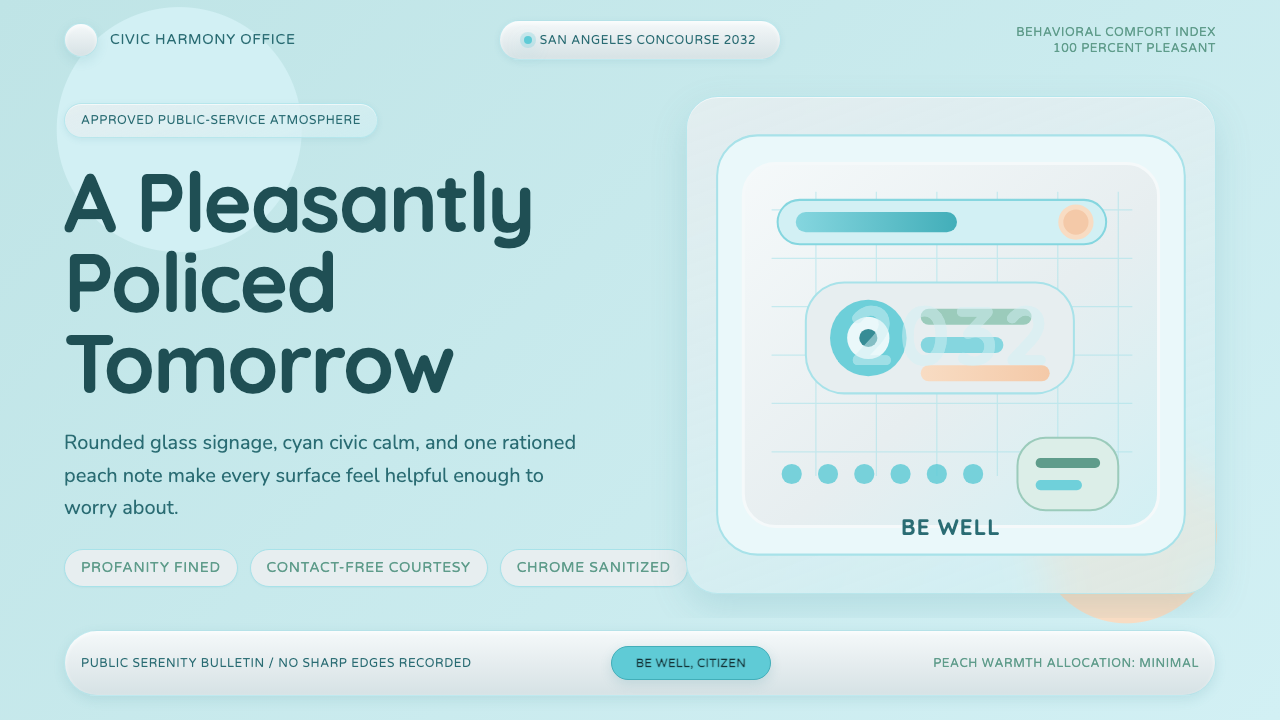 Demolition ManToo clean to trust. Pastel cyan glass, rounded civic signage, one peach warni…
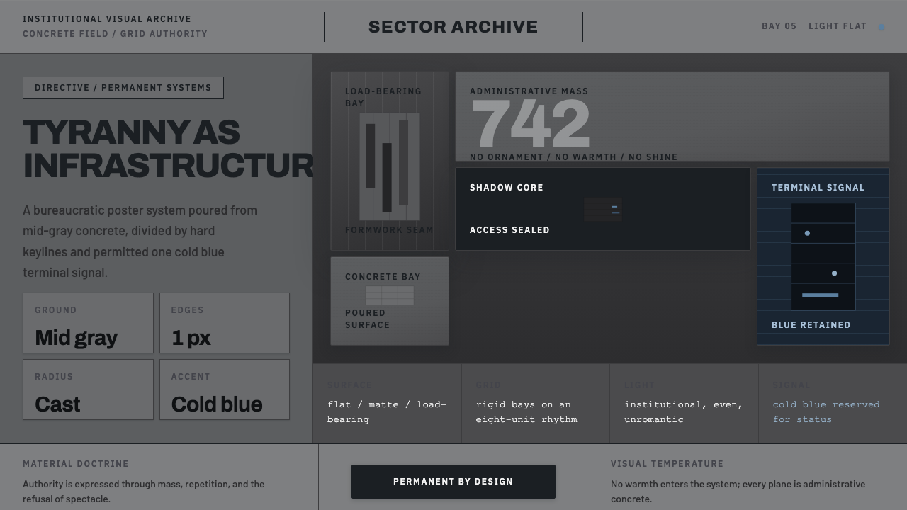 Andor Imperial GrayOppression made ordinary. Mid-gray concrete slabs, hard keylines, one cold bl…
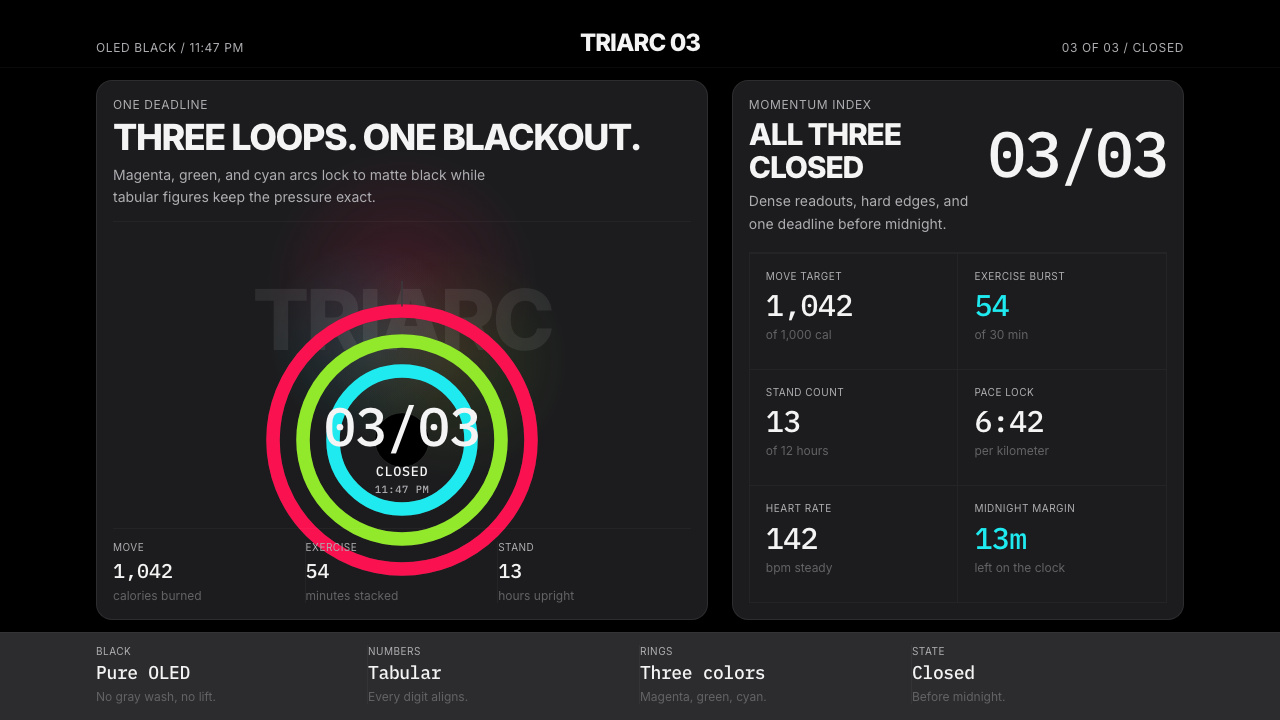 Apple Fitness Rings Closed (2024)Midnight feels exact. Magenta, green, and cyan rings lock onto OLED black.
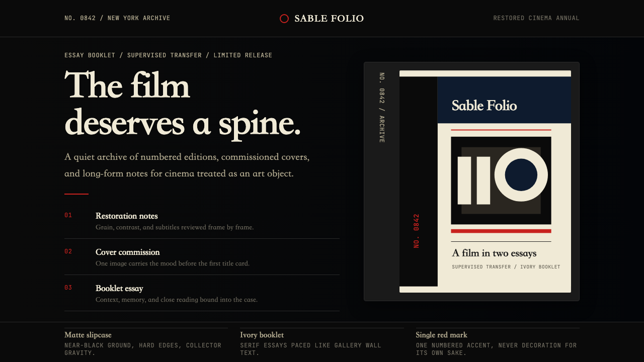 Criterion CollectionMuseum-grade cinema. Matte black, ivory serif, and one red numbered spine set…
 Lunar Regolith SettlementMoonlight without the myth. Regolith gray, hard terminators, and a strict tec…
 Microsoft Fluent 2Disciplined translucency. Warm Mica neutrals, acrylic blur, and muted blue cr…