What is Agent Ops Console?
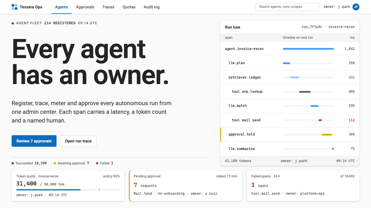
Agent Ops Console imagines the admin screen a 2030 IT team opens every morning, where governing a fleet of AI agents looks less like science fiction and more like working through a well-sorted queue.
Agent Ops Console in brief
Agent Ops Console is a design style for the control room of an organization that runs many AI agents at once. Dozens or hundreds of agents are calling tools, spending tokens, failing at particular steps and waiting for a human to approve certain requests. The interface exists to show all of that on one screen and to make the next required action obvious.
It is deliberately unglamorous. The canvas is a light grey, content sits on white cards, and a single Fluent blue marks everything that can be clicked. Status is limited to three colors: green for success and granted access, red for failure and overruns, and a marigold yellow reserved for one meaning only, which is that a request is waiting for a person to decide.
The style treats governance as a queue rather than a spectacle. Tables line up, run traces unfold as indented trees in monospaced type, and every number arrives with a unit, a timestamp and a named owner. There are no holographic dashboards and no robot mascots, only information you can verify and a person you can ask about it.

Where does Agent Ops Console come from?
Although the style is projected to 2030, its starting point is already in production. Fluent 2, Microsoft's design language, was released in 2023 and defines the sober grey-and-white surfaces and the blue used for interaction. Microsoft Agent 365, announced in 2025, brings an agent registry, approval and denial of access requests, and per-agent identity and permissions into the Microsoft 365 admin center. Agent Ops Console extends that existing ground by a few years rather than inventing a new world.
The second root is LLM observability and tracing. Tools in this area, with LangSmith the best-known reference and Harrison Chase associated with it, popularized the idea that an agent's work should be inspectable as a nested run tree: a top-level task, the model calls inside it, the tool calls inside those, and the point where something went wrong. The indented, monospaced trace in this style comes directly from that practice.
The third root is human-in-the-loop agent governance. As organizations give software agents real permissions, a recurring question is who approves what, and where a person must stay involved. Instead of hiding that question in settings, the interface turns it into a first-class object, with its own color and its own queue.
These threads sit inside the older genre of enterprise admin-center design, where the audience spends hours a day, the information density is high, and the screen is judged by how reliably it can be read at a glance. The 2030 label is a statement of intent: this is what that genre looks like when the thing being administered is no longer a fleet of laptops but a fleet of autonomous workers.
What defines the Agent Ops Console look?
Light grey canvas, white cards
The page ground is a quiet light grey and content lives on white cards with soft edges. This gives a clear layering without relying on heavy shadows, and it lets a dense screen stay calm. Each card holds one subject, such as an agent, a request or a trace.
Blue only for what you can click
Fluent blue is a signal for interaction. Links, primary buttons, selected tabs and focus rings use it, and nothing decorative does. A reader can learn the whole screen's grammar quickly: if it is blue, it does something.
Three status colors, one meaning each
Green means success or granted, red means failed or over limit, and marigold means pending human approval. The yellow is deliberately not used for generic warnings, so that anyone scanning the page can find the items waiting on a person without reading a word.
Nested run trees in monospace
Traces are shown as indented trees: task, steps, model calls, tool calls. Monospaced type keeps identifiers, durations and token counts aligned in columns. Expanding and collapsing nodes lets an operator move from a one-line summary to the exact step that failed.
Every number has a unit, time and owner
A bare figure is treated as unfinished. Costs carry their currency, latencies their unit, counts their time window, and each record names the person or team accountable. The aim is that a number can be questioned and traced rather than merely admired.
Aligned tables over decorative charts
The default presentation is a well-aligned table with sortable columns, filters and clear row states. Charts appear when a trend is the actual question, and they stay plain: restrained axes, no gradients, no ornamental motion.
Approval as a first-class screen
Pending requests have their own queue with the requesting agent, the permission asked for, the reason and clear approve and reject actions. Nothing important is buried in a menu. The interface assumes a person will make the decision and designs for speed and confidence.

Who shaped Agent Ops Console?
Associated with LangSmith and the wider practice of tracing language-model applications. The nested run tree that defines this style's trace view descends from the conventions that work helped popularize.
The group behind Fluent 2, released in 2023. Its sober surfaces, interaction blue and approach to dense enterprise layouts provide the visual foundation on which Agent Ops Console is built.
The product teams who brought agent registry, access-request approvals and per-agent permissions into the admin center in 2025. Their work is the real-world version of the queue this style dramatizes.
How do you use Agent Ops Console today?
For slide decks, this style is ideal for internal reviews of AI programs. A cover can be a plain white card on pale grey with a single blue accent and a short title. Content slides should look like screens from the product: one subject per card, a table of agents with their owners and status, or a trace tree showing where a run failed. Data slides should use the three status colors faithfully, so that an audience learns the code in the first minute and can read every later slide without a legend.
On the web, it fits admin consoles, governance dashboards, usage and cost pages and internal tools for AI platforms. Navigation is a quiet sidebar, the main area is cards and tables, and primary actions are blue. Pricing or plan pages can borrow the same card structure, but should avoid using yellow, since in this system it means a person must decide.
In editorial and marketing work, the style supports explainers, white papers and product pages about agent governance. Screenshots or faithful recreations of the console are persuasive precisely because they look ordinary. A diagram of an approval queue or a trace tree can do more than an abstract illustration of a glowing network.
Typography is simple: a clean interface sans-serif for labels and body, a monospaced face for identifiers, trace nodes and numeric columns. Keep sizes modest and consistent, and rely on alignment and spacing for hierarchy rather than decoration.
A common mistake is to add the very things the style rejects: glowing gradients, animated neural graphics, robot characters or dark sci-fi chrome. Another is to use status colors loosely, for example painting a decorative badge yellow, which destroys the rule that yellow always means a request awaits approval. A third is to show metrics without owners or timestamps, which turns an operational screen into a poster.

Agent Ops Console — FAQ
What is the Agent Ops Console design style?
It is a design style for admin and governance screens that manage AI agents. It uses a light grey canvas with white cards, Fluent blue for interactive elements, three status colors, monospaced run trees for traces, and strict habits such as giving every number a unit, a timestamp and an owner. It is projected to 2030 but grounded in tools that exist today.
Why is yellow reserved for approvals?
Human approval is the one state where the system cannot continue without a person. Giving it a color that nothing else uses means an administrator can scan a long page and find every blocked item immediately. If yellow also served for general warnings, that guarantee would be lost.
How does it relate to Microsoft Fluent?
It builds on Fluent 2's sober surfaces and interaction blue, and on the admin-center conventions of Microsoft 365, where agent registry and access approvals already exist through Agent 365. It is an extension of that language into a near future, not an official Microsoft product.
Can I use it outside AI products?
Yes. Its underlying habits, which are calm layering, one interaction color, meaningful status colors and fully labeled numbers, suit any operations, finance or compliance tool. The agent-specific parts such as run trees can be dropped, and the rest still produces a trustworthy back-office interface.
Should I add futuristic effects to match the 2030 label?
No. The future in this style is shown by the subject matter, not by visual effects. Glow, particles and sci-fi chrome would make the screen harder to trust. The credibility of the style comes from looking like software an IT team could deploy next quarter.
Related design styles
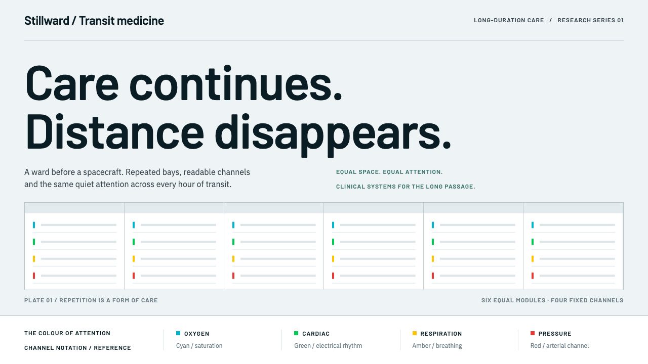 Cryosleep Transit WardCare without spectacle. Clinical white, equal bay grids and the fixed colours…
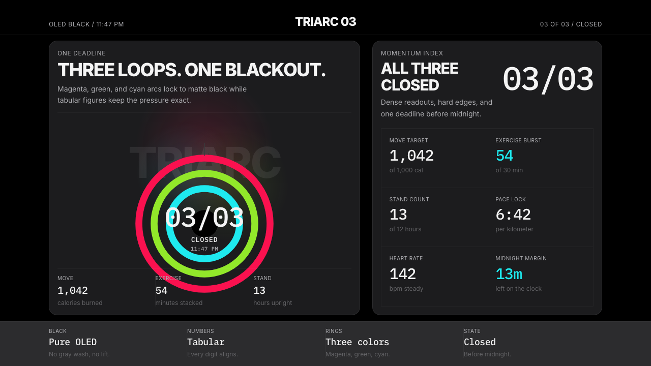 Apple Fitness Rings Closed (2024)Midnight feels exact. Magenta, green, and cyan rings lock onto OLED black.
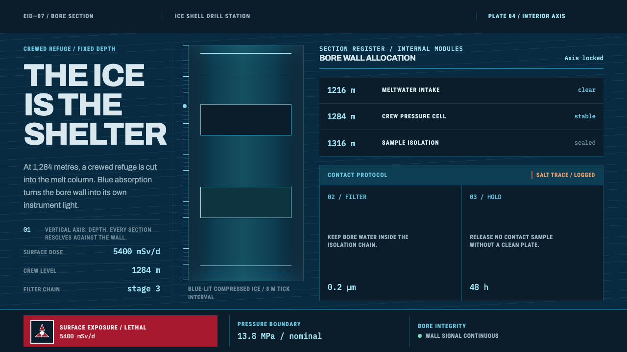 Europa Ice Drill StationShelter is a depth, not a room. Blue bore axis, hard tables, and earned radia…
 Longevity ClinicThe report is the care. Cool white sheets, hairline seams, and teal signals m…
 Lunar Regolith SettlementMoonlight without the myth. Regolith gray, hard terminators, and a strict tec…
 Microsoft Fluent 2Disciplined translucency. Warm Mica neutrals, acrylic blur, and muted blue cr…