What is Longevity Clinic?
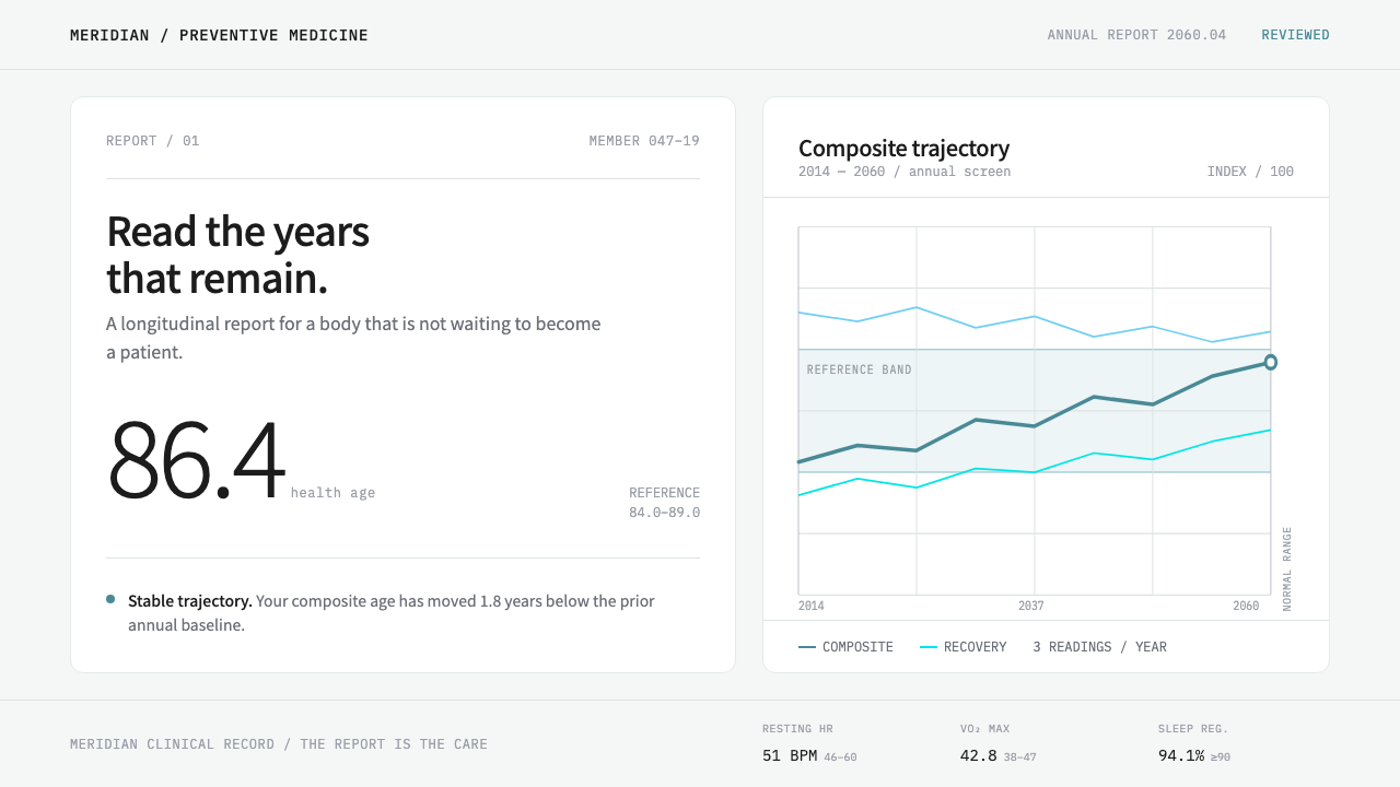
Longevity Clinic projects the preventive-medicine report forward to 2060 without adding a single piece of science fiction: cool white sheets, hairline seams, one teal signal and measured numbers in mono.
Longevity Clinic in brief
Longevity Clinic is a design style built on one observation: the preventive-medicine clinics of the 2010s and 2020s do not sell surgery, they sell a document. A person who feels perfectly well walks in, is scanned and sequenced, and leaves with a report. The visual language of that report, carried forward to the year 2060, is the entire style: a cool near-white page, pure-white sheets resting on it, matte panels, a single teal reserved for signal, and numbers set in a monospaced face.
What makes it distinctive is what it refuses. There are no glowing holograms, no neon vital signs, no chrome or glass, none of the shorthand that science fiction uses to say 'the future'. The premise is that tomorrow's medicine will look like today's with the noise taken out: the same label, value, unit and reference range, only calmer, clearer and easier to trust. Care is expressed as legibility. The report is the care.
Visually, surfaces are separated by a hairline seam instead of a shadow, so each sheet reads as paper lying flat against a wall panel. Colour is nearly absent, because white is the clinical base and teal is a status signal rather than a mood. The personality lives in the numbers: aligned, accompanied by their units and their reference ranges, so a reader can compare a measurement against its norm without decoding anything.
Where does Longevity Clinic come from?
The lineage begins in the early 2010s. Chaum began offering preventive, membership-style health examinations in Seoul in 2010, and in 2013 Human Longevity opened in San Diego, selling a full-body imaging scan and a whole-genome read to people who were not sick. Its founders were J. Craig Venter and Peter Diamandis. Fountain Life and Function Health followed. What separates these companies from a hospital is what they hand over at the end. It is not a procedure. It is a report: a personal, take-away document that turns a body into a set of values and ranges.
Three intellectual currents feed the practice. Precision and preventive medicine argues that disease is cheaper and kinder to catch before symptoms than after them. Geroscience treats ageing itself as a biological process that can be measured and perhaps shifted, which is how the word 'longevity' entered the vocabulary of clinics. The quantified-self movement, meanwhile, had already taught a generation of non-patients to track their own bodies as data. Together they produced a new kind of customer, healthy, curious and analytically inclined, and a new kind of document made for that person to read alone.
Seoul sits at the centre of the style's reference set, with San Diego and Boston named as the parallel lineage. That shows up in the interface voice. Running text uses a sans-serif with full Korean coverage, so Hangul and Latin share a page without a visible seam, while values, units and reference ranges are given to a monospaced face. The two voices divide the labour cleanly: the sans speaks, the mono measures.
The style also rests on a small piece of medical colour history. White is the primary clinical colour: the colour of walls, panels, coats and report paper. Green and blue replaced it only inside the operating theatre, because green is the complement of red and so cancels the afterimage that builds up in a surgeon's eye after staring at blood. On the diagnostic and reporting side of medicine, where nobody is cutting, white never gave way. Longevity Clinic takes that side as its home ground and extrapolates it to 2060. Nothing in it is invented; it is only carried forward.
What defines the Longevity Clinic look?
A cool clinical ground
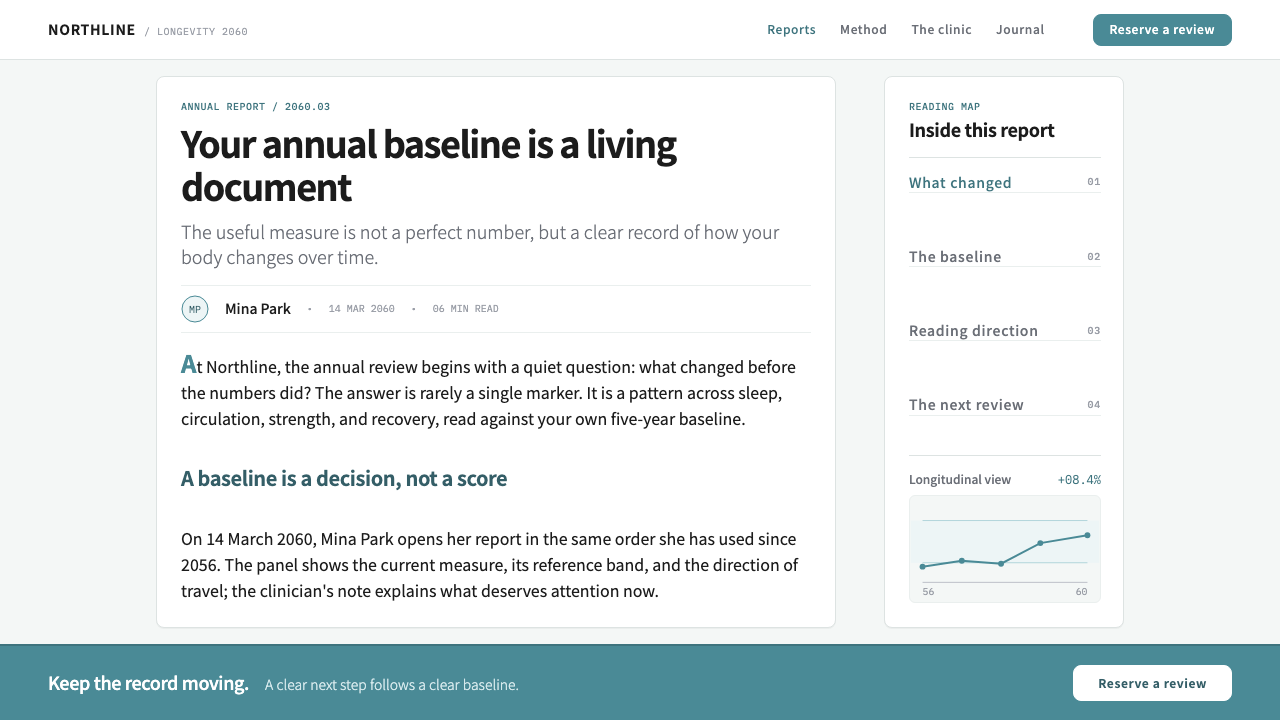
The page is a cool near-white, the colour of wall panelling and report paper, and the cards laid on it are pure white. The difference between them is a shift in temperature, not a drop in brightness, which lets each sheet lift off the page without help from any shadow. Everything chromatic has been subtracted until a single hue remains.
Hairline seams, not shadows
Sheets are divided from the page and from one another by a hairline rule. There is no elevation, no blur and no glow; depth is replaced by adjacency. The result is an interface that looks printed and filed rather than floating, which is exactly how a clinical report should feel in the hand.
One teal signal
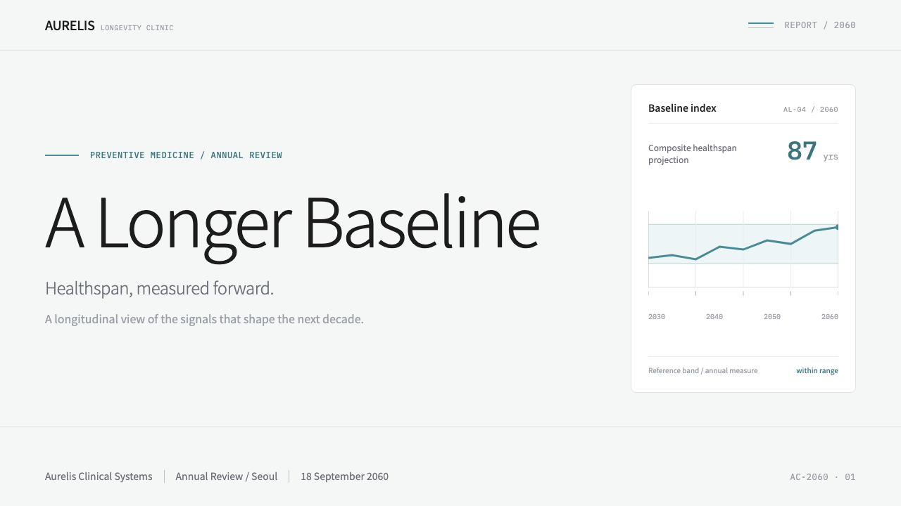
A single muted teal, sitting between blue and green, carries every signal: selection, status, an in-range indicator, a link. It never decorates. Because it is the only hue on the page, its appearance always means something, and a reader learns within seconds to treat it as information rather than as brand colour.
Measured numbers in mono
Values, units and reference ranges are set in a monospaced face, so digits align in columns and a result can be scanned against its range at a glance. The rhythm is label, value, unit, range, repeated down the sheet. Numbers are given room and weight; they are the headline, never the footnote.
Matte panels
Surfaces are matte. They absorb light instead of reflecting it, and nothing gleams, glows or refracts. This is the clinical opposite of the glossy glass that usually signals 'the future' in interface design, and it is precisely what keeps the style from drifting into science fiction.
A calm bilingual sans voice
Interface text uses a quiet humanist sans-serif with full Korean coverage, so Hangul and Latin sit together on one page. Hierarchy comes from size, weight and spacing rather than from colour, and headings stay modest. The sans speaks in sentences; the mono answers with measurements.
Who shaped Longevity Clinic?
Named in the style's reference set as one of the two founders of Human Longevity, the San Diego company that opened in 2013 and sold a full-body scan and a whole-genome read to people who were not ill. His association with the project supplies the genome half of the story: a person's sequence treated as a document that can be read and handed back to them.
The other founder of Human Longevity. Together with Venter he helped set an early commercial template that later clinics followed: a preventive examination for healthy people whose real deliverable is a report. For a designer, the relevant legacy is that template, a medical offering whose product is a surface meant to be read.
A Seoul preventive-medicine clinic that, according to the style's source material, was already doing this work in 2010, three years before Human Longevity opened. Its presence is the reason the style's centre of gravity is Seoul rather than California, and the reason the system's interface face is chosen for Korean as well as Latin.
Two later entrants in the same field, named in the source as having followed Human Longevity and Chaum. They matter to the style as evidence that the report-as-product model had become a category rather than a one-off, and that the look of the report was worth designing carefully.
How do you use Longevity Clinic today?
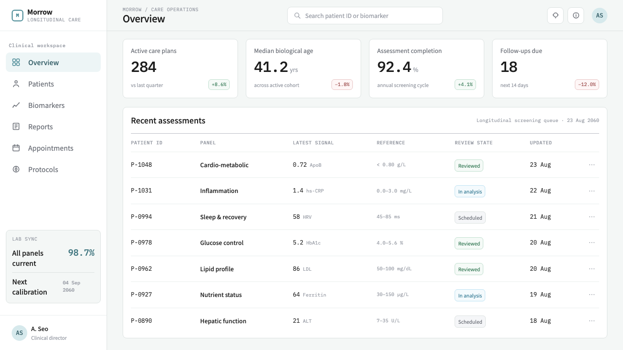
Longevity Clinic suits any product whose real deliverable is a reading of something measured: a health record, a lab result, an analytics report, a financial statement, an audit. Applying it well means understanding that the style is a discipline of accuracy, not a palette. The question for every element is whether it helps someone read a value against its range.
On slides, the cover should feel like the first page of a report: a large pale field, a title in a calm sans, and one teal element, a small status mark or a rule, to anchor it. Content slides work as sheets, one white panel on the cool page separated by a hairline, with label, value and unit rows in mono. Data slides are the style's strongest territory. Tables beat decorative charts here; where a chart is needed, draw it thin and flat, shade the reference range quietly, and let teal mark the one value the audience should read.
For web interfaces the style fits health and lab portals, biomarker dashboards, finance and analytics tools, and anything built around a personal record. Cards are flat white sheets with hairline borders, inputs are quiet, and teal appears on the active tab, the selected row and the in-range indicator and nowhere else. A pricing page should read like a schedule on a clinic wall: a table of what is included, with units, rather than a gradient-lit ladder of tiers.
In editorial and marketing work, adopt the voice of the report. Use narrow, unhurried columns, section heads that read like findings, and figures given as value, unit and range. Photography, if it appears at all, should be sparse, neutral and unretouched. The page persuades by seeming accurate, so avoid promising a miracle in the layout: the style's credibility comes from its restraint.
The most common mistake is to read 'longevity' and 'the future' as licence for gradient glows, neon accents and glass panels, which are exactly what the style removes. A second mistake is spreading teal across headings and buttons until it stops meaning status; hold it back for signal. A third is setting numbers in the proportional sans. The mono is what makes the report feel measured, and without it the page becomes merely pale.
Longevity Clinic — FAQ
Is Longevity Clinic just 'hospital blue'?
No. The ground is a cool near-white and the sheets are pure white; blue and green barely appear. The one chromatic voice is a muted teal, used for signal only. Traditional medical-blue branding floods surfaces with colour, while this style does the opposite and lets white do the clinical work. It also avoids crosses, pulse lines and other medical clip-art entirely.
Why does the style avoid shadows?
Because a shadow implies an object floating and lit from somewhere, and a report is not floating. A hairline seam says that one sheet ends here and the next begins, in the way paper and wall panels do. It also prints, prototypes and reproduces cleanly, and it keeps the interface from drifting into the glossy glass vocabulary the style is deliberately avoiding.
Is it a sci-fi style, given the year 2060?
Only in the sense that it extrapolates. Nothing in it is invented: the page, panels, labels, units and ranges all exist in today's preventive clinics. The year 2060 is a promise about calm, not about technology. The style assumes that as medicine becomes more measurable, its documents will become quieter rather than louder.
Where does it struggle?
It is a poor fit for products that need warmth, play or emotional intensity: children's brands, food, entertainment, lifestyle. Its coolness reads as trustworthy in a lab result and as distant in a birthday card. It is also a light-ground system built on a paper-on-panel idea, so a dark inversion loses its central logic.
Can I add more signal colours for warnings and errors?
The point of the system is that there is exactly one signal hue. You can tune it, but a second signal colour defeats the design: red, amber and green traffic lights turn a calm report into a dashboard of alarms. If a product needs severity levels, express them first with labels, position and weight, and keep any extra colour as a small, separate exception.
Related design styles
 Apple Fitness Rings Closed (2024)Midnight feels exact. Magenta, green, and cyan rings lock onto OLED black.
 Arctic Terraform StationEvery colour carries a duty. Sky-blue panels, coded modules and hard seams en…
 Ex MachinaClinical control, made visible. Concrete gray, cyan glass, LED seams, one woo…
 Lunar Regolith SettlementMoonlight without the myth. Regolith gray, hard terminators, and a strict tec…
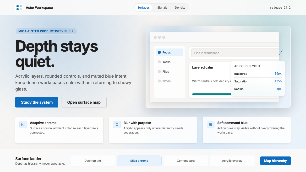 Microsoft Fluent 2Disciplined translucency. Warm Mica neutrals, acrylic blur, and muted blue cr…
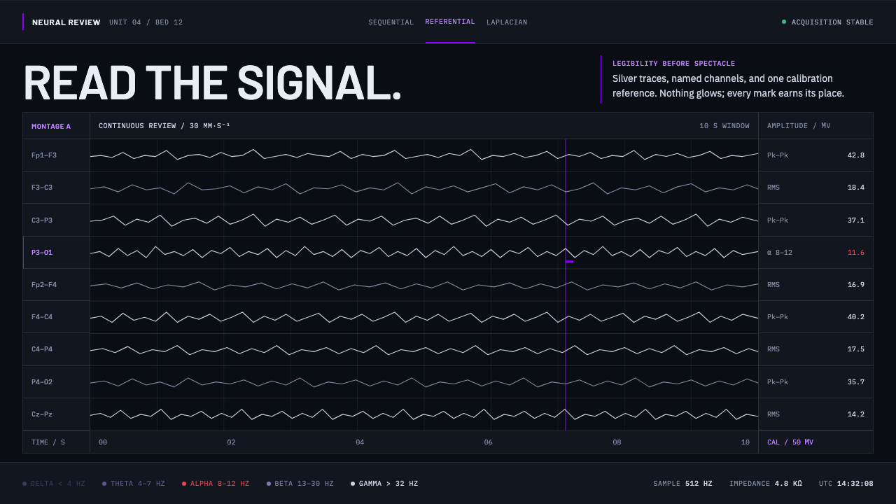 Neural Interface ClinicalClinical restraint makes signals legible. Silver traces cross near-black; vio…