What is Organ Bioprint Bank?
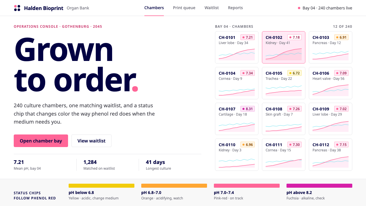
Organ Bioprint Bank is a clinical white console with one saturated pink, whose status chips drift from pink to orange to yellow the way phenol red does in a culture dish.
Organ Bioprint Bank in brief
Organ Bioprint Bank imagines the operations console of a facility in the year 2045 that grows transplantable organs on demand. Culture chambers are laid out on a dense grid, each numbered and each showing its organ type, its days in culture and a small growth curve. Beside the grid sits a waitlist, ordered by blood type and tissue-match score. It is a speculative product, but it is drawn with the plainness of a real laboratory dashboard.
The palette is borrowed from CELLINK, the Gothenburg company that makes bioprinters and bioinks: white panels, black text, navy headings and a bright brand pink. The surface is restrained, flat and orderly, more like a clinical data panel than a science-fiction interface. There is no dramatic imagery, no glowing chambers and no gore. The seriousness of the subject is expressed by calm, not by spectacle.
What makes the style distinctive is that its one saturated colour is also a laboratory signal. In cell culture, the indicator phenol red appears pink-red at physiological pH, drifts toward orange and yellow as the medium acidifies, and turns a bluish purple when it becomes too alkaline. Every status chip in the system follows that same drift, so colour is not decoration but a reading. The style suits medical, laboratory, research and regulated-industry products, anywhere that a viewer must quickly tell whether something is fine or needs attention.

Where does Organ Bioprint Bank come from?
Organ Bioprint Bank is a projected design. Its stated horizon is 2045, but it is anchored to the real company CELLINK, founded in 2016, and to the three-dimensional bioprinting of the late 2010s and 2020s. In that period, printing living tissue moved from academic demonstration to a commercial tool, with laboratories buying printers and bioinks as ordinary equipment. The style asks what the control room of a far larger, routine version of that activity might look like, and answers by extending the visual habits of today's laboratory software rather than inventing a futuristic look.
CELLINK is based in Gothenburg, Sweden, which the style gives as its place of origin, noting a global network of laboratories behind it. Two names are listed in its background. Erik Gatenholm is a co-founder of CELLINK, and Héctor Martínez is also named among the people connected with the company. Their presence points to the real source of the palette: white panels, black text, navy headings and a bright pink that functions as the company's signature. The speculative console inherits its colours from the actual maker of the equipment.
Three movements are named as the style's intellectual background: three-dimensional bioprinting, tissue engineering and regenerative medicine. Together they describe a field that aims to replace damaged tissue by growing it, and they shape the console's priorities. Because the product's users would be technicians and clinicians, not consumers, the interface is organised around monitoring and queueing: which chambers are healthy, which need attention, and which patients are waiting for a match.
The most inventive move in the style is the use of phenol red as a design logic. A brand colour is often only a brand colour; here the pink is also a recognisable laboratory indicator, and the transition to orange and yellow gives the interface a native vocabulary of status. That convergence between corporate identity and scientific convention is what makes the system feel designed from within the field, and not merely dressed in a medical costume.
What defines the Organ Bioprint Bank look?
Clinical white with one pink
Panels are white, text is black and headings are a deep navy. Against this neutral base sits a single bright, saturated pink, used sparingly. The restraint is what makes the pink legible as a signal: there is no secondary accent to compete with it. The page feels hygienic, flat and quiet, closer to a medical record than to a marketing site.
Phenol-red status chips
Each chamber carries a small chip whose colour follows the behaviour of phenol red. Pink-red means the medium is at a healthy balance, orange and then yellow mean it is turning acidic and needs attention, and a bluish purple means it has become too alkaline. The scale lets a technician judge the state of dozens of chambers at a glance, long before reading any text.
Numbered chamber grid
The main view is a dense grid of numbered chambers. Each cell states the organ type, the days in culture and shows a miniature growth curve. Cells are uniform in size and aligned to a strict rhythm, so the eye can scan rows to find an anomaly. Density is a feature here: the console is built for people who monitor many things at once.
Growth curves as texture
Tiny line charts accompany every chamber and give the console its only graphic texture. They are drawn in a thin, plain stroke without fills, decoration or glow. They tell the viewer whether growth is on track, and by repeating across the grid they make the page feel alive without introducing any ornament.
The matching waitlist
Beside the chambers is a waitlist ordered by blood type and tissue-match score. It is laid out as a plain table with clear columns and the same status vocabulary as the chambers. Connecting supply and demand in one screen is the product's core story, and the interface expresses it through alignment and proximity rather than through drama.
Quiet, unsensational tone
Nothing in the interface depicts bodies, blood or glowing capsules. The typography is plain, headings are navy rather than black for a slightly softer hierarchy, and spacing is orderly. The subject matter is emotionally heavy, and the design deliberately declines to add to it, treating the user as a professional doing careful work.

Who shaped Organ Bioprint Bank?
Gatenholm is a co-founder of CELLINK, the Gothenburg company whose white, navy and pink identity supplies this style's palette. He represents the real-world side of the story: a firm that made bioprinting and bioinks into commercial products from 2016 onward.
Martínez is named among the people connected with CELLINK. Together with Gatenholm he anchors the style in a real company and in the bioprinting technology of the late 2010s and 2020s, from which the 2045 console is projected.
Founded in 2016 in Gothenburg, CELLINK makes bioprinters and bioinks. Its palette of white panels, black text, navy headings and bright pink is the direct source of this system's colours, which is why a speculative console looks like genuine laboratory software.
How do you use Organ Bioprint Bank today?
In slides, the style works for science, medical, biotech and regulated-industry presentations. A cover can be a clean white slide with a navy title and a single pink element, perhaps a small status chip. Content slides should use a grid of uniform cells, each with a label, a figure and a mini-chart. Data slides are the natural home: place trends in small line charts, use the pink-to-orange-to-yellow drift to encode condition, and keep all other colours neutral.
On the web and in software, the style suits laboratory information systems, hospital operations dashboards, logistics consoles, monitoring tools and any interface in which many items must be checked quickly. Build the main screen as a dense grid of identically sized cards, add a sortable table for queues or waitlists, and make status chips the primary colour carriers. Navy headings, white panels and black text keep the surrounding interface calm. If a different domain is used, replace the phenol-red logic with that domain's own indicator scale, so colour continues to mean something real.
For editorial and marketing work, the style is an excellent choice for explainers on emerging medical technology, investor materials for biotech firms and long-form features about the ethics of transplantation. Its restraint helps with sensitive subject matter, since the layout never sensationalises. A hero image can be a diagram or a plain data view rather than a dramatic photograph. Let the single pink carry brand identity and use status chips as small recurring motifs.
The look also carries to printed laboratory reports, patient-facing information sheets and signage inside clinical facilities. White stock, black text and a single pink or navy accent print reliably and are easy to read under bright lighting. Where colour printing is limited, the status vocabulary can fall back to labelled chips with words, so that information never depends on colour alone.
The most common mistake is to treat the pink as a general brand colour and spread it across headers, buttons and backgrounds. Once pink is everywhere it no longer reads as a measurement, and the phenol-red logic collapses. A second mistake is to dramatise the subject with glowing tanks, anatomical imagery or dark sci-fi panels, which contradicts the calm clinical stance. Finally, do not use the status colours decoratively or for unrelated categories: if orange means acidifying in one place, it must never mean a sale in another.

Organ Bioprint Bank — FAQ
Why does the pink change to orange and yellow?
The interface borrows its status logic from phenol red, an indicator used in cell culture medium. It looks pink-red at physiological pH, drifts to orange and yellow as the medium becomes acidic, and turns purple when too alkaline. Every status chip in the system follows that drift, so colour tells a technician whether a chamber is healthy or needs attention.
Where do the colours come from?
They are taken from CELLINK, the Gothenburg company that makes bioprinters and bioinks. Its identity uses white panels, black text, navy headings and a bright brand pink. The style adopts those colours directly, then gives the pink a second job as a laboratory signal.
Is this a real product?
No. It is a speculative console for a facility in 2045 that grows transplantable organs on demand. It is anchored to real bioprinting technology and a real company's visual identity, but the bank itself is imagined. The design therefore reads as plausible laboratory software rather than as science fiction.
Can the style be used for non-medical dashboards?
Yes. The transferable principles are the white panel base, the dense uniform grid, the small trend charts and a single status colour scale that has real meaning. Monitoring tools, logistics, energy and industrial dashboards can all use them. Replace the pink drift with whatever indicator scale your domain already trusts.
How should sensitive subject matter be handled visually?
By staying calm and clinical. This style shows no bodies, blood or glowing capsules; it uses numbered chambers, plain charts and tables instead. The emotional weight of the subject is respected by declining to dramatise it, which is also what makes the interface credible to the professionals who would use it.
Related design styles
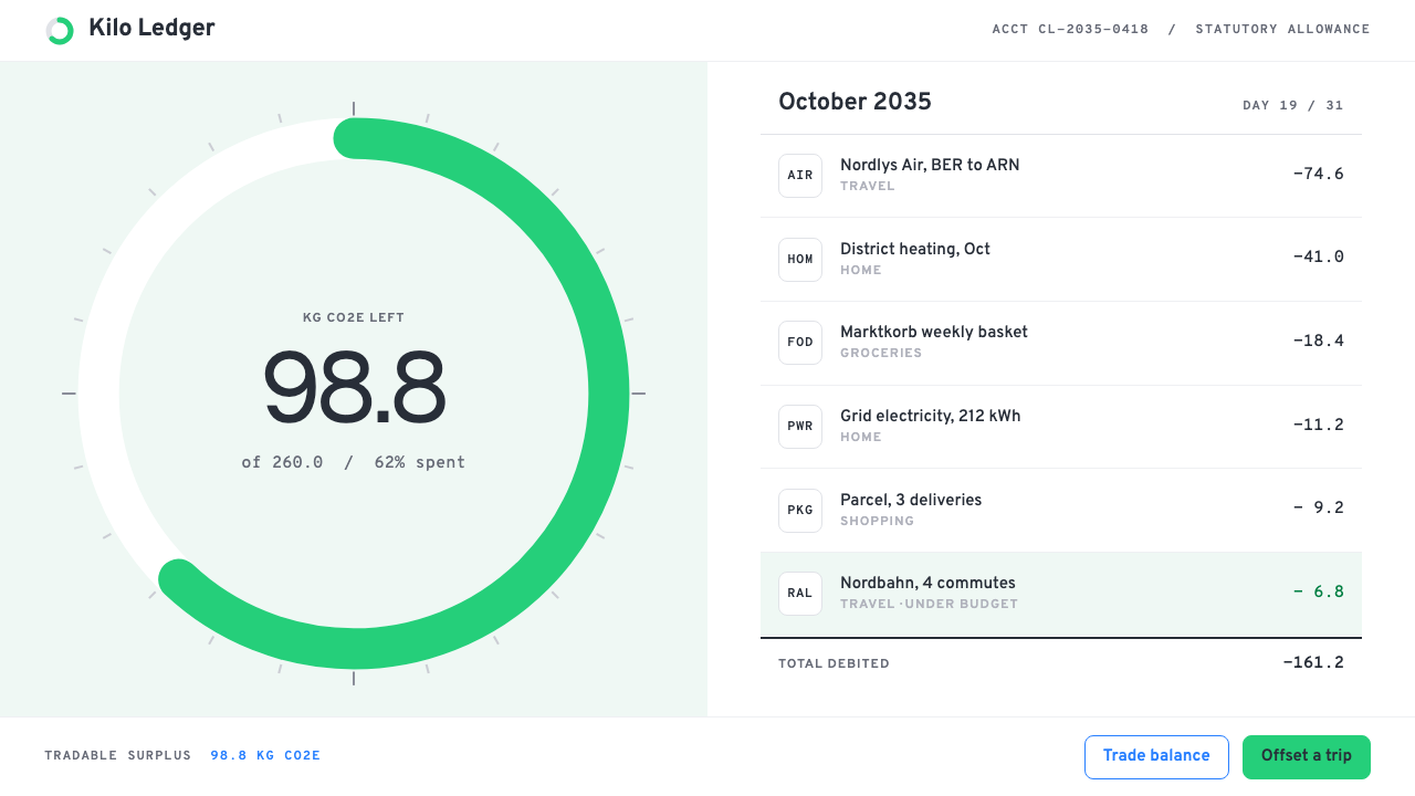 Personal Carbon LedgerEmissions kept like a current account. One green quota ring on white, debits…
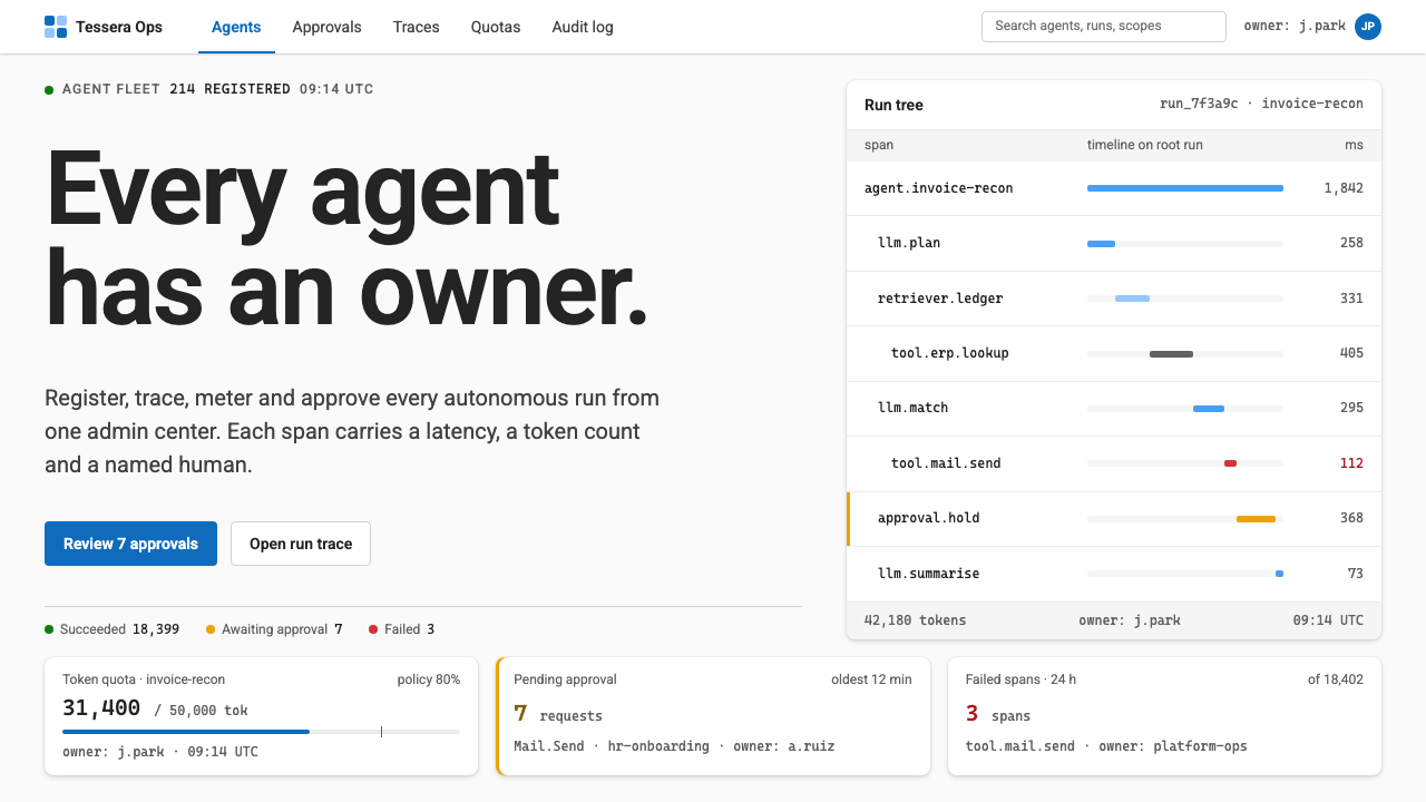 Agent Ops ConsoleGovernance as a queue. Fluent blue on grey, mono run trees, marigold for pend…
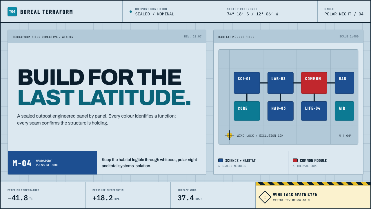 Arctic Terraform StationEvery colour carries a duty. Sky-blue panels, coded modules and hard seams en…
 Autonomous Cargo Ship BridgeColour is protocol. Near-black chart grids reserve orange for decisions that…
 Cryosleep Transit WardCare without spectacle. Clinical white, equal bay grids and the fixed colours…
 Ex MachinaClinical control, made visible. Concrete gray, cyan glass, LED seams, one woo…