What is Personal Carbon Ledger?
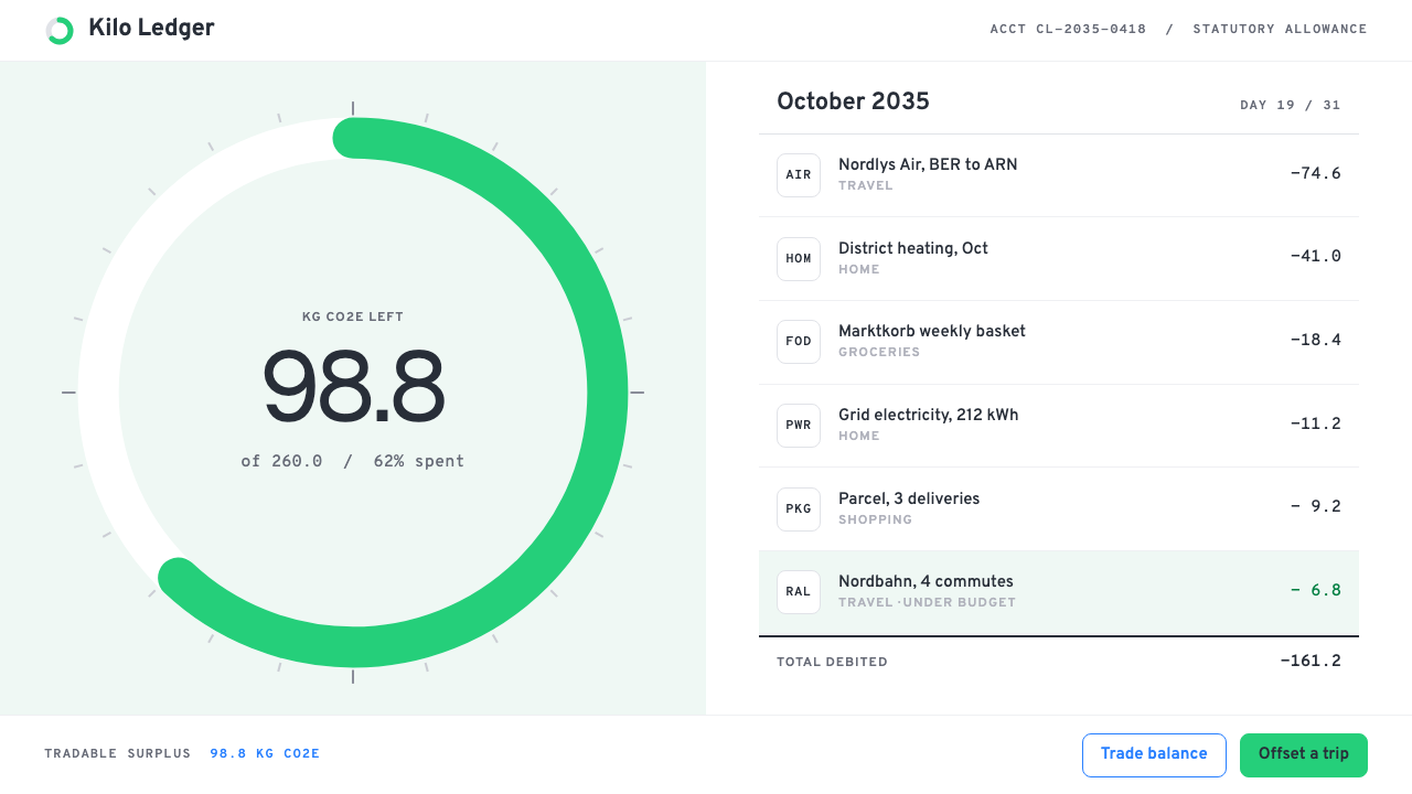
Personal Carbon Ledger keeps emissions like a current account: a monthly quota, a green ring that fills as you spend, and every flight and grocery basket debited in a monospace column.
Personal Carbon Ledger in brief
Personal Carbon Ledger is a design style that treats carbon emissions the way a retail bank treats money. There is a monthly quota, a ring that fills as the quota is spent, and a running statement in which every flight, train ride and grocery basket is debited as a quantity of carbon dioxide equivalent, written as kg CO2e. The whole interface is built to make an abstract environmental quantity feel as concrete and manageable as a bank balance.
The look is deliberately sober. Pages are white, a single brand green carries all the meaning, and figures are set in a monospace grid so that columns of numbers align and can be scanned like a statement. The tone is that of retail banking, not environmental campaigning: there are no glaciers, no polar bears and no leaf icons. The data itself is the picture.
The style is set in 2035, a future in which personal carbon allowances have become statutory and an unused balance can be traded. That projection explains the seriousness of the interface. When a quota has legal weight, it deserves the same clarity, precision and calm that people expect from their money.

Where does Personal Carbon Ledger come from?
The style grows out of a family of real products that appeared from around 2019 onward and that apply the habits of financial technology to climate. Doconomy, from Stockholm, built a carbon-tracking layer on top of payment cards and everyday spending, and its founder Mathias Wikström became one of the best-known voices for the idea that emissions should be visible at the point of purchase. Johan Pihl is also associated with the Swedish climate-fintech scene around it.
The 2030 Calculator, associated with the United Nations climate effort, brought a similar approach to consumer awareness, presenting personal footprints in a clear, numerical way. In Berlin, Klima and Plan A turned carbon accounting into mobile apps that feel like personal finance tools, with Lubomila Jordanova, the founder of Plan A, among the people who have pushed for emissions to be measured with the rigour of accounting. Together, these products established the visual vocabulary of white pages, one brand green and monospaced figures.
Three movements feed the style. Climate fintech is the commercial one, treating emissions as data that can be tracked, categorised and compared. Carbon accounting is the technical one, with its conventions of scopes, factors and equivalence, which gives the interface its unit, kg CO2e, and its insistence on consistent measurement. Personal carbon allowances are the policy one: the long-debated idea that every individual might be given a tradable annual or monthly budget of emissions, which is the premise the 2035 projection takes for granted.
The geographic roots are Northern European, in Stockholm and Berlin, and the sensibility reflects that: functional, restrained, trusting in numbers rather than rhetoric. The style is nevertheless meant to be used globally, and its bank-statement conventions travel well because almost everyone already knows how to read a ledger.
What defines the Personal Carbon Ledger look?
Color
White pages and one brand green. Green marks the quota ring, the remaining balance and positive actions, while the rest of the interface sits in neutral greys and black type. A cautionary tone for overspending is signalled by change in the ring and in text rather than by adding alarm colours, which keeps the interface calm even when the news is bad.
Typography
A clean sans serif handles labels and headings, and a monospace face handles every figure. Because monospaced numerals share a width, columns of amounts align exactly and can be compared by eye. Units such as kg CO2e are always shown next to the number, never implied.
The quota ring
The signature graphic is a single ring that fills as the monthly allowance is used. It sits at the top of the screen like a bank balance, with the remaining amount written inside it in large monospaced figures. It is the one decorative-looking element, and it is entirely functional.
Statement rows
Below the ring, a running statement lists each debit with its date, category and amount. Rows are plain, separated by thin dividers, and sorted by time. The structure mirrors a bank app so closely that a first-time user needs no instruction.
Imagery
There are almost no illustrations. The style avoids the visual clichés of environmentalism, such as ice caps, forests and animals, in favour of charts, rings and numbers. Where an icon is needed, it is a simple, monoline symbol for a category such as travel, food or home energy.
Tone of voice
Copy speaks like a retail bank: plain, precise and unemotional. It says what was debited, what remains and what is projected, and it avoids guilt, slogans and exclamation marks. The aim is to give people accurate information and let them decide.

Who shaped Personal Carbon Ledger?
Co-founder of Doconomy in Stockholm and a leading advocate of showing carbon impact directly alongside spending. His work helped normalise the idea that a payment product can also be a climate product.
Associated with the Swedish climate-fintech movement that built consumer tools for tracking emissions. His name appears alongside Doconomy in the early history of the carbon-tracking card.
Founder of Plan A in Berlin, a carbon-accounting platform. She is a prominent voice for measuring emissions with the rigour and clarity of financial accounting, which is the temperament this style adopts.
How do you use Personal Carbon Ledger today?
For slides, the cover should look like the top of a statement. Use a white ground, a restrained title in a plain sans serif, and a single green ring or a large monospaced figure with its unit. Content slides can present a short table of items and amounts, aligned in a monospaced column, with one row highlighted in green. Avoid decorative imagery; the numbers are the illustration.
For data slides, this style is at its strongest. Use a ring for progress against a quota, simple horizontal bars for category breakdowns, and a table for detail. Keep green for the main measure, grey for everything else, and always show units. A single sentence of plain commentary under a chart, in the voice of a bank notification, is better than a paragraph of explanation.
For web interfaces such as dashboards and pricing pages, the style suits fintech, sustainability reporting, energy and mobility products, and any service where a person manages a budget of something finite. A dashboard can open with the ring, followed by a statement and a short list of suggestions. Pricing pages should be equally sober, with plan features listed in aligned rows and no emotional appeals.
For editorial and marketing work, the style supports reports, annual summaries, policy explainers and investor materials where credibility matters. A year-end summary can be laid out like an annual statement, with totals, comparisons and a monthly chart. Writing should be specific and measured, preferring a precise figure to a dramatic adjective.
The most common mistake is to add the clichés the style deliberately omits: leaves, globes and cheerful nature photography make a ledger look like a campaign poster and weaken its credibility. A second mistake is to lose the units or to set numbers in a proportional face, which makes columns drift and the whole statement harder to trust. A third is to use alarming reds, since the style persuades through clarity, not through fear.

Personal Carbon Ledger — FAQ
What is the Personal Carbon Ledger style?
It is an interface style that presents personal carbon emissions as a bank account: a monthly quota shown as a green ring, a running statement of debits in kg CO2e, white pages, one brand green and monospaced figures. It is set in 2035, when personal allowances are statutory and tradable.
What does kg CO2e mean?
It stands for kilograms of carbon dioxide equivalent, a standard unit in carbon accounting that expresses the warming effect of different greenhouse gases as the amount of carbon dioxide that would have the same effect. Showing it consistently lets very different activities, such as a flight and a meal, be compared on one scale.
Why are there no nature images or leaf icons?
Because the style aims to be credible and neutral. Nature imagery signals a campaign, whereas a ledger signals a measurement. By letting the data carry the visual weight, the interface avoids guilt and persuasion and presents emissions as information to be managed.
Is this the same as a fintech banking style?
It borrows heavily from retail banking and fintech conventions, such as statements, balances, rings and aligned numerals, but applies them to a different resource. The distinctive features are the carbon unit, the single green, and the absence of financial cues like currency symbols or charts of growth.
Can I use it outside climate products?
Yes. Any product that manages a finite allowance or budget, such as data usage, energy consumption, time or calories, can use the ring-and-statement structure. The calm, precise tone also suits reports and dashboards where trust and legibility matter more than excitement.
Related design styles
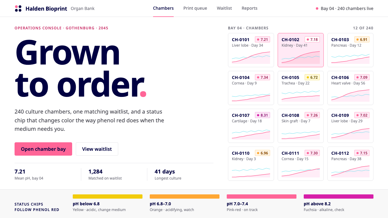 Organ Bioprint BankClinical white, one saturated pink. Status chips drift pink to orange like ph…
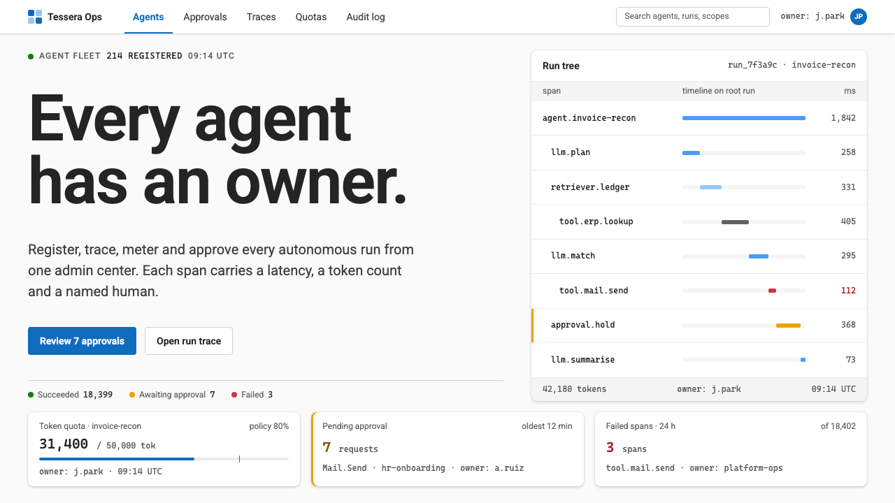 Agent Ops ConsoleGovernance as a queue. Fluent blue on grey, mono run trees, marigold for pend…
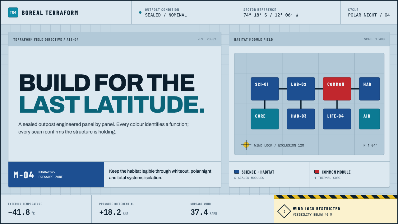 Arctic Terraform StationEvery colour carries a duty. Sky-blue panels, coded modules and hard seams en…
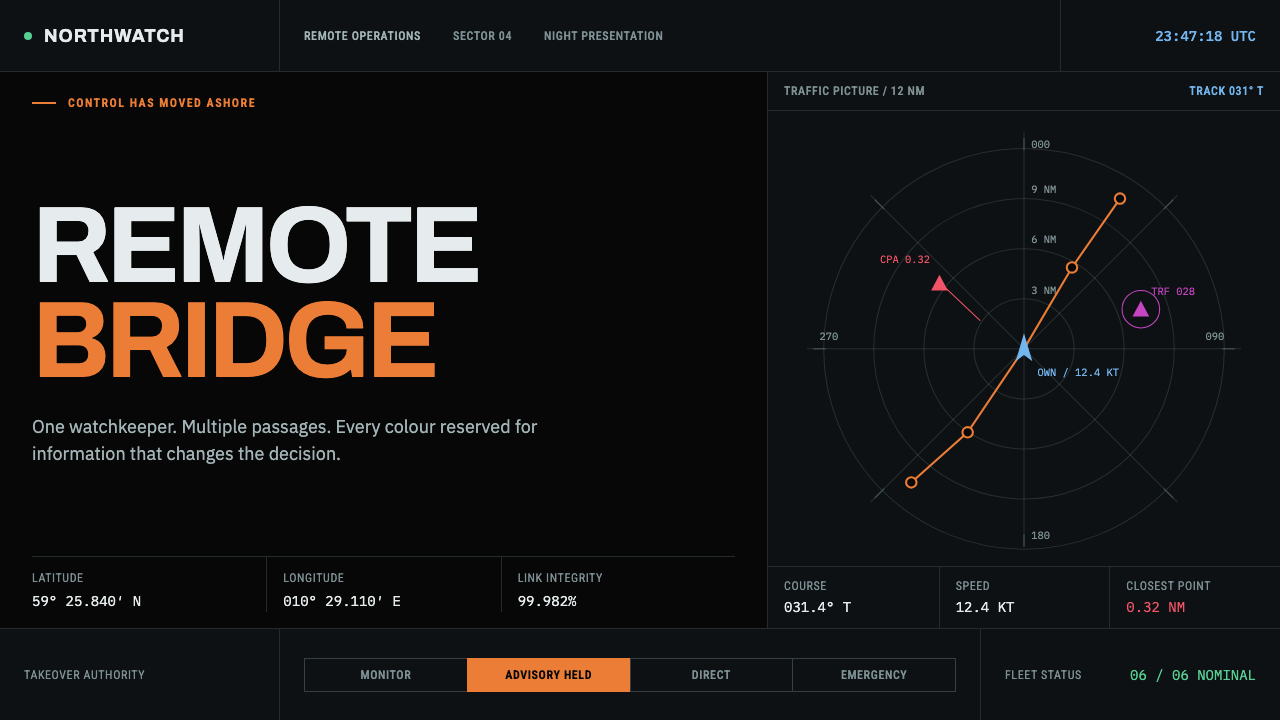 Autonomous Cargo Ship BridgeColour is protocol. Near-black chart grids reserve orange for decisions that…
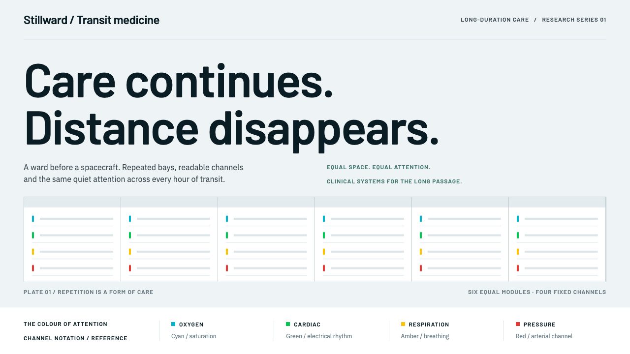 Cryosleep Transit WardCare without spectacle. Clinical white, equal bay grids and the fixed colours…
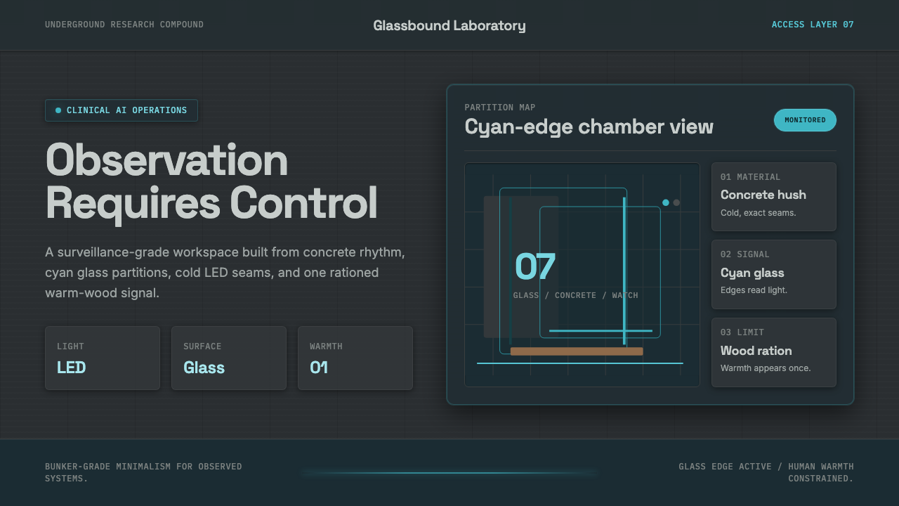 Ex MachinaClinical control, made visible. Concrete gray, cyan glass, LED seams, one woo…