What is Demolition Man?
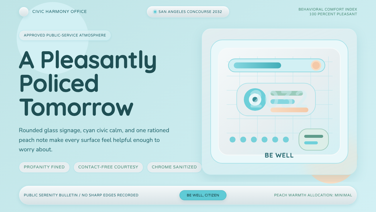
Demolition Man makes utopia feel suspicious: pastel cyan glass, polished civic calm, and one peach warning inside a future engineered to be harmless.
Demolition Man in brief
Demolition Man is a sanitized retro-future style derived from the 1993 film’s vision of San Angeles in 2032. Its world is bright, spacious, and civic-minded: pale cyan grounds meet translucent glass curves, polished chrome, pure white surfaces, and restrained peach accents. Rounded signs and carefully softened forms promise that the city has eliminated danger, friction, and disorder.
That promise is also the source of the style’s unease. Crime has disappeared, profanity is fined, and every surface projects airless wholesomeness. The visual system therefore works through contradiction: it is welcoming but supervisory, cheerful but sterile, luxurious but impersonal. Nothing looks openly threatening; control appears as cleanliness, courtesy, and seamless public service.
The style is not a general picture of futuristic technology. It is specifically a municipal future shaped by sanitized teal accents, curved glass, generous empty space, and friendly institutional language. Its most convincing applications preserve this public-facing character. A page should feel less like a spaceship console than a civic information center whose immaculate surfaces are slightly too composed to trust.
Where does Demolition Man come from?
The style begins with Demolition Man, released in 1993 and set partly in the imagined city of San Angeles in 2032. The film presents the near future as an engineered utopia: crime is gone, offensive speech is penalized, and civic life has been reorganized around order, brightness, and compulsory wholesomeness. Its future does not announce authority through darkness or military machinery. It makes authority look hygienic, comfortable, and socially considerate.
The visual setting belongs to a North American production context and is associated with the Pacific Design Center in Los Angeles. Glass-and-chrome civic modernism supplies the material vocabulary: gleaming hard surfaces, transparent or translucent partitions, white expanses, and continuous curves. Pastel cyan and peach prevent this modernism from feeling severe, replacing the colder image of machinery with the softer atmosphere of a health complex, public atrium, or carefully managed civic concourse.
This softness produces the film’s distinctive sanitized retro-future utopianism. The world is futuristic, but its optimism remains visibly tied to the early 1990s: public order is imagined through immaculate architecture, polished materials, conspicuous spaciousness, and universal friendliness. The result is not chaotic cyberpunk density. It is a future cleared of clutter, grime, visual noise, and apparently every unsanctioned human impulse.
Curio’s design system distills that setting rather than reproducing individual scenes. Pale cyan becomes the environmental field, teal acts as an official accent, white and chrome suggest institutional cleanliness, and peach introduces the controlled signal of warning or disruption. Rounded civic signage binds these elements together. The essential historical idea is a future in which design has solved disorder so completely that perfection itself becomes suspicious.
What defines the Demolition Man look?
Sanitized Pastels
Pale cyan establishes the atmosphere, while cool teal gives interfaces an official, hygienic emphasis. White and reflective neutral surfaces keep the composition luminous. Peach is the deliberate interruption: warm enough to attract attention, but gentle enough to remain inside the utopian system. It should behave like a civic warning, not a decorative flourish.
Glass and Chrome
Translucent glass curves suggest openness without surrendering control, while polished chrome introduces a clean technological sheen. These materials should read as immaculate and maintained rather than industrial or rugged. Transparency is atmospheric, often separating areas without visually enclosing them; reflection makes the environment feel continuously inspected and freshly cleaned.
Civic Curves
Corners, signs, panels, and spatial boundaries favor continuous curves and softened profiles. The geometry is orderly but rarely sharp. Rounded forms communicate safety and friendliness, turning governance into an approachable service. Their repetition is important: a single rounded card feels contemporary, while an entire environment of softened forms begins to feel deliberately behavior-shaping.
Airless Space
Generous negative space gives every object ceremonial room and removes the visual friction of ordinary life. Surfaces remain uncluttered, alignments calm, and groupings easy to scan. Yet the emptiness should not feel contemplative or handmade. It is managed emptiness, closer to a pristine public facility prepared before opening than to a quiet domestic room.
Friendly Authority
Typography and symbols should resemble civic guidance rather than entertainment branding. Language is concise, reassuring, and politely directive. Letterforms feel rounded and highly legible, with hierarchy created through scale, placement, and open spacing. The voice never shouts; even prohibition arrives with the composure of a helpful notice.
Controlled Warning
Tension enters through a single warm accent, an unusually firm message, or a small break in the otherwise immaculate rhythm. The warning must remain visually integrated: too much contrast turns the style into conventional alarm graphics. The characteristic effect is subtler—a system acknowledging danger while refusing to let danger disturb its smile.
Suspicious Perfection
The defining quality is not cleanliness alone but cleanliness pushed beyond comfort. Repetition is exact, surfaces appear untouched, and every interaction seems anticipated. A successful composition lets viewers enjoy the calm before noticing its social implication: no mess means no spontaneity, and a world designed to prevent every offense may also prevent genuine freedom.

Who shaped Demolition Man?
Marco Brambilla is one of the key figures identified with Demolition Man’s 1993 production. Within this style’s history, his name belongs to the film that established San Angeles as an engineered civic utopia: immaculate, rounded, cheerful, and governed through an atmosphere of total order. The design language ultimately depends on that union of comic brightness and institutional control.
David L. Snyder is likewise identified among the production’s key figures. His place in the source material connects him to the film’s defining visual environment: pastel glass, polished chrome, white civic interiors, and carefully welcoming forms. These elements matter as a complete system, because their reassuring surface makes the underlying regulation of San Angeles feel ordinary rather than openly coercive.
The Pacific Design Center in Los Angeles is the key named location associated with the production context. As a reference point, it grounds the imagined San Angeles in a recognizable North American language of glass-and-chrome civic modernism. Its importance to the style is conceptual as well as geographic: the future is built from polished public architecture, then purified into something brighter and stranger.
How do you use Demolition Man today?
For presentation covers, begin with a broad pale field, one translucent curve, and a compact title that reads like an official civic announcement. A peach marker can signal the subject or provide the first hint of tension. Content slides should retain generous space, rounded information zones, and short labels. Avoid filling every open area; the engineered calm is part of the argument.
Data slides work best when charts resemble public information instruments rather than technical control panels. Use cool cyan and teal for ordinary categories, reflective neutrals for context, and peach for the exception requiring attention. Keep legends direct and annotations politely declarative. The visual hierarchy should suggest that the system already understands the situation and is calmly explaining it to the citizen.
For dashboards and pricing interfaces, organize features as sanitized civic services. Panels can feel like translucent partitions, while navigation resembles rounded institutional signage. Pricing tiers should appear orderly and equally legitimate, with restrained differences in emphasis rather than aggressive sales tactics. Peach is most effective for a limitation, warning, or recommended action; overuse removes its narrative role.
Editorial and marketing layouts can alternate spacious white or pale-cyan passages with glossy image fields and concise teal headings. Pull quotes should resemble public notices, while calls to action remain friendly, rounded, and formally composed. The style is particularly effective when the message concerns order, future living, public systems, or the uneasy bargain between convenience and personal freedom.
The common mistake is to treat Demolition Man as generic pastel futurism. Excessive decorative gradients, playful candy colors, crowded retro gadgets, or dark cyberpunk machinery miss its civic discipline. Another error is making everything merely pleasant. The design needs one controlled disturbance—a peach warning, an over-polite instruction, or an immaculate emptiness that lasts long enough to feel unnatural.
Demolition Man — FAQ
Is Demolition Man style simply 1990s retro-futurism?
It belongs to that broader territory, but its identity is more specific. The style combines sanitized retro-future utopianism with glass-and-chrome civic modernism. Its subject is not technology alone but a regulated public world in which technology, architecture, and social behavior share the same friendly polish. Remove the civic order and subtle coercion, and only a generic pastel future remains.
Why is peach so important to the palette?
Peach introduces warmth without breaking the sanitized atmosphere. Against cyan, teal, white, and chrome, it becomes a controlled anomaly: a warning made polite. It can identify an exception, restriction, or moment of human friction while remaining visually acceptable to the utopian system. If peach spreads everywhere, the anomaly disappears and the composition loses its underlying tension.
Can the style be used with a dark background?
A dark interpretation is possible, but it weakens the source’s defining condition: a world too bright to trust. Pale grounds, luminous glass, white surfaces, and reflective materials create the sense of compulsory health and uninterrupted maintenance. Dark backgrounds easily shift the result toward cyberpunk or conventional science fiction. If darkness appears, it works better as a limited interruption than as the dominant environment.
How should imagery be treated in this design system?
Imagery should reinforce the engineered civic environment: smooth glass, polished public interiors, open concourses, curved partitions, and surfaces without visible wear. Cropping should favor architectural rhythm and controlled emptiness rather than busy human spectacle. Images feel most authentic when they look maintained and impersonal, with any sign of disruption isolated as a deliberate exception.
What kinds of products suit Demolition Man styling?
It suits interfaces that can plausibly speak in a civic or institutional voice: dashboards, service portals, pricing systems, public-information presentations, and campaigns about managed futures. It is less natural for products depending on handmade warmth, historic texture, or intimate spontaneity. The style succeeds when polished convenience is both the benefit being offered and the idea being quietly questioned.
Related design styles
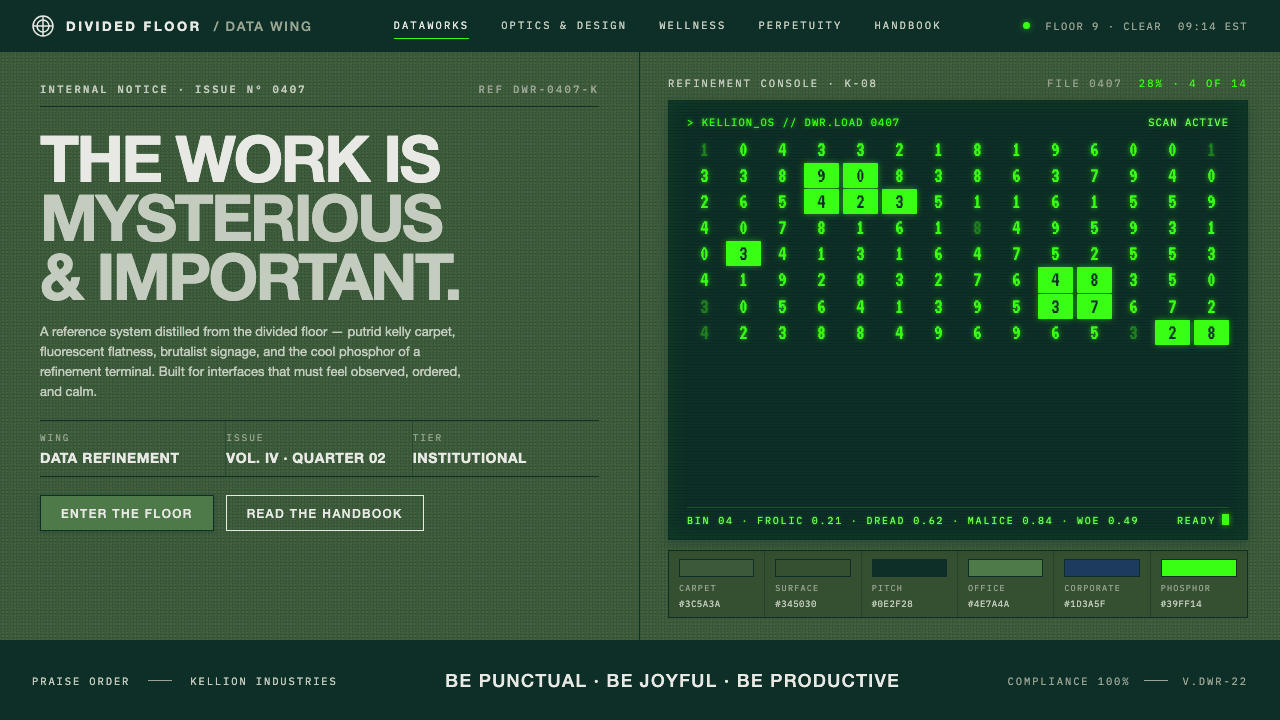 Severance LumonCorporate dread, distilled. Putrid kelly carpet, brutalist signage, CRT phosp…
 Astro Islands Architecture 2022Warm cosmic devtools. Deep violet, magenta glow, Inter clarity, and island ge…
 Interstate by Frere-JonesBuilt to be read at speed. Highway green, crisp white legends and strict sign…
 Mistral Le Chat French AIOpen science feels engineered. Navy panels, Inter grids, and coral stripes ke…
 Moon (2009)Quiet light, one amber signal. Cool panel-white, condensed signage type, GERT…
 Post-it Canary Yellow (1980)Temporary thought, warmly kept. Canary yellow paper, graphite script, blue ma…