What is Dribbble?
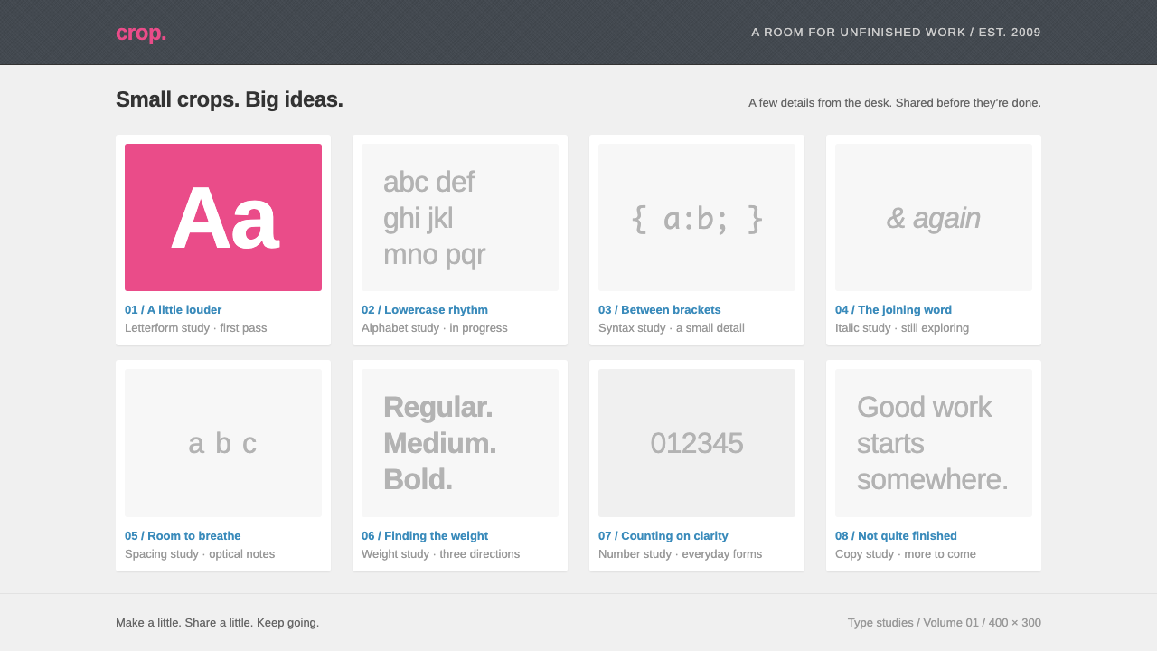
Dribbble made a quiet grey room for loud work: white cards, a charcoal header, and exactly one unmistakable pink.
Dribbble in brief
The Dribbble style is the look of a 2009 design community built around a single idea: show work in progress, one small image at a time. Every post is a 'shot', a small landscape crop of something unfinished, placed inside a white card on a pale grey page beneath a charcoal header bar. The visual identity is the frame, not the picture.
The system is deliberately quiet so that the work can be loud. Grey, charcoal and white do the structural job; blue is reserved for links; and pink belongs to a very short list of things, namely the basketball mark, the hand-lettered wordmark and the little heart that means 'like'. Because pink is so scarce, it works as a signature rather than a decoration.
Typographically the style leans on a tight, Helvetica-style grotesque, set small and orderly. Meta rows under each shot carry a round avatar, a name, and a handful of tiny counters for views, comments and likes. Corners are softly rounded, shadows are faint, and nothing on the page competes with the thumbnails it surrounds.

Where does Dribbble come from?
Dribbble began in 2009 as a small, invite-only room where designers showed each other what they were working on. It was started in Salem, Massachusetts by Dan Cederholm and Rich Thornett, and its early culture was intimate: you needed an invitation to join, and you posted something small rather than a polished portfolio piece. The point was not self-promotion but conversation between people who made interfaces, icons and lettering for a living.
That context explains the visual system. A portfolio site wants to look like its owner. A place for work in progress wants to look like nobody, so that every contributor's work can sit in it without clashing. The designers of the site chose a neutral grey ground, a dark header to hold navigation, and a white card as the universal container. The result resembles a gallery wall painted in a colour chosen to disappear.
The classic version of the site, with its grey well and charcoal header, ran roughly from 2009 to 2012. It belongs to the late-2000s moment sometimes grouped under Web 2.0 design communities: sites where ordinary members, not editors, supplied the content, and where the interface was a thin, friendly shell around it. Similar sites for photographs and for code shared the habit of treating the page as a neutral stage.
Its influence has been larger than its look. The practice of sharing work-in-progress as small, bite-sized images, and of letting a grid of thumbnails with tiny meta rows stand in for a whole community, was adopted by countless later portfolio and inspiration sites. The pink basketball stayed behind as the one part of the identity that nobody copied, because it was the part that was truly theirs.
What defines the Dribbble look?
Grey well, white cards
The page is a pale grey field and every shot sits in a white card. The contrast is gentle, which keeps the eye on the thumbnails and lets the card edge read as a quiet frame rather than a box.
Charcoal header bar
A dark, full-width bar across the top holds the wordmark and navigation. It is the heaviest tone on the page, anchoring the layout and giving the white cards something to hang beneath.
One loud colour
Pink is rationed to the basketball, the wordmark and the like heart. Everything else is neutral. The scarcity is what makes the colour feel like a signature and keeps it from becoming a theme.
Helvetica-style grotesque
The interface type is a tight, neutral sans in small sizes. It reads as information, not expression, which is exactly the point when the content is other people's visual work.
Tiny meta rows
Under each shot sits a compact row: a round avatar, a name, and small counters for views, comments and likes. The row is dense but never loud, and it turns each card into a person as well as a picture.
Blue for links only
Links are the familiar web blue. Reserving blue for navigation and pink for affection keeps the two meanings from blurring, and the rest of the page stays grey.
A grid of equal thumbnails
Shots appear in a regular multi-column grid, all the same shape. Equal treatment is a form of fairness: a first sketch and a finished icon get the same space and the same frame.

Who shaped Dribbble?
Co-founder of Dribbble in 2009, working from Salem, Massachusetts; one of the two people credited with starting the community.
Co-founder of Dribbble alongside Dan Cederholm, also based in Salem; part of the pair behind the original invite-only site.
How do you use Dribbble today?
In slides, the Dribbble style suits a work-in-progress review, a design critique, or a team show-and-tell. A cover can be nothing more than the wordmark-style title on a pale grey slide with a single pink accent. Content slides work best as one white card per idea, with a small meta line underneath for who made it and when. For data slides, keep the chart in the neutral greys and use pink only for the one number you want the room to remember.
On the web, the style is natural for portfolio feeds, community galleries, inspiration boards and any dashboard whose job is to show many small things from many people. Cards in a regular grid, a dark header for navigation, and a compact meta row under each item carry most of the work. Pricing and settings pages can borrow the same grey ground and white panels, keeping blue for links and leaving pink out of them entirely.
In editorial and marketing material, the style works for community newsletters, event recaps and creator spotlights, where the point is to put someone else's work in front of the reader. Let the images be the colour. Keep captions short, put the author's name next to every piece, and use the header bar as a consistent masthead.
A further use is internal tools. Review queues, asset libraries and moodboard apps all benefit from a frame that disappears. The Dribbble approach gives reviewers a neutral stage on which colour comparisons are honest, because the surrounding interface is not tinting the work.
The most common mistake is spreading the pink around. Once buttons, headings, tags and backgrounds all pick it up, the colour stops being a signature and the style collapses into a generic pink theme. Keep it to the few places where it carries meaning, and let grey, white and charcoal do everything else.

Dribbble — FAQ
What is the Dribbble design style?
It is the look of the original 2009 Dribbble community: white shot cards on a pale grey page, a charcoal header bar, a tight Helvetica-style sans, blue links, and a single pink reserved for the basketball, the wordmark and the like heart. It is a deliberately quiet frame for other people's work.
Who started Dribbble?
Dan Cederholm and Rich Thornett started it in 2009 in Salem, Massachusetts, as a small invite-only community where designers shared works in progress.
What is a 'shot'?
A shot is a single small landscape image of something a designer is working on, such as a piece of interface, an icon or some lettering, shown in a white card with a small meta row beneath it.
Why is the pink used so sparingly?
Because scarcity makes it a signature. The system is built so the work can be loud, so the interface stays in grey, white and charcoal and saves pink for the basketball, the wordmark and the like heart.
When does this style work best?
It works best for galleries, portfolio feeds, community pages, review tools and presentations where the content is other people's visual work and the interface should step back.
Related design styles
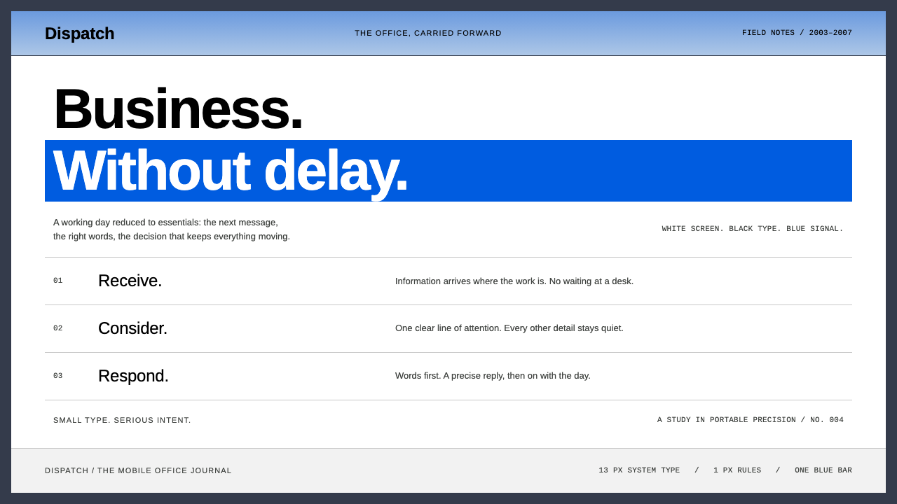 BlackBerryPortable precision. Dense black Arimo, white ruled rows and one decisive blue…
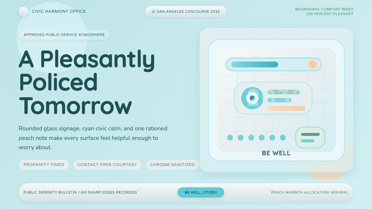 Demolition ManToo clean to trust. Pastel cyan glass, rounded civic signage, one peach warni…
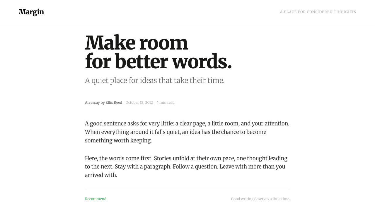 MediumWords come first. A narrow Merriweather column, warm grey ink and one quiet g…
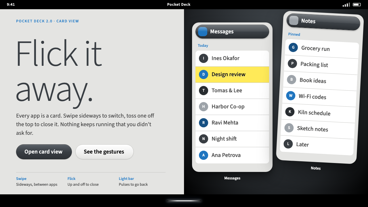 Palm webOSEvery app is a card you flick away. Charcoal gloss pills and blue labels on g…
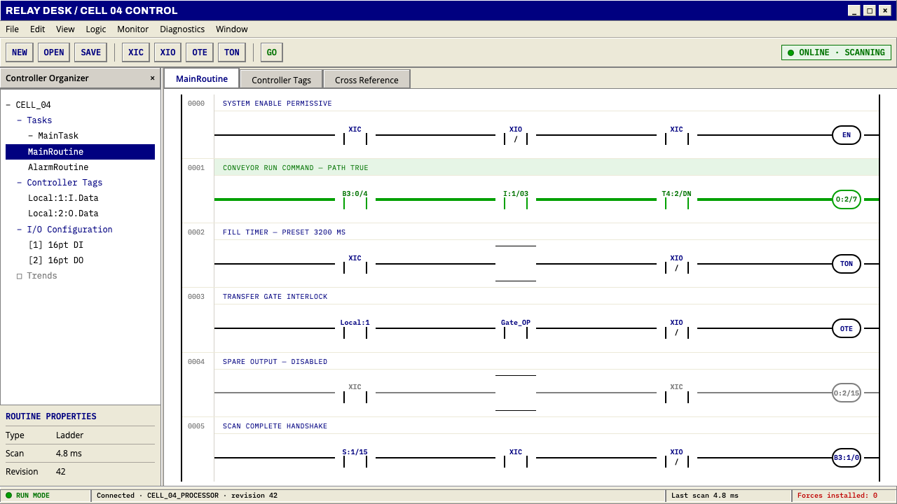 PLC Ladder LogicLogic made visible. Black rails and navy mnemonics turn green wherever the ci…
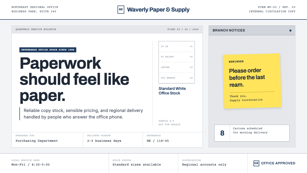 The Office (Dunder Mifflin, 2005)Mundanity is the punchline. Copier white, cubicle gray, memo grids, and one y…