What is Selenite Crystal Cave?
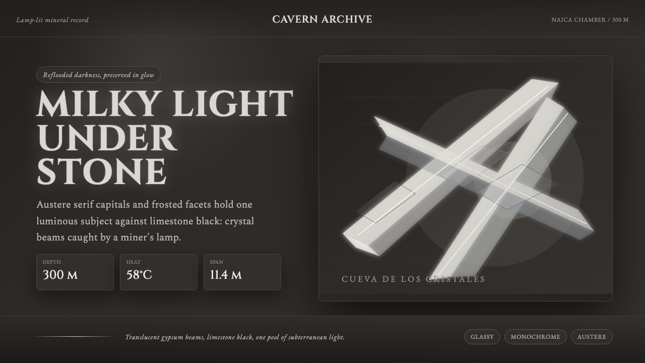
Darkness makes the crystal speak: milky serif type and translucent facets glow against limestone nearly black.
Selenite Crystal Cave in brief
Selenite Crystal Cave draws its visual logic from the Cave of the Crystals beneath the Naica mine in Chihuahua, Mexico. Deep underground, giant selenite gypsum beams cross a chamber of oppressive heat and humidity, appearing milky luminous white against limestone so dark that it nearly disappears. The style turns that contrast into an interface system: dark rock is the field, while crystal is the event.
The aesthetic is not a generic dark mode. It treats darkness as geological space with mass, depth, and silence. Pale surfaces are reserved for the elements that need attention: a title, a key figure, a selected control, a framed image, or a piece of essential information. The result should feel less like a bright screen placed on black and more like a cave lamp catching one plane of mineral before the surrounding chamber returns to shadow.
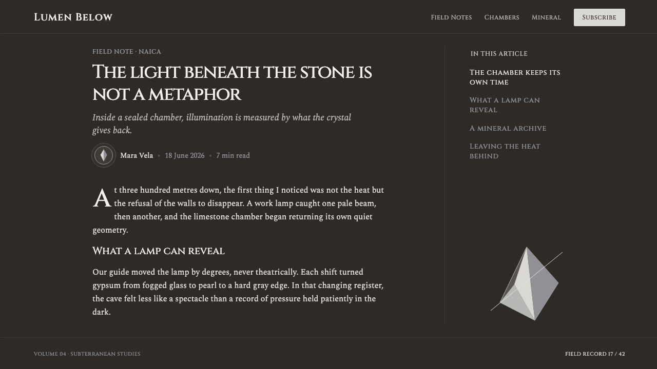
Its visual language combines austere carved typography with faceted, glass-like surfaces. Cinzel supplies the ceremonial, inscriptional voice: formal enough to suggest a mineral specimen label or a carved threshold, but restrained enough to remain readable. Panels, dividers, images, and controls should appear crystalline rather than glossy, with translucent layers and controlled highlights that imply internal depth without turning the page into a decorative fantasy.
Where does Selenite Crystal Cave come from?
The origin is geological before it is stylistic. The Cave of the Crystals lies roughly three hundred metres beneath the Naica mine in Chihuahua, Mexico, where giant selenite gypsum beams formed a subterranean spectacle of exceptional scale. In the chamber, some beams reach 11.4 metres long. Their pale translucency and the surrounding limestone darkness supply the system's essential contrast.
The chamber was discovered in 2000 during mine dewatering. Its discovery belongs to the period identified here as 1990–2010, when the cave entered public geological documentation as a remarkable underground environment rather than an imagined fantasy landscape. That distinction matters: the design should feel observed and mineralogical, not theatrical or extraterrestrial.
The Delgado brothers are named among the key figures connected with the cave, alongside Peñoles mine geologists and Juan Manuel García-Ruiz. Together, those names anchor the source material in the practical conditions of mine work, geological observation, and scientific attention. The cave is therefore best understood as a documented physical place whose visual force comes from real material contrast.
The associated movements are mineralogical subterranean spectacle and geological documentation. They suggest an editorial attitude for the style: present crystalline forms with the gravity of evidence. Let the interface borrow the cave's luminous white, dark limestone, humidity-like atmosphere, and faceted translucency, while avoiding visual signals that would make the subject read as a jewel advertisement or a science-fiction setting.
What defines the Selenite Crystal Cave look?
Rock Darkness
The ground is a brown-black limestone darkness, never a neutral empty black. It should feel dense and receding, with generous areas left unlit so that bright content appears discovered rather than continuously illuminated.
Milky Crystal Light
Milky luminous white is the primary active light. Use it for type, focal surfaces, and essential information, allowing it to glow softly from the dark rather than glare as a flat white field.
Carved Typography
Cinzel gives headings an austere, carved presence. Use it where the page needs gravity or ceremony, then let quieter supporting text preserve reading flow. The contrast should feel like an inscription emerging from stone.
Faceted Transparency
Surfaces should suggest translucent gypsum or glass facets: layered, pale, and subtly divided. Their depth comes from overlapping planes and selective highlights, not from polished gloss or ornamental visual noise.
Cave Light Falloff
Light behaves as it would around a lamp in a cavern. It gathers on a crystal face, reveals only enough texture to establish form, then falls rapidly into shadow. Uniform brightness breaks the atmosphere.
Chromatic Restraint
The cave's power comes from pale crystal against dark limestone, not from a spectrum of saturated color. Avoid rainbow effects and bright daylight associations; let small tonal shifts carry the sense of mineral depth.

Who shaped Selenite Crystal Cave?
The Delgado brothers are identified as key figures in the source record of the Cave of the Crystals. Their inclusion keeps the style connected to the human circumstances around the cave's discovery and recognition, rather than treating its forms as anonymous visual decoration.
Peñoles mine geologists connect the cave to its mining context and to geological documentation. In design terms, that association favors observational clarity, material seriousness, and specimen-like framing over luxuriant fantasy.
Juan Manuel García-Ruiz is named among the cave's key figures. Within this system, that scientific association reinforces the importance of treating crystal geometry, translucency, and subterranean darkness as subjects for attention rather than generic atmospheric effects.
How do you use Selenite Crystal Cave today?
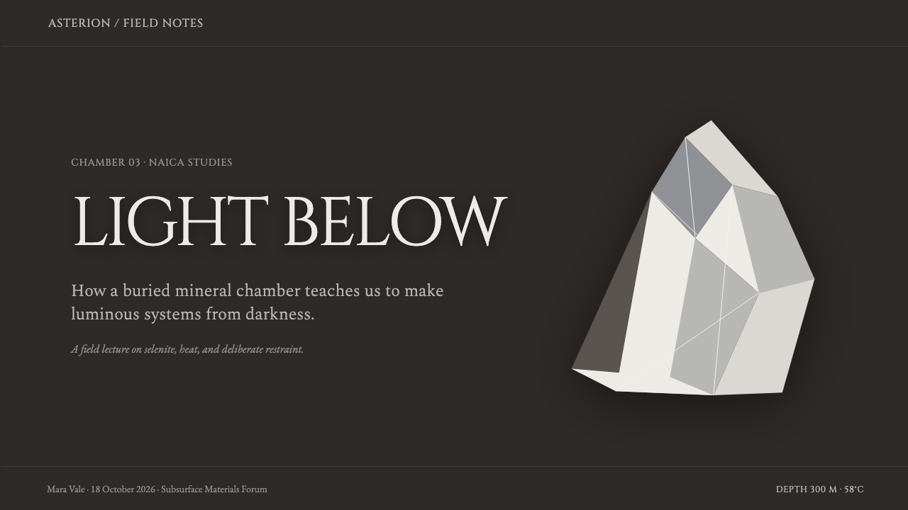
For presentation covers, let one pale crystalline plane or a cropped cave-like image carry the composition against a large field of rock darkness. A Cinzel title can sit as an inscription near the illuminated form. Keep supporting information quiet and distant, so the cover preserves the sensation of entering a chamber rather than opening a conventional business deck.
For content and data slides, use darkness to create hierarchy rather than to fill every region. Reserve the milky crystal treatment for the main argument, an important metric, or the active comparison. Tables and charts should read as geological documentation: clear structure, restrained highlights, and only enough translucent framing to separate information from the surrounding shadow.
For web interfaces, the system suits dashboards, analytical tools, archives, and premium information spaces where focus matters. Navigation should recede into the limestone ground while current states emerge as pale crystalline surfaces. Dense interfaces need particularly disciplined light control; if every card glows, none of them feels like a crystal found in darkness.
For editorial and marketing pages, use the style to create a slow, immersive reading sequence. Give long-form text quiet dark margins, let chapter titles arrive as carved pale markers, and use images as illuminated discoveries rather than continuous decoration. Product storytelling can move between shadowed narrative sections and carefully lit evidence, such as a feature, material detail, or quotation.
The common mistake is making the system bright, colorful, and uniformly glossy. That loses the cave's defining condition: limited light surrounded by real darkness. Do not treat translucency as a license for decorative glass effects, and do not use pale type everywhere. The style works when illumination is scarce, intentional, and meaningful.
Selenite Crystal Cave — FAQ
Is Selenite Crystal Cave simply a dark glass interface?
No. Glass-like translucency is only one surface behavior. The system is built on the geological relationship between luminous selenite and dark limestone. A generic dark glass interface often distributes shine evenly; this style concentrates light selectively, making darkness and falloff as important as the translucent planes.
Can vivid color be used as an accent?
It should be used with extreme restraint. The approved source material emphasizes milky crystal white, dark brown-black rock, and the rejection of rainbow saturation. If an interface needs differentiation, use shifts in brightness, translucency, framing, and light concentration before introducing conspicuous color.
Does Cinzel need to be used for all text?
No. Cinzel is most effective when it carries the carved, austere voice of titles and important labels. Applying the same ceremonial character to every line weakens hierarchy and can make long reading feel heavy. Supporting text should remain quieter so the inscriptional moments retain force.
How should imagery be treated in this style?
Treat imagery as an illuminated specimen or a partial discovery. Crop toward texture, translucency, mineral planes, and the boundary between light and shadow. Avoid imagery that fills every section with bright daylight, cheerful color, or unrelated decorative scenery, because it dissolves the subterranean atmosphere.
Where does the style work best?
It works best where concentration, rarity, materiality, and discovery are useful emotional values: curated archives, analytical dashboards, premium editorial pages, scientific storytelling, and presentations that need a memorable dark atmosphere. It is less suitable for interfaces requiring persistent brightness, playful immediacy, or broad rainbow-coded categorization.
Related design styles
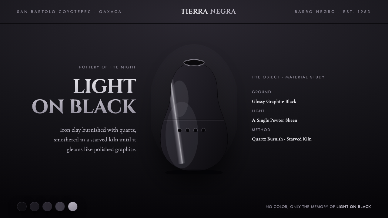 Oaxaca Barro NegroPottery of the night. Glossy graphite on matte black, one pewter sheen on the…
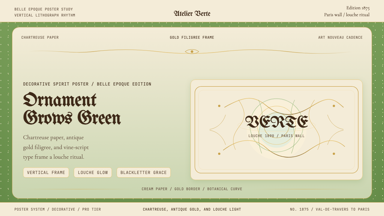 Absinthe Art Nouveau Green (1875)Ornate and verdant. Chartreuse field, gold filigree, vine-script type, and lo…
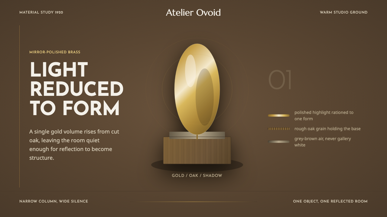 Brâncuși SculptureLight is rationed. Brass ovoids glow against oak-brown space and geometric ty…
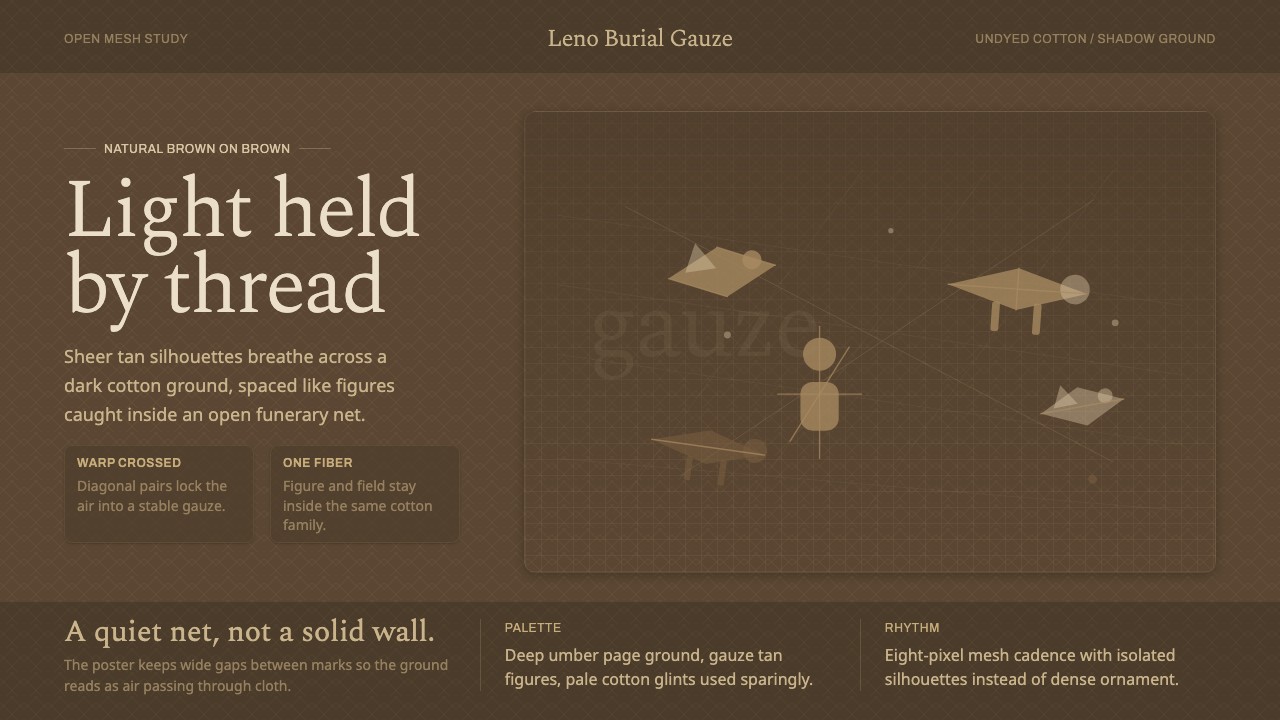 Chancay Gauze TextileQuiet woven dignity. Tan silhouettes float through a dark open cotton mesh.
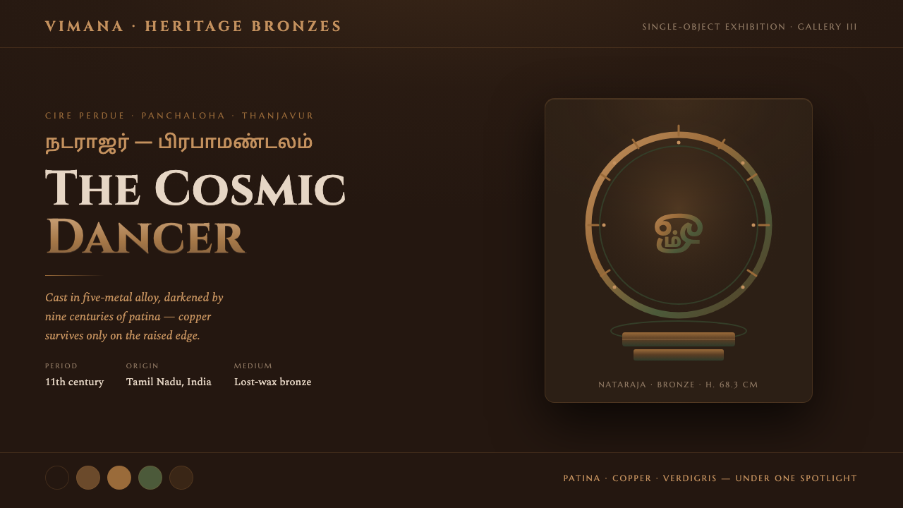 Chola Bronze NatarajaA patinated bronze under museum spotlight. Near-black field, verdigris recess…
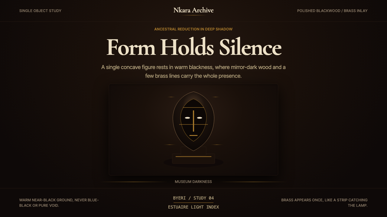 Gabonese Fang Mask & ByeriStillness has weight. Mirror-black forms, brass hairlines, and museum shadow…