What is Oaxaca Barro Negro?
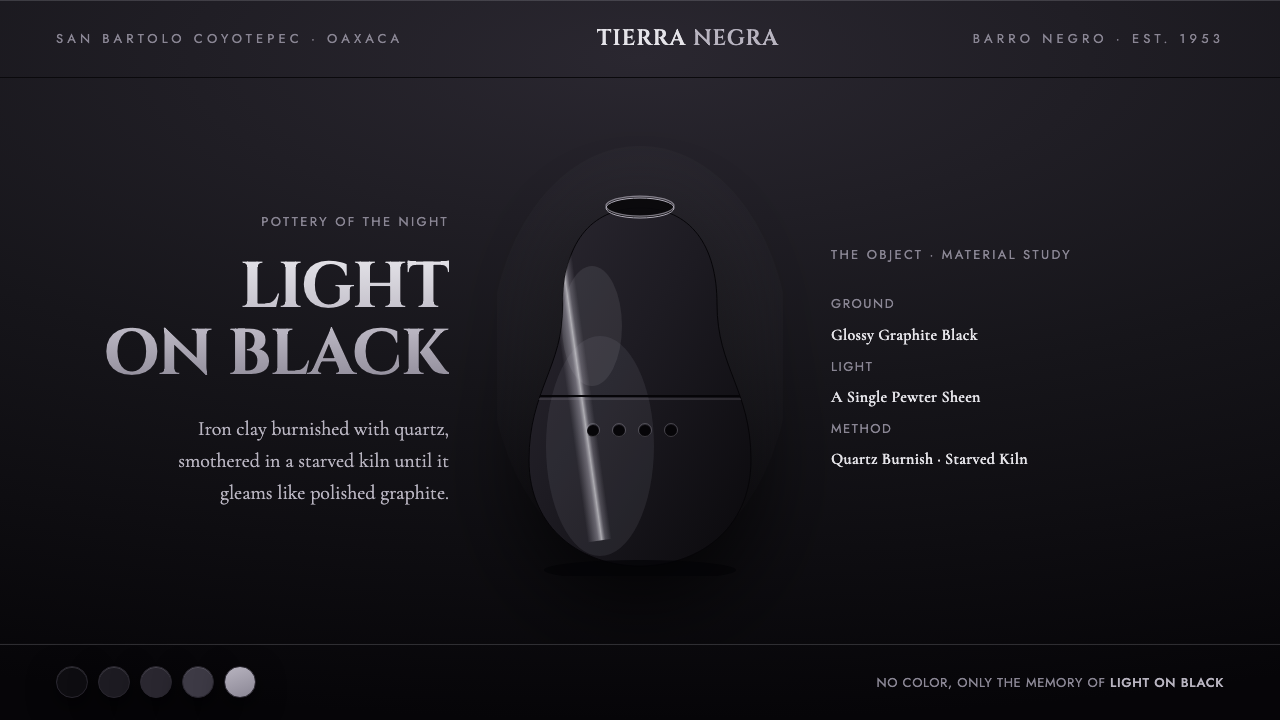
Oaxaca Barro Negro turns darkness into material presence: a world of matte black, graphite gloss, and one pewter glint traveling across a hand-burnished curve.
Oaxaca Barro Negro in brief
Barro negro is the burnished black pottery of San Bartolo Coyotepec in Oaxaca, Mexico. It begins with iron-rich clay, is polished with quartz before firing, and is then smothered in a low-oxygen kiln until the vessel becomes a deep metallic black. The object does not rely on painted pattern or bright color for its identity. Its visual drama comes from the behavior of one dark surface against another.
This design language translates the pottery into a definitively dark interface system. Black is not a backdrop waiting for accents; it is the full environment. Matte areas behave like recesses, graphite-like surfaces behave like exposed planes, and a restrained silvery-pewter sheen marks a curve, edge, border, or focal object. The eye reads material contrast before it reads color.
The result should feel quiet, ceremonial, and tactile rather than futuristic for its own sake. Large dark fields make room for small changes in reflectivity. Roman-capital typography introduces the gravity of an inscription on a vessel. Every highlight must look earned by curvature or hierarchy, never sprinkled across the page as decoration.
Where does Oaxaca Barro Negro come from?
The origin of this style is inseparable from San Bartolo Coyotepec, Oaxaca, Mexico, where barro negro is made from iron-rich clay. Its visual identity is not an abstract luxury palette invented after the fact. It comes from a material process: clay is shaped, its surface is worked with quartz, and firing changes the body into an unusually deep black with a metallic cast.
The essential act is burnishing before firing. Quartz-polishing compresses and refines the clay surface so that it can later carry a dark, reflective sheen. This is why the pottery reads as black-on-black rather than merely black: some areas seem to absorb light, while the burnished surface catches it and returns it as graphite or faint pewter.
The firing environment completes the transformation. The vessel is smothered in a low-oxygen kiln, producing the deep metallic black for which the pottery is known. In design terms, that process suggests a disciplined visual rule: depth does not need a broad palette. It can emerge from controlled differences between opacity, reflectivity, edge, and shadow.
The source period for this modern articulation is 1950–1990, associated with Doña Rosa Real Mateo's mid-century pre-fire quartz-burnish innovation and its spread. A Barro Negro-derived system should preserve that connection to hand-finished material culture. It may be used digitally, but it should never lose the sense that the bright edge was polished into existence.
What defines the Oaxaca Barro Negro look?
Black on Black
The palette is fundamentally monochrome and dark. Matte black establishes depth and silence; glossy graphite establishes exposed form. The contrast must remain close enough that the viewer discovers it gradually, as if turning a vessel under low light. Bright color has no role here, because it would interrupt the artifact's central claim: darkness itself contains structure.
Burnished Sheen
Gloss is selective, never ambient. It belongs to a rounded edge, a featured object, a dividing line, or a single moment of emphasis. The visual reference is quartz-burnished clay, so shine should feel compressed into the surface rather than projected outward as a theatrical effect. One controlled reflective gesture is stronger than many competing highlights.
Pewter Edge Light
The silvery-pewter glint is the system's only true light. Use it as a narrow signal of contour and priority: the lip of a card, the rim of a circular control, the edge of an image, or the line that joins one content field to another. It should suggest light moving across a curve, not metallic ornament applied uniformly.
Matte Recession
Matte surfaces carry the system's shadow and negative space. They are not empty areas; they make the burnished elements legible by withholding reflection. Panels, surrounding fields, and secondary controls should recede into this velvety darkness so that hierarchy feels excavated from the surface instead of assembled from floating layers.
Cinzel Capitals
Cinzel capitals give headings an inscribed, formal presence. They work best when reserved for titles, section markers, product names, and short navigational language. Their role is not to make every sentence ceremonial. Body copy should remain calm and highly readable, allowing the capitals to function as a carved threshold between areas of content.
Quiet Curvature
Curves matter because the pottery's sheen is revealed by curvature. Rounded forms should feel substantial and vessel-like, not playful or inflated. A curved boundary creates a reason for a pewter highlight; a straight boundary creates a reason for restraint. This relationship keeps the interface tactile without turning it into imitation ceramic.
Who shaped Oaxaca Barro Negro?
Doña Rosa Real Mateo is the named figure associated with the mid-century pre-fire quartz-burnish innovation and its spread between 1950 and 1990. Within this style, her significance is practical as much as symbolic: the dark luster is understood as the outcome of deliberate surface work before firing, not as a superficial finish added afterward.
San Bartolo Coyotepec is the Oaxacan place from which barro negro takes its identity. It anchors the design language in a specific ceramic tradition rather than a generic dark aesthetic. Referencing the place means preserving the tension between iron-rich clay, polished surface, low-oxygen firing, and the final black metallic body.
Quartz burnishing is the process anchor of the visual system. It explains why a dark object can possess such precise, silvery edge light: reflectivity is made through polishing, while the surrounding body remains dark. In digital work, it should inspire selective highlights and carefully differentiated surfaces, not mirror-like gloss everywhere.
How do you use Oaxaca Barro Negro today?
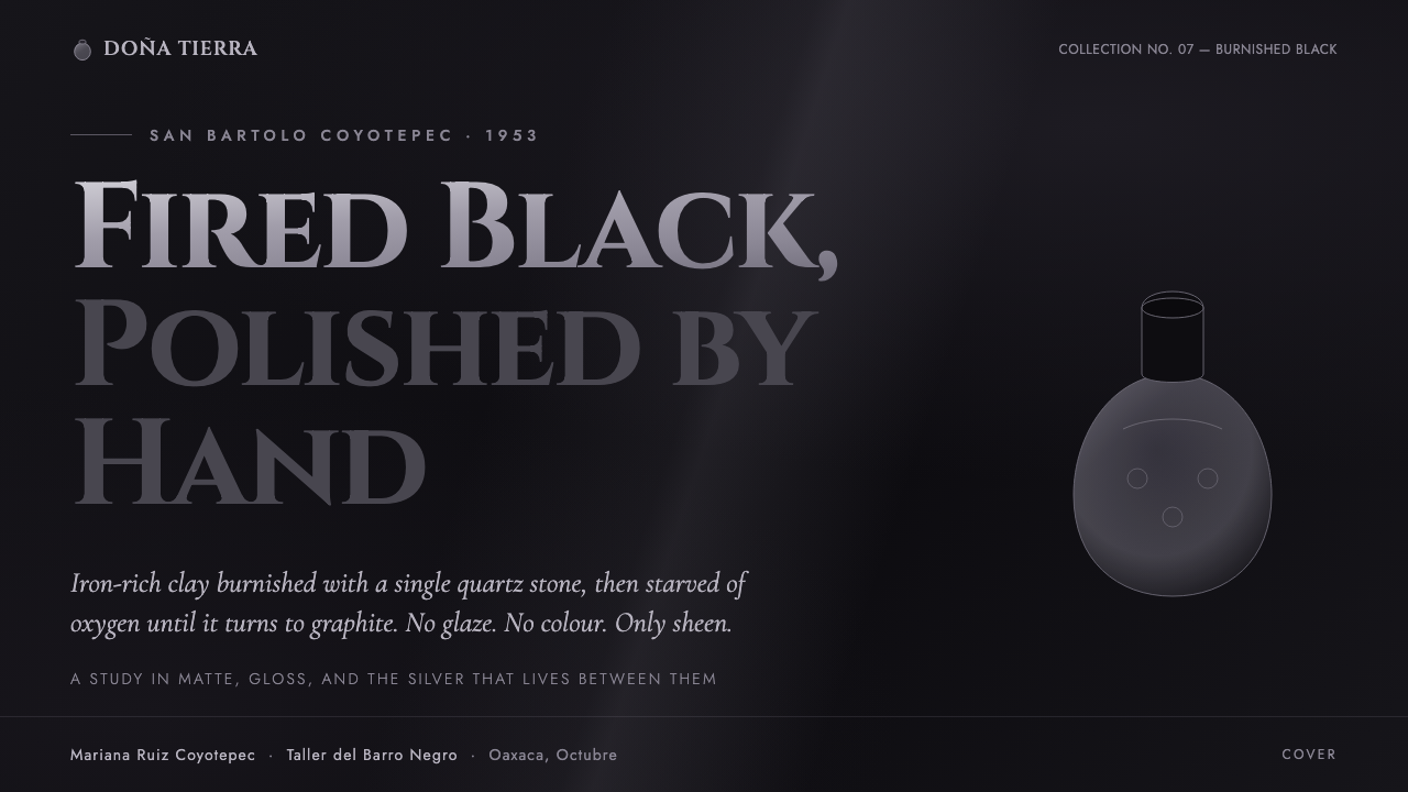
For presentation covers, let one vessel-like curve or dark graphite form hold the composition against a broad matte field. Set the title in Cinzel capitals with generous surrounding darkness, then use a single pewter edge or small reflective detail to establish focus. Content slides should be quieter: clear text groups, dark panels that recede, and only enough sheen to distinguish the active layer from the supporting one.
Data slides work when information is treated as an illuminated relief rather than a colorful chart. Keep the main analytical structure matte and dark, then use graphite brightness and a rare pewter accent to identify the series, threshold, or conclusion that matters most. Do not convert every category into a separate bright signal; that breaks the material logic and makes the page feel generic.
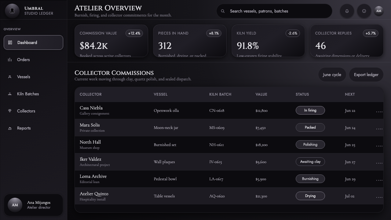
For web interfaces, the style suits dashboards, account surfaces, and premium pricing pages where focus and perceived material quality matter. A dashboard can place the most important metric or control on a subtly burnished panel while secondary modules fade into matte black. A pricing page can use the same hierarchy for one featured plan, reserving the edge light for the plan users should inspect first.
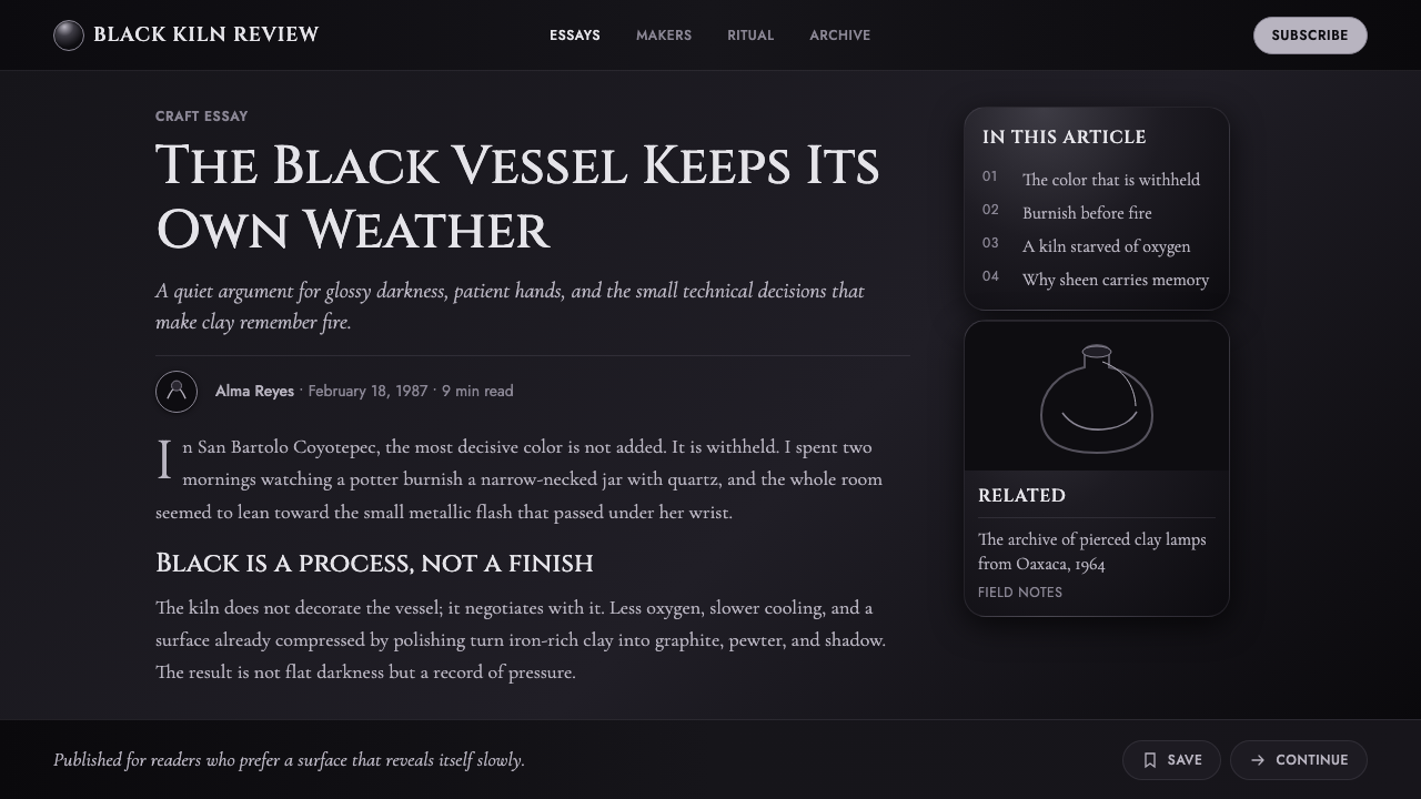
For editorial and marketing work, build an atmosphere of considered restraint. An article page can use a dark reading field, formal section titles, and a thin reflective divider to separate major ideas. Marketing compositions benefit from close crops of curved dark objects, short declarative copy, and large areas left deliberately unlit. The desired mood is pottery of the night, not a loud metallic campaign.
The common mistake is confusing Barro Negro with a generic black-and-chrome luxury look. Excessive mirror shine, repeated silver borders, bright accent colors, and glossy controls everywhere erase the crucial difference between burnished clay and polished machinery. Lead with matte darkness, make gloss sparse and surface-bound, and allow the single pewter glint to carry the system's emphasis.
Oaxaca Barro Negro — FAQ
Is Oaxaca Barro Negro simply a black luxury style?
No. Its distinction lies in ceramic process and surface contrast, not in expensive-looking darkness. Barro negro depends on the relationship between iron-rich clay, quartz burnishing, low-oxygen firing, matte recession, and the restrained reflective edge that follows a curve. A generic luxury treatment usually adds shine broadly; this style makes shine scarce and materially motivated.
Can this style use colorful accents?
The source material calls for no chromatic primary. The design system is built from dark matte black, glossy graphite, and a faint silvery-pewter sheen. Introducing a strong colored accent changes the hierarchy from material contrast to color contrast, which weakens the black-on-black character that defines the reference.
Why should highlights be so limited?
Because the highlight represents the burnished surface catching light, not a general lighting effect. If every card, button, edge, and divider shines equally, there is no longer a meaningful contrast between matte clay and polished clay. Limitation gives the pewter glint its authority and lets the viewer feel the implied curve.
Where does Cinzel work best in this system?
Use Cinzel capitals for short, consequential language: titles, named sections, product marks, and compact navigation. It supplies a Roman-inscription quality that complements the pottery's ceremonial gravity. It is less suitable for long reading passages, where a calmer body type preserves clarity and keeps the display lettering special.
What kinds of products suit Oaxaca Barro Negro?
It is strongest where a product benefits from concentration, tactility, and deliberate hierarchy: premium dashboards, account experiences, analytical tools, and focused pricing or editorial pages. It is less natural for cheerful, highly playful, or color-dependent communication, because the system asks users to notice quiet surface differences rather than rapid colorful cues.
Related design styles
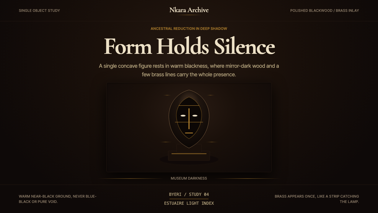 Gabonese Fang Mask & ByeriStillness has weight. Mirror-black forms, brass hairlines, and museum shadow…
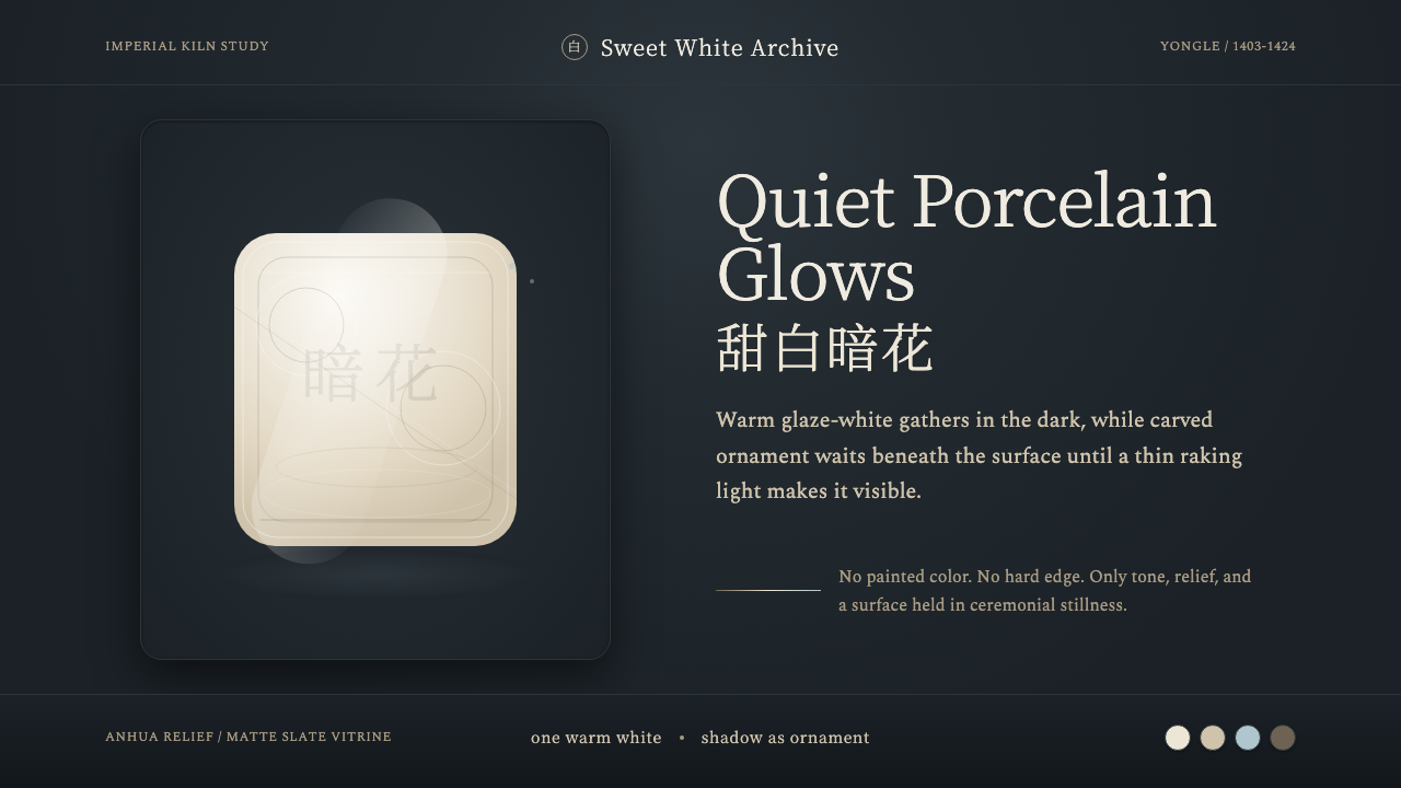 Jingdezhen BlancQuiet porcelain glows. Warm glaze-white on slate reveals hidden anhua incisio…
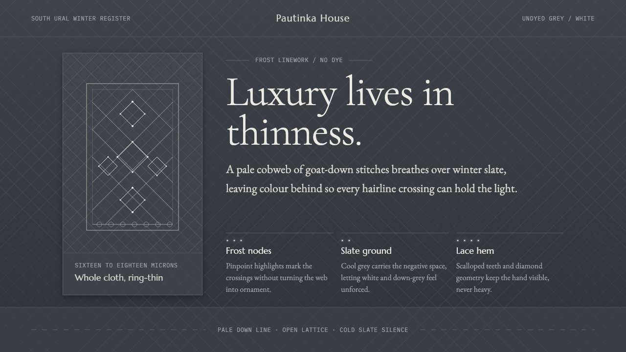 Orenburg Goat-Down Gossamer ShawlLuxury in thinness. Pale Cormorant type and down-lace lines breathe on Ural s…
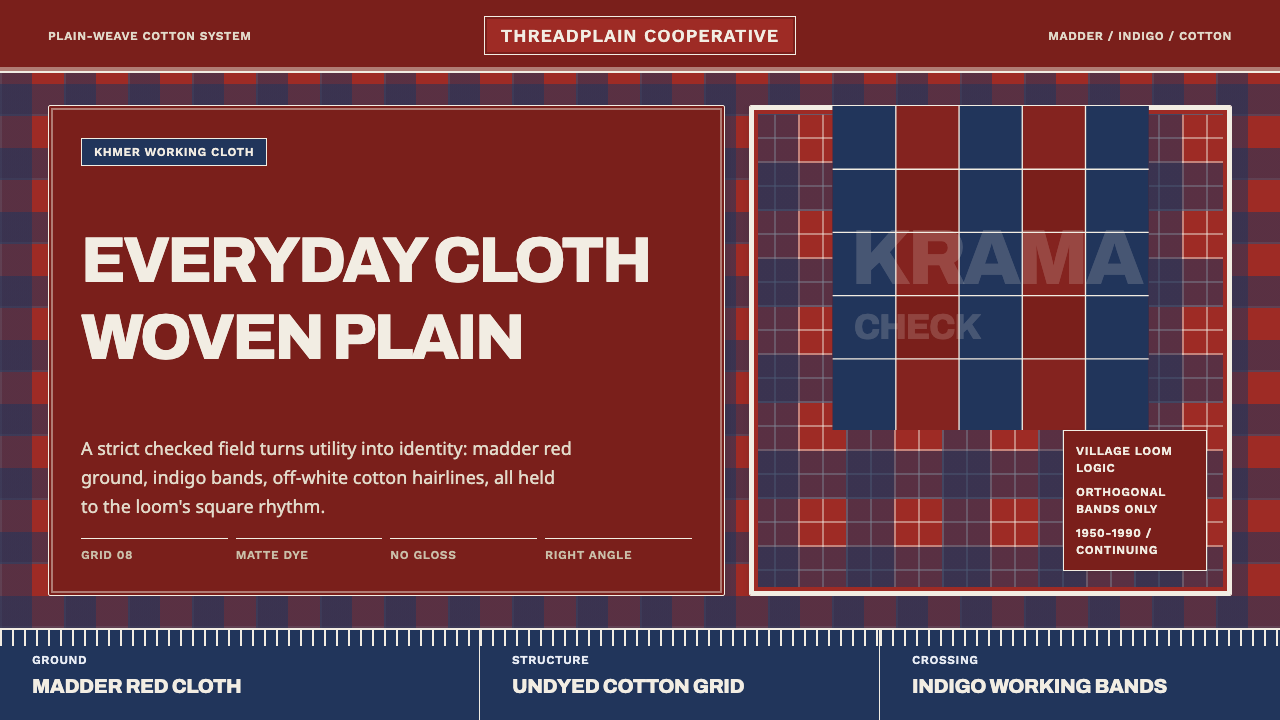 Cambodian Krama CheckPlain cloth has authority. Madder red, indigo bands, and cotton grid lines do…
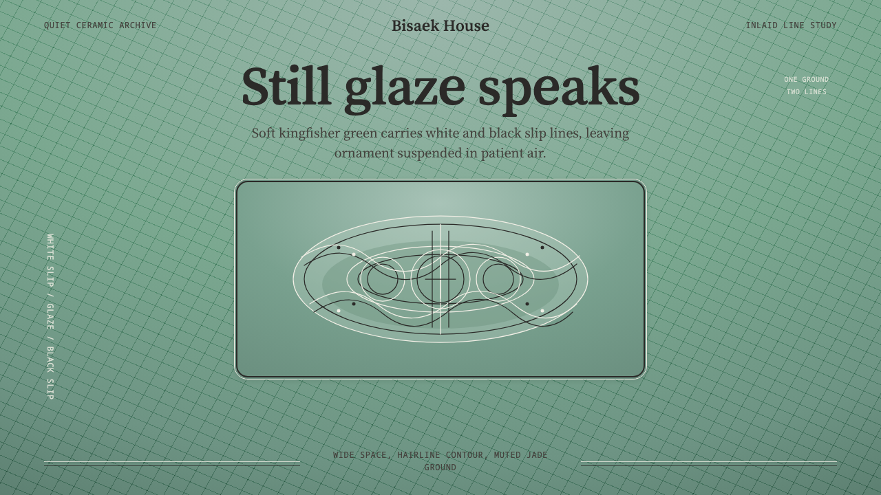 Goryeo Celadon 高麗青瓷Stillness carries ornament. Bisaek jade ground holds white and black hairline…
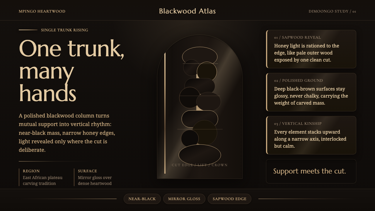 Makonde Ujamaa BlackwoodKinship carved upward. Near-black gloss climbs a sapwood-lit vertical column.