What is Sashiko Boro?
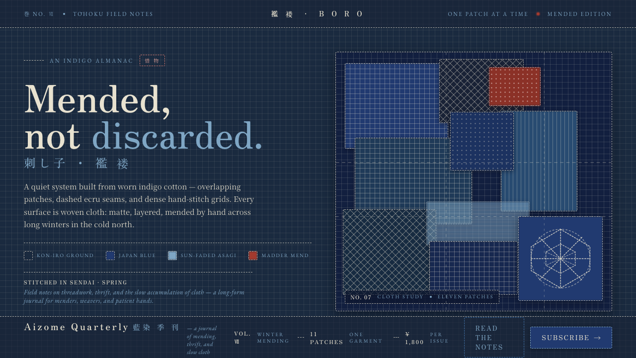
Sashiko Boro treats wear as memory — deep indigo cloth, layered repairs, and ecru stitches turning survival into pattern.
Sashiko Boro in brief
Sashiko Boro is a Japanese folk textile practice built from repair. Worn cotton and hemp, dyed deep indigo, are reinforced with white running stitches and covered with patch upon patch until the original garment becomes a palimpsest of fabric fragments. Its beauty does not come from pristine material or decorative finish. It comes from continued use made visible.
As a design language, Sashiko Boro is a dark kon-iro field broken by sun-faded blue patches, overlapping rectangular pieces, visible seams, and dense dashed stitch grids. The surface should feel woven, handled, and accumulated rather than smooth or polished. A restrained madder-red mend may interrupt the blue, but the essential mood remains quiet, durable, and intensely tactile.
Where does Sashiko Boro come from?
The practice belongs to rural Japan before 1900, across the Edo through Meiji period. Its strongest regional association is northern Japan, especially the farming and fishing villages of Tōhoku. In these communities, cloth was not treated as disposable. A worn garment remained useful when reinforced, and a damaged section could become the foundation for another layer of repair.
Sashiko supplied the reinforcement method: repeated running stitches that stabilize fragile cloth while also creating a visible geometric surface. Boro describes the accumulated textile condition, where repairs, remnants, and wear remain legible instead of being concealed. Together, the two traditions produce a material language in which structure and history are inseparable.
The origin story is collective rather than author-centered. Anonymous Tōhoku farming households, rural fishing families, and household women weavers and stitchers carried the work through everyday making. Their contribution was not a signature style imposed by a named designer, but a shared intelligence about thrift, endurance, and how to keep a useful object in service.
Aizome indigo dyeing established the deep ground from which the lighter repairs could emerge. Against that field, white or ecru stitches read as deliberate marks, while faded blue fragments register age and repeated exposure. The ethic of mottainai, or 惜物, gives the whole tradition its moral center: value is preserved by mending rather than discarded at the first sign of damage.
What defines the Sashiko Boro look?
Indigo Ground
The dominant field is deep kon-iro or indigo, with the visual density of dyed cotton rather than the flatness of ink. It creates a nocturnal, grounded atmosphere and gives every lighter stitch or patch a strong place to register. The ground should feel continuous but never immaculate.
Layered Patches
Rectangular patches overlap visibly, with edges, seams, and changes in cloth direction left exposed. The composition is assembled rather than smoothly authored. Each patch should feel like a response to a particular weakness in the underlying surface, not an arbitrary decorative tile.
Running-Stitch Grid
Fine ecru dashes form dense geometric grids across the indigo field. The lines are rhythmic but not mechanically perfect; slight irregularity keeps the hand of the maker present. Stitching functions as both reinforcement and navigation, giving the interface a quiet internal order.
Faded Blue
Lighter blue patches appear as evidence of sun, handling, and time. They should remain close to the indigo family, creating a tonal conversation rather than a loud contrast. Fading is treated as accumulated history, not as a decorative gradient or atmospheric effect.
Madder-Red Mend
Madder red is an occasional repair mark, not a competing palette. Used sparingly, it reads like a newly visible intervention against the long indigo history of the cloth. Its irregular placement can call attention to an action, warning, or important seam without breaking the textile mood.
Woven Materiality
The surface belongs to cloth. Seams, frayed boundaries, layered opacity, and stitch rhythm should suggest fibers and handling. Smooth paper-like planes, glossy polish, and pristine digital surfaces contradict the system because they erase the evidence of making and repair.
Who shaped Sashiko Boro?
These households represent the agricultural communities in northern Japan where worn cloth was kept in use through repeated reinforcement and layering. Their anonymous, collective authorship is central to the style: the design language values continuity and usefulness over individual signature.
Fishing families are part of the rural context in which boro developed. Their presence connects the textile to work, exposure, and the practical demand for durable cloth. In an interface, this figure suggests that visible wear can communicate service and resilience rather than failure.
Household women weavers and stitchers carried the detailed labor of making, reinforcing, and extending the life of cloth. Their work appears through the stitch grid, patch placement, and accumulated hand decisions. The system should preserve that sense of patient, repeated attention.
How do you use Sashiko Boro today?
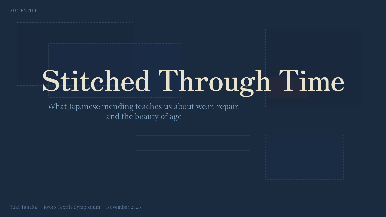
For presentation slides, use the dark indigo field as a continuous stage rather than treating every page as a separate card. Cover slides can feature a single large overlapping patch or a broad stitched seam that frames the title. Content slides should organize information along visible stitch paths, while data slides can use patch-like blocks and ecru running marks to distinguish categories. Keep the visual rhythm calm so the texture supports the message instead of competing with it.
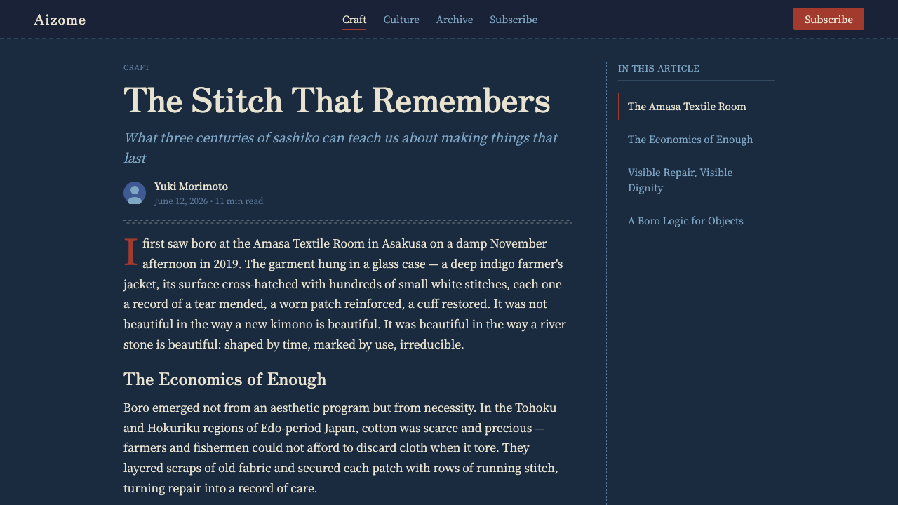
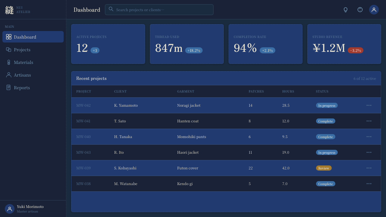
For web interfaces, Sashiko Boro suits dashboards and pricing pages that need a strong sense of continuity, care, or durable service. Use indigo for the main surface, lighter blue for secondary regions, and stitched borders or seams to separate functional areas. Cards should feel layered into the fabric rather than floating above it. Reserve madder red for active actions, urgent states, or a meaningful point of intervention, and keep labels clear against the dark ground.
For editorial and marketing work, the style can turn repair into the organizing metaphor. An article may use a broad cloth-like field, narrow text areas, visible patch seams, and stitch grids that reappear at section transitions. Marketing pages can present a product or service as something maintained, adapted, and kept useful, with close crops of layered surfaces and quiet indigo-led compositions. The strongest executions let the material story shape the hierarchy.
For data communication, treat each visual unit as a textile fragment with a role in the larger weave. A chart can be assembled from tonal blue patches, with ecru marks indicating connection or sequence and a rare red mend drawing attention to an exception. Avoid making every block equally distressed. Variation should feel accumulated and purposeful, as though the interface has been reinforced where pressure was greatest.
The common mistake is to confuse Boro with generic vintage decoration. Adding random frays, paper grain, sepia filters, or excessive distressed effects produces nostalgia without the logic of repair. The system depends on a dark indigo ground, visible layered patches, hand-like stitch grids, and disciplined restraint. Every irregularity should suggest use, reinforcement, or history; otherwise it is only noise.
Sashiko Boro — FAQ
Is Sashiko Boro simply a vintage or distressed style?
No. Its defining idea is repair, not age as decoration. A distressed surface can imitate wear, but Sashiko Boro makes wear functional and legible through overlapping patches, seams, and reinforcement stitches. The interface should communicate that the material has been kept in service, not merely made to look old.
Can this style use colors beyond indigo and ecru?
It can, but the expansion should remain subordinate to the cloth logic. Faded blues can widen the tonal range, while madder red works as an occasional mend or point of emphasis. A broad, highly saturated palette would weaken the quiet relationship between indigo ground, pale stitching, and accumulated repair.
Why are visible seams and stitches so important?
They are the evidence that gives the system meaning. Without them, layered blue rectangles become ordinary panels and the dark field becomes a generic background. Stitches show reinforcement, seams show assembly, and patch overlap shows that the surface has been extended over time. Together they turn texture into structure.
Can Sashiko Boro work in a light-background interface?
A light variant is possible, but it changes the central experience. The source tradition depends on pale stitches and faded patches emerging from a deep indigo ground, so reversing that relationship can make the textile character less immediate. If a lighter surface is required, retain strong indigo fabric regions and visible seam logic so the design still reads as cloth rather than paper.
What kinds of interfaces benefit most from this design language?
It works best where continuity, care, endurance, and accumulated knowledge are meaningful values. Dashboards, service experiences, archives, craft-oriented products, and editorial systems can all use the layered surface to make maintenance and history visible. It is less suitable when the product depends on pristine neutrality, extreme lightness, or an entirely frictionless surface with no visible trace of use.
Related design styles
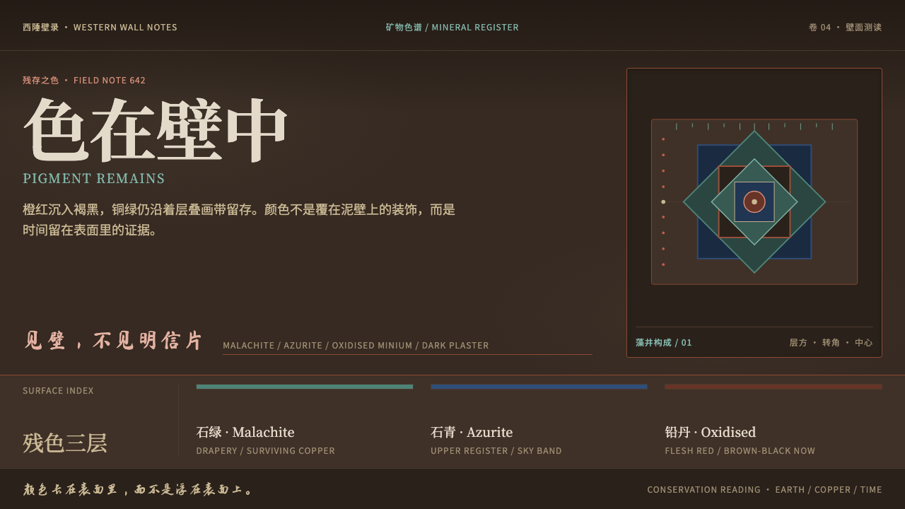 Dunhuang Mogao MuralsTime lives in the wall. Mineral green and azurite endure on oxidised brown pl…
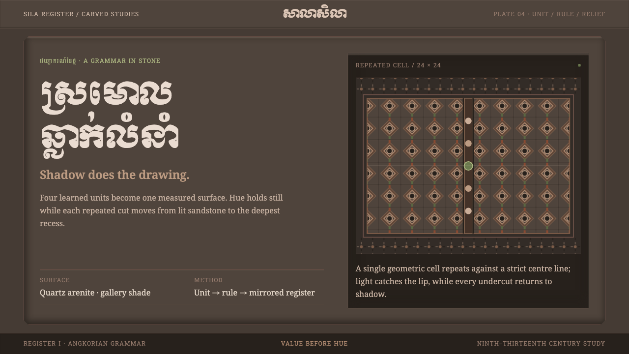 Khmer Kbach MotifShadow carves the grammar. Repeated stone cells turn a narrow sandstone palet…
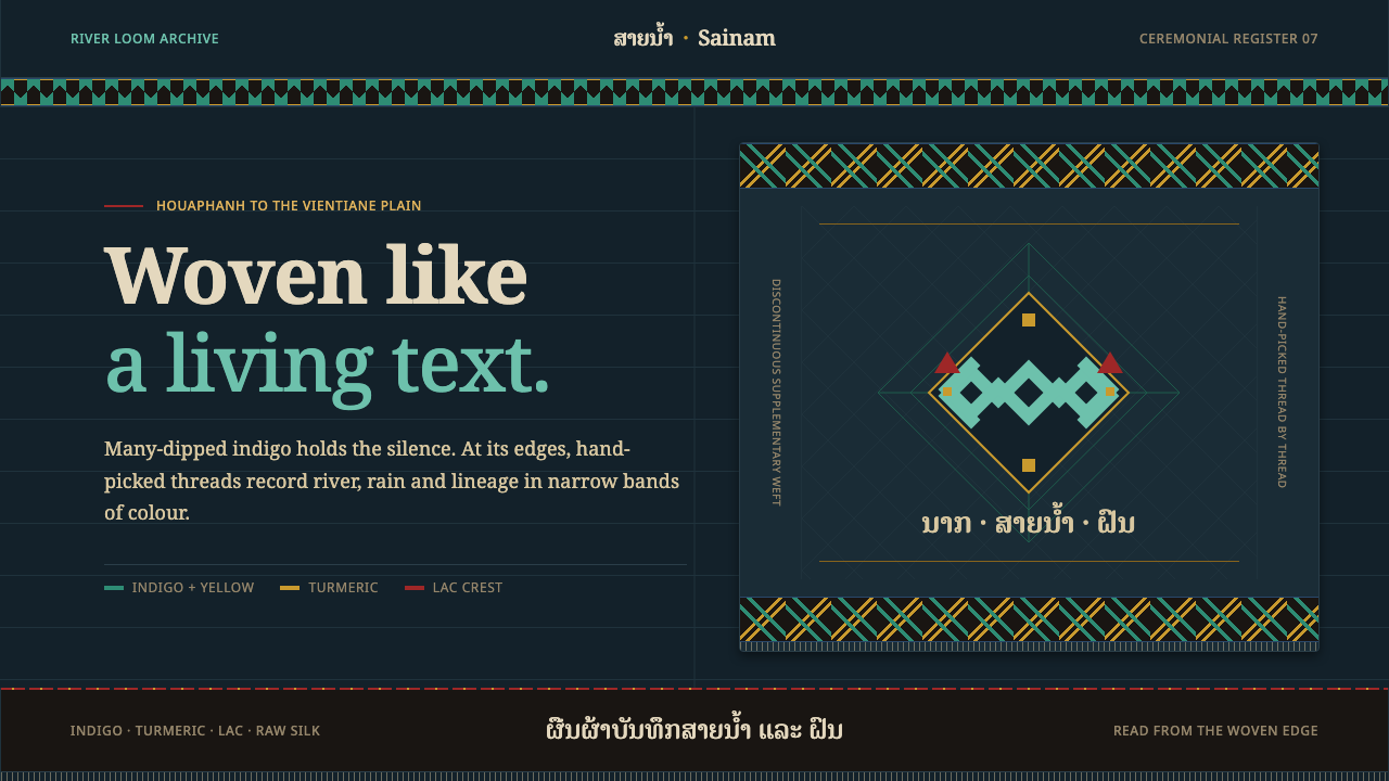 Lao Naga TextileDarkness becomes woven memory. Turquoise and turmeric bands speak across many…
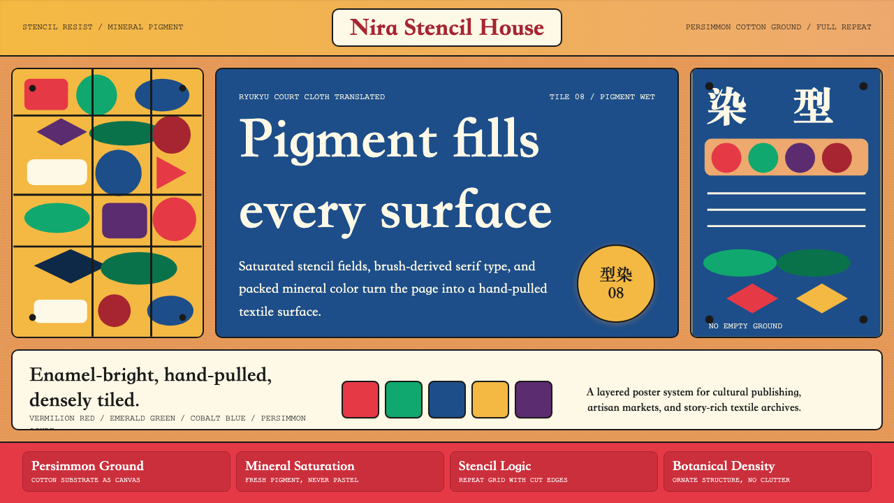 Okinawan Bingata Resist DyeOrnate without clutter. Persimmon ground, vermilion type, emerald-cobalt sten…
 Akuaba Akan Fertility DollDarkness becomes sculpture. Near-black wood, ringed geometry, and one gold be…
 Bambara Chi Wara AntelopeCarved memory in gold. Black serif silhouettes and brass-dot borders carry th…