What is Namib Sand Dunes?
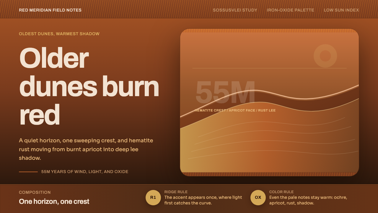
A desert that has been settling into the same warm rust and apricot for millions of years — one sweeping S-curve ridge, a quiet horizon, and enough negative space to feel like standing at the edge of it.
Namib Sand Dunes in brief
This system takes its color and composition directly from the Namib erg at Sossusvlei, home to some of the tallest sand dunes on Earth. The dunes' quartz sand grains are coated in iron-oxide hematite, which oxidizes over time the way rust does — so the oldest dunes in the erg have had the longest to oxidize and read the deepest, most saturated red, while younger dune faces burn a lighter apricot-orange.
Under low, raking desert light, a dune stops looking like a landform and starts reading almost like an interface: one smooth, lit ridge face and one deep, shadowed lee face, separated by a single sweeping crest line. This system treats that same logic as its primary compositional device — instead of a neutral background and foreground content, warm sand color is the ground, and one quiet S-curve line does the work that a grid or a divider would do elsewhere.
Nothing here is cool or neutral. Even the palest sand in this system reads warm rather than cream or white, and shadow is rendered as a rich, deep rust rather than a gray. The composition stays deliberately spare — a single ridge line, a low horizon, and generous open space — because that is what the actual landscape looks like at Sossusvlei: vast, quiet, and almost entirely made of two things, warm light and warm shadow.
Where does Namib Sand Dunes come from?
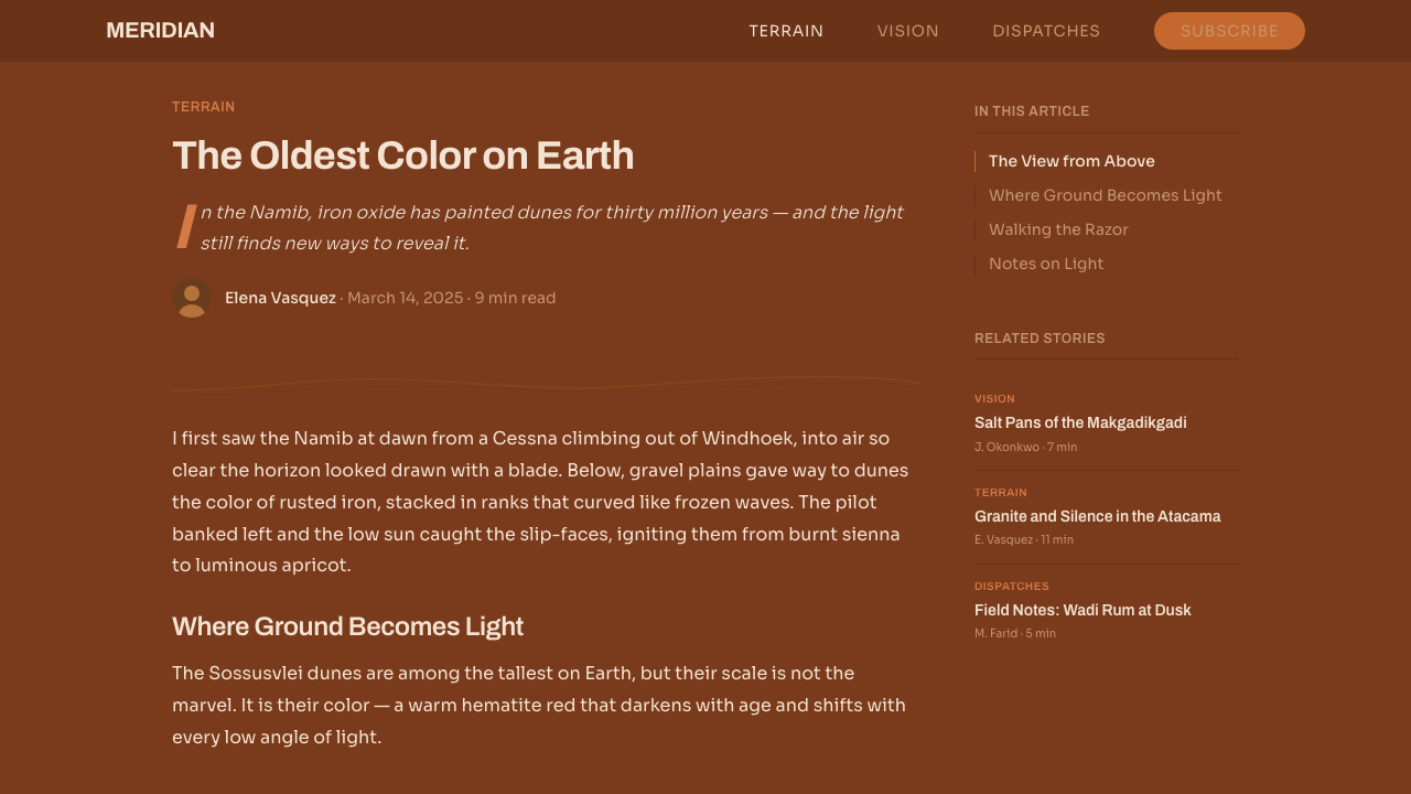
The Namib Desert is one of the oldest deserts on Earth, with arid conditions persisting for roughly 55 million years, and the dune sea (erg) at its heart — the Namib Sand Sea — holds some of the tallest dunes on the planet, some rising several hundred meters above the desert floor. Sossusvlei, a clay pan surrounded by these towering red dunes, sits within the Namib-Naukluft area of Namibia and has become one of the most photographed desert landscapes in the world.
The dunes' distinctive color comes from iron oxide coating individual quartz grains — chemically the same reaction that rusts iron left out in the weather. Because this oxidation is a slow, ongoing process, dune color in the Namib actually functions as a rough clock: the reddest, most deeply oxidized dunes are also the oldest, having had the most time exposed to air and sun, while dunes that have shifted or formed more recently show a paler, more orange hue. Sossusvlei's dunes are frequently cited as among the reddest and, correspondingly, among the oldest in the erg.
The Namib Sand Sea was inscribed as a UNESCO World Heritage Site in recognition of both its geological uniqueness and the rare desert ecosystems it supports, and the surrounding area is protected within Namib-Naukluft National Park, one of the largest conservation areas in Africa. This protected status has helped keep Sossusvlei's dune landscape largely undisturbed, which is part of why its silhouettes and light conditions have become such a consistent visual reference.
Since the digital photography era took hold in the 2010s, Sossusvlei has become a signature subject for minimalist landscape photographers specifically because of how cleanly it reduces to graphic form: a single ridge line dividing warm light from warm shadow, shot at dawn or dusk when the sun sits low enough to rake across the dune face and throw the lee side into deep color. That photographic tradition — built on ridge-line composition, warm earth-tone palettes, and large stretches of quiet negative space — is the direct visual ancestor of this system.
What defines the Namib Sand Dunes look?
Color
Every surface reads warm. The lit ground runs from pale, sun-bleached apricot to a burnt, saturated orange, while shadow is a deep, rich rust rather than gray or black — the visual result of iron-oxide-coated sand under raking light. There is no cool neutral anywhere in the palette; even the lightest tone carries a warm cast.
The S-Curve Ridge
A single sweeping, curved line — echoing a dune crest carved by wind — carries most of the compositional weight. It divides a layout into a lit field and a shadowed field the way a dune ridge divides sun from shade, and it is deliberately singular: one confident curve rather than several competing ones.
Light and Shadow as Structure
Rather than using borders, cards, or drop shadows to separate content, this system separates areas the way the desert itself does: a lit warm field against a deep rust shadow field, meeting along one clean line. Depth comes from that light-shadow contrast, not from layered elevation effects.
Quiet Horizon
A single low, steady horizon line grounds the composition, positioned well below center to leave the majority of the frame to sky or open dune field. This mirrors the actual experience of standing at Sossusvlei, where the horizon is a thin, almost incidental line beneath an overwhelming expanse of dune and sky.
Negative Space
Large, uninterrupted areas of flat warm color are treated as content in their own right, not empty space to be filled. This restraint is what lets the single ridge line and horizon carry visual weight — a busy layout would contradict the actual stillness of the landscape it references.
Texture Restraint
Surfaces stay smooth and softly graduated rather than gritty or heavily textured. A dune's surface, seen from a photographic distance, reads as smooth, rippled tone rather than individual grains — this system keeps that same smooth, large-scale reading rather than simulating close-up sand texture.

Who shaped Namib Sand Dunes?
The Namib Sand Sea's 2013 inscription as a UNESCO World Heritage Site recognized both its geological significance as one of the world's oldest and largest coastal deserts, and the unusual ecosystems adapted to survive in it — formal recognition that helped cement the dune sea's status as a landscape worth protecting and studying.
As one of Africa's largest protected areas, Namib-Naukluft National Park encompasses Sossusvlei and the surrounding dune fields, and its conservation status is a major reason the dunes' color, form, and light conditions have remained consistent enough to become a durable visual reference over decades of photography.
How do you use Namib Sand Dunes today?
This system reads as calm, warm, and expansive, so it works best where a brand or product wants to feel spacious and unhurried rather than dense or busy. It leans on very few elements doing real work — one curve, one horizon, one light-shadow relationship — so it rewards discipline rather than adding more.
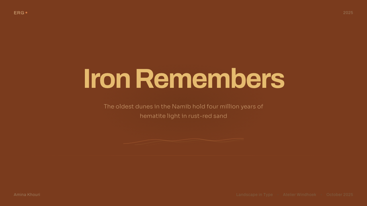
On a slide cover, a full-bleed warm field with a single sweeping ridge curve running low across the frame makes a strong, quiet title treatment — title text sits in the lit field, well clear of the shadow area, echoing how a dune ridge naturally separates bright and dark ground. Content slides should keep large areas of flat warm color rather than white space, using the shadow tone as a secondary field for supporting text rather than a bordered box. Data works best as simple, warm-toned bars or areas against the lit ground, avoiding cool comparison colors that would break the palette's warmth.
For web interfaces, this palette suits landing pages, hero sections, and travel or lifestyle products more naturally than dense data dashboards, since its strength is atmosphere rather than information density. When it is used for a dashboard or pricing page, keep the warm rust reserved for a small number of emphasis elements — an active state, a featured tier — rather than spreading it across every surface, or the calm the palette is built on will curdle into visual noise.
In editorial and marketing work, this system suits travel, nature, wellness, and slow-living stories especially well — anything that benefits from stillness and warmth rather than urgency. A full-width warm section broken only by a single ridge-curve graphic can carry a headline with no photography needed at all, since the palette itself already reads as landscape.
A common mistake is treating the shadow tone as a neutral gray or near-black rather than a fully warm rust — doing so cools the whole composition and breaks the reference immediately, since real desert shadow at Sossusvlei never reads gray. A second common mistake is adding more than one ridge line or dividing curve to a layout; the style depends on a single confident line doing the work, and multiple competing curves quickly start to look like generic wave decoration rather than a specific desert landscape.
Namib Sand Dunes — FAQ
Why are the oldest dunes the reddest, rather than the newest?
Because the red color comes from iron oxide slowly coating each quartz grain over time, in a process chemically similar to rust forming on exposed metal. A dune that has existed longer has had more time for that oxidation to build up, so it reads as a deeper, more saturated red. Younger or more recently reshaped dunes haven't had as much time to oxidize, so they read a paler orange by comparison.
Does this style require an actual photograph of a dune to work?
No — the system works as pure color and composition without any photography at all. Its core elements are a warm palette, a single sweeping ridge-line curve, a low horizon, and generous negative space; these can be rendered as flat color fields and simple vector curves and still read clearly as this style, the same way the actual landscape reduces to those same few elements when seen from a distance.
How is this different from a generic warm sunset gradient?
A generic sunset gradient blends color smoothly and has no structural logic of its own. This style is defined by a specific compositional relationship — one clean ridge line dividing a lit field from a shadowed field, with a low horizon beneath open space — that comes directly from how a dune actually reads in raking light. The color choice matters, but the structure is what makes it this style rather than an abstract warm gradient.
What kinds of products or brands does this style suit best?
It suits travel, hospitality, wellness, and lifestyle brands especially well, along with any product whose story benefits from a sense of calm, warmth, and open space rather than density or urgency. It is a poor fit for information-dense products like financial dashboards or data-heavy tools, where the style's large flat fields and minimal structure would work against the need to display a lot of detail clearly.
Related design styles
 Pinterest 2024Aspirational calm. Warm gray masonry, rounded white pins, one surgical red sa…
 Clay 2024CRM as a sketchbook, not a sales pipeline. Cream backgrounds, terracotta, han…
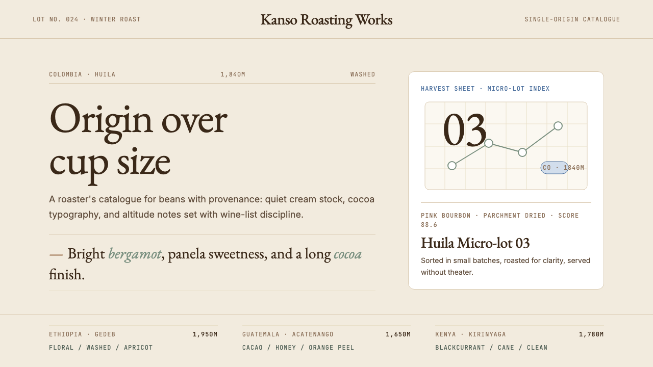 Third Wave CoffeeCoffee as catalogue. Cream paper, cocoa serif, mono origin specs, one sage no…
 Corten Weathering SteelWeight over ornament. Rust-brown planes and concrete-grey seams make mass vis…
 Peruvian Contemporary Adobe-ModernThe building dissolves into the dune. Reddish pozzolan-cement planes, matte r…
 Photographer Light FolioMakes the browser a gallery wall. Warm cream, hairline serif type, and one im…