What is Pictorialist Fog Tonalism?
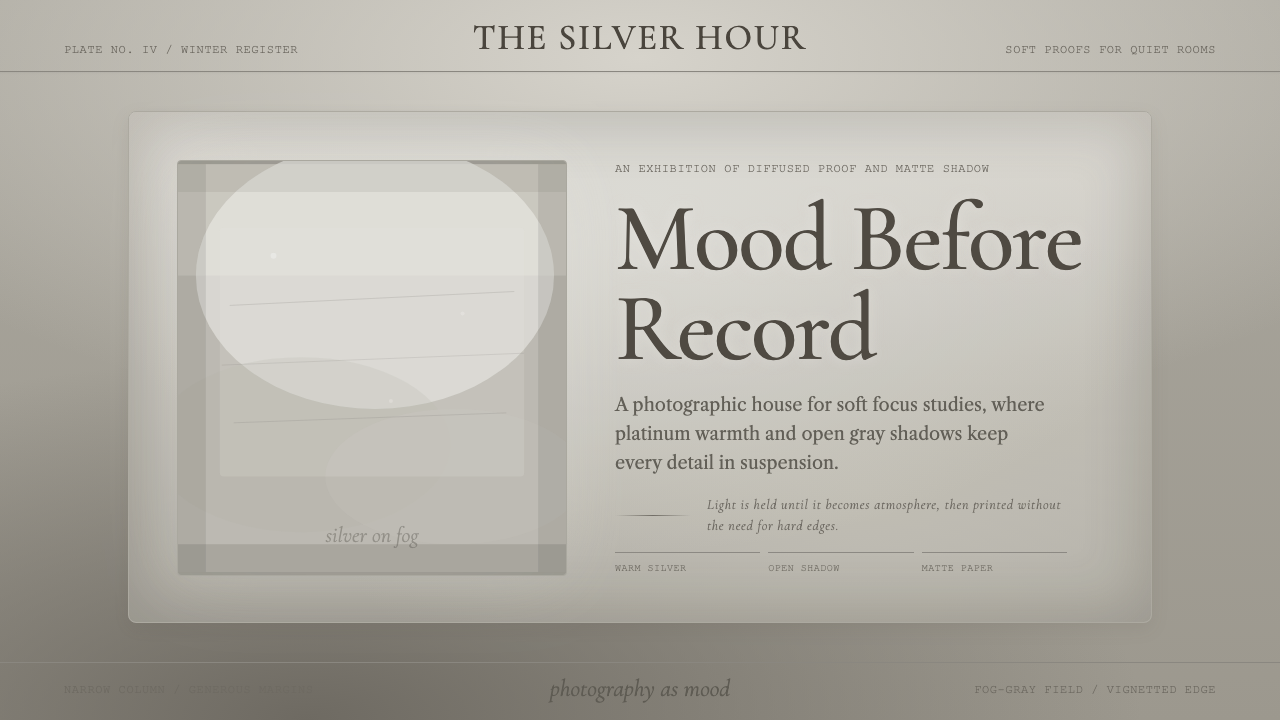
Pictorialist Fog Tonalism turns the camera's soft focus into a design language — warm grays, dissolving edges, and the conviction that mood matters more than sharpness.
Pictorialist Fog Tonalism in brief
Pictorialist Fog Tonalism is a design system drawn from the soft-focus photography of the Photo-Secession, the movement that dominated art photography in the early twentieth century. Its visual signature is diffusion: light that scatters rather than defines, tonal transitions that slide from one gray into the next without a visible seam, and a palette that never quite reaches black or white. Where most design systems build clarity through contrast, this one builds atmosphere through its absence.
The look descends directly from the platinum print and the gum-bichromate print — photographic processes prized at the time precisely because they refused sharp detail. A platinum print renders an enormous range of grays with no true black; a gum print can be worked by hand until the image reads more like a charcoal drawing than a mechanical record. Pictorialist Fog Tonalism keeps that inheritance intact: everything sits in the misty middle of the tonal scale, and edges are treated as something to be softened rather than sharpened.
Visually, the system reads as quiet rather than loud. Warm silver-grays replace pure neutrals. Shadows stay open — they darken without ever closing off into solid black. Vignetting frames the edges of a composition the way a lens's natural falloff would, gently dimming the corners rather than cropping them with a hard line. An elegant serif carries the small amount of type the system uses, and negative space is treated as generously as the fog itself — somewhere the eye is meant to rest, not rush past.
Where does Pictorialist Fog Tonalism come from?
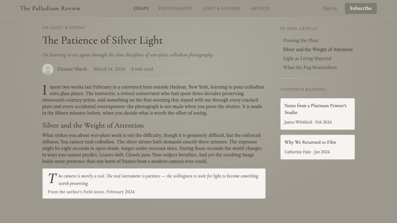
Pictorialism reached its peak between roughly 1890 and 1920, at a moment when photography was still fighting to be taken seriously as an art form rather than dismissed as mere mechanical documentation. The movement's American center of gravity was New York, where Alfred Stieglitz gathered a circle of like-minded photographers under the banner of the Photo-Secession, founded in 1902. Stieglitz ran the group's headquarters out of a small gallery at 291 Fifth Avenue — known simply as '291' — one of the first American spaces to treat photography with the same curatorial seriousness as painting.
Stieglitz and his circle argued that a photograph did not have to record the world with total fidelity to be truthful. A picture could be soft, manipulated, even scratched or brushed by hand, and still capture something more honest than a crisp documentary image — an emotional register, a fleeting atmosphere. This directly challenged the assumption that photography's only value lay in mechanical accuracy. The Photo-Secession's journal, Camera Work, reproduced these soft images in lavish photogravure printing and became the movement's primary vehicle for spreading its aesthetic.
The circle around Stieglitz included photographers who each pushed the soft-focus, tonal approach in their own direction. Edward Steichen produced moody, painterly landscapes and portraits that blurred the line between photography and Symbolist painting. Gertrude Käsebier photographed motherhood and domestic life with a gentleness that avoided any harsh documentary edge. Clarence H. White built a reputation on delicate, diffused interior scenes and later became an influential teacher, training a generation in the Pictorialist manner even as the wider photography world began to move on.
By the 1920s, a newer generation — associated with what would become known as 'straight photography' — argued that Pictorialism's soft focus and hand manipulation were a kind of dishonesty, a photograph pretending to be a painting. The movement receded from photography's mainstream, but its visual vocabulary never disappeared. The warm grays, the vignette, the refusal of hard edges persisted as a recognizable aesthetic register — one later designers would return to whenever they wanted an image to feel remembered rather than observed.
What defines the Pictorialist Fog Tonalism look?
Color
The palette lives entirely in the misty mid-light: warm silver-grays leaning slightly toward sepia rather than cold steel, and fog-neutral surfaces that read as neither warm cream nor clinical white. Nothing in the system is fully saturated, and nothing reaches pure black or pure white — the darkest shadow still carries a trace of gray warmth. This narrow tonal range is the entire mood of the system; widen it and the quiet dissolves.
Typography
An elegant serif carries the type, chosen for its soft, humanist letterforms rather than high-contrast display drama. Type is used sparingly and set with generous line spacing, as if the words themselves were suspended in the same haze as the imagery around them. Headlines gain their presence from scale and placement rather than weight or saturation, and body text stays quiet enough to let the surrounding atmosphere lead.
Diffusion and Soft Focus
Diffusion is the system's central technique: light and tonal transitions scatter rather than resolve into crisp lines. Where a conventional design system draws a boundary, this one lets one tone bleed into the next, echoing what a soft-focus lens does to a photographic image. The effect should never read as blur applied carelessly — it is a deliberate softening that keeps forms legible while stripping away their hard edges, the same restraint the original platinum and gum prints practiced.
Vignette and Framing
A vignette — the gentle darkening of a composition's edges — frames the system the way a lens's natural falloff once framed a Pictorialist print. It is never a hard border or a decorative frame; it is a gradual dimming that draws the eye inward toward a softly lit center. This framing device does double duty: it recreates the optical character of early lenses, and it reinforces the sense that the viewer is looking at something intimate and slightly veiled rather than fully exposed.
Negative Space
Space is treated as generously as the fog itself. Compositions favor a single quiet focal point surrounded by large areas of open, softly toned ground, rather than dense arrangements of competing elements. This generosity is not decorative emptiness — it performs the same function the haze does in a Pictorialist photograph, giving the eye somewhere unhurried to rest and letting the one element that matters carry the composition without competition.
Texture and Grain
Surfaces carry a faint, organic irregularity reminiscent of hand-worked print processes — the subtle unevenness left by a brushed gum-bichromate coating or the soft grain of a platinum print, rather than the perfectly even fields of a digital gradient. This texture is understated almost to the point of being felt rather than seen; its purpose is to keep every surface from reading as flatly manufactured, preserving the sense of a print that passed through human hands.
Composition and Stillness
Compositions favor stillness over motion — a single figure or object held quietly in soft light, rather than dynamic, high-energy arrangements. This stillness echoes the long exposures and deliberate posing common to Pictorialist portraiture, where subjects held their positions and the resulting image carried a contemplative, almost meditative quality. Anything the system frames should feel paused rather than caught in the middle of an action.

Who shaped Pictorialist Fog Tonalism?
Stieglitz founded the Photo-Secession in 1902 and ran its gallery at 291 Fifth Avenue, turning it into the movement's headquarters and one of the first American venues to treat photography as fine art. Through the journal Camera Work, he championed the argument that a soft, atmospheric image could be more truthful than a sharp documentary one, shaping how a generation of American photographers thought about mood and print quality.
Steichen produced some of Pictorialism's most painterly work, using soft focus and dim, atmospheric lighting to blur the boundary between photography and Symbolist painting. His landscapes and portraits from this period favor mood over description, and his mastery of gum-bichromate and other manipulated printing processes made him one of the movement's most influential practitioners, before he later helped push photography toward a sharper, more modern aesthetic.
Käsebier photographed motherhood, childhood, and domestic life with a gentleness that avoided any harsh documentary edge, becoming one of the most commercially and critically successful photographers of the Pictorialist era. Her soft, tender treatment of intimate subjects demonstrated that the movement's diffused aesthetic could carry genuine emotional weight, not merely decorative softness, and she was among the founding members of the Photo-Secession.
White built his reputation on delicate, diffused interior scenes rendered in warm, quiet tones, and became one of the Photo-Secession's founding members. He later became an influential teacher, founding his own school of photography and training a generation of students in the Pictorialist manner even as the wider photographic world began turning toward straight, unmanipulated photography.
How do you use Pictorialist Fog Tonalism today?
Pictorialist Fog Tonalism is a style built for restraint, and applying it well means resisting the temptation to sharpen anything. The system's entire emotional effect depends on keeping tones close together, edges soft, and space generous — a single crisp, high-contrast element anywhere in a layout will read as a mistake rather than an accent, because it breaks the illusion of looking through haze.
For presentation slides, the style suits cover pages and quiet content moments rather than dense data delivery. A cover slide benefits from a single soft, vignetted image or tonal field with the title set in understated serif type, floating rather than boxed. Content slides should keep text sparse and let generous margins do the work a bright accent color would do in a bolder system; where a slide must carry data, translate charts into simple, softly toned line or area forms rather than saturated bar colors, since anything too graphic will fight the mood rather than support it.
For web interfaces, the style works best on editorial-leaning surfaces — about pages, brand storytelling, portfolio presentation — rather than dense operational dashboards. If used for a dashboard or pricing page, the safest approach is to reserve the diffused treatment for hero and marketing sections while keeping functional data displays in plainer, higher-legibility type; numbers that must be scanned quickly do not benefit from soft focus. Pricing pages can use the vignette and warm-gray field to frame a small number of options elegantly, but comparison tables should stay crisp enough to remain scannable.
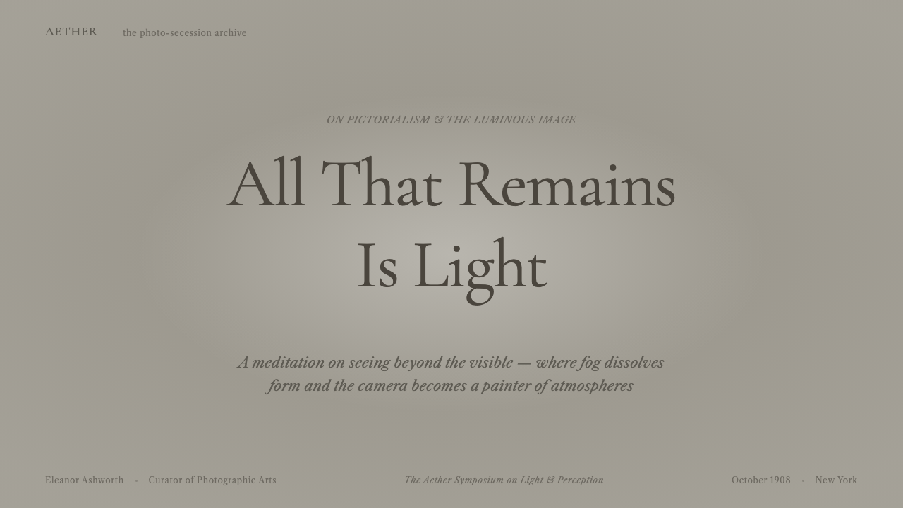
For editorial and marketing work, this is close to the style's natural home. Long-form articles, brand features, and photography-led marketing pages all benefit from the misty palette, generous whitespace, and vignetted imagery — the aesthetic was born from print and translates naturally back into print-like digital layouts. A hero section built around a single softly toned photograph, framed by a vignette, with a serif headline resting quietly beside it, captures the register at its best.
The most common mistake is treating this as simply 'a gray theme' and pairing it with sharp, modern sans-serif type, hard drop shadows, or saturated accent colors for calls to action. Any of these breaks the illusion immediately, because the system's coherence depends on every element — color, type, shadow, imagery — sitting in the same soft, misty register at once. A second common mistake is overusing the vignette as a heavy-handed border; it should read as a natural falloff of light, not a decorative frame stamped onto every image.
Pictorialist Fog Tonalism — FAQ
Is Pictorialist Fog Tonalism the same thing as a generic 'vintage photo filter' aesthetic?
They share surface similarities but come from different intentions. A generic vintage filter typically adds noise, color cast, or fading as a stylistic effect layered on top of an otherwise ordinary image. Pictorialist Fog Tonalism instead comes from an actual historical argument — that photography could be an emotional, painterly medium rather than a mechanical one — and its softness, warm grays, and vignetting are structural to the whole system, governing type, spacing, and composition, not just applied after the fact.
Can this style work with a dark background?
It can, but it changes the mood substantially. The historic palette lives in light, misty mid-tones — warm grays and open shadows that never close into true black — so a dark-ground treatment should still avoid pure black and keep shadows 'open,' with a faint warmth rather than cold, saturated darkness. Done carefully, a dark variant can feel like a print viewed in dim gallery light; done carelessly, it loses the fog entirely.
Why does the system avoid sharp edges and hard shadows so consistently?
Because sharp edges and hard shadows describe a world seen with total clarity, and this system is explicitly about a world seen through diffusion — the way light behaves passing through mist, or the way a soft-focus lens renders a scene. A hard shadow or a crisp edge signals mechanical precision, which contradicts the Pictorialist argument that photography, and by extension design, can be an instrument of mood rather than a record of fact.
What kind of imagery pairs best with this style?
Photography and photo-derived imagery pair most naturally, since the style descends directly from a photographic movement. Images with a single quiet subject, soft directional light, and minimal background clutter work best — a portrait, a landscape, a still life in gentle light. Busy, high-contrast, or brightly saturated photography works against the system, since it reintroduces the clarity the whole aesthetic is built to avoid.
Does this style suit every kind of product, or are there contexts where it struggles?
It suits contexts where mood, nostalgia, and a sense of craft matter more than speed or density of information: brand storytelling, editorial features, photography portfolios, and hospitality or wellness products that want to feel unhurried. It struggles where a user needs to scan dense information quickly — data-heavy dashboards, comparison tools, or anything requiring many similar items to be distinguished at a glance — since the system's soft, close tonal range makes fine distinctions harder to read.
Related design styles
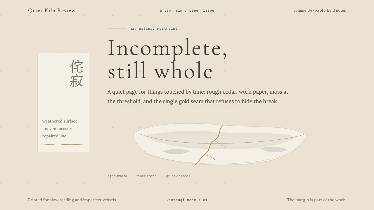 Wabi-SabiStillness makes imperfection whole. Washi beige, moss sage, and a spare gold…
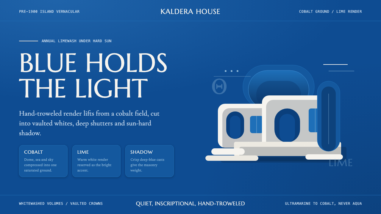 Cycladic SantoriniQuiet island gravity. Cobalt field, Marcellus capitals and white vaults hold…
 Grant Wood American Gothic (1930)Plainness stands firm. Dusty denim and ochre align on a strict central axis.
 Kaolin Porcelain Clay PitIndustrial calm in dust grey. Horizontal clay strata break for one milky turq…
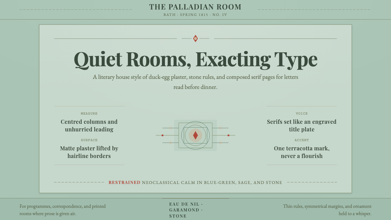 Regency EnglandCalm has authority. Duck-egg plaster, Garamond serifs, and hairline borders.
 Undyed Khadi WhiteModest, never cream. Greige homespun cotton with gray slub flecks and plain h…