What is Sámi Gákti & Duodji?
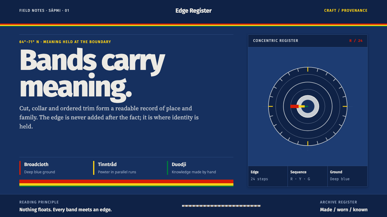
The gákti turns geography and marital status into a strict grammar of banding, worn against a field of deep blue wool that never competes with the story its edges are telling.
Sámi Gákti & Duodji in brief
The gákti is the traditional garment of the Sámi people, made from deep-blue wool broadcloth and banded at the hem, cuff, shoulder, and collar with narrow strips of red, yellow, and green. It belongs to Sápmi, the Sámi homeland spanning northern Norway, Sweden, Finland, and Russia's Kola Peninsula, and it has remained in continuous, everyday and ceremonial use since before 1900 — this is a living working system, not a revived or reconstructed one.
The bands are not decoration layered onto a finished garment; they are information. Cut, collar shape, trim placement, belt, and headwear combine to name a wearer's home region and family, functioning the way a coat of arms or a uniform insignia would in another tradition. A herder from one valley and a herder from the next would be identifiable at a distance, before either spoke a word, purely from how their collars and belts were banded. Even small details carry fixed meaning: the shape of a belt's buttons signals marital status, with square buttons indicating a married wearer and round buttons an unmarried one. Nothing on the garment is arbitrary or purely decorative — every band, every button, every placement is doing identifying work.
Duodji is the craft discipline that surrounds and produces the gákti — a body of skilled techniques rather than a separate decorative style. It includes pewter thread couched onto reindeer leather, narrow bands plaited by hand, and the risku, a metal brooch worn at the collar. Every one of these techniques produces a hard-edged, precisely placed mark rather than a soft or painterly effect, because the craft itself works in discrete, countable units — a length of thread, a plaited strand, a single brooch — rather than in continuous washes of color.

Where does Sámi Gákti & Duodji come from?
The gákti predates 1900 and belongs to Sápmi, a homeland that stretches across four modern national borders — northern Norway, Sweden, Finland, and Russia's Kola Peninsula — without itself being a single state. Because the garment developed independently across this wide, cold, historically nomadic and semi-nomadic territory, regional variation became the system's organizing principle from the start: a gákti was never meant to look the same everywhere, because looking different from a neighboring region was exactly the point.
That regional variation is legible because the coding is consistent within it: a viewer who knows the system can read cut, color placement, and trim the way a reader reads a label. This is why the style is often described as identity worn at the edge rather than identity announced at the center — the meaningful information sits at hems, cuffs, collars, and belts, the parts of a garment that touch the boundary between the wearer and the world.
Duodji, the craft tradition that produces the garment's pewter embroidery, plaited bands, and risku brooches, runs alongside the gákti as its own discipline with its own transmitted skills, passed down through practice rather than through a single founding document or school. It is named directly among this system's defining movements, alongside the broader Sámi national revival — the twentieth-century assertion of a distinct Sámi political and cultural identity across the four countries Sápmi spans.
That revival reached a formal milestone in 1986, when Astrid Båhl designed the Sámi flag. Her decisive choice was to draw the flag's colors from the existing gákti costume rather than invent a new palette — red, yellow, green, and blue moved from garment to flag, not the other way around. The flag's 1986 codification is the one precisely dated event in this system's history, and it matters because it confirms that the costume's color logic came first: the flag borrowed its authority from clothing that had already been carrying identity for generations.
What defines the Sámi Gákti & Duodji look?
Deep Blue Ground
The base garment is a deep, dark blue wool broadcloth, dense enough to function as a stable field rather than a background that fades. Every other color in the system is read against this blue, never against white or neutral gray.
Ordered Band Sequence
Red, yellow, and green appear as narrow, clearly separated bands rather than blended or overlapping fields. The sequence and spacing of the bands is fixed and repeatable, not improvised for each piece.
Edge Placement
Bands sit at hem, cuff, shoulder, and collar — the boundary points of the garment — rather than across its main body. Information lives at the edge; the large central fields stay plain blue.
Coded Trim
Specific trim details carry fixed, readable meaning rather than free aesthetic choice — a belt button's shape alone distinguishes married from unmarried, the way a badge or insignia would in a uniform system.
Pewter-on-Leather Embroidery
Pewter thread is couched onto reindeer leather in precise, hard-edged lines. The metal thread reads as a bright, linear accent against dark leather, never as a soft glinting texture.
Risku Brooch
A metal disc brooch worn at the collar functions as a single fixed focal point, placed exactly where the garment's most information-dense trim already gathers, rather than floating independently across the composition.

Who shaped Sámi Gákti & Duodji?
Astrid Båhl designed the Sámi flag in 1986, drawing its red, yellow, green, and blue directly from the existing gákti costume rather than inventing a new color scheme. Her decision to let clothing dictate the flag, rather than the reverse, is the clearest documented proof that the garment's color and banding logic came first and carried its own settled authority before it was ever asked to represent a nation.
The craftspeople working within the duodji tradition are responsible for every technique that gives the gákti its precision: pewter thread couched onto reindeer leather, hand-plaited trim bands, and the metal risku brooch. Their skills are transmitted through practice rather than a single school, and their work is what turns the garment's coded meaning into a physical, wearable object.
Spread across northern Norway, Sweden, Finland, and Russia's Kola Peninsula, Sápmi's regional Sámi communities are the reason the gákti varies by place at all. Each community's distinct cut, color placement, and trim is what the garment's coding system exists to distinguish, making the communities themselves the origin point of the style's core organizing logic.
How do you use Sámi Gákti & Duodji today?
Sámi Gákti & Duodji transfers well anywhere a design needs to communicate identity, belonging, or origin through precise, coded detail rather than through broad decorative gesture — but the transfer only works if the deep blue stays the dominant field and the color bands stay narrow, ordered, and pushed to the edges.
For presentation slides, a cover page should hold to a deep blue field with a single ordered band of red, yellow, and green run along one edge — top, bottom, or side — rather than centered as a decorative motif. Content slides should keep body areas plain and reserve the banded color sequence for section dividers or slide edges, echoing the way the garment keeps its main body blue and its meaning at the boundary.
For web interfaces, the palette suits products built around identity, membership, or regional customization — profile systems, community platforms, or anything that needs to visually distinguish one group or tier from another. A deep blue base with a consistent, ordered accent-band system reading at the edge of cards or navigation elements can carry the same coded, information-dense function the garment's trim carries, without needing text labels to do all the work. A settings or account page, for instance, can use a fixed sequence of narrow colored bars along a sidebar edge to signal plan tier or region, the way a belt button once signaled marital status — small, consistent, and legible at a glance.
For editorial and brand work, the style supports a strong masthead or cover treatment: deep blue ground, a fixed sequence of narrow accent bands at a top or side edge, and a single metallic accent point — echoing the risku brooch — reserved for a logo mark or one focal detail. The bands should never wrap the entire page; they belong at hems and edges, not scattered through the body of a layout.
A common mistake is treating this style as a generic 'primary color plus blue' scheme and spreading red, yellow, and green evenly and centrally across a design. The system's actual discipline is the opposite: color is rationed to edges, ordered in a fixed sequence, and kept narrow, while the large central fields stay calm and monochrome. A design that centers the color bands loses the exact quality — information at the boundary — that makes the source system legible.
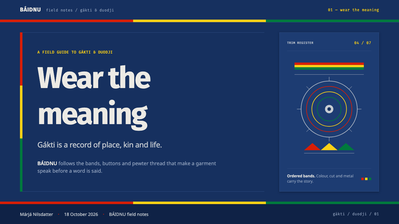
Sámi Gákti & Duodji — FAQ
Is this the same as a generic Scandinavian or Nordic color scheme?
No. Generic Nordic design tends toward pale neutrals and restrained accent color spread evenly across a layout. This system is built on a deep, saturated blue field with narrow, ordered bands of red, yellow, and green pushed specifically to edges and boundaries, where they carry fixed coded meaning about region and status. The two traditions come from the same broad geography but follow opposite instincts about where color belongs.
Can the deep blue ground be swapped for a lighter background?
It can, but doing so removes the stable, dark field that the ordered color bands were designed to read against, and the coded, edge-placed quality of the system tends to weaken as a result. If a lighter ground is necessary, keep the accent bands narrow, ordered, and pushed to edges rather than letting them spread — the placement discipline matters more than the exact darkness of the base color.
Why does the system put meaning at the edges instead of the center?
Because on the actual garment, the edges — hem, cuff, collar, belt — are the parts that meet the world and are most visible in passing encounter, making them the most efficient place to encode identifying information. A viewer does not need to inspect the whole garment to read who someone is; a glance at the trim is enough. Applying the same logic to a layout means reserving cards, borders, and navigation edges for the information that most needs to be scanned quickly.
Does this style require real duodji craft techniques to be authentic?
The physical techniques — pewter-on-leather embroidery, hand plaiting, metal brooch work — belong to a living craft tradition and should not be reproduced as costume in unrelated commercial work. What transfers safely to design is the underlying visual discipline: a stable dark ground, narrow ordered color bands held to the edges, and a single fixed metallic focal point, rather than a literal copy of any specific garment or ornament.
What kind of products or contexts does this style not suit?
It struggles in contexts that call for loose, improvisational, or highly saturated all-over color — playful consumer entertainment, generative art tools, or anything where the brand voice is deliberately unpredictable. The style's authority depends on fixed, repeatable coding and a calm, dominant dark field; forcing bright, freely arranged color across the whole surface erases the very discipline that makes it legible as this system rather than as generic folk pattern.
Related design styles
 Bulgarian Kukeri MummersRitual darkness hits first. Scarlet wool, brass bells, and bone type stomp ac…
 Samoan Tatau (Pe'a)Gravitas without softness. Soot-black geometry locks into warm skin-tone gutt…
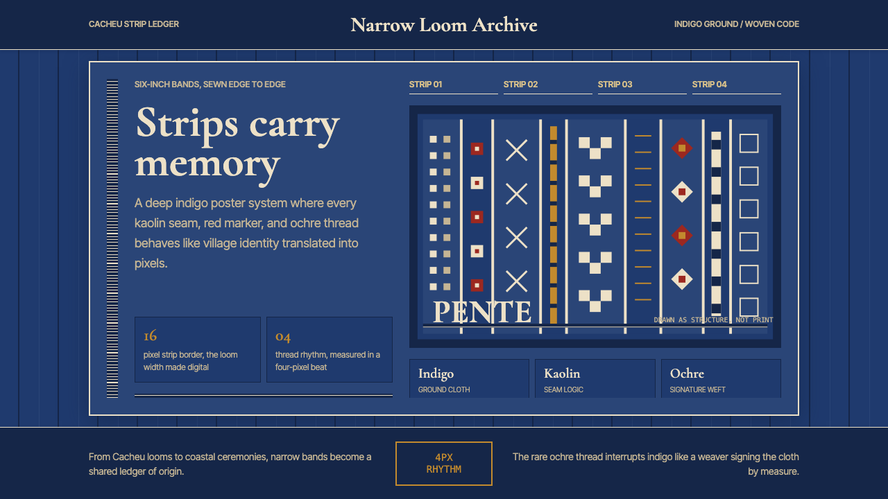 Bissau-Guinean Pano de PenteIndigo remembers. Narrow bands and kaolin seams turn weave grammar into pixel…
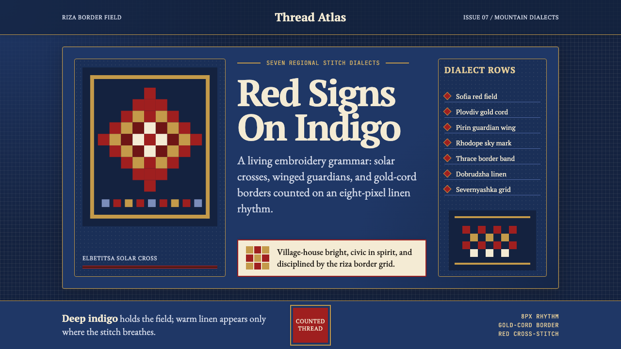 Bulgarian Shevitsa Folk EmbroideryVillage-bright code. Deep indigo carries shevitsa red crosses and gold-cord b…
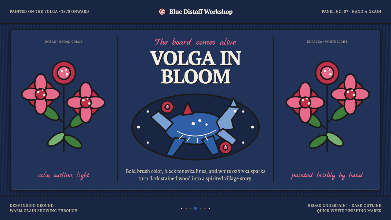 Gorodets Folk Panel PaintingFolk color moves at a gallop. Blue forms, red roses and white dots spark on i…
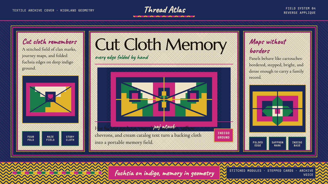 Hmong Paj Ntaub (Flower Cloth)Memory is geometric. Fuchsia applique on indigo forms stepped maze panels.