What is Gorodets Folk Panel Painting?
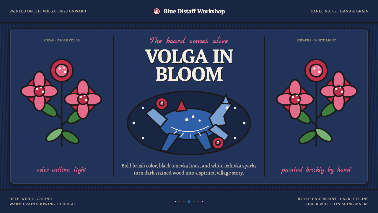
Gorodets painting makes folk color gallop across dark wood — blue horses, red flowers, black outlines, and white sparks held together by the visible confidence of the hand.
Gorodets Folk Panel Painting in brief
Gorodets Folk Panel Painting is a decorative folk style from Gorodets, a Volga town in Russia’s Nizhny Novgorod region. It first appeared on carved distaffs and later extended across wooden panels, chests, and furniture. The style is immediately recognizable for its deep indigo stained-wood ground, prancing blue horses and riders, symmetrical flowers, and leafy sprays that seem to move outward from the painted surface.
Its visual energy comes from contrast rather than subtle modeling. Saturated red flowers, blue forms, and crisp white marks stand sharply against dark wood. The palette does not dissolve into pastel softness, and the surfaces do not imitate polished digital smoothness. The grain of the wood remains part of the composition, while the brushwork retains the directness of a hand-painted object.
The painting is constructed through a clear layered method. Broad strokes establish the main colors and silhouettes; black graphic outlining, known as tenevka, gives the forms their definition; then small white ozhivka highlight dots enliven petals, leaves, and other details. The result is decorative without becoming slick: every mark feels placed by hand, and every accent helps the painted scene stay vivid against the dark ground.

Where does Gorodets Folk Panel Painting come from?
Gorodets painting belongs to the Russian folk panel-painting tradition and is tied specifically to the Volga settlement of Gorodets in the Nizhny Novgorod region. Its documented school emerged in the nineteenth century, from the 1870s onward. The style’s early support was not a neutral gallery surface but the carved distaff, an object whose wooden body already carried a practical and material identity before painting was added.
The move from distaffs to panels, chests, and furniture expanded the field in which the visual language could operate. The painted surface remained wood, and that continuity matters: the style does not attempt to conceal its support. Dark staining, exposed grain, and broad hand-brushed forms allow the object beneath the decoration to remain present rather than disappearing under an artificial image.
The Gorodets school developed its identity through recurring subjects and a stable method of construction. Blue horses and riders provide movement; kupavka and rozan roses establish floral rhythm; leafy sprays connect the separate motifs. These elements are not presented as isolated naturalistic studies. They are arranged as a decorative system in which symmetry, repetition, and directional movement make the wooden surface feel animated.
Its character is therefore inseparable from the relationship between folk subject matter and direct craft technique. The dark indigo ground gives the saturated colors their force, black tenevka makes the motifs legible, and white ozhivka marks supply the final spark. The style’s history is carried not by named individual authors in the approved material, but by the collective practice of village distaff-painters and the continuing Gorodets school.
What defines the Gorodets Folk Panel Painting look?
Dark Wood Ground
The dark indigo stained-wood ground is the stage on which every other color becomes active. It is not merely a background fill; the visible wood and its grain establish the material identity of the piece. The darkness gives the blue horses, red flowers, and white accents a concentrated brightness, while the uneven presence of wood keeps the composition connected to craft rather than a perfectly sealed image surface.
Folk Saturation
Color is saturated, direct, and unapologetically decorative. Blue forms, red roses, and white marks are placed for immediate visual impact against the dark ground. The palette does not rely on pastel transitions or restrained neutral modulation. Its force comes from the collision of strong color areas, allowing the painted object to announce itself with the liveliness of a folk celebration.
Prancing Horses
The blue horse and rider are among the style’s strongest carriers of movement. Their posture is not treated as a quiet naturalistic study but as a decorative gesture: the body, legs, and rider create a readable rhythm across the panel. Against the stillness of the wood, the horse supplies a galloping pulse, giving the composition its characteristic sense of forward motion.
Floral Symmetry
Kupavka and rozan roses bring a symmetrical floral counterpoint to the moving horse forms. Their arrangement gives the panel a sense of balance without making it rigid. Petals are organized as bold decorative shapes, then enlivened by dark outlining and white ozhivka dots. The flowers feel emblematic rather than botanically descriptive, designed to carry rhythm, color, and visual fullness.
Graphic Outlining
Black tenevka outlining gives the broad underpainted forms their graphic authority. It separates neighboring colors, clarifies petals and leaves, and prevents the saturated palette from dissolving into visual noise. The line is not a delicate contour attempting to imitate soft natural edges. It is a confident structural mark that makes the folk image legible at a glance.
Ozhivka Highlights
White ozhivka marks act as small bursts of life across the painted surface. Their role is not to create polished realism or smooth reflected light. They punctuate petals, leaves, and other forms with crisp interruptions, making the hand-painted pattern feel animated. Because the marks are bright and sparse, each one carries emphasis and helps the decorative structure remain open and energetic.

Who shaped Gorodets Folk Panel Painting?
The village distaff-painters of the Gorodets school are the collective makers named in the approved material. Their work establishes the connection between carved wooden objects and painted folk decoration. The distaff is not treated as an incidental support: it is the original setting in which the style’s dark wood ground, broad color, recurring motifs, and hand-brushed directness came together.
The documented Gorodets school gives the tradition its regional identity and continuity. It is defined less by a single signature than by a shared visual vocabulary: blue horses and riders, kupavka and rozan roses, leafy sprays, dark stained wood, black tenevka, and white ozhivka. The school’s strength lies in how consistently these parts can be recombined without losing their folk character.
The painters who carried the language from distaffs onto panels, chests, and furniture represent the tradition’s expansion through wooden objects. Their contribution is understood through the surfaces they worked on rather than through individual biographies. By preserving the wood ground while enlarging the field for horses, flowers, and foliage, they allowed the same decorative logic to inhabit a wider family of everyday forms.
How do you use Gorodets Folk Panel Painting today?
For presentation covers, Gorodets painting works best when the first impression is allowed to be bold and concentrated. A dark wood-like field can carry a large blue horse, a red floral cluster, or a sweeping leafy spray, while the title sits in a clear contrasting area. Content slides should preserve the same logic: use one dominant motif, keep supporting text calm and legible, and let white highlight marks act as small moments of emphasis. Data slides can treat charts as painted emblems, using saturated color blocks and strong outlines instead of soft atmospheric effects.
For web interfaces, the style suits dashboards and pricing pages that need a memorable visual identity without losing hierarchy. A deep indigo ground can organize the page, while red, blue, and white distinguish active states, categories, or important figures. Cards should feel like framed wooden panels, with clear dark outlines and visible separation between regions. The interface should retain generous breathing room around the motifs so the folk pattern remains energetic rather than becoming a dense decorative wallpaper.
For editorial and marketing work, Gorodets painting offers a strong relationship between object, story, and surface. An article can introduce a dark field, a single horse or floral motif, and a narrow text column that leaves the painted forms room to move. Section openings can use a red rose or leafy spray as a visual marker, while marketing compositions can place products inside a panel-like frame. The most convincing applications keep the wood character visible and allow irregular brushwork to carry warmth.
A common mistake is to reproduce only the color combination while removing the material and brush logic that makes the style distinctive. Blue, red, and white placed on a dark background are not enough if every edge is perfectly smooth, every surface is gradient-polished, and the wood grain has been erased. Another mistake is to scatter horses, roses, and leaves without a compositional rhythm. The style depends on broad shapes, graphic outlining, selective white accents, and a clear relationship between movement and balance.
Gorodets painting is also easy to weaken through excessive restraint. If the colors are muted into dusty neutrals, the dark ground becomes merely fashionable rather than material, and the white ozhivka marks are treated as random decoration, the result loses its folk directness. The style needs confident saturation and visible hand presence. Its sophistication comes from controlled recurrence and contrast, not from smoothing away every sign of making.

Gorodets Folk Panel Painting — FAQ
What makes Gorodets painting different from a generic folk floral style?
Its identity comes from a specific combination of material, subject, and mark-making. The dark indigo stained-wood ground, blue horses and riders, kupavka and rozan roses, leafy sprays, black tenevka outlining, and white ozhivka dots operate together. Removing the wood character or the graphic brush method leaves a generic decorative surface rather than a convincing Gorodets-derived language.
Why is the visible wood grain important?
The wood grain keeps the decoration tied to the object that carries it. Gorodets painting began on carved distaffs and later appeared on panels, chests, and furniture, so the support is part of the tradition’s identity. Visible grain also prevents the work from feeling digitally sealed or mechanically perfect. It reminds the viewer that the painted image belongs to a made wooden thing.
Are the white ozhivka dots meant to imitate realistic light?
No. Their purpose is to enliven the decorative forms rather than create smooth naturalistic illumination. They appear as crisp, hand-placed accents across petals, leaves, and other motifs. The marks interrupt the larger color fields and make them feel active. They are closer to visual punctuation than to a realistic rendering of reflected light.
Can the style be used without horses?
Yes, provided the broader system remains intact. The blue horse and rider are strong recurring motifs, but the style also depends on flowers, leafy sprays, dark stained wood, saturated color, tenevka outlining, and ozhivka highlights. A composition centered on roses or foliage can still feel related if it preserves the same direct material presence, graphic clarity, and lively contrast.
Related design styles
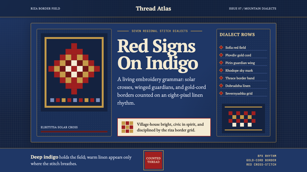 Bulgarian Shevitsa Folk EmbroideryVillage-bright code. Deep indigo carries shevitsa red crosses and gold-cord b…
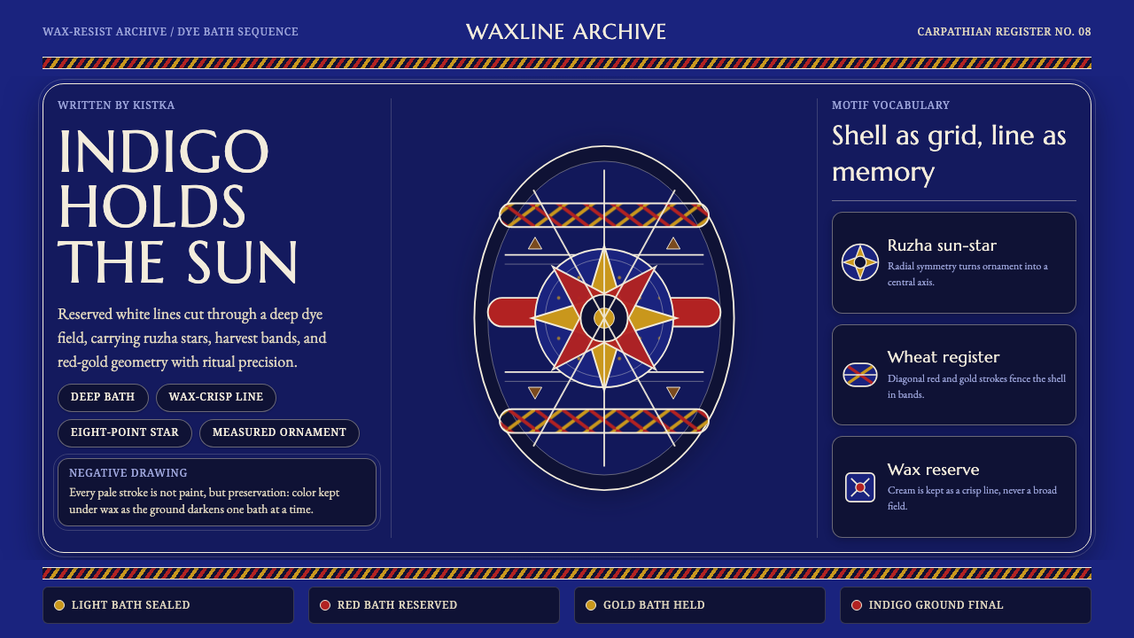 Ukrainian Pysanka Wax-Resist EggIndigo preserves ritual geometry. Wax-white lines hold red-gold stars and whe…
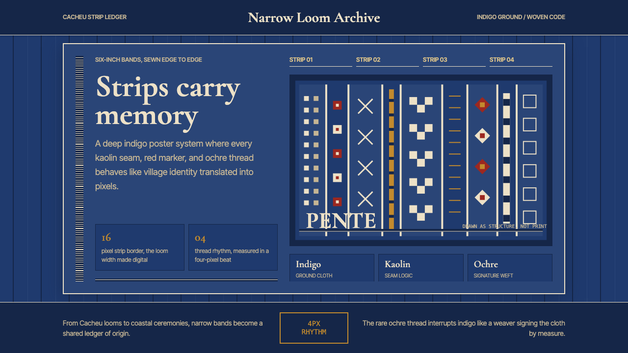 Bissau-Guinean Pano de PenteIndigo remembers. Narrow bands and kaolin seams turn weave grammar into pixel…
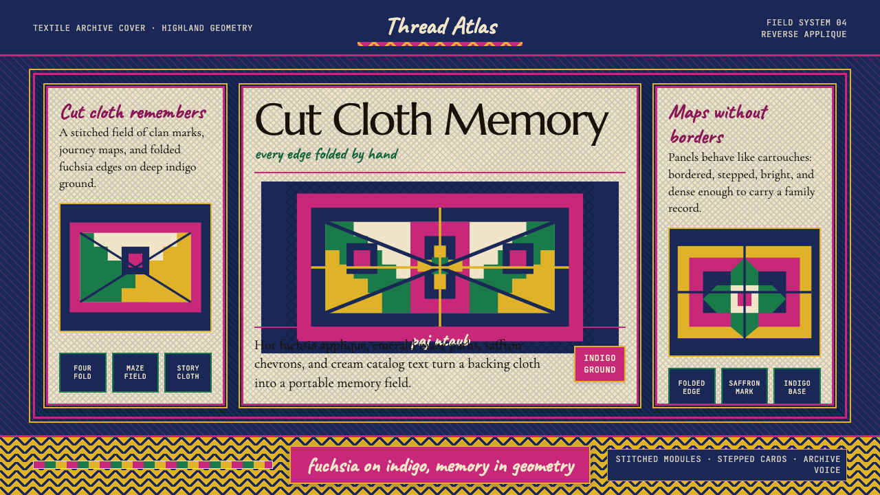 Hmong Paj Ntaub (Flower Cloth)Memory is geometric. Fuchsia applique on indigo forms stepped maze panels.
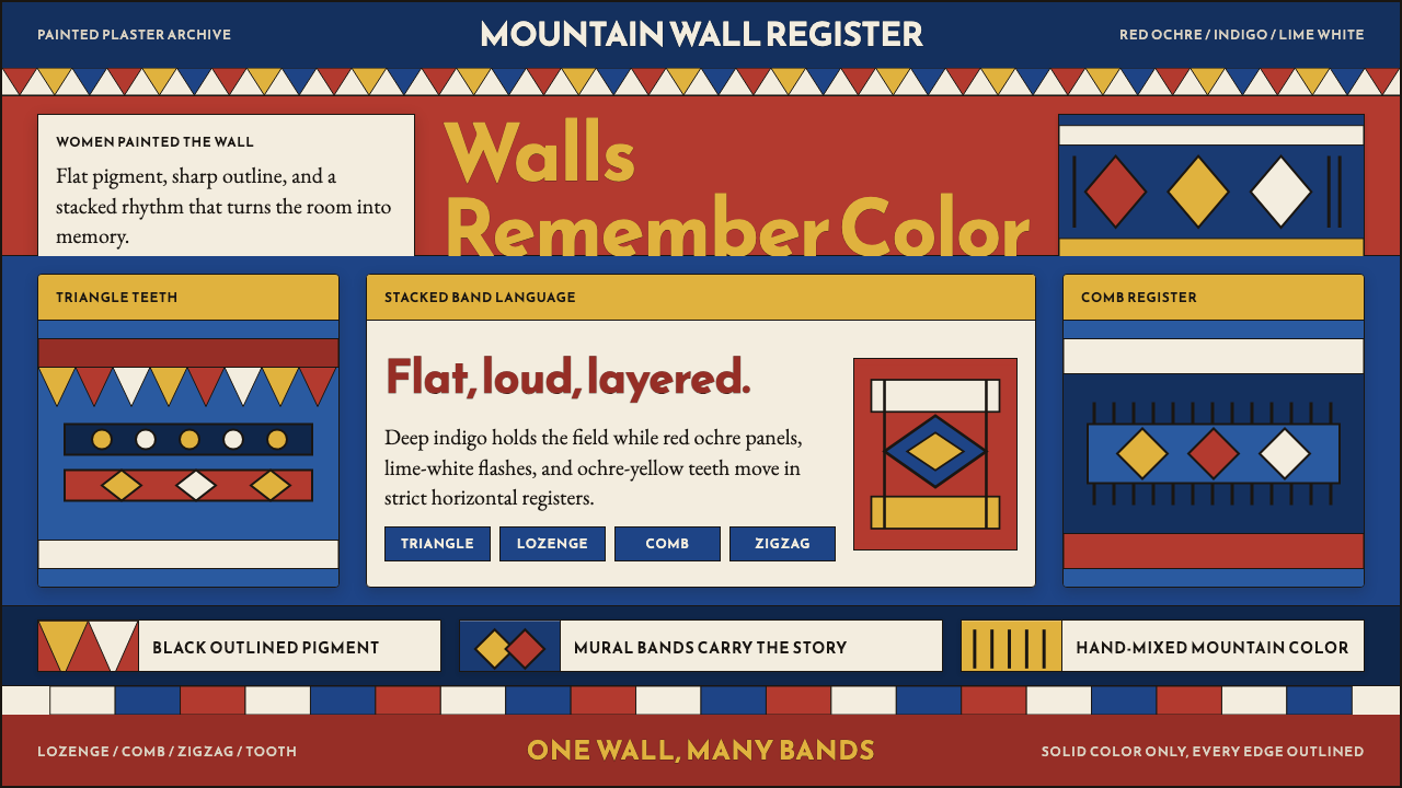 Saudi Asiri Qatt Wall PaintingPainted walls speak loudly. Indigo bands, red triangles, ochre teeth, black o…
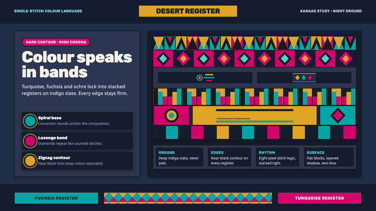 Wayuu Mochila CrochetColour speaks in bands. Turquoise, fuchsia and ochre stack on indigo-slate.