What is Sake Brewery Kura?
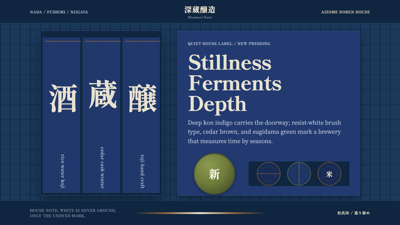
Sake Brewery Kura is the quiet authority of an old Japanese brewhouse — deep indigo cloth, resist-dyed white characters, and a cedar ball hanging at the eaves to mark the season's new brew.
Sake Brewery Kura in brief
Sake Brewery Kura draws its visual language from the sakagura — the traditional brewing houses of Japan, many of them centuries old, clustered in regions like Nada near Kobe, Fushimi near Kyoto, and Niigata. These are working buildings, not showrooms, and the style reflects that: it is a trade identity built by craftspeople for craftspeople, meant to signal reliability and long practice rather than to seduce a casual passerby.
The two objects that anchor the entire system are the noren and the sugidama. The noren is a split cloth curtain, dyed deep indigo and hung across a shop's entrance, with the brewery's mark or name rendered in resist-dyed white where the cloth was bound or pasted to block the dye before immersion. The sugidama is a ball of bundled cedar sprigs hung under the eaves each time a new batch of sake is pressed; fresh green when hung, it browns slowly over the following months, turning the building itself into a visible calendar of the brewing season.
Everything in this system is built from that same logic: deep indigo as the dominant field, white reserved for characters and marks rather than open background, and warm cedar-brown as a secondary material note. Nothing is bright, nothing is loud, and very little is purely ornamental — even the circular stamp on a sake cask exists because the mark had to be legible at a glance across a warehouse floor, not because a designer decided the composition needed a circle.
Where does Sake Brewery Kura come from?
Sake brewing in Japan is an old craft, but the visual identity captured by this system belongs specifically to the commercial brewing houses that matured through the Edo period (1603–1868), when many of the breweries still operating today were founded. Regions with reliable water sources, good rice-growing land, and access to trade routes — Nada, on the coast near Kobe; Fushimi, south of Kyoto; and Niigata, in the snow country of the north — grew into recognized centers of production, each developing its own reputation for a particular style of sake alongside its own visual house marks.
The noren curtain predates sake brewing by a long way; it originated as a simple sun and dust screen for shopfronts across many trades in pre-modern Japan. What sake breweries did with it was formalize it into a trade signal — the deep indigo dye (aizome), extracted from fermented indigo leaves and requiring a slow, skilled dyeing process, became closely associated with brewing and other traditional craft trades because of both its durability and its symbolic weight of seriousness and permanence. The white characters left un-dyed by resist paste or binding were not just legible marks; they were proof of the labor and precision that went into producing the cloth itself.
The sugidama has its own separate and specific origin: cedar has long been associated with Shinto shrines dedicated to the deity of sake brewing, and a ball of fresh cedar branches hung outside a brewery functioned as both an offering-adjacent symbol and a purely practical announcement — new sake is ready. Because the ball's color shifts predictably from green to brown as the cedar dries, it also gave customers and rival brewers alike a way to judge, from the street, roughly how long ago a batch had been pressed.
Central to the entire craft is the tōji, the master brewer — traditionally a seasonal specialist, often from a farming background, who took charge of the brewing process during the cold months and answered for the quality of an entire season's output. The tōji's name and reputation, along with the brewery's inherited mark, were what the noren and cask stamps were ultimately advertising: not a season's marketing campaign, but a lineage of technique passed down and defended over generations. Long-established houses such as Gekkeikan, founded in Fushimi in the seventeenth century, exemplify how a single visual mark — refined only slightly over centuries — could carry that inherited trust forward largely unchanged.
What defines the Sake Brewery Kura look?
Indigo Ground
Deep kon indigo is the dominant field color across the entire system — dark, saturated, and cool rather than warm. It functions the way a dark neutral would in another system: everything else in the palette exists as an accent against it, never as an equal partner.
Resist White
White never functions as an open background in this system. It appears only where dye was deliberately blocked — as characters, marks, or crests standing against the indigo field. This is the single most important discipline to preserve: white is a figure, drawn with intent, not empty canvas space.
Vertical Calligraphy
Brush-written characters run vertically, in the traditional top-to-bottom, right-to-left order, with visible variation in stroke weight that reflects the speed and pressure of a real brush. This vertical orientation is structural to the noren format and should not be casually rotated to horizontal without losing the format's authenticity.
Cedar and Green Accents
Warm cedar-brown and a muted sugidama green appear as secondary material notes — the brown recalling aged wood barrels and building timbers, the green recalling a freshly hung cedar ball before it dries. These accents are used sparingly, as material texture rather than as a competing color story against the indigo.
Noren Panel Format
The split, hanging-panel format of the noren — a rectangular cloth, sometimes divided into two or three vertical sections by a slit — is a distinct compositional unit that can be echoed in card layouts, section dividers, or navigational elements, giving the design a recognizable silhouette beyond just its color palette.
Cask Roundel Marks
Sake casks are traditionally marked with a circular stamp bearing the brewery's crest or name, sized and weighted for at-a-glance recognition across a warehouse or shop floor. This roundel format works as a compact logo or badge treatment — simple, high-contrast, and legible at small sizes rather than intricate or densely detailed.
Restraint and Craft Seriousness
Nothing in this system is decorative for its own sake. Every recurring element — the noren, the sugidama, the cask stamp, the vertical brush type — exists because it originally served a working, practical purpose. Applying the style well means preserving that sense of purposeful restraint rather than adding flourishes that a genuine brewhouse identity would never have carried.
Who shaped Sake Brewery Kura?
Founded in Fushimi in 1637, Gekkeikan is one of Japan's oldest and best-known sake breweries, and its long continuity illustrates how a brewery's visual mark — a crest, a noren pattern — could remain recognizable and largely unaltered across many generations of production. Its history spans the exact commercial-brewing tradition this style draws from.
The tōji is not a single historical person but a traditional craft role — a seasonal master brewer, historically often drawn from farming communities, who oversaw the brewing process each winter and whose reputation was staked on that season's output. The system's emphasis on inherited mark and quiet authority over flashy branding reflects the tōji tradition's own values: skill proven over repeated seasons, not a single dramatic gesture.
Traditional indigo-dyeing craftspeople, working in the aizome technique, are the unnamed but essential authors of the noren's core visual signature. Their slow, skilled process of fermenting indigo leaves and applying resist paste or binding before dyeing produced the deep, durable blue and crisp white reserve that define the palette; the quality of a noren's dye work was itself a form of craft reputation, much like the sake inside the building it hung in front of.
How do you use Sake Brewery Kura today?
Because this style was built by working trades for practical, legible signage rather than for seduction, applying it well means favoring clarity and restraint over visual richness at every decision point.
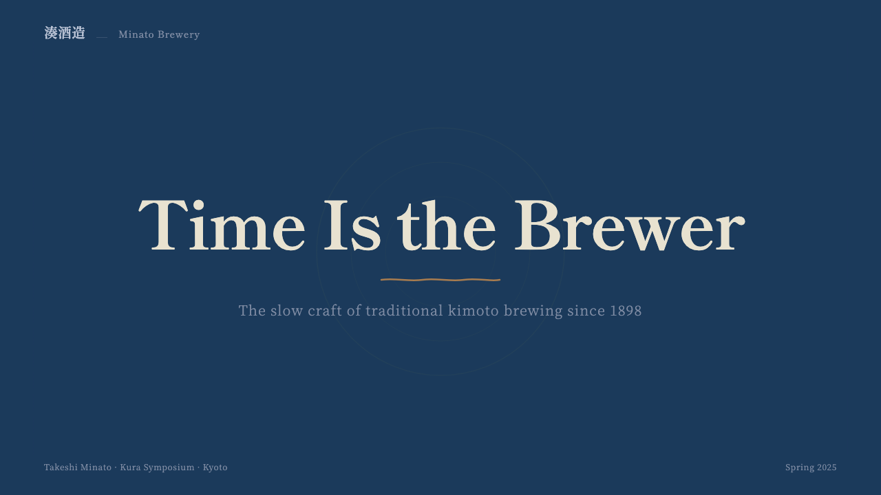
On presentation slide covers, the style works best when a deep indigo field carries a single vertical or centered white mark — echoing a noren's crest — rather than a busy composite of imagery and text. Content slides should treat section dividers as noren-panel breaks: a vertical slit or seam motif separating blocks of information, with body text kept plain and left-aligned rather than centered or heavily styled. Data should be shown in simple, high-contrast roundel or badge treatments rather than elaborate charts, echoing the cask-stamp aesthetic of at-a-glance clarity.
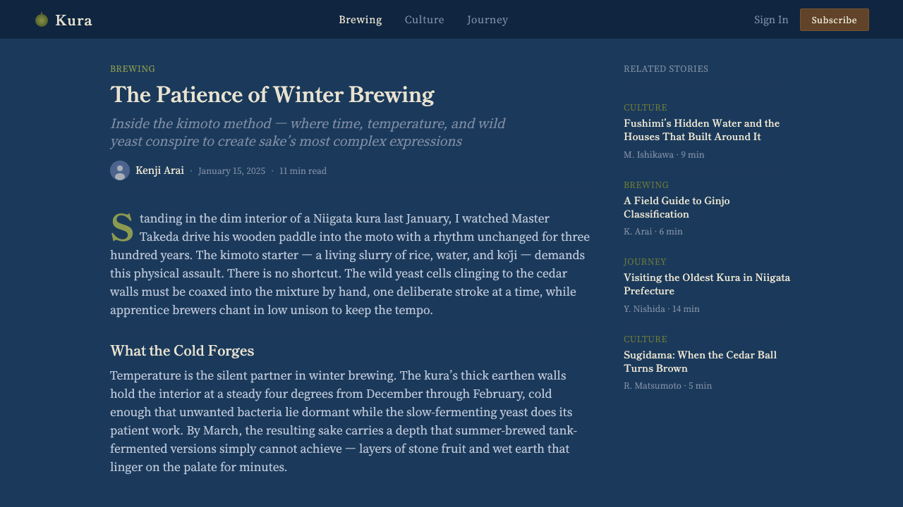
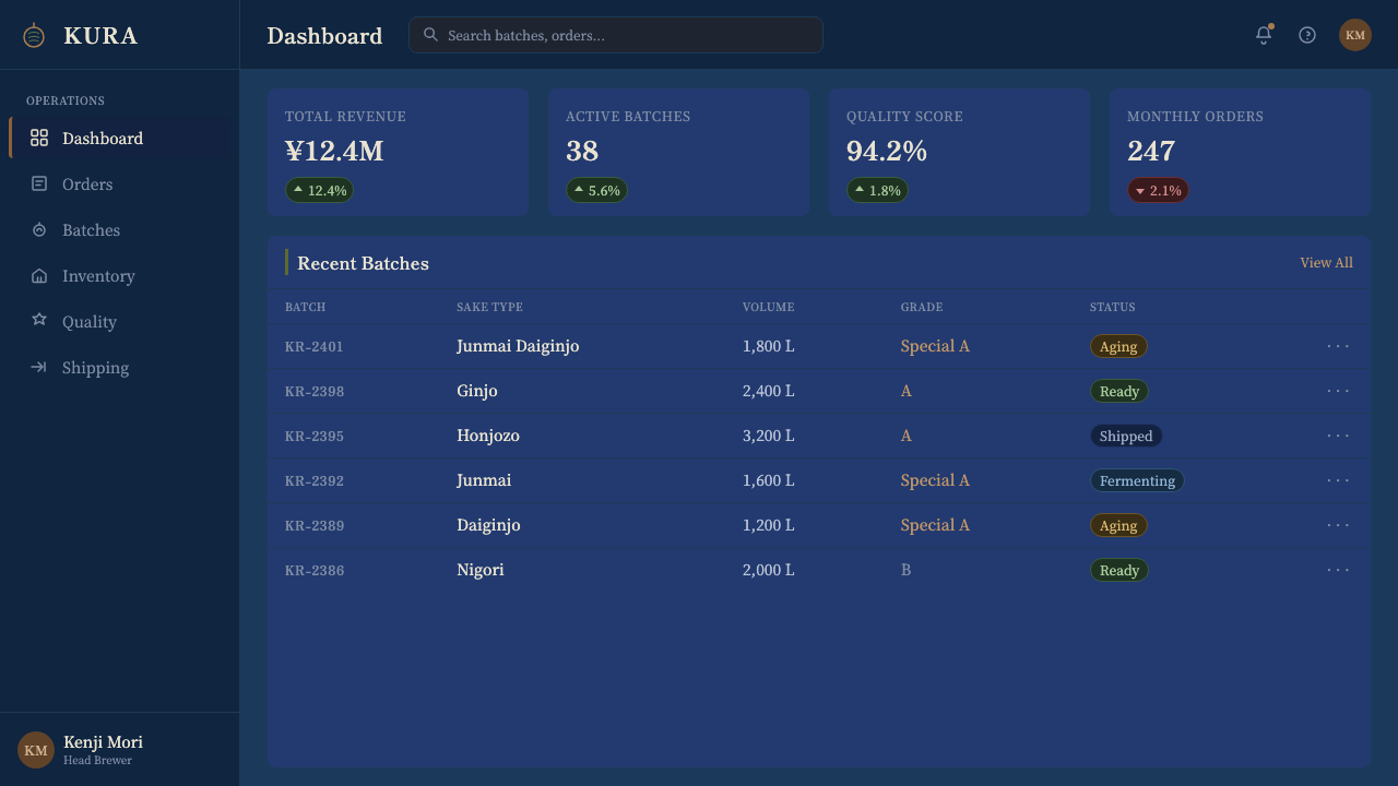
For web interfaces, this palette suits premium food, beverage, and craft-heritage brands particularly well — a dark indigo header or navigation bar with resist-white logotype signals seriousness and lineage rather than novelty. It is a poor match for playful consumer apps or anything that needs to feel light and casual; the style's entire emotional register is one of quiet, earned authority, and forcing bright accent colors or rounded, friendly UI chrome onto it undercuts that authority immediately.
In editorial and marketing contexts, the style supports strong, simple hero treatments: a full-bleed indigo field, a single white mark or short line of vertical type, and generous surrounding space that reads as considered rather than empty. Pull quotes and callouts work well set as narrow vertical panels reminiscent of a noren's split sections rather than as horizontal boxed call-outs.
A common mistake is treating indigo simply as 'a dark blue' and pairing it with bright, saturated accent colors as though building an ordinary modern brand palette. This style depends on tonal restraint — cedar brown and muted green are the only accepted companions to the indigo-and-white core, and introducing red, orange, or neon accents breaks the craft-trade seriousness the whole system is built to project.
Sake Brewery Kura — FAQ
Does this style require literal Japanese characters, or can it work with other alphabets?
The vertical brush-written mark is a defining structural element, but the underlying discipline — a resist-white mark standing against a deep indigo field — can be translated to other scripts or even to a simple monogram or crest, as long as the mark is treated as a carved-out figure rather than text floating on an open background. What must be preserved is the relationship between figure and ground, not the specific script.
Can this palette work with a light or white background instead of dark indigo?
Not faithfully as the primary treatment — the deep indigo ground is what gives the resist-white marks their meaning and contrast, and inverting to a light background removes the very tension the noren format depends on. A workable approach is to reserve the dark indigo-and-white treatment for specific brand touchpoints — a header, a seal, a card border — while surrounding content sits on a plain neutral background, rather than inverting the whole palette.
How does this style differ from other indigo or blue-and-white design languages?
Many blue-and-white systems around the world — porcelain traditions, certain textile traditions — use blue and white as a decorative color pairing applied to varied motifs. This style is narrower and more specific: it is anchored to a working trade signage format (the noren), a specific dyeing technique (aizome resist-dyeing), and a set of literal objects (the noren, the sugidama, the cask stamp) rather than a general decorative color scheme. The vertical brush calligraphy and the noren's split-panel silhouette are what distinguish it from a generic blue-and-white palette.
Is this style suitable for a fast, playful consumer brand?
Generally no. The entire emotional register of this system — deep tonal restraint, brush-drawn marks, a working trade's practical signage — communicates patience, lineage, and earned authority rather than speed or novelty. It is far better suited to brands built around craft, heritage, food and drink, or artisanal production than to fast-moving consumer apps or youth-oriented products, where the style's gravity would read as mismatched or even slightly funereal.
What is the significance of the sugidama's changing color, and can that idea be reused in digital design?
The sugidama's shift from green to brown is a natural, time-based indicator — a low-tech way of communicating freshness or elapsed time without any written label. The underlying idea, a visual element that changes state to communicate the passage of time or the freshness of content, is a useful concept to borrow even outside this style's literal palette — for example, a status indicator or freshness badge that shifts tone over a defined period. Reused this way, it should still favor a slow, natural-feeling tonal shift over an abrupt or brightly colored state change, to stay true to the calm register of the source style.
Related design styles
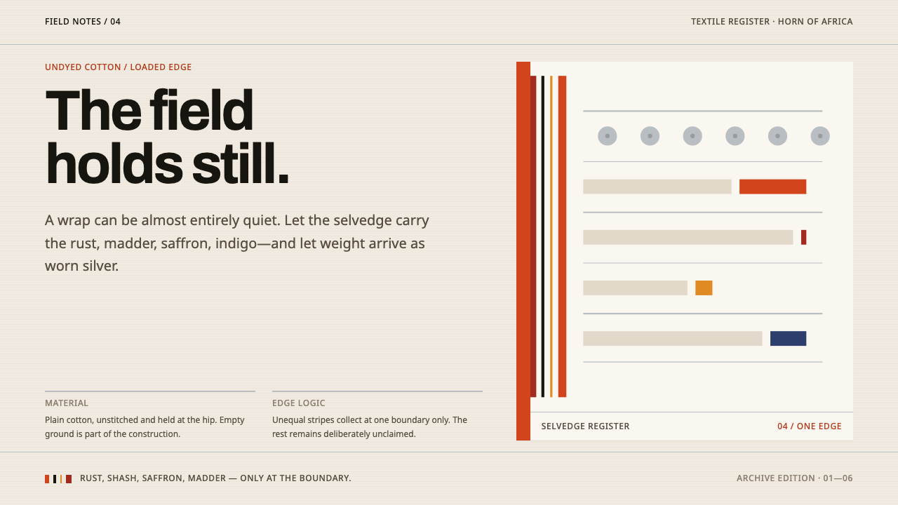 Afar Nomad TextileWeight lives at the edge. Rust and madder selvedges cut across a quiet cotton…
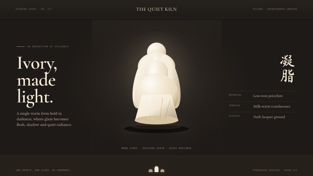 Dehua Blanc de ChineIvory becomes light. Warm porcelain glows as one quiet form against a near-bl…
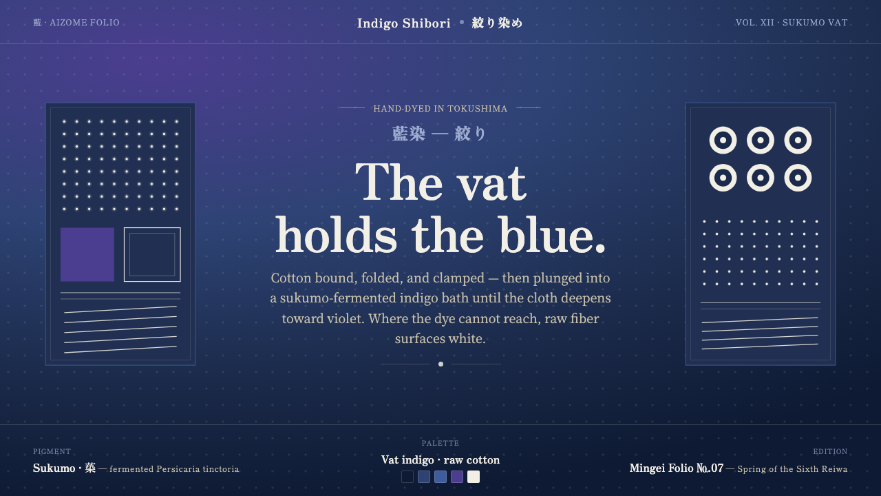 Indigo ShiboriCloth before image. Bound cotton plunged into sukumo vats — raw-white resist…
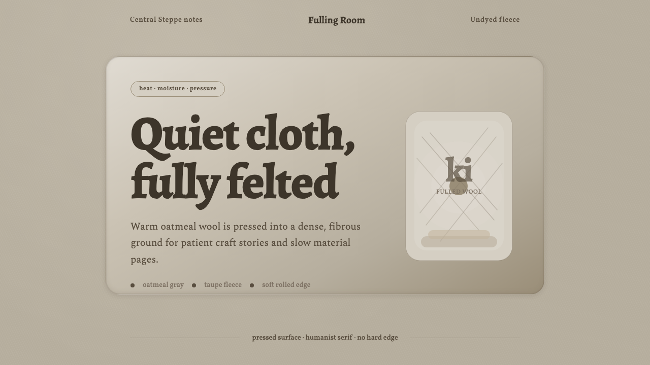 Wool FeltingHandmade stillness. Oatmeal-gray felt, humanist serifs, and soft rolled panel…
 Buncheong Gray Slip WareBetween celadon and porcelain. Greenish-gray clay, chalky slip brushwork, dar…
 Cycladic SantoriniQuiet island gravity. Cobalt field, Marcellus capitals and white vaults hold…