What is Safavid Charbagh Plan?
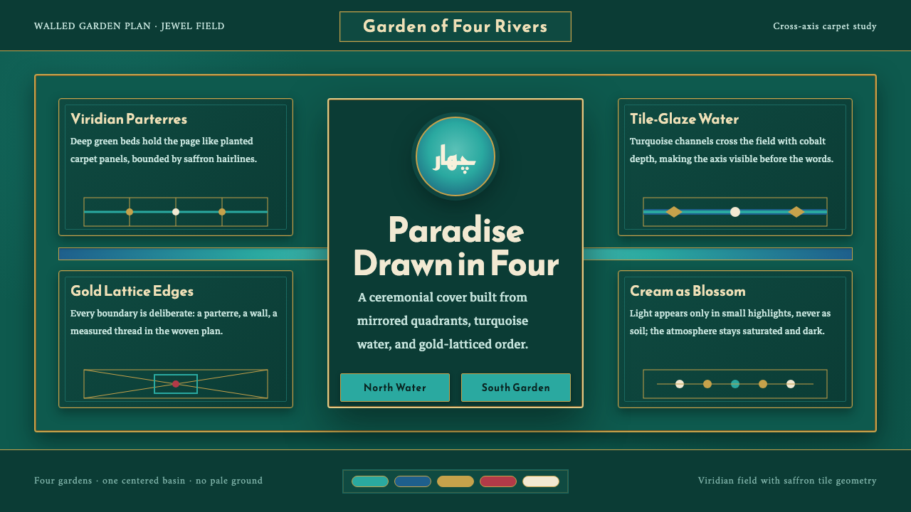
The Safavid Charbagh Plan turns paradise into a disciplined field: turquoise water crosses deep green gardens, while gold draws every edge into order.
Safavid Charbagh Plan in brief
The chahar-bagh, meaning four gardens, is a Persian plan of paradise. Two cross-axis water channels divide a planted ground into four quadrants, making an earthly image of Eden. Its power lies in the fact that order is not merely decorative: the crossing channels establish the whole composition, giving the eye a center, a direction, and a way to understand the garden as a complete world.
In Safavid Isfahan, this spatial system endured in haft-rang tilework and knotted garden carpets. Turquoise water lines cross deep-viridian parterres, while gold defines their edges. The result is jewel-toned and architectural at once: water reads as a bright route through darkness, planting becomes a contained field, and ornament serves the larger axial plan rather than dissolving it.
As a visual language, the Safavid Charbagh Plan is rigorously symmetrical, richly colored, and intentionally dark. It does not begin from a pale neutral ground. Instead, a deep paradise-green field carries the composition, allowing turquoise and gold to appear luminous without becoming weightless. Every line reinforces the garden's underlying division, so decoration, landscape, and structure become inseparable.
Where does Safavid Charbagh Plan come from?
The Charbagh Plan belongs to Persian garden design, with roots described in the source material as ancient Achaemenid Persian. Its central idea is enduringly simple: paradise can be understood as a cultivated, watered, bounded order. The crossed channels and planted quadrants give that idea a visible framework, converting an expansive spiritual image into a composition that can be built, tiled, woven, and remembered.
Around 1600, Safavid Isfahan became the defining setting for the style presented here. The source material identifies the city in Persia, now Iran, as the regional focus, and names Shah Abbas I among its key figures. In this Safavid context, the garden plan was not treated as an isolated diagram. It entered a broader visual culture in which axial order, saturated color, tilework, and textile pattern could speak the same language.
Haft-rang tilework preserved the garden's vocabulary in durable surface form. Turquoise could stand for water, deep viridian for planted ground, and gold for the edges that keep each section legible. Rather than softening the plan through naturalistic scenery, the tile language makes the garden feel deliberate and bounded. A channel is a channel because it is drawn as a decisive line; a quadrant is a quadrant because its perimeter is maintained.
Isfahan carpet workshops carried the same order into knotted garden carpets. The garden could therefore be encountered as a textile field as well as a planted place: crossed water lines, enclosed green areas, and gold-defined boundaries translated into a portable image of paradise. This continuity between garden, tile, and carpet is central to the theme. The medium changes, but the axial structure remains recognizable.
What defines the Safavid Charbagh Plan look?
Axial Order
The cross-axis is the governing device. Two water channels meet at the center and divide the field into equal garden territories. This is not a loose suggestion of symmetry; it is a compositional commitment. Major content should acknowledge the crossing, the center, or the quadrants so that the layout reads as one ordered garden rather than a collection of unrelated panels.
Turquoise Water
Turquoise is reserved for the water channels that cross the deep field. Its role is directional and connective: it leads the eye through the composition while separating planted areas without isolating them. Treat it as a clear, continuous route. Fragmented or casually scattered turquoise weakens the visual metaphor because water is the system's organizing movement.
Deep Viridian Ground
The ground is a deep paradise green rather than a pale backdrop. It gives the plan density, making the garden feel enclosed, fertile, and nocturnal in mood. Against it, the water lines appear more luminous and the gold boundaries more precise. The dark field should feel continuous across the composition, like planted ground extending beneath every ornamental decision.
Gold Boundaries
Gold draws the edge of each garden area and gives the plan its finished authority. It should clarify division rather than behave like general sparkle. Used along borders, frames, and decisive intersections, it turns the quadrants into precious enclosures. Its value comes from restraint: gold is strongest when it makes structure visible, not when it competes with the water channels.
Fourfold Garden Fields
The planted quadrants are not empty background areas. They are active fields whose repeated structure creates calm, abundance, and containment. Pattern may enrich them, but it should remain contained by the water channels and gold edges. The important visual contrast is between dense planted color and the clean, legible paths that divide it.
Tile and Carpet Translation
The style carries its garden logic across haft-rang tilework and knotted garden carpets. It therefore favors flat, patterned, bounded surfaces over illusionistic depth. A motif should appear placed, woven, or tiled into the field, not rendered as a view through a window. This material sensibility allows a browser composition to retain the authority of a garden plan without pretending to be a landscape painting.
Who shaped Safavid Charbagh Plan?
Shah Abbas I is named in the source material as a key figure for Safavid Isfahan around 1600. Within this theme, his name anchors the historical setting in which the Charbagh Plan is presented: a Safavid courtly world where Persian garden design, saturated tilework, and garden-carpet arts converge around a shared axial image of paradise.
The Safavid court garden designers named in the source material represent the makers of the plan as spatial order. Their significance is not individual authorship but the sustained ability to make water channels, planted quadrants, and formal boundaries read as a unified image. The Charbagh Plan depends on that coherence: each garden part remains distinct while serving the central crossing.
The carpet workshops of Isfahan are key because they carried the garden into knotted textile form. In the source material, garden carpets preserve the same turquoise crossings, deep-viridian fields, and gold-edged divisions associated with Safavid tilework. Their work demonstrates that the Charbagh Plan is a transferable visual system, not a garden arrangement limited to one physical site.
How do you use Safavid Charbagh Plan today?
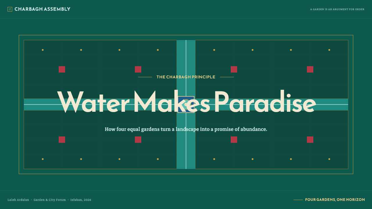
For presentation covers, use the crossing channels as the primary act of composition. Let a deep green field establish the mood, then place turquoise axes so they create a clear center before introducing the title. Gold can frame the title area or mark a decisive boundary. The cover should feel like an entrance into a garden plan, not like a generic dark slide decorated with ornamental lines.
For presentation content and data pages, preserve the garden's disciplined partitioning. Treat the quadrants as related information territories: one may hold the argument, another a supporting image, another a key figure, another a conclusion or reference. Data should follow the same rule. Charts and diagrams work best when their divisions echo channels and enclosed fields, while turquoise identifies movement or connection and gold marks meaningful boundaries.
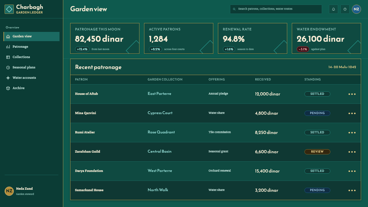
For web interfaces, the Charbagh Plan suits dashboards, analytical tools, and pricing pages that benefit from clear segmentation without losing visual richness. A central crossing can organize navigation, status areas, or key comparisons, while surrounding panels read as planted quadrants. Deep green should remain the unifying field; turquoise should indicate routes, active relationships, or movement through the interface; gold should be reserved for thresholds, outlines, and moments of deliberate emphasis.
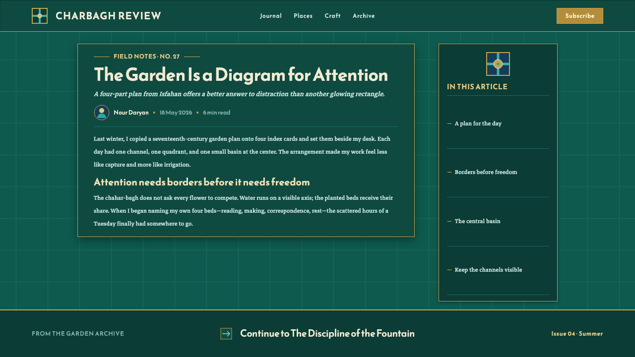
For editorial and marketing work, use the style to make information feel curated rather than crowded. An article can begin with an axial hero composition, then move through clearly bounded sections that retain a shared dark field. Campaign pages can use tile-like blocks and carpet-like pattern to connect content areas, but each block should remain subordinate to the larger garden structure. The atmosphere should be luxuriant through concentration and order, not through uncontrolled ornament.
The common mistake is to borrow turquoise, green, and gold as a decorative palette while abandoning the Charbagh Plan itself. If lines do not divide, water does not cross, boundaries do not contain, and the center has no authority, the result may look jewel-toned but it will not feel like a Persian garden of paradise. Begin with the axial system, then let color and pattern reveal that system.
Safavid Charbagh Plan — FAQ
Is the Safavid Charbagh Plan simply a symmetrical grid?
Symmetry is essential, but the plan is more specific than a generic grid. Its order comes from crossed water channels dividing planted quadrants, producing an earthly image of paradise. The channels are not neutral separators: they create movement, establish the center, and make the garden's divisions meaningful. A design can be symmetrical without carrying the Charbagh logic if it lacks that axial water structure.
Why does this style use such a deep green ground?
The source material describes the system as laid on a deep paradise-green field rather than a pale ground. That darkness gives the turquoise channels and gold edges their jewel-like intensity while keeping the planted quadrants visually unified. The effect is not gloom. It is density: the garden feels rich, enclosed, and capable of holding bright water and radiant boundaries within one coherent field.
How should turquoise and gold be balanced?
Turquoise should retain its association with water and crossing movement, while gold should define edges and divisions. Their roles are complementary rather than interchangeable. If gold becomes widespread surface decoration, it loses its ability to clarify the garden's boundaries. If turquoise appears without a route or crossing, it loses its water-like function. Their balance depends on keeping each color structurally legible.
Can the plan be used outside a garden or textile context?
Yes. The approved material explicitly frames it as a system rebuilt in the browser, and its history already spans planted gardens, haft-rang tilework, and knotted garden carpets. The transferable element is the fourfold axial order: deep green ground, turquoise crossings, gold-defined edges, and bounded fields. A digital layout can use those relationships without imitating a literal garden scene.
Related design styles
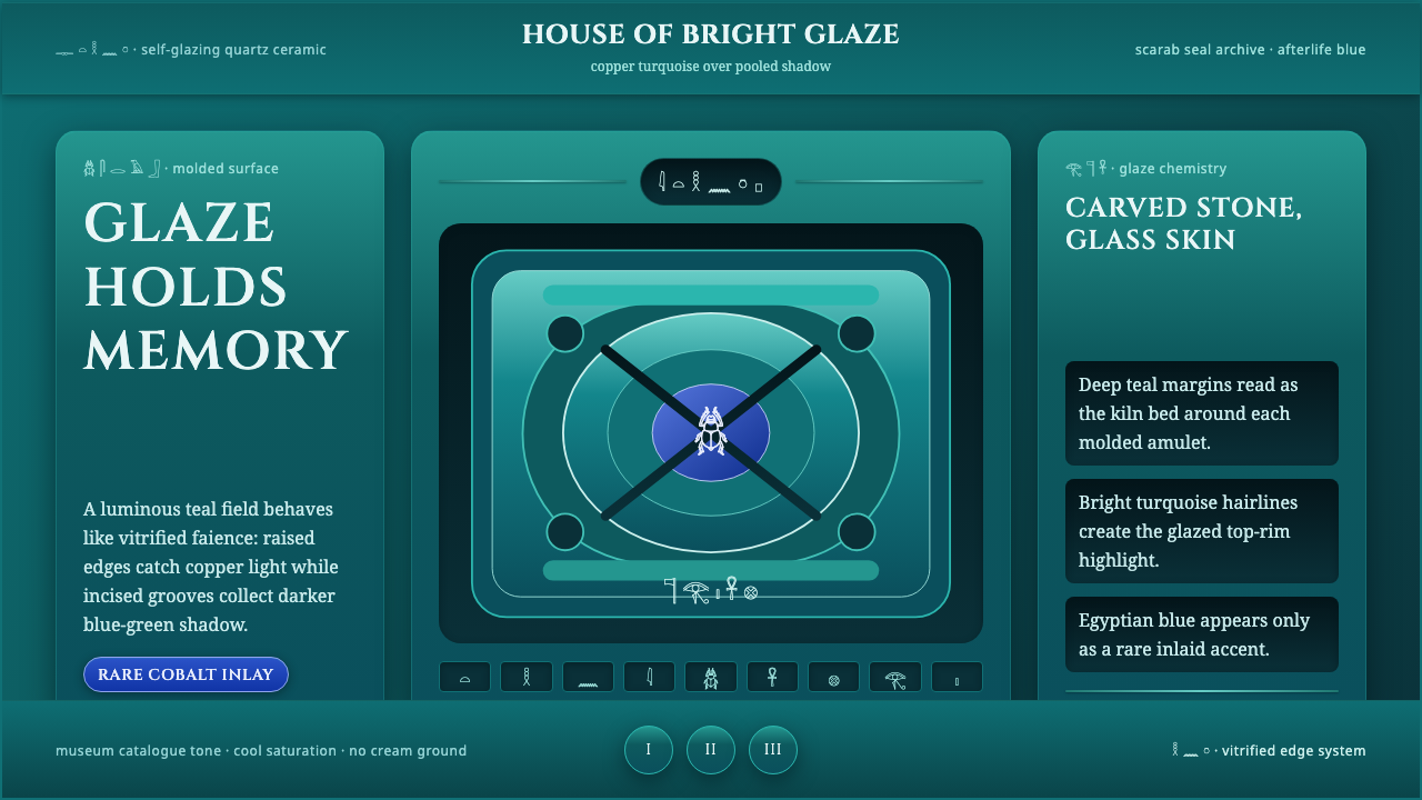 Egyptian FaienceGlaze carries the afterlife. Deep teal grooves, copper-turquoise rims, rare c…
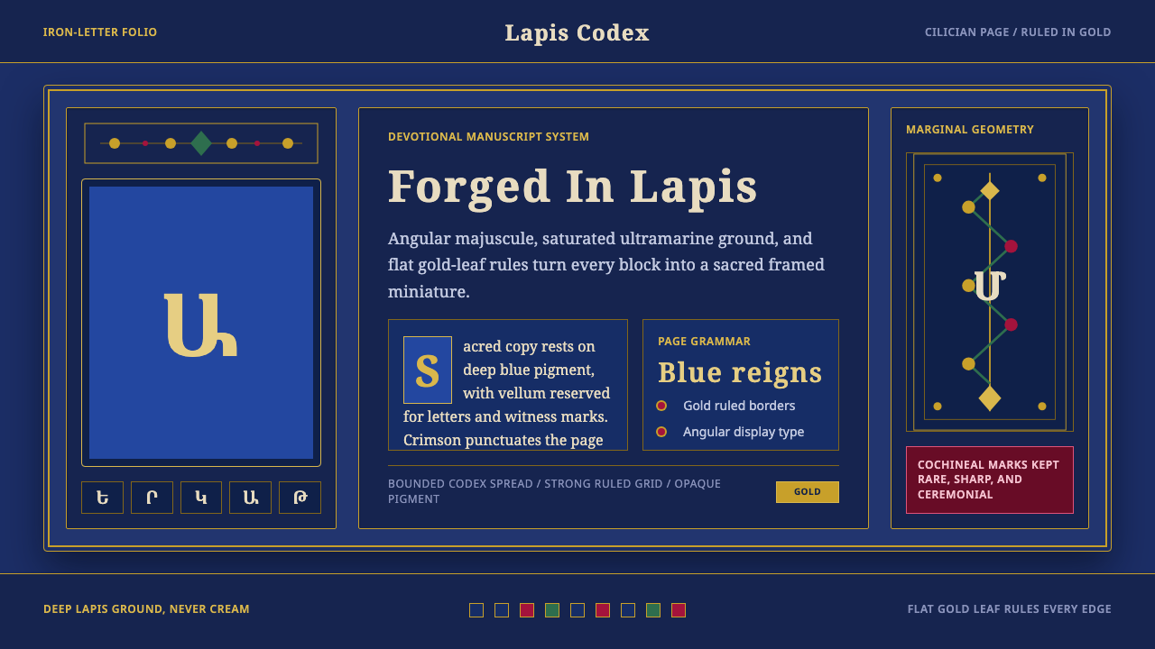 Armenian ErkatʿagirDevotional lapis reigns. Gold rules and angular serif glyphs frame a sacred g…
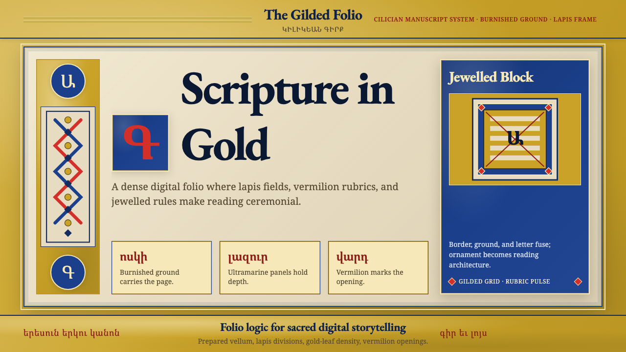 Armenian Illuminated ManuscriptGilded maximalism. Burnished gold, lapis frames, and vermilion initials build…
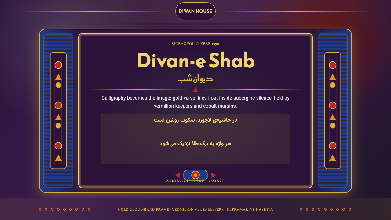 Iranian Shiraz Poetry Divan 1390Midnight manuscript glow. Aubergine fields, gold Kufi type, cobalt margins.
 Jordanian Petra Rose NabataeanGeology feels monumental. Crevice umbra, rose strata, and Cinzel capitals car…
 Ottoman Court Miniature (Topkapı)Ceremony made dense. Gold ground, cinnabar cartouches, cobalt procession geom…