What is Egyptian Faience?
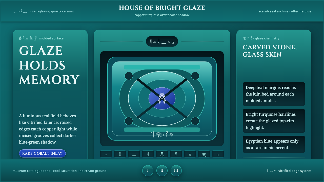
Egyptian faience turns glaze into a promise of permanence — luminous turquoise skin, shadowed grooves, and rare blue accents carrying earthly form toward the afterlife.
Egyptian Faience in brief
Egyptian faience is a self-glazing quartz ceramic associated with ancient Egypt and produced in the Nile Valley over millennia. Copper colors the material a vivid turquoise-blue, while an alkaline glaze forms across the surface as the paste dries. The resulting object is neither plain stone nor conventionally painted pottery: its color belongs to a luminous glassy skin generated by the material itself.
The scarab amulet is the clearest expression of this craft. Its carved body creates two distinct visual registers: exposed surfaces catch brighter copper-turquoise light, while glaze gathers more deeply inside incised lines and turns those grooves into dark teal shadows. Relief, inscription, color, and reflected light therefore act together. The object can be read as a tiny sculpture, a decorated surface, and an amulet intended to accompany a pharaoh into the afterlife.
As a contemporary design language, Egyptian Faience is dark, saturated, and mineral rather than sandy or parchment-like. Deep teal-turquoise establishes the field; brighter rims suggest glaze catching light; authentic Egyptian blue appears sparingly as an inlaid accent. The atmosphere is pharaonic and glassy, with depth concentrated in grooves and edges. Cream backgrounds, dusty antiquarian palettes, and generic desert imagery contradict the material logic of the style.
Where does Egyptian Faience come from?
Egyptian faience belongs to the long history of pharaonic craft in ancient Egypt. Its production extended over millennia in the Nile Valley, making it a continuing material tradition rather than the signature of a single reign, workshop, or named inventor. The source tradition identifies it as tjehenet, a quartz-based ceramic craft whose distinctive identity came from self-glazing and copper-derived turquoise-blue color.
Its manufacture joined material preparation with surface transformation. Artisans formed a quartz-rich paste and carved or impressed its details while shaping the object. As the paste dried, alkaline glaze migrated outward and developed a glassy surface. Because the glaze settled differently across raised areas and recesses, production itself generated a hierarchy of light: exposed forms appeared brighter, while carved grooves held darker color and stronger shadow.
Faience became closely connected with amulet-making and especially with the scarab tradition. The compact scarab body offered a natural field for modeled contours, incised divisions, and hieroglyphic decoration. Its small scale did not make it visually slight. Concentrated turquoise luminosity, darkened grooves, and carefully articulated markings gave the amulet a presence greater than its physical size, while its placement with pharaohs linked crafted brilliance to the passage into the afterlife.
No individual master defines Egyptian faience in the surviving source material. Its history is instead carried by workshops, amulet-makers, and a repeated scarab-making tradition. That collective authorship matters to the modern interpretation: the style should not imitate one isolated artifact as though it were a personal artwork. It should preserve a durable system of relationships — quartz body, migrating glaze, copper color, carved shadow, hieroglyphic detail, and funerary meaning.
What defines the Egyptian Faience look?
Glaze Palette
Deep teal-turquoise is the governing color, not a secondary accent. Brighter copper-turquoise belongs on exposed rims, raised marks, and focal edges where glaze appears to catch light. Egyptian blue is rarer and more concentrated, functioning like an inlay or precious interruption. Blackened teal can deepen recesses, but pale cream and sandy beige should not become the ground.
Grooved Depth
Depth comes from incision and pooling rather than soft atmospheric shading. Lines should feel cut into a glazed body, with darker color collecting inside them and brighter color remaining on the surrounding surface. This makes borders, dividers, icons, and chart marks resemble carved information. Recesses are narrow and decisive; they do not dissolve into haze.
Glassy Highlights
Highlights are controlled flashes along rims and raised forms, suggesting a smooth alkaline glaze without turning the composition into polished metal. Their purpose is to reveal curvature, relief, and material continuity. Broad universal shine weakens the effect; selective illumination makes the surface feel precious, handmade, and responsive to viewing angle.
Scarab Geometry
Forms favor compact symmetry, domed silhouettes, segmented bodies, and enclosing contours derived from the scarab amulet. These cues can organize cards, emblems, or diagram nodes without requiring literal insect illustration. The silhouette provides stability, while internal divisions introduce rhythm. Used abstractly, it produces a ceremonial geometry distinct from generic rounded-interface styling.
Hieroglyphic Marking
Decoration behaves like inscription: repeated marks, pictorial signs, and ordered bands appear embedded in the surface rather than floating above it. Even when modern symbols replace hieroglyphs, they should be arranged with the density and intentionality of carved notation. Marks are meaningful units of navigation or identity, not a scattered ancient-Egyptian pattern applied for atmosphere.
Dark Ceremonial Field
The composition begins in darkness. Teal-black space allows turquoise glaze to appear internally luminous and gives rare cobalt accents their authority. Negative space should feel deep and still, like a setting prepared for a precious amulet. This is not cheerful aquatic color or tropical freshness; it is mineral radiance held inside a solemn pharaonic atmosphere.
Who shaped Egyptian Faience?
The workshops are the collective makers behind the tradition. Across millennia of pharaonic production in the Nile Valley, they sustained the knowledge required to form quartz paste, create carved surfaces, and obtain the characteristic self-glazed turquoise-blue finish. Their importance lies in continuity: Egyptian faience was preserved through repeated material practice rather than through the theory of a single named designer.
Amulet-makers translated the material into small objects charged with funerary purpose. They joined compact sculptural form, carved detail, and hieroglyphic decoration with a glaze whose luminosity made the object visually precious. Their work established a crucial lesson for contemporary design: symbolism is strongest when it is inseparable from material, shape, and method of making.
The scarab-amulet tradition gave Egyptian faience its most enduring visual vessel. The scarab's domed body, enclosing outline, segmented carving, and association with the afterlife concentrated the craft's material and symbolic qualities in one form. It remains the central reference for translating faience into a design system, provided its structure is studied rather than reduced to a decorative insect motif.
How do you use Egyptian Faience today?
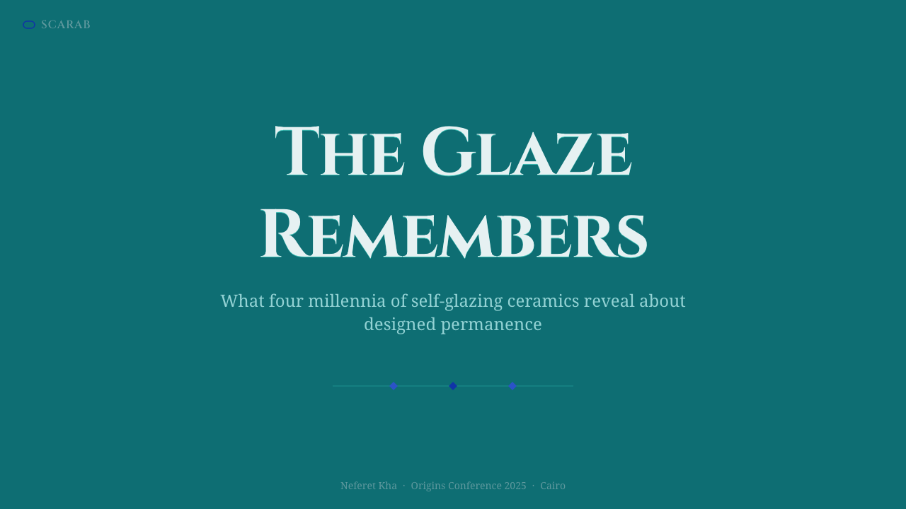
For presentation covers, build the composition around one amulet-like focal form emerging from a deep teal field. Let the title occupy a calm area beside it, while a narrow copper-turquoise rim or rare Egyptian-blue mark signals importance. The cover should feel ceremonial and concentrated, not crowded with pyramids, papyrus textures, or miscellaneous archaeological symbols.
Content slides should translate carved organization into information hierarchy. Use enclosing contours for major sections, incised-looking dividers for subordinate material, and brighter glaze accents for the current argument or key quotation. Keep paragraphs in quiet dark regions so that reading remains effortless. Repeating scarab-like symmetry on every slide becomes monotonous; alternate compact framed sections with more open, inscription-like arrangements.
Data slides work best when charts resemble inlaid or carved records. Dark grooves can establish axes and category divisions, turquoise forms can carry the principal series, and cobalt can isolate one exceptional value. Preserve clear comparison before adding material effects. If every bar, label, and marker receives an equally bright glazed edge, the hierarchy disappears and the chart becomes ornamental.
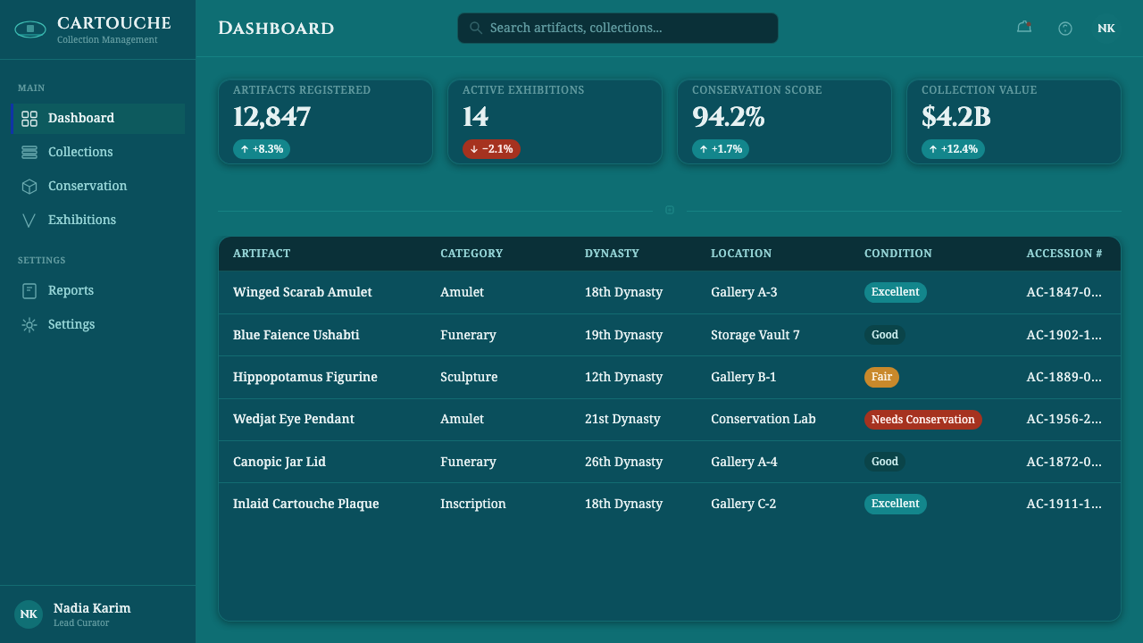
For web interfaces, Egyptian Faience suits dashboards, archives, collection browsers, and pricing pages that benefit from a sense of rarity and authority. Dashboard cards can behave like glazed tablets with recessed internal divisions, while active states catch brighter turquoise light. On pricing pages, one featured tier may receive the rare blue inlay, but ordinary controls should remain quieter. The dark field requires especially disciplined text contrast and uncluttered navigation.
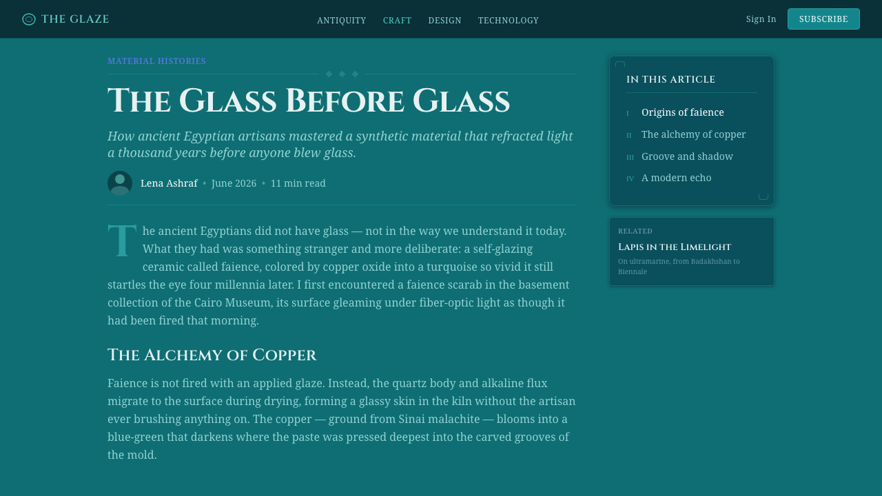
Editorial and marketing layouts can use the style to frame stories about heritage, craft, preservation, or transformation. Open with a luminous artifact-like image or emblem, then let subsequent sections unfold as bands of carved annotation and spacious dark text fields. The common mistake is to substitute generic Egyptian imagery for faience itself. Sand, gold, parchment, and monumental silhouettes may suggest ancient Egypt, but they erase the specific story of quartz paste, migrating glaze, copper turquoise, and shadowed incision.
Egyptian Faience — FAQ
Is Egyptian faience the same material as ordinary glazed pottery?
No. In the supplied tradition, Egyptian faience is identified as a self-glazing quartz ceramic. Its defining surface develops as alkaline glaze migrates outward while the paste dries, and copper gives it the characteristic turquoise-blue color. Ordinary glazed pottery may also have a glassy exterior, but treating the two as interchangeable loses the specific relationship between quartz body, migrating glaze, and pooled color that defines faience.
Why must a digital Egyptian Faience design use a dark ground?
The dark ground translates the supplied system's deep teal glaze and grooved shadow depth into a coherent digital environment. It lets brighter copper-turquoise edges appear luminous and gives rare Egyptian blue sufficient distinction. A cream or parchment field shifts attention toward generalized antiquity and away from the glassy, mineral, self-glazed character that makes faience specific.
Should scarabs and hieroglyphs appear literally in every composition?
No. Literal motifs are strongest when the subject genuinely concerns the amulet tradition. In broader applications, borrow structural principles instead: enclosing scarab-like contours, segmented organization, incised marks, and ordered bands resembling inscription. Repeating recognizable symbols without informational purpose turns a material system into themed decoration and risks overwhelming the content.
How should Egyptian blue differ from the main turquoise?
Turquoise is the continuous glazed body of the system; Egyptian blue is the rare inlay. Turquoise may establish backgrounds, panels, and principal forms, with brighter copper-toned variations marking exposed edges. Blue should appear in smaller, more deliberate moments: a selected state, a singular data point, a featured tier, or a ceremonial emblem. Its scarcity gives it authority.
Where does the style work poorly?
It struggles where an interface must feel airy, casual, domestic, or deliberately neutral. The dark ceremonial field, precious glaze, and funerary association naturally create gravity. They can enrich cultural archives, premium presentations, and authoritative dashboards, but may burden everyday productivity tools or cheerful mass-market services. The style should be chosen when material depth and symbolic permanence support the message, not merely because turquoise looks striking.
Related design styles
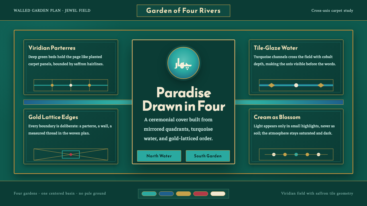 Safavid Charbagh PlanParadise made axial. Turquoise cross-channels divide viridian quadrants in go…
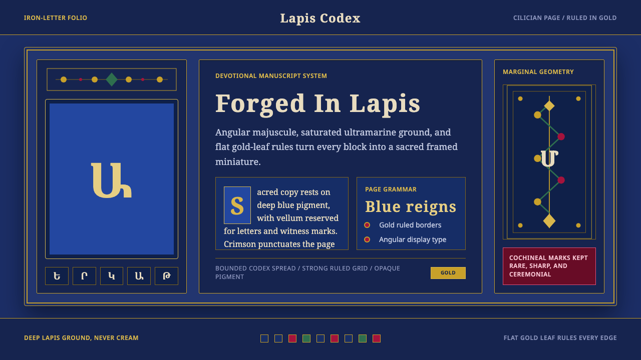 Armenian ErkatʿagirDevotional lapis reigns. Gold rules and angular serif glyphs frame a sacred g…
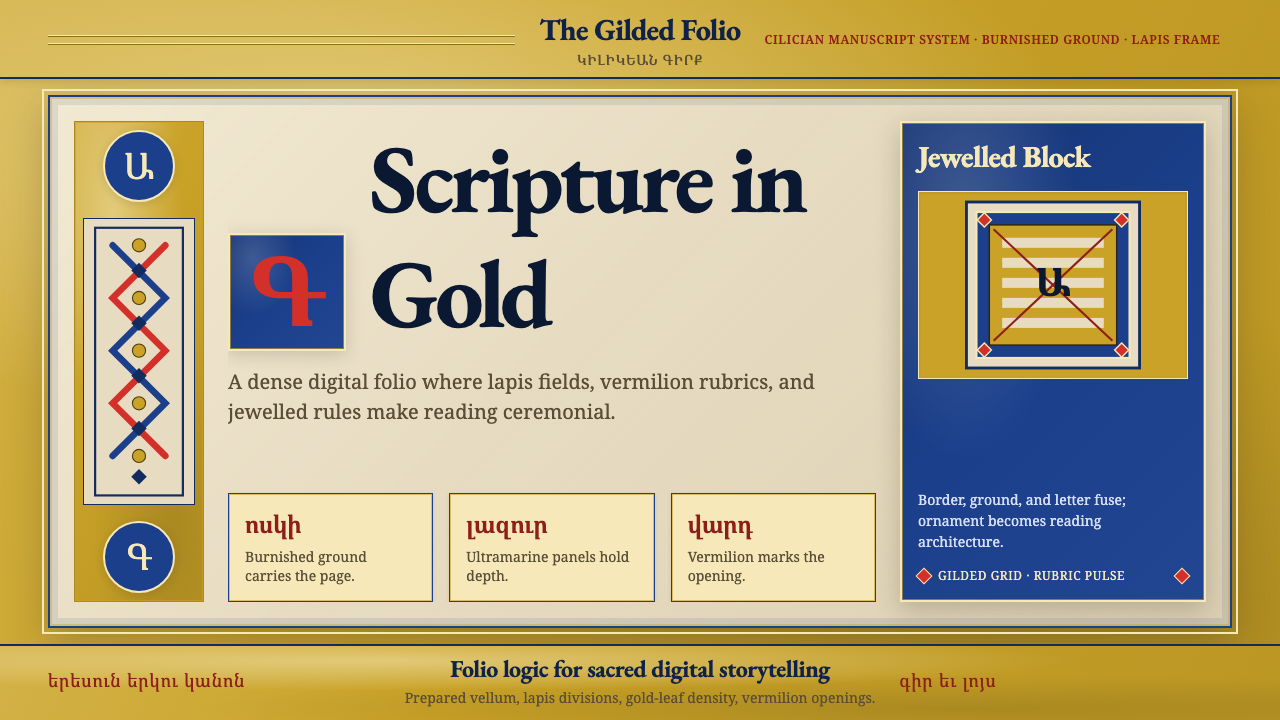 Armenian Illuminated ManuscriptGilded maximalism. Burnished gold, lapis frames, and vermilion initials build…
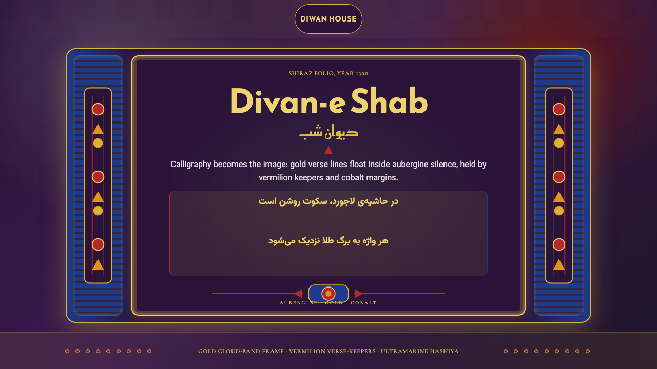 Iranian Shiraz Poetry Divan 1390Midnight manuscript glow. Aubergine fields, gold Kufi type, cobalt margins.
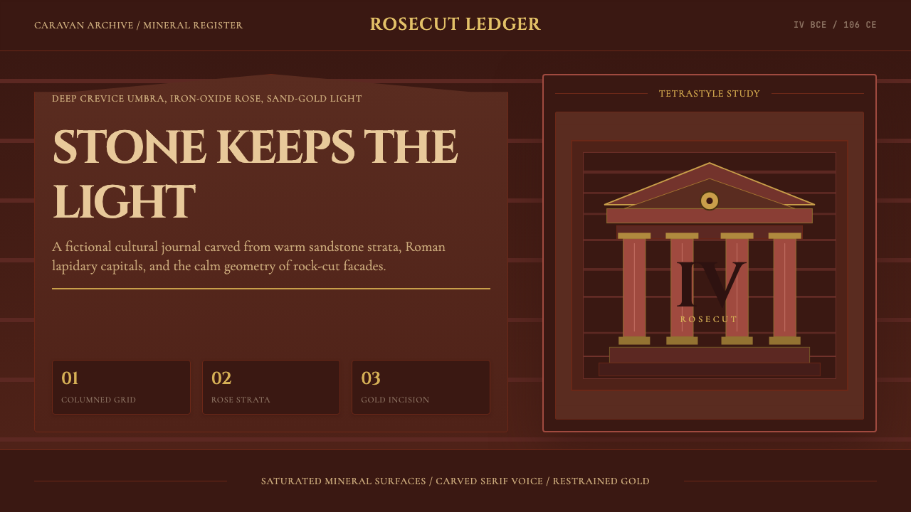 Jordanian Petra Rose NabataeanGeology feels monumental. Crevice umbra, rose strata, and Cinzel capitals car…
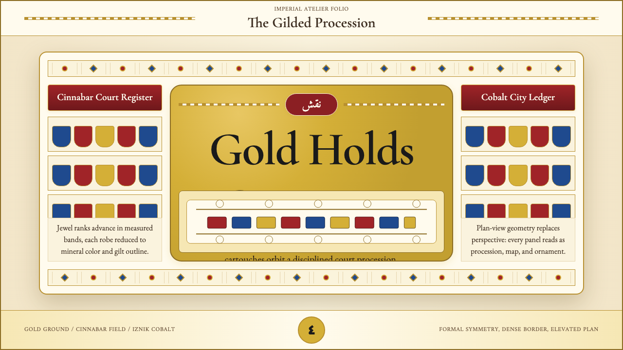 Ottoman Court Miniature (Topkapı)Ceremony made dense. Gold ground, cinnabar cartouches, cobalt procession geom…