What is Sabon by Jan Tschichold?
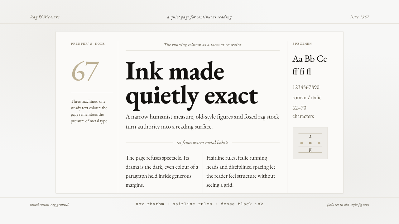
Sabon gives the printed page quiet authority: dense black Garamond, a weathered rag-paper ground, and enough silence around the text for reading to become the subject.
Sabon by Jan Tschichold in brief
Sabon is Jan Tschichold’s Garamond revival, designed between 1964 and 1967 and released in 1967. Its unusual technical ambition was to produce one design that could print identically through Linotype, Monotype, and Stempel handsetting, despite those systems being incompatible with one another. That constraint explains much of its character: Sabon is controlled, unified, and built to remain itself when the machinery beneath it changes.
Before it is a display face, Sabon is a book text face. Its natural setting is the running column: continuous prose, measured lineation, restrained hierarchy, and a page that asks the reader to settle in rather than scan for spectacle. The voice is classical and humanist, but not antique in a theatrical sense. It feels composed rather than nostalgic, carrying the gravity of a well-made book without turning typography into costume.
The surrounding visual system returns Sabon to a material world of German fine-press printing. Dense black letterpress ink sits on toned cotton-rag stock that appears aged and lightly foxed. The paper is neither fresh cream nor blank white; it has memory, grain, and reserve. Generous margins, one carefully composed text column, old-style figures, and a modest contrast between roman and italic make the page feel printed rather than merely styled.
Where does Sabon by Jan Tschichold come from?
Sabon belongs to the twentieth-century Garamond revival, a tradition concerned with returning a humanist book-hand sensibility to modern type production. Its lineage is signaled directly in the name Garamond and in the inclusion of Claude Garamond among the key figures associated with the theme. The revival does not treat historical letterforms as museum objects; it makes them available again for contemporary composition, especially the sustained demands of book reading.
Jan Tschichold designed Sabon in Frankfurt between 1964 and 1967. The project was defined by a practical problem rather than by decorative invention: the face had to function through Linotype, Monotype, and Stempel handsetting. A typeface normally adapts to the limits of its production method, but Sabon was asked to move across several methods while preserving a single visual identity. Consistency became part of the design’s aesthetic discipline.
That demand for identical results gave the project a special relevance to publishing. A book composed through different workflows could retain the same typographic voice, rather than becoming a near-match with altered proportions or rhythm. Sabon therefore joined technical standardization to literary quietness. Its achievement lies not in making technology visible, but in preventing technology from disturbing the reader’s encounter with the text.
The theme’s other named figures, Jacques Sabon and Konrad Berner, place the design within a broader typographic lineage alongside Tschichold and Garamond. The resulting style is best understood as fine-press book typography adapted to modern production: a page where historical continuity, machine compatibility, and material restraint meet. Its visual world is Frankfurt in the later twentieth century, but its intended experience is deliberately timeless: black type, calm paper, and prose given room to endure.
What defines the Sabon by Jan Tschichold look?
Foxed Rag Paper
The ground should resemble toned cotton-rag paper from an aged fine-press volume. It carries a subdued grey-tan cast and light foxing rather than the polish of new stock. This is not a distressed effect added for novelty. The paper establishes the page as an object with history, tempering the force of the dark type and making empty space feel inhabited rather than vacant.
Dense Black Ink
Sabon’s text is imagined as dense black letterpress ink pressed into the sheet. The darkness should feel physical and slightly weighted, not glossy or electronically perfect. Against the muted paper, the type gains authority through contrast and mass. Large fields of light grey interface chrome, bright color, or low-contrast text would weaken this printed impression.
Running Column
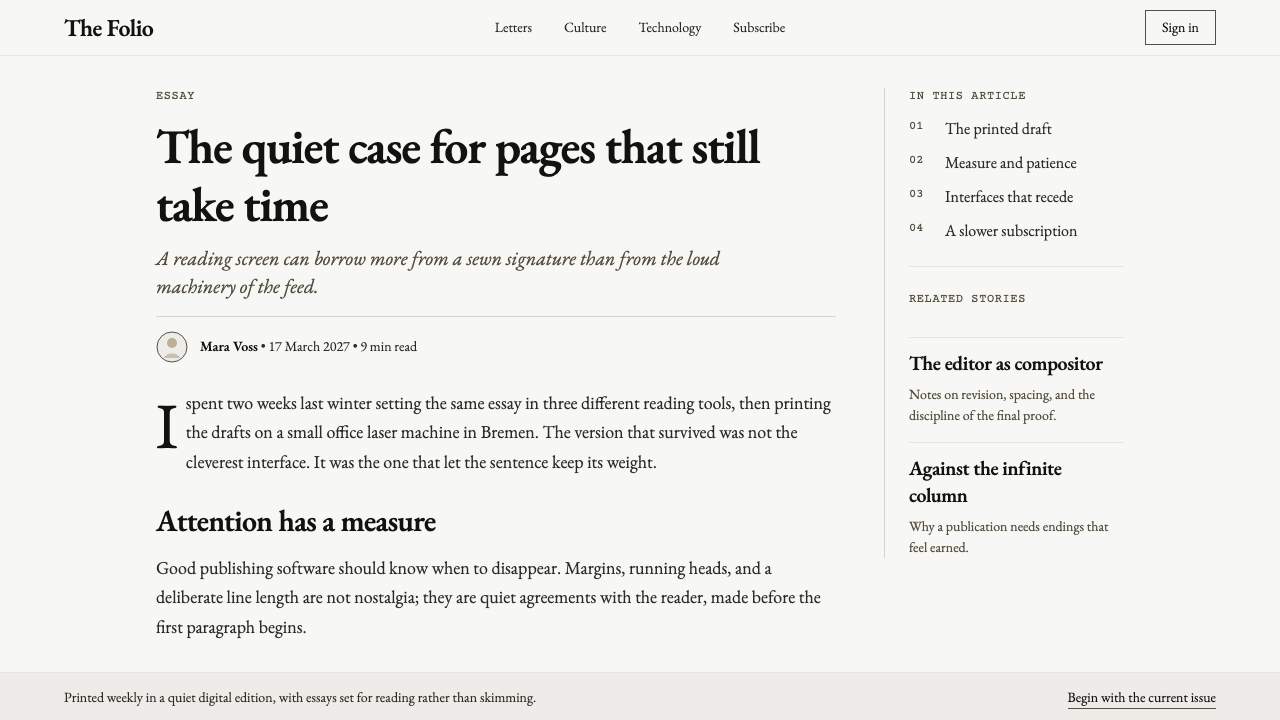
The central unit is a single well-set column of continuous reading. It should look stable, patient, and deliberately bounded by generous margins. The column is not a content container among many competing panels; it is the page’s primary event. Supporting matter belongs in quieter positions, so the eye understands where the sustained argument or narrative lives.
Classical Humanism
Sabon’s Garamond basis gives the system a classical, humanist voice suited to prose. The effect is literary without becoming precious. Letterforms should be allowed to carry the identity; extra motifs, ornamental illustrations, and theatrical framing compete with the type’s own rhythm. The page earns warmth from its paper, its italic, and the human cadence of reading rather than from decorative abundance.
Roman and Italic
Roman is the structural voice, while italic supplies emphasis, titles within prose, or moments of tonal shift. Their contrast should remain restrained. Italic is not a second visual system or an invitation to flourish; it is a quieter variation within the same typographic family. This limited contrast lets hierarchy emerge without breaking the composure of the reading page.
Old-Style Figures
Old-style figures belong naturally to the flow of book text. They should appear as part of prose rather than as rigid technical labels. Dates, citations, chapter references, and measured facts can therefore sit within the paragraph with less interruption. The choice reinforces Sabon’s bookish continuity: numerals participate in the page’s rhythm instead of standing outside it as a separate interface language.
Who shaped Sabon by Jan Tschichold?
Tschichold designed Sabon in Frankfurt between 1964 and 1967 and brought the project to release in 1967. His defining achievement here was not simply reviving Garamond, but making one coherent design work identically across Linotype, Monotype, and Stempel handsetting.
Garamond is the historical name at the center of Sabon’s revival lineage. In this system, that inheritance is expressed through a calm, humanist book-text voice rather than through historical display or ornamental imitation.
Jacques Sabon is named among the key figures connected to the typeface’s lineage. His presence in the theme anchors the name Sabon within a longer typographic tradition, linking the modern revival to the historical world from which its book-page character is drawn.
Konrad Berner is likewise identified as a key figure in the theme’s typographic context. Alongside Tschichold, Garamond, and Sabon, his inclusion emphasizes that this is not an isolated font treatment but a design lineage shaped by production, naming, and book typography.
How do you use Sabon by Jan Tschichold today?
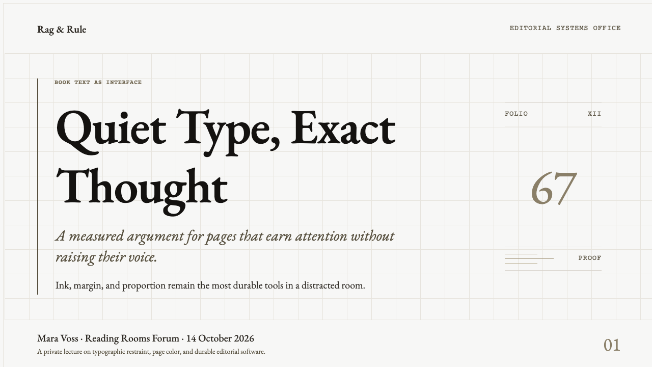
For presentation covers, use Sabon as a title voice with the confidence of a title page rather than the drama of an advertising poster. Let a quiet field of foxed grey-tan paper carry a short title in dense black type, with a restrained subtitle or author line below. On content slides, preserve the book logic: one main reading area, substantial margins, and a clear distinction between heading, prose, and supporting note. Avoid turning every slide into a page of miniature cards.
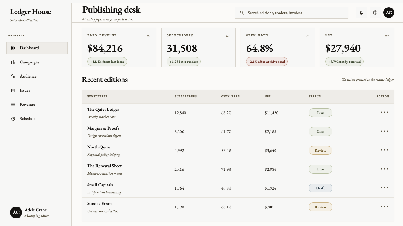
Data slides can borrow the same composure. Treat the key finding as the page’s central sentence, then make tables, labels, and figures subordinate to it. Old-style figures are especially appropriate when data appears inside explanatory prose or references. Charts should feel like printed editorial evidence, not luminous dashboard widgets: subdued grounds, dark marks, and enough open paper around comparisons for the argument to remain legible.
For web interfaces, Sabon is strongest in reading-led products: article archives, publishing tools, scholarly collections, book catalogues, and editorial dashboards. A dashboard can adopt the style by giving the principal report or analysis a single dominant column, while navigation and metadata sit at the edges with less visual force. On pricing pages, it can lend seriousness to plans that need explanation, provided pricing details remain plainly organized and do not become buried in literary atmosphere.
Editorial and marketing work can use the style to communicate provenance, patience, and intellectual care. Long-form pages benefit from strong opening matter, a calm text measure, italic interludes, and paper-like section transitions rather than abrupt visual effects. Marketing copy should read like a considered imprint or catalogue description. The visual system is especially useful when the product has a relationship to writing, collecting, education, books, craft, or durable cultural memory.
The common mistake is to mistake Sabon for generic vintage decoration. Artificial stains, random torn edges, seals, flourishes, and overworked nostalgic imagery turn its restraint into costume. Another error is treating the aged paper as a reason for weak contrast: the point is dense black type meeting a muted ground, not faded text disappearing into beige. Sabon works when the page remains readable, singular, and materially convincing.
Sabon by Jan Tschichold — FAQ
Is Sabon simply a decorative vintage type style?
No. The supplied context defines Sabon first as a book text face and a Garamond revival designed for consistent production across several typesetting technologies. Its aged-paper setting supports that identity, but the essential qualities are continuous reading, humanist calm, dense printed black, and disciplined hierarchy. Decoration is secondary and can easily undermine the system.
Why is pure white paper unsuitable for this style?
The intended ground is toned, aged, lightly foxed cotton-rag stock associated with German fine-press books. Pure white removes the material warmth and temporal depth that balance the dense black type. The goal is not dirtiness or low contrast, but a softened paper field that makes the ink feel pressed into a physical page rather than displayed on a neutral screen.
Can Sabon work in a modern web product?
Yes, particularly where reading and explanation are central. Editorial products, catalogues, research collections, and analysis-led dashboards can use its single-column discipline and restrained supporting information effectively. It is less natural for interfaces that depend on constant alerts, dense simultaneous controls, or aggressively promotional visual energy. The interface should preserve the page’s calm rather than merely applying a historical surface.
How should italic be used in a Sabon-based layout?
Use italic as a tonal inflection within the text system: for emphasis, titles embedded in prose, or a brief shift of voice. It should remain subordinate to roman rather than becoming a decorative headline device. Because the system relies on a quiet running column, restrained italic preserves continuity while still giving the reader small, meaningful changes in emphasis.
Related design styles
 Quaker Plain StyleSilence made visible. Timber gray, Caslon serif, and bench-rule spacing leave…
 Cartier-Bresson Decisive MomentNever cropped. Silver-gray tonality is locked by a dead-black film rebate.
 Concorde SupersonicPhysics made prestige. Pearl grey, sky-blue window line, and one red wing vec…
 Emil Ruder TypografieDiscipline makes type visible. Near-white grotesque and measured space cut th…
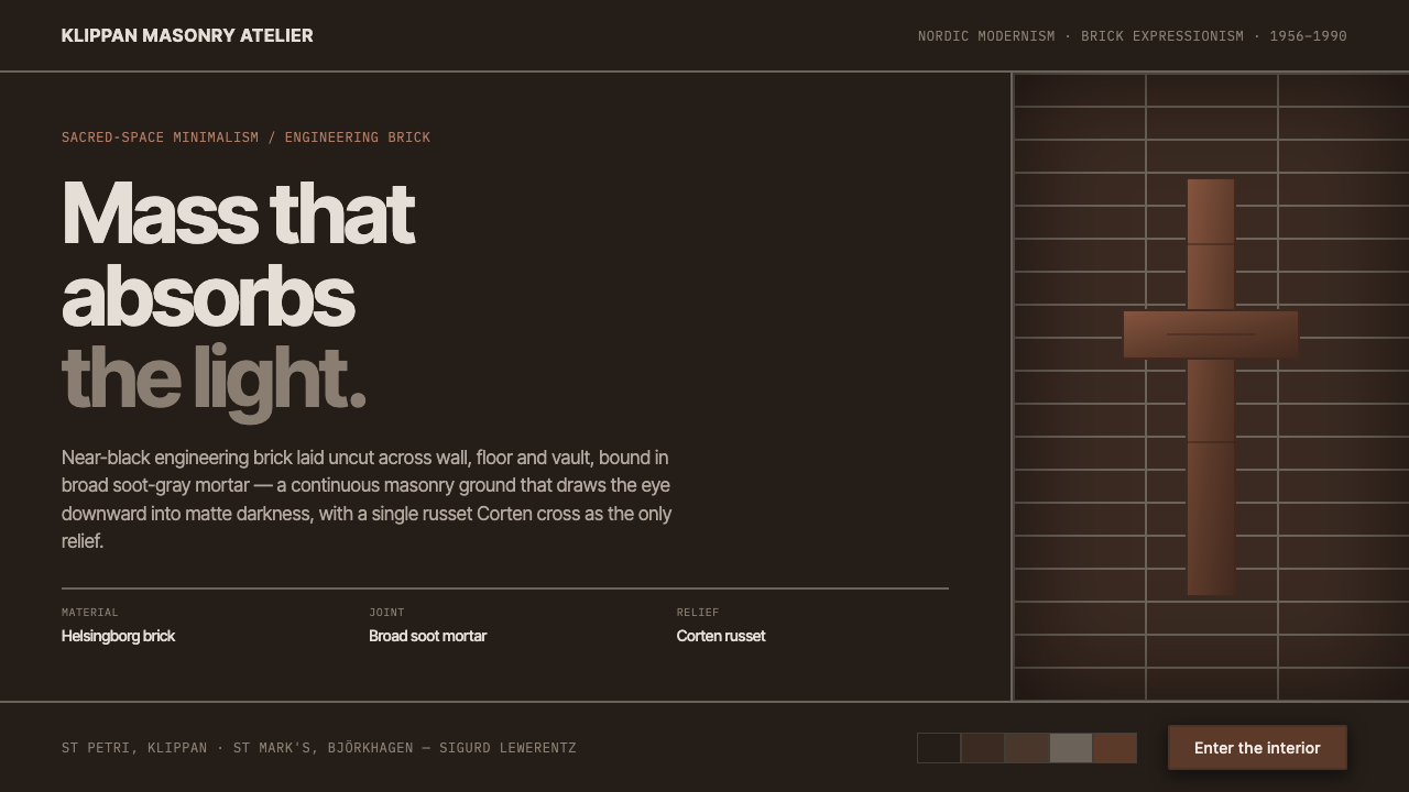 Lewerentz Dark BrickMass that absorbs light. Near-black engineering brick, broad soot mortar, one…
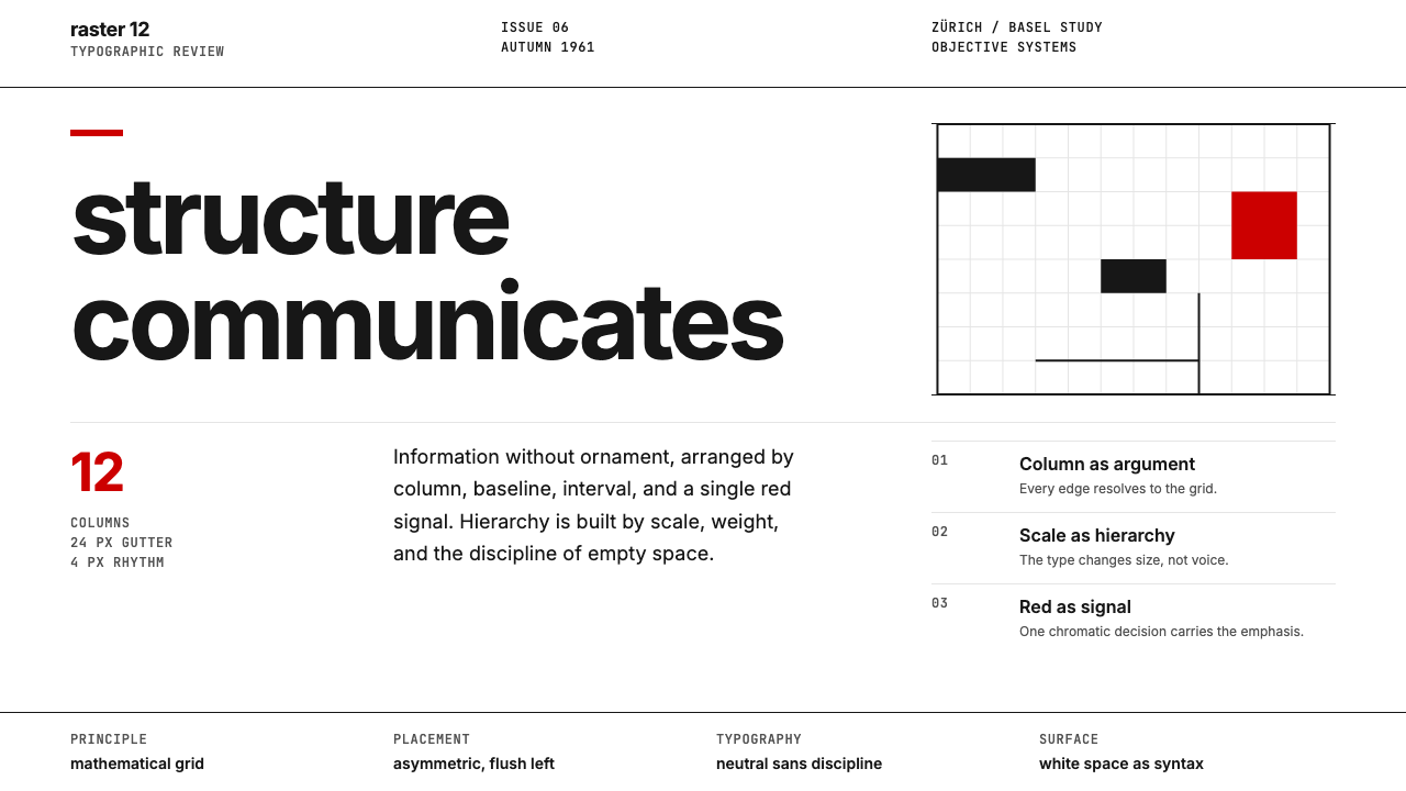 Swiss International StyleObjectivity made visible. Inter scale, white space, and one red block expose…