What is Japanese Newspaper Grid?
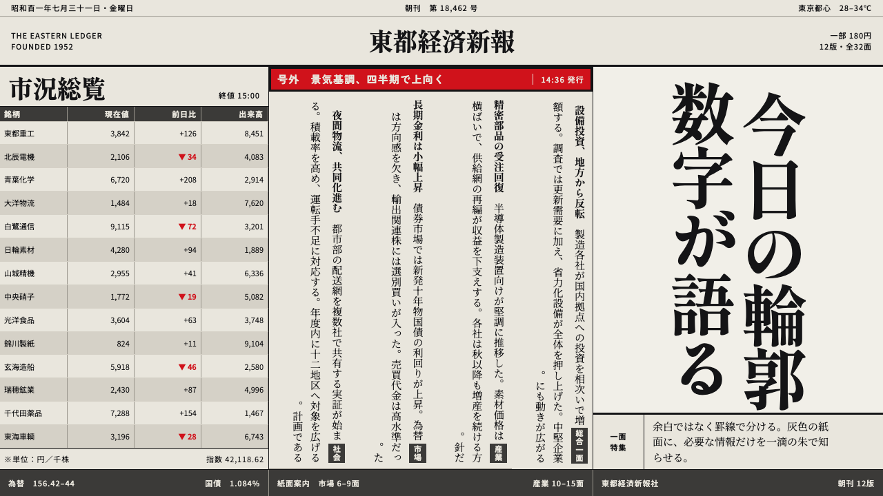
The Japanese broadsheet turns density into order: vertical Mincho, grey newsprint and hairline rules hold a whole page taut, with a single vermilion kept in reserve.
Japanese Newspaper Grid in brief
The Japanese newspaper grid is the visual system of the country's daily broadsheet, arguably the most information-dense printed surface in everyday use. Text is set in Mincho, a serif-like face with fine horizontal strokes, running vertically in columns that read from right to left. Columns are not separated by white space but by hairline rules, known as 罫線 (keisen), and the margins at the edge of the page are measured in millimetres rather than in generous bands of air. Photographs are cropped to sit inside the column structure and never bleed off the sheet, and even stock-price tables are set at a size that Western papers would not attempt.
Colour barely exists. Ink is black, and the ground is grey: newsprint made from mechanical pulp has a low natural whiteness, so the page looks dull and slightly grey rather than bright white. One chromatic note survives the press, a vermilion kept back for 号外 (gogai, the extra edition), for section flags and for 特報 (tokuhō, special report) banners. Because it is reserved for those few jobs, it still means something when it appears. Used anywhere else, it would stop being a signal.
The result is a design language in which order is produced by compression. Hierarchy comes from the size of headlines, the weight of rules and the position within a column, not from space or colour. It suits any project that has to deliver a great deal of text with authority, such as news, reports, bulletins and data digests, and any visual identity that wants the credibility of a newspaper of record.
Where does Japanese Newspaper Grid come from?
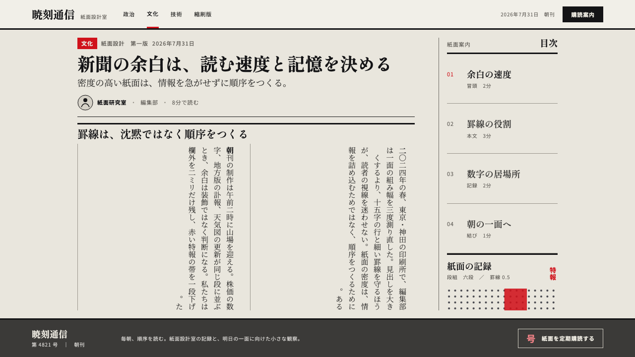
The vertical column is older than the newspaper. Tategaki, the vertical writing direction of Japanese, runs from top to bottom with lines advancing from right to left, and the newspaper grid takes that direction and turns it into a production system. Each character sits in a square cell, lines are packed to a fixed length, and columns are stacked edge to edge so that a single page can hold a startling number of items. The source of this style is that physical logic of the page, not any art movement.
The period the style draws on runs from the 1950s to the 1990s, and its material history is a sequence of three technologies. Hot-metal typesetting cast lines of lead type. Phototypesetting then replaced the metal with photographically projected letterforms. Computerised web-offset production, with its rolls of paper running at industrial speed, finally let a page be composed and plated digitally. Each step changed how a Mincho character was drawn and reproduced, but the logic of the page, vertical lines, narrow columns and rules instead of white space, survived all three.
Typefaces made specifically for newspapers form a category of their own, known as 新聞書体 (shimbun-shotai). They have to survive fast presses and rough, absorbent paper, so strokes tend to be sturdy, counters stay open and the characters are drawn to look large for the space they occupy. The names of Morisawa Nobuo and Ishii Mokichi belong to the phototypesetting side of this history, while the Asahi Shimbun type department stands for the other tradition: the newspaper company that draws and maintains its own text faces instead of borrowing them.
Tokyo is the centre of this tradition, where the national dailies compete on speed, completeness and the reliability of the printed record. The page stays deliberately plain because its readers come for information, not decoration. That is also why the vermilion matters. On a grey page of black text, one warm colour is enough to tell a reader that something has happened.
What defines the Japanese Newspaper Grid look?
Vertical Mincho
Text runs top to bottom, columns run right to left, and the face is Mincho, with fine horizontal strokes and sturdier verticals. It is chosen for endurance on cheap paper rather than for elegance, and the line is short enough that the eye drops down a column without losing its place.
Hairline rules instead of space
Columns are held apart by thin ruled lines, not by gutters of white space. The rule does the work that air does in Western layouts: it makes the page feel braced and organised, and it lets the maximum amount of text fit inside a fixed sheet.
Millimetre margins
Outer margins are tiny and inner spacing is tight. Nothing floats; every element is wedged between a rule, a column edge and a neighbour. Whitespace is treated as a cost, to be spent only where it helps the reader.
Grey newsprint ground
The ground is the dull grey of mechanical-pulp paper, not a clean white. This is part of the look: type sits in the paper, and a design that insists on pure white feels like a different medium. The low whiteness also gives black ink a quiet, even contrast.
Ink black with one vermilion
Black ink does almost everything. The single chroma is vermilion, reserved for extra editions (号外), section flags and special-report (特報) banners. The designer's rule is to give it one kind of news only, since any overuse destroys the signal it is there to send.
Images locked to the grid
Photographs and charts are cropped to column widths and framed by rules. They do not bleed off the page or float over text, and captions are tight, set in a smaller version of the body face. Every picture is a unit of the grid, not an interruption of it.
Density and tiny tables
Stock tables, result lists and classified notices are set so small and so regularly that they function as texture. Density is a feature: a reader trusts a paper that is obviously full, and scans it by headline, rule and position.
Who shaped Japanese Newspaper Grid?
Morisawa's name is tied to Japanese phototypesetting, the technology that replaced cast metal with projected letterforms in the middle of the period. Phototypesetting made it practical to scale and space letterforms optically, which fed directly into the dense yet legible text pages that define the newspaper look.
Ishii is associated with the Mincho text faces of the phototypesetting age. His work stands for the idea that a Japanese text face is a piece of engineering as much as calligraphy: thousands of characters must look like a single voice, each fitted to the same square cell and still readable at very small sizes.
An in-house type department lets a newspaper control how its own page looks at the smallest sizes. The Asahi's department is the example in the source of how a daily draws, adjusts and maintains newspaper typefaces to suit its presses, its paper and its page structure, making typography part of the editorial infrastructure.
How do you use Japanese Newspaper Grid today?
The Japanese newspaper grid works when the goal is authority through density. It is less a mood than a method: you apply it by changing how a page is structured, not by changing a colour theme.
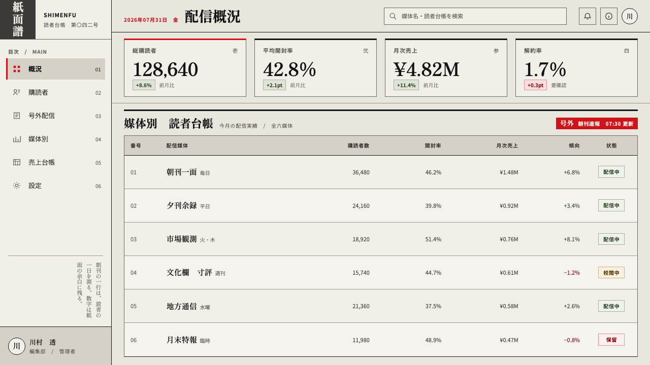
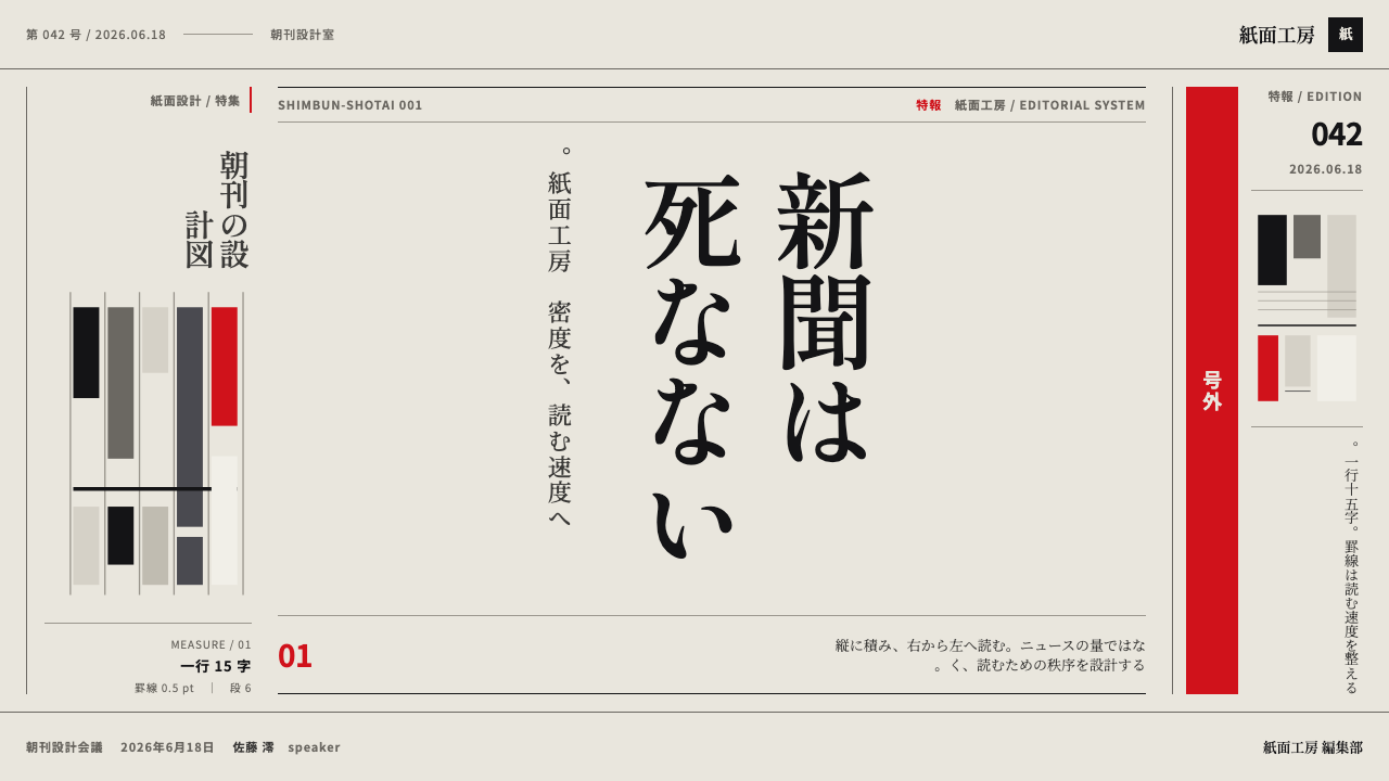
For presentation slides, a cover in this style is austere: a large Mincho headline, vertical or horizontal, against the grey ground, one hairline rule, a small date line and, if the topic is urgent, a single vermilion banner. Content slides can be built as newspaper pages, with a headline across the top and two or three narrow text columns divided by rules. Data slides are a natural fit: tables, rankings and small multiples sit in fine ruled grids, with numbers aligned in columns and labels in the smallest legible size.
For web interfaces the style suits news readers, research digests, financial dashboards, documentation and any product with many items to scan. Use narrow columns with ruled separators in place of cards, keep line lengths short and let headline size and position define hierarchy. Reserve the vermilion for a single state, such as a breaking update or an error, and keep everything else in black and grey. For Japanese-language content, vertical text can be used sparingly for a heading or a pull quote, with horizontal text for running body copy on screen.
For editorial and marketing work the style conveys credibility in a way few others do. A campaign page, annual report or magazine feature can borrow the front-page structure: a lead item with a larger headline, secondary items in narrower columns, small ruled sidebars for data and a flag line for the section. Keep images at column width with thin frames, and let the vermilion mark the single most important announcement.
The most common mistake is to copy the surface, grey paper, small type and vertical text, without the discipline. Using vermilion as a general accent, leaving generous whitespace or setting Latin text in a decorative face breaks the system. Another is to mistake density for clutter: a newspaper page feels full but is rigidly ordered, and every item must still sit on a column line and be anchored by a rule.
Japanese Newspaper Grid — FAQ
Does the style require vertical text?
No, but it helps. The vertical Mincho column is the source of the look. On screens and slides you can use horizontal setting for running copy and keep vertical lines for headings, pull quotes or labels. What matters most is the ruled, narrow-column structure and the tight spacing.
Why is the background grey rather than white?
Because newspaper is printed on mechanical-pulp paper with a low natural whiteness. A grey ground is part of the authenticity, and it gives the black ink a quiet, even contrast. On screen, switching to a pure white background changes the character of the page and makes it feel like a web document rather than a printed sheet.
What is the vermilion for, and can I use it more?
The vermilion is reserved for extras (号外), section flags and special-report (特報) banners. It works as a signal, so the more it is used, the less it means. Treat it as a once-per-page colour at most, and give it to the one item that truly deserves to interrupt the reader.
Is this the same as a Western newspaper style?
Related, but different. The Japanese broadsheet sets text vertically, divides columns with hairline rules instead of gutters and runs much denser, down to tiny stock tables that Western papers do not attempt. It is also less decorative: there is only one spot colour, and it appears rarely.
What content suits it, and what does not?
Dense, factual, update-driven content suits it: news, research summaries, financial data, policy reports and documentation. It is a poor fit for airy lifestyle or luxury branding, where whitespace and softness carry the value. If the product's promise is calm and spaciousness, this system will fight it.
Related design styles
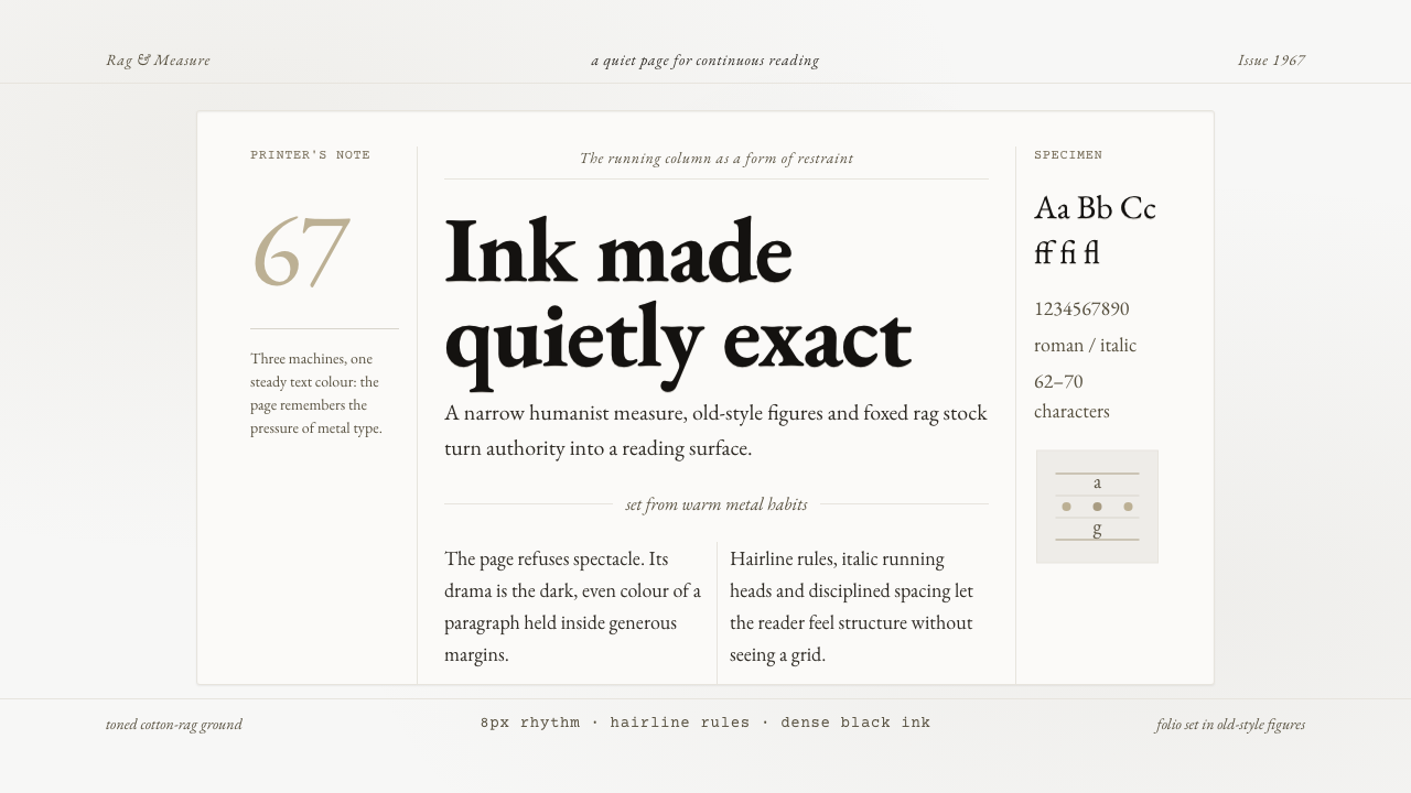 Sabon by Jan TschicholdQuiet authority in print. Dense black Garamond rests on foxed grey-tan rag pa…
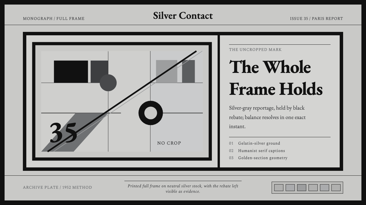 Cartier-Bresson Decisive MomentNever cropped. Silver-gray tonality is locked by a dead-black film rebate.
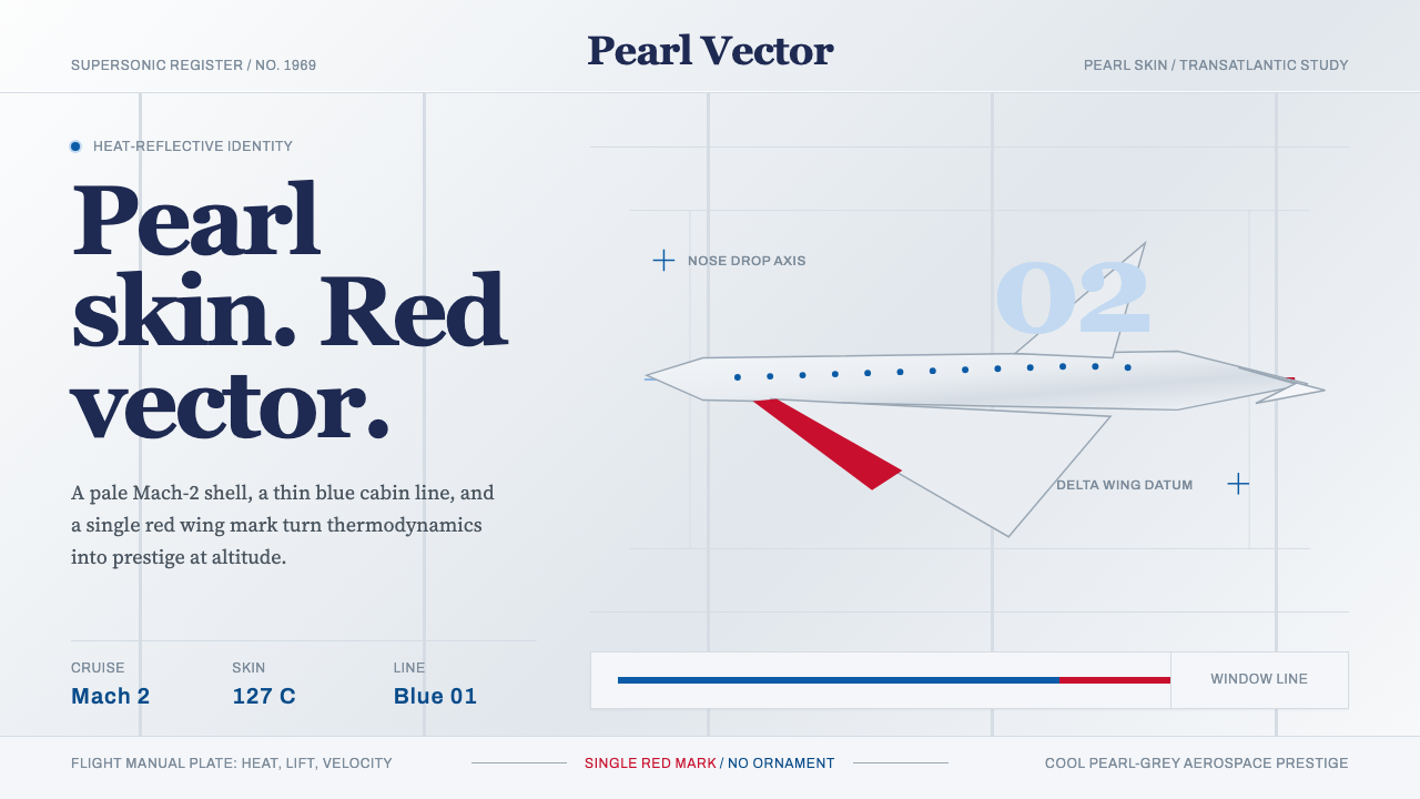 Concorde SupersonicPhysics made prestige. Pearl grey, sky-blue window line, and one red wing vec…
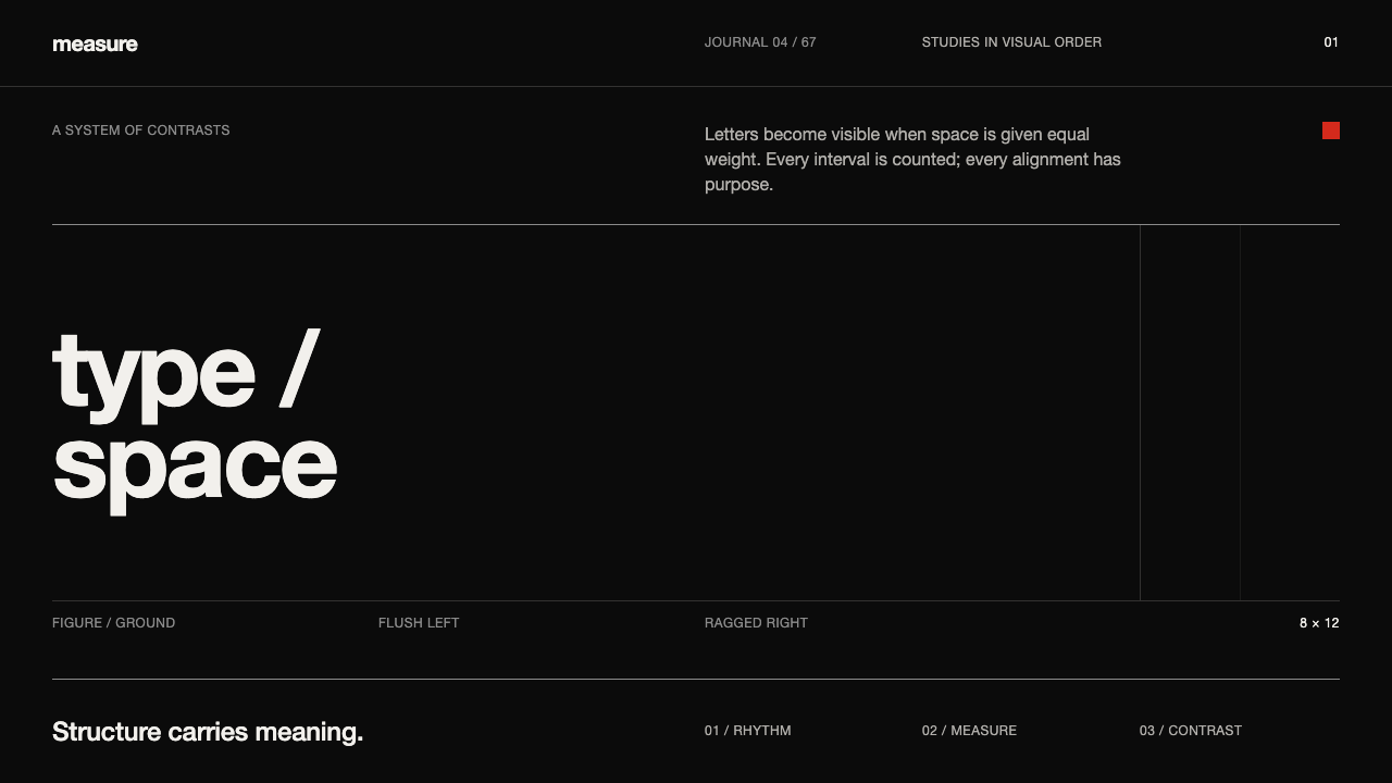 Emil Ruder TypografieDiscipline makes type visible. Near-white grotesque and measured space cut th…
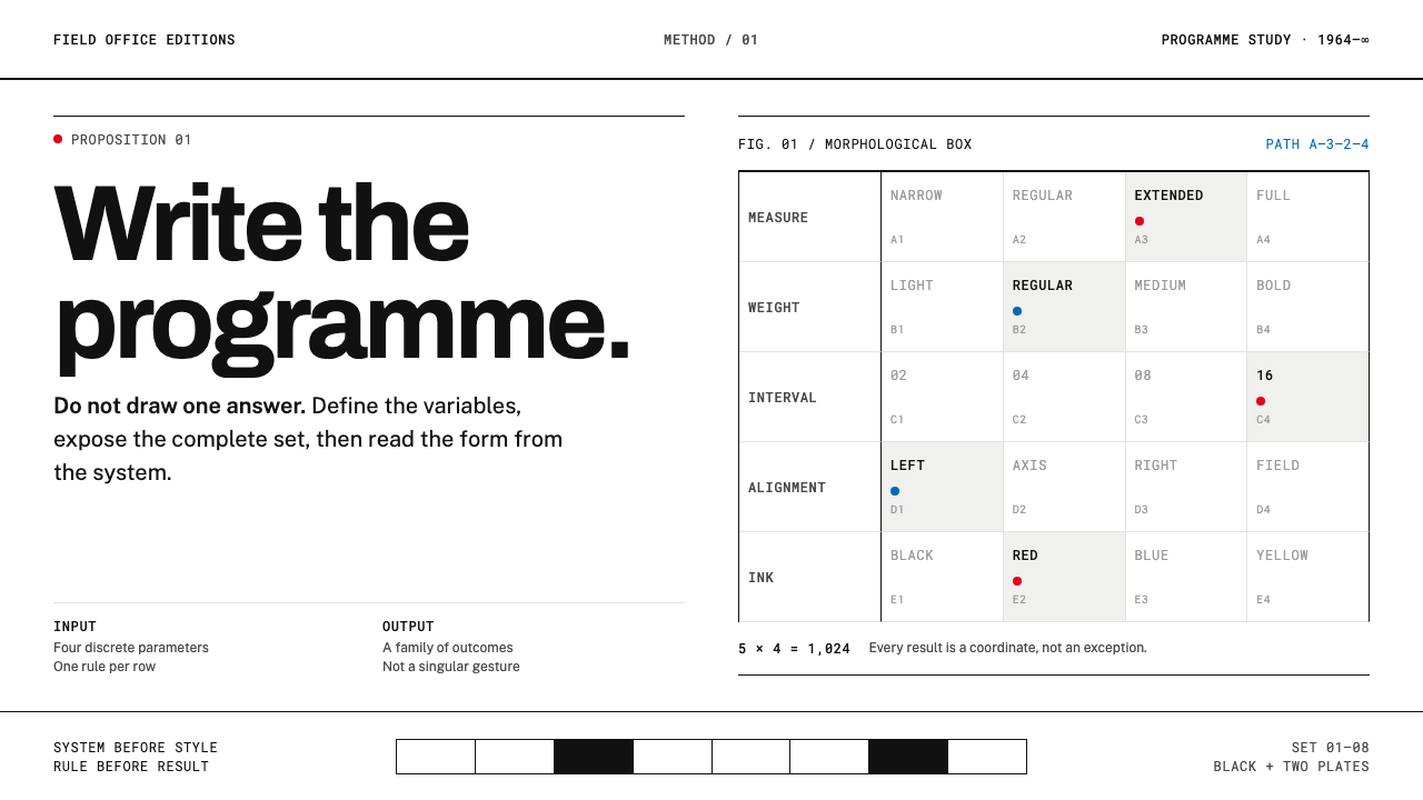 Karl Gerstner ProgrammesDesign becomes a programme. Black hairlines and a strict matrix turn paramete…
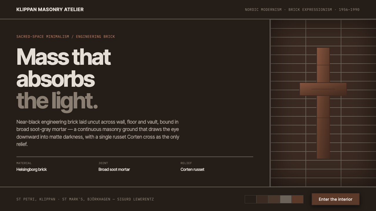 Lewerentz Dark BrickMass that absorbs light. Near-black engineering brick, broad soot mortar, one…