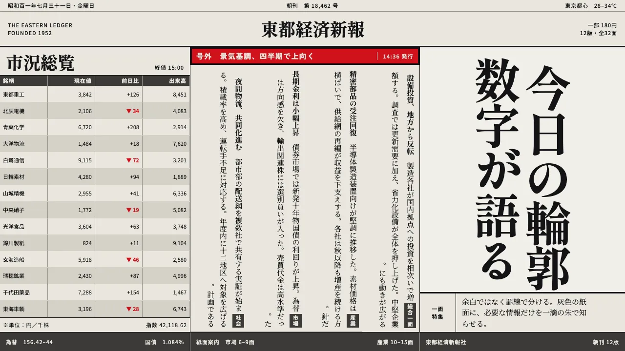
About Japanese Newspaper Grid
The Japanese broadsheet packs more information into a page than any other daily surface. Mincho runs vertically, right to left, fifteen characters to a line, columns held apart by hairline 罫線 rather than whitespace. Margins are millimetres.
Everything is ink black on grey mechanical pulp. One chroma survives the press: the vermilion kept back for 号外 extras, section flags and 特報 banners. Used anywhere else, it stops meaning anything.
- Origin
- Tokyo, Japan
- Era
- 1950s–1990s; hot metal → phototypesetting → computerised web offset
- Key figures
- Morisawa Nobuo · Ishii Mokichi · Asahi Shimbun type department
- Movements
- 新聞書体 (shimbun-shotai) · Tategaki vertical typesetting · Japanese web-offset newspaper production
Japanese Newspaper Grid design spec
Colors
Background
Surface
Primary
Secondary
Accent
Text
Typography
Shippori MinchoHeadings
Noto Serif JPBody
Noto Sans JPMono
Unlock for 1 credit
The other 11 sections — buttons, cards, spacing, motion, techniques and more — open once you unlock. Download the DESIGN.md or send it to your AI in one click. Unlock once, yours forever.
Sign up nowHave an account? Sign in
Styles similar to Japanese Newspaper Grid
Also inspired by print & type, with a close feel.
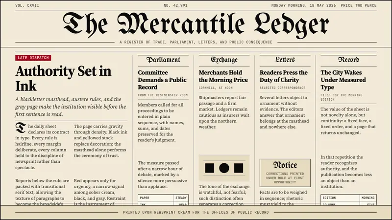 Gothic Blackletter Newspaper Masthead (1700)Authority in ink. Blackletter masthead, cream newsprint, and hairline columns.
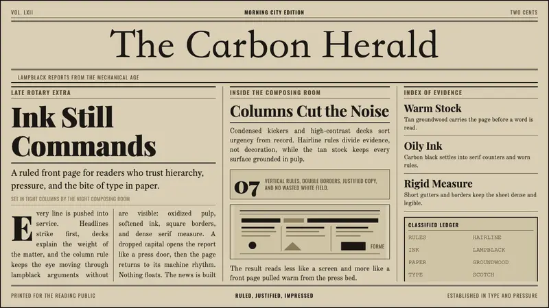 Broadsheet LetterpressAuthority in ink. Lampblack serif decks lock into tan paper with strict ruled columns.
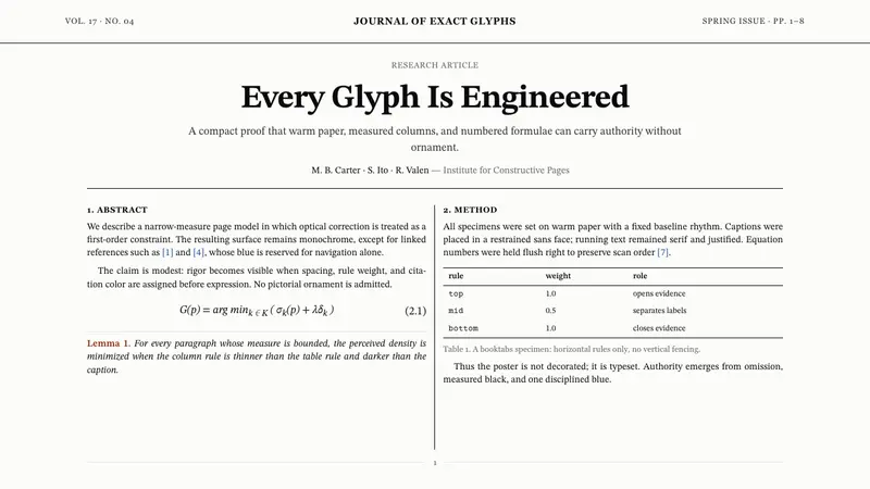 TeX Academic PaperRigor without ornament. Warm paper, Computer Modern text, hairline columns, one blue link.
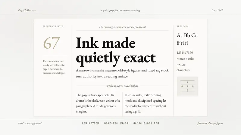 Sabon by Jan TschicholdQuiet authority in print. Dense black Garamond rests on foxed grey-tan rag paper.