What is Russian Onion Domes?
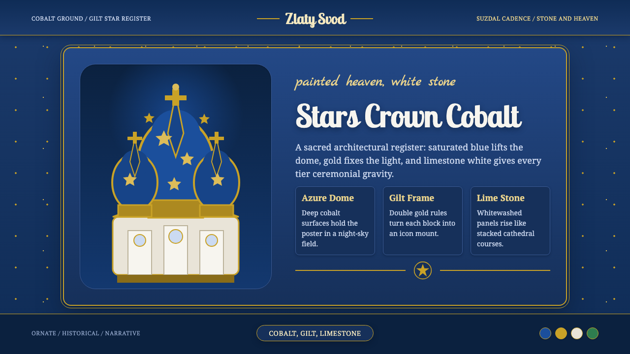
Russian Onion Domes ascend in sacred cobalt — gilt stars scattered over deep blue, rising from limestone-white walls in the silhouette that defines Russian Orthodox architecture.
Russian Onion Domes in brief
Russian Onion Domes draws its visual language from the canonical silhouette of Russian Orthodox church architecture: bulbous, tapering domes rising above whitewashed limestone walls, most iconically embodied by the Cathedral of the Nativity of the Theotokos at Suzdal, whose deep azure domes are scattered with gold five-pointed stars. In Orthodox symbolism the blue reads as heaven itself and the stars recall the Star of Bethlehem, giving the whole composition a devotional weight beyond mere decoration.
This design system renders that architecture as a saturated, ornate visual register: cobalt blue grounds, gilt-gold ornament used for stars, crosses, and decorative accents, and lime-white stone standing in as a bright, neutral figure ground against the deeper colors around it. Where a plainer church might use whitewash alone, this system also draws on the polychrome tradition of buildings like St Basil's Cathedral, whose domes carry a riot of green, red, and gold patterning far beyond the single-color onion dome of Suzdal.
Cyrillic-capable serif type carries the visual weight appropriate to Slavonic ecclesiastical text, while painted script accents recall the gilded lettering historically applied directly onto dome surfaces and icon frames. The overall effect is deliberately grand, narrative, and richly finished — closer to a Byzantine-Slavic devotional object than to a restrained modern design system, because that ornate, gilded richness is itself part of what the architecture was built to communicate.
Where does Russian Onion Domes come from?
The onion dome as an architectural form developed within Russian Orthodox church building over several centuries, distinguishing Russian ecclesiastical architecture visually from the flatter domes of Byzantine precedent it otherwise drew heavily upon. The form is thought to have practical roots — its curved, tapering profile sheds snow more effectively than a flatter dome, useful in Russia's long winters — as well as symbolic ones, with the dome's flame-like upward taper widely read as a visual representation of a candle or of spiritual ascent toward heaven.
Suzdal, one of the historic towns of the Golden Ring surrounding Moscow, developed as a major center of medieval Vladimir-Suzdal principality architecture beginning in the twelfth century, and its Cathedral of the Nativity of the Theotokos — whose current form dates largely from the thirteenth century with later additions — became a defining example of the cobalt-blue, gold-starred onion dome now treated as a canonical Russian Orthodox image. The star motif scattered across the dome's surface directly references the Star of Bethlehem, tying the building's exterior ornament to the specific biblical narrative of Christ's nativity that the cathedral is dedicated to.
Domes across Russian Orthodox architecture were not uniformly blue; color and finish varied by region, period, and available materials, ranging from plain sheet-metal grey or green to elaborate polychrome tilework and gilding. Saint Basil's Cathedral in Moscow, completed in 1561 under Ivan the Terrible to commemorate a military victory, represents the most famous departure from single-color restraint — its cluster of domes carries an almost carnival-like riot of pattern and color, an intentional visual statement of triumph and abundance rather than the quieter devotional blue of a church like Suzdal's.
Over centuries of Russian Orthodox tradition, the church remained the primary patron and steward of this architectural language, commissioning, recoloring, and maintaining domed structures across the empire as expressions of both spiritual devotion and imperial or princely authority. The visual vocabulary — saturated color, gilded ornament, a whitewashed stone ground, and Cyrillic ecclesiastical lettering — carried forward through that patronage into the present day as the most instantly recognizable signature of Russian religious architecture worldwide.
What defines the Russian Onion Domes look?
Color
Saturated cobalt blue dominates as the primary ground, read in Orthodox tradition as a representation of heaven itself, set against lime-white stone as a bright neutral figure ground. Polychrome greens and reds, drawn from buildings like St Basil's, may appear as secondary accents for a richer, more festive register.
Gilt Ornament
Gold-toned ornament — stars, crosses, decorative borders — carries symbolic and devotional weight rather than purely decorative function, most directly referencing the five-pointed stars scattered across the Suzdal dome as a visual echo of the Star of Bethlehem. Gilt accents are used deliberately rather than applied evenly across a composition.
Dome Silhouette
The bulbous, flame-like taper of the onion dome is the system's most recognizable structural motif, usable as a literal shape or as a compositional rhythm — a form that widens and then narrows toward a point, echoed in framing devices, section dividers, or iconographic borders.
Whitewashed Stone Ground
Lime-white stone surfaces provide a bright, neutral figure ground beneath the saturated blue and gold above, echoing the whitewashed limestone walls of buildings like the Suzdal cathedral. This pale base keeps the richer colors from becoming overwhelming by giving them a clear field to rest against.
Cyrillic Ecclesiastical Type
Serif type capable of rendering Cyrillic script carries the weight appropriate to Slavonic religious text, favoring forms with historical and devotional gravity over contemporary geometric sans-serifs. This typographic choice ties the system's textual elements directly to its architectural and religious source.
Painted Script Accent
Ornamental script accents recall lettering historically gilded directly onto dome surfaces and icon frames, used sparingly for titles, dedications, or decorative flourishes rather than as body text. This handwritten quality adds warmth and devotional character against the more formal ecclesiastical serif.
Polychrome Richness
Where the system draws on St Basil's Cathedral rather than Suzdal's single-color restraint, patterning becomes denser and more varied — overlapping bands of color, faceted or striped dome surfaces, and a generally more crowded, celebratory visual field than the plainer cobalt-and-gold register.

Who shaped Russian Onion Domes?
The medieval princes and builders of the Vladimir-Suzdal principality, active from the twelfth century onward, commissioned and constructed the cathedrals and churches that established Suzdal as a major center of Russian ecclesiastical architecture, including the Cathedral of the Nativity of the Theotokos whose cobalt, gold-starred dome defines this style.
As the primary patron and steward of Russian ecclesiastical architecture across centuries, the Russian Orthodox Church commissioned, colored, and maintained the domed churches this style draws from, embedding the cobalt-and-gold visual language with specific theological meaning — the blue of heaven, the gold of the Star of Bethlehem — rather than treating it as arbitrary decoration.
How do you use Russian Onion Domes today?
Russian Onion Domes is a style for products that want to feel grand, devotional, and historically weighty rather than restrained or minimal — cultural and heritage content, travel and tourism products about Russia or Eastern Europe, religious or civic institutions, or storytelling platforms that want a strongly narrative, ornate register.
For presentation slides, a cover works well built around a single dome silhouette rendered in cobalt with scattered gold star accents against a whitewashed field, with the title set in Cyrillic-capable serif type beneath it. Content slides should keep the deep blue and gold combination for headers and key accents while letting most of the body content rest on the lighter limestone ground, preserving the same balance the architecture itself strikes between saturated dome and pale wall. Data visualizations can use the dome silhouette as an unconventional chart or icon shape rather than a generic bar or circle.
For web interfaces, the style suits cultural institutions, heritage tourism platforms, or religious and civic organizations where grandeur and narrative weight are appropriate values rather than liabilities. Primary actions and headers can carry the cobalt-and-gold combination, while cards and content areas rest on the lighter stone tone, keeping the richer palette reserved for moments that deserve emphasis rather than spread evenly across an entire interface.
For editorial and marketing work, the style supports long-form storytelling about Russian history, Orthodox architecture, or Eastern European travel, where a gilded dome motif can frame a pull-quote or mark a section break with appropriate ceremonial weight. Marketing pages for cultural or heritage tourism benefit from full-bleed cobalt sections punctuated by gold ornament, evoking the scale and grandeur of the architecture itself.
A common mistake is to flatten the style into a single uniform blue-and-gold pattern without distinguishing between the quieter, single-dome cobalt register of a cathedral like Suzdal's and the far busier, polychrome richness of St Basil's — the two represent genuinely different registers within the same tradition, and mixing them without intention produces a muddled result. Equally, overusing gold ornament across an entire layout undermines its symbolic weight; gilt accents should mark specific, deliberate points of emphasis, the way stars are scattered rather than solidly covering a historic dome.
Russian Onion Domes — FAQ
Is this the same as generic 'Byzantine' or 'Eastern Orthodox' visual style?
It shares roots with the broader Byzantine-Slavic tradition but is anchored specifically in the Russian onion-dome silhouette, most iconically the cobalt-and-gold dome of the Suzdal cathedral rather than the flatter domes and mosaic traditions more associated with Byzantine architecture proper. Treating it as generically 'Byzantine' loses the specific dome silhouette and the deep-blue, gold-star combination that makes this reference distinctly Russian rather than broadly Eastern Orthodox.
Should this style always use the single cobalt-blue dome, or can it draw on St Basil's polychrome domes instead?
Both registers are legitimately part of the tradition and can be chosen depending on the desired mood. The single cobalt-and-gold dome, as at Suzdal, reads as quieter and more devotional; the polychrome, patterned domes of St Basil's read as festive, triumphant, and visually busier. A project should pick one register deliberately rather than blending both inconsistently within the same composition.
Can this style work with a light or pastel palette instead of saturated cobalt?
Not naturally. The saturated cobalt blue carries specific theological weight — it represents heaven in Orthodox tradition — and diluting it toward a pastel tone undermines that meaning along with the visual drama the style depends on. If a lighter composition is needed, it is better achieved by increasing the proportion of whitewashed stone ground relative to the blue, rather than lightening the blue itself.
Does this style suit modern secular products, or only religious and cultural content?
It works best for products with a genuine connection to grandeur, heritage, history, or place — cultural tourism, historical education, civic institutions, or narrative-driven brands. It is a poor match for products that need to feel light, casual, or fast-moving, since its saturated color, gilded ornament, and devotional symbolism carry a ceremonial weight that would feel misplaced on a casual consumer app or a minimal productivity tool.
Why do gold stars specifically appear on the dome, rather than another ornamental symbol?
The gold five-pointed stars scattered across domes like the one at Suzdal directly reference the Star of Bethlehem from the biblical nativity story, tying the building's exterior ornament to a specific theological narrative rather than functioning as arbitrary decoration. Using a different symbol in its place would sever that direct scriptural connection, which is part of why the star motif specifically, rather than a generic ornamental shape, carries so much weight in this style.
Related design styles
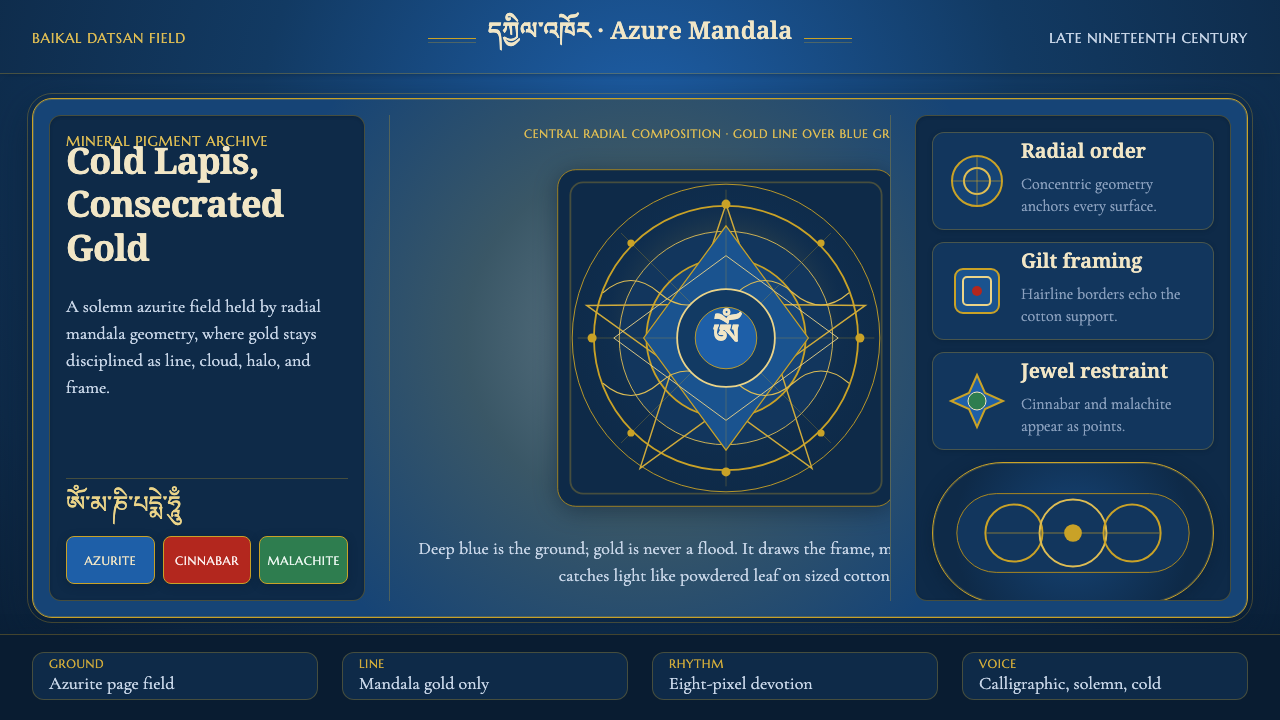 Buryat Buddhist Datsan ThangkaCold lapis holds silence. Gold mandala lines frame a solemn azurite field.
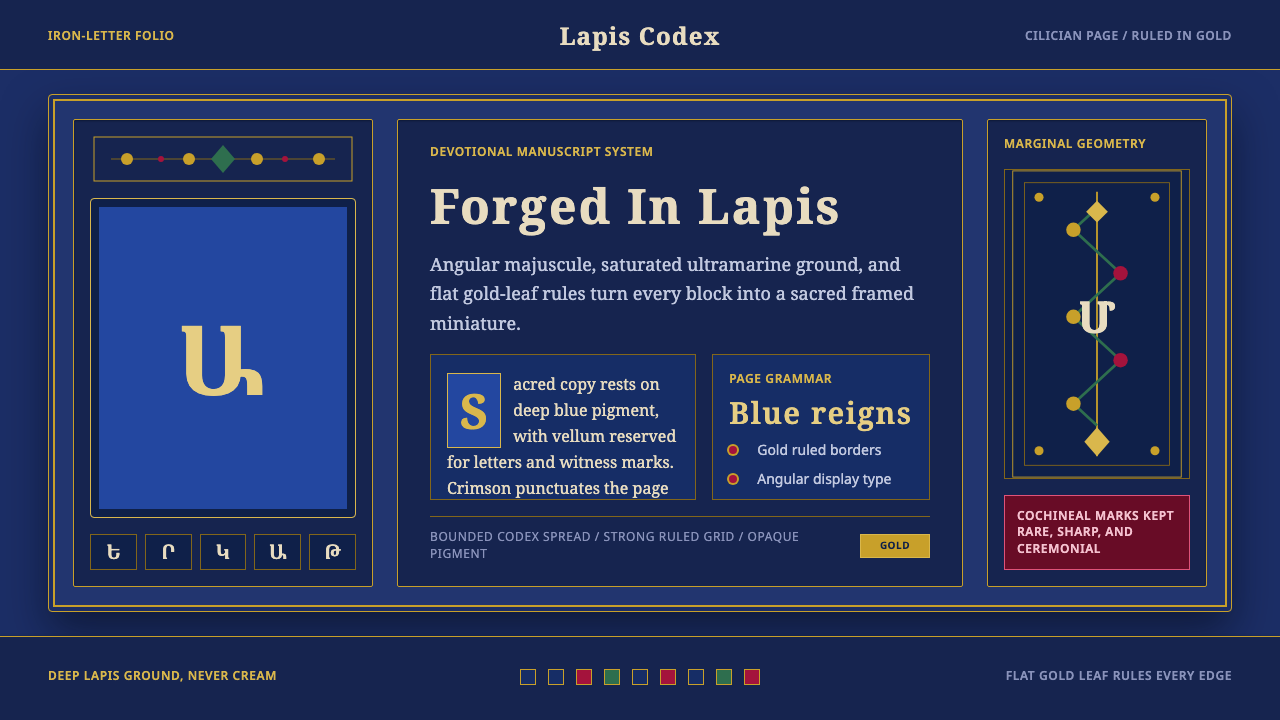 Armenian ErkatʿagirDevotional lapis reigns. Gold rules and angular serif glyphs frame a sacred g…
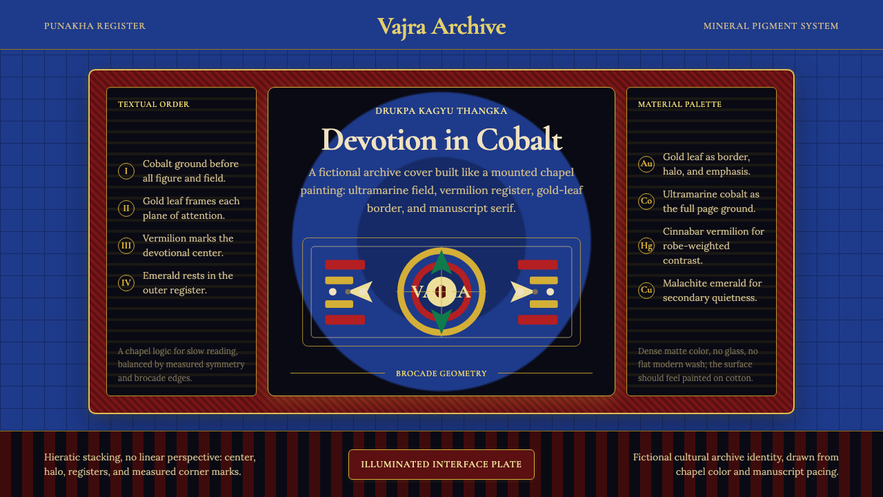 Bhutanese Drukpa Kagyu ThangkaDevotion made cobalt. Gold frames, Cormorant serif, and vermilion marks hold…
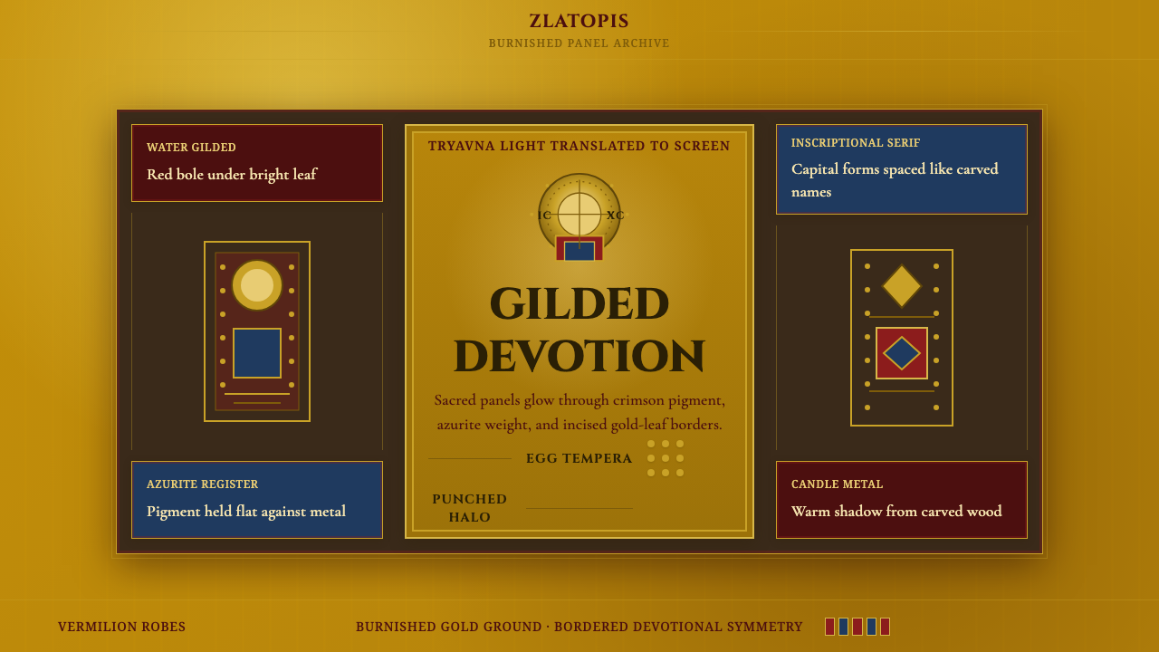 Bulgarian Orthodox IconSacred metal holds still. Burnished gold, crimson panels, and punched halos f…
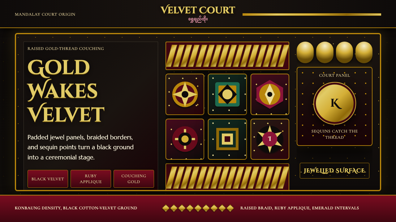 Burmese Kalaga TapestryVelvet becomes theater. Black ground, gold-thread borders, ruby and emerald p…
 Cellarius Celestial AtlasCelestial luxury on lapis. Gilt serif type, star fields, and concentric chart…