What is Rudolf Koch Lettering?
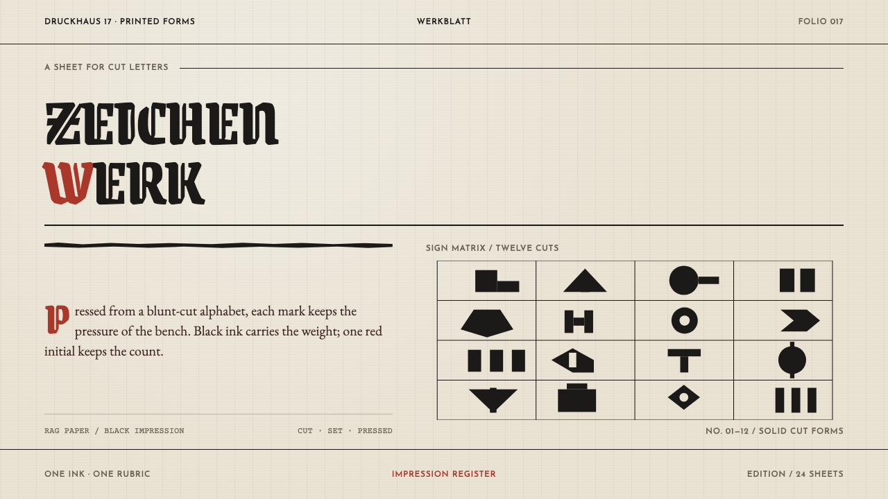
Rudolf Koch's Offenbach lettering is the look of a letterpress sheet on which the letters are the layout — blackletter cuts pressed into warm rag paper, a single vermilion mark, and nothing decorative laid on top.
Rudolf Koch Lettering in brief
Rudolf Koch Lettering is a design language modelled on a letterpress sheet from Offenbach am Main in the first third of the twentieth century. Warm handmade rag paper carries black ink that has been pressed, even bitten, into the surface; a single vermilion mark provides emphasis; and the solid black woodcut signs of Das Zeichenbuch float in generous white. The letters are not placed on a layout. They are the layout, and they are set large, full, and pushed toward the edge of the sheet.
Its source is a way of making rather than a way of looking. Rudolf Koch cut type the way a scribe writes: broad nib first, graver second, drawing almost never. The shapes you see are the traces of a writing hand carried into metal, not outlines drawn and then polished. That is why the style is full of small irregularities — weight that wobbles from stroke to stroke, terminals that land blunt — and why those irregularities are the skeleton of the style rather than its flaws.
The system turns this into a rule for screens and slides: let type be the primary image, keep colour to black ink and one red, and let the paper be warm instead of neutral white. Blackletter, which German calls gebrochene Schriften or 'broken scripts', supplies the angular, rhythmic texture. Wide white space around the lettering and the woodcut signs supplies the pause. What the style refuses is the idea that lettering is an ornament on top of a composition.
Where does Rudolf Koch Lettering come from?
The material dates the relevant work to 1906–1934, the Klingspor years, with the Offenbacher Werkstatt active through the 1920s and early 1930s. The place is Offenbach am Main, Germany, and Karl Klingspor, whose name the period carries, is among the key figures. The movements the system names are German Schriftkunst — the art of lettering and writing — the revival of the gebrochene Schriften, and Werkstatt craft-guild type production. Together they describe a world in which type was still understood as handwork.
What is distinctive is how Koch made letters. A scribe writes with a broad nib, and Koch began there; the graver came second, and drawing hardly at all. Neuland, dated in the system's material to 1923, went straight into metal punches at every size. Because each size was cut directly rather than derived from a drawing, its weight wobbles and its terminals land blunt. Those traits would count as defects in a face engineered for uniformity. In Koch's work they are the evidence of a hand.
At the Offenbacher Werkstatt, Koch and Fritz Kredel worked as a guild rather than as a design office: a punchcutter, a woodcutter, a weaver and a bookbinder at the same bench. The arrangement matters visually. A letter cut in metal and a sign cut in wood are close relatives — both are cut shapes, solid and unshaded, made by a hand that expects to be seen — and that kinship is why the type and the Zeichenbuch signs sit so comfortably on the same sheet.
The system's translation of all this is a letterpress sheet, a physical object with a material relationship between ink and paper. Black ink bites. The paper is warm and handmade, not neutral. Vermilion appears once, in the manner of a rubricator, to mark the one thing that matters. The woodcut signs sit in the white as solid black shapes. The design rule that follows from the history is simple: if the letters shrink, the energy leaves the page. Type has to be big, full, and pressed to the edge of the sheet.
What defines the Rudolf Koch Lettering look?
Lettering as composition
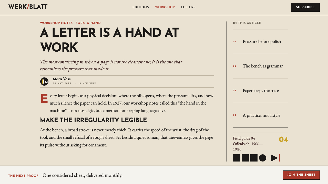
Type is not placed on a layout; it is the layout. Lines of lettering run large and full, close to the edges of the sheet, and the arrangement of the words is the arrangement of the page. Everything else — the red mark, the woodcut sign, the white around them — is subordinate to the shape the letters make together.
Hand-cut irregularity
Strokes vary in weight and terminals land blunt, because the letters were cut directly into metal at every size rather than generated from a drawing. This is not distress or roughening applied afterwards. The wobble is structural, belongs to each individual letter, and gives the sheet a pulse that uniform digital outlines cannot supply.
Blackletter structure
Gebrochene Schriften — 'broken scripts' — are built from angular, faceted strokes that make a dense, vertical, rhythmic texture. In this system blackletter is the voice of the headline and the display line. It is a texture as much as a set of letters: a line of it reads first as a dark band and only then as words, which is part of its force.
Ink bitten into rag paper
The ground is warm, handmade rag paper, and the black ink sits in it with the slight bite of letterpress rather than on it like a coating. The paper is a participant: its warmth and its soft edges are part of the palette, and a stark neutral white would remove the material relationship between ink and sheet that the whole look depends on.
One vermilion rubrication
There is exactly one accent: a vermilion red used in the manner of a scribe's rubrication, to point at the single thing that matters on the sheet. Because it appears once, it works. A second red element, or a second accent colour, dilutes it immediately; the discipline of the palette is the discipline of one mark.
Solid woodcut signs
The signs of Das Zeichenbuch are solid black shapes, cut rather than drawn, with no hatching or tonal modelling. They float in generous white and read as marks of the same family as the letters. Used as ornament they would be decoration; used as signs, scattered sparingly in white space, they behave like punctuation.
Generous white
Large lettering needs room to be large. The white around the type and the signs is not leftover space but the counterweight that lets the black read as dense. The page is organised as heavy shapes surrounded by quiet, and the quiet is as deliberate as the ink.
Who shaped Rudolf Koch Lettering?
The centre of the system. Koch cut type the way a scribe writes — broad nib first, graver second, drawing almost never — and the Neuland of 1923 went straight into metal punches at every size. The wobble in its weight and the bluntness of its terminals are what this design language protects. Everything else about the style, from the big full lettering to the single red mark, follows from taking that handmade origin seriously.
Named as the colleague with whom Koch worked at the Offenbacher Werkstatt as a guild, not an office. The detail to take from his place in the story is the arrangement itself: punchcutter, woodcutter, weaver and bookbinder at one bench. A design system built on this lineage should feel like one hand across different trades, with letters, signs and page all sharing the same cut, solid, unshaded character.
Listed among the key figures of the lineage, which signals that the Werkstatt look was a shared tradition rather than Koch's alone. The material places the period in a window of 1906–1934; for his individual work, readers are better served by histories of twentieth-century lettering. What this system takes from his inclusion is the reminder that the style is a school of making, not a single typeface.
The period itself carries his name: 1906–1934 is described as the Klingspor years, and the Offenbach setting in which Koch and his workshop operated belongs to that window. For a designer the useful point is chronological. The look is a product of the first third of the twentieth century and of a specific town, and its credibility depends on keeping that grounded sense of place and material.
How do you use Rudolf Koch Lettering today?
Rudolf Koch Lettering is a typographic style first and a colour scheme second. Applying it well means committing to the idea that the letters carry the page: large, full lines, set against warm paper, with a single red mark and a few solid signs in the white. Anything that makes the type smaller or the page busier works against it.
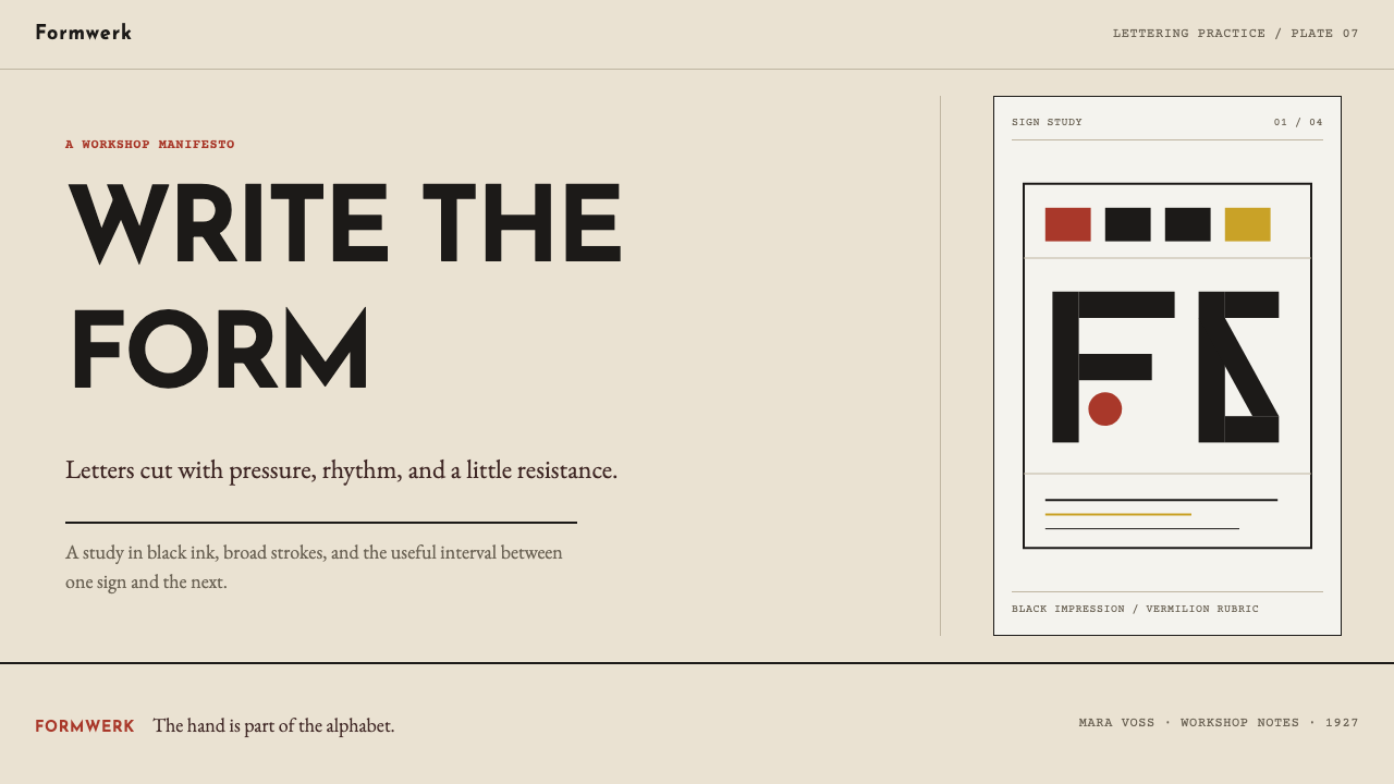
On slides, the cover is a poster: one or two words set so large they nearly touch the edges, black on warm paper, with a single vermilion rule, word or sign as the only accent. Content slides should say less and say it bigger — one statement per slide, set as lettering rather than bullets, with a woodcut-style sign in generous white as punctuation. Data slides can set the key number in display lettering, with the chart built from solid black shapes and no gridlines, shading or gradients.
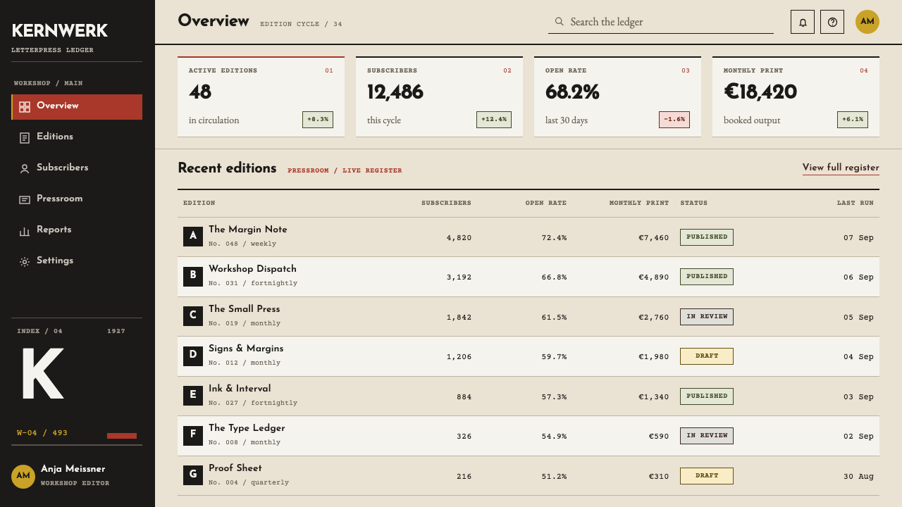
On the web the style suits publishers, bookshops, presses, galleries, craft food and drink, festivals and anything that sells the idea of things made by hand. A hero can be nothing but a huge line of type on a paper-coloured field, with one red link or button as the single call to action. Pricing pages can set the price numerals as lettering and rely on spacing rather than boxes to separate the plans. It is a poor fit for dense dashboards, where the premise of oversized type works against information density.
In editorial and marketing work — posters, book covers, invitations, menus, packaging and announcement cards — the style is at home. Set the title as the whole image, add a single red element, and let a small solid sign sit in the margin. Long text can be handled by pairing the display lettering with a quiet, readable text face at a comfortable size and keeping the blackletter for headings and short lines, where its texture works as a band before it is read as words.
The commonest mistake is fake roughness: applying a uniform grunge filter, noise or random distortion to clean digital type to imitate the wobble. Koch's irregularity was structural, belonging to each cut letter, and a filter reads as costume. The other mistakes are shrinking the lettering so the energy leaves the page, using a second red or a second accent, setting long passages of text in blackletter, and filling the white space with decoration, shadows or gradients.
Rudolf Koch Lettering — FAQ
What was the Offenbacher Werkstatt?
It was the workshop in Offenbach am Main where Rudolf Koch and Fritz Kredel worked as a guild rather than as a design office, with a punchcutter, a woodcutter, a weaver and a bookbinder at the same bench. It was active through the 1920s and early 1930s. For design purposes the key idea is that letters, woodcut signs and bound pages were products of one shared craft culture, which is why they look related.
Why are the letters irregular on purpose?
Because the irregularity is where the style comes from. Koch's Neuland went straight into metal punches at every size, so its weight wobbles and its terminals land blunt. Those are the marks of a cutting hand. Remove them and what is left is a generic blackletter costume. Keep them, and avoid imitating them with random roughening, which has none of the logic of a cut letter.
Why only one red?
The red works in the manner of a scribe's rubrication: it marks the one thing that must be seen first. A single vermilion element on a field of black type and warm paper has a clear job. A second red, or a second accent, turns emphasis into decoration. If a layout seems to need more than one mark, the hierarchy is usually the problem, not the palette.
Can blackletter be used for body text?
It is best kept for headings, display lines and short phrases. Blackletter reads first as a dense dark band and then as words, which suits large lettering but tires the eye over long passages. This system's idea of lettering as the composition is about big display type; for paragraphs, pair it with a quiet, plain text face and let the contrast between the two do the work.
Does the style work on a dark background?
It is built on warm paper and black ink, so the natural reading is dark on light. Inverting it loses the bite of ink into paper and the sense of a printed sheet, and the vermilion mark behaves differently against black. If a dark version is needed, keep the type large and full, keep the single red accent, and treat the page as a letterpress sheet printed on dark stock rather than as a glowing screen.
Related design styles
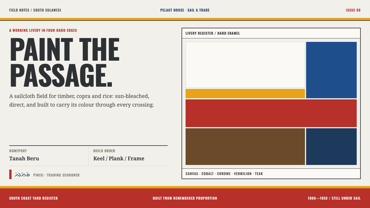 Bugis PinisiSailcloth made resolute. Vermilion, chrome and cobalt bands cut a warm white…
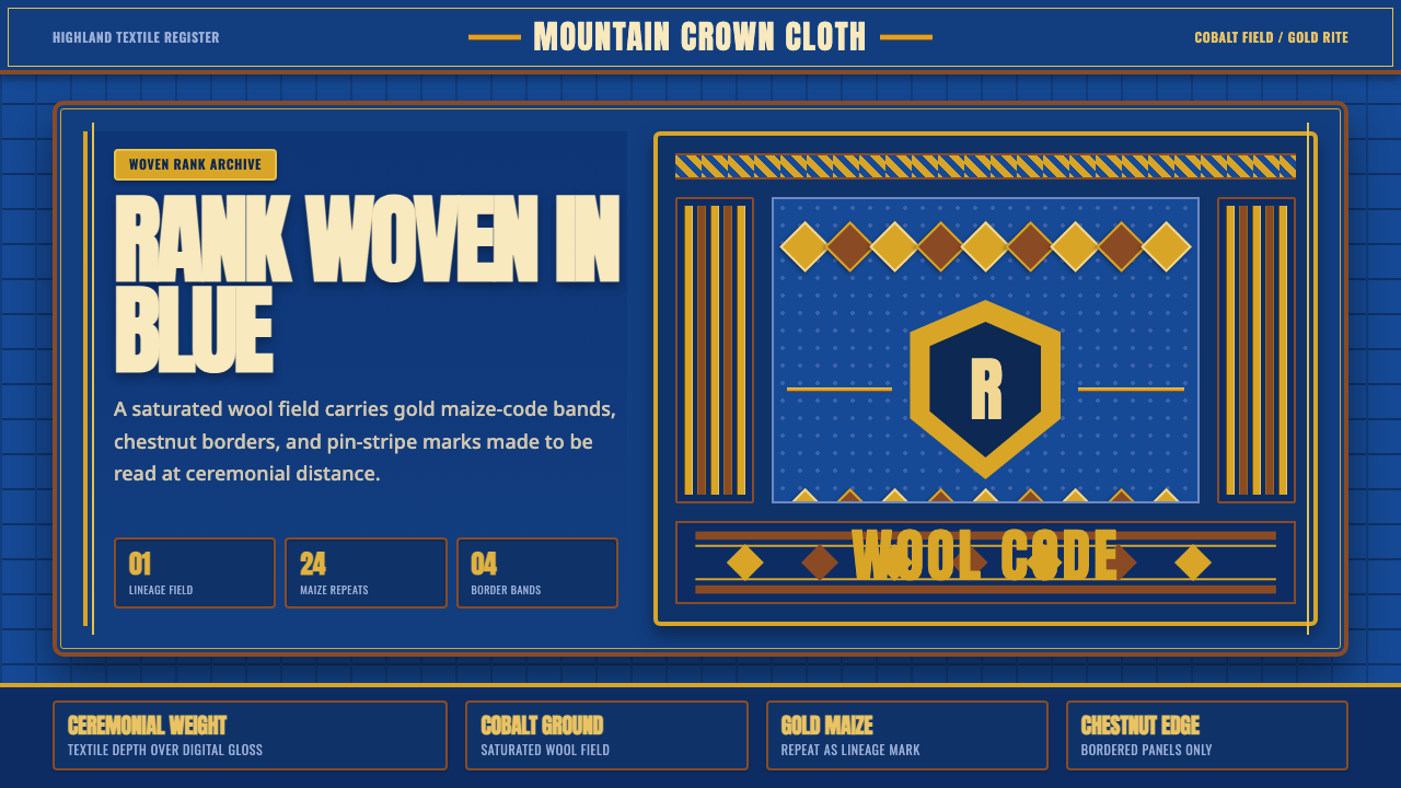 Basotho Seanamarena BlanketRank made visible. Cobalt wool, gold maize diamonds, and chestnut borders rea…
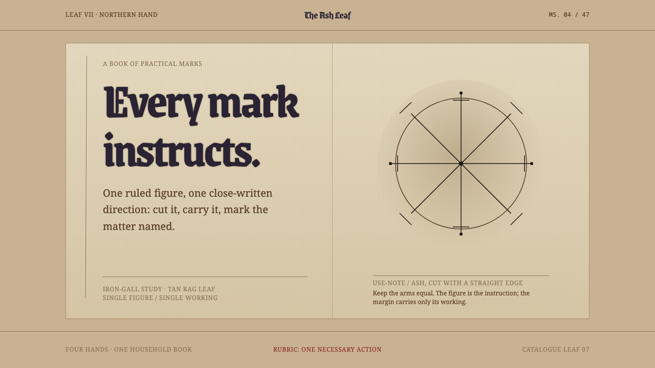 Icelandic GaldrabókEvery mark instructs. Iron-gall geometry stands alone on a smoke-darkened tan…
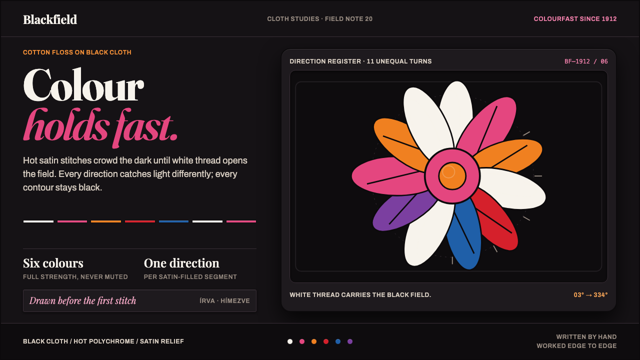 Kalocsa EmbroideryColour burns against black. White thread and hot satin segments pack the fiel…
 Pinocchio (1883 Marionette Workshop)Carved from honest timber. Red, blue and ochre punctuate crisp engraved lines.
 Plečnik's LjubljanaA city made monumental by hand. Fired-clay courses and carved Roman capitals…