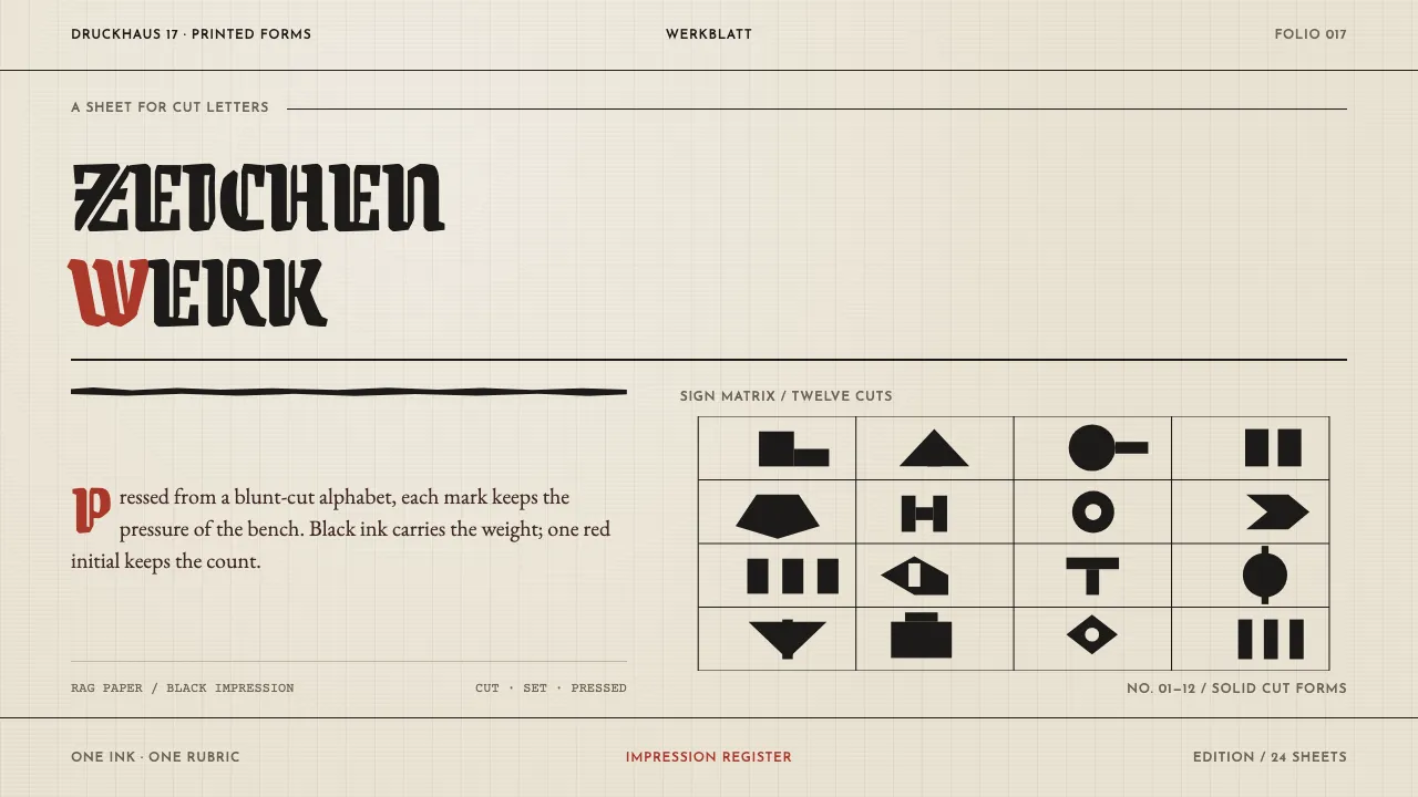
About Rudolf Koch Lettering
Rudolf Koch cut type the way a scribe writes: broad nib first, graver second, drawing almost never. Neuland went straight into metal punches at every size, which is why its weight wobbles and its terminals land blunt. At the Offenbacher Werkstatt he and Fritz Kredel worked as a guild — punchcutter, woodcutter, weaver, bookbinder at the same bench.
The look is a letterpress sheet: warm handmade rag paper, black ink bitten into the surface, one vermilion rubrication for emphasis, and the solid woodcut signs of Das Zeichenbuch floating in generous white. Lettering is the composition, not the ornament on top of it.
- Origin
- Offenbach am Main, Germany
- Era
- 1906–1934 (Klingspor years); Offenbacher Werkstatt through the 1920s–early 1930s
- Key figures
- Rudolf Koch · Fritz Kredel · Berthold Wolpe · Karl Klingspor
- Movements
- German Schriftkunst · gebrochene Schriften revival · Werkstatt craft-guild type production
Rudolf Koch Lettering design spec
Colors
Typography
The other 11 sections — buttons, cards, spacing, motion, techniques and more — open once you unlock. Download the DESIGN.md or send it to your AI in one click. Unlock once, yours forever.
Sign up nowStyles similar to Rudolf Koch Lettering
Also inspired by print & type, with a close feel.
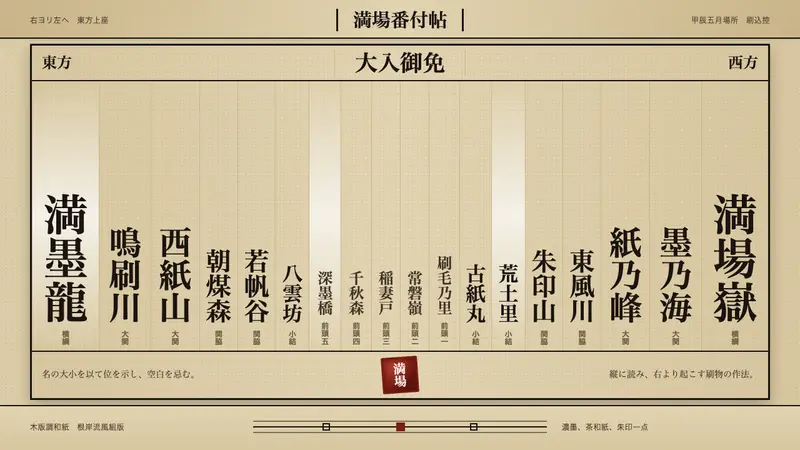 Sumo BanzukeCeremonial density. Sumi columns crowd tan washi; rank-scaled type meets one vermilion seal.
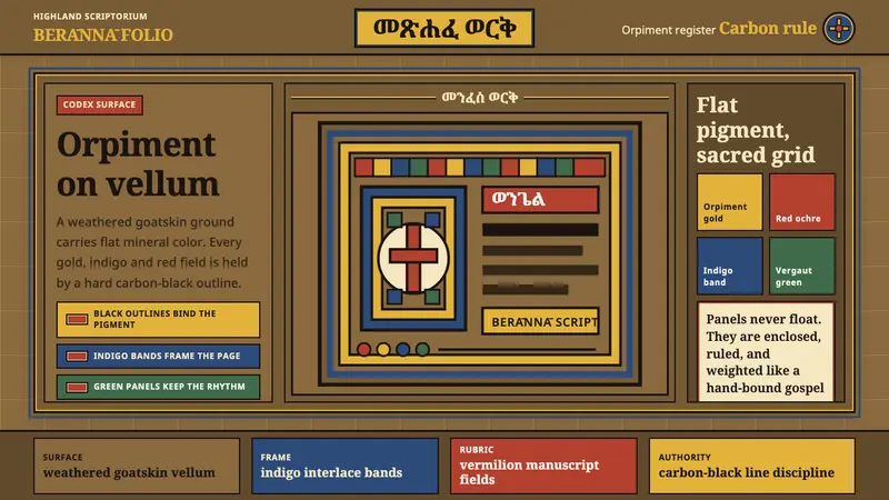 Ethiopian Ge'ez GospelSacred color held in line. Orpiment gold and indigo panels sit on weathered vellum.
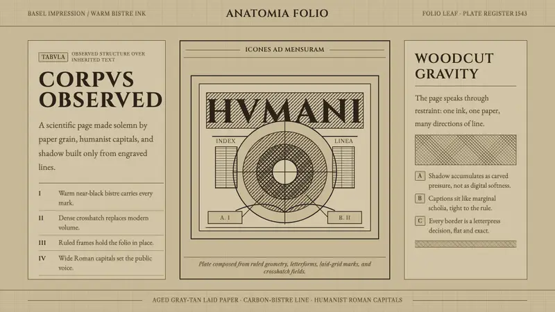 Vesalius AnatomyScience feels hand-pressed. Bistre Cinzel, hatchwork, and warm laid paper hold the page.
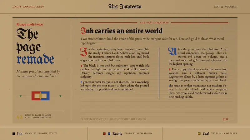 Gutenberg 42-Line BiblePrecision awaits the hand. Dense black columns open into red, blue and gold on browned vellum.