What is Pinocchio (1883 Marionette Workshop)?
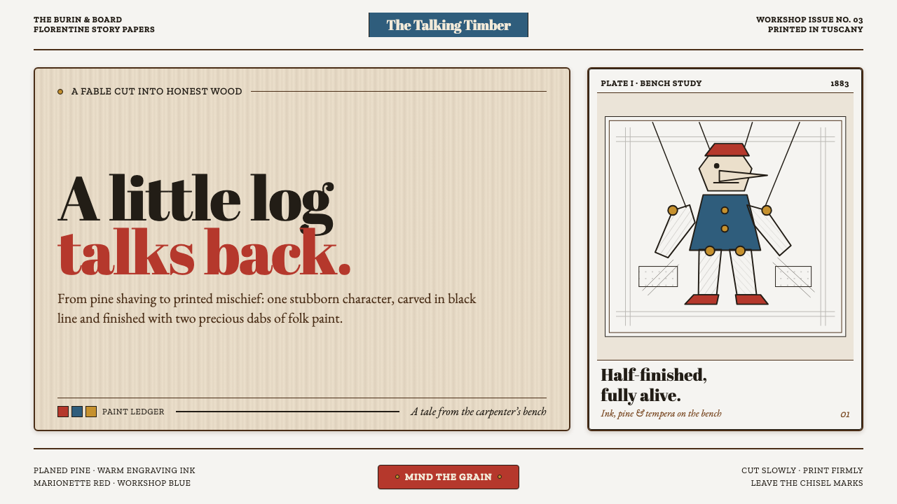
Pinocchio (1883 Marionette Workshop) turns a children’s classic into a carpenter’s bench: honest timber, engraved ink, and a few stubborn marks of folk paint.
Pinocchio (1883 Marionette Workshop) in brief
Pinocchio (1883 Marionette Workshop) is a visual language rooted in the material world of Carlo Collodi’s talking log: a piece of timber becoming a character under a carpenter’s tools. Its ground is raw walnut and pine, with visible grain, planed surfaces, small imperfections, and the suggestion that every object has been cut, carved, joined, or held in a vise. The mood is playful, but never polished into sweetness. It should feel handmade, slightly unruly, and physically credible.
Its imagery borrows the visual discipline of nineteenth-century wood engraving, especially the hand-cut illustration plates associated with Enrico Mazzanti and the first Felice Paggi edition. Form is established through engraved contour, close hatching, and cross-hatching rather than soft modeling. Light appears where the ink loosens; shadow accumulates where lines thicken, overlap, and change direction. A face, sleeve, plank, toy, or theatrical prop should read as something worked from a block, not painted with smooth digital volume.
Color is deliberately scarce. Vermilion, Prussian blue, and ochre-like warmth punctuate the brown timber field as if applied by a Tuscan craftsperson to a cap, coat, sign, or toy detail. These bright notes are not a general palette for filling every surface. They are precious interruptions: a painted signal against grain, ink, and exposed wood. The result is closer to a half-finished marionette in a workshop than a flat, candy-colored cartoon.
Where does Pinocchio (1883 Marionette Workshop) come from?
The style belongs to the period in which Pinocchio first emerged: Carlo Collodi’s story was serialized in Giornale per i bambini from 1881 to 1883, then appeared as a first book edition in Florence in 1883. That publication history matters because the workshop atmosphere is not an abstract rustic fantasy. It is anchored in a specific Italian children’s-book world, where narrative, illustration, printing, and physical craft met on the page.
Its regional imagination is Tuscan, spanning Florence and the village of Collodi. The workshop is therefore not a generic European toy shop. It evokes a local culture of carpentry, painted objects, marionette making, worn timber, and practical handiwork. Wood is not a background texture pasted behind a design; it is the governing material, the narrative premise, and the surface against which every mark must earn its place.
Nineteenth-century wood engraving provides the image-making method. Engraved lines do more than decorate an illustration: they describe direction, surface, pressure, and contour. Parallel marks can follow a rounded cheek, angled grain can establish a board, and cross-hatching can make a recess feel deep without dissolving the image into atmospheric blur. This vocabulary retains the evidence of the hand and of reproduction through a carved plate.
The source material identifies Carlo Collodi, Enrico Mazzanti, Ferdinando Martini, and Felice Paggi as key figures around this cultural frame. Collodi supplies the talking log and the moral mischief of the tale; Mazzanti supplies the original engraved visual reference; Paggi names the early book-edition context. Together with Tuscan folk marionette craft and Italian children’s-book illustration, they define a style that is literary, printed, theatrical, and materially grounded at once.
What defines the Pinocchio (1883 Marionette Workshop) look?
Honest Timber
Walnut and pine are the visual ground, not merely scenic decoration. Grain should remain legible, planed boards should retain their directional character, and small irregularities should imply handling and use. The surface feels made from material that can split, chip, darken, and carry paint. A clean digital field may support the composition, but it should not erase the sense that the design began with wood.
Engraved Line
The defining mark is the crisp engraved line: decisive around silhouettes, lively within surfaces, and visibly cut rather than softly brushed. Line density establishes hierarchy. Sparse marks preserve a highlight or an open plane; tightly gathered marks indicate weight, shadow, or roughness. The line should retain a tactile scratch, as though a burin has met resistance in the block.
Hatching and Cross-Hatching
Shadow is built through laborious direction changes rather than smooth tonal transitions. Parallel hatching follows the structure of an object, while cross-hatching deepens folds, cavities, or the underside of a form. This creates a graphic rhythm that is both descriptive and decorative. The important quality is not photographic realism, but the conviction that every dark area has been earned by accumulated marks.
Scarce Folk Paint
Vermilion and Prussian blue are used like workshop paint, with ochre warmth already present in the timber. A colored passage should identify something important: a puppet garment, a cap, a painted sign, or a moment of comic attention. Because color is scarce, it carries disproportionate narrative force. When every object becomes equally bright, the workshop loses its material gravity and begins to resemble the flat cartoon language this style explicitly avoids.
Marionette Construction
Objects and characters should suggest joints, rods, strings, carved limbs, toy mechanisms, or simple stagecraft. This does not require literal strings in every composition. It means treating the figure as an assembled thing with a visible construction logic. A crooked pose, a segmented sleeve, a wooden hinge, or a theatrical prop can make the image feel poised between workshop object and living character.
Unfinished Evidence
The workshop should look inhabited by process. Chisel marks, exposed grain, partial paint, irregular ink, and a reserve of unworked surface make room for making itself. This is not an excuse for random distressing. Each roughness should clarify how an image, prop, page, or puppet might have been produced. The preferred imperfection is purposeful: a trace of labor that strengthens the story.
Who shaped Pinocchio (1883 Marionette Workshop)?
Collodi is the authorial source of the talking log and the marionette world that this style reimagines. His story supplies more than a recognizable character: it supplies the central transformation from raw timber into a troublesome living presence. The workshop aesthetic works when it preserves that tension between objecthood and animation.
Mazzanti is the visual reference point for the original illustration plates associated with the first book edition. His presence directs the style toward cut line, hatching, and cross-hatching rather than polished painted illustration. The goal is not to reproduce an old plate mechanically, but to preserve its engraved logic: contour first, texture through marks, and depth through disciplined accumulation.
Martini is named in the source material among the key figures surrounding the theme’s early Italian context. Within this style framework, that listing reinforces that Pinocchio belongs to a particular nineteenth-century cultural and publishing world, rather than to a later mass-media interpretation detached from Tuscany, engraving, and the first book-era atmosphere.
Paggi names the Florence book-edition setting tied to Mazzanti’s original plates. For the visual system, this connection matters because it keeps print culture in view. A page should feel capable of being printed from inked engraving, even when it is adapted for a screen, presentation, poster, or contemporary editorial composition.
How do you use Pinocchio (1883 Marionette Workshop) today?
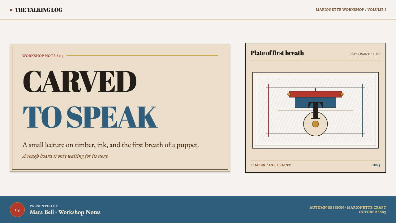
For presentation slides, use the cover as a workshop sign or illustrated title leaf. Let one carved object, puppet silhouette, knotty plank, or engraved character carry the composition, with the title placed as a clear printed inscription rather than floating decoration. On content slides, organize information as if it were pinned to a bench: firm headings, ruled separations, small engraved motifs, and broad areas of wood or paper-like quiet. The style needs breathing room so its grain and linework remain readable.
Data slides work best when charts behave like cut objects rather than glossy software widgets. Use the timber field as a stable ground, draw axes and divisions with engraved-looking restraint, and reserve vermilion or Prussian blue for the series that needs attention. Bars can resemble painted slats, markers can resemble round pegs, and annotations can use narrow illustrated callouts. Avoid smooth atmospheric effects, dense rainbow coding, or decorative depth that competes with the data.
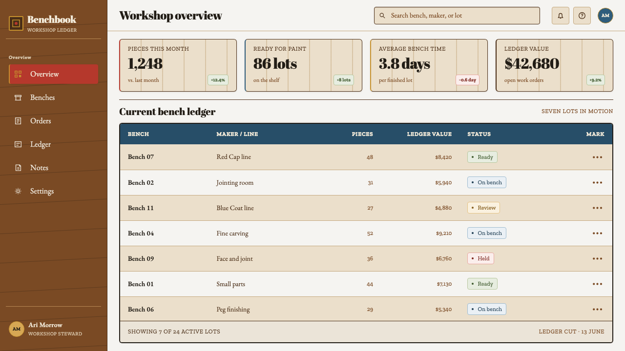
For web interfaces, the style is strongest in editorial dashboards, project trackers, educational tools, catalog pages, and pricing experiences that benefit from a memorable craft identity. Navigation can feel like printed labels on a cabinet or workshop drawer. Panels should look constructed, with clear edges, grain-aware backgrounds, and small signs of joinery or engraving, while text remains direct and comfortably readable. Use bright folk paint for selected states, important actions, or category signals, not as a constant background event.
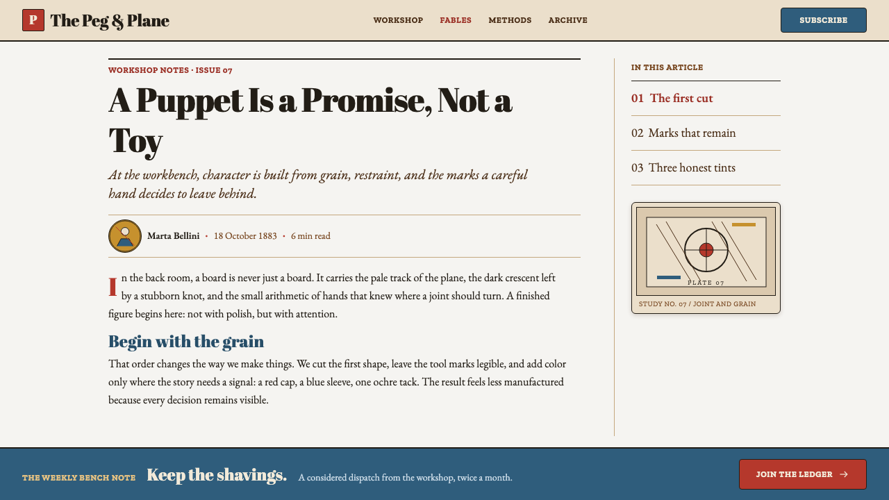
For editorial and marketing work, treat the page as an illustrated book leaf, workshop poster, or toy-maker’s broadside. Long-form articles can pair generous reading space with engraved marginal ornaments, hand-cut dividers, or small narrative vignettes. Campaign pages can place a carved hero object beside concise copy, then reveal features as labeled workshop components. The best compositions make the reader feel invited into a place where stories are manufactured from rough material rather than delivered as frictionless digital spectacle.
The common mistake is mistaking this style for any vintage children’s illustration. It is not defined by cuteness, antique paper, or random wood texture. It depends on a coherent relationship between material, image-making, and color: timber must feel honest, ink must behave like engraving, hatching must explain form, and bright paint must remain rare enough to matter. Most importantly, do not turn it into a candy-colored Disney-like cartoon; that erases the wood, labor, and slightly unsettling unfinishedness that give the workshop its character.
Pinocchio (1883 Marionette Workshop) — FAQ
Is this style simply a rustic or vintage look?
No. Rustic mood is only the outer layer. The defining system combines Tuscan workshop materiality, nineteenth-century wood-engraving logic, Italian children’s-book illustration, and marionette construction. Wood grain without engraved linework can feel like generic farmhouse decoration; antique-looking paper without the disciplined use of scarce color can feel merely nostalgic. The style becomes recognizable when all of its material and printed components work together.
How should vermilion and Prussian blue be used?
Use them as folk paint applied to a meaningful object or signal, not as a uniform visual coating. A painted hat, jacket edge, sign, toy wheel, selected action, or one highlighted data series can carry the color. Brown timber, engraved black line, and open ground should remain visually dominant. Their scarcity gives them the energy of a fresh brushstroke on a carved object.
Can photography be used in a Marionette Workshop layout?
It can, but photography should submit to the engraved and material logic of the page. Favor close views of timber, tools, carved objects, paint marks, and constructed props; crop them so grain, joinery, and surface become legible. A photograph that remains glossy, smooth, and detached from the linework will pull the design away from the source material. It should feel like workshop evidence, not a polished lifestyle image.
Why is the unfinished quality so important?
The source image is a marionette still in the vise: a living character emerging from a worked block. Chisel traces, exposed wood, irregular ink, and incomplete paint keep that transformation visible. They make the style feel active rather than museum-like. The goal is not carelessness; it is to retain enough evidence of making that the reader can sense the distance between a raw log and a finished story.
Related design styles
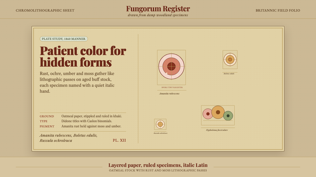 Victorian Mycology PlatePatient field science. Rust and moss specimens sit on stippled buff paper wit…
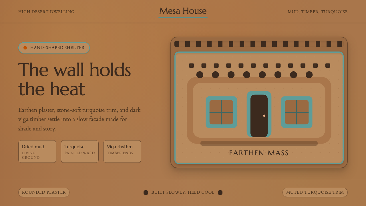 Adobe Pueblo SouthwestFeels made by hand. Earthen tan, turquoise trim, and viga rhythm shape the fr…
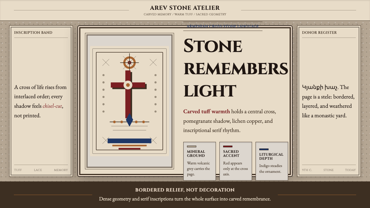 Armenian Khachkar Cross-StoneStone becomes memory. Tuff grey, pomegranate red, and carved borders hold the…
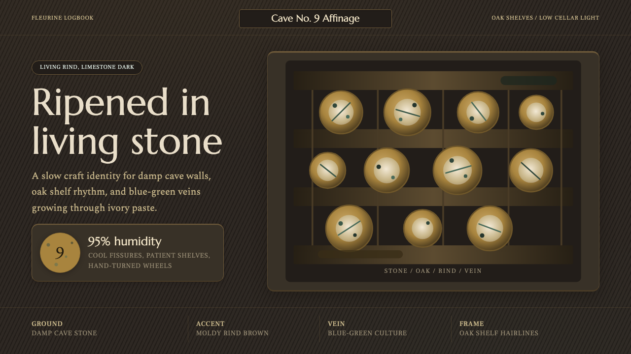 Cheese Affinage CavePatience reads as stone. Rind brown, mold green, and oak shelf grids glow in…
 Derge Woodblock Sutra PrintHand-pulled scripture gravity. Cinnabar uchen and ochre rules press into dark…
 Don Quixote (1605)Imagination defies the plain. Rust capitals and cross-hatched ink score a dry…