What is Knossos Minoan Fresco?
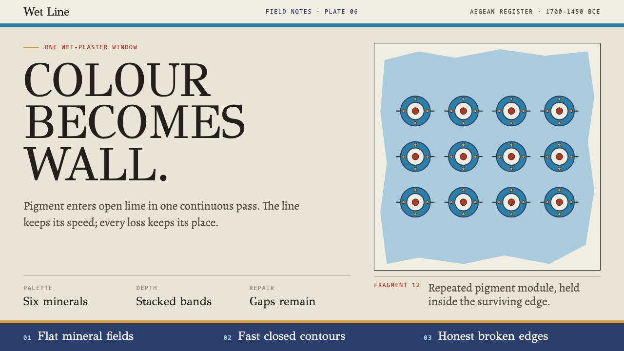
Colour becomes wall: six mineral fields inside swift contours, depth built from horizontal bands, and honest gaps where the plaster has gone.
Knossos Minoan Fresco in brief
Knossos Minoan Fresco is the visual language of the wall paintings of the Bronze Age palace at Knossos on Crete, made in the Neopalatial period, roughly 1700 to 1450 BCE. Its images are famous: dolphins crossing a blue field, young bull-leapers, blue birds among rocks, stems of papyrus. In design terms they add up to a clear system, with flat mineral colour held inside a drawn outline and with no gradients, no cast shadows and no perspective.
The system is shaped by its technique. In buon fresco the pigment goes into hydrated lime while the plaster is still open, the carbonate cures around it and the colour becomes the wall. There is a single working window and no correcting a line afterwards. Every contour at Knossos was therefore drawn fast and continuous, and the confident, slightly quivering line that results is the hallmark of the style.
A third element makes it unusual among historical styles: the fragment is part of the image. The surviving paintings are broken. Pieces are separated by plain render, edges are ragged, and parts of the composition are simply absent. This system keeps those gaps visible rather than offering a flawless restoration. What results is bright and graphic, but also candid about time, a style that shows what is left.
Where does Knossos Minoan Fresco come from?
The painted walls belong to Neopalatial Crete, the period of the great palaces on the island, when Knossos was the largest of them. The date is usually given as roughly 1700 to 1450 BCE. The palace was a complex of storerooms, shrines and ceremonial rooms, and its plastered walls carried painted scenes: processions, landscapes, marine life and rituals. The Minoan palace fresco is a tradition that treats the wall itself as the picture, with colour and structure fused in one skin.
The painters worked in buon fresco, the technique in which pigments are applied to fresh lime plaster and bind with it as the plaster cures. The method rewards confidence and punishes hesitation. A line cannot be reworked after the fact, so a painter has to draw the contour in one pass, at speed, and fill the area before the surface dries. That discipline explains the look: animal bodies swept out in a single stroke, flat colour packed tightly against the outline, and a general absence of correction or fuss.
The pigments were mineral, and the list is short. The documented palette has six colours: Egyptian blue, a deeper iron-based blue, hematite red, yellow ochre, carbon black and burnt-lime white. They are the colours of ground rocks, burnt bone or wood and a synthetic frit, and they behave on a wall as mineral colour does, matte, strong and slightly chalky. The subject matter is equally particular: dolphins, bull-leapers, blue birds and papyrus stems belong to what is called the Aegean Bronze Age marine style, which draws its energy from the sea and from the visible flow of living bodies.
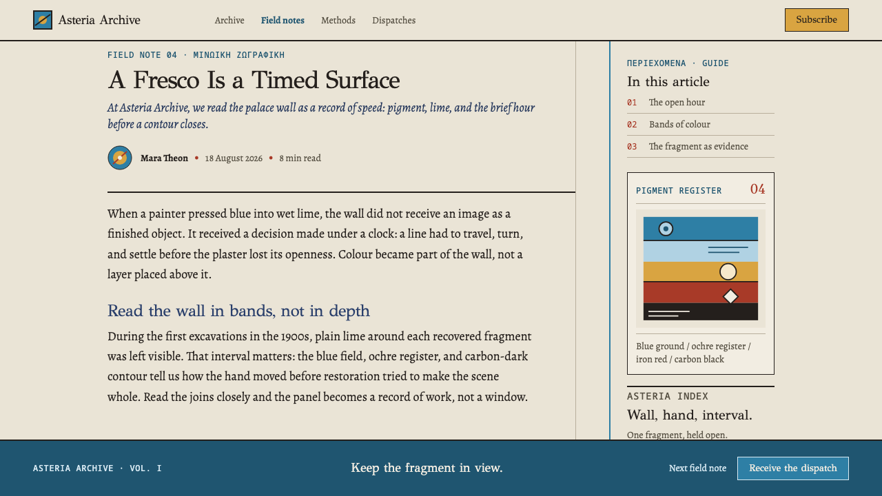
The wall paintings were excavated and reconstructed from 1900 onward, and the two names tied to that story are Arthur Evans, the excavator of Knossos, and the artists Émile Gilliéron père and fils, who restored the fragments. The reconstructions filled gaps to present complete images, and debate about how much of the famous pictures is ancient and how much restorer's invention has long accompanied them. This system takes a deliberate stand within that debate. The dolphin fragments survive in the museum surrounded by plain render, and the style keeps that fact in view: fragments, gaps and joins remain visible, because that is what the artefact actually looks like.
What defines the Knossos Minoan Fresco look?
Six mineral colours
The palette is Egyptian blue, a deeper iron-based blue, hematite red, yellow ochre, carbon black and burnt-lime white, and no more. Each has a documented origin in excavated material. The limit is part of the style: with six colours, every combination feels earned, and the pictures hold together because everything is drawn from the same few pots.
Flat fields inside an outline
Colour is laid flat inside a dark drawn contour. There is no modelling, no gradient and no cast shadow. The outline does the work that shading does in other traditions: it defines form and separates one field from the next. A body is a clean shape of one colour held by a line, and the edge is a decision rather than a blend.
Swift continuous contour
Because plaster cannot be corrected, lines are drawn in one confident pass. The contour has speed, with a slight tremor where the hand moved quickly, and it runs unbroken around a dolphin's back or the curve of a leaping body. This is the most recognisable texture of the style, a line that looks decided rather than polished.
Depth from stacked bands
Space is built from horizontal bands stacked one above another, in the manner of strata or of sea, shore and sky. There is no linear perspective and no vanishing point. Objects higher in the picture are further away, and zones of colour run across the surface like layers of a wall. The result is a clear, readable space that stays flat.
Profile figures, overlapping bodies
Figures are shown in profile and overlap each other, so that crowds and groups are suggested by stacking rather than by foreshortening. Animals leap, swim and fly in side view, their silhouettes carrying the information. The overlapping is orderly: one body's contour passes in front of another's with no confusion about which is nearer.
Fragment honesty
The surviving paintings are broken, and the style keeps that visible. Fragment edges, joins and the plain render between surviving pieces remain on the page, rather than being painted over to restore a perfect whole. Gaps are neither hidden nor faked with artificial wear. The artefact is shown as it is, and its incompleteness is part of its dignity.
Sea and living motifs
The subjects come from the island's world: dolphins, bull-leapers, blue birds and papyrus stems. They belong to the Aegean marine style, with its fascination for the flow of living bodies and for water. Motifs are drawn from nature but reduced to flat, decisive forms, so that a bird or a stem reads as a pattern as readily as a picture.
Who shaped Knossos Minoan Fresco?
The excavator of Knossos, whose work from 1900 onward brought the palace and its wall paintings to light. Evans shaped how the Minoan world is imagined, naming the civilisation and organising the reconstruction of the site. His account is therefore both the source of much of our knowledge and a reason to keep gaps and joins visible, since the image we know has been interpreted.
One of the two artists who restored the fragments for the Knossos excavation. The reconstructions gave the Minoan frescoes the complete, vivid look familiar from books and museum shops, and they have become part of the visual history of the site in their own right. His name stands for the tension between preserving a fragment and presenting a picture.
The son of the above, who continued the restoration work into the later campaigns. The father-and-son partnership is one of the formative influences on what the public thinks Minoan painting looks like. For a designer, their work is a lesson in the choice between a seamless reconstruction and a candid fragment, a choice this style resolves in favour of the fragment.
How do you use Knossos Minoan Fresco today?
Knossos Minoan Fresco is the right reference for work about culture, heritage, craft, the sea and the long view of time. It suits projects that want colour with gravity, bright but not cheerful, and projects for which an honest relationship with age and incompleteness is a strength. It asks the designer to commit to a small palette and a firm outline and to leave things unfinished on purpose.
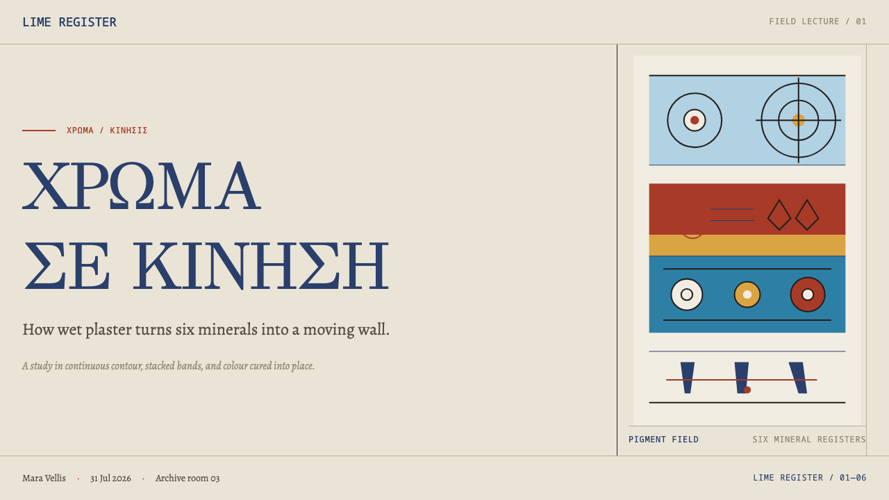
For slides, a cover can be a flat mineral field of blue or red with a single drawn motif and a plain lime-white band, like a fragment mounted in a wall. Content slides work as horizontal registers stacked above one another, each band a different colour field, in the way a fresco frieze is organised. Data slides suit bar charts drawn as flat fields with a dark outline, using only the six colours, and with one deliberate gap left to show where information is missing.
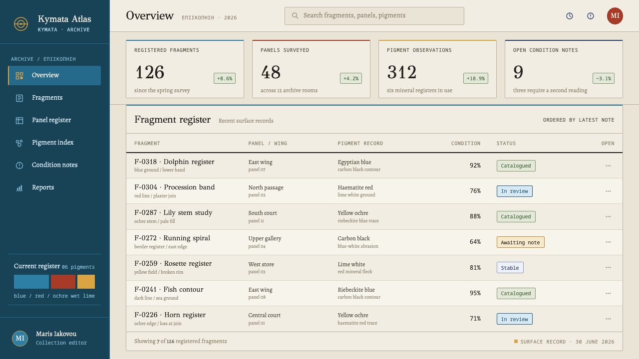
For web interfaces, treat sections as bands. A page can stack full-width horizontal fields in the six colours, with content set in plain type on each and no shadows, gradients or perspective effects. Cards are flat shapes with a dark edge, buttons are solid mineral fields, and loading or empty states can use fragmented, partly unfilled shapes rather than spinners. The style works best on storytelling, learning, museum and travel products rather than dense dashboards.
For editorial and marketing work, think history features, museum guides, archaeology publications, travel writing, craft and heritage brands. Illustrations can be reduced to the style's own vocabulary of outline and flat fill, and the plain plaster-white of unpainted areas gives page margins a meaningful role. Marketing pages can alternate bands of colour with generous plain areas, using the broken edge as a graphic device in the right places.
The common mistake is to restore everything to perfection: smoothing every edge, filling every gap and presenting a flawless reconstruction. A close second is to fake the damage with grunge textures or distressed filters, which is not fragment honesty but a costume. Others include adding gradients, shadows or perspective, widening the palette beyond six colours, and using the style as a generic Mediterranean look. Keep the line swift, the fields flat and the gaps real.
Knossos Minoan Fresco — FAQ
Is this the same as a Greek or Mediterranean style?
No. This style is drawn specifically from the Bronze Age palace paintings at Knossos, with a documented six-colour mineral palette, flat fields in a drawn outline and stacked horizontal bands. It is neither a generic Mediterranean mood nor the later classical tradition. Treating it as a holiday look misses its discipline, which comes from fresco technique and from honesty about fragments.
Why only six colours?
Because those are the colours with excavated evidence behind them, and because the limit is what holds the images together. Egyptian blue, a deeper iron-based blue, hematite red, yellow ochre, carbon black and burnt-lime white can be combined in many ways, but nothing outside the set belongs. Adding a seventh colour changes the style into something else.
How do I show fragments without making it look like a grunge filter?
Treat a gap as a real absence of information, not as a texture. Leave an area unpainted in plain plaster-white, let a shape end at a clean broken edge, and show a join where two pieces meet. Do not add noise, scratches or stains. A good test is whether the gap tells the viewer something true about what is missing, or only adds atmosphere.
How can I show depth without shadows or perspective?
Stack horizontal bands. Place nearer or lower objects in the lower bands, let figures overlap in an orderly way, and use a clear outline to say which shape is in front. The depth you get is shallow and readable, like a relief or a wall, which is exactly the point. Cast shadows and gradients would turn the wall back into a window.
Can this work as a dark theme?
The reference is mineral colour on lime plaster, so the natural ground is a pale plaster white with deep blue and carbon black as strong notes. A dark version is possible by treating carbon black as one of the fields, but it must stay flat, with a clear outline and no glow. The warmth of the plaster is part of what holds the six colours together.
Related design styles
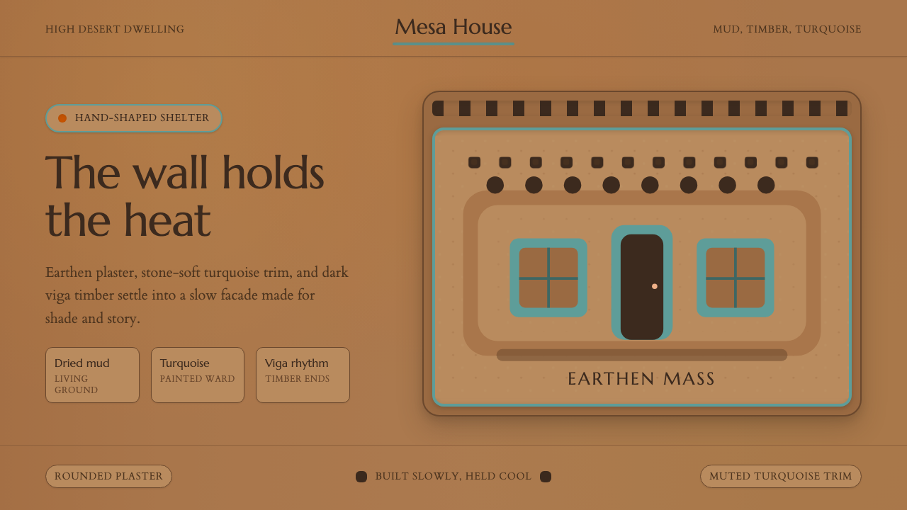 Adobe Pueblo SouthwestFeels made by hand. Earthen tan, turquoise trim, and viga rhythm shape the fr…
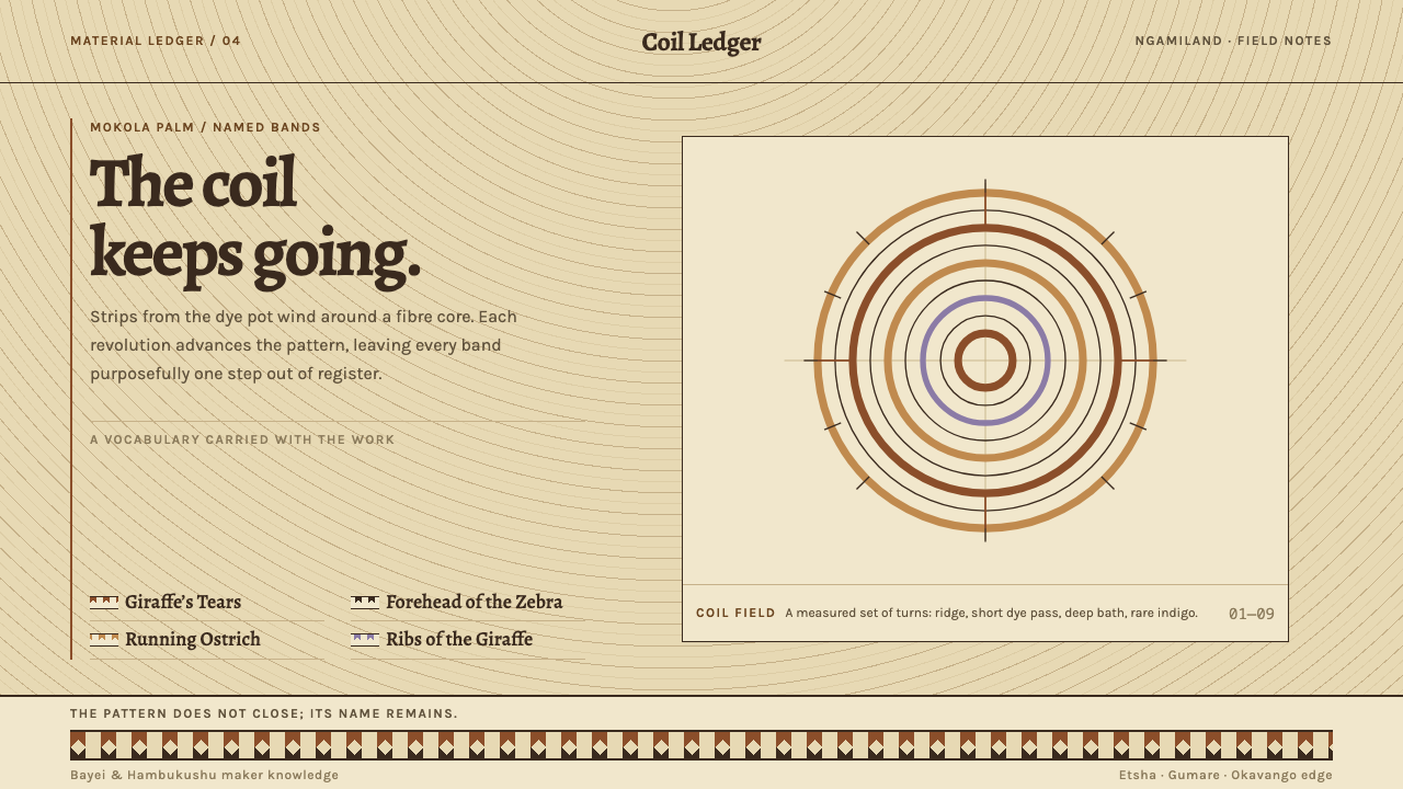 Botswana Coiled BasketThe pattern keeps travelling. Bark-brown stepped bands wind across a straw co…
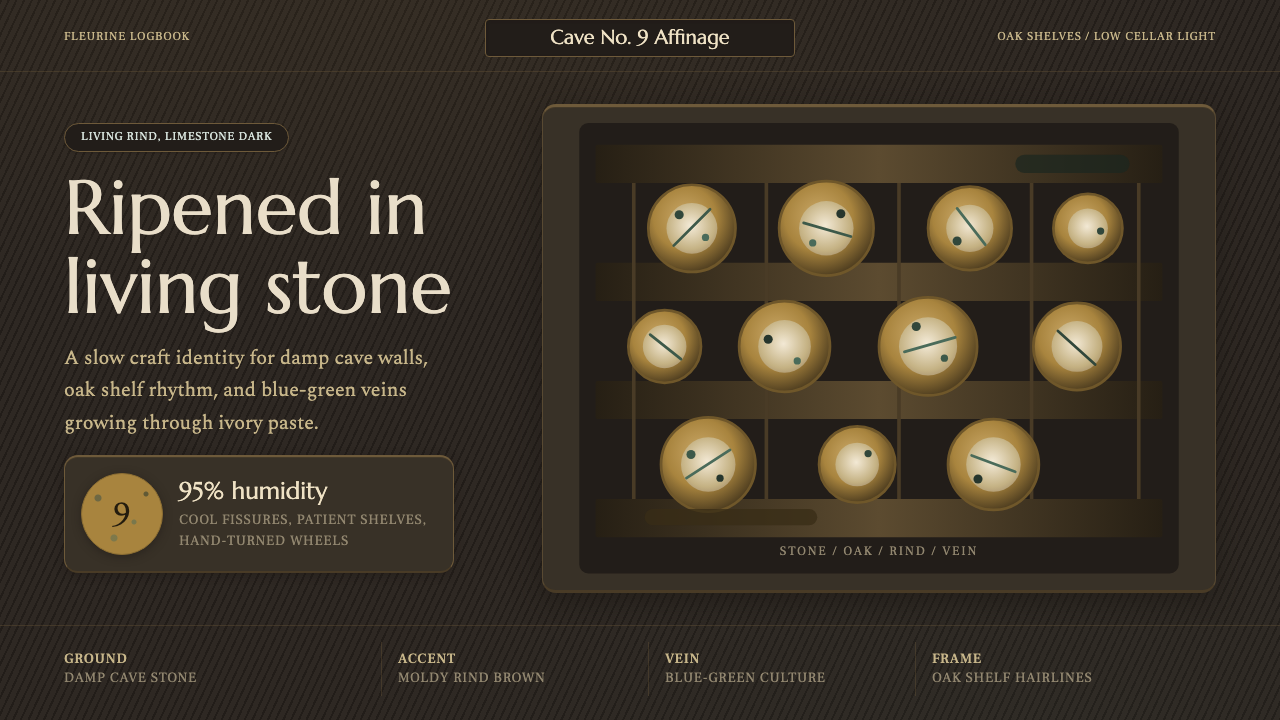 Cheese Affinage CavePatience reads as stone. Rind brown, mold green, and oak shelf grids glow in…
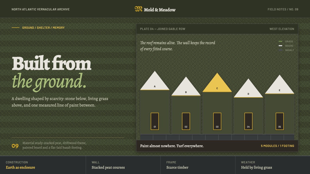 Icelandic Turf HouseThe hillside becomes shelter. Peat coursing surrounds one narrow line of yell…
 Iñupiat ParkaStructure carries the signature. Caribou-hide bands frame a bounded qupak rep…
 Maldivian Coir (Coconut Rope)Ocean-tested craft. Coir tan, coral cream, Cormorant type, and dashed seam ge…