What is Icelandic Galdrabók?
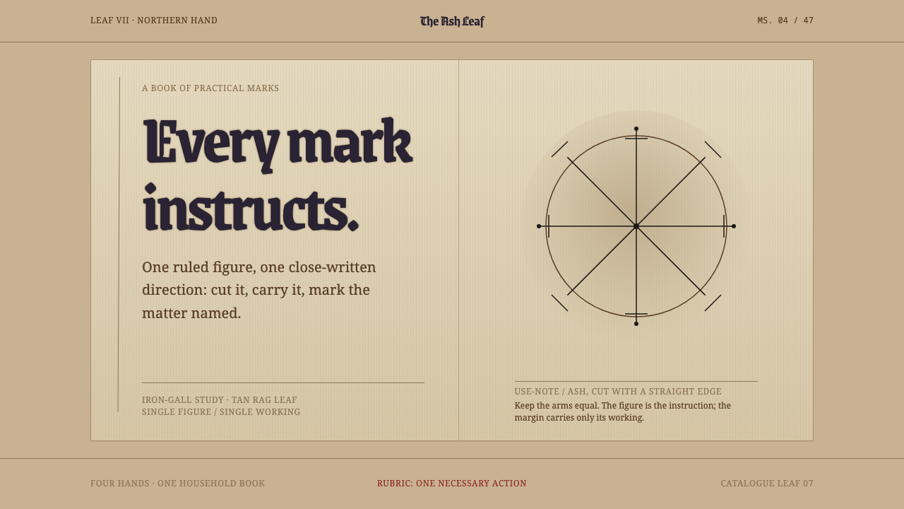
Icelandic Galdrabók is a design language in which every mark is an instruction — iron-gall geometry standing alone on a smoke-darkened tan leaf, with a short note beneath saying what it does.
Icelandic Galdrabók in brief
Icelandic Galdrabók is a design language drawn from a small household book of magic compiled in Iceland from about 1600 into the middle of the seventeenth century. Four hands filled it over roughly half a century with forty-seven spells. Beside each spell is a stave ruled with a straightedge, and under it a short note saying what the stave does and what it should be cut into. Nothing in the book is decorative. Every mark is there because it is meant to work.
The design system keeps that arrangement. A darkened tan leaf carries one figure per block, drawn in iron-gall ink, with its use-note set small and close beneath. The geometry is straight-edged and the stroke is uniform. Where other historical styles reach for ornament to signal age, this one signals age through the material itself: paper darkened by handling and smoke, ink that has shifted from purple-black toward brown.
The result is quiet and unusually disciplined. It does not try to look mystical. It looks like a working reference, the page of a person who needs to find the right sign, understand what it is for and copy it correctly. The authority comes from specificity: one sign, one purpose, one short explanation, and a great deal of empty leaf around them.
Where does Icelandic Galdrabók come from?
The Galdrabók belongs to a body of Icelandic magical writing that grew after the Reformation, when manuscripts in the vernacular circulated outside the church and the printing press. Its material is local and practical: spells for ordinary needs, written in the language people spoke, mixing older Norse ideas with Christian formulas in a way scholars describe as syncretic folk magic. The tone is that of a household notebook rather than a treatise. The surviving book is held in Stockholm, far from the Strandir coast and the north of Iceland where its tradition lived.
Four hands wrote it over roughly half a century, from about 1600 into the middle of the seventeenth century. That plurality matters for design. The book was never planned as an object; it accumulated, entry by entry, in response to real uses. Each entry follows the same logic: a spell, a stave ruled beside it, and a brief note saying what the stave does and how it should be cut. The pairing of figure and instruction, repeated forty-seven times, is the book's whole grammar.
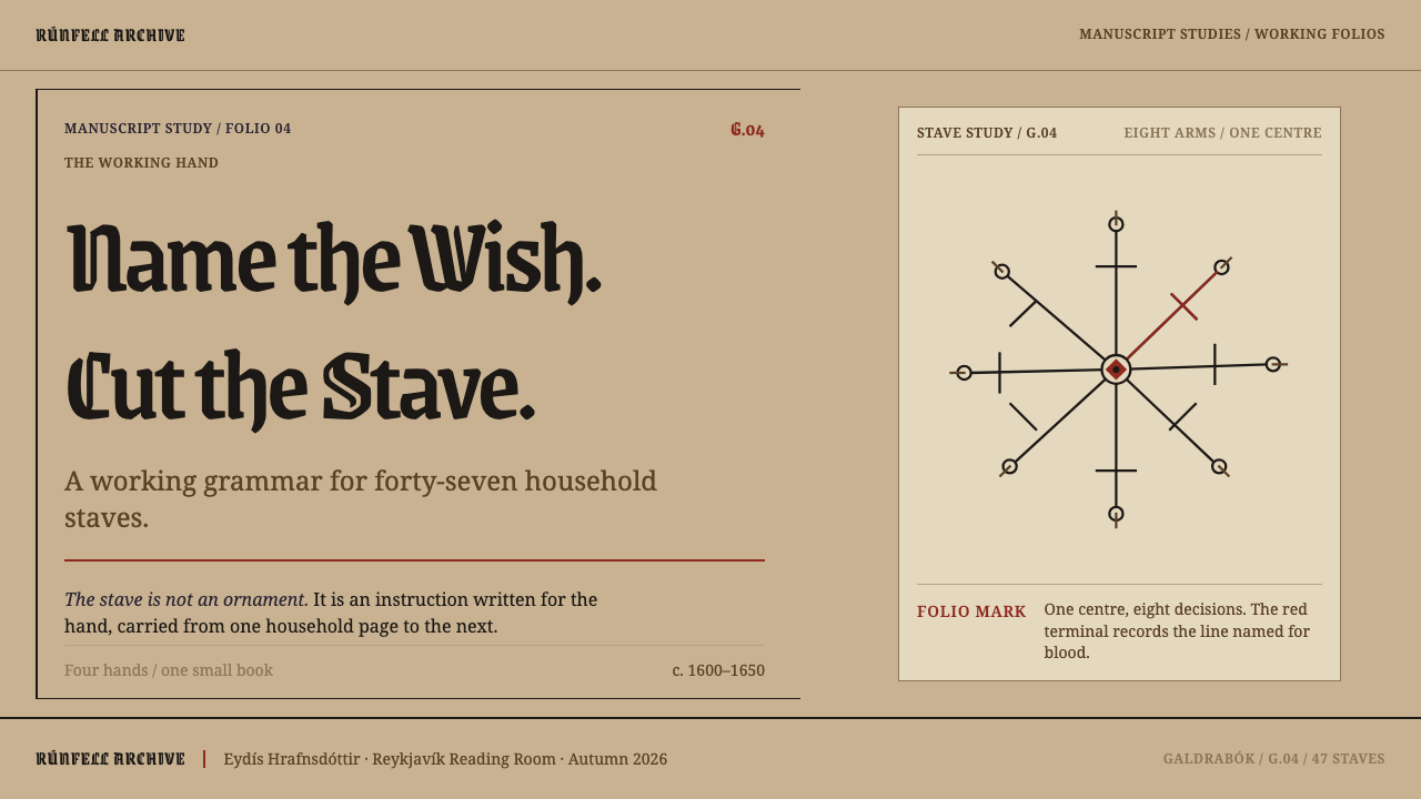
The staves themselves, known in Icelandic as galdrastafir, are built from a small kit of moves. A central point, arms that radiate along diagonals and right angles, and ends that close as crossbars, forks, dots or half-moons. The figures are symmetrical, usually fourfold or eightfold, and the line is the same width from end to end. They are constructed rather than drawn freehand, which is why they reproduce so cleanly and why they translate so easily to a screen.
The book also traveled as a copy. A later manuscript in the Huld collection, catalogued as ÍB 383 4to, was copied in 1860, carrying the staves and their notes into a new century of Icelandic scholarship and collecting. Writers such as Ólafur Davíðsson studied Icelandic folk belief and magical signs, and Stephen Flowers later made the Galdrabók available in an English edition. The design style inherits this double life: an artifact made for use, preserved and studied as heritage, and now offered as a visual discipline.
What defines the Icelandic Galdrabók look?
The Smoke-Darkened Leaf
The ground is a tan, rag-paper tone, darkened by lamp smoke and by years of handling. It is warm and slightly uneven, but never ornamental: there are no torn edges, no stains used as decoration and no parchment illustration. The leaf behaves as a working page, a surface that has been used rather than staged, and most of the composition is simply empty paper.
Iron-Gall Ink
The drawing medium is iron-gall ink, which starts a purplish black and oxidizes toward brown as it ages, and in places bites into the paper itself. The palette follows the ink: dark purple-black for the freshest marks, brown for the aged ones, with the paper tone doing the rest. There are no extra accent hues. The corrosion that eats through the leaf in some spots is treated as evidence, not as an effect to be exaggerated.
Stave Geometry
A stave begins with a central point, then sends arms outward along diagonals and right angles. Each arm ends in a closure: a crossbar, a fork, a dot, a half-moon. The whole figure is symmetrical, fourfold or eightfold, and ruled with a straightedge. The vocabulary is small and strict, and that scarcity gives each figure its meaning. A figure invented outside this grammar will look wrong to anyone who knows the originals.
Uniform Stroke
Line weight is constant from one end of a figure to the other. There is no taper, no calligraphic swelling and no pressure variation. The stroke reads as a decision rather than a gesture, and it keeps every figure legible at any scale. When two figures sit side by side their lines match, so the page feels like the work of one disciplined hand even when it is not.
One Figure, One Note
The unit of composition is a block holding a single figure with its use-note set small and close beneath it. The note says what the sign does and, where relevant, what to cut it into. Type stays secondary to the figure: compact, quiet, practical, tightly set against the drawing. Hierarchy is flat on purpose. Nothing competes with the figure, and nothing floats loose from its instruction.
No Glow, No Costume
The style refuses the usual signals of the occult: no glowing outlines, no candle effects, no torn-edge parchment skeuomorphs, no gothic flourishes. It also refuses to turn a stave into a logo. A stave in the book is an instruction attached to a use; as a mere brand mark it loses what made it a stave. The restraint is the style's way of respecting its source.
Who shaped Icelandic Galdrabók?
Geir Vigfússon is among the names tied to the Strandir-coast tradition from which the Galdrabók comes. Little can be said with certainty about the individual hands that filled the book, which fits its character: an accumulated household reference more than an authored work. His name stands in this style for the practitioner-writer, someone who recorded signs because they were useful and wrote the notes that made them usable.
Ólafur Davíðsson is remembered as an Icelandic folklorist who collected and wrote about Icelandic folk belief, including magic and its signs. Work of this kind kept the staves visible as part of Icelandic cultural history rather than as embarrassing leftovers. For design, his importance is indirect but real: serious scholarship is what allows these forms to be cited accurately instead of imitated vaguely.
Stephen Flowers is a scholar and translator whose English-language edition of the Galdrabók brought its spells and staves to readers far outside Iceland. Editions like his are how a manuscript in Stockholm becomes a reference for designers, writers and researchers elsewhere. The clarity of the translated notes is part of why the book's logic of figure plus instruction remains so easy to see.
How do you use Icelandic Galdrabók today?
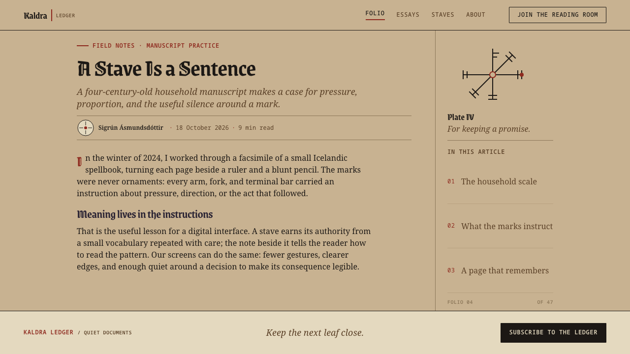
Icelandic Galdrabók is best used where meaning attaches to a single mark and a short explanation: reference works, archives, glossaries, documentation, educational material, games and books about folklore or craft. Its authority comes from specificity and restraint, so it rewards content that is already organized as entries.
On slides, a cover can be a single large geometric figure on the tan leaf with the title set small beneath it, as if captioning a plate. Content slides should hold one diagram each, with a short note tight beneath it. Data slides can treat charts as ruled geometry in a single ink tone, with labels set close to the marks they explain. Avoid filling the empty paper; the space is part of the effect.
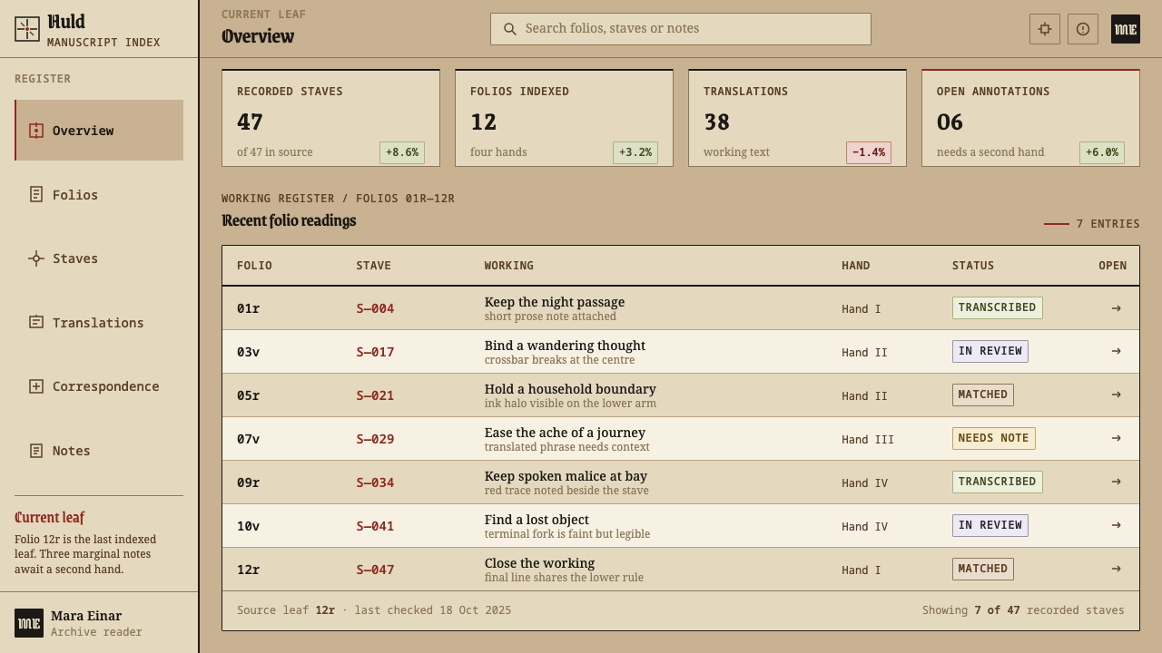
On the web, the style suits documentation, glossaries and knowledge bases built from one card per entry. Cards are simple blocks: a figure above, a small note below, nothing floating loose. A pricing page can present each plan as a figure with a short statement of what it does and what it is for. Hover and focus states should darken the ink or thicken a rule, never glow. Dashboards should read like a ledger, with sparse, deliberate marks.
For editorial and marketing work, it fits folklore, history, craft, tabletop and narrative games, and any story about knowledge handed down by use. Long articles can place a single figure at the head of each section with a short margin note, and keep body text plain and compact. Marketing pages work when they lead with one sign and one sentence, trusting emptiness to carry confidence.
A common mistake is to treat the style as generic fantasy costume: torn parchment, glowing runes, candle smoke, gothic lettering. These contradict the source. Another is to use a stave as a logo or decorative bullet, which strips it of its function. Inventing pseudo-staves with arbitrary flourishes also fails, since the originals are built from a strict grammar. Finally, mixing several ink colors or varying line weight breaks the single-hand discipline. These are historical objects tied to a living cultural heritage, so credit them as such and do not claim magical efficacy.
Icelandic Galdrabók — FAQ
What is the Galdrabók?
It is a small Icelandic household book of magic compiled by four hands from about 1600 into the middle of the seventeenth century. It contains forty-seven spells, each paired with a stave and a short note about what the stave does and how to cut it. The surviving book is held in Stockholm, and later copies, including a manuscript copied in 1860, carried its content forward.
What is a galdrastafur?
It is an Icelandic magical sign, a geometric figure built from a central point and radiating arms that end in crossbars, forks, dots or half-moons. Staves are symmetrical and drawn with a uniform line. The plural is galdrastafir. A stave stands for a purpose rather than for a sound, which is why the book pairs each one with a note.
Why tan paper and brown ink instead of black on white?
Because that is how the source looks and, more importantly, how it behaves. The paper darkened with lamp smoke and handling, and iron-gall ink starts purplish black and ages to brown. The palette is therefore the record of time spent in use. A white-and-black version would lose that evidence and drift toward a generic minimalism with no connection to the source.
Are these runes?
Not in the usual sense. Runes are an alphabet whose letters spell sounds. Galdrastafir are signs that stand for a purpose, built from a different geometric grammar. They belong to a post-Reformation tradition of vernacular magic manuscripts, and any resemblance to runic shapes should not be mistaken for the same system.
Can I use a stave as my logo?
The style advises against it. In the book a stave is an instruction attached to a use, and as a brand mark it loses that function and becomes decoration. If you want the style's feel, use its logic instead: one figure per block, a short note close beneath it, a uniform line, and plenty of empty leaf. Treat the originals as cultural heritage, and credit them.
Related design styles
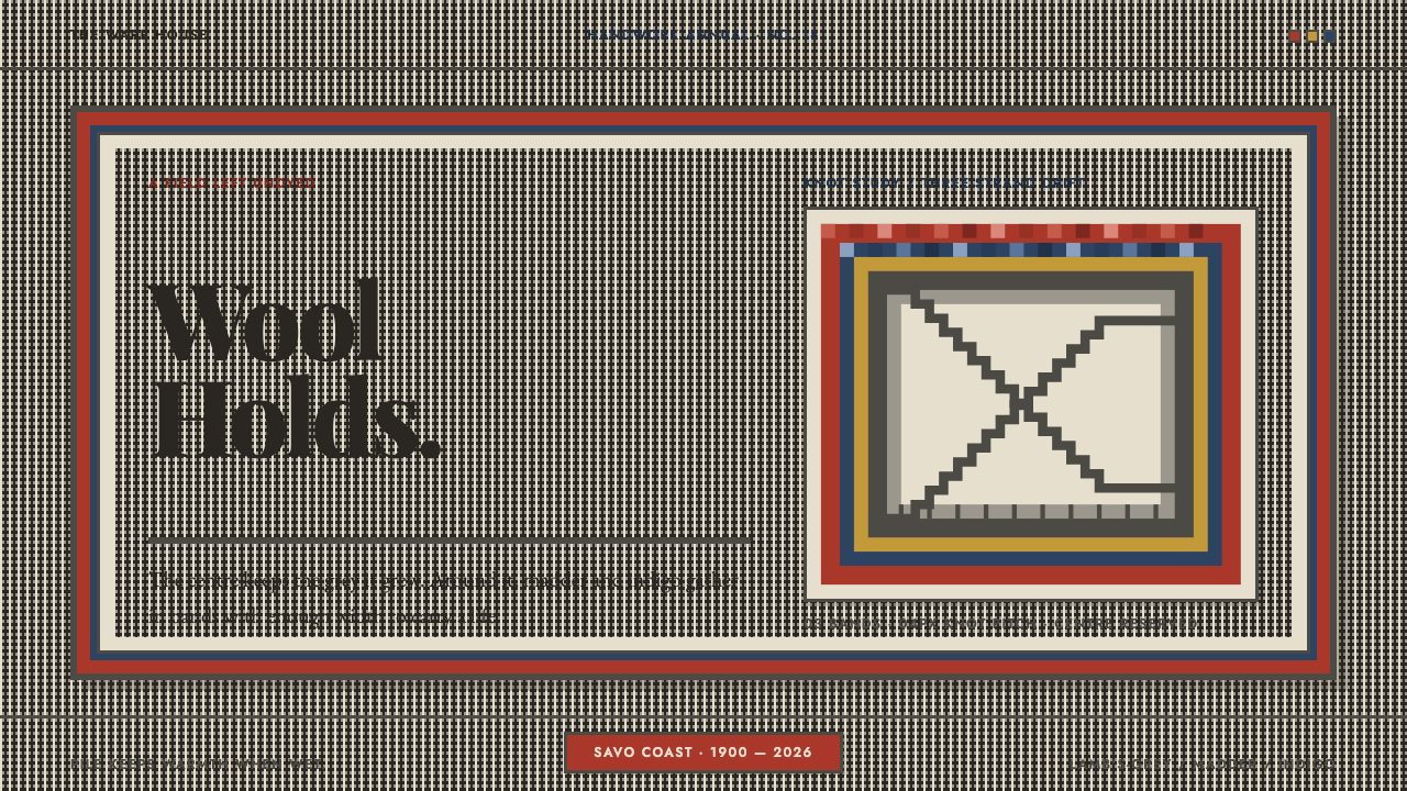 Finnish RyijyWool holds its ground. Lamb's-grey centres meet stepped madder and indigo ban…
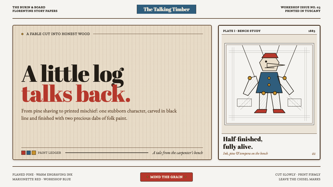 Pinocchio (1883 Marionette Workshop)Carved from honest timber. Red, blue and ochre punctuate crisp engraved lines.
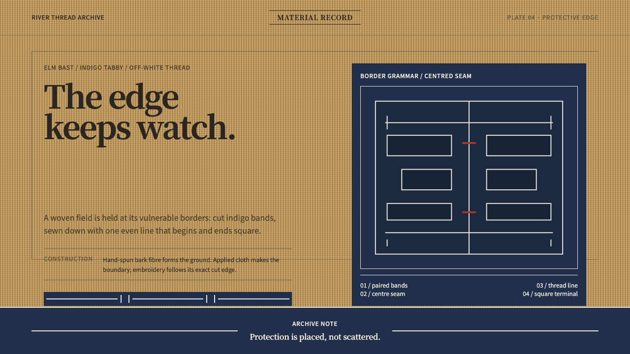 Ainu Attus RobeProtection is cut, not painted. Indigo bands and square-ended thread hold elm…
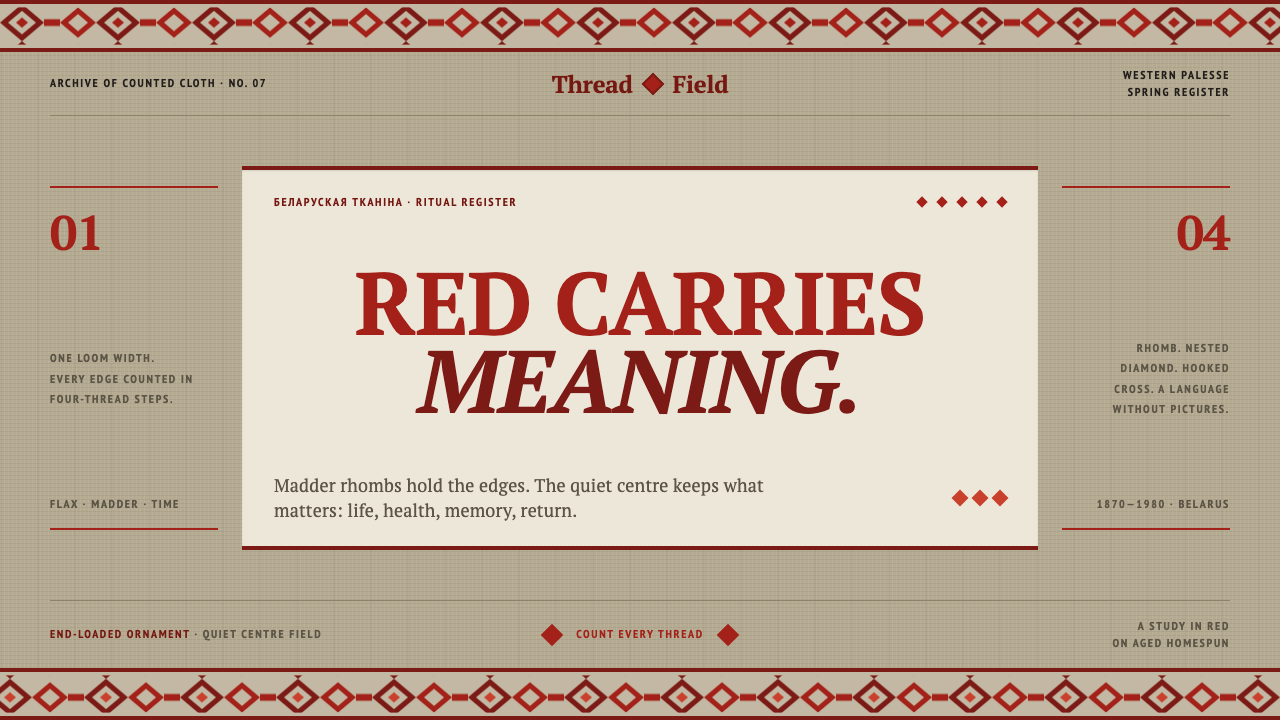 Belarusian RushnykRed carries meaning. Madder rhombs crowd aged flax edges while the woven cent…
 Bhutanese KushutharaPatience made visible. Lac pink and indigo bands shift across a warm silk gro…
 Chuvash SurpanThe ends remember. Madder geometry frames an open hemp field, counted for bot…