What is Royal Copenhagen Musselmalet?
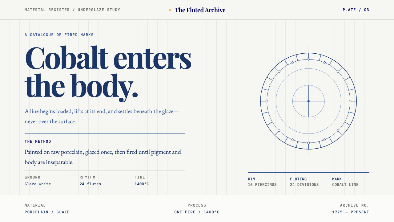
Musselmalet puts cobalt into the body of the porcelain, so that blue is a hand-lifted mark and fluted glaze-white is the ground that makes every stroke matter.
Royal Copenhagen Musselmalet in brief
Royal Copenhagen's Musselmalet is a hand-painted blue-and-white porcelain pattern from Copenhagen, painted at the manufactory since 1775. The method has not changed: cobalt is brushed straight onto the raw porcelain body, glazed over, and fired once at about fourteen hundred degrees Celsius, so that the blue sinks into the white instead of sitting on top of it.
That single fact sets the whole visual system. The ground is glazed porcelain, a white with a faint grey-blue cast, never a tinted panel. Blue is a mark, not a field: it appears only as brushwork, never as a flat area of colour. Every line starts loaded with pigment and lifts at the end, so strokes swell and taper instead of keeping an even width. Fluting, the vertical ribs moulded into the body, supplies the rhythm of the surface, and lace piercing follows the rim rather than floating free of it.
For a screen, Musselmalet is an unusually clear lesson in restraint and material honesty. White is both ground and hero; blue is rare, handmade and meaningful. The result is calm, domestic and slightly formal, and it rewards very careful placement: one lifted stroke, one rhythm of vertical lines, one small signature of three waves at the foot of the page.

Where does Royal Copenhagen Musselmalet come from?
The pattern's history begins with the manufactory itself. Royal Copenhagen was founded in 1775 by Frantz Heinrich Müller, a Danish chemist who worked to produce hard-paste porcelain in Denmark. Hard-paste porcelain had first been mastered in Europe at Meissen, and Royal Copenhagen belongs to the generation of manufactories that followed. Juliane Marie, the Queen Dowager, gave the enterprise royal patronage, and from the start it stood in the tradition of the Danish royal manufactory: porcelain as a state-sponsored craft, made to a standard and signed with a recognisable mark.
The decoration comes from a still older source. Blue-and-white porcelain, with cobalt painted under a clear glaze, was developed in China and exported to Europe in great quantities, where it became the model that European factories imitated and then adapted. Musselmalet sits in that Chinese-export blue-and-white lineage, but it translates the model into Danish terms: motifs drawn from the foliage and fruit of plants of the daisy family, and a fluted body shape that suits a hand-painted line.
Two moments shaped the pattern as it is known today. In the nineteenth century the manufactory added its Half Lace and Full Lace tiers, extending the plain fluted form with pierced, lace-like edges. Then, from 1885, the pattern was redrawn, a change associated with the artistic direction of Arnold Krog, tightening the relationship between painted line and moulded form. The back-stamp of three waves, standing for the Øresund, the Great Belt and the Little Belt, is the manufactory's signature, placed as a mark of origin rather than as decoration.
What survives across more than two centuries is a method rather than a look. Because the cobalt goes onto the raw body and is fired once, a painter cannot correct, overpaint or retouch; each stroke is committed. That single-fire discipline produced the style's most recognisable quality: marks that look confident, slightly uneven and entirely human. As a design principle it is useful far beyond porcelain. Make fewer marks, commit to them, and let the white ground do most of the talking.
What defines the Royal Copenhagen Musselmalet look?
Glazed Porcelain Ground
The ground is the white of glazed porcelain, carrying the faintest grey-blue cast of the glaze, and it is never replaced by a tinted panel. It reads as a surface with depth rather than as a flat blank, as though the white itself had a thin glassy layer over it. Everything else on the page exists in relation to this ground.
Blue Is a Mark, Not a Field
Cobalt blue shows up only as brushwork, in strokes, lines and small painted forms. It is never laid down as a flat block, never used as a background, and never filled across a large area. Because blue is scarce, each appearance of it counts, and a tiny blue mark on white can carry more weight than a full panel of colour.
Loaded Start, Lifting End
Every line begins heavy with pigment and thins as the brush lifts, so strokes swell and taper like handwriting. There is no uniform, machine-drawn line weight. This variation is what makes the pattern look painted rather than printed, and in a layout it means linework should have a visible start, a body and a release.
Fluting as Vertical Rhythm
The vertical ribs moulded into the porcelain give the surface its beat. They organise the page into a sequence of parallel verticals, a rhythm that holds the painted motifs in place and defines where decoration can sit. In an interface this translates into a calm, column-like structure rather than a free-floating arrangement.
Lace Follows the Rim
In the Half Lace and Full Lace tiers, the pierced openwork runs along the rim and nowhere else, and it stops where the fluting begins. Ornament is therefore tied to an edge and bounded by structure. It never floats free in the middle of a surface, which is a useful discipline for any lace-like or border-like detail on a page.
Daisy-Family Botany
The pattern grows from the branches, leaves and fruit of plants of the daisy family, drawn in a loose, observed way rather than as geometric repeats. Motifs are botanical and slightly irregular, set against the regular verticals of the fluting. The contrast between organic brushwork and the formal rhythm beneath it is the heart of the look.
The Three-Wave Signature
The three waves on the back of the porcelain stand for the Øresund, the Great Belt and the Little Belt. In the visual system they appear as a small signature at the foot, a maker's mark that certifies origin. They are used once, quietly, at the bottom of the page and never repeated as a decorative pattern.

Who shaped Royal Copenhagen Musselmalet?
The Danish chemist who founded the Royal Copenhagen manufactory in 1775, working to make hard-paste porcelain in Denmark after the model Meissen had set. His name stands for the origin of the enterprise and for its identity as a technical craft: a white body, a glaze and a cobalt that was fired together.
Associated with the artistic direction of the manufactory in the period when the Musselmalet pattern was redrawn from 1885. His name marks the moment when the relationship between brushwork, fluting and body shape was refined, and it is a useful reminder that a pattern that looks timeless has been redrawn deliberately.
The Queen Dowager whose patronage connects the manufactory to the Danish crown. Her name stands for the royal manufactory tradition, in which porcelain is made to a standard under state protection and carries a mark of origin. That context explains why the wave signature matters and why consistency is part of the brand.
How do you use Royal Copenhagen Musselmalet today?
Musselmalet is a style of restraint, and its main lesson is that white and blue should not be treated equally. White is the ground, the hero and most of the page; blue is a rare, handmade mark. Applying it well means letting the white do the work, placing each blue stroke with care, and avoiding anything that would turn blue into a background.
For presentation slides, a cover can be an expanse of porcelain white with a single hand-lifted blue motif, perhaps a small cluster of daisy-family foliage in one corner, and the title set in a calm, bookish serif. Content slides should stay predominantly white, with blue limited to headings, rules and annotations drawn as fine strokes. Data slides suit linework charts and light outlines, where the marks are strokes rather than filled blocks, and a small wave signature at the foot of each slide quietly ties the deck together.
For web interfaces, the style fits heritage retail, tableware and gift shops, craft studios, hospitality sites, wedding registries and museum shops, anywhere that an air of care and provenance serves the product. Product cards should be mostly white, with blue appearing in links, outlines and small hand-drawn accents. Pricing is best shown as a clean white table with blue linework rather than filled tiles. Vertical structure, such as column-like layouts and evenly spaced vertical rules, echoes the fluting.
For editorial and marketing work, Musselmalet suits catalogues, menus, invitations, packaging, stationery and long-form brand stories about craft. A page can carry one painted motif, one clear column rhythm and a closing signature, and nothing more. Photography works best when it shows the porcelain or similar objects on white, so that the page remains airy rather than crowded.
The commonest mistake is turning the blue into a field: a navy background, a full-width blue banner or a filled button across every surface. This destroys the scarcity that gives each mark its value. Other errors are using even, vector-perfect lines with no taper, repeating the pattern as wallpaper, using the three waves as a decorative border, and setting lace-like details in the middle of a surface instead of along an edge. When in doubt, take a mark away.

Royal Copenhagen Musselmalet — FAQ
What does Musselmalet mean, and how is the pattern organised?
The Danish name is usually glossed as 'mussel-painted' or 'shell-patterned'. The pattern is organised in three layers: a glazed white porcelain ground, a vertical fluted body that supplies rhythm, and cobalt brushwork drawn from daisy-family plants. In the lace tiers, pierced openwork follows the rim and stops where the fluting begins. The three layers keep each other in check, which is what makes the design look both ornamental and disciplined.
Why does the blue have to sink into the white?
Because cobalt is painted onto the raw porcelain, glazed, and fired once, the blue becomes part of the material and cannot sit on top of it. For design, that means blue elements should feel integrated with the ground rather than overlaid on it: no drop shadows, no floating badges, no fills that look pasted on. A mark should look as if it belongs to the surface it is on.
What are the Half Lace and Full Lace tiers?
They are the two lace tiers of the pattern, added to the plain fluted form in the nineteenth century, in which the rim is pierced with openwork. In a layout they translate into ornamental border detail that always follows a real edge and halts where the structure begins. If a page uses lace-like decoration, it should sit on the rim of something, not float in the middle of the surface.
Can Musselmalet work with a dark background?
Not without losing its main logic. The style is defined by a glazed white ground on which blue is a rare mark, and an inversion to a dark ground makes the blue a field or a glow. If a dark moment is needed, such as a footer or a single panel, treat it as an exception and keep the porcelain white dominant everywhere else.
How is this different from other blue-and-white styles?
Blue-and-white is a wide family, which includes the Chinese-export porcelain that Musselmalet descends from. This member has its own rules: cobalt painted into the body and fired once, tapering hand-lifted strokes, fluting as the rhythm, lace tied to the rim, and a three-wave signature. Pattern-heavy, all-over blue-and-white tends to fill the surface, whereas Musselmalet leaves most of it white.
Related design styles
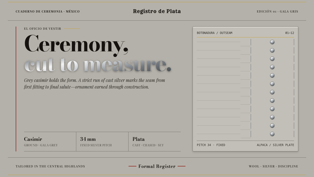 Charro SuitOrnament is structure. Gala-grey wool and chased silver studs hold a strict v…
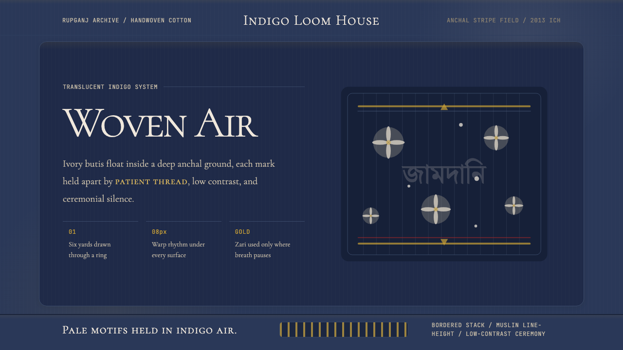 Bengali Jamdani MuslinBreathes like woven air. Indigo ground, ivory butis, and threadline borders s…
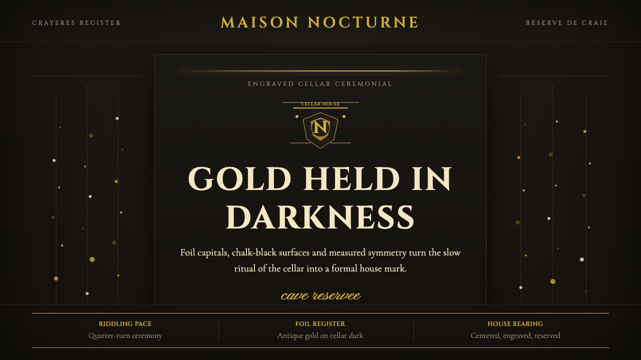 Champagne MaisonGrandeur without glitter. Cinzel capitals and gold foil rules glow in cellar…
 Chartreuse Liqueur GreenAcid glow rules the cellar. Cormorant Garamond and brass hairlines frame yell…
 Delft BlauwBrushwork remembers. Lavender cobalt washes follow blue-black lines across mi…
 Fern CyanotypeStillness turns scientific. Prussian blue field, white photograms, Victorian…