What is Delft Blauw?
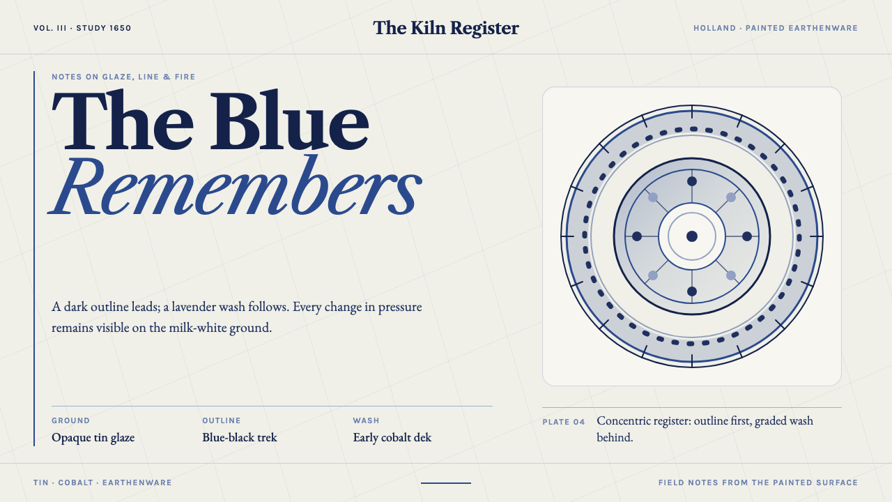
Delft blue began as a trick of tin and clay: an opaque milk-white glaze, with cobalt brushed onto it, so that cheap Dutch earthenware could pass for Chinese porcelain.
Delft Blauw in brief
Delftware is tin-glazed earthenware made in Delft, in Holland, in the Dutch Republic, and the 1650 version of the style is its early, lighter-blue moment. It began by solving a commercial problem with a chemical trick: tin oxide turned the glaze opaque and milk-white, so that cheap red Dutch clay could pass for Chinese porcelain. Everything about the look follows from that surface. The white glaze is the ground; the cobalt is brushwork laid onto it, never a field printed behind it.
At 1650 the blue is still light. A lavender-tinted wash carries dark blue-black outlines, well before the full-strength cobalt of the late-century workshops. Delft painters copied imported Chinese Kraak plates and quietly made them Dutch: chinoiserie sprigs shared a rim with tulips, windmills and low-horizon landscapes. The result is a decorative language of bands, rims and painted scenes in which the white of the glaze is always visible between the marks.
The surface also carries the evidence of its making: a fine network of crazing in the glaze, pooled glaze at the edges, small flaws left by the kiln, and brush strokes in which you can read how heavily the brush was loaded. As a design style, Delft blue means brushwork on a luminous ground rather than blue as a background, and that distinction is the whole discipline.
Where does Delft Blauw come from?
The commercial logic comes first. Tin-glazed earthenware, known in the wider European family as maiolica or faience, covers a humble clay body with an opaque white coat. In Delft, in the 1640s to 1680s, that coat was used to imitate Chinese porcelain at a fraction of the cost, and the style takes 1650 as its referent moment within that longer window, because the blue is not constant across it. Knowing which Delft you are borrowing from matters, since the lighter, lavender-washed blue of 1650 reads very differently from the later full-strength cobalt.
The Dutch Golden Age supplies the setting: a commercial society in which Asian porcelain was prized and in which a local industry could profit by approximating it. The model was Kraak porcelain, the Chinese plates that Delft painters copied. The style's references name the whole phenomenon as European imitation of Chinese Kraak porcelain, and it is worth taking the word imitation seriously. The point of the glaze was resemblance, which is why the white is so deliberately clean and the blue so deliberately painterly.
Imitation did not stay imitation. The Delft painters quietly made the borrowed designs Dutch, setting chinoiserie sprigs on the same rim as tulips and filling the centre of a plate with a windmill or a low-horizon landscape. That blend of an imported frame and local subject matter is part of why Delft blue feels at once international and domestic, and it is a useful habit for contemporary design: take a respected reference and let your own subject matter occupy it.
The style's reference list names Wouter van Eenhoorn, Samuel van Eenhoorn and Frederik van Frytom among the key figures, which tells us that Delft blue is the product of particular workshops and hands as well as a general fashion. The movement labels that sit alongside them are tin-glazed earthenware, the Dutch Golden Age, and imitation of Kraak porcelain: three ways of describing one object made of clay, white glaze and cobalt, painted quickly enough to be affordable and carefully enough to be admired.
What defines the Delft Blauw look?
Milk-White Glaze as Ground
The ground is an opaque, milky white, the surface that tin oxide gives to the glaze, and it covers the clay body entirely. White is not the absence of colour here but the material the whole style stands on. It is allowed to show between and around every mark, and it is never treated as a background to be flooded. A page built on this logic keeps its white generous and its marks light.
Cobalt as Brushwork
Blue is applied as painted marks, never as a field. The pigment is cobalt, set down with a brush onto the finished white surface, so every blue area is an act of drawing: a stroke, a wash, a hatched edge. Because the blue is always a mark rather than a plane, its density varies with the loading of the brush, and that variation is part of the pleasure of looking.
The 1650 Lavender Wash
At the 1650 moment, the blue is light. Areas are filled with a lavender-tinted cobalt wash rather than the full-strength blue the late-century workshops would later favour. The lightness is the signature of this particular Delft: it gives the surface an airy, slightly cool and gentle tone, and it keeps the white ground luminous behind the colour. Pushing the blue darker would turn it into a different, later style.
Blue-Black Outline
The wash is carried by dark blue-black outlines, which give each motif its edge and its drawing. Line comes first and tint follows, so shapes read clearly even where the wash is pale. The outline is hand-drawn rather than mechanical, with natural variation in pressure and speed; it is the structural element that lets a very light blue stay legible against milk-white.
Dutch Motifs on a Chinese Frame
Delft painters copied Kraak plates and made them Dutch. Chinoiserie sprigs share a rim with tulips, and windmills and low-horizon landscapes fill the field. The structure is imported and the content is local, so the decoration reads as two worlds sharing a surface. Flat, wide landscapes with a low horizon are especially characteristic, giving a calm, open quality that complements the bands and rims.
Evidence of the Glaze
The surface keeps the record of how it was made: fine crazing in the glaze, glaze pooling at the edges, small kiln flaws, and the weight of the loaded brush visible in each stroke. These imperfections are not corrected, because they are what make the white look like glaze rather than paint on a screen. A convincing Delft treatment keeps a little irregularity in its edges and tones instead of polishing everything to digital perfection.
Who shaped Delft Blauw?
Both names appear in the style's reference list among the key figures of Delft's tin-glazed production. Having two Eenhoorn entries underlines how closely the look is tied to particular workshops rather than to anonymous output. What the style takes from that tradition is a working method: a clean white glaze, blue brushwork, and decorative frames filled by painters who knew the product had to look like porcelain.
Listed among the key figures alongside the Eenhoorn names. His presence in the references stands for the individual hand behind Delft's brushwork. The style distils what such painters share: line first, wash second, always on a white glaze, with the blue allowed to vary and never filled in like printed colour.
The people who copied Kraak plates and quietly made them Dutch are the real authors of the style. They are why a sprig of chinoiserie can share a rim with a tulip, and why a windmill can stand in a Chinese-derived frame. Their craft gives the design system its most useful principle: borrow structure from a respected model, but let your own subject fill it.
Not a person but the model that set the whole enterprise in motion. Kraak plates were the imported ideal against which Delft's earthenware measured itself, and the style's references describe the entire tradition as European imitation of them. Remembering the model keeps the design honest about what it is doing: aiming at porcelain's white and blue while making its own tin-glazed thing.
How do you use Delft Blauw today?
Delft blue works for work that wants warmth, craft and a certain old-world sociability without becoming heavy. It rewards a designer who understands the logic of the glaze (white as material, blue as brush) rather than one who simply drops a blue palette on a white page.
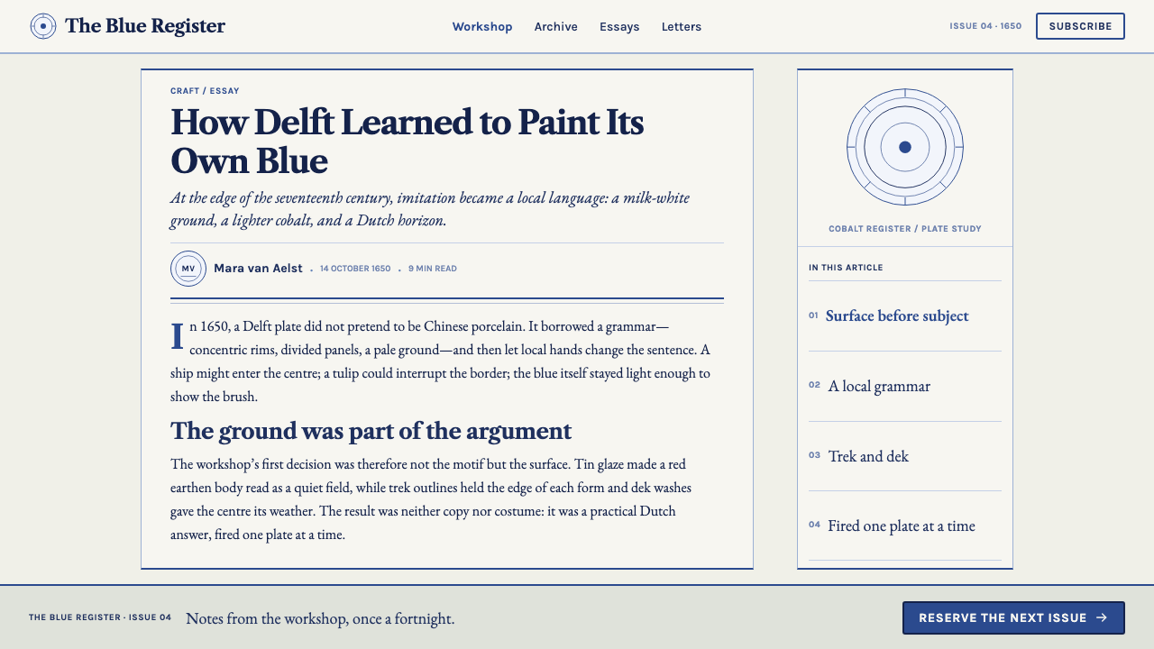
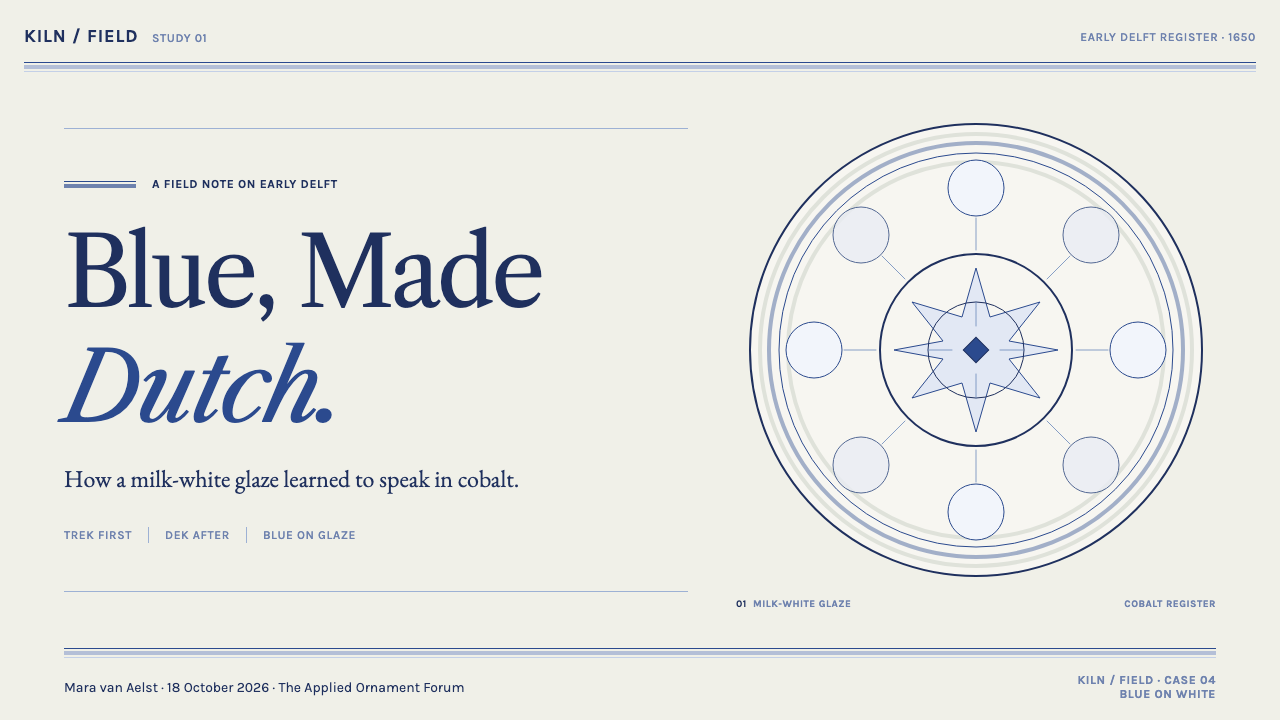
On a presentation cover, keep the slide predominantly white and let a brushed motif, such as a sprig, a scene or a framing rim of bands, carry the blue, with dark blue-black outlines under a pale lavender wash. Content slides read like a series of plates: a white field, a single painted illustration or ornamental band, and plenty of ground. For data, draw the chart as if with a brush: outlines in the dark blue, fills as light washes, and the white showing clearly between bars and lines.
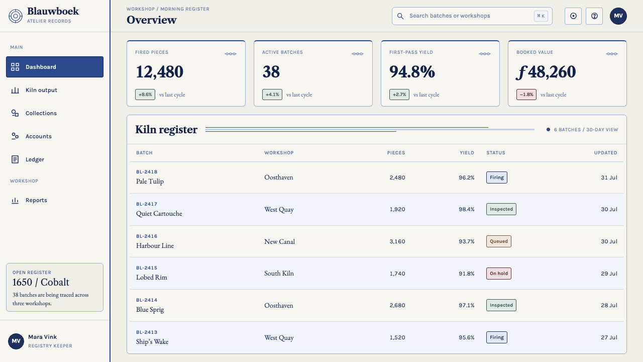
For web interfaces, the style suits tableware and ceramics shops, heritage and travel brands, restaurants, museum shops, stationery and any product that wants to feel crafted and warm. Use a milk-white page, set text in a deep blue-black, and reserve the lighter cobalt wash for illustrations, section accents and hover states. Buttons can be outlined in blue-black with a wash tint on interaction. Keep decorative bands and rims for headers and dividers, and avoid heavy shadows that would contradict the flat painted surface.
In editorial and marketing work, the style gives you the grammar of a decorated plate: a framing rim, a painted centre and a calm margin between them. Pair a reference from far away with something local, in the way Delft set chinoiserie beside tulips and windmills, and the result feels considered rather than pastiche. Illustration commissioned in this vein should look drawn, with visible brush weight, instead of generated or vector-perfect.
The most common mistake is to flip the logic and use blue as a field, with white lettering or motifs reversed out of it; Delft is white with blue painted on, not blue with white left in. Another is pushing the colour to full-strength cobalt or navy, which turns the 1650 look into a later and heavier one. A third is treating blue and white as merely a palette and omitting the brush: without hand-drawn variation and a bit of glaze irregularity, the result reads as corporate blue instead of ceramic.
Delft Blauw — FAQ
Why is this blue lighter than the Delft blue many people picture?
Because the style is pinned to 1650, an earlier moment in a production window that runs from the 1640s to the 1680s. At that point the blue is a lavender-tinted wash carrying dark blue-black outlines, before the full-strength cobalt of the late-century workshops. The later, deeper blue is the one most often imagined today, but it is a different stage of the same tradition.
What is tin glaze, and why does it matter to the look?
Tin oxide added to the glaze turns it opaque and milk-white, covering the red clay underneath so the piece can pass for Chinese porcelain. That opaque white is the ground the cobalt is painted onto, which is why Delft blue is read as brushwork on a surface rather than colour in a field. Without that surface, the style loses its logic.
How is Delft blue related to Chinese blue-and-white porcelain?
Delft was an imitation: its painters copied imported Chinese Kraak plates, using tin glaze to achieve a porcelain-like white. But they did not stay faithful. Chinoiserie sprigs ended up on the same rim as tulips, and windmills and low-horizon landscapes replaced the original subjects. The relationship is one of homage and adaptation, which is why the style feels both familiar and distinctly Dutch.
Can blue be used as the page background in this style?
No, or only in small, deliberate areas. The core rule is that white is the ground and blue is the brushwork laid onto it, never a field printed behind it. A full blue page with white type reverses the relationship and stops reading as glazed ceramic. If you need depth, deepen the outlines and add more washed areas on white, rather than reversing the field.
Does the style work on a dark interface?
It is a light-ground style, and the milk-white glaze is its premise. A dark interface can borrow the vocabulary of line, wash and rim, but the white ground still has to appear somewhere, for instance as a panel or plate-like card on a darker surround. Without a luminous white to paint on, the cobalt loses what makes it look like Delft.
Related design styles
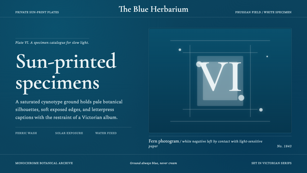 Fern CyanotypeStillness turns scientific. Prussian blue field, white photograms, Victorian…
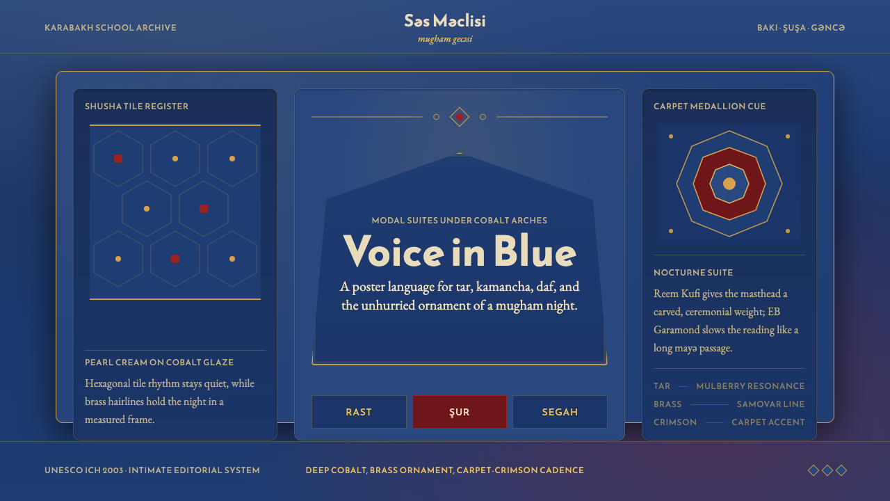 Azerbaijani Mugham Saz BlueMugham night, deeply tiled. Cobalt ground, brass hairlines, arched editorial…
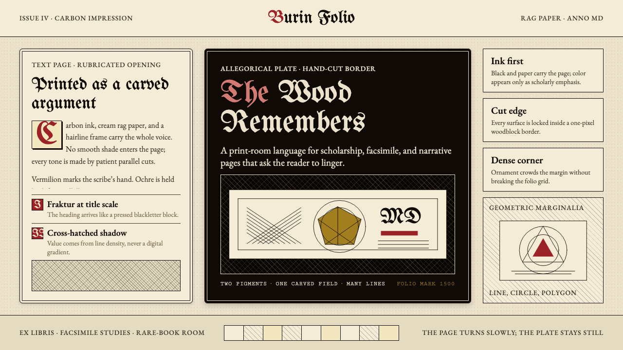 Dürer WoodcutInk remembers everything. Fraktur titles, rag-paper cream, and cross-hatched…
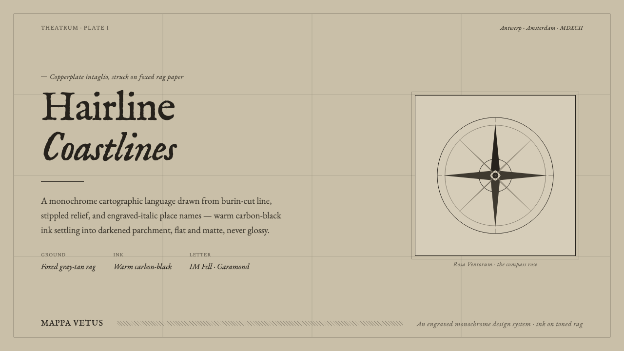 Engraved Monochrome MapThe gravity of an old printed sheet. Warm carbon-black ink on foxed rag paper…
 Gregorian Chant NeumesNotation becomes scripture. Rubric red staff lines and square neumes sit on t…
 Gutenberg 42-Line BiblePrecision awaits the hand. Dense black columns open into red, blue and gold o…