What is Telemark Rosemaling?
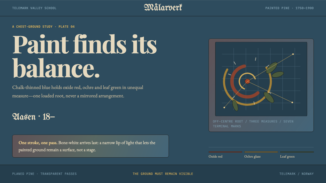
Telemark rosemaling is paint on planed pine: oxide-red scrolls thrown asymmetrically from one off-centre root over a chalky Prussian blue ground, finished with a single tapering stroke of bone-white.
Telemark Rosemaling in brief
Rosemaling — literally ‘rose painting’ — is the Norwegian tradition of painted decoration on wood, and the Telemark manner is its most freely asymmetric form. It is paint on planed pine: dowry chests, log chairs called kubbestol, ale bowls and, in more ambitious houses, whole interior wall panels. The look is a deep blue ground carrying red, ochre and muted green scrolls, with fine pale highlights added last.
Its identity is asymmetry made by hand. A single off-centre root throws C-shaped and S-shaped scrolls out to left and right in unequal weights, and the composition balances by mass rather than by mirroring. Curl tips are tightened, leaves hang from the outer edge of the arcs, and the eye is led around the object by rhythm rather than by a central axis.
Nothing in the style pretends to be anything other than paint on wood. There are no cast shadows and no floating layers. Pigment goes on in transparent glazes that never quite hide the grain, and the pale highlight that finishes each element is a single brush pass that tapers to nothing.
Where does Telemark Rosemaling come from?
The Telemark manner developed in rural Norway between roughly 1750 and 1900, with its peak in the eighteenth and nineteenth centuries. It belongs to the broader rosemaling tradition, which took its vocabulary of scrolls and acanthus leaves from Baroque and Rococo ornament, the decoration of churches, courts and towns, and translated it into the vernacular of farmhouse furniture and interiors. What travelled from town to valley was not a fixed pattern book but an idea: a flexible grammar of curved forms that painters could rework to fit a chest lid, a bowl or a wall.
Within Norway the tradition split into regional schools, each with its own habits. The Telemark valley school stands apart from neighbours such as Hallingdal and Rogaland, whose compositions tend toward symmetry. Telemark painters worked from a different premise: the asymmetric root, the unequal scroll, balance by mass. This was a design decision rather than a limitation, and it is why Telemark pieces feel more improvised and more musical than the formal symmetry of other schools.
The palette had an economic logic. Prussian blue was a pigment that cost money, so it was thinned and extended with chalk to cover a large surface, which gave the grounds their characteristic chalky, slightly pale quality. Oxide red, ochre and a muted leaf green went over it as transparent glazes, so that the wood and the blue ground continued to show through. What looks like a refined colour sensibility is partly the result of working thoughtfully with costly materials.
Telemark rosemaling also travelled. Norwegian emigrants carried painted chests and bowls across the Atlantic to the American Midwest, and the collections at Vesterheim in Decorah, Iowa, preserve many of them. The two names tied to this system, Olav Hansson and Thomas Luraas, stand for the generations of rural painters who developed and refined the manner, many of them working from farm to farm. Their work shows that rosemaling was a trained craft with its own standards of line, not simply a pastime.
What defines the Telemark Rosemaling look?
Chalky Prussian Blue Ground
The ground is a deep Prussian blue thinned and extended with chalk, which gives it an opaque, slightly powdery softness instead of a glossy depth. It is a flat field, not a gradient. In a design system it plays the role of a dark neutral with a hue: calm, cool and rich enough that warm colours placed on it glow without any added effects.
Transparent Glazes
Oxide red, ochre and a muted leaf green sit on the ground as thin glazes that never fully hide the wood below. The colours are earthy and slightly smoky, not pure or neon. Where glazes overlap or thin out, the surface shows variation, which is the mark of a hand at work rather than a printed fill.
The Asymmetric Root
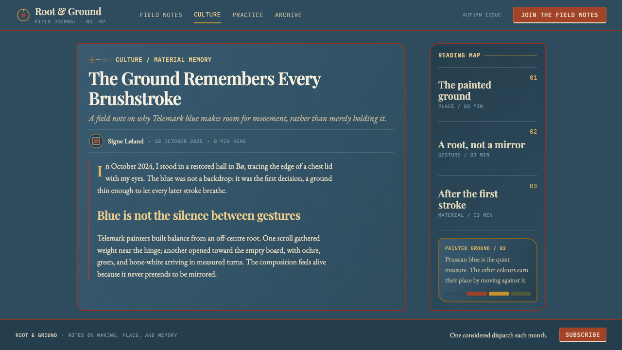
Every composition grows from one off-centre root, a point on the surface from which scrolls radiate. Because the root is not on the centreline, the object never reads as mirrored. The entire layout has a sense of growth, as if the pattern began at a point and extended until the space was used.
C- and S-Scrolls
The basic units are the C-scroll and the S-scroll, long curving strokes that end in tightly wound tips. Leaves and small blossoms hang from the outer edge of the arcs, not along the inside. The curves are confident and varied in length, and they set a flowing rhythm that holds the whole panel together without any frame or border.
Balance by Mass
Left and right halves are deliberately unequal, but they are weighed against each other: a heavy cluster of scroll on one side is answered by a longer, lighter sweep on the other. Balance is a judgment of weight, not a reflection. For a layout, this means asymmetric compositions that still feel stable.
Bone-White Last
Highlights are added at the end in a warm bone-white, one stroke per pass, thickest at the start and tapering to nothing. They are never repeated or blended. In use, the pale accent is a finishing touch reserved for the most important edges and tips, and its power comes from its rarity.
Paint on Wood, Nothing Else
There are no shadows, no floating overlays, no simulated depth. Everything is a flat application of paint onto a flat surface. This honesty about material is what keeps the dense ornament from becoming heavy: shapes sit on the ground side by side, never on top of one another.
Who shaped Telemark Rosemaling?
Hansson is one of the two painters named in this system's reference set for the Telemark manner. He stands in for the rural rosemalers of the eighteenth and nineteenth centuries, who turned imported Baroque and Rococo ornament into a local, hand-painted language, and whose shared habits this system keeps: the asymmetric root, the glazed colour and the single finishing stroke.
Luraas is the second named painter in the reference set, and a name that belongs with the Telemark manner. His place in the set underlines that rosemaling is a craft with recognisable hands and standards, where fluency of line and judgement of balance distinguished one painter from another.
The Telemark valley school is the loose community of painters, workshops and households whose shared habits define the style. Its defining choice, asymmetry in contrast with the symmetry of neighbouring regions, is the clearest example of how a regional design identity forms: through repeated agreement on a few formal rules rather than through a single master.
The Vesterheim museum in Decorah, Iowa, holds painted objects carried across the Atlantic by Norwegian emigrants, and it keeps the craft practised today. These collections matter to the style for a practical reason: they preserve worn, real objects, showing how the colours aged on wood and how a hand-painted line actually looks at close range.
How do you use Telemark Rosemaling today?
Telemark rosemaling is a rich but disciplined ornamental style, and it works best when the ornament is concentrated and the surrounding layout stays plain. Think of the painted object: a chest with one decorated panel, a bowl with a single band. The scrolls are a feature, not wallpaper.
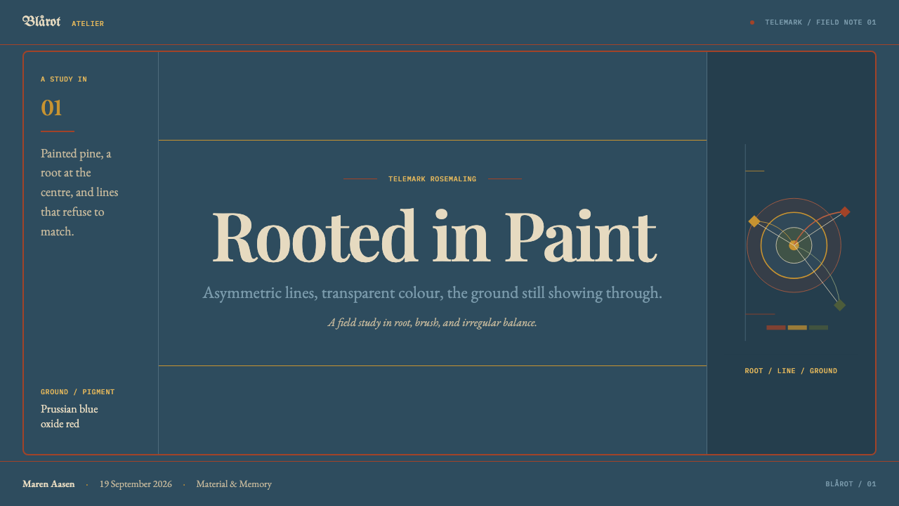
On presentation slides, a deep blue cover with a single scroll cluster growing from an off-centre point makes a memorable opening, with the title in a plain, warm pale tone nearby. Content slides can keep the blue ground and use a slim scroll motif along only one edge or corner. For data slides, set charts on the blue ground, use red, ochre and green for series, and keep the bone-white for the one highlighted value or label.
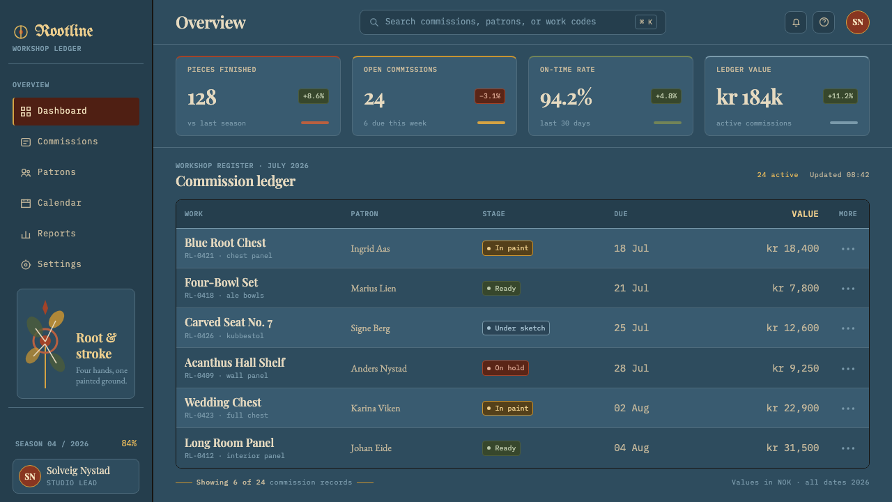
In web interfaces, the style suits products with craft, food, hospitality, heritage, folk-music or seasonal themes: shops, restaurants, festival sites, cultural institutions, and storytelling pages. Use the blue ground for hero sections and footers, keep the main reading area plain, and restrict scroll ornament to dividers, headers and empty states. Buttons and cards should be flat, with no shadows; their warmth comes from the glazed accent colours.
For editorial and marketing work, the style gives an immediate sense of provenance and handwork. A feature article can open with a large asymmetric scroll panel, then drop into calm text columns. Packaging, invitations, menus and campaign banners can place a single decorative cluster off-centre and let the rest of the layout breathe. Photography should be warm and tactile, with wood, textile and natural light.
The common mistake is symmetry. Mirroring the scrolls turns Telemark into the formal manner of other regions and loses the quality that defines it. Other errors are adding drop shadows, bevels or glossy gradients, which contradict the flat painted surface; filling every corner with ornament until the composition has no weight to balance; and using all the accent colours at full strength instead of letting the glazes stay muted.
Telemark Rosemaling — FAQ
How is Telemark rosemaling different from Hallingdal and Rogaland styles?
The main difference is symmetry. Hallingdal and Rogaland compositions lean toward left-right symmetry, with ornament mirrored around a central line. Telemark grows from one off-centre root and balances unequal masses, so the result looks freer and more improvised. If you want a Telemark feel, the single most important rule is not to mirror.
Why a blue ground, and why does it look chalky?
Prussian blue was a costly pigment, so painters thinned it and extended it with chalk to cover large surfaces. The chalk made the ground opaque and slightly pale, with a soft powdery quality. That economic choice became a visual signature, and it is why the ground in this style is a matte, calm blue rather than a deep, glossy one.
Is the style too ornate for modern interfaces?
It can be, if ornament is applied everywhere. The style works when decoration is concentrated in a few places, such as a hero panel, a divider or an empty state, while the working parts of the interface stay flat and plain. Treat scrolls like a painted panel on a chest, not like a pattern over the entire product.
Where did the scroll vocabulary come from?
It derives from Baroque and Rococo acanthus ornament, the curved leaf and scroll decoration of churches, courts and towns. Rural painters adapted it to wooden furniture and interiors, simplifying and reworking it into a local, freehand language. The acanthus lineage is why the curves feel flowing and classical even though the objects are humble.
Does this style work with dark mode?
Yes, it is a dark-ground system. The deep blue ground is its natural state, with warm glazed colours and the pale highlight read against it. For a light version, keep the blue as the dominant accent and use a pale wood tone as a secondary field, but avoid turning the whole interface white, which would lose the contrast the painted palette depends on.
Related design styles
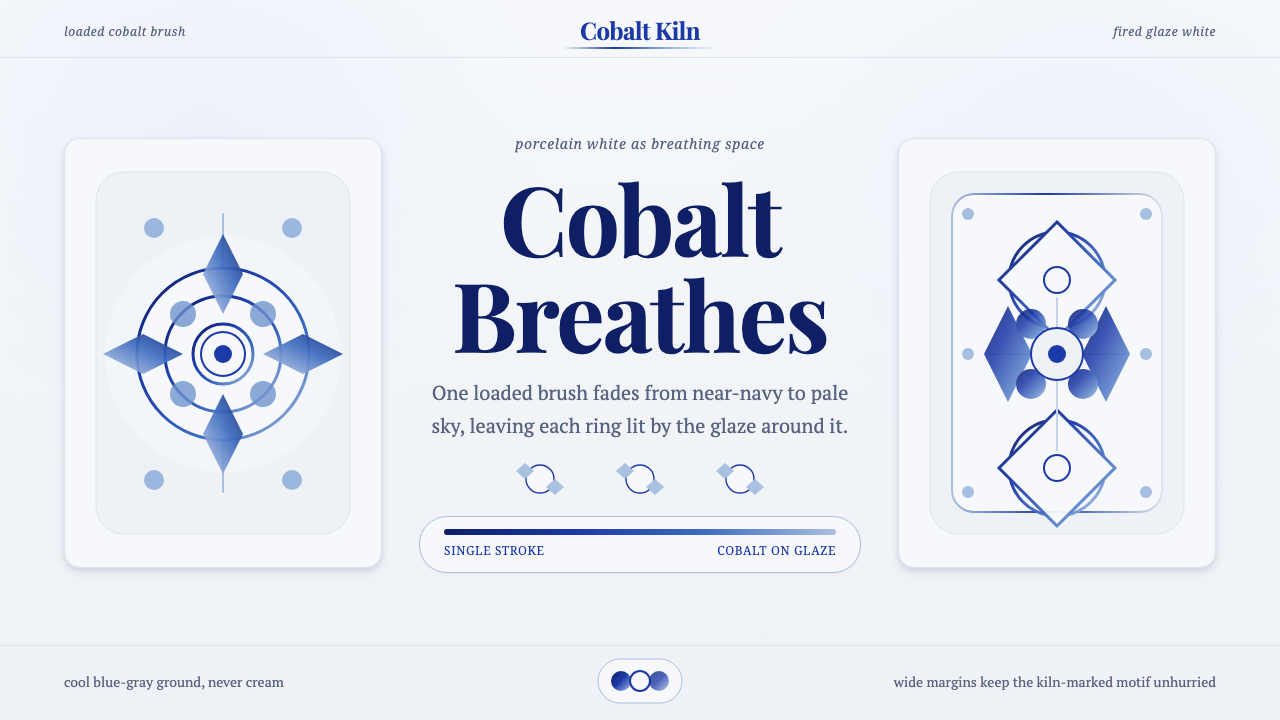 Gzhel Blue PorcelainPorcelain breathes. Cobalt gradients bloom across cool glaze-white space.
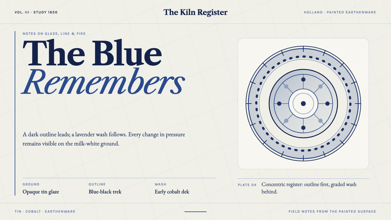 Delft BlauwBrushwork remembers. Lavender cobalt washes follow blue-black lines across mi…
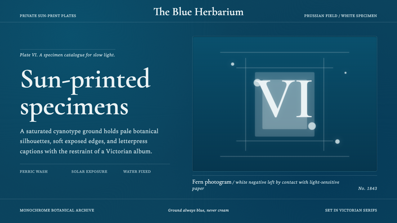 Fern CyanotypeStillness turns scientific. Prussian blue field, white photograms, Victorian…
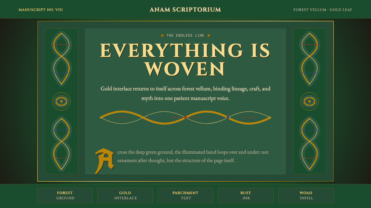 Celtic KnotworkEverything is connected. Gold Cinzel interlace frames forest-green vellum.
 Finnish RyijyWool holds its ground. Lamb's-grey centres meet stepped madder and indigo ban…
 Herbal PharmacopoeiaSlow scholarship of the apothecary folio. Foxed tan parchment, sap-green wash…