What is Fern Cyanotype?
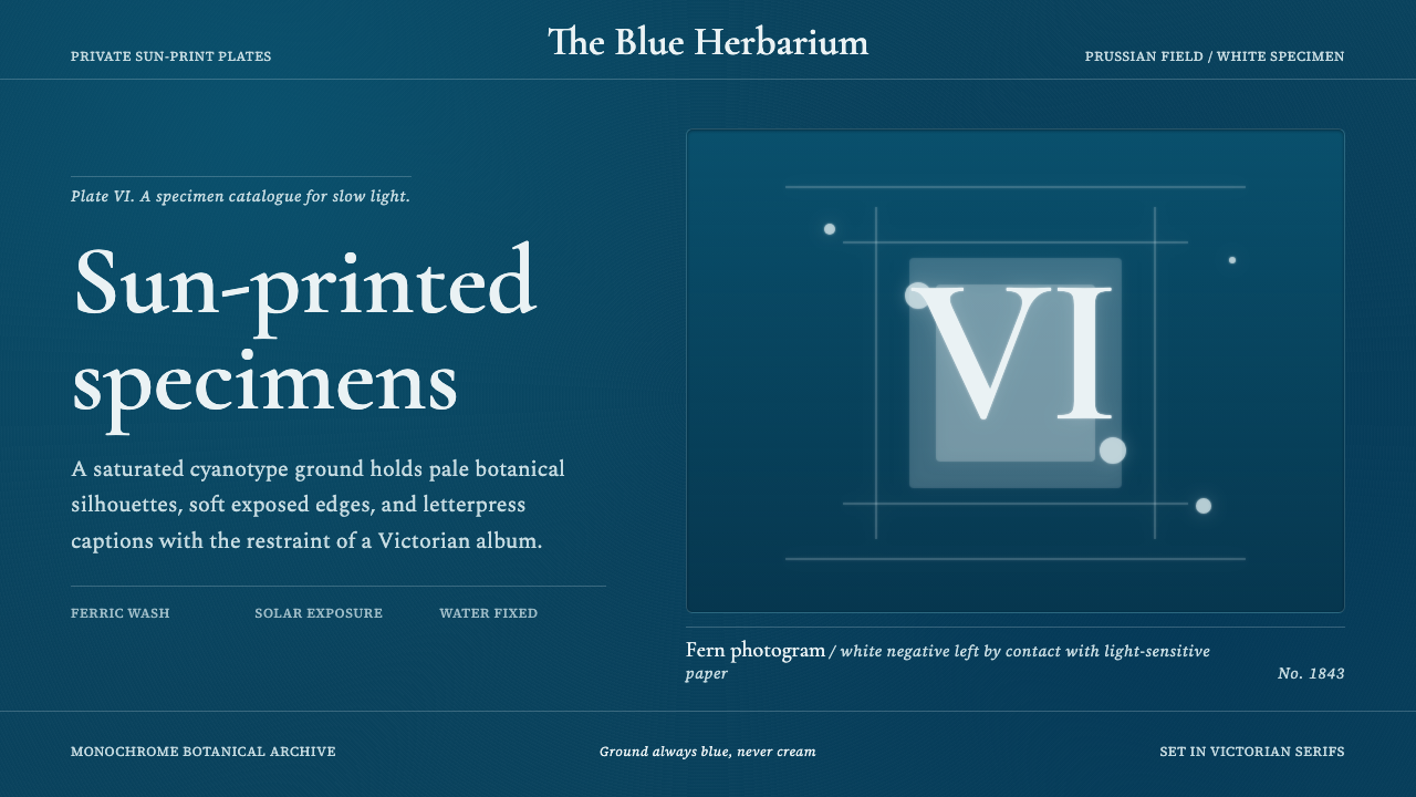
Fern Cyanotype turns botanical stillness into evidence — pale specimens held against an unbroken Prussian-blue field, as if sunlight itself had prepared the archive.
Fern Cyanotype in brief
Fern Cyanotype is a dark, monochrome visual style derived from the cyanotype photograms associated with early photography, botanical illustration, and Victorian scientific publishing. Its defining image is a white botanical silhouette on a saturated Prussian-blue ground: fronds, algae, stems, and branching structures appear not as drawings but as direct traces of objects exposed against sensitized paper. The result combines scientific specificity with the quiet uncanniness of a shadow preserved after its source has been removed.
The style depends on an absolute relationship between figure and field. Blue is not an accent placed on a neutral page; it is the environment in which everything exists. White forms interrupt that field as specimens, labels, rules, and areas of illumination. Botanical imagery should remain crisp enough to reveal structure while retaining softly sun-exposed edges that distinguish a photogram from a cut-paper silhouette or digital icon.
Victorian serif captions give the imagery the character of a classified plate. Their measured, literary presence contrasts with the organic irregularity of each specimen and supplies institutional authority without competing for attention. The style is therefore neither nostalgic decoration nor a generic botanical theme. It is a visual system built from observation, contact, exposure, and classification.
Where does Fern Cyanotype come from?
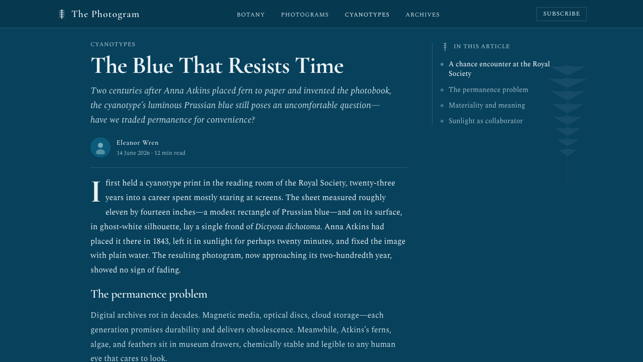
The style begins with the cyanotype process invented by Sir John Herschel in 1842. The process made it possible to fix pale impressions against an intensely blue ground through exposure to sunlight. Its visual consequence was unusually direct: an object placed on sensitized paper could determine the image by blocking or admitting light. Instead of translating a specimen through the hand of an illustrator, the photogram allowed the specimen itself to participate in making its record.
In 1843, the English botanist Anna Atkins self-published Photographs of British Algae: Cyanotype Impressions. She laid algae and related botanical material directly on sensitized sheets, exposed them to the sun, and fixed their white silhouettes onto deep Prussian blue. The book is recognized in the supplied history as the first book illustrated with photographic images. Its pages joined a new photographic process to the established purposes of scientific publishing: comparison, identification, preservation, and the orderly presentation of natural forms.
This union of photography and botany gave cyanotype imagery its distinctive tension. Each plate behaves like evidence because its outline comes from physical contact and light, yet it also feels dreamlike because color and depth have been removed. Fine branching structures become pale networks; overlapping leaves produce compressed layers; empty blue space isolates the specimen as though it had been lifted out of landscape and placed under examination. The image is both index and abstraction.
From 1843 onward, cyanotype belonged simultaneously to early photography, the history of the photogram, botanical illustration, and Victorian scientific publishing. Fern Cyanotype draws from that shared territory rather than reproducing a single historical page. It retains the permanent blue ground, white contact-image logic, sun-softened contours, and serif captions, then organizes them into a contemporary design language suitable for screens, slides, and editorial compositions.
What defines the Fern Cyanotype look?
The Blue Field
A saturated Prussian-blue ground is the style's non-negotiable condition. It should feel continuous, immersive, and materially deep, never like a colored panel floating on cream or white. Variations may appear through exposure-like unevenness, but the composition remains fundamentally monochrome. Blue supplies both darkness and atmosphere; introducing unrelated background hues breaks the historical and perceptual logic.
Photogram Figures
Botanical forms appear as pale contact impressions rather than conventional illustrations. Their outer contours are immediately legible, while veins, filaments, and overlaps preserve enough internal variation to suggest the physical specimen. The strongest figures feel discovered through light: precise but not mechanically traced, delicate but not ornamental, and isolated without becoming logo-like.
Sun-Softened Edges
Edges combine clarity with slight atmospheric diffusion. A specimen may have a crisp central silhouette while its finest fronds soften where light traveled around them during exposure. This restraint is essential: uniformly sharp contours look digitally cut, while heavy blur destroys botanical information. The desired edge records an encounter between object, paper, and sunlight.
Victorian Serif Captions
Serif typography carries names, captions, classifications, and explanatory prose. It should feel formal and bookish, with a calm rhythm appropriate to scientific plates, rather than theatrical or excessively ornate. Hierarchy comes from scale, placement, and spacious composition. The type supports the specimen as a curator supports an exhibit: present, authoritative, and deliberately secondary.
Specimen Composition
Layouts favor one dominant botanical specimen or a carefully spaced series of related forms. Generous blue intervals prevent delicate structures from merging and create the silence associated with archival viewing. Alignment may be orderly, but the organic asymmetry of each plant should remain visible. The page feels classified without becoming a rigid spreadsheet of images.
Monochrome Restraint
Depth is created through density, overlap, exposure, and negative space rather than a broad palette. White may range perceptually from brilliant paper-like light to subdued blue-tinted traces, but additional accent colors should not compete with the cyanotype relationship. This limitation gives the style coherence and makes small differences in form unusually expressive.
Who shaped Fern Cyanotype?
The English botanist Anna Atkins gave cyanotype one of its earliest and most consequential publishing forms. In 1843 she self-published Photographs of British Algae: Cyanotype Impressions, placing botanical material directly on sensitized paper and using sunlight to preserve its pale silhouette. Her work joined scientific observation to photographic contact, establishing the specimen-on-blue relationship that Fern Cyanotype treats as its central visual grammar.
Sir John Herschel invented the cyanotype process in 1842. The process enabled sunlight to produce pale impressions against a characteristically intense blue ground, creating the technical basis for the imagery Atkins used the following year. Within this style, Herschel's importance lies in making light not merely a means of illumination but the active agent that separates specimen from field.
Self-published by Atkins in 1843, this book is the foundational artifact behind Fern Cyanotype and the first book illustrated with photographic images in the supplied account. Its combination of direct botanical impressions, Prussian-blue pages, and scientific sequencing established a model in which image-making and classification were inseparable. The style inherits both its visual beauty and its documentary seriousness.
How do you use Fern Cyanotype today?
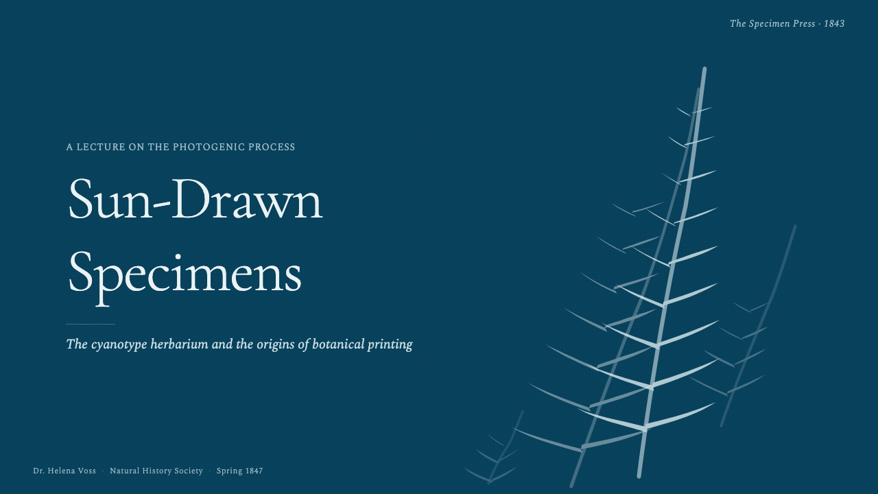
For presentation covers, use a single large fern, algae form, or branching specimen as the visual event. Let it enter from an edge or occupy the quiet center of an uninterrupted blue field, then place the title like a catalog heading rather than an advertising slogan. Content slides work best as scientific plates: a dominant specimen, a restrained serif heading, a short explanatory block, and ample blue separation. Repetition should feel like a sequence of observations, not a collection of decorative botanical cards.
Data slides should translate information into the same figure-and-field logic. Pale lines, bars, points, or branching diagrams can behave like exposed traces, while labels remain compact and bookish. Preserve strong separation between marks so the chart retains the clarity of a classified specimen. Decorative gradients, colorful category systems, and crowded legends weaken the monochrome discipline; when distinctions are necessary, use differences in density, line character, grouping, or exposure-like brightness.
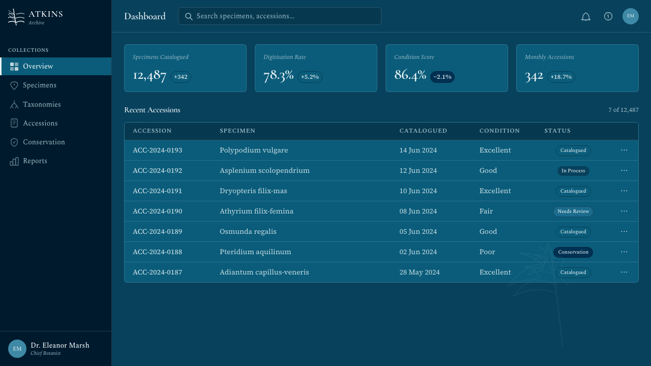
For web interfaces, Fern Cyanotype suits archival dashboards, research collections, cultural catalogs, and pricing pages that benefit from rarity and calm authority. Keep the interface blue from edge to edge and use white for primary information, controls, and states. Panels should be distinguished by boundaries, spacing, or subtle changes in blue rather than pale cards pasted onto the field. Pricing tiers can be treated as labeled specimens, with one featured tier receiving stronger illumination instead of an unrelated accent color.
Editorial and marketing layouts should borrow the rhythm of a botanical volume: a quiet opening plate, closely observed imagery, measured captions, and prose arranged with generous pauses. Long-form articles can alternate full-field specimen pages with text-led sections, while campaign pages can use a single plant form as a recurring identifying motif. The style is especially persuasive when the subject concerns nature, archives, observation, early photography, or patient craftsmanship; its authority comes from specificity rather than spectacle.
The most common mistake is reducing cyanotype to white leaf icons on an arbitrary dark-blue background. Generic vector foliage, perfectly uniform edges, modern neutral type, and numerous decorative panels remove the sense of contact and evidence. Another error is introducing cream sections to make the page feel historical. The canonical ground here is always blue. Authenticity comes from preserving the photogram relationship: physical-looking botanical structure, sunlight-softened contours, disciplined serif captions, and enough empty field for the specimen to remain singular.
Fern Cyanotype — FAQ
Is Fern Cyanotype simply a botanical version of blueprint style?
They share the intense blue-and-white vocabulary, but Fern Cyanotype is specifically grounded in the photographic photogram and botanical publishing. Its forms are contact impressions shaped by specimens and sunlight, not technical lines describing an object to be constructed. A blueprint tends toward measured diagrams and plans; Fern Cyanotype tends toward organic evidence, classification, and the preserved trace of a physical thing.
Why must the background remain blue?
Because the blue field is not a decorative color choice; it is the visible identity of the cyanotype process described in the source material. The white specimen gains meaning as an area protected from exposure within that field. Moving the composition onto cream or white turns the image into ordinary botanical illustration and reverses the relationship that makes a cyanotype recognizable.
How should photography or botanical imagery be prepared for this style?
Choose specimens with distinctive outer contours and enough internal branching to remain interesting as pale impressions. Remove ordinary scene depth and treat the subject as if it had been placed directly against sensitized paper. Preserve fine irregularities, overlaps, and slight edge softness. The goal is not a photograph tinted blue, but an image that appears to have been authored through physical contact and sunlight.
Can sans-serif type be used with Fern Cyanotype?
It can appear in a limited supporting role when interface clarity requires it, but Victorian serif captions should carry the visible identity of the system. Replacing them entirely with neutral sans-serif typography removes the connection to scientific publishing and makes the design resemble a contemporary monochrome interface. The serif need not be ornate; restraint, readability, and a measured editorial cadence matter more than period theatrics.
Where does Fern Cyanotype work poorly?
It struggles when a product depends on a broad color language, dense real-time status signaling, playful warmth, or abundant naturalistic photography. Its monochrome field and archival stillness deliberately slow perception and concentrate attention on a few forms. That is powerful for research, culture, nature, and editorial storytelling, but restrictive for interfaces where many categories must be distinguished instantly or where energetic variety is the central promise.
Related design styles
 Kiribati Coconut ArmorArmour without metal. Dark coir, golden sennit and one disciplined tooth-ivor…
 Samoan Siapo MamanuBeaten bark, never white. Five natural dyes paint freehand grids of fish, she…
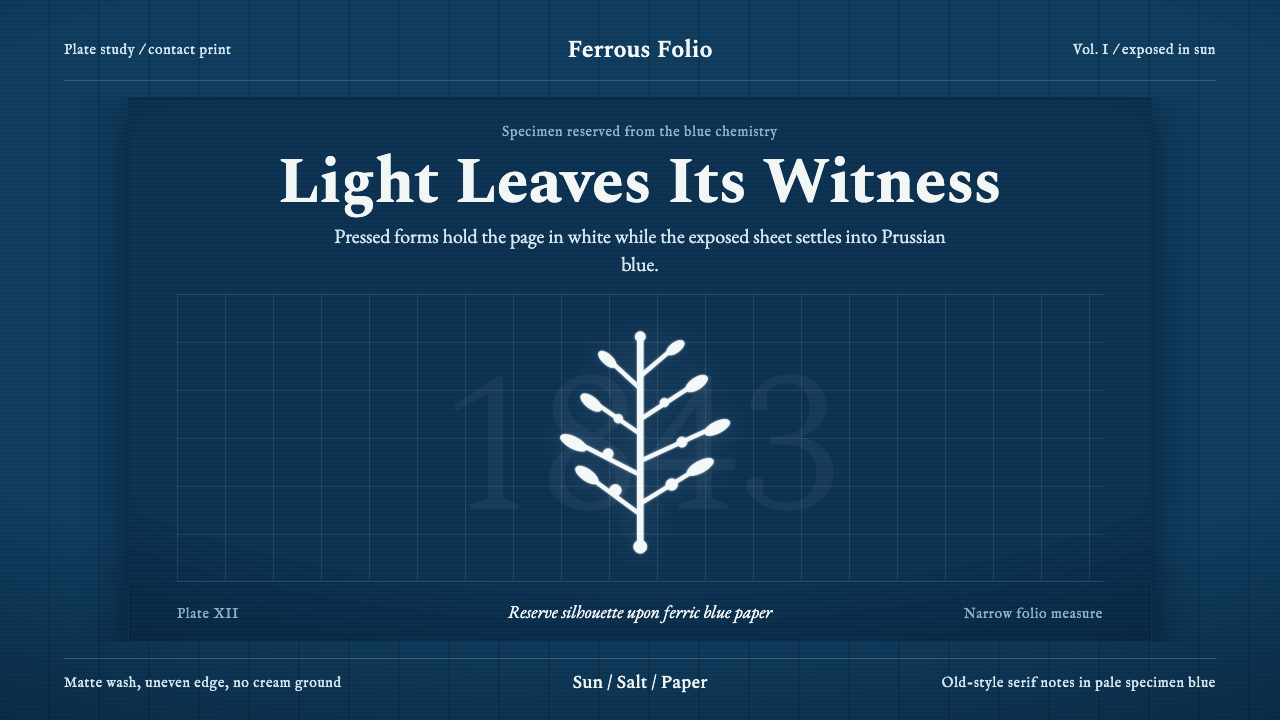 Anna Atkins CyanotypeScience turns spectral. Prussian blue ground, white reserves, Victorian serif…
 Delft BlauwBrushwork remembers. Lavender cobalt washes follow blue-black lines across mi…
 Azerbaijani Mugham Saz BlueMugham night, deeply tiled. Cobalt ground, brass hairlines, arched editorial…
 Botticelli Birth of Venus (1486)Grace defeats gravity. Shell pink, seafoam, and fine gilt contours keep every…