What is Swedish Allmoge Chest?
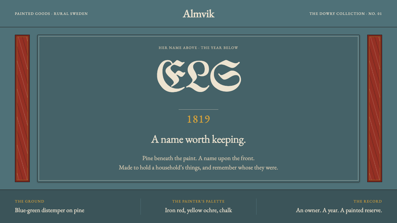
Swedish Allmoge Chest turns a farm painter's marriage chest into a design language: a muted blue-green ground, a bordered reserve for the thing that matters, and lettering that states who and when.
Swedish Allmoge Chest in brief
Swedish Allmoge Chest is a design language taken from a single object: the painted pine chest of the Swedish countryside. Allmoge is the Swedish word for the rural common people, and allmogemåleri is the painting that belonged to their world. The chest in question is a plain pine box with a domed lid, iron straps and turned feet, painted all over in distemper by a farm painter who came through the village and moved on. The style takes its structure, its palette and its habit of lettering directly from that object.
The decisive feature is the reserve. The front of the chest carries one rectangular panel, bordered, inside which a symmetrical flower spray grows from a single stem — the kurbits motif. Above the flowers sit the owner's initials; below them, the year. Everything around that reserve is secondary: the stiles and rails are grained or marbled to look like finer materials, and the ground between them is a worn blue-green. The layout principle is hierarchy by enclosure. Anything important goes inside a bordered field, and the surroundings stay patterned and quiet.
The tone is chalky and aged. Distemper dries to a soft, powdery matte, and the colour of an old chest has faded to a pastel through which the pine grain still shows. Against that ground the lettering is blackletter in a chalky off-white or ochre, the hand of a farm painter rather than the output of a type foundry. The result is a page that feels like an heirloom: dated, signed with initials, and honest about having been made by hand.

Where does Swedish Allmoge Chest come from?
The chest's story begins on the farm. In rural Sweden — the examples behind this style come from Dalarna, Hälsingland and Södermanland — these chests were marriage chests, the dowry boxes of farm families. They were built from pine, which was affordable, and their construction is the same from chest to chest: a domed lid, iron straps for strength and turned feet to lift the box off the floor. The paint is what makes each one a personal object, since it turns a standard box into a record of a particular family.
The painters were itinerant. A farm painter came through the village, painted what was wanted and moved on. The paint was distemper, pigment bound in a water-based glue medium, which dries to the chalky, matte surface that the style reproduces. The scheme was regular enough for a travelling painter to repeat but personal in its details: the flower spray in the middle, the owner's initials above, the year below. That combination of a repeatable framework and a single named, dated owner is the heart of the tradition.
Around the reserve, the painter did what the budget demanded. Pine could be bought and hardwood could not, so the stiles and rails were grained or marbled with a rag and a feather to suggest costlier timber and stone. The imitation reads as imitation: the gesture of the rag and feather stays visible, and the effect is decoration rather than forgery. Its job is to frame the real content, which is the name and the date, and not to deceive anyone about the material underneath.
Enough of these chests survive to date the practice. The source record runs from the 1790s to the 1860s, with dated marriage chests that include a blue chest from 1795, one marked JNS 1819 and one marked ABS 1860. The Sörmlands museum and the Swedish auction houses Auctionet and Bukowskis are the places the record points to for dated examples. The design system turns this habit into a rule: lettering says who and when, and the surface carries its own provenance on its face.
What defines the Swedish Allmoge Chest look?
The chest form
The object's construction supplies the page's structure. The domed lid suggests a gently curved top edge, the iron straps suggest strong bands that cross and hold the composition together, and the turned feet suggest a grounded, heavy base. A layout in this style feels like a box with contents rather than a free-floating surface, and bands, rules and heavy edges do the work that decorative ornament does elsewhere.
Distemper surface
Distemper dries to a soft, powdery matte with no sheen. The surface looks dry and slightly worn, and the grain of the pine shows through the thin colour. In design terms this means no gloss, no glassy highlights and no deep shadows; colour sits flat and chalky, and a faint underlying texture is allowed to peek out so that the page appears to have a physical body behind its paint.
The bordered reserve
The reserve is a rectangular field, set off by a double line, that holds everything of consequence. It is the only place the flower spray, the initials and the date are allowed to live. Content outside the reserve is deliberately quieter. As a layout rule it works like a spotlight made of a frame: the eye goes straight to the enclosed panel, and the hierarchy of the page needs no help from colour or size.
Kurbits flower spray
The ornament inside the reserve is a single symmetrical flower spray growing from one stem. Its symmetry gives the panel a vertical axis, and its single-stem origin gives it a sense of growth rather than arrangement. The motif is used once, at the centre of the reserve. It is a focal ornament, not a repeating pattern, and it is the reason the reserve feels alive instead of merely framed.
Lettering that states provenance
The lettering is blackletter, the hand of a farm painter, set in chalky off-white or ochre. It is used for short strings: initials above, year below. These strings tell the viewer who owned the object and when it was made. The practice treats text as identification rather than as running prose, and the system accordingly reserves this lettering for names and dates, not for paragraphs.
Faux grain and marble
The frame members around the reserve are patterned with an imitation of grain or marble, made with a rag and a feather rather than a fine brush. The pattern is soft, irregular and visibly hand-made. It gives the surrounding areas a rich, quiet texture that supports the reserve without competing with it, and it keeps flat areas of colour from feeling empty.
Aged pastel palette
The palette is small and faded. A muted blue-green carries the ground, chalky off-white and ochre carry the lettering and ornament, and the warm tone of bare pine shows underneath. Nothing is saturated; the colours look as if they have sat in a room for generations. The effect is a gentle, slightly melancholy warmth that rewards close looking more than fast scanning.

Who shaped Swedish Allmoge Chest?
The real authors of the style are the farm painters who travelled between villages, painted a chest in a few days and left. Their names are mostly lost, but their method is the style's method: a repeatable framework, a symmetrical flower from one stem, the owner's initials above and the year below, and an imitation of grain or marble applied quickly with a rag and a feather. The design system keeps the framework and the speed of the gesture, and does not try to polish them away.
The Sörmlands museum is the regional museum named among the key figures of the style, and its role is that of an institutional record. A museum holds the objects that make a vernacular style legible: the chests whose construction, paint and lettering can be compared across households and decades. For a design system built on a handmade tradition, that kind of institutional memory is what keeps the details accurate.
Auctionet is a Swedish online auction service, listed in the record as a source for dated chests. Auction catalogues matter to this style because they tend to describe a chest in the same terms the style itself uses: the year, the initials, the colour of the ground and the character of the flower. They are, in effect, a public archive of provenance, built one sale at a time.
Bukowskis is a Swedish auction house, also named in the record. Like Auctionet, its catalogue entries preserve the identifying facts of a chest, and a dated, initialled chest is exactly the kind of lot whose value depends on its recorded origin. That attention to who and when is the same attention the design system builds into its lettering.
How do you use Swedish Allmoge Chest today?
Swedish Allmoge Chest rewards designers who think in enclosures. The style says that the thing which matters goes inside a bordered field and everything else gets out of the way, so the best uses give the reserve a real job: a title, a name, a plan, a date. It suits subjects with provenance, craft and a human hand, and it works best when the page has one clear focal panel and a quieter, patterned surround.
For presentation slides, a cover can follow the chest front exactly: a bordered reserve at the centre holding the title, a short identifying string above it such as an organisation's initials, and a year below, all against the muted blue-green ground. Content slides can put the one statement that matters inside a reserve and leave supporting material in the quieter surround. Data slides can set a chart inside a reserve, with a short blackletter-style caption giving who produced the figures and when, so the provenance of the numbers is visible.
For web interfaces, pricing pages and plan cards map neatly onto reserves: each tier sits in its own bordered field, with the plan name as the short lettered string and the price as the focal element. Dashboards can treat each key metric the same way, one reserve per figure, while the surrounding panels carry a soft, hand-patterned texture. Keep the body text plain and readable, and use blackletter only for small labels so the interface stays usable.
For editorial and marketing work, the style suits heritage and provenance stories: craft marketplaces, auction catalogues, family histories, wedding and anniversary stationery, certificates and small-batch product labels. A masthead can carry initials and a year in the manner of a dated chest, and a feature block can use a single central ornament and a bordered caption. The tone is warm and unhurried, so it is a poor match for copy that needs to feel urgent or high-tech.
The most common mistake is to use the lettering and the faux grain everywhere. Setting long paragraphs in blackletter makes them hard to read, and filling every surface with marbled or grained texture makes the reserve lose its authority, because nothing is quiet any more. A second mistake is to make the frame louder than the content it holds, with stronger colour or heavier detail on the surround than on the reserve. Keep the reserve as the loudest element on the page and let the rest recede.

Swedish Allmoge Chest — FAQ
What does allmoge mean?
Allmoge is the Swedish word for the rural common people, the farming population of the countryside. Allmogemåleri is the painting that belongs to that world, mostly on furniture and interiors, made by farm painters for farm households. In this style, the word signals a particular kind of authorship: not a studio designer, but a travelling craftsman working in a repeatable, regional idiom for a named client.
What is kurbits?
Kurbits is the name for the symmetrical flower spray that grows from a single stem and sits in the middle of the chest's reserve. In this style it is the focal ornament, used once and placed on the vertical axis of the panel. The name is also used for the painting tradition built around that motif, and the source lists it among the style's movements alongside allmogemåleri and faux marbling and graining.
Why do the initials and the year matter so much?
Because the chests were marriage chests, and the lettering made them personal and dated. Examples in the record include a blue chest from 1795, one marked JNS 1819 and one marked ABS 1860. The design system turns this into a principle: a page should say who it belongs to and when it was made. It gives the surface authority without adding decoration, and it makes even a very simple layout feel like it has a history.
Can blackletter be used for body text in this style?
It can, but it should not be. The blackletter in this style comes from the hand of a farm painter lettering short strings such as initials, names and years. It works as a label and is hard going as continuous reading. The sensible approach is to reserve the blackletter for the short identifying lines inside the reserve and to set body paragraphs in a plain, readable face, keeping the same chalky colours so the page still feels unified.
Is faux graining a form of dishonesty, and how should it be used digitally?
In the original tradition the imitation is plainly an imitation: the rag-and-feather gesture stays visible, so it reads as decoration rather than forgery. Digitally, that suggests using faux grain or marble as a soft, irregular texture on the frame areas around the content, not as a photographic wood image behind everything. Keep it quiet and keep it away from the reserve, so it supports the panel instead of competing with it.
Related design styles
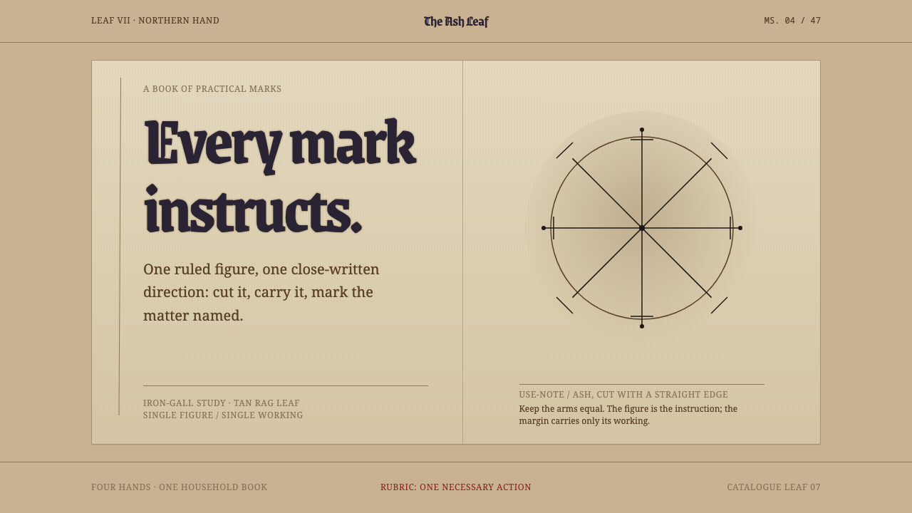 Icelandic GaldrabókEvery mark instructs. Iron-gall geometry stands alone on a smoke-darkened tan…
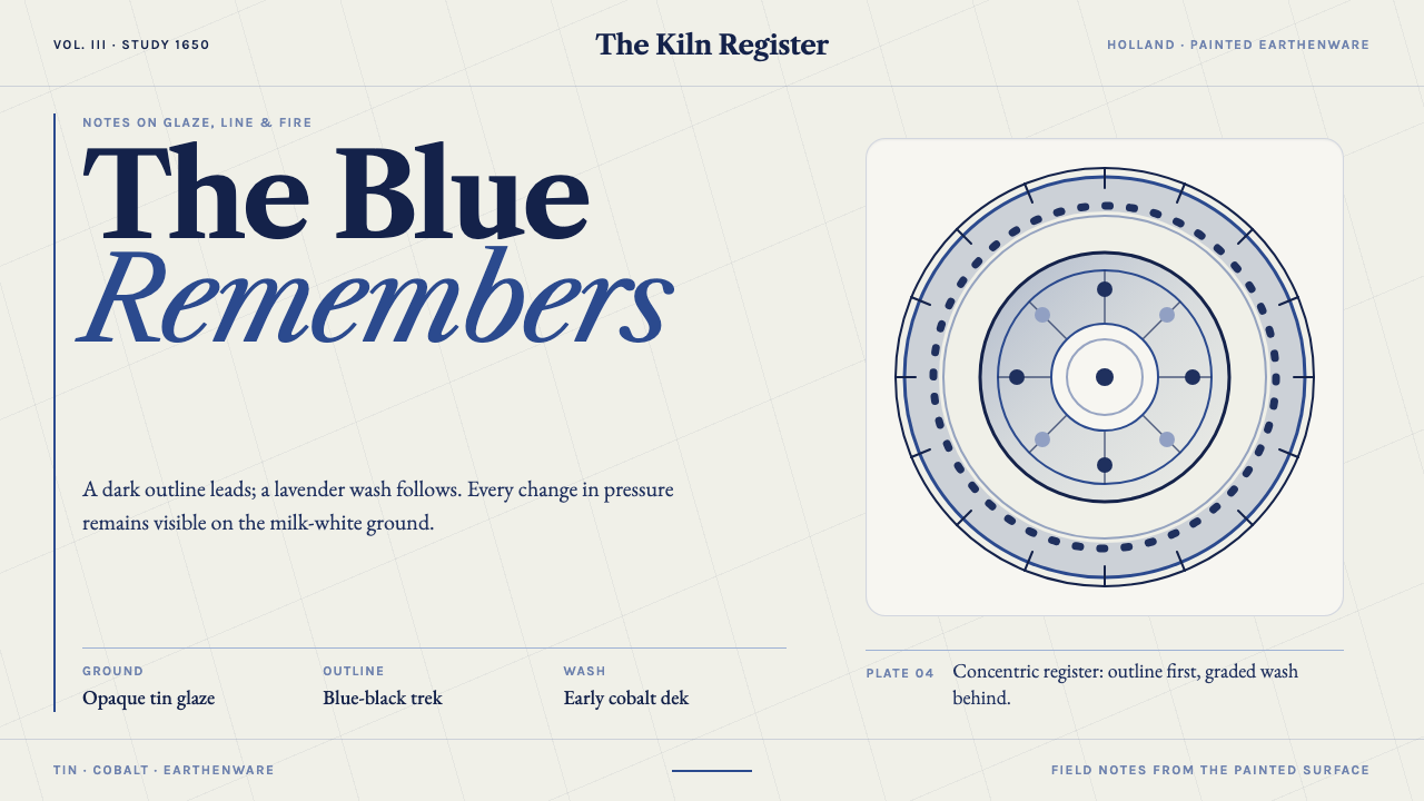 Delft BlauwBrushwork remembers. Lavender cobalt washes follow blue-black lines across mi…
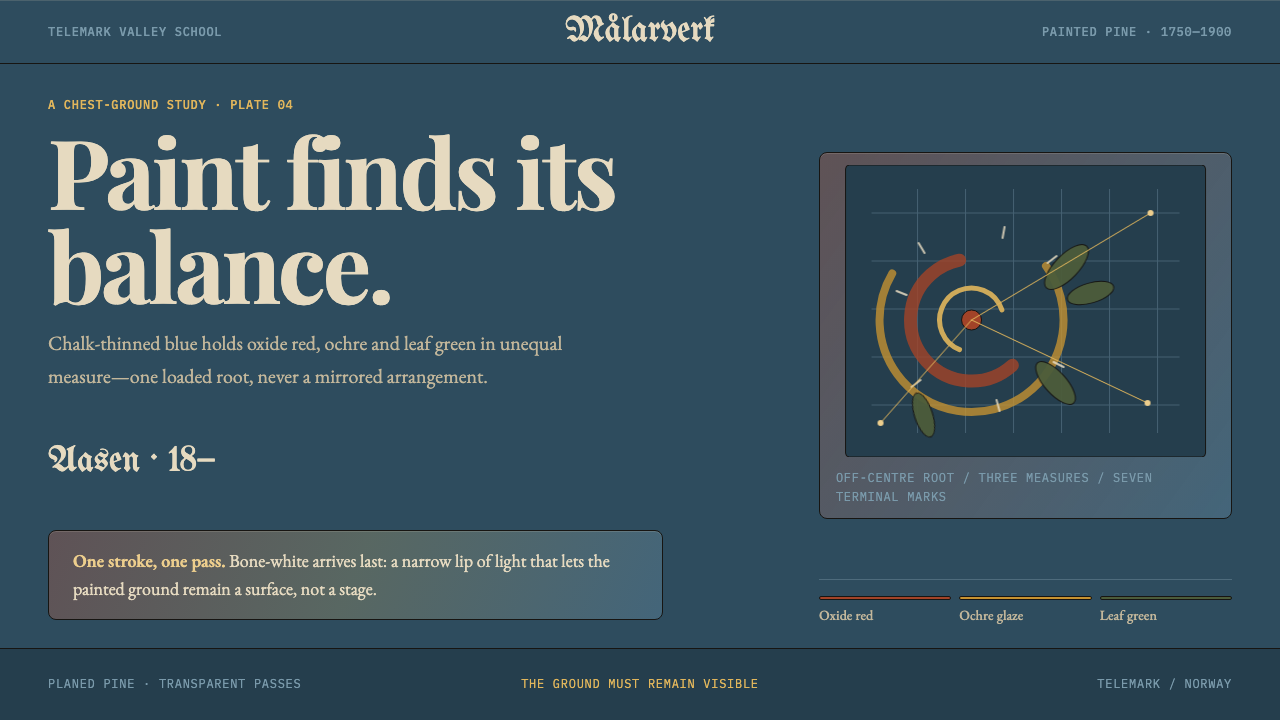 Telemark RosemalingAsymmetry made by hand. Oxide-red scrolls balance on chalky Prussian blue wit…
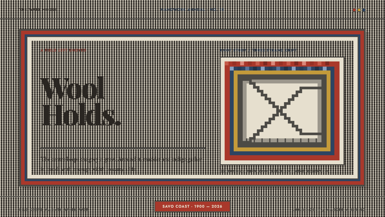 Finnish RyijyWool holds its ground. Lamb's-grey centres meet stepped madder and indigo ban…
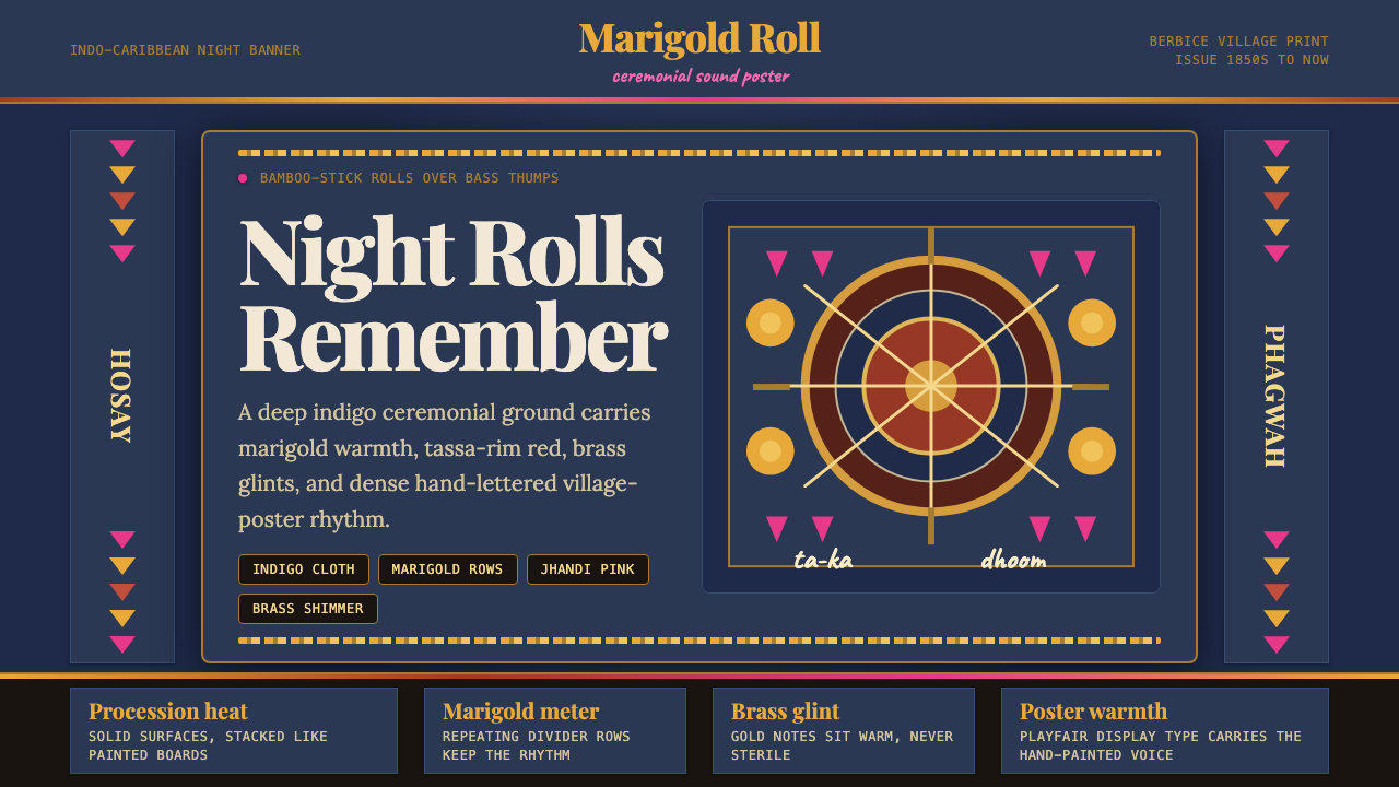 Guyanese Tassa DrumCeremony carries the beat. Indigo banners, Playfair type, and marigold rows g…
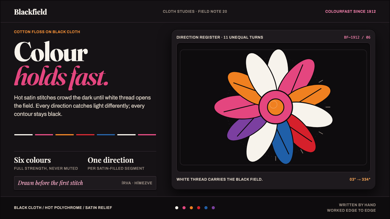 Kalocsa EmbroideryColour burns against black. White thread and hot satin segments pack the fiel…