What is Horezu Ceramics?
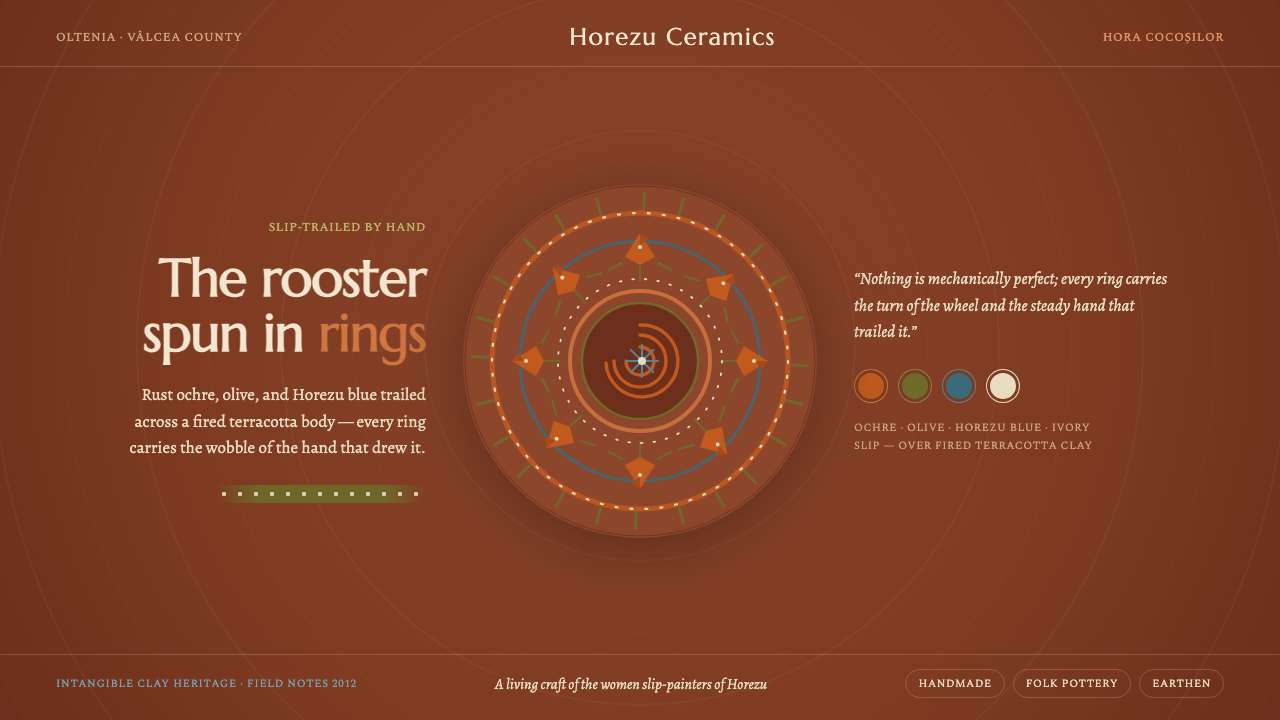
Horezu Ceramics brings the warmth of fired red clay and the patient irregularity of a steady hand into a dark digital world, where the Horezu rooster turns every interface into a quiet ritual of making.
Horezu Ceramics in brief
Horezu ceramics are a living folk-pottery tradition from Horezu in Vâlcea County, within Romania’s Oltenia region. Potters shape a red terracotta clay body, then women slip-paint the spiral Cocoșul de Hurez, or rooster of Horezu, arranging it within concentric Hora Cocoșilor rings. The result is both vessel and visual system: a warm earthen ground, a central animal emblem, and a rhythm of surrounding movement.
The style is grounded in material rather than polish. Rust ochre, olive green, Horezu blue, and Horezu ivory move across the red clay as hand-drawn marks, never as perfectly manufactured surfaces. Lines may thicken, narrow, drift, or settle unevenly. That irregularity is not a flaw to correct; it is evidence of touch, sequence, and attention.
Translated into a digital interface, Horezu Ceramics becomes an earthy dark style with a strong sense of craft. The screen should feel like a fired object carrying slip-painted marks: calm, tactile, and quietly ceremonial. Color is used in measured gestures, while spirals, rings, borders, and rooster forms provide continuity across cards, panels, charts, and editorial sections.
Where does Horezu Ceramics come from?
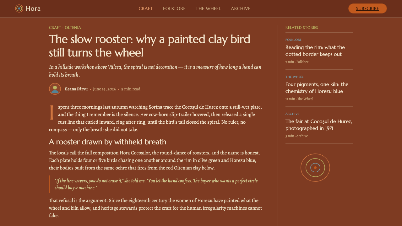
Horezu ceramics belong to the Oltenian folk-pottery tradition of Eastern Europe and come from Horezu, Vâlcea County, Romania. The craft is centuries old and was already established before 1900, making it a living practice rather than a recently reconstructed historical style. Its identity is inseparable from the place: the name Horezu describes both the locality and the ceramic language associated with it.
The making process is divided between distinct acts of care. Potters throw and shape the red terracotta clay body, creating the physical ground of the vessel. Women slip-painters then draw the rooster and its surrounding rings by hand. This division does not separate form from decoration; it creates a sequence in which structure, image, and gesture belong to the same object.
The central motif is Cocoșul de Hurez, the rooster of Horezu. Around it, the Hora Cocoșilor rings create a circular movement that can be read as dance, repetition, and communal continuity. The motif is therefore more than an illustration. It organizes the surface, gives the eye a route to follow, and turns the vessel into a field of recurring rhythm.
Horezu ceramics were listed by UNESCO as Intangible Cultural Heritage in 2012. The tradition is carried by Horezu potter families and by the women who slip-paint the vessels. In a digital interpretation, that lineage matters: the style should communicate continuity and practiced hands, not the detached appearance of a decorative theme assembled from unrelated rustic symbols.
What defines the Horezu Ceramics look?
Fired-Clay Ground
The red terracotta body is the visual foundation. In an interface, surfaces should feel warm, earthen, and slightly absorbed rather than sterile or luminous. A dark surrounding field can make the clay-like notes and slip-painted marks feel embedded, as if color has settled into a fired object instead of floating above it.
Earthy Slip Palette
Rust ochre, olive green, Horezu blue, and Horezu ivory form a restrained family of colors. They should appear as purposeful painted passages: ochre for warmth, olive for organic balance, blue for a cooler counterpoint, and ivory for relief and breathing space. The palette gains character through restraint and adjacency, not through loud saturation.
Rooster as Emblem
The Horezu rooster is the unmistakable focal emblem. It can anchor a page header, mark a featured state, or appear as a small recurring sign across a product. Its character should remain graphic and symbolic: a recognizable silhouette or hand-drawn figure with enough irregularity to retain the sense of a painted ceramic motif.
Concentric Rhythm
The Hora Cocoșilor rings establish movement without requiring animation. Repeated circular bands can frame a data point, contain a status, or guide attention toward a central action. Their spacing should feel rhythmic rather than mathematically sterile, with the visual priority placed on continuity and return.
Hand-Drawn Irregularity
The defining human quality is controlled variation. Borders, motifs, and decorative marks may wobble gently, vary in thickness, or break their symmetry. The variation must remain intentional and legible. If every line is perfectly uniform, the style loses its hand; if every line is chaotic, it loses the calm discipline of a practiced craft.
Tactile Restraint
Horezu Ceramics suggests touch through the relationship between ground and mark, not through excessive texture effects. Interfaces should favor quiet surfaces, clear painted accents, and occasional material cues. The design feels crafted when each irregular detail has a role, not when every panel is covered with simulated grain or ornamental noise.
Who shaped Horezu Ceramics?
The potter families of Horezu represent the continuity of the living craft. They shape the red terracotta body that gives every painted vessel its physical and visual ground. In a design system, this role translates into dependable structure: warm surfaces, stable containers, and repeated forms that can carry changing content without losing their identity.
The women slip-painters bring the hand-drawn image into the clay surface. Their work gives the style its human scale, visible gesture, and variation. They are the reason the digital interpretation should treat marks as authored strokes rather than generic decoration, allowing small differences to signal care and presence.
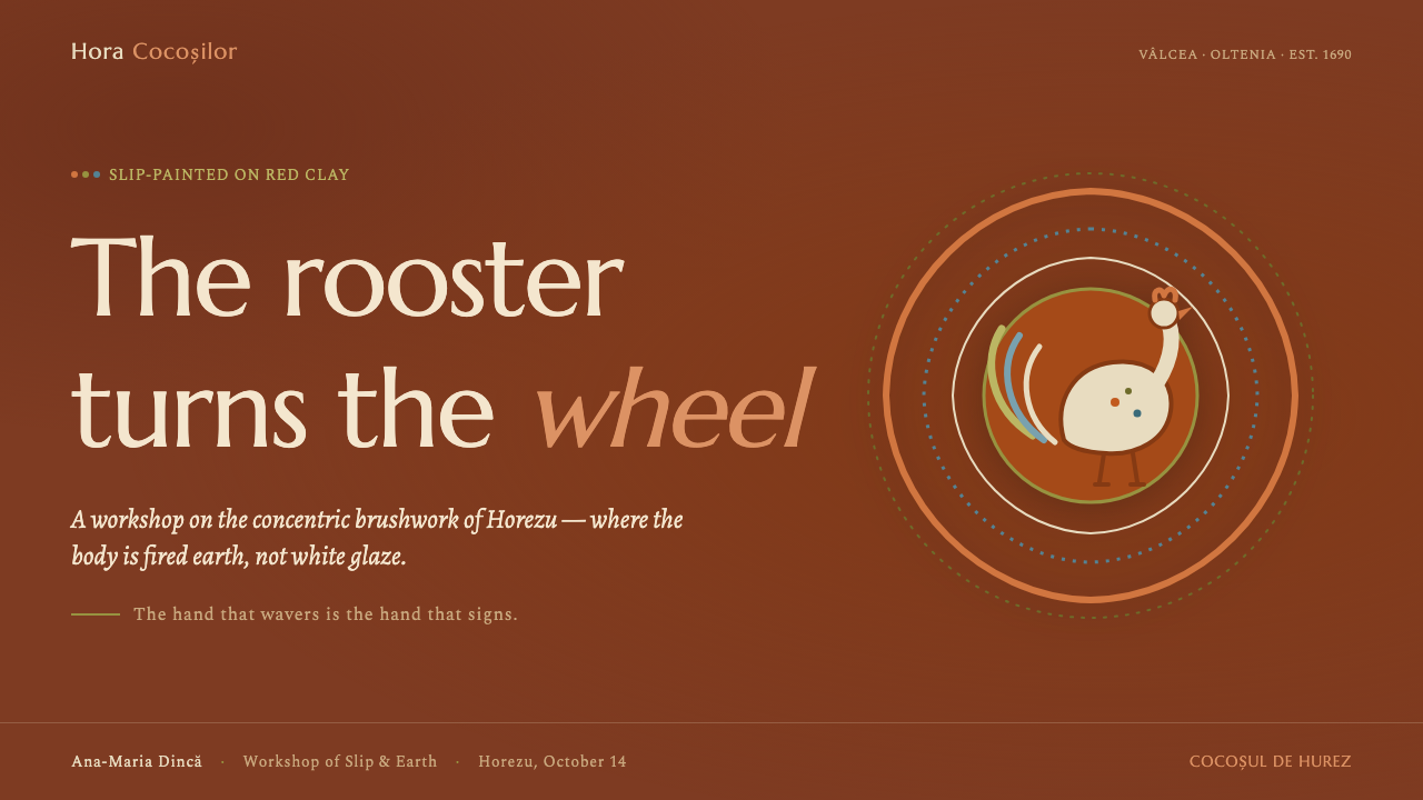
The rooster of Horezu is the central visual figure of the tradition. It gives the surface a clear subject and a recognizable point of return. Used in digital work, the rooster can function as a brand mark, empty-state companion, section emblem, or quiet sign of completion, provided it remains symbolic and does not become cartoonish ornament.
The concentric Hora Cocoșilor rings give the rooster its surrounding rhythm. They turn a single emblem into a complete composition and offer a useful model for organizing interface relationships: a central message, a surrounding context, and repeated bands that make hierarchy feel circular rather than merely stacked.
How do you use Horezu Ceramics today?
For presentation slides, use the style as a quiet stage for a central idea. A cover can place the title against a dark ground with a single rooster emblem or circular ring structure providing focus. Content slides should let the earthen palette establish sections without turning every slide into a patterned plate. Data slides can use concentric rings, painted bands, or rooster-like directional forms to frame a number, compare categories, or lead the eye toward the main conclusion.
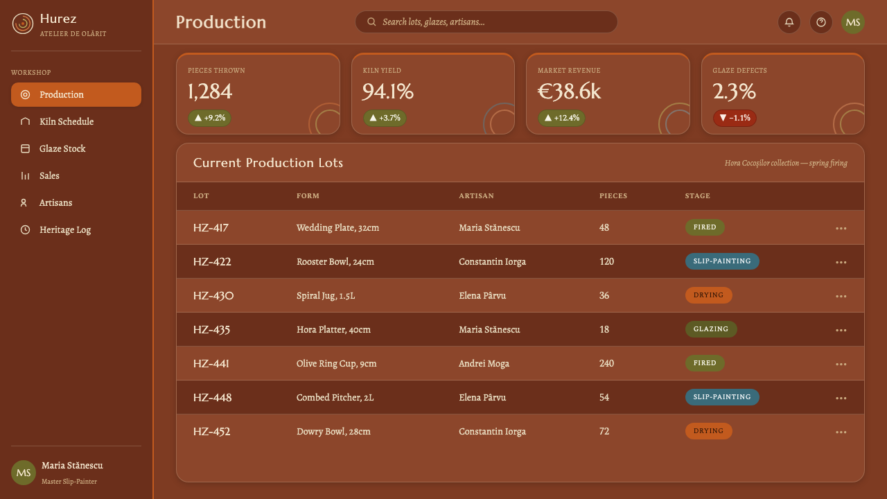
For web interfaces, Horezu Ceramics suits dashboards, collection tools, and pricing pages that need warmth without losing structure. Use a dark field as the overall environment, reserve rust ochre, olive, blue, and ivory for meaningful states, and keep containers calm enough for information to remain legible. Cards can feel like grouped ceramic plaques, while rings can distinguish progress, categories, or featured plans. Pricing tiers should differ through emblem, accent, and motif rather than a loud parade of unrelated colors.
For editorial and marketing work, the style supports a strong story of place, process, and human continuity. Articles can use a broad dark opening with the rooster as a visual anchor, followed by quieter reading sections that echo the terracotta ground. Marketing pages may alternate between dense information and open breathing space, using hand-drawn borders or circular motifs to mark transitions. The result should feel tactile and culturally specific, with the craft story visible in the organization as well as in the decoration.
The most common mistake is confusing hand-made character with visual disorder. Adding irregular borders, repeated roosters, and every available palette color to every component quickly turns the system into noise. Horezu Ceramics works through hierarchy: a clear clay-like ground, a dominant focal motif, restrained accents, and carefully placed variation. The irregularity should appear where a hand would naturally leave evidence, while the larger composition remains calm, readable, and purposeful.
Horezu Ceramics — FAQ
What makes Horezu Ceramics different from a generic rustic style?
Its identity comes from a specific living tradition rather than from a broad mood of natural warmth. The red terracotta body, the slip-painted Cocoșul de Hurez, and the concentric Hora Cocoșilor rings form a connected visual language. A faithful digital interpretation therefore needs the relationship between ground, emblem, and circular rhythm, not merely earthy colors or rough texture.
Why is the rooster so important in the design system?
The rooster is the central motif named by the tradition itself. It gives the viewer an immediate subject and a point of return, while the surrounding rings turn it into a complete composition. In an interface, it can carry recognition, orientation, and emotional warmth, as long as it remains a clear emblem rather than being repeated as empty decoration.
Can Horezu Ceramics work with a dark interface?
Yes. A dark interface gives the warm red clay, ochre, olive, blue, and ivory marks a strong field of contrast. The dark ground should remain quiet so the painted accents feel like material emerging from it. Avoid making every surface equally dramatic; the style depends on the tension between a restrained environment and a few visibly hand-made signs.
How much irregularity should be introduced into digital components?
Enough to suggest a practiced hand, but not enough to damage hierarchy or reading. Let variation appear in selected borders, motifs, rings, and emblem details, while the overall grouping remains stable. The goal is controlled deviation: the viewer should notice warmth and authorship before noticing that a line is not perfectly uniform.
What should be avoided when applying the style?
Avoid treating the palette, rooster, and rings as independent stickers. When every component receives the same intensity, the system loses the quiet discipline of the ceramic tradition. Also avoid simulated texture that overwhelms the interface. Horezu Ceramics is strongest when material, motif, and irregular gesture work together in a clear hierarchy.
Related design styles
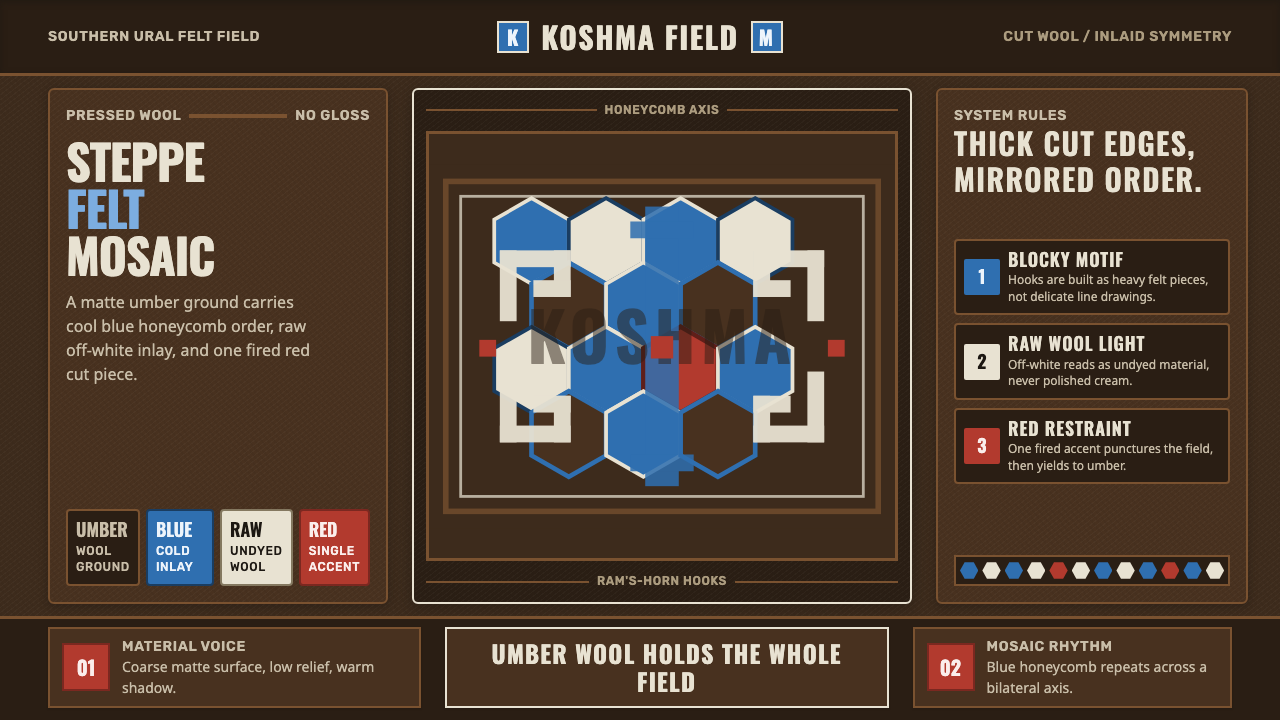 Bashkir Honeycomb Felt OrnamentSteppe craft feels weighty. Umber felt holds blue honeycomb and raw-wool hook…
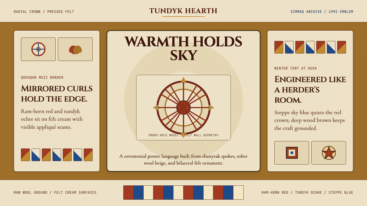 Kazakh Shanyrak Yurt FeltDomestic warmth, engineered. Ram-horn red felt curls around a radial shanyrak…
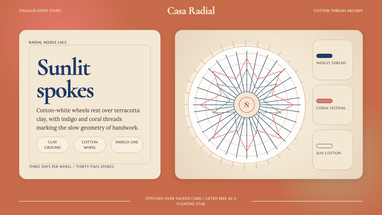 Paraguayan Ñandutí Spider-Web LacePatient lace in sunlight. Terracotta ground, Cormorant serif, indigo radial s…
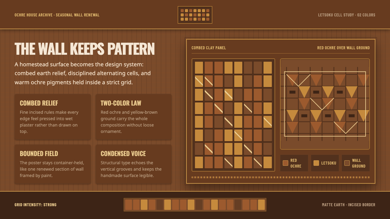 Sotho Litema Wall MuralEarth remembers the hand. Ochre cells and combed borders turn wall into patte…
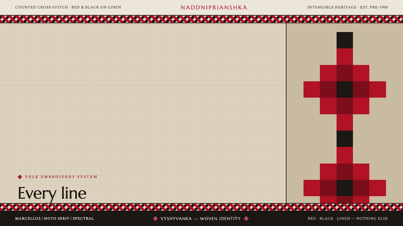 Ukrainian Vyshyvanka EmbroideryRed is life, black is protection. Stepped rhombus motifs counted thread by th…
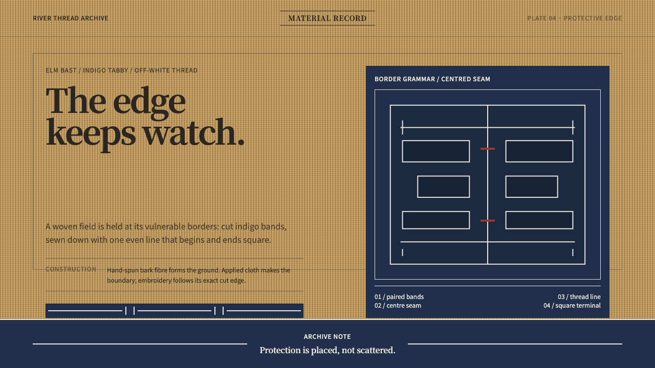 Ainu Attus RobeProtection is cut, not painted. Indigo bands and square-ended thread hold elm…