Design style guide设计风格指南
What is Paraguayan Ñandutí Spider-Web Lace?什么是 Paraguayan Ñandutí Spider-Web Lace?
Ñandutí — Guaraní for spider web — is a radial needle-lace tradition from Paraguay's patio culture, transformed into a design language of sunlit terracotta grounds, cotton-white floating forms, and indigo spoke-lines that radiate outward like a wheel of thread lifted free from cardboard.Ñandutí 在瓜拉尼语中意为蛛网——这一源自巴拉圭露台文化的辐射状针织蕾丝传统,化为一套设计语言:阳光下的赤陶底色、棉白浮游形态,以及像从硬纸板上揭起的线轮般向外辐射的靛蓝辐条。
Paraguayan Ñandutí Spider-Web Lace in briefParaguayan Ñandutí Spider-Web Lace 速览
Ñandutí spider-web lace is a needle-lace tradition unique to Itauguá, a town in Paraguay's departamento Central, where artisans — almost exclusively women — stitch cotton thread over tacked patterns on cardboard frames, working outward from a central point in 8, 16, or 32 radiating spokes. When the work is complete, the finished medallion is lifted free as a self-supporting wheel, bleached by midday sun to a warm ivory. The name, from Guaraní, simply means spider web, and the visual logic of the form bears out the metaphor: concentric rings of looped thread connecting radial spokes, the whole structure held by geometry rather than a ground fabric.Ñandutí 蛛网蕾丝是巴拉圭中央省伊陶瓜镇特有的针织蕾丝传统。那里的工匠——几乎清一色是女性——将棉线按固定样式缝绣在硬纸板框架上,从中心点向外辐射展开,形成八根、十六根或三十二根辐条。完成后,整片轮盘被揭离底板,在午后阳光下漂白成温润的象牙色,一件自给自足的圆轮就此诞生。Ñandutí 这个瓜拉尼语名称直译即为蛛网,形态本身印证了这个比喻:环绕辐条的圈圈线环层层相连,整体结构由几何支撑,无需织底。
As a design system, Ñandutí spider-web lace channels the atmosphere of an Itauguá patio at noon: the deep warmth of terracotta clay underfoot, cotton-white lace surfaces catching the light, and thread accents in indigo and coral winding between the spokes. The palette is restrained but not muted — the terracotta ground reads as both earthy and luminous, the white forms seem to float rather than sit, and the accent threads carry just enough chromatic tension to keep the composition alive. Typography in this system pairs an elegant serif for headings with a warm, readable companion for body text, echoing the patience and fine-motor precision that each medallion demands.作为设计体系,Ñandutí 蛛网蕾丝呼唤的是正午伊陶瓜露台的氛围:脚下赤陶砖的深沉暖意、棉白蕾丝在光线中浮起、靛蓝与珊瑚色细线穿梭于辐条之间。色板克制而不沉闷——赤陶底既有土地气息又带光泽感,白色形态像是悬浮而非落定,强调色线则保持着恰到好处的色彩张力,让构图不至于沉睡。这套体系的字体选用优雅衬线体搭配温润易读的正文字体,呼应每片轮盘所需的沉静耐心与精细触感。
The aesthetic register that Ñandutí lace establishes is one of crafted intimacy — not the cold precision of industrial design, but the measured repetition of a skilled hand returning to the same gesture dozens of times per wheel. Every visual choice within the system points toward this quality: soft warmth over clinical white, radial organization over rigid grids, decorative surface detail that is also structurally necessary. This is not ornament for its own sake but ornament as structure, exactly as a lace spoke is not decorative but load-bearing within the wheel.Ñandutí 蕾丝确立的美学基调是一种手作的亲密感——不是工业设计的冷峻精确,而是熟练双手在每片轮盘上将同一动作重复数十次的沉稳节律。体系内的每一项视觉选择都指向这种品质:柔暖而非临床的白,辐射性组织而非刚性网格,既是装饰也是结构的表面细节。这里的装饰并非为装饰而装饰,正如蕾丝辐条不是点缀而是轮盘的受力骨架。
Where does Paraguayan Ñandutí Spider-Web Lace come from?Paraguayan Ñandutí Spider-Web Lace 从何而来?
The precise origins of Ñandutí in Paraguay are debated, but the most widely held account traces the technique to the arrival of Spanish missionaries and settlers in the seventeenth century. Spain's Torchon and bobbin-lace traditions, themselves descended from broader European needle-lace lineages, were carried to the New World as part of the domestic and ecclesiastical craft culture that colonial settlers brought with them. In Itauguá — a town some forty kilometers from Asunción — these European techniques encountered the Guaraní textile tradition, and over generations the two merged into a form that is neither purely European nor purely indigenous but distinctly Paraguayan.Ñandutí 在巴拉圭的确切起源至今仍有争议,但最广为接受的说法将这门技艺的源头追溯至十七世纪西班牙传教士与定居者的到来。西班牙的梭织蕾丝传统,本身源自更广泛的欧洲针织蕾丝脉络,随殖民者携带的家庭与教堂手工艺文化一同传入新大陆。在距亚松森约四十公里的伊陶瓜镇,这些欧洲技艺遭遇了瓜拉尼纺织传统,经过数代融合,形成了一种既非纯欧洲也非纯原住民、而是明确属于巴拉圭的形式。
The key transformation was the shift to radial structure. European bobbin lace typically follows a straight or diagonal repeat pattern across a pillow, producing lengths of fabric with border designs. Ñandutí abandoned this directional logic entirely and organized every medallion from a central point outward, in a composition that mirrors both the spider web of its Guaraní name and the rosettes of colonial ecclesiastical decoration. This radial grammar became the tradition's defining signature — so absolute that a Ñandutí piece without a clear center axis is almost unthinkable.关键的转变在于向辐射结构的转型。欧洲梭织蕾丝通常沿枕头表面以直线或对角重复展开,产出带有边饰图案的布幅。Ñandutí 彻底抛弃了这种方向性逻辑,将每片轮盘从中心点向外组织,构图既呼应其瓜拉尼语名称中的蛛网意象,也映照殖民时期教堂装饰中的玫瑰花窗。这种辐射语法成为这一传统的决定性标志——如此绝对,以至于一件没有清晰中轴的 Ñandutí 作品几乎难以想象。
By the nineteenth and early twentieth centuries, Ñandutí had become Itauguá's primary craft industry and a significant source of income for the town's women. The technique was transmitted almost exclusively through female lineages, passed from mothers and grandmothers to daughters within the same household. The craft sustained families through the War of the Triple Alliance (1864–1870), one of the most devastating conflicts in South American history, which killed a substantial portion of Paraguay's male population and left women as the primary economic producers in many communities. In this context, Ñandutí was not simply a decorative art but an economic anchor.到十九世纪与二十世纪初,Ñandutí 已成为伊陶瓜镇的主要手工业,也是当地女性的重要收入来源。这门技艺几乎完全通过女性谱系传承,由母亲与祖母在家中传授给女儿。在三国同盟战争(1864—1870年)——南美洲历史上最具毁灭性的冲突之一——之后,大量巴拉圭男性人口伤亡,女性成为许多社区的主要经济支柱,Ñandutí 在此语境下不仅是装饰艺术,更是经济命脉。
The Festival del Ñandutí, held annually in Itauguá, was established to sustain the tradition's visibility and economic viability as industrial textiles made handcraft increasingly difficult to sell at fair prices. The festival draws buyers, journalists, and visitors from across Paraguay and internationally, and has helped establish Itauguá as a UNESCO-recognized center of intangible cultural heritage. Key figures in the tradition's documentation and promotion include Josefina Plá, the Spanish-born Paraguayan poet and cultural historian who wrote extensively on Paraguayan folk arts, and master lacemakers such as Ramona Ferreira, Felicita Vera, and Carolina Aguayo, whose work has been exhibited outside Paraguay and helped introduce the form to international audiences.一年一度的 Ñandutí 节在伊陶瓜举行,旨在维护这一传统在工业纺织品冲击下的能见度与经济可持续性。节日吸引来自巴拉圭各地及国际的买家、记者与游客,也帮助伊陶瓜成为联合国教科文组织认可的非物质文化遗产中心。在记录与推广这一传统方面,西班牙裔巴拉圭诗人兼文化史学家霍塞菲娜·普拉功不可没,她广泛撰文介绍巴拉圭民间艺术;而拉莫娜·费雷拉、费利西塔·韦拉、卡罗琳娜·阿瓜约等蕾丝大师的作品曾在巴拉圭境外展出,将这一形式引介给国际观众。
What defines the Paraguayan Ñandutí Spider-Web Lace look?Paraguayan Ñandutí Spider-Web Lace 的视觉特征是什么?
Radial Composition辐射构图
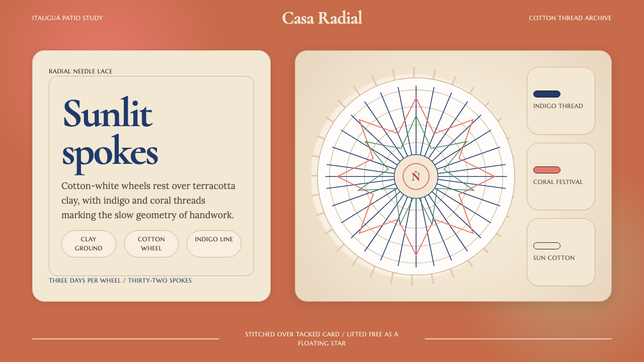
Every visual element in the Ñandutí system is organized around a central point, with structure radiating outward in evenly spaced lines — mirroring the 8, 16, or 32 spokes of a lace medallion. This radial grammar replaces the conventional horizontal-vertical grid entirely; what might be a rectangular content block in another system becomes a wedge or a segment, and hierarchy is established by distance from center rather than by left-to-right reading order. The effect is simultaneously ancient — mandala-like, rosette-like — and immediately legible.Ñandutí 体系中的每一个视觉元素都围绕中心点组织,结构以均匀间距向外辐射——镜像蕾丝轮盘的八根、十六根或三十二根辐条。这种辐射语法完全取代了传统的横竖网格;在其他体系中可能是矩形内容块的地方,在这里成了扇形或弧段,层级由距中心的远近决定,而非从左到右的阅读顺序。效果既古老——如曼陀罗、如玫瑰花窗——又直觉可读。
Color: Terracotta, Ivory, and Accent Threads色彩:赤陶、象牙与强调色线
The palette draws from the physical materials and environment of lace-making in Itauguá. The ground tone is a warm terracotta — the color of fired clay floors and sun-baked plaster walls — providing a setting that is neither neutral nor dominant. Against this, the primary surface color is a bleached cotton-white, warm rather than cool, the tone of thread that has dried in outdoor light. Accent colors — deep indigo and a muted coral — appear only in secondary elements, acting as the colored threads a lacemaker might incorporate for a special piece or festival work. The overall palette reads as hand-made and place-specific, never clinical.色板取材于伊陶瓜蕾丝制作的实物材料与环境。底色是暖赤陶——烧制砖地与日晒灰泥墙的颜色——既非中性也不强势。与之对照的主体表面色是漂白棉白,偏暖而非冷调,是在室外阳光下晾干的线的颜色。强调色——深靛蓝与静默珊瑚——仅出现于次级元素,如同蕾丝工匠在特殊作品或节日件中偶尔织入的彩线。整体色板传递出手作感与地域特异性,绝无临床之感。
Surface Texture as Pattern质感作为图案
Where most design systems treat texture as optional atmosphere, this system treats it as a structural layer. The fine looped texture of stitched cotton — the characteristic fill of a Ñandutí medallion's intermediate rings — is abstracted into a surface pattern that gives areas between radial lines their visual weight. This texture does not simulate depth or shadow; it tiles flat, read as a field rather than a volume. The distinction is important: the goal is the quality of a lace surface lying in sunlight, not the illusion of three-dimensional weaving.大多数设计体系将质感视为可选的氛围层,这套体系则将其视为结构层。针织棉线的细腻环圈质感——Ñandutí 轮盘中间环的特征填充——被抽象为一种表面图案,赋予辐条之间区域以视觉重量。这种质感不模拟深度或阴影,它平铺展开,被读作一片区域而非一个体积。这一区分至关重要:目标是阳光下蕾丝表面的质感,而非三维编织的幻觉。
Concentric Ring Hierarchy同心环层级
Just as a Ñandutí medallion builds outward in concentric rings of increasing complexity — the innermost rings tightest and most detailed, the outermost rings more open — the design system uses concentric zones to establish visual hierarchy. The central zone holds the primary content or call-to-action, the middle rings carry supporting information, and the outermost ring is reserved for metadata, credits, or secondary navigation. This mirrors the lacemaker's logic: the center commands the most attention precisely because it is the origin point of all structure.正如 Ñandutí 轮盘从内向外以复杂度递增的同心环叠加——最内环最紧密、最精细,最外环则更开阔——这套设计体系用同心区域建立视觉层级。中心区域承载主要内容或行动召唤,中间环承载辅助信息,最外环留给元数据、署名或次级导航。这镜像了蕾丝工匠的逻辑:中心之所以最受关注,恰恰因为它是所有结构的起点。
Serif Typography with Craft Register带手工感的衬线字体
The typographic choices in this system reject the industrial sans-serif in favor of letterforms with warmth and deliberate elegance. An editorial serif with fine contrast between thick and thin strokes references the variation between the thicker cotton spokes and the finer infill threads of the lace. A secondary serif for body text is chosen for warmth and sustained readability over long passages rather than for technical precision. The combination reads as considered and careful — the typographic equivalent of three days' needlework — rather than fast or systematized.这套体系的字体选择拒绝了工业无衬线体,转而采用带有温度与刻意优雅的字形。一款粗细笔画对比明显的编辑衬线体,呼应蕾丝中较粗棉辐条与较细填充线之间的变化。正文辅助衬线体的选择标准是温润感与长段落的持续易读性,而非技术精确度。两者结合读来显得经过深思熟虑、慢工细活——在字体上等同于三天的针线活——而非急就或系统化。
Floating Form on Ground底面上的浮游形态
A defining visual behavior of the Ñandutí medallion is that it is always seen as a distinct object against a surface, never embedded in it — when you set a lace wheel on a tablecloth or hold it to the light, it reads as figure against ground with high clarity. The design system replicates this quality: primary content elements are rendered as discrete, clearly bounded forms that seem to rest on or float above the terracotta ground, rather than blending into it. Edges are soft enough to avoid severity but crisp enough to maintain the figure-ground distinction.Ñandutí 轮盘的一个决定性视觉特征是:它始终作为一个独立物体出现在底面之上,从不融入其中——无论将蕾丝轮盘置于桌布上还是举向光线,它都以极高的清晰度呈现为图-底关系中的图。这套设计体系复现了这种品质:主要内容元素呈现为离散、边界清晰的形态,像是搁置或浮游于赤陶底面之上,而非融入其中。边缘足够柔和以避免严峻感,又足够清晰以维持图-底之分。
Deliberate Repetition as Rhythm刻意重复即节律
Ñandutí lace achieves its visual richness not through variety but through the repeated application of a small set of stitches across many spokes and rings. The design system inherits this logic: visual rhythm comes from consistent repetition of a limited motif set — the spoke, the loop, the ring — rather than from novelty or surprise at each position. Layouts built in this system tend toward measured regularity rather than dynamic asymmetry, and the eye is invited to rest and travel across the pattern rather than to search for the next unexpected element.Ñandutí 蕾丝的视觉丰富性并非来自多样性,而是来自将少量针法在众多辐条与环圈上反复施用。这套设计体系继承了这一逻辑:视觉节律来自对有限母题集合——辐条、线环、圆环——的持续重复,而非在每个位置追求新意或意外。在这套体系中构建的版面倾向于有节制的规律性,而非动态的非对称,眼睛被引导着在图案中游弋、停驻,而非搜寻下一个出乎意料的元素。
Who shaped Paraguayan Ñandutí Spider-Web Lace?谁塑造了 Paraguayan Ñandutí Spider-Web Lace?
Ramona Ferreira is one of the most celebrated living practitioners of Ñandutí lace-making in Itauguá, known for the extraordinary density and precision of her medallions and for her work passing the technique to younger generations. Her pieces have been exhibited internationally as examples of Paraguayan intangible cultural heritage, and she has been a consistent presence at the Festival del Ñandutí as both exhibitor and teacher. Her contribution to the tradition lies as much in transmission as in creation.拉莫娜·费雷拉是伊陶瓜最受推崇的在世 Ñandutí 蕾丝工匠之一,以其轮盘的惊人密度与精准度著称,也以将这门技艺传授给年轻一代而广为人知。她的作品作为巴拉圭非物质文化遗产代表曾在国际上展出,并在 Ñandutí 节上持续以展商与导师身份现身。她对这一传统的贡献在于传承与创作并重。
Felicita Vera is a master lacemaker whose work is particularly recognized for its use of color — incorporating the indigo and coral accent threads that distinguish festival-quality Ñandutí pieces from everyday work. Her medallions have been collected by Paraguayan cultural institutions, and her approach to color within the tradition has influenced how younger makers think about palette as an expressive rather than merely decorative choice. She represents a generation of lacemakers who treated the craft as both livelihood and artistic voice.费利西塔·韦拉是一位蕾丝大师,其作品以色彩运用见长——她将靛蓝与珊瑚色强调线融入作品,这正是区分节日级别与日常 Ñandutí 作品的标志。她的轮盘被巴拉圭文化机构收藏,她对传统中色彩的处理方式影响了年轻工匠对色板的理解——将其视为表达性选择而非单纯装饰。她代表了那一代将手工艺同时视为生计与艺术表达的蕾丝工匠。
Carolina Aguayo has been instrumental in bringing Ñandutí lace to international audiences through exhibition work and cultural diplomacy, contributing to the tradition's recognition beyond Paraguay's borders. Her role has been as much ambassadorial as artisanal — demonstrating the technique at cultural events abroad and helping frame Ñandutí not merely as craft but as a sophisticated visual tradition worthy of serious design attention. Her efforts contributed to the broader documentation of the tradition that preceded its UNESCO recognition.卡罗琳娜·阿瓜约通过展览工作与文化外交,为将 Ñandutí 蕾丝引介至国际观众做出了重要贡献,推动了这一传统在巴拉圭境外获得认可。她的角色兼具文化大使与工匠两个维度——在海外文化活动中展示这门技艺,并帮助将 Ñandutí 定位为值得严肃设计关注的成熟视觉传统,而非单纯的手工艺。她的努力为此后联合国教科文组织认可该传统的更广泛记录工作奠定了基础。
Josefina Plá (1903–1999) was a Spanish-born poet, playwright, ceramicist, and cultural historian who spent most of her life in Paraguay and became one of the country's most important chroniclers of folk and applied arts. Her writing on Paraguayan craft traditions, including Ñandutí, helped establish a critical and historical vocabulary for these practices at a time when they risked being dismissed as mere domestic craft. Plá understood the needle-lace tradition as a living document of Guaraní-Spanish cultural fusion and advocated for its preservation with the same rigor she brought to her literary work.霍塞菲娜·普拉(1903—1999年)是一位出生于西班牙的诗人、剧作家、陶艺家与文化史学家,一生大部分时光在巴拉圭度过,成为该国最重要的民间与应用艺术记录者之一。她关于巴拉圭手工艺传统(包括 Ñandutí)的著述,在这些实践面临被贬为单纯家庭手工艺的风险之际,为其建立了批评与历史话语。普拉将针织蕾丝传统理解为瓜拉尼—西班牙文化融合的活态文献,并以与文学创作同等的严谨态度倡导其保护。
How do you use Paraguayan Ñandutí Spider-Web Lace today?今天怎么用 Paraguayan Ñandutí Spider-Web Lace?
Ñandutí spider-web lace translates into digital design contexts best when the core logic — radial organization, warm ground color, floating white forms, deliberate repetition — is adopted as a structural commitment rather than a surface treatment. Using the terracotta palette and then laying out content in a conventional rectangular grid produces a decorative pastiche; building the layout itself around a radial or concentric logic produces something that genuinely channels the tradition. The style suits products that want to read as warm, crafted, and culturally specific rather than neutral and universal.Ñandutí 蛛网蕾丝在数字设计语境中的最佳转化,是将其核心逻辑——辐射组织、暖色底面、浮游白色形态、刻意重复——作为结构承诺而非表面处理来采纳。使用赤陶色板却依然在常规矩形网格中排布内容,只会产生装饰性仿作;将版面本身围绕辐射或同心逻辑构建,才能真正传递这一传统的精神。这种风格适合那些希望呈现温暖感、手工质感与文化特异性而非中性普世的产品。
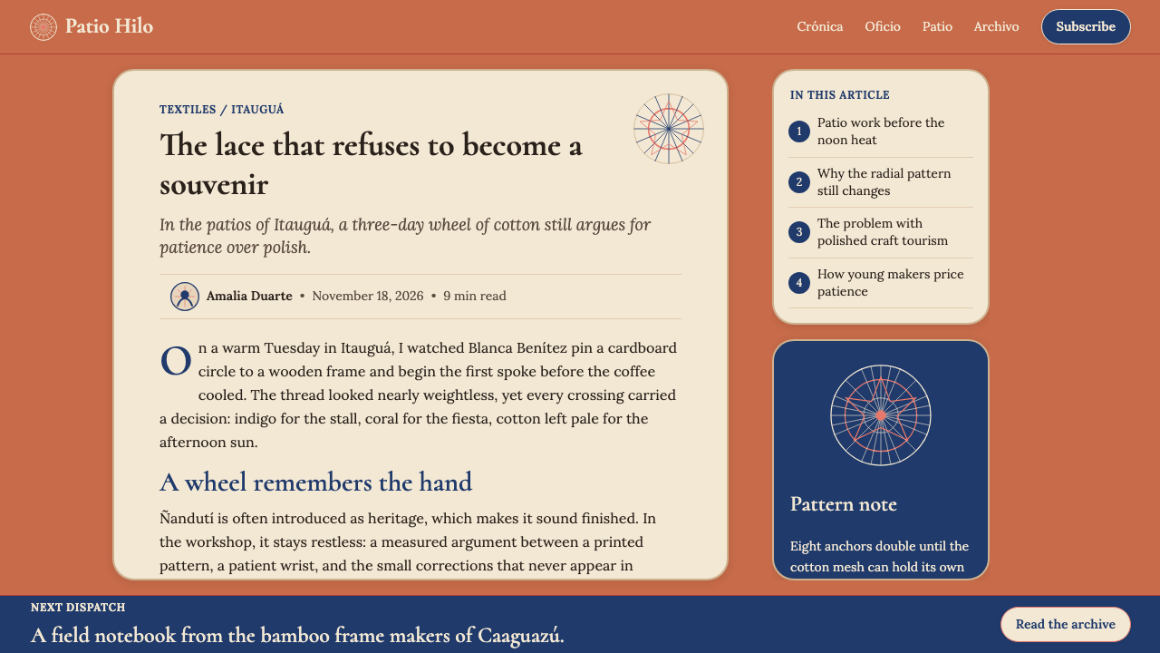
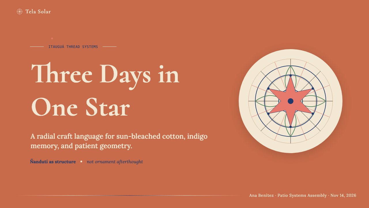
For presentation slides, the Ñandutí system works particularly well on title and section-break pages, where a full radial composition can anchor the viewer's attention at the center before reading outward. A title slide might use a large medallion-derived form as its focal element, with the presentation title placed at the center and subtitle or date text sitting in the middle ring. Content slides are better treated with more restraint: a warm terracotta background with white content cards and indigo or coral accent lines for emphasis achieves the palette's character without requiring a full radial layout on every page. Data slides should use the warm tones to humanize what might otherwise read as cold numerical content — bar charts in terracotta and ivory with indigo highlights read as considered rather than automated.在演示文稿中,Ñandutí 体系在标题页与章节过渡页上表现最佳——在那里,完整的辐射构图可以将观看者的注意力锚定在中心,再引导其向外阅读。一张标题幻灯片可以用大型轮盘衍生形态作为焦点,演示标题置于中心,副标题或日期文字位于中间环带。内容页则应更克制:以温暖赤陶底配白色内容卡片,靛蓝或珊瑚色强调线用于重点标注,在不要求每页都有完整辐射版面的情况下,仍能传递色板的性格。数据页应借助暖色调,让原本可能显得冷峻的数字内容变得更具人情味——赤陶与象牙色的柱状图配靛蓝高亮,读来是经过深思的,而非自动生成的。
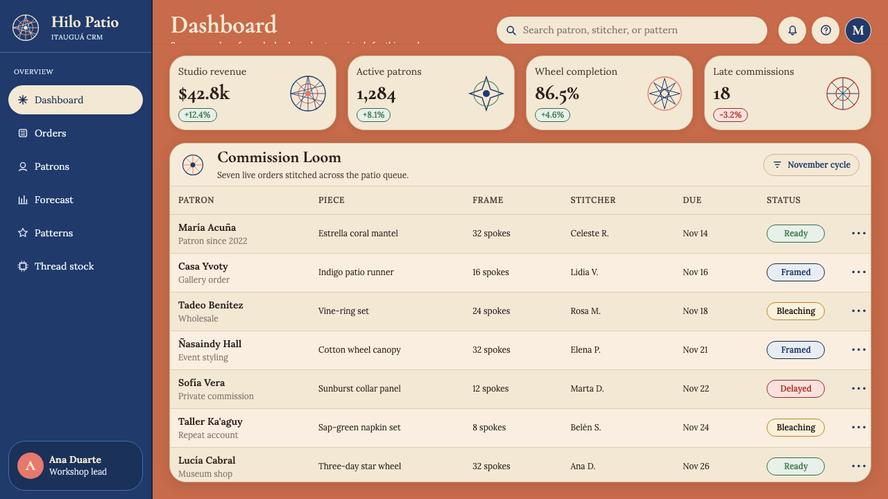
For web interfaces, the style is well suited to editorial landing pages, cultural institution sites, artisan marketplace pages, and any product that benefits from communicating handmade provenance or local origin. Dashboard and data-heavy interfaces are a more difficult fit — the radial and concentric logic can work for circular chart types, but rectangular data tables and left-to-right reading flows resist the system's native grammar. Where the style is applied to web, the key moves are: a warm near-terracotta background rather than neutral white or gray, generous whitespace (representing the open areas between lace spokes), and typographic choices that use elegant serifs with visible stroke contrast rather than geometric sans-serifs.对于网页界面,这种风格最适合编辑型落地页、文化机构网站、手工艺市集页面,以及任何有益于传递手作渊源或地域特色的产品。数据密集型仪表板是更难适配的场景——辐射与同心逻辑可用于圆形图表类型,但矩形数据表格与从左到右的阅读流程与这套体系的原生语法存在抵触。在网页中应用这种风格,关键动作是:用接近赤陶的暖底色而非中性白或灰,留出充裕的留白(对应蕾丝辐条之间的开阔区域),在字体选择上用笔画粗细对比可见的优雅衬线体,而非几何无衬线体。
For editorial and marketing contexts, Ñandutí lace provides strong visual differentiation from the dominant tech-influenced minimalism that characterizes much contemporary work. A feature article opener using a full-page radial composition in terracotta and ivory will stand out in a content feed dominated by flat white layouts and sans-serif type. The style lends itself to campaigns that want to assert craft, heritage, cultural depth, or geographic specificity — tourism, artisan products, heritage brands, cultural events. In these contexts, the accent colors — indigo and coral — should be used with genuine restraint, as a lacemaker would use colored thread: occasionally, purposefully, for emphasis rather than decoration.在编辑与营销语境中,Ñandutí 蕾丝提供了与当代大量作品中主导性科技极简主义鲜明的差异化。一篇特稿开篇用赤陶与象牙色的全版辐射构图,在一众平白版面与无衬线字体主导的内容流中会脱颖而出。这种风格适合希望彰显手工感、文化传承、地理特殊性的推广活动——旅游、手工艺产品、遗产品牌、文化活动。在这些场合,强调色——靛蓝与珊瑚——应以蕾丝工匠用彩线的方式来使用:偶尔、有意、用于强调而非装饰。
A common mistake when working with this aesthetic is treating the radial motif as decoration rather than structure — placing a medallion-inspired graphic element in a corner or header while the rest of the layout follows a standard rectangular grid. This produces a result that reads as themed rather than coherent. A related mistake is pushing the terracotta and ivory palette toward either extreme: too dark and the warmth becomes oppressive; too pale and the composition loses the grounded quality that distinguishes the style from generic cream-and-white minimalism. The palette works best in the middle register, where the ground color is unmistakably warm but still light enough for body text to read clearly against it.使用这种美学时最常见的错误,是将辐射母题当作装饰而非结构——在角落或页眉放置一个轮盘灵感图形元素,其余版面仍按标准矩形网格排布。这样的结果读来像是主题化,而非浑然一体。另一个相关错误,是将赤陶与象牙色板推向任何一个极端:太深则暖意变为压迫;太浅则构图失去那种接地气的品质,让风格退化为普通的奶油白极简主义。这个色板在中间调域效果最佳——底色温暖感无可置疑,却仍足够明亮,使正文在其上清晰可读。
Paraguayan Ñandutí Spider-Web Lace — FAQParaguayan Ñandutí Spider-Web Lace · 常见问题
How does this style differ from other lace-inspired or folk-craft design systems?这种风格与其他蕾丝灵感或民间手工艺设计体系有何不同?
Most folk-craft-inspired design systems use surface pattern — repeated motifs, border ornament, decorative fills — as their primary reference point, layering these elements onto conventional rectangular or grid-based layouts. Ñandutí works differently because the lace tradition itself has a governing spatial logic — radial organization from a center point — that can replace the underlying structure of a layout rather than merely decorating it. This makes it more compositionally distinctive and harder to pastiche superficially. The warm terracotta-and-ivory palette also distinguishes it from the cool whites and brights often associated with Nordic or East Asian folk-craft aesthetics.大多数民间手工艺灵感设计体系以表面图案为主要参照点——重复母题、边饰装饰、装饰性填充——将这些元素叠加在传统矩形或网格版面之上。Ñandutí 的作用方式不同,因为这一蕾丝传统本身具有一套支配性的空间逻辑——从中心点向外的辐射组织——这套逻辑可以取代版面的底层结构,而非仅仅对其进行装饰。这使它在构图上更具独特性,也更难被表面模仿。温暖的赤陶与象牙色板,也将它与北欧或东亚民间手工艺美学常见的冷白与亮色区分开来。
Can the radial structure work in digital interfaces where users scroll vertically?辐射结构能在用户垂直滚动的数字界面中发挥作用吗?
Radial composition is inherently suited to contained, framed contexts — a single screen, a slide, a print page — rather than to long scrolling documents. In scrolling interfaces, the full radial logic typically works only above the fold, as a hero or opening section that establishes the visual register before the layout transitions to a more conventional vertical structure for body content. Alternatively, radial motifs can appear at section transitions — as full-width dividers or background elements — reintroducing the visual language at intervals without requiring the entire page to be structured radially. Using the color palette and typographic character throughout, with radial elements as punctuation rather than continuous structure, is the most practical approach for long-form digital content.辐射构图天然适合有边界的、被框定的场景——单屏、幻灯片、印刷页面——而非长滚动文档。在滚动界面中,完整的辐射逻辑通常只适用于首屏之上,作为英雄区或开篇区段来确立视觉基调,之后版面过渡到更常规的垂直结构承载正文内容。另一种做法是让辐射母题出现在章节过渡处——作为全宽分割元素或背景元素——定期重新引入这套视觉语言,而不要求整个页面都按辐射方式组织。在长篇数字内容中,最实用的方法是:通篇保持色板与字体风格,让辐射元素作为标点符号式的点缀,而非持续的结构。
Is this style appropriate for digital products targeting non-Paraguayan audiences?这种风格适合面向非巴拉圭受众的数字产品吗?
The visual language of Ñandutí translates across cultural contexts because its core qualities — warmth, craft legibility, radial geometry, and restrained accent color — are not culturally exclusive even though their origins are specific. Most audiences will not know the lace tradition by name but will register the warmth, patience, and care that the aesthetic communicates. The risk of cultural appropriation is present, as with any tradition-inspired design work, and is best mitigated by accurate attribution, genuine engagement with the source tradition rather than decorative borrowing, and avoiding reduction of the style to a single exotic motif. A product that uses the system thoughtfully and situates its origins honestly is on solid ground; one that strips the tradition to a generic 'ethnic pattern' without acknowledgment is not.Ñandutí 的视觉语言可以跨越文化语境,因为其核心品质——温暖感、手工可读性、辐射几何与克制的强调色——即便起源具体,也并不具有文化排他性。大多数受众不会知道这一蕾丝传统的名称,但会感知到这套美学所传递的温度、耐心与用心。与任何传统灵感设计一样,文化挪用的风险客观存在,最好的化解方式是准确溯源、真诚接触而非装饰性借用,以及避免将这种风格简化为单一的异域母题。一款经过深思熟虑、诚实呈现其来源的产品站得住脚;一款将传统剥离成无名「民族图案」的产品则站不住脚。
What types of products should avoid this style?哪些类型的产品应该避免使用这种风格?
Products that depend on the communication of speed, precision, or scalable rationality will find the Ñandutí aesthetic counterproductive. Fintech applications, real-time analytics dashboards, enterprise software, and products in categories where clinical cleanliness signals reliability should look elsewhere. The warmth and craft legibility that define the style work against the qualities these contexts need to project. Similarly, products that require very dense typographic content — legal documents, technical references, data-heavy reports — will find the radial and concentric composition logic difficult to reconcile with long-form reading flows. The style is genuinely excellent within its domain; knowing that domain is the most important design judgment.那些依赖传达速度、精准或可扩展理性的产品,会发现 Ñandutí 美学适得其反。金融科技应用、实时分析仪表板、企业软件,以及临床洁净感是可靠性信号的产品类别,应当另寻风格。定义这种风格的温暖感与手工可读性,恰好与这些场景需要传递的品质相悖。同样,需要非常密集文字内容的产品——法律文件、技术参考、数据密集型报告——会发现辐射与同心构图逻辑难以与长篇阅读流程协调。这种风格在其适配领域确实出色;了解那个领域,是最重要的设计判断。
How should the accent colors be rationed across a composition?强调色在构图中应如何配比使用?
The indigo and coral accent colors should be thought of as the colored threads a lacemaker would choose for a special commission — present enough to be noticed, restrained enough that their appearance feels deliberate. A practical guide: the terracotta ground and ivory white together should account for the vast majority of surface area in any given composition. Indigo and coral, used together, should appear on no more than a small fraction of the total surface, and should generally not appear simultaneously at high saturation — one leads and the other is subordinate, just as a lacemaker working with two accent threads will typically use one as the dominant thread for a given ring and the other only for connectors or highlights. When in doubt, use less: the tradition values patience over abundance.靛蓝与珊瑚色强调色,应被理解为蕾丝工匠为特别订件选用的彩线——出现得足以被注意,却克制到让人感受到每次出现的刻意。一个实用参考:在任何构图中,赤陶底色与象牙白应共同占据绝大部分面积。靛蓝与珊瑚合并使用时,在总面积中的占比应保持在很小的分量,通常不应同时以高饱和度出现——一个主导,另一个从属,就像同时使用两种彩线的蕾丝工匠,通常会在某一环中以一种为主线、另一种仅用于连接或点睛。拿不准时,少用:这一传统重视的是耐心,而非丰盛。
Related design styles相关设计风格
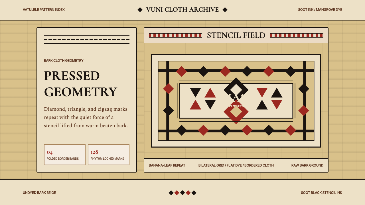 Fijian Masi Tapa StencilGeometry keeps ceremony. Soot-black diamonds repeat on bark beige with rust-r…几何守住仪式感:树皮米黄上,烟黑菱形与锈红边带反复压印。
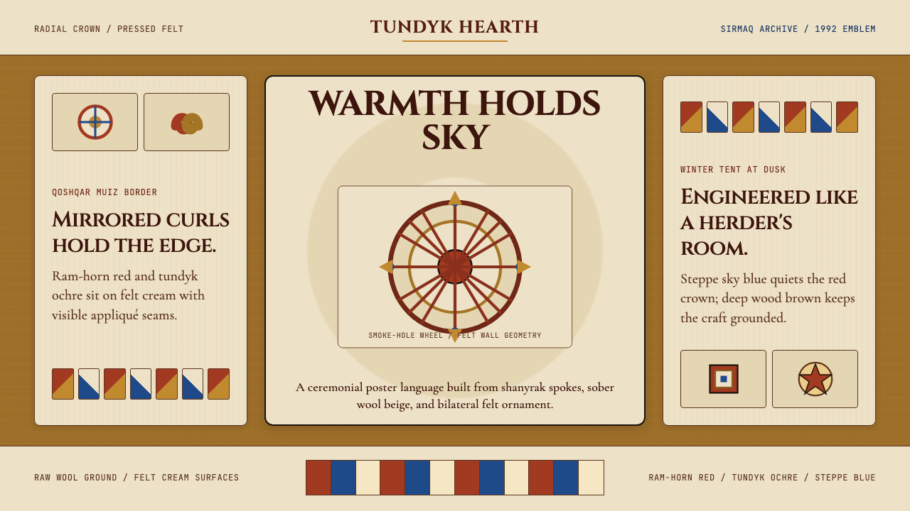 Kazakh Shanyrak Yurt FeltDomestic warmth, engineered. Ram-horn red felt curls around a radial shanyrak…居家暖意如工程般精密。羊角红毡纹环绕沙尼拉克轮。
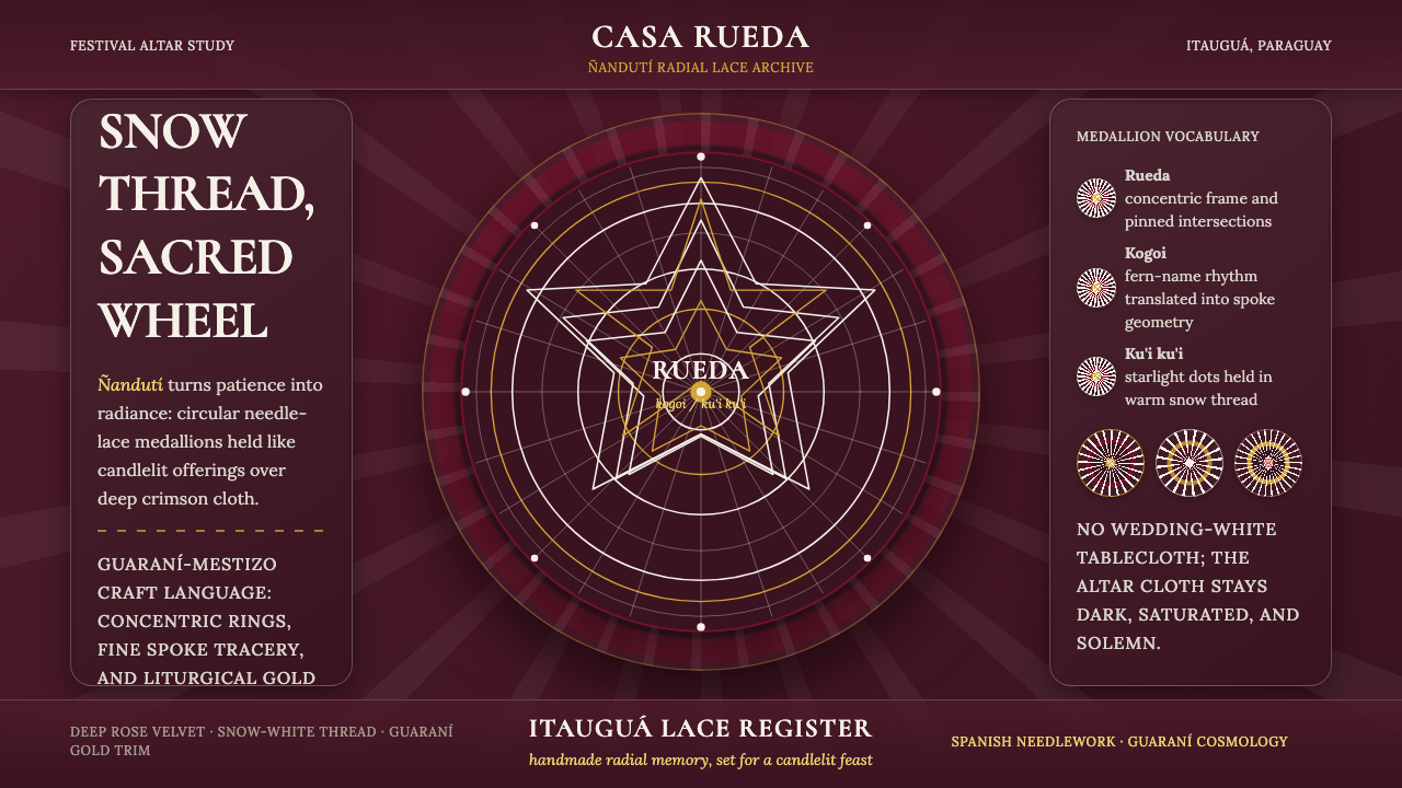 Paraguayan Itauguá Ñandutí Spider LaceReverent craft glows. Snow lace medallions radiate over rose velvet with Guar…庄严手作发光:雪白蕾丝勋章在玫瑰绒面上放射,金色收边。
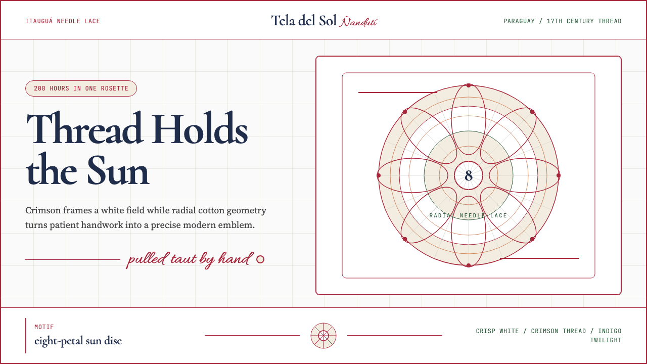 Paraguayan Ñandutí LacePatient craft, modern frame. Crimson lines pin radial lace on crisp white.耐心手艺,现代框架。深红线把放射蕾丝钉在洁白底上。
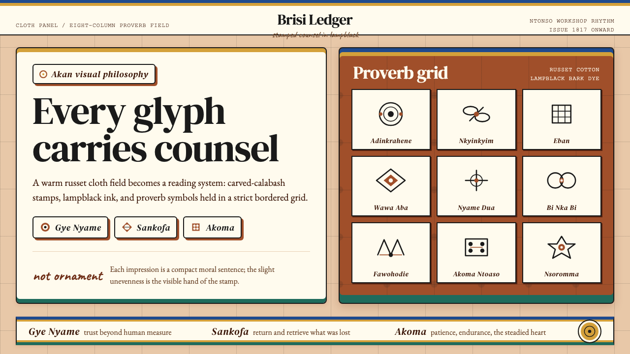 Akan Adinkra (Ghana)Proverbs become cloth. Russet grids, lampblack serif marks, and gold-edge ban…箴言化为布面:赭红网格、灯烟黑印纹与金边带盖出意义。
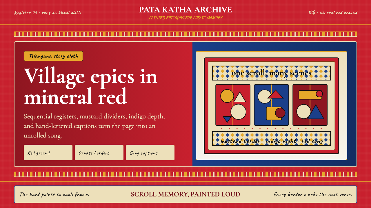 Andhra Cheriyal Scroll PaintingSaturated oral memory. Mineral red registers, mustard diamonds, and serif son…饱和的口述记忆:矿物红分格、芥末黄菱纹与衬线唱词。