What is Risograph Print?什么是 Risograph Print?
Risograph turned a 1986 office duplicator into the defining aesthetic of 2010s indie publishing — where every registration slip and halftone dot is a feature, not a flaw.Risograph 把一台1986年的办公复印机变成了2010年代独立出版的标志性美学——每一处错位与每一个半调网点,都是风格,而非缺陷。
Risograph Print in briefRisograph Print 速览
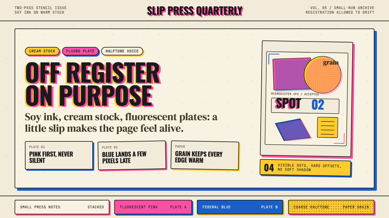
Risograph Print is the aesthetic vocabulary that emerged from indie publishing studios in the 2010s around the Risograph duplicator — a soy-ink stencil machine invented by Riso Kagaku Corporation in Japan in 1986. Unlike offset or digital printing, the Risograph applies one spot color per pass, which means any multi-color composition is built up layer by layer. The imprecision inherent in that process — slight shifts between color layers, variations in ink density, halftone dot patterns at low line-screen frequencies — became not a deficiency to correct but the entire visual point.Risograph Print(理想孔版印刷美学)是2010年代独立出版工作室围绕Risograph复印机所形成的视觉语汇。Risograph是日本理想科学工业株式会社1986年发明的豆油墨孔版复印机。与胶印或数字印刷不同,Risograph每次只能印一种专色,因此任何多色画面都是逐层叠加而成的。这一流程内在的不精确——色层之间的轻微错位、墨水浓度的变化、低线数的半调网点——不再是需要纠正的缺陷,而成为整个视觉意义的核心所在。
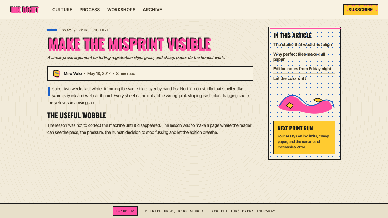
The look is immediately recognizable: warm cream or natural stock as the base, two or three fluorescent or muted spot colors layered in rough register, halftone dot fills that recall screen-printed posters, chunky condensed display type alongside hand-drawn illustration, and an overall quality of mechanical warmth — something printed by a machine, but a machine with personality and imprecision built in. Overlapping color areas create unexpected secondary hues through transparent ink interaction, adding tonal depth that no designer fully controls in advance.这种风格的面貌极易辨认:温暖的奶油色或原色纸底、两到三种荧光色或哑光专色粗略叠压、令人联想到丝网印刷海报的半调网点填充、粗壮紧缩的展示字体搭配手绘插画风格,以及一种整体上「机械的温度感」——由机器印出,但这台机器天生具有个性与偏差。色彩叠压区域通过透明墨水的相互作用产生意料之外的混合色调,带来没有任何设计师能完全预控的色彩深度。
Risograph Print sits in a creative space between screen printing and photocopying. It reads as hand-made and analog while being genuinely mechanical. The aesthetic emerged partly from economics — Risograph machines are cheap to run and accessible to small studios — and partly from a cultural reaction against the hyper-clean output of digital printing. Where desktop publishing promised perfection, Risograph print embraced productive failure. That embrace turned a workhorse duplicator into one of the most recognizable and widely imitated visual styles of its generation.Risograph Print 处于丝网印刷与复印之间的创作空间:读来像手工制品与模拟物,实质上却是真正的机械产物。这种美学的兴起一半源于经济原因——Risograph机器运营成本低廉,小型工作室可以轻松获取——一半源于对数字印刷超洁净输出的文化反弹。台式出版许诺完美,Risograph Print 则拥抱富有成效的失败。正是这种拥抱,将一台勤恳的复印机变成了那个时代最具辨识度、被模仿最广的视觉风格之一。
See the Risograph Print design system查看 Risograph Print 完整设计系统
Where does Risograph Print come from?Risograph Print 从何而来?
The Riso Kagaku Corporation introduced the Risograph in 1986 as an inexpensive, high-volume duplicator for offices and schools — a successor to the spirit duplicator and mimeograph that could handle long print runs at low cost. The machine works by scanning a master image onto a thermal stencil drum, which then rolls ink through the stencil onto each sheet. Because it was designed for office utility rather than fine reproduction, it was never engineered to be consistent or precise in the way commercial presses are. Registration — the alignment between successive color passes — was deliberately tolerated at a loose standard. Ink saturation varied depending on paper absorption and drum age. These were known limitations, accepted as the cost of accessibility.理想科学工业株式会社于1986年推出Risograph,定位为办公室与学校低成本、高产量的复印机,是酒精复印机和油印机的继承者,能够以极低成本完成大批量印刷。机器的工作原理是:将主图像扫描到热敏孔版滚筒上,再通过滚筒将油墨印压到每张纸上。由于设计初衷是办公实用而非精细复制,它从未被设计成像商业印刷机那样精确一致。色层之间的套准——即多次印刷通道之间的对位——被刻意允许在宽松的标准下存在。墨水饱和度随纸张吸收性和滚筒老化程度而变化。这些都是已知的局限,被当作可及性代价而接受。
For the first two decades of its existence, the Risograph was largely invisible to the design world. It lived in church offices, community centers, and school print rooms. Then, beginning around 2008, a handful of design and illustration studios in London, Toronto, and New York began acquiring the machines not despite their limitations but because of them. Hato Press in London, founded in 2009, became one of the first studios to build an identity around Risograph printing, producing zines, posters, and books that foregrounded the machine's characteristic slippage and opacity. Colour Code Printing in Toronto and Risolab in New York followed, each developing a house aesthetic that treated the Risograph's fluorescent ink palette — including colors like fluorescent pink, bright red, and cornflower blue — as a distinct design vocabulary unavailable through any other printing method.在最初二十年里,Risograph在设计世界几乎是隐形的——它活在教会办公室、社区中心和学校印刷室里。然后,大约从2008年起,伦敦、多伦多和纽约少数几家设计与插画工作室开始购入这些机器,不是尽管它有局限性,而是正因为这些局限性。2009年在伦敦创立的Hato Press成为最早围绕Risograph印刷建立工作室身份的机构之一,出版的zine、海报和书籍将机器特有的错位与不透明感作为前景。多伦多的Colour Code Printing和纽约的Risolab相继跟进,各自发展出以Risograph荧光油墨色板——包括荧光粉红、亮红和矢车菊蓝等颜色——为独特设计词汇的工作室美学,而这些色彩是其他任何印刷方式都无法复现的。
The timing aligned with the broader zine renaissance of the early 2010s, in which independent publishing, small-press books, and artist-made periodicals proliferated as cultural objects with genuine cachet. Digital tools had democratized page layout, but they had also homogenized the look of self-published work. The Risograph offered a material specificity that digital methods could not replicate — the ink was physically present on the paper, imperfect and tactile, and the fluorescent spot colors had a luminosity that no CMYK combination could reproduce faithfully. For artists and designers working outside mainstream commercial publishing, the machine represented both an economic alternative and an aesthetic position.这一时机与2010年代初更广泛的zine复兴运动恰好吻合。在那个时期,独立出版、小型出版社书籍和艺术家自制刊物作为具有真实文化分量的对象大量涌现。数字工具普及了页面排版,却也使自出版作品的外观趋于同质化。Risograph提供了数字方法无法复制的材料特殊性——油墨在纸张上真实存在,不完美而有触感,荧光专色所具有的发光感是任何CMYK色彩组合都无法忠实再现的。对于在主流商业出版之外工作的艺术家和设计师而言,这台机器既是经济选择,也是美学立场。
By the mid-2010s, the Risograph aesthetic had become identifiable enough to generate imitators who had never touched an actual machine. Digital designers began replicating halftone dot patterns, deliberate color misregistration, and the particular glow of fluorescent spot colors using software filters and texture overlays. This secondary wave — digital Risograph simulation — spread the aesthetic far beyond the small-press community and into commercial illustration, motion graphics, and interface design. The aesthetic continued to evolve through the late 2010s and into the 2020s, absorbing influences from zine culture, contemporary illustration, and the broader revival of analog media, while retaining the core visual signatures that Hato Press and its contemporaries had established in the first place.到2010年代中期,Risograph美学已具有足够的辨识度,以至于从未接触过实体机器的人也开始模仿它。数字设计师开始用软件滤镜和纹理叠加来复制半调网点图案、刻意的色彩套印偏差,以及荧光专色特有的光晕感。这股二次浪潮——数字Risograph模拟——将这种美学从小型出版社社群扩散至商业插画、动态图形和界面设计。进入2010年代末和2020年代,这种美学在吸纳zine文化、当代插画与更广泛的模拟媒体复兴影响的同时,始终保留着Hato Press及其同时代工作室最初确立的核心视觉标志。
What defines the Risograph Print look?Risograph Print 的视觉特征是什么?
Spot-Color Layering专色叠压
Risograph print is built from a small number of spot colors — typically two or three — applied in separate passes rather than mixed into a unified CMYK output. This means each color is visually distinct on the page, and where two colors overlap, they create a third mixed tone through ink transparency rather than a pre-planned blend. The palette tends toward fluorescent or semi-fluorescent hues — vivid pinks, warm yellows, muted teals, bright reds — that have a luminosity unavailable in standard four-color process printing. Designers working in this aesthetic, whether in actual print or digital simulation, restrict themselves to this limited layered palette rather than drawing from a full spectrum.Risograph印刷由少量专色构成——通常是两到三种——分次印刷叠加,而非混合为统一的CMYK输出。这意味着每种颜色在页面上视觉上相互独立,而两种颜色叠压的区域通过油墨透明度产生第三种混合色调,而非事先计划的渐变。色板倾向于荧光或半荧光色调——鲜艳的粉红、暖黄、哑光绿青、亮红——具有标准四色印刷无法实现的发光感。无论是真实印刷还是数字模拟,使用这种美学的设计师都将自己限制在这个有限的叠压色板内,而非从完整色谱中取色。
Misregistration套印错位
Because each color in a Risograph print is applied in a separate pass through the machine, there is always some degree of misalignment between layers — a slight shift where the edge of one color does not perfectly meet the edge of another. In mechanical printing this would be a defect to minimize; in Risograph aesthetics it is actively cultivated. The misregistration creates a halo effect at color boundaries, adds tactile visual depth, and marks the work as genuinely printed rather than digitally composed. When simulated in digital work, this misregistration is introduced deliberately as an offset between color layers, creating the same halo without actual mechanical variance.由于Risograph印刷中的每种颜色都需单独过机,层与层之间必然存在一定程度的错位——某种颜色的边缘与另一种颜色的边缘无法完美对齐,产生轻微偏移。在机械印刷中这是需要最小化的缺陷;在Risograph美学中,它是被主动培育的。套印错位在色彩边界处产生光晕效果,增添触觉感的视觉深度,并将作品标记为真实印刷而非数字合成。当在数字作品中模拟时,这种错位被刻意作为色层之间的偏移量引入,在没有实际机械偏差的情况下制造出同样的光晕效果。
Halftone Dot Texture半调网点肌理
Risograph machines reproduce tonal gradation through coarse halftone dot screens — dot patterns where larger dots indicate higher ink density and smaller dots indicate lower density. The screen frequency used in Risograph printing is noticeably lower than in commercial offset printing, meaning the individual dots are large enough to be seen clearly with the naked eye. This produces a texture that is simultaneously mechanical and hand-crafted — rows and clusters of dots visible as a visual element in their own right, not hidden infrastructure. In the Risograph aesthetic, halftone fills are used expressively, applied to illustrative elements, backgrounds, and type treatments as a primary texture rather than a workaround for limited color range.Risograph机器通过粗粝的半调网点来再现色调渐变——网点越大,墨水密度越高;网点越小,密度越低。Risograph印刷所使用的网屏线数明显低于商业胶印,意味着单个网点大到肉眼清晰可见。这产生了一种同时具有机械感和手工感的肌理——成行成簇的网点本身作为视觉元素可见,而非隐藏在背后的基础设施。在Risograph美学中,半调填充被表现性地使用,应用于插画元素、背景和文字处理中,作为主要肌理而非有限色域的变通手段。
Warm Analog Stock温暖的模拟纸底
The paper stock in Risograph printing is not a neutral white substrate but an active part of the visual result. Uncoated, natural, or recycled stocks — cream, off-white, or pale buff in tone — are preferred both for practical reasons (the soy ink adheres better to uncoated surfaces) and for aesthetic ones (the warm ground integrates with the spot colors to create a unified analog feel). The slight texture and absorbency of these stocks cause the ink to sit on and within the paper in a way that glossy coated stock never would, contributing to the characteristic matte, slightly rough quality of the finished surface. In digital applications of the aesthetic, this ground is simulated through off-white or cream backgrounds with subtle paper texture overlays.Risograph印刷中的纸底不是中性的白色承印物,而是视觉结果的主动组成部分。非涂布纸、天然纸或再生纸——奶油色、米白色或浅棕黄色调——是首选,既有实际原因(豆油墨在非涂布表面附着效果更好),也有美学原因(温暖的纸底与专色融合,形成统一的模拟质感)。这些纸张的轻微纹理和吸墨性使油墨以亮面涂布纸从未能实现的方式定着于纸张表面与内部,形成成品表面特有的哑光、略粗糙质感。在这种美学的数字应用中,这一纸底通过带有细微纸张纹理叠加的米白色或奶油色背景来模拟。
Display Type and Hand-Drawn Illustration展示字体与手绘插画
The typographic character of Risograph print work draws from two related sources: chunky condensed sans-serif or display serif letterforms at large scale, and hand-drawn lettering and illustration that mirrors the organic imprecision of the print process itself. The type tends toward strong weight and compressed proportions — it fills the page boldly without competing with the texture of the printed color fields. Illustration styles range from flat graphic shapes to deliberately rough line-drawn characters, always with a hand-made quality that harmonizes with the mechanical imperfection of the printing. The combination of display type and hand-drawn elements is among the most immediately legible signatures of the aesthetic.Risograph印刷作品的字体性格来自两个相关来源:大尺寸粗壮紧缩无衬线或展示衬线字形,以及手绘字体与插画——后者呼应印刷流程本身的有机不精确性。字体倾向于强壮的字重与压缩比例——在页面上大胆占位,同时不与印刷色块的肌理相竞争。插画风格从平面图形到刻意粗糙的线描人物不等,始终保有与印刷机械不完美性相协调的手作质感。展示字体与手绘元素的组合,是这种美学最直接可辨的标志之一。
Transparent Ink Overlap and Surprise透明油墨叠印与意外混色
Because Risograph inks are semi-transparent, any area where two color layers overlap produces an emergent third color that is neither a deliberate mix nor a fully predictable result. A layer of fluorescent yellow over a layer of bright red might produce a warm orange; a blue over a pink might produce a quiet lavender — but the exact result depends on ink density, paper absorption, and layer order in ways that cannot be precisely pre-visualized. This productive unpredictability is a defining quality of the aesthetic: the designer sets up a system of layers and spot colors, but the machine negotiates the final result. In digital simulation, this overlap is approximated with multiply or screen blending modes, which mimic the optical mixing without the physical variance.由于Risograph油墨具有半透明性,任何两个色层叠压的区域都会产生一种既非刻意混合、也非完全可预测的第三色。荧光黄叠在亮红上可能产生温暖的橙色;蓝色叠在粉红上可能产生柔和的薰衣草色——但确切结果取决于墨水浓度、纸张吸收性和色层顺序,无法被精确预视。这种富有成效的不可预测性是这种美学的核心特质:设计师搭建起色层与专色的系统,由机器来协商最终结果。在数字模拟中,这种叠印通过正片叠底或滤色混合模式来近似,模拟光学混合而不带物理偏差。
Zine-Scale IntimacyZine 尺度的亲密感
Risograph printing is inherently suited to small-format, short-run production — the economics of the machine favor zines, limited-edition posters, chapbooks, and hand-distributed publications rather than mass-market runs. This material context shapes the aesthetic: it is close, personal, and small-batch in character. Even when the visual style is applied at larger scales — to exhibition posters, book covers, or digital interfaces — it carries this implicit quality of intimacy and limited production. Work in the Risograph aesthetic tends to resist the anonymous scalability of mainstream commercial design, feeling instead like something made for a specific audience by a specific hand.Risograph印刷天然适合小尺寸、短版次的生产——这台机器的经济逻辑有利于zine、限量版海报、薄册和手工分发的出版物,而非大批量商业印刷。这种物质语境塑造了这种美学:它在性格上是亲近的、个人化的、小批量的。即便这种视觉风格被应用于更大尺度——展览海报、书籍封面或数字界面——它依然携带着这种隐含的亲密感与限量生产质地。Risograph美学的作品往往抗拒主流商业设计的匿名可扩展性,感觉更像是由某双特定的手为某个特定的受众所制。
See the Risograph Print design system查看 Risograph Print 完整设计系统
Who shaped Risograph Print?谁塑造了 Risograph Print?
The Japanese company that invented the Risograph duplicator in 1986, Riso Kagaku (often simply called Riso) designed the machine as an affordable high-volume office copier, never anticipating its adoption as an art and design tool. The company's fluorescent ink range — developed for visibility in office communication — became the essential color palette of the aesthetic. Riso continues to manufacture the machines and has benefited from the cultural resurgence of Risograph printing, even as the primary driver of that resurgence has come from design studios operating far outside the corporate office market the company originally targeted.日本理想科学工业株式会社于1986年发明了Risograph复印机,将其设计为经济实惠的高产量办公复印机,从未预料到它会被当作艺术与设计工具使用。公司的荧光油墨系列——最初为了在办公通讯中增强视觉辨识度而开发——成为这种美学不可或缺的色板。理想科学继续生产这些机器,并从Risograph印刷的文化复兴中获益,尽管这一复兴的主要推动者来自远在公司最初目标市场之外的设计工作室。
Founded in London in 2009, Hato Press was among the first design studios to build a complete identity around Risograph printing, treating the machine's limitations as a creative framework rather than a production constraint. The studio published zines, artist books, and posters that established what a consciously designed Risograph aesthetic could look like — vibrant spot colors in deliberate misregistration, halftone textures used expressively, hand-drawn and display type working together. Hato Press became a reference point for studios internationally and helped legitimize Risograph printing as a serious design medium within the contemporary graphic design community.Hato Press于2009年在伦敦创立,是最早围绕Risograph印刷建立完整工作室身份的设计机构之一,将这台机器的局限性视为创作框架而非生产约束。工作室出版的zine、艺术家书籍和海报确立了经过有意设计的Risograph美学可以呈现的面貌——鲜艳专色在刻意错位中叠压、半调肌理被表现性地运用、手绘字体与展示字体协同工作。Hato Press成为国际各地工作室的参照点,并帮助Risograph印刷在当代平面设计社群内确立了作为严肃设计媒介的正当性。
Colour Code Printing, based in Toronto, became one of the leading Risograph print studios in North America during the 2010s, operating both as a print service for artists and designers and as a creative studio in its own right. Their work helped develop the North American strain of the aesthetic, which tended toward a slightly warmer, more illustration-forward approach compared to the graphic severity of some European counterparts. By offering accessible print-on-demand Risograph services to artists across the continent, Colour Code also made the physical technology available to practitioners who lacked access to their own machines, helping spread the aesthetic beyond established studio centers.总部位于多伦多的Colour Code Printing在2010年代成为北美领先的Risograph印刷工作室之一,既作为艺术家与设计师的印刷服务机构,也以独立创意工作室的身份运营。他们的作品帮助发展出北美流派的Risograph美学——与一些欧洲同行的平面严肃感相比,北美版本往往更温暖、插画感更强。通过向北美各地艺术家提供可及的Risograph按需印刷服务,Colour Code也将这项实体技术带给了那些没有自己机器的从业者,帮助美学扩散至既有工作室中心之外。
Risolab NYC established Risograph printing as a serious creative medium within the New York design and art publishing community, operating as a print studio and educational space where artists and designers could work with Risograph machines directly. The studio's dual role — as both service provider and creative advocate — helped introduce the aesthetic to a broader audience of illustrators, graphic designers, and artists who might otherwise have encountered it only as a digital simulation. Risolab contributed to the ecosystem of small-press publishing in New York that made the city one of the key nodes in the international Risograph network during the 2010s.Risolab NYC在纽约设计与艺术出版社群中确立了Risograph印刷作为严肃创意媒介的地位,以印刷工作室和教育空间的形式运营,让艺术家和设计师能够直接使用Risograph机器工作。工作室的双重角色——既是服务提供者,也是创意倡导者——帮助将这种美学引介给更广泛的插画师、平面设计师和艺术家受众,否则他们可能只会在数字模拟中接触到它。Risolab为纽约的小型出版生态贡献了力量,使这座城市在2010年代成为国际Risograph网络的关键节点之一。
How do you use Risograph Print today?今天怎么用 Risograph Print?
Risograph Print is one of the most character-rich historical aesthetics to apply in contemporary design contexts, but its character is specific enough that misapplication is easy. The core discipline is restraint in color selection: choose two or three spot colors from the Risograph palette — fluorescent pinks and reds, warm yellows, teals, cornflower blues — and commit to them for the entire composition. The power of the style comes from the limitation, not from the range. A composition using five or six colors stops reading as Risograph and starts reading as generic retro illustration.Risograph Print是当代设计语境中个性最为鲜明的历史美学之一,但正因个性太过具体,误用也很容易发生。核心自律在于色彩选择的克制:从Risograph色板中选择两到三种专色——荧光粉红和红色、暖黄、绿青、矢车菊蓝——并将其贯穿整个构图。这种风格的力量来自限制,而非来自范围。使用五到六种颜色的构图不再读来像Risograph,而更像是泛泛的复古插画。
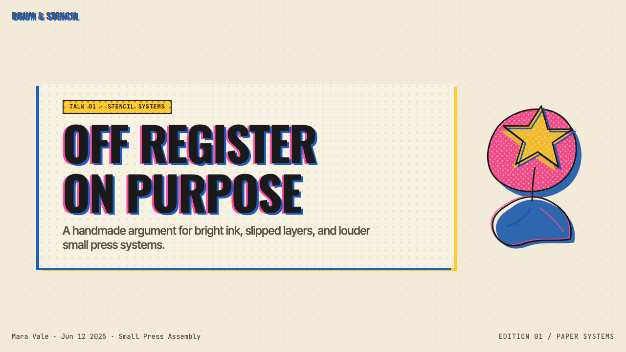
For presentation slides, the Risograph aesthetic works exceptionally well on cover pages and section dividers. A cover benefits from an illustrative full-bleed composition in two spot colors — a halftone-textured background in one color, a bold hand-drawn or display-type title in a second, with deliberate misregistration between the two creating a shadow-halo effect. Content slides should be simpler: cream or warm off-white ground, one accent color used for data highlights or call-outs, a condensed sans-serif or slab-serif heading style. Data slides can adopt the halftone dot as a texture for bar fills, creating charts that feel consistent with the overall illustration-forward aesthetic. Avoid digital-smooth gradients or drop shadows — they break the analog illusion immediately.在演示文稿中,Risograph美学在封面页和章节分隔页上表现极为出色。封面适合以两种专色做满版插画构图——一种颜色的半调纹理背景,第二种颜色的粗壮手绘或展示字体标题,两者之间刻意的错位制造出阴影光晕效果。内容页应更简洁:奶油色或温暖米白底,一种强调色用于数据高亮或引用语,标题采用紧缩无衬线或粗衬线风格。数据页可以用半调网点作为柱形填充的肌理,使图表感觉与整体插画优先的美学相一致。避免数字平滑渐变或投影阴影——它们会立即打破模拟质感的幻觉。
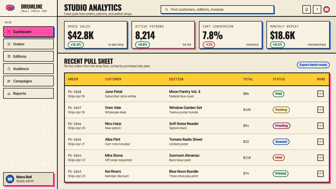
For web interfaces, Risograph works best in contexts that benefit from warmth and personality: editorial platforms, cultural organization sites, independent publication landing pages, creative portfolio sites, and event or festival microsites. The approach for dashboards and pricing pages is workable but requires care — the warm ground and limited color palette can feel low-contrast for data-dense layouts. Where it does apply: use a cream or warm white base, define one fluorescent or saturated accent color for primary interactive states and calls to action, and use halftone patterns as decorative fills for hero sections or feature cards rather than for body content. Bordered cards with a slight offset shadow simulate the printed object quality without requiring actual texture.对于网页界面,Risograph最适合能从温暖感与个性中获益的语境:编辑平台、文化机构网站、独立出版物落地页、创意作品集网站,以及活动或节日微型网站。将其应用于仪表板和定价页面是可行的,但需要谨慎——温暖的底色和有限的色板在数据密集的版面中可能感觉对比度不足。适用的情况:使用奶油色或暖白色底,为主要交互状态和行动号召定义一种荧光色或高饱和强调色,将半调图案用作主视觉区或功能卡片的装饰性填充,而非正文内容。带有轻微偏移阴影的有边框卡片模拟印刷对象的质感,无需真实纹理。
For editorial and marketing work, Risograph Print excels at giving publications, social content, and campaign materials a distinctly hand-crafted, independent-feeling character that mass-market design typically cannot replicate. Magazine covers and feature headers benefit from the aesthetic's poster-like scale: a large illustrative element in two spot colors, a bold display headline set against the cream ground. Marketing campaigns that position a brand as independent, artist-aligned, or culturally embedded — record labels, independent fashion brands, arts nonprofits, specialty food producers — find the aesthetic a natural fit. The spot-color discipline applies to marketing as firmly as to editorial: pick one primary campaign color and one accent, and let the cream ground do the rest.对于编辑与营销工作,Risograph Print在赋予出版物、社交内容和活动物料以独特手工感、独立气质方面表现卓越,而这种质感是大众市场设计通常无法复制的。杂志封面和专题页眉适合这种美学的海报尺度感:两种专色的大型插画元素,粗壮展示标题置于奶油底上。将品牌定位为独立、与艺术家对齐或具有文化根植感的营销活动——唱片厂牌、独立时尚品牌、艺术类非盈利机构、特色食品生产者——会发现这种美学天然契合。专色自律在营销中的要求与编辑中同样严格:选一种主色调和一种强调色,让奶油底做其余的事。
The most common mistake when applying Risograph Print digitally is mistaking visual complexity for authenticity. Adding more colors, more halftone layers, more grain and grit does not intensify the Risograph quality — it dilutes it. The original aesthetic is legible precisely because each color layer is simple and the composition underneath is clear. A second common error is applying the texture without the underlying design discipline: halftone fills and misregistration effects placed over a standard corporate grid layout do not produce Risograph work, they produce Risograph decoration. The aesthetic requires that the entire compositional logic — type scale, illustration style, color role, layout proportion — be rebuilt from the Risograph sensibility, not layered on top of an existing design system as a visual treatment.将Risograph Print数字化应用时最常见的错误,是把视觉复杂度误认为真实性。添加更多颜色、更多半调层、更多颗粒感与粗糙感,并不会强化Risograph特质——而是稀释它。原始美学之所以清晰可读,恰恰因为每个色层简单,其下的构图结构清晰。第二个常见错误是在没有底层设计自律的情况下应用纹理:将半调填充和套印错位效果叠加到标准企业网格版面上,产生的不是Risograph作品,而是Risograph装饰。这种美学要求从Risograph感性出发重建整个构图逻辑——字体尺度、插画风格、色彩角色、版面比例——而不是将其作为视觉处理叠加到现有设计系统之上。
See the Risograph Print design system查看 Risograph Print 完整设计系统
Risograph Print — FAQRisograph Print · 常见问题
Do I need an actual Risograph machine to work in this aesthetic?使用这种美学必须拥有真正的Risograph机器吗?
No — the Risograph aesthetic has a well-established digital simulation tradition that has been part of the style's spread since the mid-2010s. Digital work in this aesthetic typically uses a limited two or three-color spot palette, halftone dot patterns applied as fills or overlays, deliberate misregistration between color layers achieved through small layer offsets, and a warm off-white or cream background with subtle paper texture. The distinction between actual Risograph print and digital simulation is visible on close inspection but not at a glance — both convey the same essential visual character. What matters for authenticity is not the production method but the design discipline: limited colors, restrained composition, and an honest engagement with the aesthetic's logic rather than borrowing its surface texture while ignoring its structural constraints.不需要——Risograph美学已有成熟的数字模拟传统,自2010年代中期起就是这种风格传播的组成部分。这种美学的数字作品通常使用有限的两到三种专色色板、作为填充或叠加层应用的半调网点图案、通过小幅图层偏移实现的刻意色层错位,以及带有细微纸张纹理的温暖米白或奶油色背景。真实Risograph印刷与数字模拟之间的区别在近距离检视时可见,但一眼扫过并不明显——两者传达相同的核心视觉性格。决定真实性的不是生产方式,而是设计自律:有限色彩、克制构图,以及对这种美学逻辑的诚实运用,而非借用其表面肌理的同时忽略其结构约束。
How does Risograph Print differ from screen printing aesthetics?Risograph Print与丝网印刷美学有何不同?
The two aesthetics share significant common ground — both are spot-color processes, both work in limited ink layers, and both produce a flat, non-photographic look with visible texture. The differences are in the character of the imperfection and the palette available. Screen printing imperfection tends to show as ink bleed at edges, uneven coverage across large flat areas, and slight variation in registration. Risograph imperfection is more systemic: the halftone dot patterns are coarser and more visible, the misregistration between layers is more consistent (a predictable drift rather than random variation), and the fluorescent ink palette is specific to the Riso machine formulation in ways that screen printing inks do not replicate. Screen printing also allows for fully opaque inks, which Risograph does not, meaning Risograph color mixing through transparency is a distinct visual property absent from most screen-printed work.两种美学有大量共同点——都是专色流程,都在有限油墨层中工作,都产生可见纹理的平面、非摄影感外观。区别在于不完美的性格和可用色板。丝网印刷的不完美通常表现为边缘的油墨渗出、大面积平涂区域的覆盖不均匀,以及套准的细微变化。Risograph的不完美更具系统性:半调网点图案更粗粝、更明显,层与层之间的错位更为一致(是可预测的漂移而非随机变化),而荧光油墨色板对Riso机器配方的依赖,是丝网印刷油墨无法复制的。丝网印刷还允许完全不透明的油墨,而Risograph不行,这意味着Risograph通过透明度的色彩混合是一种独特的视觉属性,在大多数丝网印刷作品中不存在。
Which types of projects benefit most from the Risograph aesthetic, and where does it struggle?哪类项目最能从Risograph美学中获益?哪些场景它会力不从心?
Risograph works best for projects where warmth, personality, cultural specificity, and an independent or hand-crafted character are genuine values — not just visual styling. Independent publishing, music releases, cultural event materials, artist portfolios, experimental editorial, specialty retail brands, and community-oriented organizations all find natural alignment with the aesthetic's intimacy and intentional imperfection. It struggles in contexts requiring institutional authority, clinical neutrality, or high information density: enterprise software dashboards, financial services, healthcare interfaces, and any context where users need to trust the design to be transparent rather than expressive. The aesthetic also resists high-resolution photographic content — it is fundamentally an illustrative, flat-color system, and mixing it with conventional product photography or photorealistic rendering produces uneasy results rather than productive contrast.Risograph最适合那些温暖感、个性、文化特殊性以及独立感或手工感是真正价值——而非仅仅是视觉造型——的项目。独立出版、音乐发行、文化活动物料、艺术家作品集、实验性编辑内容、特色零售品牌和社区导向机构,都会发现自己与这种美学的亲密感和刻意不完美天然契合。它在需要机构权威感、临床中立性或高信息密度的语境中则力不从心:企业级软件仪表板、金融服务、医疗健康界面,以及任何用户需要信任设计保持透明而非表达性的场景。这种美学还抗拒高分辨率摄影内容——它从根本上是一个插画式、平面色彩系统,与常规产品摄影或写实渲染混合会产生令人不安的结果,而非富有成效的对比。
Why do designers keep returning to this aesthetic even as digital tools have advanced?为何即便数字工具不断进步,设计师仍持续回归这种美学?
The persistence of the Risograph aesthetic is not nostalgia in the simple sense — it is a continuing argument about what digital perfectibility costs. As print-on-demand, AI-generated imagery, and hyper-refined digital tools have made flawless visual production accessible to almost anyone, the visible imperfection of the Risograph process functions as a signal of intentionality, labor, and human presence. A Risograph-aesthetic composition — whether printed or simulated — communicates that a person made a series of specific, constrained choices rather than generating output at scale. This communicative function gives the aesthetic a durability that purely trend-driven visual styles lack. It will remain legible and meaningful as long as the cultural pressure toward digital frictionlessness that it responds to continues — which is to say, for the foreseeable future.Risograph美学的持久生命力并非简单意义上的怀旧——它是一场关于数字可完美化代价的持续辩论。随着按需印刷、AI生成图像和高度精炼的数字工具使几乎任何人都能获得无瑕的视觉生产,Risograph流程中可见的不完美开始充当一种关于意图性、劳动与人类在场的信号。一件Risograph美学的作品——无论是真实印刷还是数字模拟——传达的信息是:一个人做出了一系列具体的、受约束的选择,而非批量生成输出。这种传达功能赋予了这种美学一种纯粹潮流驱动的视觉风格所缺乏的持久性。只要它所回应的那种数字无摩擦化的文化压力持续存在——也就是说,在可预见的未来——它就将保持清晰可读和有意义。
How should color overlap and mixing be handled when working digitally?在数字工作中,色彩叠印和混色应如何处理?
The key is to respect the logic of transparent ink layering rather than pre-mixing colors in software. Work with each spot color on a separate layer, set to a multiply or screen blending mode depending on whether you want a darker or lighter overlap result — multiply approximates transparent ink layering, which is the Risograph default. The overlap color will emerge from the blending mode calculation rather than being chosen directly, just as it would emerge from actual ink transparency in physical printing. Avoid using the eyedropper to sample the resulting overlap color and apply it directly as a flat fill — that removes the layering logic and produces a result that looks like graphic design referencing Risograph rather than design operating within Risograph's own system. Keep each color layer simple and structurally meaningful, and let the overlap areas be a consequence of composition rather than a deliberate additional color choice.关键在于尊重透明油墨叠压的逻辑,而非在软件中预先混合颜色。将每种专色置于独立图层,并根据你希望叠印结果偏暗还是偏亮,设置为正片叠底或滤色混合模式——正片叠底近似透明油墨叠压效果,也是Risograph的默认状态。叠印色彩将从混合模式的计算中自然呈现,而非被直接选定,就像实体印刷中油墨透明度产生的结果一样。避免用吸管采样叠印区域产生的颜色并将其直接作为平涂填充应用——这样做会移除叠压逻辑,产生的结果看起来像是在参考Risograph的平面设计,而非在Risograph自身系统内运作的设计。保持每个色层简单且具有结构意义,让叠印区域成为构图的结果,而非刻意增加的额外色彩选择。
Related design styles相关设计风格
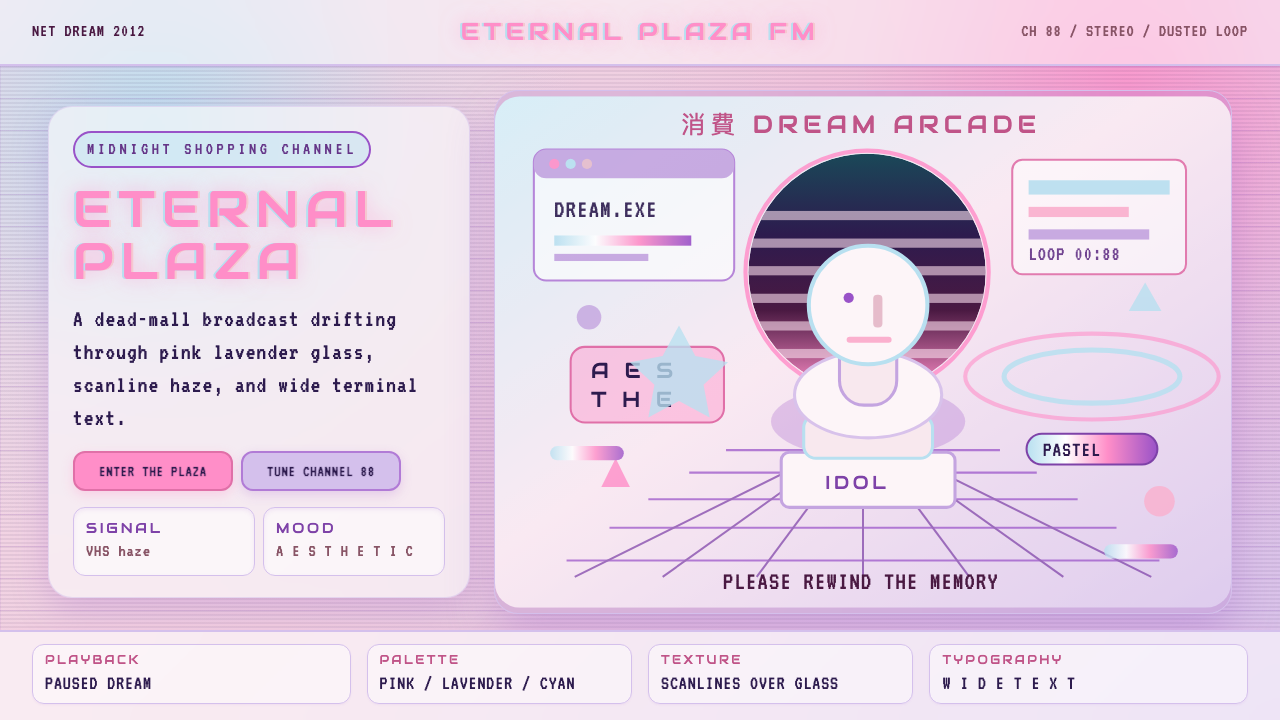 Vaporwave (Tumblr 2012)Dead-mall nostalgia glows. Pink-lavender glass, VHS scanlines, and wide retro…废墟商场的柔光怀旧:粉紫玻璃、VHS 扫描线与宽字距复古字体。
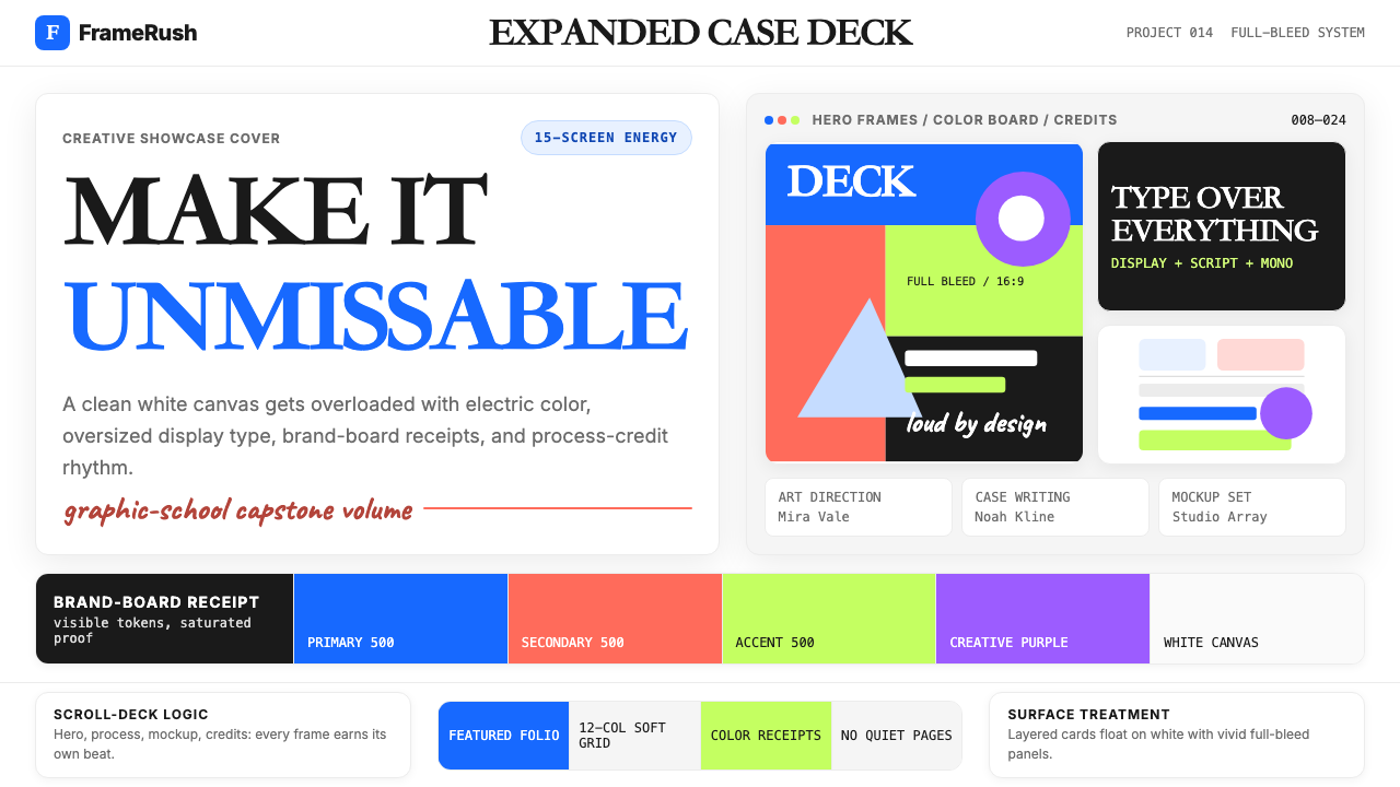 Behance Maximalist PortfolioPortfolio volume at max. Electric blue, coral and lime stack into a full-blee…作品集音量拉满:电光蓝、珊瑚橙与酸橙绿堆成全出血案例板。
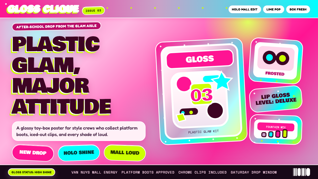 Bratz Doll 2003Y2K maximalism, mall-glossy. Hot-pink gradients, holographic lavender, chunky…Y2K 极繁的商场美学:热粉渐变、全息薰衣草紫、厚重展示字体——拆开 Brat…
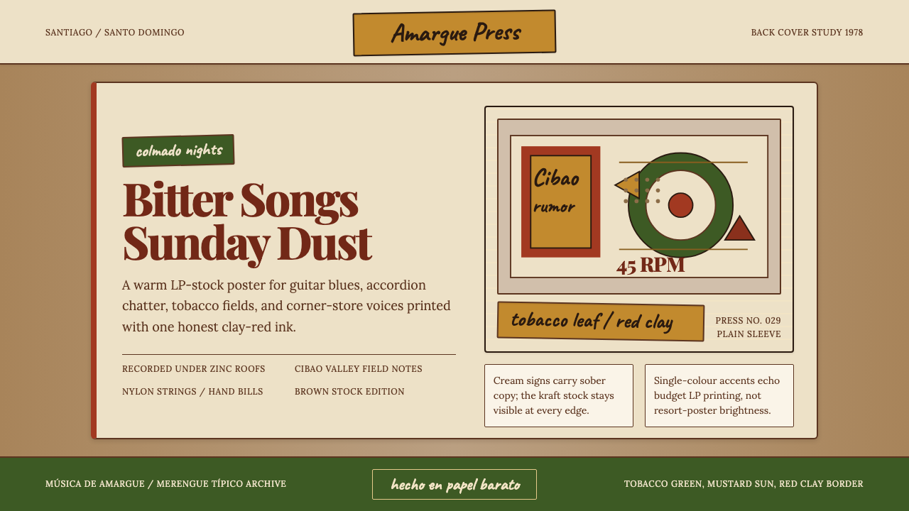 Dominican Bachata & Perico RipiaoPlainspoken warmth. Kraft stock, red clay serif, and typewriter credits carry…质朴而温热。牛皮纸、红土衬线与打字机署名托住苦情。
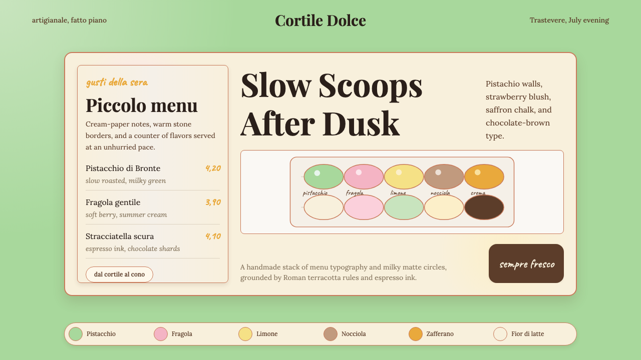 Italian Gelato ShopWarmth is hand-scooped. Pistachio green, cream panels, high-contrast serif, c…手工温暖被舀起。开心果绿、奶油纸卡、高反差衬线和粉笔字。
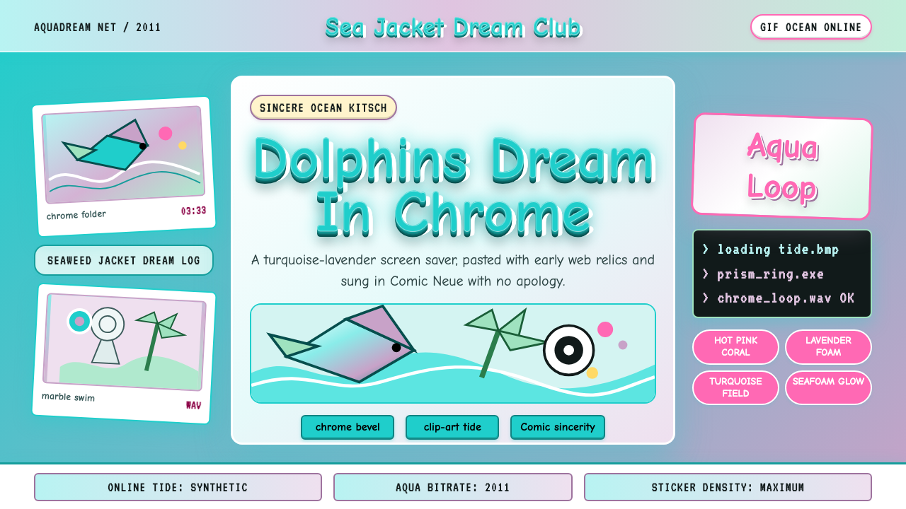 Seapunk 2011Sincere ocean kitsch. Turquoise gradients, Comic Neue chrome, and clip-art do…真诚的海洋俗艳:青绿渐变、Comic Neue 铬字与海豚剪贴画相撞。