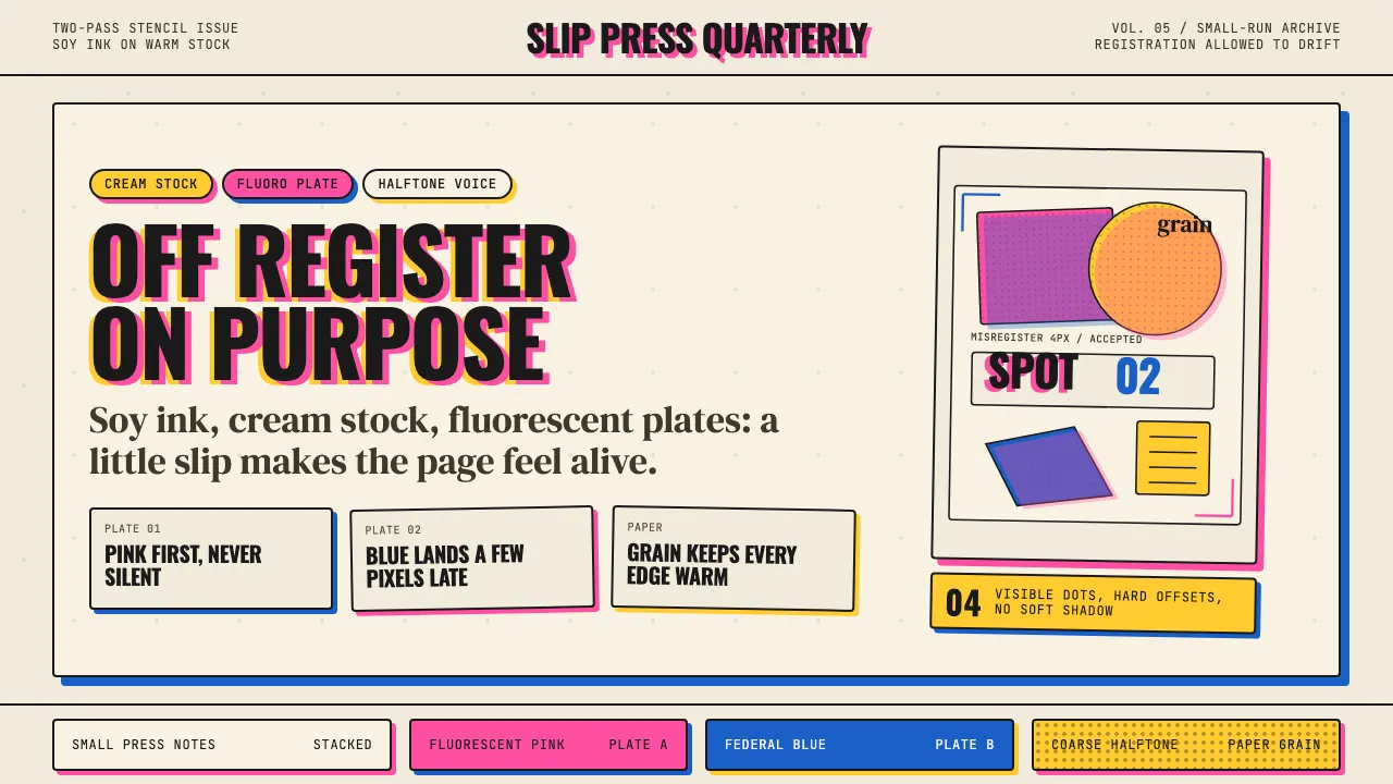
About Risograph Print
Risograph is the aesthetic of the Japanese soy-ink stencil duplicator that the 2010s indie-publishing scene adopted as a signature. One ink per pass, cream paper stock, two or three fluorescent spot colors, and a deliberate 3–5px registration slip between layers — the imperfection *is* the style.
Born in 2008+ studios like Hato Press (London), Colour Code (Toronto) and Risolab (NYC), it pairs chunky condensed caps with display serifs, halftone-dot fills, and hand-drawn illustration. It reads as hand-made, mechanically imperfect, and warmly analog.
- Origin
- Global (Japan invented; London, Toronto, New York, Berlin studios)
- Era
- 1986 Riso invented; design-studio adoption 2008+; 2010s zine renaissance; still active
- Key figures
- Riso Kagaku Corp · Hato Press · Colour Code Printing · Risolab NYC
- Movements
- zine / small-press · contemporary illustration · indie publishing
Risograph Print design spec
Colors
Typography
The other 11 sections — buttons, cards, spacing, motion, techniques and more — open once you unlock. Download the DESIGN.md or send it to your AI in one click. Unlock once, yours forever.
Sign up nowStyles similar to Risograph Print
Also inspired by print & type, with a close feel.
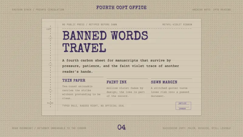 Samizdat TypewriterSecrecy leaves an imprint. Methyl-violet type on tea paper, narrow column, stitched gutter.
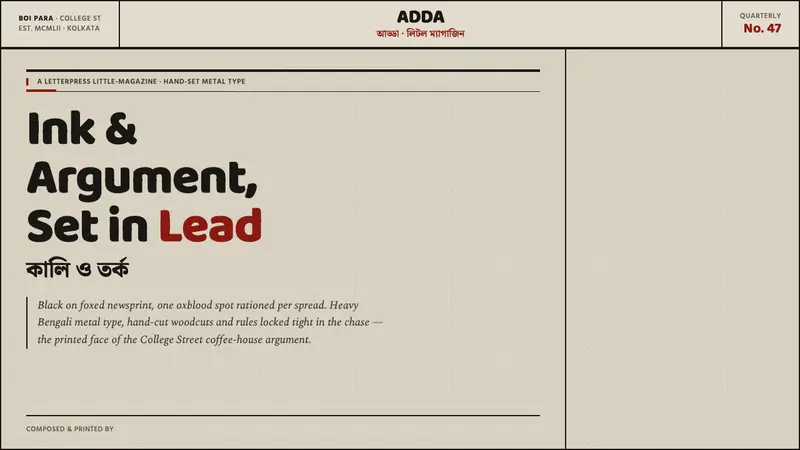 Kolkata Adda LetterpressAustere print, alive with argument. Baloo Bengali type and oxblood rules bite into foxed pulp.
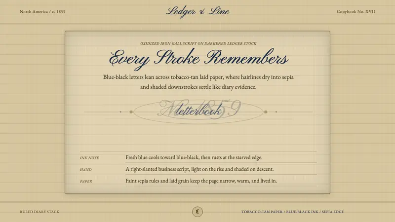 Spencerian PenmanshipLyrical ink, aged by time. Blue-black script rides tobacco-tan ruled paper.
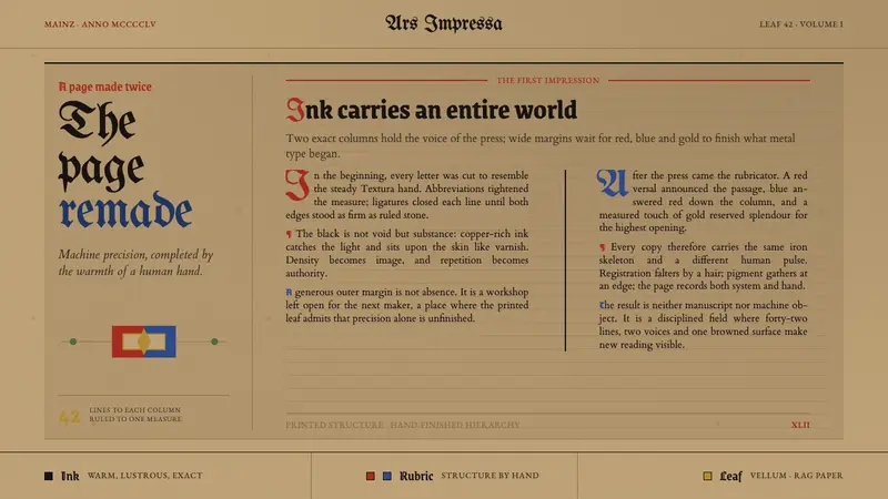 Gutenberg 42-Line BiblePrecision awaits the hand. Dense black columns open into red, blue and gold on browned vellum.