What is Rice Terrace?
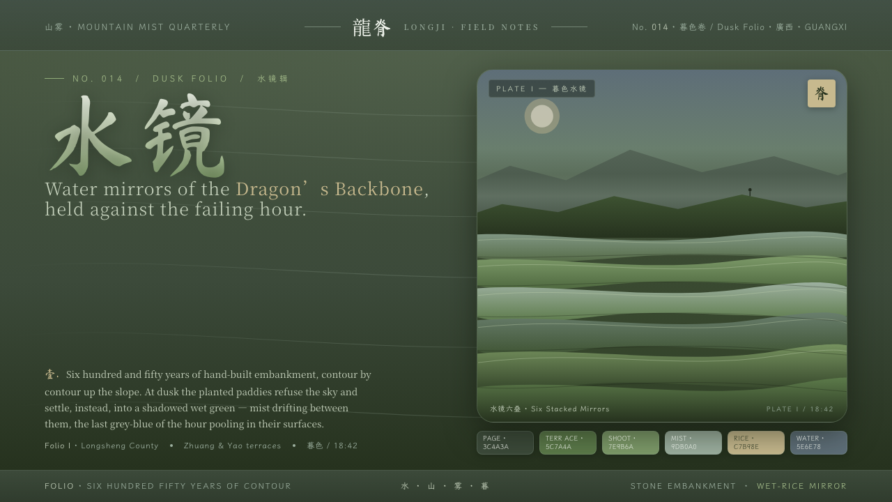
Rice Terrace begins after the daylight glare has left the mountain: dark paddy water, contour lines, and an agrarian calm built from reflection rather than display.
Rice Terrace in brief
Rice Terrace is a dark East Asian landscape system drawn from the flooded Longji terraces in Longsheng, Guangxi. Its defining image is not a bright travel photograph or a pale open sky, but the moment at dusk when contour-following paddies become stacked fields of shadowed water. The ground is deep paddy green. Across it sit quieter layers of shoot green, mist sage, ripe-rice tan, and cool blue reflected from water and the retreating sky.
The visual language treats the terrace as both landscape and structure. Curved bands imply fields stepping around a mountainside; broad dark intervals suggest the slope between them; reflective surfaces create pause, depth, and correspondence between land and sky. The result should feel cultivated rather than engineered. Its order comes from long adjustment to terrain, water, season, and labor, not from a rigid rectilinear diagram.
Typography carries the cultural register as much as color and shape do. CJK serif type gives sustained reading a measured, literary voice, while brush calligraphy can introduce a more immediate human gesture. Together they should suggest an East Asian agrarian world of accumulated practice: quiet, weathered, attentive, and closely tied to place. The system is dark without being theatrical, decorative without being ornamental, and rich without becoming crowded.
Where does Rice Terrace come from?
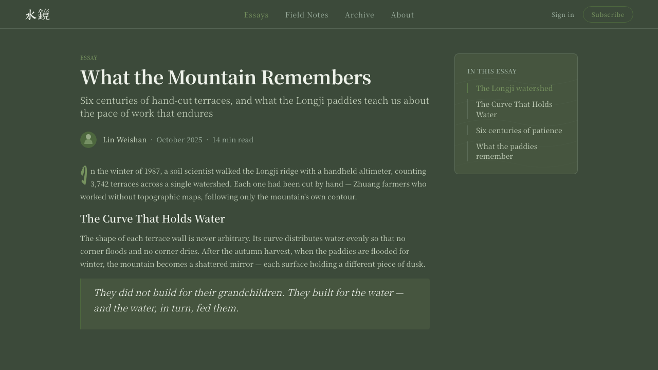
The source landscape is the Longji terrace system of Longsheng, Guangxi, China. Zhuang and Yao terrace farmers carved and maintained these mountainside paddies over roughly 650 years. Their work turned steep terrain into a sequence of wet-rice fields that follow the contours of the mountain rather than cutting across them. The terraces therefore express a practical relationship between settlement, cultivation, water, and slope.
Flooded paddies are central to the system’s imagery. When water fills the fields, each terrace becomes a reflecting plane, catching mountain mist and changing light. In the source material, this is especially important at dusk: the bright reflections of the day settle into shadowed green water, while the last light remains cool and subdued. Rice Terrace takes that transition as its emotional and visual starting point.
Its wider cultural context is East Asian terraced wet-rice agriculture and mountain-village farming. This is not an urban decorative style borrowed from a rural image. The essential forms come from agricultural landscape heritage: repeated field edges, interrupted reflections, uneven terraces, seasonal color, and the patience required to cultivate a mountainside. Any application should preserve that sense of terrain-led rhythm.
The system also draws its voice from East Asian agrarian expression. CJK serif type supports reflection, narration, and information with composure; brush calligraphy provides a counterpart that feels embodied and singular. Used together, they connect interface language to the same long-duration heritage represented by the fields. The aim is not nostalgia for an imagined past, but respect for a living landscape shaped by successive hands.
What defines the Rice Terrace look?
Dusk Ground
The foundation is deep paddy green, never a broad pale sky. It should feel like water darkening between terraces after daylight has receded: absorbent, calm, and spacious. Light elements emerge from this field as mist, reflection, or cultivated growth, rather than floating independently on an empty background.
Water Mirrors
Reflection is a compositional principle, not a glossy effect. Cool water-mirror blue and muted grey-blue light can appear as restrained surfaces, bands, or quiet highlights. They should imply a field holding sky and mist, with depth created by repetition and interruption rather than by spectacle.
Contour Rhythm
Terrace curves should guide the system. Lines and layered fields follow, bend, widen, and pause as a mountainside does. They are more organic than a conventional grid, yet never random. A successful layout feels stepped and cultivated, with each band responding to the presence of the one above and below it.
Cultivated Palette
The palette moves through dark paddy green, shoot green, mist sage, ripe-rice tan, and cool reflected blue. These colors should read as conditions of one landscape rather than separate decorative accents. Green carries growth and waterlogged terrain; tan introduces harvest and earth; muted blue holds the distance of dusk.
Agrarian Type
CJK serif type provides the main reading voice: settled, legible, and unhurried. Brush calligraphy should be used as a concentrated gesture for a title, place name, or emotional turn, not as a texture spread everywhere. The contrast between disciplined serif text and variable brush marks mirrors the relationship between maintained fields and changing weather.
Mist and Restraint
Rice Terrace needs softness, but not sentimentality. Mist sage, diffuse transitions between dark and cool surfaces, and generous unoccupied areas can create air around information. Decorative motifs should remain secondary to the sense of damp mountain atmosphere. The design should feel observed at close range, not staged as scenery.
Who shaped Rice Terrace?
Zhuang minority terrace farmers are among the communities identified in the source landscape. Their long-term cultivation of the Longji mountainside grounds the style in agricultural practice rather than in an abstract scenic image. The terrace bands, flooded fields, and cultivated seasonal palette all depend on this sustained relationship with terrain and water.
Yao minority terrace farmers are likewise central to the Longji landscape described here. Their presence makes the system inseparable from mountain-village farming and inherited maintenance. Rice Terrace should therefore retain evidence of care, repetition, and adaptation, instead of reducing the fields to a smooth ornamental pattern.
The Longji terraces themselves act as the system’s defining visual figure. Their contour-following paddies, flooded reflections, mountain mist, and dusk light supply its forms, atmosphere, and hierarchy. They are not a backdrop added after the fact; they are the organizing model from which the interface language is derived.
How do you use Rice Terrace today?
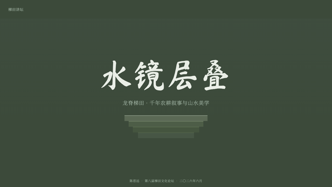
For presentation covers, begin with the dusk ground and let a contour-like field or water-mirror surface establish the title area. CJK serif type can carry the main title with measured authority, while a small brush-calligraphic phrase supplies a human accent. Avoid turning the cover into a literal landscape illustration. The strongest covers suggest the terraces through layered curvature, reflection, and empty dark space.
Content and data slides should use terrace rhythm to organize information. Group sections as broad stepped bands rather than isolated floating cards, and give explanatory text enough dark ground to settle. For data, use the cultivated palette to distinguish related conditions: greens for growth or continuity, ripe-rice tan for grounded emphasis, and cool reflected blue for comparison or secondary context. Charts should remain clear enough to read as information before they read as scenery.
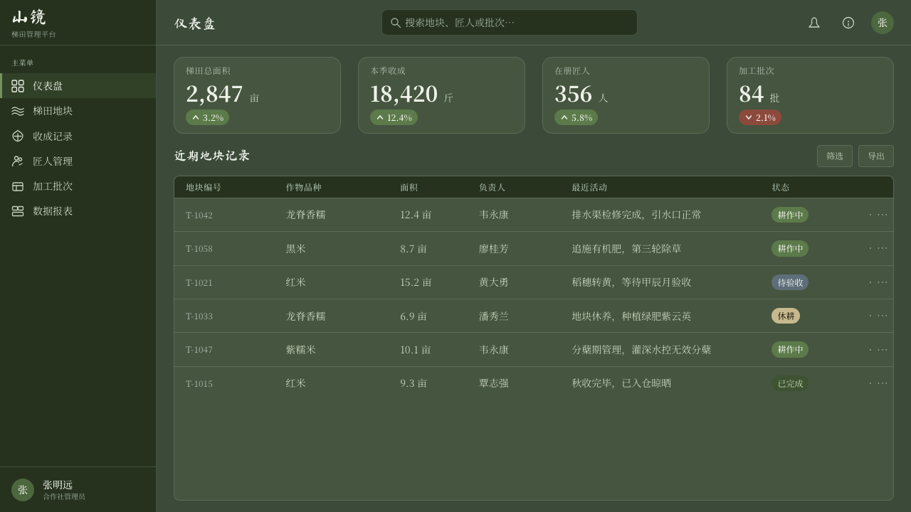
In web interfaces, the style is especially suitable for editorial dashboards, cultural archives, landscape interpretation, and products that need a contemplative but structured atmosphere. Navigation and controls should remain calm and legible against the dark paddy ground. Use layered panels sparingly, allowing water-mirror surfaces and misted separations to indicate hierarchy. A pricing or membership page can use the same approach by making each offer feel like a cultivated terrace within a larger slope.
For editorial and marketing work, Rice Terrace supports long-form stories about place, food, craft, travel, ecology, and heritage. Let generous dark intervals separate chapters, and use serif text for the continuous voice of the article. Brush calligraphy works best at moments of arrival: a section opening, a location marker, or a final line. Supporting imagery should feel like an extension of the reflective landscape, not a competing collage.
The common mistake is to treat the system as a generic dark green theme and then add every available rural symbol. That loses the restraint of the source. Do not crowd it with bright daytime skies, unrelated ornaments, repeated calligraphic flourishes, or decorative field lines with no structural role. The style works when dusk, water, contour, cultivation, and quiet typography remain visibly connected.
Rice Terrace — FAQ
Is Rice Terrace a traditional Chinese visual style?
It is better understood as a contemporary design system rooted in a specific Chinese agricultural landscape and East Asian agrarian heritage. Its references are the Longji terraces, their dusk water reflections, and the visual voice of CJK serif and brush calligraphy. It should not be treated as a catch-all substitute for every Chinese cultural setting.
Why does the system avoid a bright sky background?
The source image is the terrace at dusk, when flooded fields hold mist and the final grey-blue light rather than reflecting midday brightness. A deep paddy ground gives the system its sense of water, slope, and concentration. A broad pale background shifts the mood away from the source and makes the reflective layers feel detached.
How should brush calligraphy be used?
Use it as a deliberate focal gesture, not as a universal text treatment. It can mark a title, a place, or an emotional threshold in a story. Continuous information, navigation, and dense reading belong more naturally to CJK serif type, whose steadier rhythm keeps the interface useful and prevents the brush element from becoming visual noise.
Can Rice Terrace work for data-heavy interfaces?
Yes, provided the landscape metaphor remains subordinate to legibility. Terrace-like grouping can create clear sections, and the muted agricultural palette can distinguish categories without overwhelming them. Keep labels, controls, and comparisons direct; use reflection, mist, and contour as hierarchy cues rather than as decoration placed behind every data point.
What most quickly makes the style feel inauthentic?
Separating its elements from their shared source is the fastest failure. Bright sky imagery, generic rural decoration, excessive brush marks, or smooth ornamental waves may look loosely related, but they do not express flooded contour fields at dusk. Keep each choice answerable in terms of water, mountain terrain, cultivation, mist, or the agrarian reading voice.
Related design styles
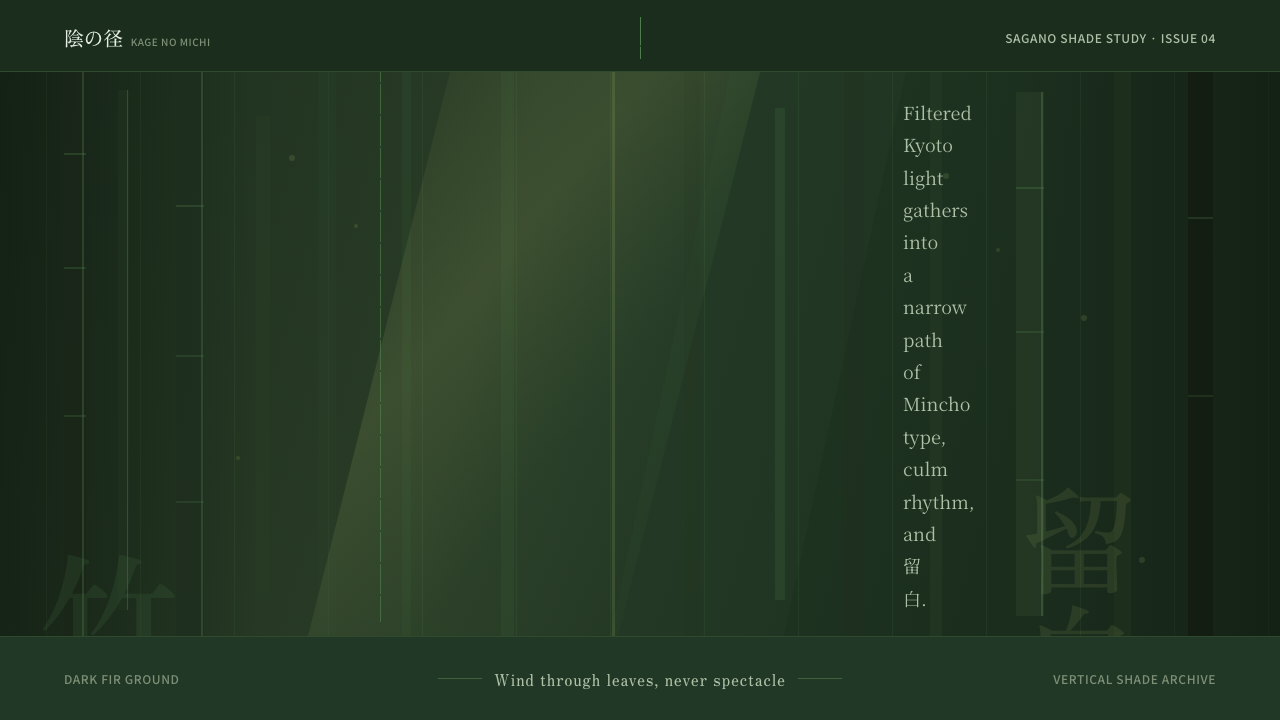 Bamboo GroveQuiet goes vertical. Fir green, Mincho type, and dappled culm rules create de…
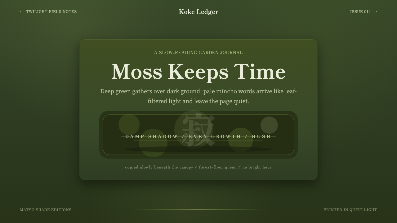 Kyoto Moss GardenStillness grows slowly. Deep moss greens, mincho serif, and dappled dark laye…
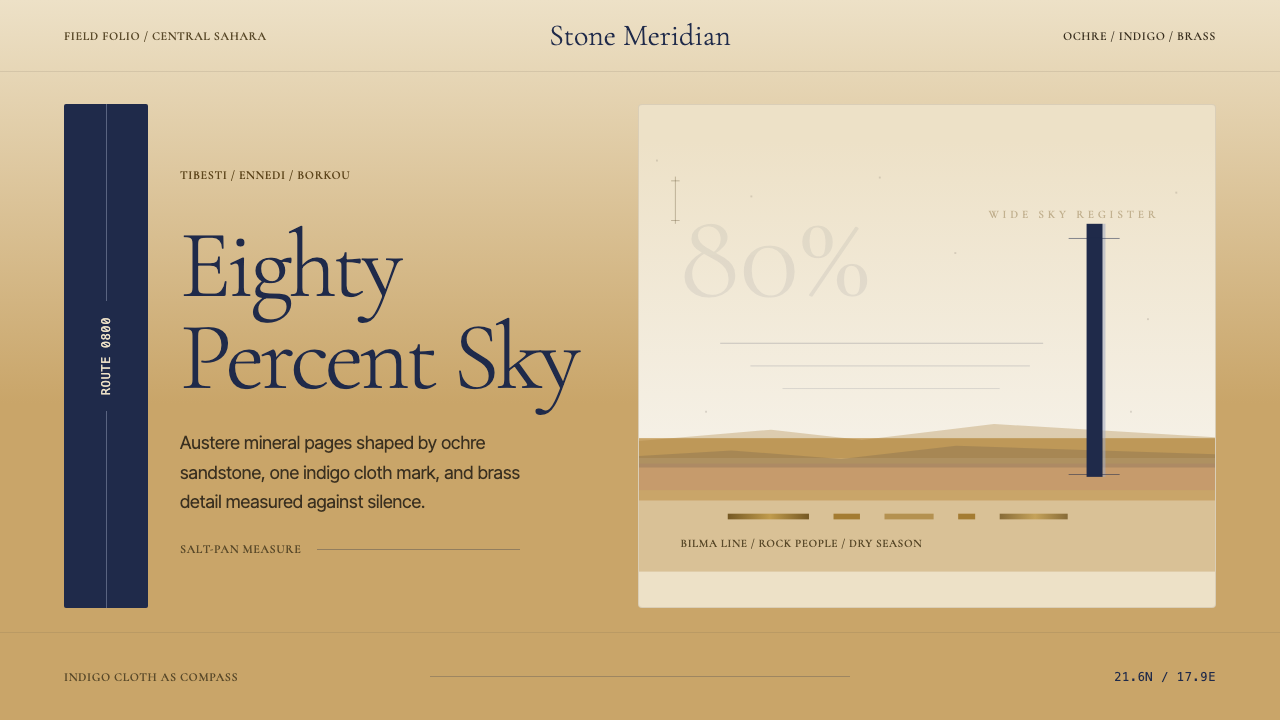 Chadian Toubou Saharan RouteRadical emptiness holds. Sandstone ochre, indigo serif, and one vertical mark…
 Yapese Stone Money (Micronesia)Monumental stillness. Limestone type and one circular void sit inside warm bl…
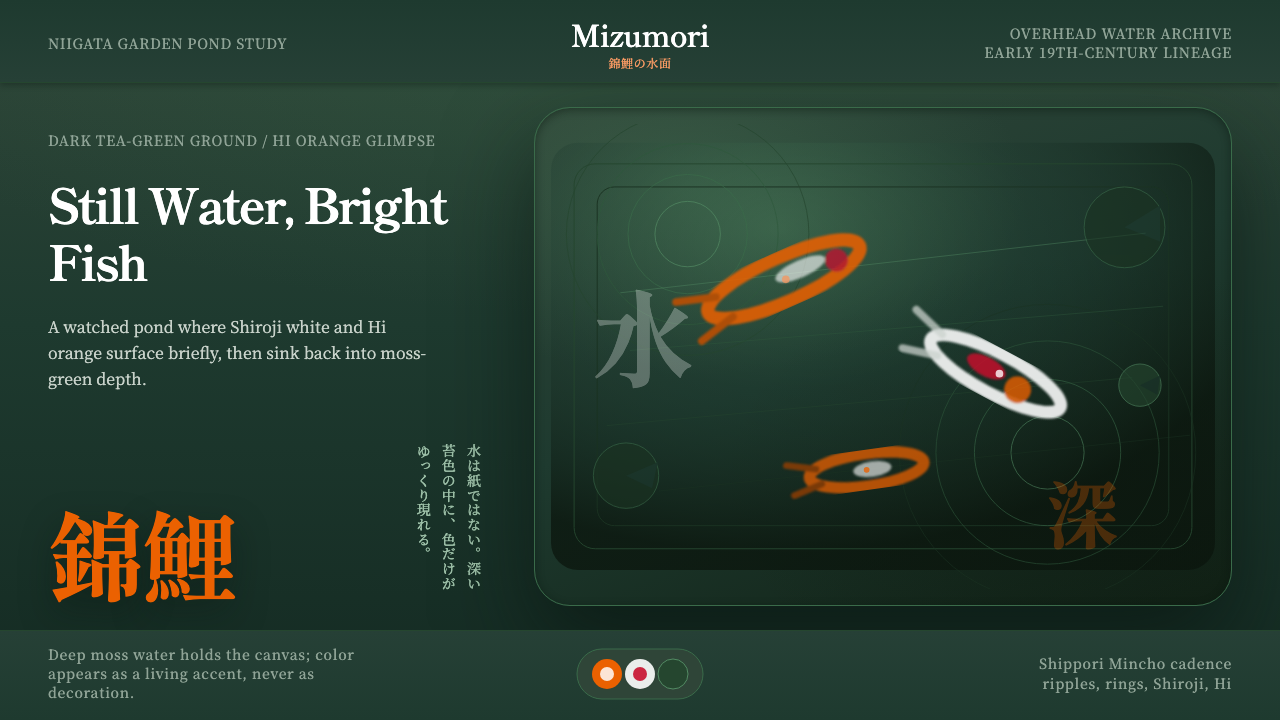 Koi PondQuiet water carries color. Moss depth, Mincho type, and orange koi flashes.
 Autumn Momiji 紅葉Stillness catches fire. Momiji gradients burn against chestnut timber and wid…