What is Rewilding Corridor Authority?
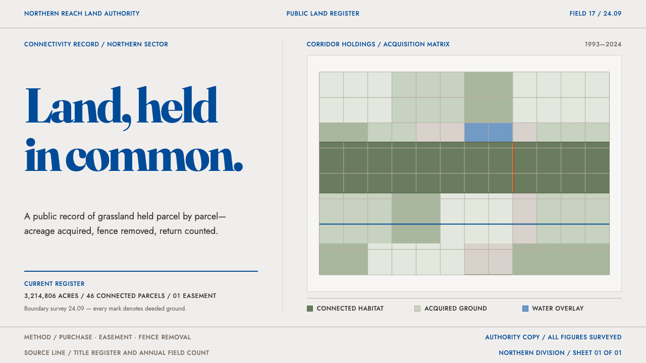
Rewilding Corridor Authority is conservation filed as a property register: sage parcel grids, big-sky blue ledger ink, and a page that argues through maps and tables instead of pleading.
Rewilding Corridor Authority in brief
The Rewilding Corridor Authority style takes its look from the way land-conservation organisations publish themselves. A land authority buys prairie parcel by parcel and then publishes what it owns: corridor maps, bison and wolf counts, and an acquisition ledger that records acres, seller type, date and funding source. The scale it describes is large, a protected landscape assembled across millions of acres of northern prairie, but the manner of describing it is that of a property register.
The page is the paper stock it would be printed on, an off-white, uncoated sheet. Sage fills the habitat, a deep big-sky blue carries every line of text and every map baseline, and rust flags the easements and acquisition points. Nothing here pleads. There is no sunset photograph with a donation banner, no cartoon animal, and none of the rounded cards and drop shadows of a start-up dashboard.
The map is the layout and the table is the argument. The only softness on the page is the outline of a range polygon, a line that follows an animal population rather than a property boundary. It is conservation filed as a property register: a style that persuades by being exact about what has been bought, what is protected and who paid.

Where does Rewilding Corridor Authority come from?
The style belongs to a lineage of landscape-scale conservation that took shape from the early 1990s onward. Rather than protecting isolated reserves, these projects try to protect and reconnect whole regions so that animals and ecological processes can move across them. The Yellowstone-to-Yukon initiative, begun in 1993, imagined a connected chain of protected areas along the Rocky Mountains. American Prairie followed in 2001 on the Northern Great Plains in Montana, and Rewilding Europe in 2011 brought a similar approach to European landscapes.
Connectivity ecology supplies the logic. Habitat that is cut into small patches loses species, while habitat joined by corridors can support wider-ranging animals and more resilient populations. That idea turns the central object of conservation into something spatial and cumulative: a network of parcels and passages that grows over time. A map is the natural document for such a project, and a corridor is easiest to explain as a line of ownership and agreement linking one block of land to the next.
The financial and legal mechanism is the land trust and the conservation easement. Instead of lobbying or protest, these organisations acquire land outright or secure legal agreements that restrict how land can be used, and they record each transaction. A land purchase has an acreage, a seller, a date and a source of funds, and an easement has a boundary and a holder. The documents that result are ledgers and registers, and the design language of this style is essentially the design language of those documents carried onto the screen.
Several people are associated with the movement's growth: Curtis Freese and Sean Gerrity on the American Prairie side, Harvey Locke around the Yellowstone-to-Yukon vision, and Frans Schepers in the European rewilding effort. The visual manner this style describes belongs to the latest generation of such organisations, which settled between roughly 2021 and 2024 into a quiet, document-like look: restrained colour, plain tables, the map as hero. It reads as the opposite of the emotional appeal that nature fundraising once relied on, and it trusts records to do the persuading.
What defines the Rewilding Corridor Authority look?
Uncoated Paper Ground
The ground is an off-white, uncoated paper stock: matte, slightly warm, never a glaring pure white. The page does not simulate paper with visible texture; it simply behaves like a printed sheet, flat and quiet. That choice sets the tone of the whole system, which is documentary rather than promotional.
Sage Habitat Fill
Sage, a grey-leaning green, is the colour of habitat and corridor. It fills regions on maps and parcel cells in grids, and it means land that is held or protected rather than decoration. Because it is muted, it stays calm over large areas, and it never reads as the bright leaf green of generic eco branding.
Big-Sky Blue Ink
A deep big-sky blue is the single ink of the system. It sets every line of text, every heading and every map baseline, the way one ink would be used across a ledger. Using a blue rather than black gives the page a distinct, open-air voice while keeping the contrast and seriousness of a printed record.
Rust for Easements
Rust is rationed. It appears only on easement markers and acquisition nodes, the places where a legal agreement or a purchase changes the status of land. That discipline keeps it meaningful: when rust shows up, it is a fact being flagged in the ledger, not an alert asking for attention.
Map as Layout, Table as Argument
Pages are built around the corridor map and the acquisition table. The map sets the composition and the table carries the case: acres, seller type, date, funding source, laid out in plain rows. There is no separate persuasive layer on top; the structure of the evidence is the rhetoric.
Parcel Grid, Soft Range Outline
Most of the page is rectilinear: parcel grids, ruled tables, square corners. The one soft element is the outline of a species range polygon, a line that follows animals rather than property. There are no rounded cards, no shadows and no illustrated animal icons, so that single curved outline carries real meaning.
A Declarative Voice
Nothing in the system asks. Counts, acreages and dates are stated plainly, in the same register as a deed or an annual statement. Imagery, where it appears, supports the record instead of tugging at the viewer, and there is no emotional hero banner. The restraint is the sales pitch: an organisation confident enough to show its books.

Who shaped Rewilding Corridor Authority?
A conservation biologist associated with the early thinking behind the American Prairie project on the Northern Great Plains. His name marks the scientific starting point of the story: the argument that grassland, long treated as empty farmland, could be restored as habitat large enough to matter.
A leading figure of the American Prairie effort, associated with turning the idea into a land-acquisition programme that buys parcel by parcel. He represents the operational side of the movement, where conservation is measured in acquisitions, funding sources and acres held, and where the ledger is the principal public record.
Associated with the Yellowstone-to-Yukon vision of a connected chain of protected lands along the Rocky Mountains. His name stands for the corridor idea at continental scale, the shift from protecting isolated reserves to protecting the connections between them, which is why this style makes the corridor map its central object.
Associated with the leadership of Rewilding Europe, which carried landscape-scale ideas to European areas. He represents the movement's international spread and the translation of a prairie-and-wolf vocabulary into settings with long histories of human use, where records of land, agreements and counts are as important as the wilderness itself.
How do you use Rewilding Corridor Authority today?
Rewilding Corridor Authority suits any subject where trust is built through records: land, assets, inventories, registries, public funding, supply chains and research data. Its core instruction is to let the structure of the evidence be the design, and to resist any layer of persuasion on top of it.
For presentation slides, a cover can be a quiet off-white sheet with a sage polygon, a title set in the single blue ink, and perhaps one rust marker. Content slides pair a map on one side with a ruled table on the other. Data slides should favour tables and simple charts in which sage bars sit on a blue baseline, annotated directly rather than decorated, so the figures read like entries in a ledger.
For web interfaces, the style fits transparency pages, registries, asset trackers, grant and funding dashboards, and project portals. A dashboard becomes a register: a map as the hero, a ledger table below it, filters expressed as plain labels. Pricing or giving tiers work best as a clean table with the same ruled rows. Navigation should be textual, with rules rather than pills, and with the single ink colour doing the work.
For editorial and marketing work, it suits impact reports, annual statements, field notes, public-benefit disclosures and press material with real numbers in it. A fundraising page can show what has been acquired and by whom it was funded, instead of begging in large type. The effect is to make the organisation look like what it claims to be: patient, exact and accountable.
The commonest mistake is dressing the style up with the clichés it exists to refuse: a hero photograph with a donation banner, cartoon animals, leaf icons, rounded cards, gradients and soft shadows. A second is spreading rust everywhere so it loses its meaning as an easement flag. A third is using the look without the substance. The style implies rigorous records, so decorative statistics that are not tied to real data will read as greenwashing.

Rewilding Corridor Authority — FAQ
What does 'conservation filed as a property register' mean in design terms?
It means the page imitates the documents conservation actually runs on: deeds, ledgers, maps and registers. Each acquisition is a row with acres, seller type, date and funding source, and each protected area is a shaded region on a map. Instead of using emotional imagery to persuade, the design lets the completeness and exactness of the record do it. The look is closer to a land registry than to a nature brochure.
Why is text set in blue instead of black?
Because the blue is the single ink of the system, in the way a ledger or a map series would use one printing ink throughout. A deep blue keeps the contrast and seriousness of a printed record while giving the page a distinct open-sky voice. It also unifies text and map baselines under the same colour, so that words and geography feel drawn by one hand.
Is this just a green or eco style?
No. Green appears only as a muted sage that stands for habitat and held land, and the system deliberately avoids the leaf icons, bright greens and soft gradients of generic eco branding. Its character comes from record-keeping, not from nature imagery. That also means it carries a duty: because it signals precision, it should only be used with real numbers behind it.
What are conservation easements, and why do they get their own colour?
A conservation easement is a legal agreement that limits how a piece of land can be used while ownership continues, typically to protect its habitat. Easements and acquisitions are the moments when the status of land actually changes, so the style gives them rust, a colour used nowhere else. That makes them easy to find on a map or in a table, and it stops the colour from turning into a general alert.
Can the style use photography?
Sparingly, and as evidence rather than atmosphere. A photograph can document a place or an animal population, set within the grid, with a caption in the same blue ink and a date or location. What the style refuses is the full-bleed, emotive hero photograph used to lever a donation. If an image does not add a fact to the record, the map or the table is usually the better choice.
Related design styles
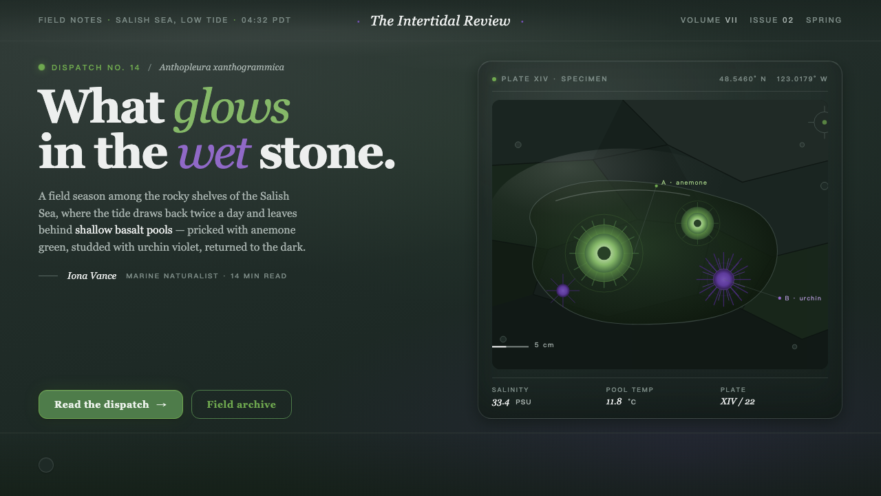 Tide PoolFeels like field notes after rain. Literary serif in basalt black, algal gree…
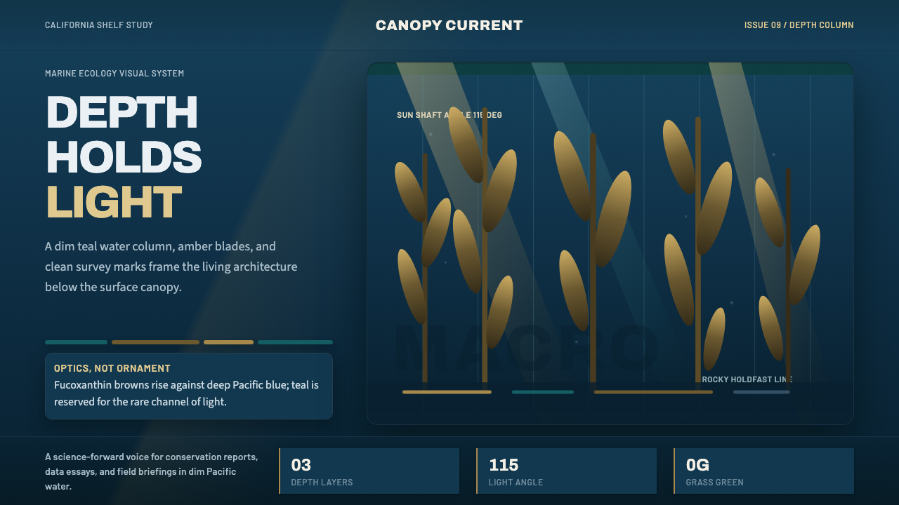 Pacific Kelp ForestScientific depth. Teal water, amber shafts, and vertical kelp rhythm carry th…
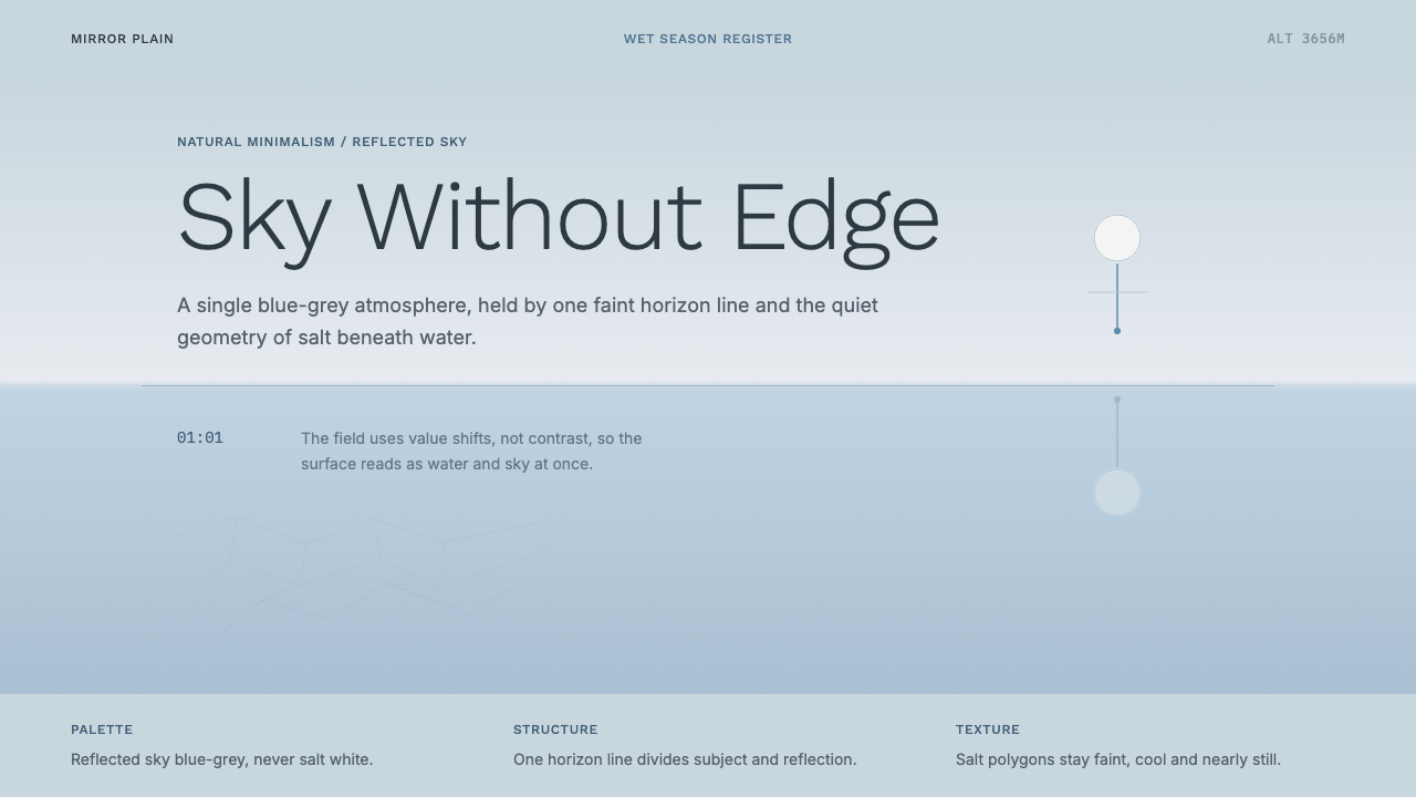 Salt Flat UyuniAtmosphere does the work. Blue-grey space, one horizon line, faint salt polyg…
 Sri Lanka Ceylon Tea ModernProvenance is emerald. Ivory mist panels and one saffron seal make origin fee…
 AllbirdsSustainability that breathes. Cream-and-sage tones, carbon labels next to pri…
 Anthropic ClayAI safety in handmade clay. Sand backgrounds, terracotta accents, serif body…