What is Pacific Kelp Forest?
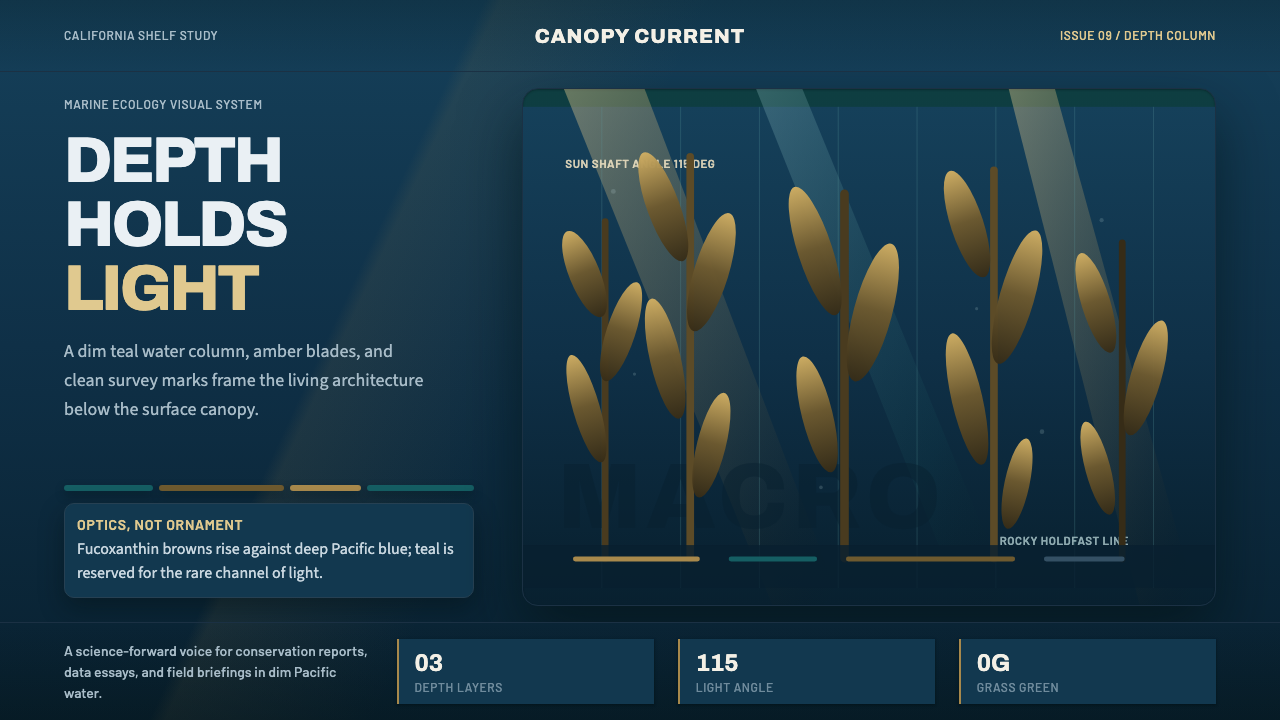
Pacific Kelp Forest turns the optics of a California kelp canopy — teal water, amber backlight, vertical stipes climbing toward the surface — into a visual system for telling scientific stories with clarity.
Pacific Kelp Forest in brief
Pacific Kelp Forest is a contemporary design style built from underwater observation rather than invented ornament: the dim, blue-green water column off the California coast, giant kelp rising in golden-brown blades from a rocky seafloor, and sunlight breaking the surface into diagonal shafts that backlight the fronds to amber. It belongs to a broader wave of ocean-ecology visual communication that has grown alongside marine science documentaries, aquarium exhibitions, and conservation campaigns since the 2010s — work that treats the undersea world not as a fantasy backdrop but as a place with its own measurable physics of light and color.
The defining discipline of this style is optical honesty. Kelp is a brown alga, and its color comes from fucoxanthin, a pigment that masks the plant's underlying chlorophyll and pushes its hue toward golden-brown and amber rather than the grass-green most people expect from a 'forest.' A design that gets this wrong — rendering kelp in saturated green — breaks the illusion for anyone who has actually looked at a kelp bed. Getting it right is what gives the style its credibility as a vehicle for scientific storytelling.
Because the style originates in an environment defined by depth, it organizes information the way water organizes light: brighter and more legible near the 'surface' of a layout, cooler and more atmospheric as elements recede. Combined with clean modern sans-serif type and a strong vertical rhythm borrowed from the kelp stipes themselves, the result reads as authoritative and current — well suited to dashboards, research communication, and any product that wants to feel grounded in observed reality rather than decorative fantasy.
Where does Pacific Kelp Forest come from?
Kelp forests themselves are among the most productive and structurally complex ecosystems in the ocean, and the giant kelp that defines the Pacific variant — Macrocystis pyrifera — is the fastest-growing organism known, capable of climbing more than half a meter a day from a holdfast anchored on rocky substrate toward a canopy that spreads across the surface. These forests line the temperate coastlines of the Pacific, most famously off California, and support dense communities of fish, invertebrates, and marine mammals, sea otters among them, that drift and forage in the shifting light beneath the canopy.
Scientific attention to these ecosystems intensified through the twentieth century as marine biologists began to treat kelp forests not as incidental seaweed but as a foundational habitat worth studying and protecting in its own right. Wheeler J. North, working out of Caltech from the 1950s onward, became one of the first researchers to systematically document Southern California's kelp beds, pioneering scuba-based survey methods and helping establish the ecological baseline against which later decline and recovery would be measured. His work treated the kelp forest as a system with a describable structure — canopy, midwater, and understory — much as a forest ecologist would describe a stand of trees.
Paul K. Dayton extended this ecological framing in the 1970s and beyond, studying kelp forests as dynamic communities shaped by disturbance, competition, and predation — most notably the cascading relationship in which sea otters keep sea urchin populations in check, and urchins in turn can strip a kelp bed bare if predation pressure disappears. This body of research reframed the kelp forest in the public imagination: not a static backdrop but a living, light-driven system whose golden-brown canopy is the visible expression of currents, grazing pressure, and decades of recovery from historical overharvesting.
The visual style now associated with Pacific kelp forests draws directly on this scientific lineage. As underwater photography and marine documentary filmmaking matured from the late twentieth century onward, image-makers learned to render the specific interplay of teal water, diagonal sunbeams, and amber-backlit fronds with increasing fidelity — first for research publications and museum exhibitions, later for the broader conservation-media aesthetic that Pacific Kelp Forest as a design style now distills into a reusable visual system.
What defines the Pacific Kelp Forest look?
Color
The palette is anchored in deep teal-blue water, ranging from a near-black depth at the edges of a composition to a lighter, more saturated blue-green near a implied surface. Kelp itself contributes golden-brown and amber tones — never green — consistent with the real optics of fucoxanthin-bearing brown algae. Amber and gold are reserved for backlit or sunlit elements, giving the palette a built-in light source rather than a flat wash of color.
Light and Depth
Surfaces are graded by implied depth rather than by a single flat backdrop: elements read as nearer the surface are brighter and warmer, while elements meant to recede sit in cooler, darker tones. Diagonal shafts of light — the visual signature of sun breaking through a water column — appear as soft directional gradients rather than hard graphic rays, reinforcing the sense of looking through water rather than at a printed surface.
Typography
Type is clean and modern, chosen for scientific legibility rather than atmosphere — the kind of sans-serif that would be at home in a research figure caption or a museum wall label. It stays neutral so the palette and imagery carry the mood, with hierarchy built through size and weight rather than ornamental flourish.
Vertical Rhythm
Composition is organized around verticality, echoing the way kelp stipes rise from holdfast to canopy in pursuit of light. Layouts favor tall, column-like structures and upward-reading hierarchies over horizontal sprawl, giving even static pages a sense of ascent.
Silhouette and Form
Foreground subjects — a drifting otter, a diver, a research instrument — are frequently rendered as darker silhouettes against the lighter, light-shafted water behind them, a direct consequence of backlighting underwater. This creates natural focal points without relying on outlines, borders, or drop shadows.
Texture
Surfaces suggest the softness of water and drifting particulate rather than the crispness of dry-land materials: edges are gently diffused, transitions are gradual, and nothing reads as hard or mechanical. This softness is balanced by the crisp, modern type, so the system never drifts into vague or muddy.
Composition
Scenes are built in layers reading front to back — silhouetted foreground subject, midground kelp canopy, background water column fading to depth — a structure borrowed directly from how the eye actually parses an underwater view. This layering gives even simple interfaces a sense of environmental depth rather than a flat illustrated backdrop.

Who shaped Pacific Kelp Forest?
Giant kelp is the organism the entire style is built to render faithfully. As the fastest-growing organism known, it can add more than half a meter of length in a single day, climbing from a rocky holdfast on the seafloor to a canopy spreading across the surface. Its golden-brown, blade-lined stipes — colored by fucoxanthin rather than chlorophyll-green — are the visual anchor of the style, and getting their color and vertical growth pattern right is what separates an authentic kelp-forest design from a generic underwater scene.
North was among the first marine scientists to systematically survey Southern California's kelp beds, working out of Caltech from the 1950s onward and pioneering scuba-based methods for studying the forest at the scale and depth it actually occupies. His baseline surveys of canopy structure and density gave later researchers — and later image-makers — a rigorous reference for what an accurate kelp forest actually looks like from within.
Dayton's ecological research in the 1970s and beyond reframed kelp forests as dynamic communities shaped by predation and disturbance, most notably the otter-urchin-kelp cascade in which the loss of a single predator can strip a canopy bare. His work is part of why the style's imagery so often includes an otter drifting overhead: the animal is not decorative but a visible marker of the ecological balance that keeps the golden canopy intact.
Sea otters are the style's recurring silhouette figure, drifting or resting at the surface above the canopy. Ecologically, they are a keystone predator whose presence or absence determines whether a kelp forest thrives or collapses; visually, their compact, backlit outline against the lighter water above the canopy is one of the style's most immediately recognizable motifs.
How do you use Pacific Kelp Forest today?
Pacific Kelp Forest is most convincing when it is used to signal that a product's claims are grounded in observation, not decoration — which makes it a natural fit for scientific, environmental, and data-forward storytelling rather than generic ocean whimsy.
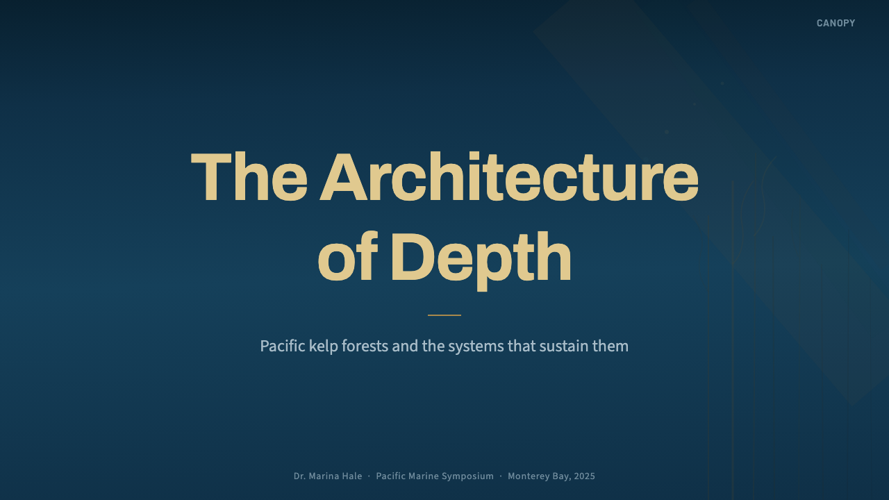
For presentation slides, a cover page benefits from the style's full depth-graded palette: a dark teal ground, a silhouetted kelp canopy rising through the frame, and a single shaft of amber light crossing the title. Content and data slides should pull back from the full illustrative scene and lean on the palette alone — deep teal backgrounds, amber or gold used sparingly as an accent for key figures or callouts, and charts that read like scientific instrumentation rather than decorative infographics. Vertical bar charts and upward-trending line graphs echo the style's kelp-stipe rhythm particularly well.
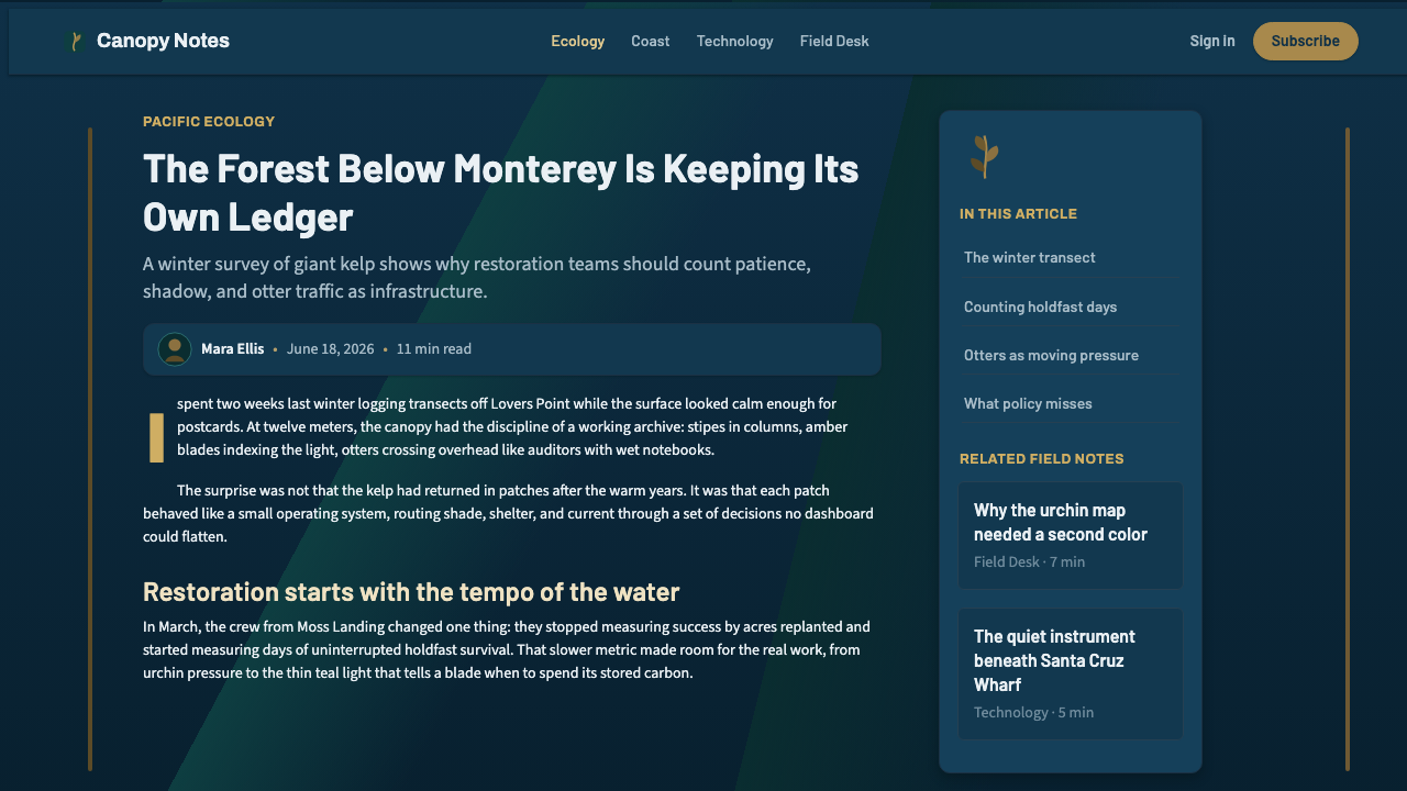
For web interfaces, the style suits dashboards and data-dense tools that want to feel authoritative and current: a dark teal base with depth-graded panels (lighter near the top of a view, cooler as content scrolls 'deeper'), amber reserved for primary actions or alerts, and clean sans-serif type throughout. Pricing pages can use the same depth logic to imply hierarchy — a featured tier sits in the brighter, warmer 'surface' zone while other tiers recede into cooler tones — without resorting to borders or badges to do the same job.
For editorial and marketing work, the style rewards restraint: a single strong image of backlit kelp or a silhouetted otter can carry an entire header, with body copy set in plain, legible type against a calm teal ground. Marketing pages for conservation, science communication, or sustainability-adjacent products benefit most, since the style's credibility depends on the audience recognizing it as accurate rather than merely aesthetic.
A common mistake is rendering the kelp in saturated grass-green rather than the correct golden-brown and amber — an easy shortcut that immediately undercuts the style's scientific credibility with anyone who has actually seen a kelp bed. A related mistake is flattening the depth grading into a single uniform blue, which strips out the light-and-depth structure that gives the style its sense of place and turns it into generic 'ocean' color without the underlying logic.
Pacific Kelp Forest — FAQ
Why is the kelp golden-brown instead of green?
Because that is what it actually is. Kelp is a brown alga, and its dominant pigment, fucoxanthin, masks the underlying chlorophyll and shifts its visible color toward golden-brown and amber rather than the grass-green of land plants. A design that colors kelp bright green is working from assumption rather than observation, and it is the single fastest way to undercut this style's claim to scientific accuracy.
Is this style only appropriate for ocean or environmental brands?
It reads most naturally for ocean, conservation, and science-communication contexts, but the underlying structure — depth-graded surfaces, a single warm accent against a cool ground, clean scientific type, strong vertical rhythm — transfers well to any product that wants to feel grounded, current, and data-literate rather than playful. Dashboards and analytical tools outside the marine world can borrow the palette logic without the literal kelp-and-otter imagery.
How does this style differ from generic 'underwater' or 'ocean' themes?
Generic ocean themes tend to use a flat wash of blue and treat marine imagery as decorative backdrop. Pacific Kelp Forest is disciplined by the specific optics of a real ecosystem: the fucoxanthin-driven amber-brown of the kelp itself, the diagonal shafts of a real water column, and a depth-graded palette that implies an actual light source. The difference is the same as the difference between a stock-photo beach scene and a research photograph — one is atmosphere, the other is observation.
Why does the vertical rhythm matter so much in this style?
Because it is not an arbitrary layout choice — it mirrors how giant kelp actually grows, climbing from a fixed holdfast toward the light at the surface faster than almost any other organism on Earth. Carrying that upward-reaching structure into typography, chart orientation, and page composition is what makes the style feel coherent rather than like a color palette borrowed from a photograph. Layouts that ignore verticality in favor of horizontal sprawl lose that connection to the source ecosystem.
What is the biggest technical trap when adapting this style for a UI?
Losing the depth grading. It is tempting to simplify the palette down to one flat teal for backgrounds and one amber for accents, but the style's sense of place comes specifically from the gradient between them — brighter and warmer near an implied surface, cooler and darker as elements recede. Skipping that gradation in favor of flat, uniform fills produces a palette that looks vaguely oceanic but has none of the structural logic that makes Pacific Kelp Forest recognizable and credible.
Related design styles
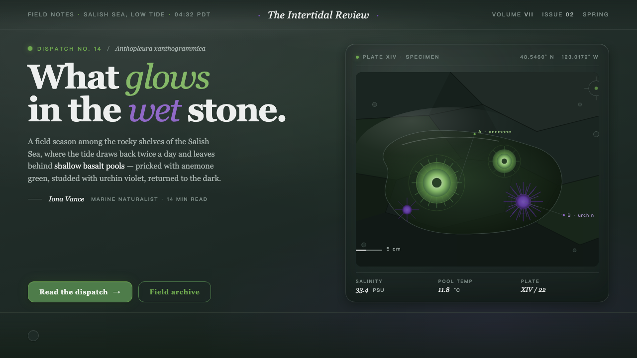 Tide PoolFeels like field notes after rain. Literary serif in basalt black, algal gree…
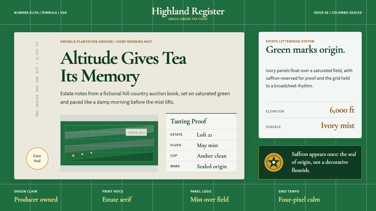 Sri Lanka Ceylon Tea ModernProvenance is emerald. Ivory mist panels and one saffron seal make origin fee…
 Mercury BankQuiet precision wins. Cream paper, charcoal Inter, and one electric-blue spar…
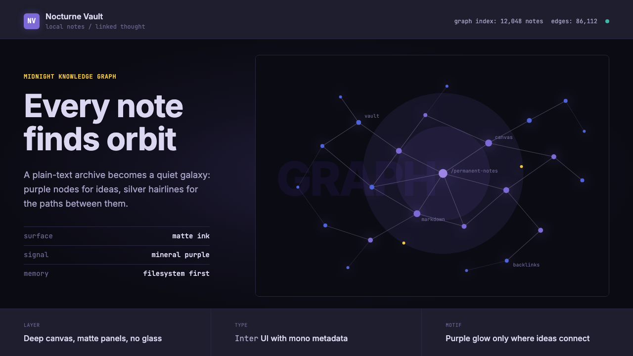 Obsidian Knowledge GraphNetworked thought glows at midnight. Purple nodes and silver hairlines map a…
 Signal Encrypted MessengerCalm privacy, plainly stated. Cobalt Inter type and white space carry the tru…
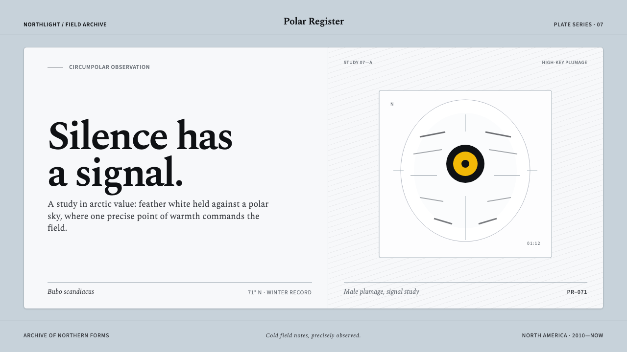 Snowy Owl TundraCold precision, one warm signal. Feather white and charcoal frame a lone lemo…