What is Tide Pool (Intertidal)?
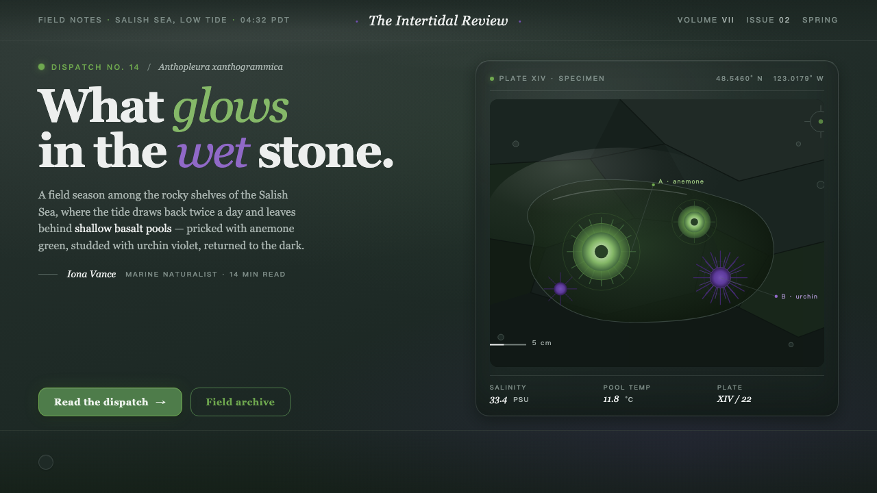
Tide Pool turns a wet Pacific shoreline into an editorial voice: luminous marine color held against reflective basalt darkness.
Tide Pool (Intertidal) in brief
Tide Pool is a contemporary visual style rooted in rocky intertidal ecology and natural-history field documentation. It recalls a Pacific shore at low tide, where shallow pools settle into wet black and dark-olive basalt, giant green anemones flare from crevices, and purple sea urchins appear as concentrated points of life. Its atmosphere is not beachlike, sun-bleached, or nostalgic. It is close, saturated, damp, and observant.
The style translates coastal ecology photography into an editorial system. Near-black stone provides the visual field, while algal green and violet emerge with the intensity of organisms seen through water. Literary serif typography gives this dark, glossy environment a natural-history voice: less like an outdoor brand and more like a field notebook whose observations have been carefully edited, captioned, and preserved.
Tide Pool depends on contrast between enclosure and discovery. Large dark surfaces create the feeling of pooled water and rock depth; green and violet should feel discovered within that darkness rather than spread evenly across it. Gloss, reflection, and organic irregularity add material presence, but the system remains composed. It is a documentarian aesthetic, not a fantasy of the coast.
Where does Tide Pool (Intertidal) come from?
Tide Pool belongs to the present, drawing from contemporary coastal ecology and natural-history field photography rather than from a closed historical design movement. Its setting is the rocky intertidal of the Pacific Northwest, particularly the Salish Sea: a place defined by changing water levels, exposed basalt, shallow marine pools, and organisms that become visible only under particular conditions.
The intertidal zone supplies both the palette and the logic. Wet basalt is dark because it holds water and reflects light; the pool is not an empty background but a frame that makes marine life legible. Green anemones and purple urchins appear with unusual force precisely because the surrounding stone is so deep and glossy. Tide Pool preserves that ecological relationship instead of treating its colors as detached decoration.
Natural-history field documentation supplies the style's editorial character. Field work asks the viewer to notice, identify, compare, and record. In visual terms, this favors captions, measured hierarchy, literary type, and a sense that an image or object has been encountered in situ. The style should feel attentive to specimen, surface, and habitat, even when it is used for a contemporary interface or publication.
California Academy of Sciences community science and the work of Salish Sea naturalists provide the project’s stated civic and observational frame. The giant green anemone, Anthopleura xanthogrammica, and the purple sea urchin, Strongylocentrotus purpuratus, function as living visual anchors. Their green and violet presence gives the system its concentrated moments of illumination within the wet darkness of the shore.
What defines the Tide Pool (Intertidal) look?
Wet Basalt Ground
The dominant field is basalt black shifting toward dark olive, with the density and reflectivity of stone after rain or immersion. It should feel sealed by water rather than matte, dusty, or theatrical. Dark space is active habitat: it holds reflections, isolates content, and gives brighter elements a reason to glow.
Marine Illumination
Algal green and urchin violet are not broad decorative fills. They are concentrated signals, like anemones and urchins encountered against wet rock. Green suggests marine growth and exposure; violet brings depth and puncture. Their saturation is most effective when the surrounding field remains restrained and dark.
Literary Serif
Typography carries the voice of a natural-history publication rather than a technical dashboard or casual lifestyle journal. A literary serif gives titles, notes, and labels the gravity of observation. It should remain calm and readable, allowing the stone-like background and marine accents to provide drama instead of forcing expression through ornamental type.
Reflective Surface
Gloss is essential because it evokes wet rock and shallow seawater. Reflections should be controlled, local, and slightly irregular, as if light has caught a film of water. The result is material presence, not luxury polish: surfaces feel ecological and close to touch rather than metallic, synthetic, or glassy in a generic way.
Field-Note Hierarchy
Information should be arranged like observations gathered in the field: a clear primary finding, supporting notes, names, and contextual details. Labels and captions are part of the visual language, not afterthoughts. Spacious dark intervals let entries feel discovered one by one, while serif hierarchy keeps the page legible and editorially deliberate.
Organic Restraint
The style welcomes irregular edges, pooled forms, and biological cues, but it does not become loose or decorative. Every organic gesture should recall an actual shoreline condition: a crevice, a reflective patch, a clustered organism, a tide line. This restraint distinguishes field-documentary intensity from tropical fantasy or generalized ocean branding.
Who shaped Tide Pool (Intertidal)?
California Academy of Sciences community science provides Tide Pool with a participatory natural-history frame. Its relevance is not a fixed visual signature but an ethic of close observation: ordinary viewers can contribute to noticing, documenting, and understanding living coastal systems.
Salish Sea naturalists represent the local field-observation perspective behind the style. Their presence keeps the visual language tied to habitat and attentive looking, so the shore is understood as a living intertidal environment rather than a scenic backdrop.
The giant green anemone is the source material’s vivid green anchor. Against wet, near-black basalt, it demonstrates the central Tide Pool contrast: a living, saturated organism appearing with startling clarity from a dark reflective setting.
The purple sea urchin gives the system its deep violet counterpoint. Its color introduces a denser, more submerged kind of brightness than green, helping Tide Pool move beyond a simple botanical palette into a marine ecology of dark stone and concentrated life.
How do you use Tide Pool (Intertidal) today?
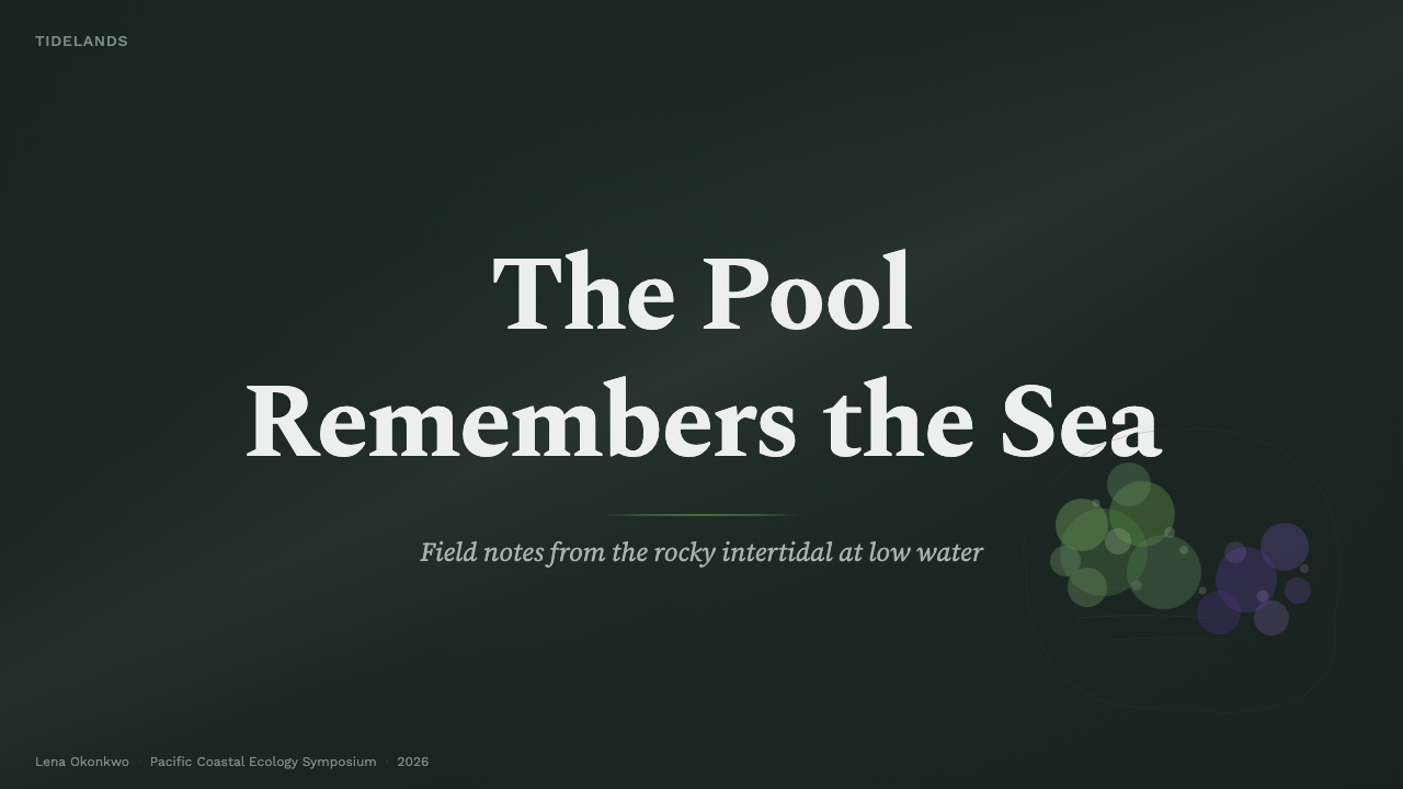
For presentation covers, Tide Pool works best as a single encounter: a broad wet-dark field, one luminous marine accent, and a literary serif title with generous breathing room. The cover should suggest a specimen or observation emerging from a tide pool. Avoid filling every area with texture; darkness is the compositional device that creates focus.
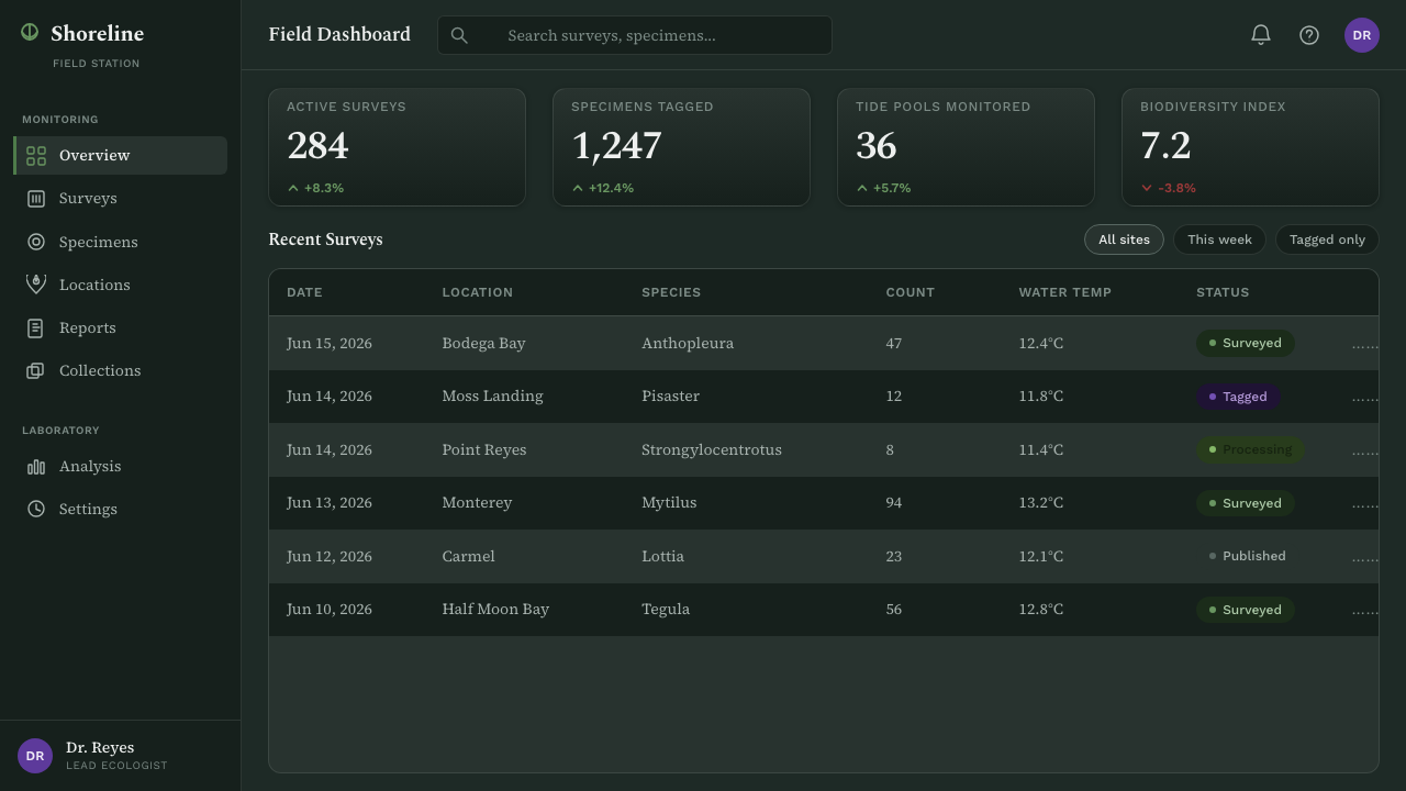
Content and data slides benefit from the style’s field-note hierarchy. Use the dark ground to separate findings, captions, and supporting evidence, then reserve green and violet for key distinctions or selected data states. Charts should read as observed patterns rather than as decorative infographics. Clear labeling is especially important because the palette is atmospheric and must not obscure meaning.
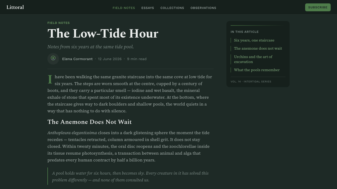
In web interfaces, Tide Pool suits research dashboards, collections, membership pages, and pricing experiences that need depth without corporate sterility. Build navigation and body copy around a readable serif-led editorial system, and use bright marine accents for active states, selected records, or actions that deserve attention. Reflective surfaces should remain quiet enough that controls still feel dependable.
For editorial and marketing work, the style is strongest when it tells a story of encounter and place. Long-form articles can pair literary headings with specimen-like captions, dark image fields, and carefully spaced notes. Campaigns can use the wet-rock atmosphere to make sustainability, observation, discovery, or coastal knowledge feel tangible, provided claims remain as specific as the visual language.
The common mistake is turning Tide Pool into generic dark ocean design: bright gradients everywhere, sandy textures, tropical motifs, or neon accents with no ecological role. Another mistake is treating green and violet as equal all-purpose brand colors. Let basalt darkness lead, let the serif voice organize, and let each bright color appear as a meaningful discovery.
Tide Pool (Intertidal) — FAQ
Is Tide Pool simply a dark nature style?
No. Its darkness has a specific environmental role: it is wet basalt and pooled seawater, not a generic dramatic backdrop. The style works when bright life appears within that habitat and when typography turns the scene into observation. Removing those relationships leaves only a dark palette, not Tide Pool.
Can the style use photography?
Yes, especially imagery that retains the close, saturated, field-documentary quality of coastal ecology photography. Favor wet surfaces, shallow water, rock crevices, and organisms in context. Images should support noticing and identification, rather than becoming broad scenic decoration or a travel-postcard view of the coast.
Why use a literary serif in such a dark visual system?
The serif shifts the mood from spectacle toward documentation. It makes headings, captions, and observations feel connected to natural-history publishing and field notes. Without that editorial voice, reflective dark surfaces and saturated marine accents can easily drift into entertainment, luxury, or generic digital atmospherics.
Where does Tide Pool struggle?
It can struggle where a light, playful, dry, or highly neutral tone is essential. The style carries moisture, darkness, locality, and sustained attention, so it may feel too intense for cheerful mass-market messaging or interfaces that need visual invisibility. Its strongest applications have room for observation, context, and atmosphere.
Related design styles
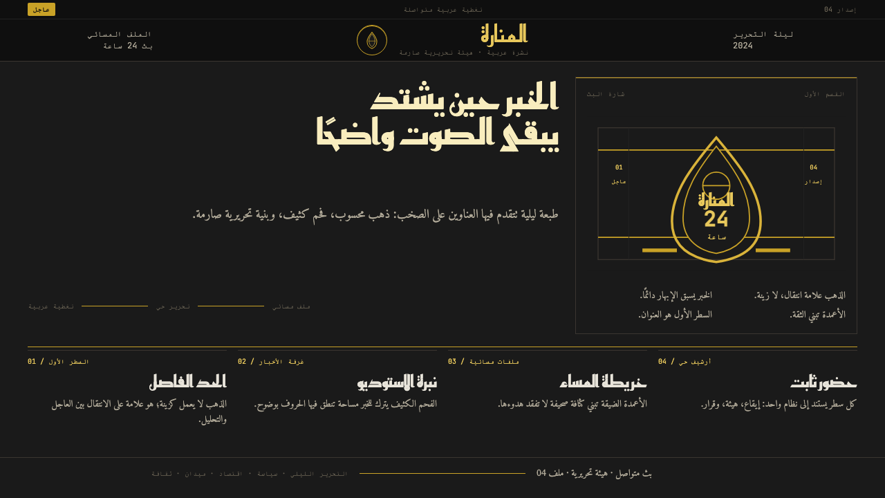 Al Jazeera Arabic NewsAuthority, stripped bare. Gold seal, dense Arabic type, matte charcoal.
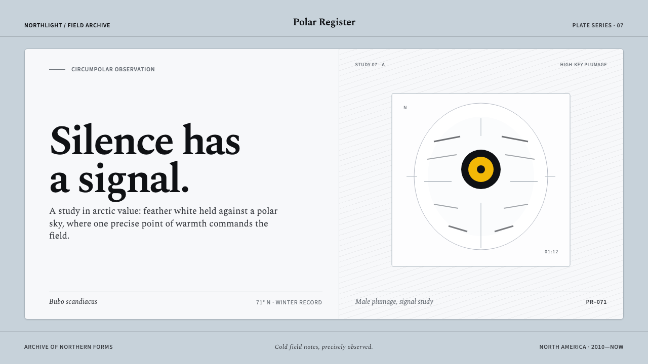 Snowy Owl TundraCold precision, one warm signal. Feather white and charcoal frame a lone lemo…
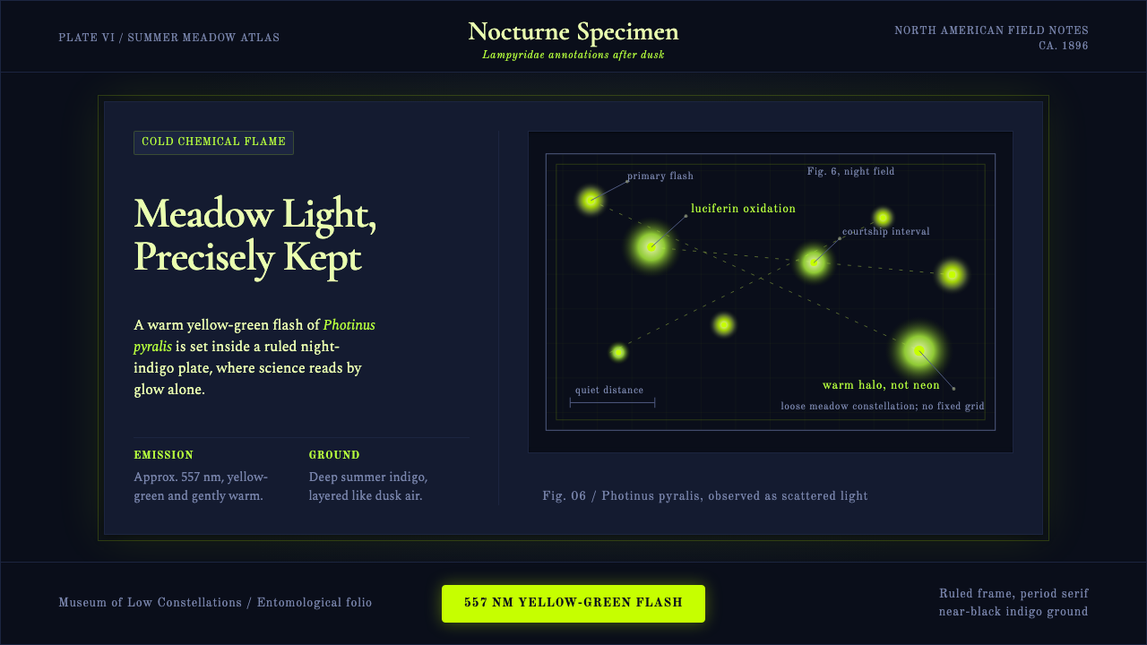 Firefly BioluminescenceQuietly luminous. Yellow-green 557 nm sparks drift through ruled indigo plate…
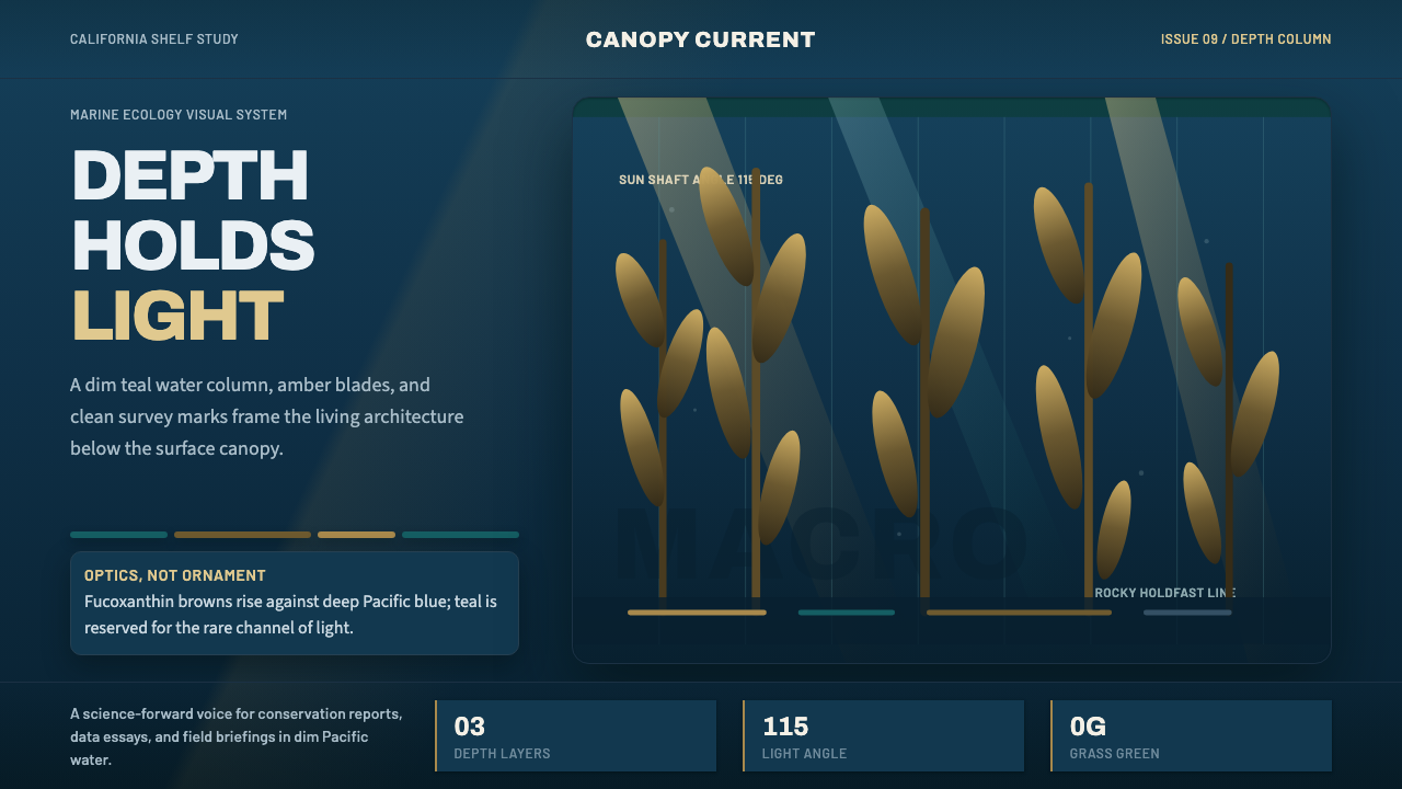 Pacific Kelp ForestScientific depth. Teal water, amber shafts, and vertical kelp rhythm carry th…
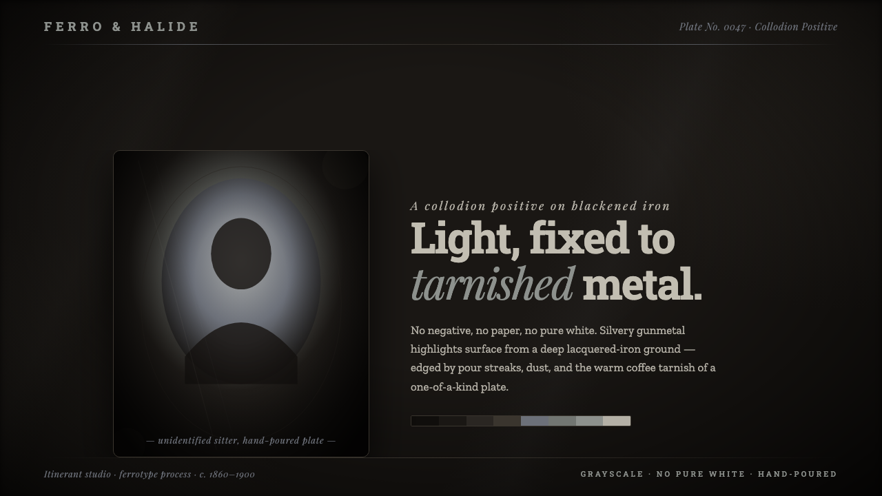 Tintype Wet PlateLight fixed to tarnished metal. Gunmetal grays rise from blackened iron, capp…
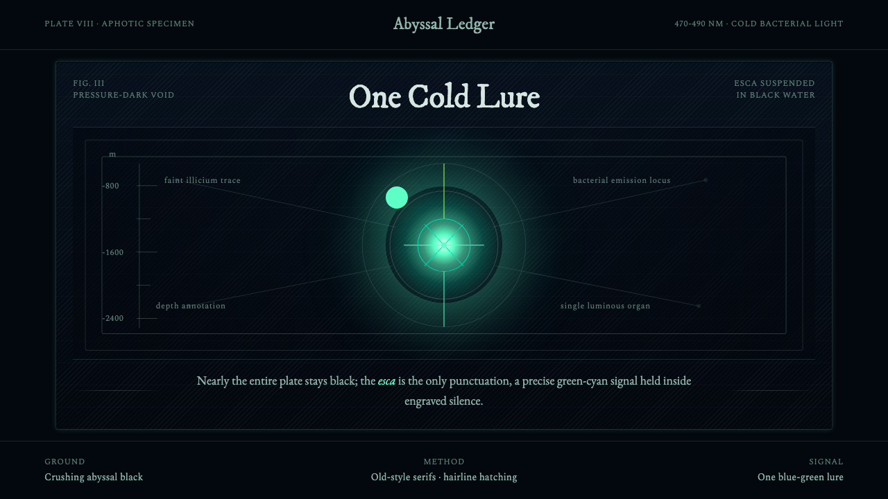 Anglerfish Lure BioluminescenceLight is scarce. Old serifs and hairline rules frame one cold green-cyan lure.