What is Rapa Nui Rongorongo Glyph?
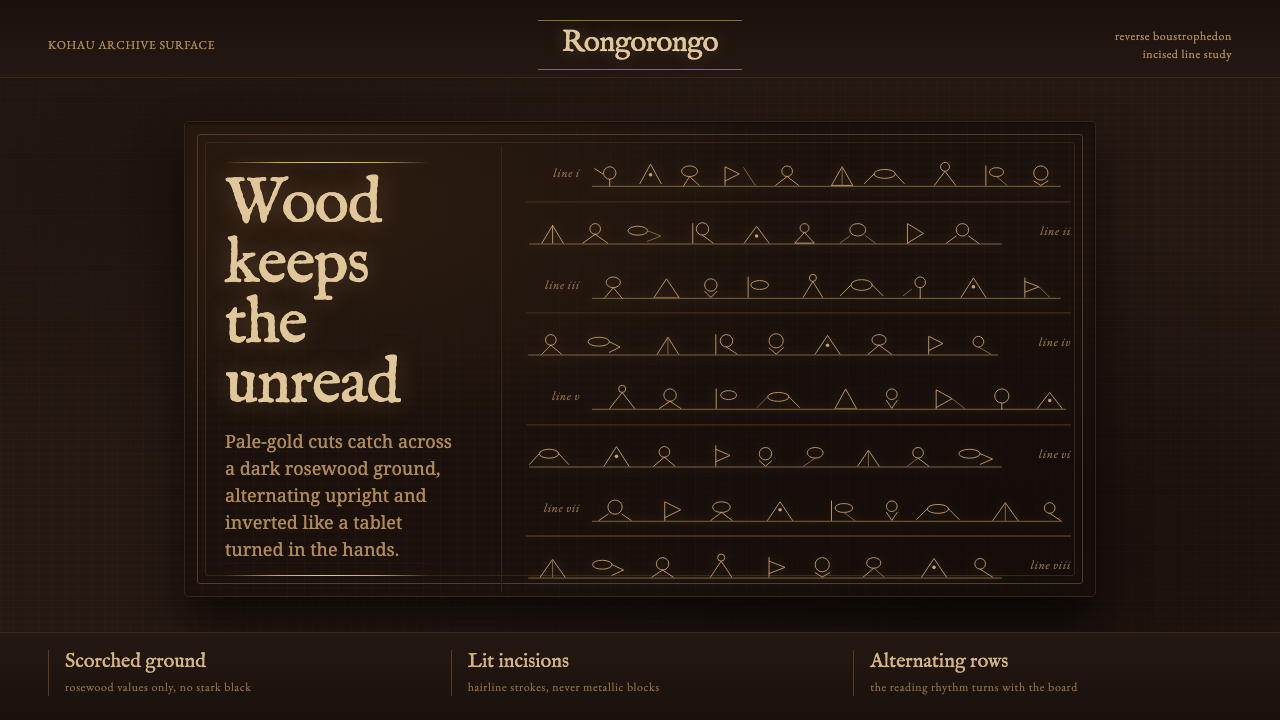
The unread glows: pale-gold incisions turn across the charred darkness of rosewood, carrying a script whose visual order survives even where its language does not.
Rapa Nui Rongorongo Glyph in brief
Rongorongo is the only known script of pre-contact Oceania. Its surviving form is inseparable from the kohau rongorongo tablet: dark Pacific rosewood marked with compact rows of standardized bird-man and anthropomorphic glyphs. The signs are not loose illustrations scattered over a surface. They form a disciplined written field, repeated across an object whose grain, age, oiling, and damage remain visible alongside the incision.
The script has not been translated. That absence is central to its visual character rather than a gap to be disguised. Rongorongo offers no confirmed verbal message for a contemporary designer to summarize, no dependable alphabet to turn into decorative text, and no license to invent meanings for individual glyphs. What can be seen with certainty is a system of carved marks, arranged in alternating rows and made legible by the changing angle of light on cut wood.
Its defining visual event is material contrast. Freshly cut edges catch a pale-gold glow against a near-black ground, while the surrounding wood remains irregular, oiled, darkened, and sometimes fire-scorched. A faithful Rongorongo-derived composition therefore treats brightness as the exposed edge of an incision. It does not turn glyphs into solid metallic symbols or strip the board into a seamless digital surface.
Where does Rapa Nui Rongorongo Glyph come from?
The Rongorongo script tradition belongs to Rapa Nui, also known as Easter Island, in Oceania. The surviving kohau rongorongo tablets date to the period before 1900, while the script remains undeciphered in the present day. That paired condition matters: the artifacts are historical objects, but their visual system is not a closed historical lesson. It continues to confront viewers as writing whose formal discipline can be observed without claiming access to its reading.
Its makers worked directly into dark Pacific rosewood. Obsidian flakes and shark teeth were used to incise the small glyphs, producing marks that are physically cut rather than applied on top. This is why surface quality cannot be separated from the script. The glyphs occupy the wood as grooves, and their visibility shifts with wear, oil, scorching, and the light caught by their newly exposed edges.
Rongorongo is organized through reverse boustrophedon. A line is read in one direction; the tablet is then turned over through a half rotation to read the following line. As a result, the rows alternate between upright and inverted glyphs down the board. The system creates a rhythm unlike a conventional page: orientation changes are not errors or visual flourishes, but part of the reading structure itself.
The named custodians in the source tradition are the tangata rongorongo, described as scribe-reciters. Their title joins inscription and recitation, but the surviving visual fact remains the tablet and its carved rows. For contemporary interpretation, that is an important boundary: the style can honor the material, orientation, density, and unresolved character of the script without pretending to restore, translate, or complete what has not been deciphered.
What defines the Rapa Nui Rongorongo Glyph look?
Incised Light
The brightest marks should read as light catching the edges of carved grooves. Their pale-gold quality is narrow, broken, and directional, never a uniform metallic fill. A glyph becomes visible because the surface has been cut, not because a luminous symbol has been placed upon it.
Dark Rosewood Ground
The ground is close to black but materially alive. It carries the impression of dark Pacific rosewood that has been oiled, aged, and at times scorched. Grain, uneven darkness, and wear are evidence of an object, not defects to be polished away.
Alternating Orientation
Rows should acknowledge reverse boustrophedon by changing orientation from one line to the next. Upright and inverted glyphs create a measured turning rhythm down the field. This alternation must feel systematic and quiet, never like a random rotation effect.
Standardized Glyph Rows
Bird-man and anthropomorphic glyphs belong in compact, continuous rows rather than isolated emblem positions. Their repetition creates the authority of a script. Preserve the sense that each mark participates in a larger sequence, even when the sequence cannot be read.
Carved Irregularity
The marks should remain fine and incision-like, with subtle variation that suggests work done by cutting into wood. Perfectly smooth vector uniformity weakens the material premise. Irregularity here is not noise; it is the visual consequence of a physical tool meeting a resistant surface.
Unresolved Meaning
Rongorongo should not be treated as a cipher ready for speculative captions or invented translations. Its undeciphered status creates restraint: glyphs can organize attention, atmosphere, and rhythm, but they should not be presented as confirmed words, slogans, or labels.
Who shaped Rapa Nui Rongorongo Glyph?
The named human role in the source tradition is the tangata rongorongo, identified as a scribe-reciter. The title locates Rongorongo in a practice that joined carving and recitation, while avoiding any unsupported claim about the content of the inscriptions.
The kohau rongorongo tablet is the surviving object through which the script is encountered. Its dark rosewood surface, aged and often fire-scorched, is not merely a support for glyphs; it determines how the incisions catch light and how the writing is visually perceived.
Rapa Nui, or Easter Island, is the Oceanian setting named for the Rongorongo script tradition. In design use, the place should be treated as the origin of a specific material and written tradition, not as a generic backdrop for vaguely tropical or archaeological decoration.
How do you use Rapa Nui Rongorongo Glyph today?
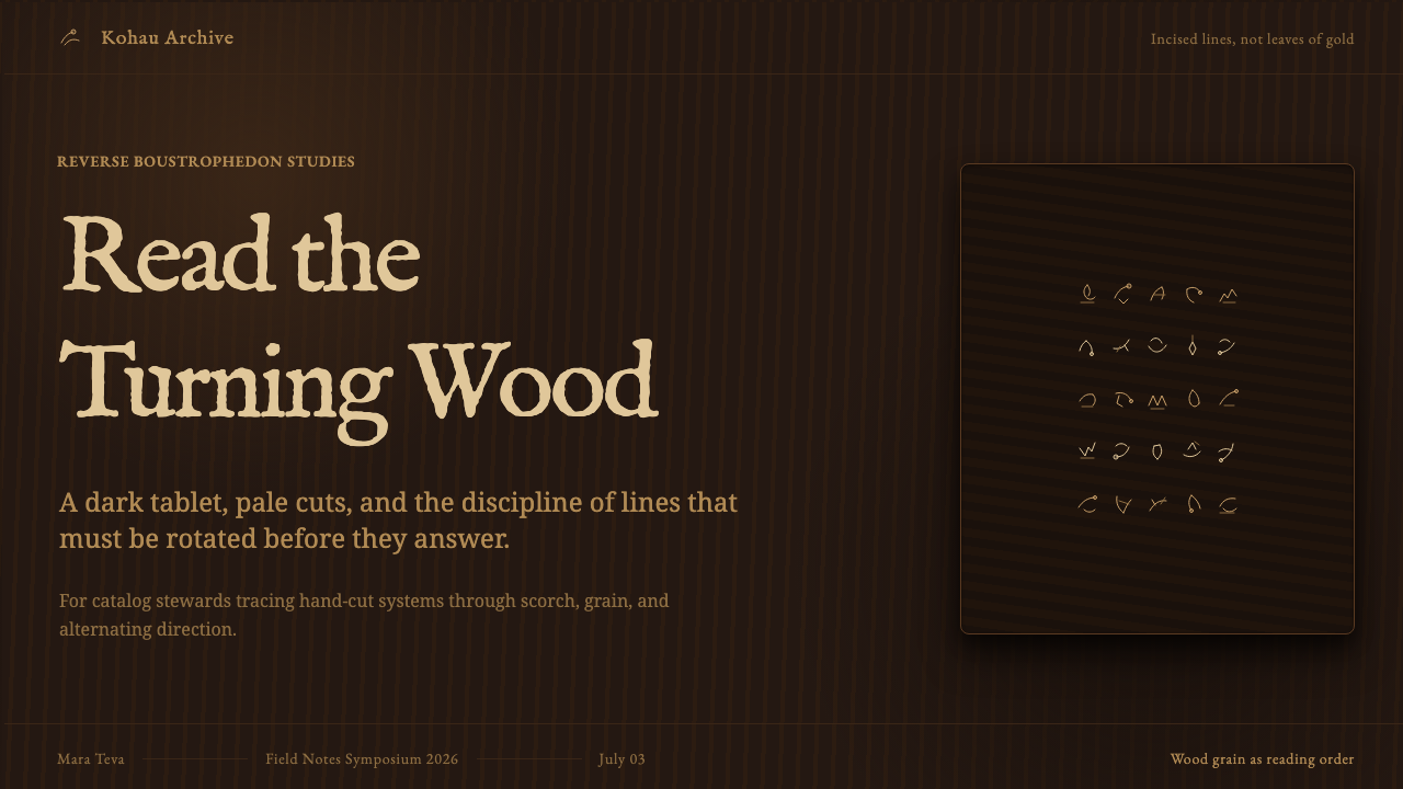
For presentation covers, use the tablet as the primary compositional logic. Set a dark, materially varied field and let one or several carved rows cross it with ample surrounding quiet. A title should remain secondary to the incised field, placed with restraint so it does not impersonate a translation of the glyphs. On content slides, use horizontal bands and alternating orientation as structural cues, while keeping ordinary explanatory text clearly distinct from Rongorongo marks.
For data slides, the most useful borrowing is sequential rhythm rather than pseudo-script ornament. Repeated rows can frame categories, guide movement through a process, or separate related observations. Charts should remain plainly legible in their own contemporary type system. The carved glyph treatment belongs to the contextual surface and should never replace labels, values, legends, or information that viewers need to understand accurately.
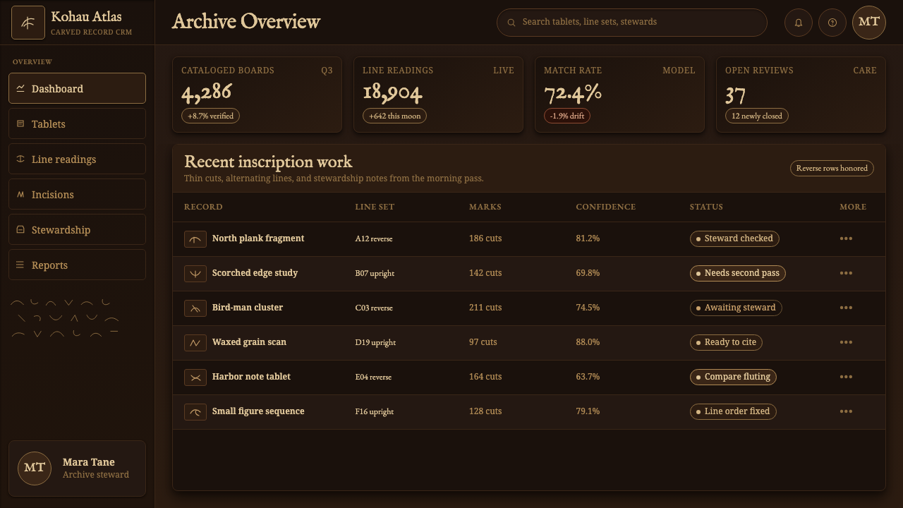
For web interfaces, this language suits immersive archives, exhibitions, scholarly gateways, cultural storytelling, and focused editorial experiences more readily than dense transactional products. A dashboard can use dark rosewood-like panels, restrained pale incision accents, and row-based grouping for sections or activity streams. A pricing page can borrow the atmosphere only carefully: pricing, terms, and calls to action must remain direct, accessible, and visually separate from undeciphered glyph imagery.
For editorial and marketing work, treat imagery as an object study rather than a decorative pattern library. Large cropped fields of dark wood, close views of incised rows, and spacious explanatory copy can establish a tactile, contemplative pace. Marketing language should foreground the fact of an undeciphered script and the material reality of carving, rather than promising secret meanings or positioning the glyphs as exotic shorthand.
The common mistake is to convert Rongorongo into clean gold iconography on flat black. That approach removes the rosewood, the groove, the alternating orientation, and the unresolved status that make the source distinctive. Another serious error is inventing translations, assigning fixed meanings to glyphs, or using them as decorative text. If a design needs readable words, use a clearly separate contemporary typeface and let Rongorongo remain what it is: visible, ordered, and unread.
Rapa Nui Rongorongo Glyph — FAQ
Has Rongorongo been translated?
No. The provided material states that no kohau rongorongo tablet has ever been translated and that the script remains undeciphered to the present day. Designers should not assign confirmed meanings to individual glyphs or use invented translations as explanatory content.
Why do adjacent rows appear upright and inverted?
The rows follow reverse boustrophedon. After reading a line in one direction, the tablet is turned through a half rotation to read the next line. The alternating orientation is therefore part of the script's reading arrangement, not an arbitrary visual effect.
Should Rongorongo glyphs be rendered as solid gold symbols?
No. The source material describes pale-gold light along freshly cut incision edges on dark wood. The effect comes from a groove catching light, so a faithful interpretation keeps the marks thin, carved, and materially connected to the near-black rosewood ground.
What kinds of projects are appropriate for this visual language?
It is most appropriate where material history, close looking, and careful contextual explanation are central: archives, exhibitions, cultural storytelling, editorial features, and scholarly interfaces. It is less appropriate when undeciphered glyphs would be mistaken for functional labels, instructions, or branding shorthand.
How can a designer avoid turning Rongorongo into generic mystery imagery?
Keep the design anchored to the provided facts: Rapa Nui origin, dark rosewood, physical incision, pale edge-light, standardized glyph rows, reverse boustrophedon, and an undeciphered script. Avoid fabricated messages, ornamental scattering, polished technology surfaces, and claims that the glyphs disclose meanings they have not been shown to disclose.
Related design styles
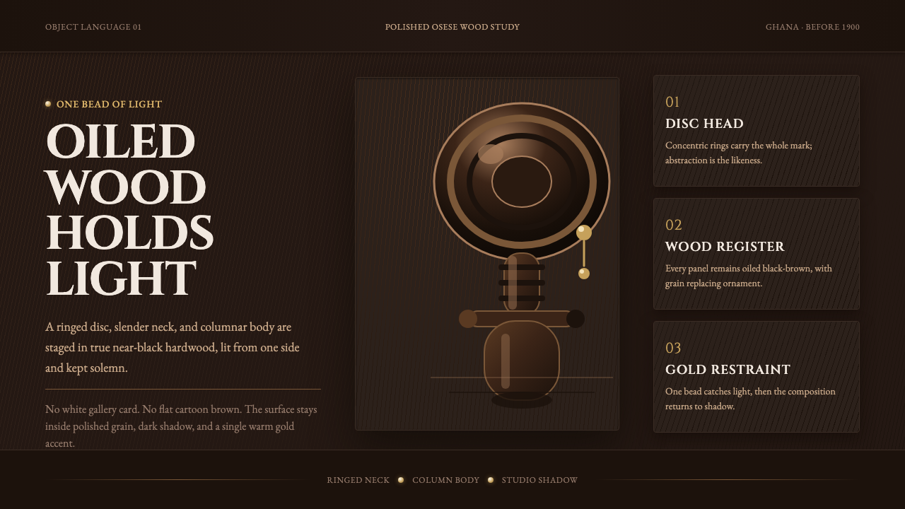 Akuaba Akan Fertility DollDarkness becomes sculpture. Near-black wood, ringed geometry, and one gold be…
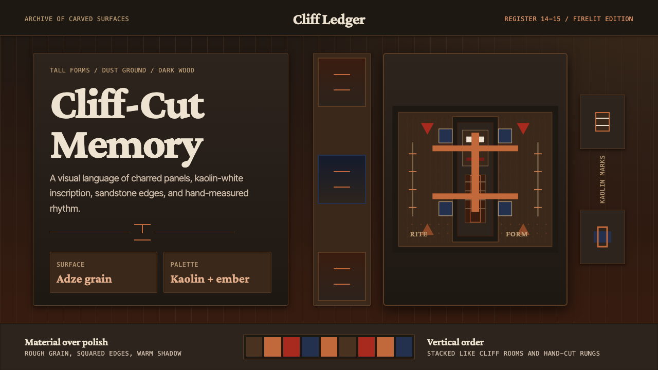 Dogon Bandiagara Cliff MaskHand-hewn gravity. Charred wood, kaolin type, and sandstone geometry stack li…
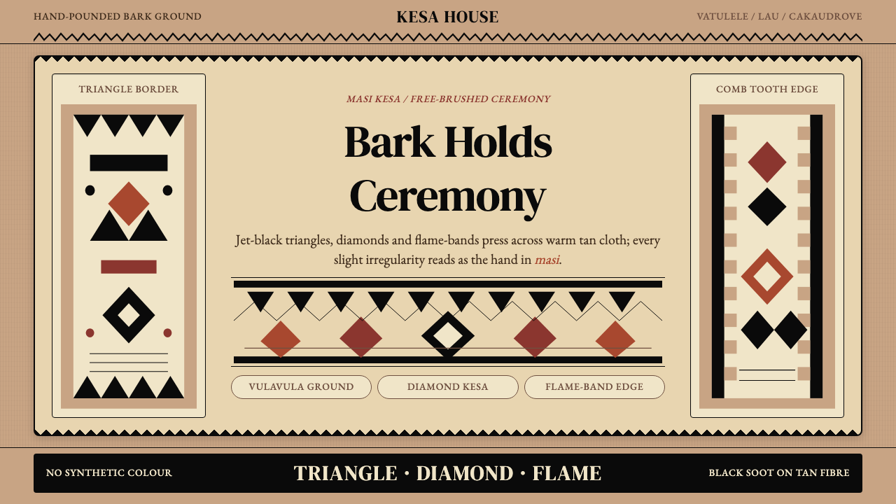 Fijian Masi (Tapa Cloth)Ceremony hits in black. Tan bark ground carries diamonds, zigzags and flame-b…
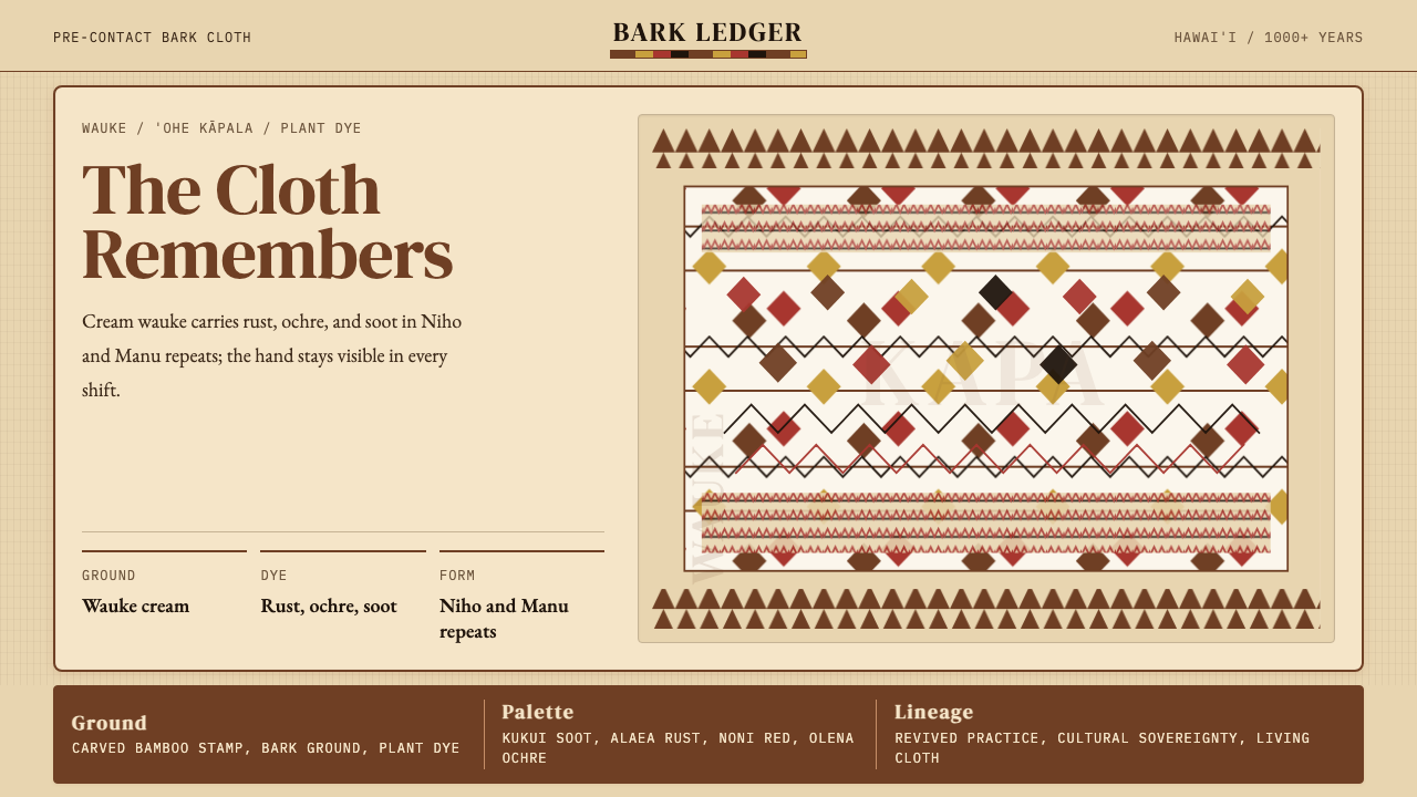 Hawaiian Kapa (Bark Cloth)Ceremonial geometry. Cream wauke, rust, ochre, and soot stamped in repeat.
 Lithuanian Amber (Baltic Pagan)Ancient amber glows. Honey resin on smoked oak, framed by saulė geometry.
 Māori Koru Spiral (Aotearoa)Carved, not drawn. Totara brown, pounamu green, and mirrored koru geometry ca…