What is Queenslander House?
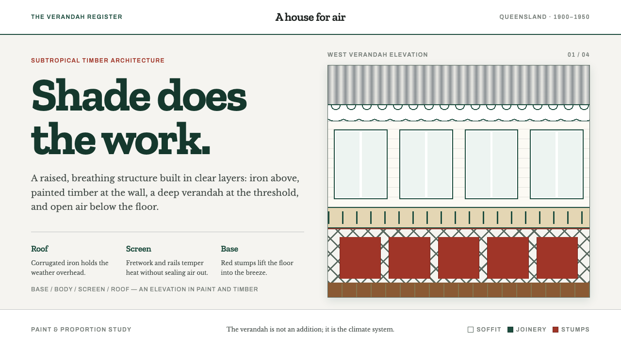
The Queenslander is a house that solved its climate first and became beautiful second — a raised timber body wrapped in shade, built layer by layer from base to roof.
Queenslander House in brief
The Queenslander is the traditional timber house of Queensland, Australia, and the design system named for it takes the house's logic as its layout principle. The house is raised on stumps so that air can move beneath the floor, wrapped on two or three sides by a deep verandah, clad in weatherboard and V-jointed (VJ) board, and vented through lattice and fretwork valances cut with a jigsaw at the local joinery mill. Every part answers a problem of heat or rain; the beauty is what the answers add up to.
The style's motto could be the line from its own description: shade is the architecture. In a Queenslander the verandah is not an add-on but a room, and the shaded zone around the body — the space between the sun and the wall — is the main thing the builder designs. Seen from the street, the elevation reads as stacked horizontal layers: a base of stumps and lattice, a body of boards, a screen of verandah posts, balustrade and fretwork, and a roof of corrugated metal.
That stacking is the style's central idea. Its palette is documented, not invented: muted greys, stark whites and soft biscuits on the body; Brunswick green and Indian red held back for joinery, balustrades and window hoods; galvanized iron overhead; oiled hardwood underfoot. The result is an interface language that is horizontal, shaded and breathable — calm across large surfaces, and saving its deepest colors for the small parts people touch and see up close.
Where does Queenslander House come from?
The Queenslander is dated in the record to 1900–1950, the Federation and inter-war years, but it is built on late-nineteenth-century precedent. Builders in Queensland had learned that a house copied from a cooler country fitted a subtropical climate badly: heavy masonry held heat, closed rooms were stifling, and floors at ground level invited damp. The solution that spread was lighter and more open — a timber frame lifted off the ground, with generous openings and shade on the sides that faced the sun.
Three strands feed into the form, and the source record names all three. The first is the colonial verandah tradition, in which a covered gallery shades a building's walls. The second is Federation and Edwardian domestic architecture, which brought a more considered sense of composition, roof form and detail to ordinary houses in the early twentieth century. The third is an Australian subtropical vernacular: the accumulated practice of builders adapting what they knew to Brisbane, Toowoomba, Rockhampton and Townsville — towns that differ in rainfall, temperature and elevation but share the need to manage heat and storm rain.
Individual designers mattered too. Richard Gailey and Robin Dods are the two names the record carries. Gailey belongs to the nineteenth-century generation of Brisbane architect-builders on whose precedent the later house rests; Dods belongs to the Federation generation that refined the timber house into a considered piece of architecture without abandoning its climate logic. Between them, the house moved from a practical builder's solution to a recognized domestic type.
The local joinery mill is the unsung author. Fretwork valances, lattice panels and balustrade patterns were cut at the mill, which put decoration within reach of ordinary homes and made it part of the house's ventilation. This is the origin of a distinctive trait designers can borrow: ornament that works. A jigsaw-cut valance lets warm air escape and frames the edge of the verandah; it is decorative and functional at once. The design system keeps both halves of that sentence.
What defines the Queenslander House look?
Base, Body, Screen, Roof
The page is built the way the house is: a base, then a body, then a screen, then a roof, stacked as horizontal bands. Each band has its own material and its own job. The base is open and airy, the body is the calm surface where content lives, the screen filters and frames, and the roof caps everything with a single clear edge. Order is vertical and legible, and no band pretends to be another.
The Deep Verandah
Shade is the architecture. A deep verandah wraps two or three sides of the body and turns the edge of the building into a usable room. In layout terms it is the generous margin and the sheltered in-between zone: content never presses against the outer edge but sits behind a band of calm space that cools the whole composition. Depth is created by shelter, not by drop shadows.
Weatherboard and VJ Board
Walls are clad in weatherboard, laid in overlapping horizontal courses, and in VJ board, a tongue-and-groove lining with a fine V-shaped groove at each joint. Together they give surfaces a quiet, regular line texture. In an interface, this is a rhythm of fine horizontal and vertical divisions rather than a flat fill — structure you can feel at the edge of your attention without any single stripe calling for it.
A Documented Palette
The body of the house wears muted greys, stark whites and soft biscuits — pale, sun-faded neutrals that keep the large surfaces cool and unassertive. The palette is documented rather than invented, drawn from how these houses were actually painted, which is why it feels settled and believable. The neutrals carry the bulk of the page; color is something that has to be earned by a small part.
Held-Back Green and Red
Brunswick green, a deep and slightly bluish green, and Indian red, an earthy brick-leaning red, are reserved for joinery, balustrades and window hoods. They appear on the small, touched parts of the building and never as walls. In design terms they are for edges, rails, tabs, focus states and small structural details. Used sparingly they look like the trim of a house; used as fills they stop being trim and start fighting the body.
Fretwork and Lattice
Jigsaw-cut valances and lattice, produced at the local joinery mill, are the house's ornament and its ventilation at once. They are patterns with a purpose: openings that let warm air out while framing the verandah's edge. In this style, a decorative pattern is justified only if it does something — separates, frames, filters or lets the layout breathe. Pattern never fills a space merely to look busy.
Metal Above, Timber Below
Galvanized iron overhead and oiled hardwood underfoot give the composition a clear top and bottom. The roof is cool metal with a ridged, corrugated rhythm; the floor and steps are warm timber with the grain showing. The pairing makes a vertical temperature gradient — cool at the top, warm where you stand — which sets the house apart from any flat, single-material treatment and anchors the stack of layers.
Who shaped Queenslander House?
Dods is the architect most closely associated with the Federation-era Queensland house as a considered work of architecture. His name stands for the moment when the practical timber house, already shaped by heat and rain, was given deliberate composition: proportion, roof form and detail in the service of climate. For a designer he represents the argument that responding to conditions and making something beautiful are the same act.
Gailey belongs to the earlier, colonial-era generation of Brisbane architects and builders, the nineteenth-century precedent on which the later Queenslander rests. His place in the record points to the long history behind the style: the verandah, the raised floor and the timber frame were worked out by practice before they were fashionable, and the Federation house inherited a solved problem.
The joinery mill supplied the fretwork valances, lattice, balustrades and window hoods that give the Queenslander its detail. It is a figure of production rather than a single person: the place where a vernacular became a repertoire of standard, buildable parts. Its legacy in the design system is the idea that ornament should be a made, repeatable component, cut for a reason, and not a one-off flourish.
The colonial verandah tradition supplied the house's defining space. A covered gallery that wraps the building shades the walls, cools the rooms, shelters people from rain and doubles as living space. It is the source of the style's central layout idea: a deep zone of shelter between the world and the content, where the edge of the composition does real work.
How do you use Queenslander House today?
The Queenslander style suits work that wants to feel open, shaded and unforced: architecture and landscape practices, travel and regional tourism, outdoor and climate-minded brands, home and renovation services, local government and community projects, and any product whose message is that it is sensibly built for its conditions. It is horizontal by nature, so it favors content that can be organized in bands and read left to right and top to bottom.
On a cover slide, stack two or three broad horizontal bands — a pale roof line at the top, a calm body of neutral with the title set in it, and a thin base — and let the deep green or red appear only as a slim rule or a single small detail. Content slides should keep a generous margin that behaves like a verandah, and sections can be separated by fine board-like lines instead of boxes. For data slides, use stacked horizontal bars or banded charts that echo courses of boards, with the neutral palette for most series and one joinery color for the highlight.
On the web, the layered model maps cleanly to page structure: a light, open header as the roof line, a navigation strip as the screen, the content body in calm neutrals, and a footer that behaves like the stumps and lattice — open, airy, giving the page a visible foundation. Dashboards can organize panels into bays under a continuous top edge. A pricing page can present tiers as bays of the same house, with the deep green or red reserved for the border, the tab or the button edge of the recommended plan.
In editorial and marketing work, the style gives a warm but disciplined voice. Long-form pieces can use a wide verandah-like margin for captions and notes, board-line dividers, and photographs of real timber, iron and shade. Regional and community marketing benefits from the palette's believability, because it was drawn from real paint practice. Keep copy plain and place-specific; the style respects people who know the conditions it was built for.
The most common mistake is to treat Brunswick green and Indian red as brand colors and flood whole sections with them. In the house they are trim; as walls they turn the system into something heavy and costume-like. A second mistake is to add clip-art fretwork borders that do nothing — in a Queenslander, ornament is justified by ventilation or framing. A third is to slide toward generic 'rustic farmhouse' styling with distressed wood textures and handwritten fonts. The Queenslander is cool, orderly and carefully built; its nostalgia, if any, is for sensible design.
Queenslander House — FAQ
What exactly is a Queenslander?
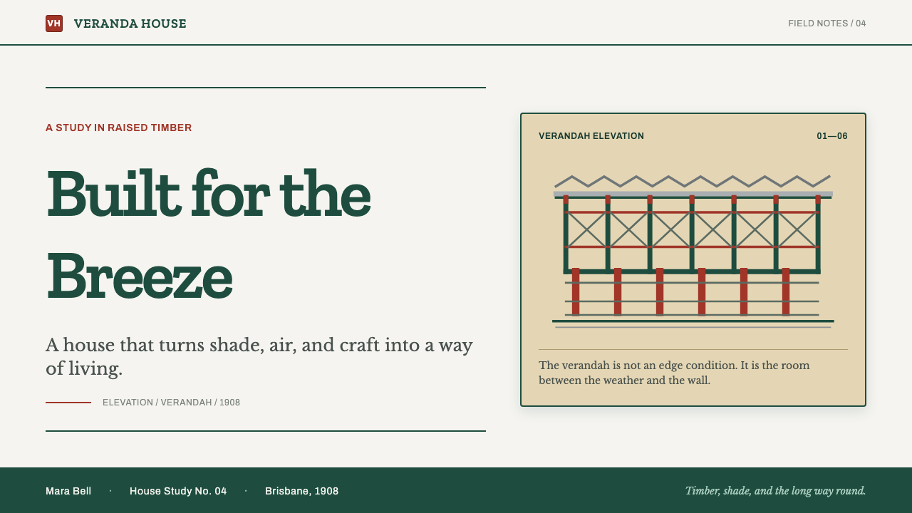
A Queenslander is the traditional timber house of Queensland, Australia. It is raised on stumps, wrapped on two or three sides by a deep verandah, clad in weatherboard and VJ board, and topped with a roof of galvanized iron. The record dates the type to 1900–1950, built on late-nineteenth-century precedent, and ties it to cities and towns such as Brisbane, Toowoomba, Rockhampton and Townsville. As a design system, it borrows the house's layered, shaded logic.
Why is the house raised on stumps?
So that air can move underneath. Lifting the floor off the ground keeps the house cooler, lets breezes carry heat away and keeps the floor away from ground damp. The raised body also lets the house be vented through lattice at the base. In design terms, the stumps give the page an open, breathable foundation: the lowest band is not a solid slab but something with air in it.
What is VJ board?
VJ board is a tongue-and-groove timber lining board with a small V-shaped groove at each joint, which is where the name comes from. It gives a wall a fine, regular line pattern. Alongside overlapping weatherboard, it is one of the two cladding types that define the body of the house, and in design it translates to a quiet rhythm of fine divisions instead of a flat fill.
Where do Brunswick green and Indian red belong in a layout?
Only on the small, touched parts. In the house they are used for joinery, balustrades and window hoods, never for walls. In a layout that means borders, rails, tabs, focus states, icons and the edge of a button, not backgrounds. If the page feels heavy or costume-like, the green or red is probably covering too much area; return it to trim and let the neutrals carry the body.
Is this style only for Australian or heritage-themed projects?
No. The house is the source, but the principles are general: layered horizontal structure, deep margins that act like shelter, a calm neutral body, and small, well-chosen accents. Any project that wants to feel open and climate-aware can use them. The design system should not be used to imitate the place — it works best when it brings the house's reasoning to a different subject, not its costume.
Related design styles
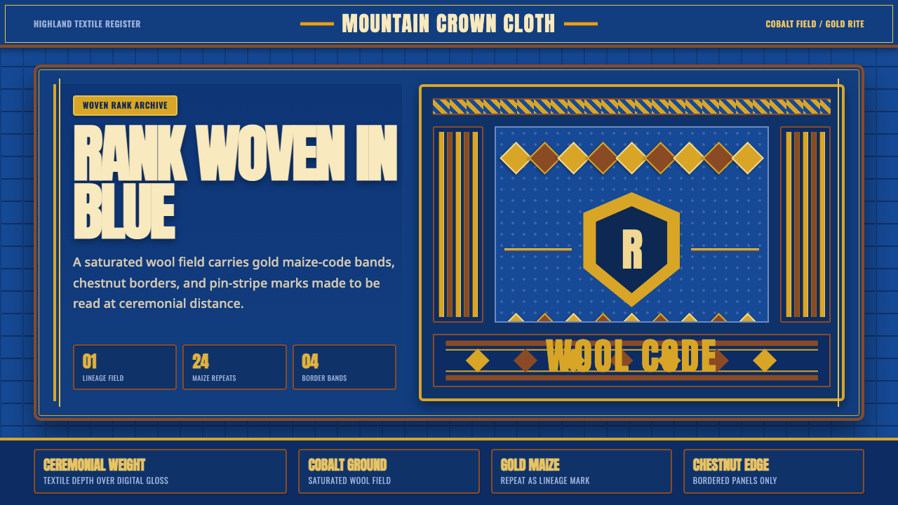 Basotho Seanamarena BlanketRank made visible. Cobalt wool, gold maize diamonds, and chestnut borders rea…
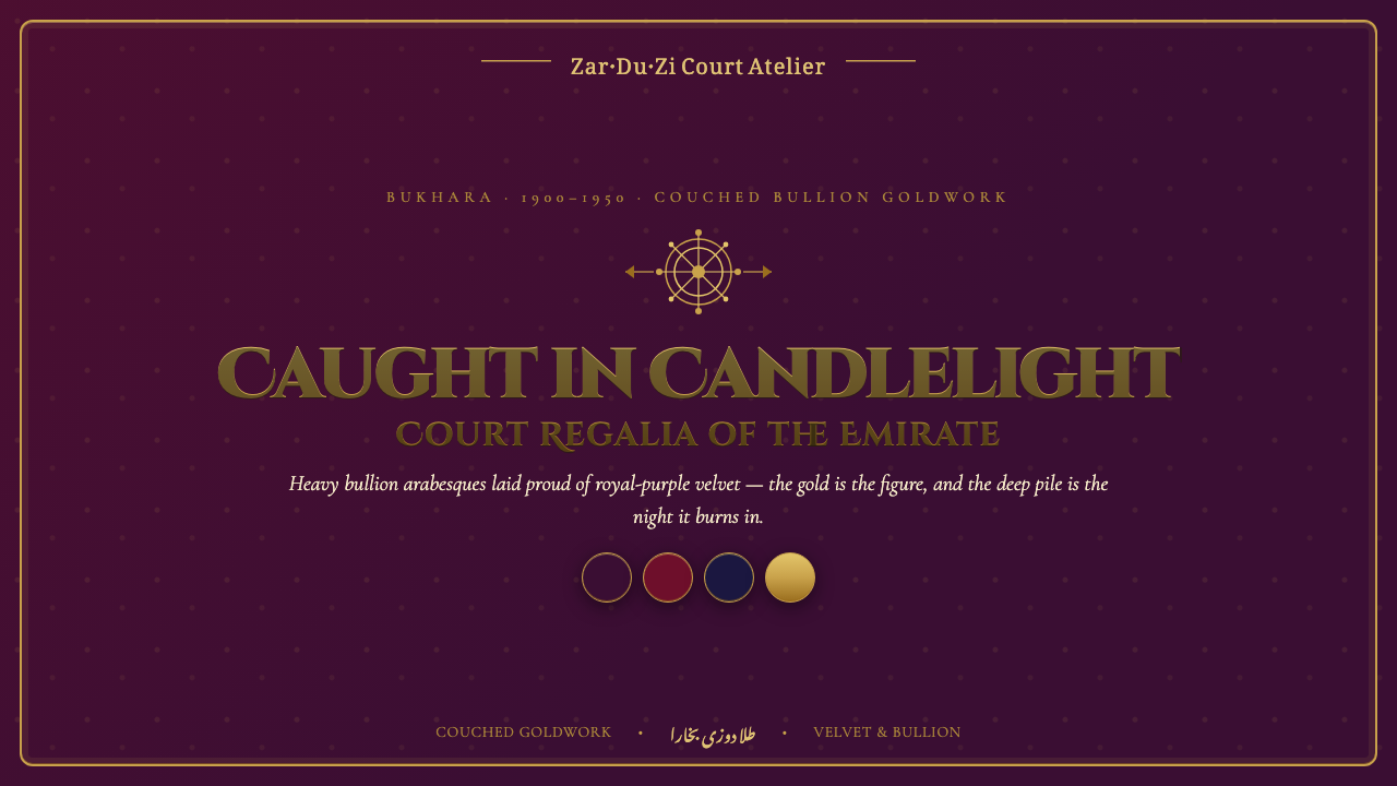 Bukhara Gold-Embroidered ChapanGold is the figure, velvet the night. Bullion arabesques blaze on royal-purpl…
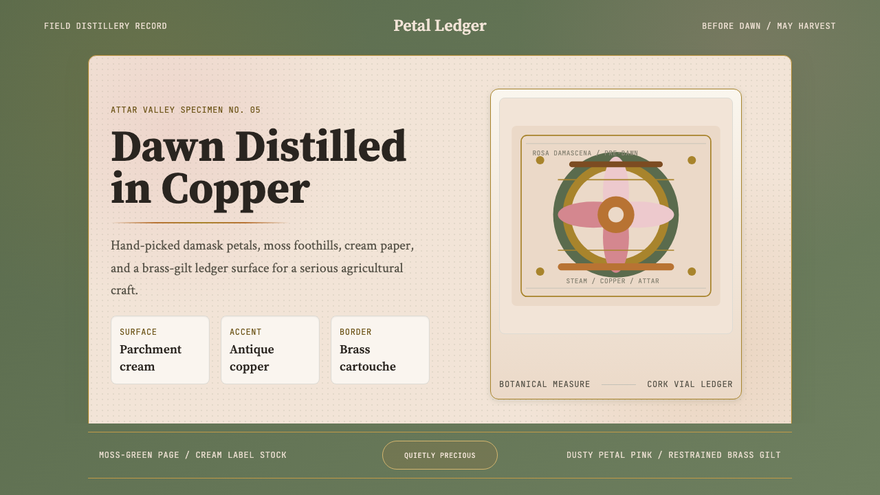 Bulgarian Rose Attar (Valley of Roses)Quietly precious craft. Moss green, dusty rose and brass borders frame a dawn…
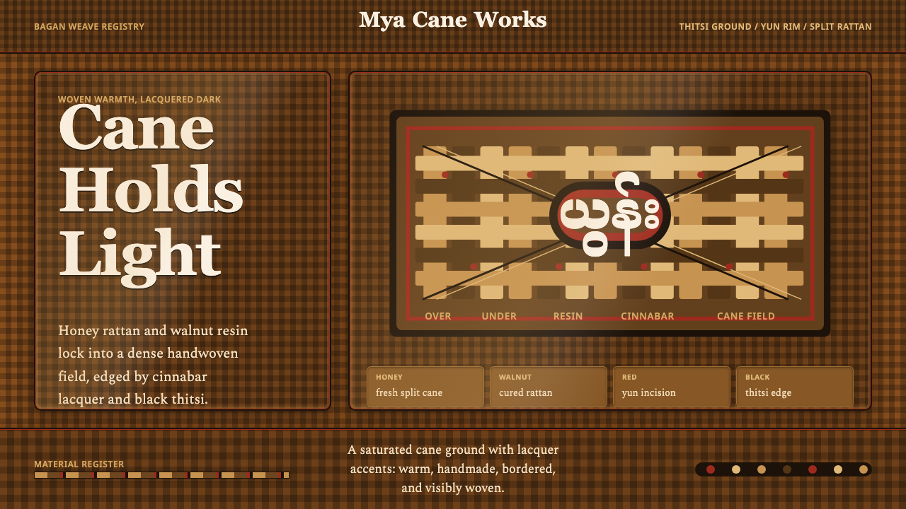 Burmese Cane RattanWoven warmth holds the page. Walnut cane lattice glows with cinnabar rim line…
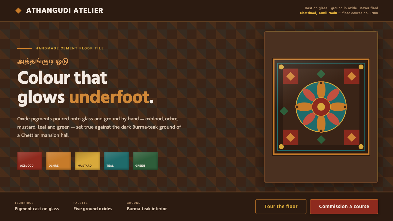 Chettinad Athangudi TilesColour that glows underfoot. Five ground-oxide tones on dark teak in bordered…
 Christmas ClassicTradition glows warmly. Evergreen panels, berry-red notes and burnished-gold…