What is Bukhara Gold-Embroidered Chapan?
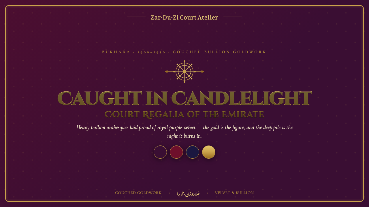
Gold is the figure, velvet the night: Bukhara Gold-Embroidered Chapan turns courtly bullion embroidery into a dark, ceremonial screen language.
Bukhara Gold-Embroidered Chapan in brief
Bukhara Gold-Embroidered Chapan draws from zar-duzi, the couched gold-thread embroidery associated with the emir’s court in Bukhara, Uzbekistan. Between 1900 and 1950, this dense goldwork appeared on velvet chapan robes: long outer garments whose dark, saturated fields carried heavy metallic bullion in arabesques, palmette scrolls, and ceremonial pattern. The source is not a restrained textile tradition. Its identity comes from accumulation, raised surface, and the dramatic contrast between glowing metal and light-absorbing velvet.
As a visual style, it begins with a reversal of ordinary interface hierarchy. The dark velvet ground is not merely background; it creates the conditions under which gold can appear luminous. Gold is the active figure: it frames, divides, crowns, and draws the eye through the composition. Pattern is not a marginal flourish added after the information has been organized. It is part of the structure, filling borders, surfaces, medallions, and transitions with the ceremonial density of court regalia.
The resulting aesthetic is maximalist but controlled. Royal purple and crimson establish a nocturnal, saturated atmosphere, while metallic gold carries the visual authority. Cinzel titling extends the sense of inscription and ceremony into typography. Screen elements should feel less like flat panels than embroidered fields: layered, raised, reflective in implication, and deliberately formal. The central challenge is to make richness feel composed rather than merely crowded.
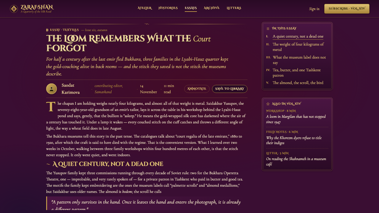
Where does Bukhara Gold-Embroidered Chapan come from?
The historical source is Bukharan zar-duzi, a gold-thread embroidery tradition of the emir’s court in Central Asia. Its regional setting is Bukhara, in present-day Uzbekistan, and its documented period here is 1900 to 1950. The technique is defined by couched metallic bullion on velvet: rather than disappearing into the cloth, the goldwork remains visibly present on the surface, producing the dense, raised character that gives the style its authority.
The chapan robe provides the style’s physical logic. It is a garment-sized field, not a small decorative sample, so pattern operates across broad expanses of royal-purple and crimson velvet. Heavy bullion arabesques and palmette scrolls cover that field with an all-over courtly richness. In translation to digital work, this matters because the reference does not suggest a single isolated emblem on an otherwise empty page. It suggests a hierarchy in which the whole surface participates in the ceremonial statement.
Its key makers are identified collectively as the court zardo’z master embroiderers of the Bukharan emirate. The approved source does not name individual masters, and the anonymity is significant to the way the tradition is represented here: the design language belongs to a court craft practice rather than to a single signature artist. A contemporary interpretation should preserve that sense of skilled, collective ornament without inventing a biography, a workshop lineage, or symbolic claims that the source does not provide.
The screen adaptation therefore treats zar-duzi as a material and compositional lesson rather than as a literal historical reconstruction. Deep velvet becomes the visual ground; gold becomes the raised figure; arabesques and palmettes become organizing motifs; and restrained areas of text provide the pauses needed for the ornament to register. The goal is not to simulate a museum object. It is to carry forward the contrast, density, and ceremonial poise of gold embroidery on dark velvet.
What defines the Bukhara Gold-Embroidered Chapan look?
Velvet Ground
The ground should read as deep velvet rather than generic dark mode. Royal purple and crimson are the defining chromatic fields, carrying saturation, darkness, and a sense of absorbed light. Broad quiet areas are valuable because they make the goldwork appear more concentrated when it enters. A flat black interface can feel merely severe; a velvet-like dark field should feel rich, enclosed, and ceremonial.
Raised Goldwork
Gold must behave like couched metallic bullion, not like ordinary yellow fill. It should imply weight, relief, and changing reflection through layered edges, selective highlights, and darker recesses. The effect is tactile even on a screen: gold appears laid onto the velvet, held in place, and given enough visual thickness to become an object in the composition rather than a color choice.
Arabesque Density
Arabesques and palmette scrolls create continuity across the surface. Their role is to connect zones, crown focal elements, and keep the composition from dissolving into unrelated ornaments. Repetition should feel cultivated rather than mechanical: motifs may recur along frames and medallions, but they need changes in scale, direction, and emphasis so the eye can travel through the field.
Ceremonial Framing
Borders are active architectural devices in this style. A framed panel, title field, or featured image should feel enclosed by goldwork with a purpose: it marks importance and sets a formal threshold. The framing may be dense, but it should not compete equally with every piece of content. Reserve the richest treatment for titles, hero statements, selected data moments, and other places that deserve courtly emphasis.
Cinzel Titling
Cinzel titling gives headings an inscribed, ceremonial voice. It works best as a display element with room around it, where its capitals can establish rank against the softer visual depth of velvet. Supporting text should remain quieter and more readable. The contrast between stately title treatment and restrained information text helps the interface feel formal without turning every sentence into ornament.
Maximalist Hierarchy
The style welcomes abundance, but abundance needs rank. Gold ornament, titles, body copy, controls, and data cannot all demand the same brilliance. Establish a dominant ceremonial moment, then allow secondary motifs to support it and plain regions to rest. The most convincing compositions alternate density and pause, making richness feel intentional instead of treating every available surface as equally valuable.

Who shaped Bukhara Gold-Embroidered Chapan?
The source identifies the court zardo’z master embroiderers of the Bukharan emirate as the tradition’s key makers. Their collective designation keeps attention on the skilled goldwork itself: metallic bullion couched onto velvet to produce dense, raised arabesques and palmette scrolls. Any public account of the style should retain that collective attribution rather than attach unsupported individual names or biographies.
The emir’s court is the ceremonial setting named by the source. It explains why the visual language reads as regalia rather than domestic decoration: dark velvet, saturated royal-purple and crimson fields, and heavy goldwork combine to communicate formality and display. In contemporary use, the courtly reference should guide hierarchy and atmosphere, not be converted into invented political or historical detail.
The velvet chapan is the carrier of the goldwork tradition described here. Its large, continuous surface establishes the compositional model for the style: ornament can occupy broad fields, but it needs a deep textile ground to hold it. Digital interpretations borrow this relationship by letting dark surfaces carry the pattern, rather than placing bright ornament on neutral panels without material contrast.
How do you use Bukhara Gold-Embroidered Chapan today?
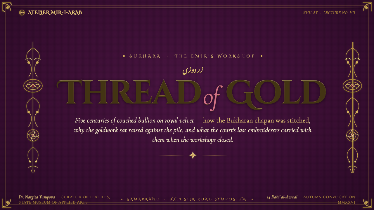
For presentation covers, treat the slide as a ceremonial textile field. Use a deep royal-purple or crimson ground, place the title in Cinzel with generous surrounding darkness, and concentrate the richest gold arabesque treatment around one edge, medallion, or title enclosure. Do not distribute equal ornament everywhere. The cover should announce a formal occasion, with the gold directing attention toward the title rather than replacing it.
For presentation content and data slides, reduce the embroidery density without abandoning the system. Content pages can use a fine gold border, a restrained ornamental corner, and a clear text area that remains easy to scan. Data should be organized in calm groups against the velvet field, with gold reserved for the principal series, important totals, or key distinctions. Charts should remain legible before they become decorative; the goldwork can frame the reading experience rather than obscure comparison.
For web interfaces, the style is strongest in dashboards, premium portals, editorial collections, and pricing experiences where ceremony, exclusivity, or high-value presentation supports the product message. Use dark velvet-like surfaces as a stable canvas, then give navigation, featured metrics, selected cards, and premium tiers a hierarchy of gold treatment. Controls need enough plain contrast to remain obviously interactive. Decorative motifs should sit around information architecture, not disguise it.
For editorial and marketing work, this language suits launches, invitation-like campaigns, cultural features, luxury collections, and long-form stories that benefit from a sense of occasion. Pair broad dark fields with framed pull quotes, ornamental section openings, and featured imagery contained within goldwork. Let crimson and royal purple alternate as supporting atmospheres, while the metallic treatment remains the unifying figure. The result should feel composed like regalia, not merely dramatic.
The common mistake is to interpret the style as permission to make every surface bright, gilded, and ornate. When gold is universal, it stops reading as precious; when every border is dense, hierarchy disappears; when text also becomes decorative, reading suffers. Begin with velvet darkness, assign one dominant gold moment, and use the remaining ornament to reinforce that decision. The style succeeds through contrast between night and metal, not through indiscriminate visual excess.
Bukhara Gold-Embroidered Chapan — FAQ
Is this style simply a dark luxury interface with gold accents?
No. The essential reference is zar-duzi goldwork on velvet chapan robes from the Bukharan emirate court. Gold should therefore suggest couched metallic bullion: dense, raised, and materially present against a saturated velvet ground. A generic dark surface with occasional gold buttons may look premium, but it misses the relationship between surface, embroidery, and ceremonial pattern that defines the style.
How much ornament should a digital adaptation use?
Use enough to make the goldwork feel structural, not so much that every region has equal intensity. The historical reference is dense, but screen interfaces still need reading paths, control clarity, and visual rest. Concentrate ornament around titles, borders, featured panels, and key transitions. Leave darker velvet fields available so the gold retains its role as the figure.
Can royal purple and crimson appear together?
Yes. Both are named as saturated dark velvet grounds in the source material. They work best when assigned distinct roles rather than used as equally loud competing fields: one can establish the primary atmosphere while the other marks a feature, section, or shift in emphasis. Gold remains the unifying figure across both, keeping the palette connected to the embroidery reference.
What should typography contribute to the style?
Cinzel titling should contribute ceremony and rank, especially in headings, covers, and featured statements. It should not force every label or paragraph into a monumental voice. Keep supporting text clear and comparatively quiet, then let the title treatment function like a gold-framed focal point on velvet. This preserves both the grandeur of the style and the usability of the page.
Related design styles
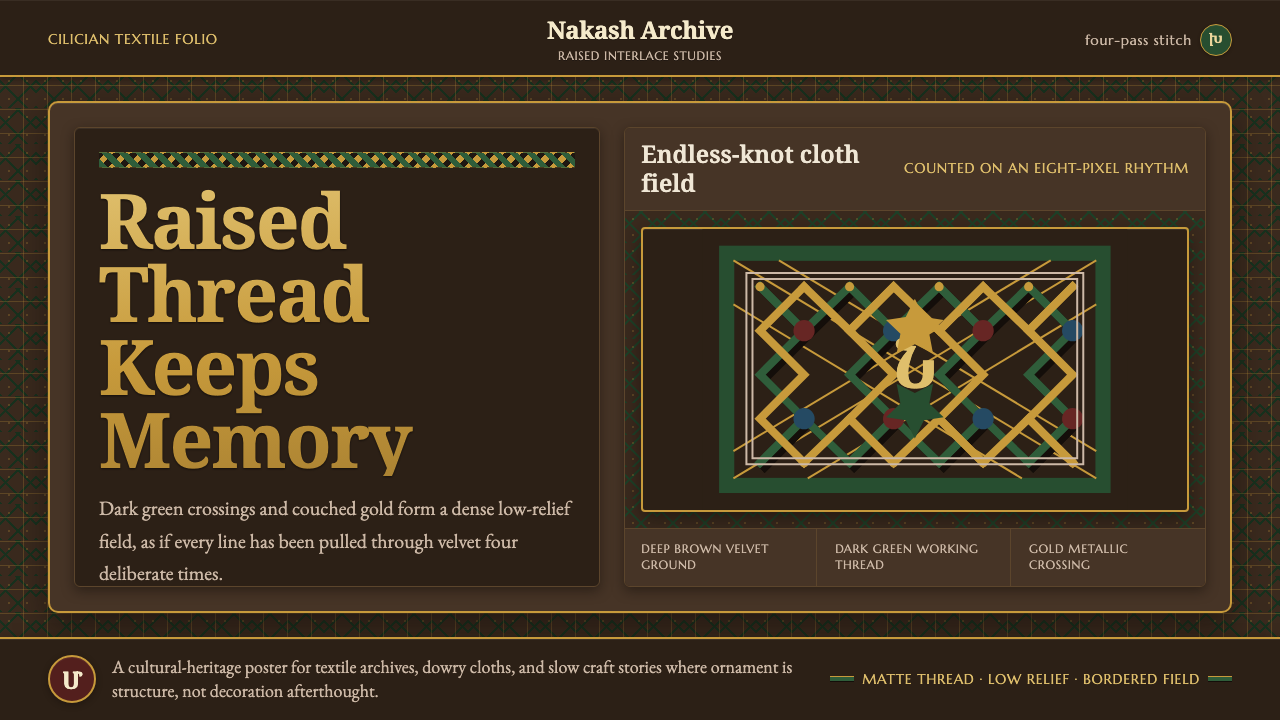 Armenian Marash Interlace EmbroideryDense memory in raised thread. Green-gold interlace locks over deep brown clo…
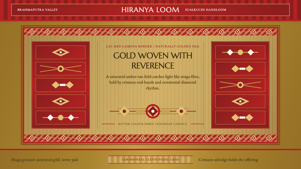 Assam Muga Silk & GamosaWarm ceremony in silk. Muga gold sheen meets crimson borders and woven diamon…
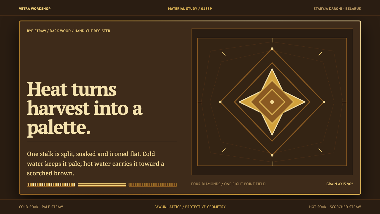 Belarusian SolomkaOne harvest, a tonal ladder. Straw diamonds turn pale gold to scorched brown…
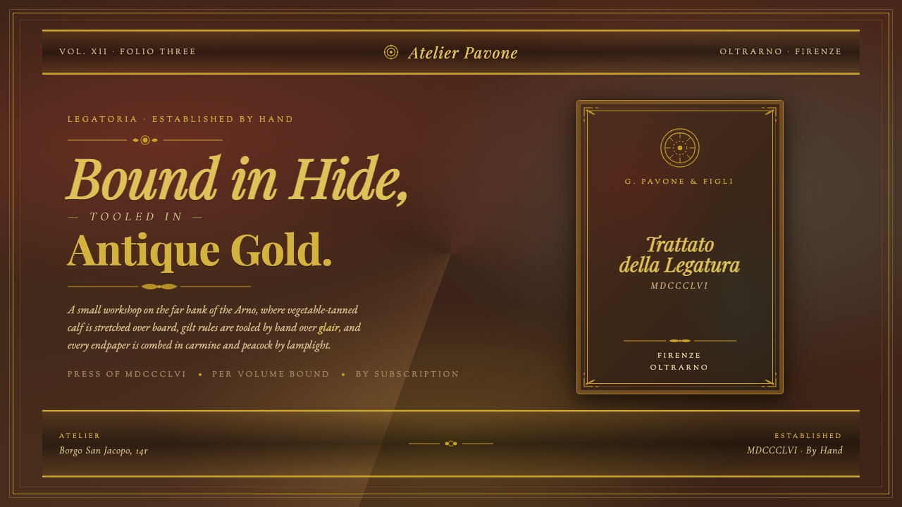 Florentine Leather BinderyRenaissance craft as luxury. Tanned hide, antique gold tooling, carmine-and-p…
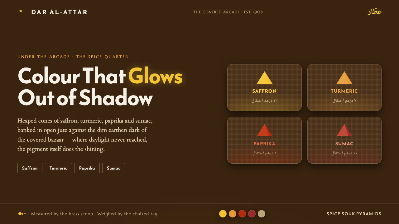 Spice Souk Market PyramidsColour glows out of shadow. Saffron-paprika-sumac heaps on dim earthen brown,…
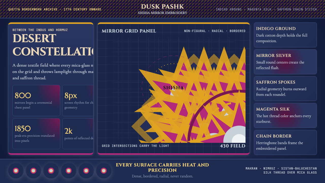 Balochi Mirror Embroidery (Shisha)Desert light made dense. Indigo grids flash with magenta, saffron, and mirror…