What is Quantum Datacenter Cryo?
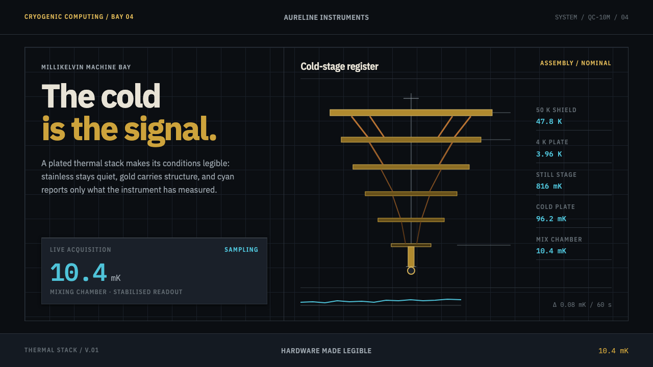
Quantum Datacenter Cryo turns a dilution refrigerator into an interface: gold stages descend on black, steel stays honestly grey, and cyan is spent only on what has been measured.
Quantum Datacenter Cryo in brief
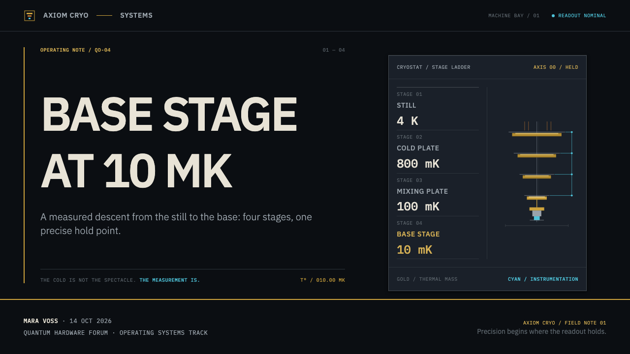
Quantum Datacenter Cryo is a dark design language drawn from the hardware that keeps superconducting quantum processors cold. Picture a dilution refrigerator hanging upside down in its bay: gold-plated copper plates stacked widest at the top, bare copper braids draping between stages, and a plated finger at the bottom holding the chip at 10 millikelvin. Engineers call the whole assembly the chandelier, and the system takes that object literally.
Every colour has a physical reason. Gold is the primary because the plating is real. Stainless steel stays grey because the cryostat can is left unpainted so that it reads as cold. Cyan belongs to instrumentation alone: traces, live values, the temperature of each stage. Helium itself is colourless, so nothing in this system glows, steams or frosts over. The result feels scientific without borrowing the clichés of science fiction.
It is a system about legibility under demanding conditions: a black ground, metallic structure, and numbers that are always precise and always attached to their units. This is design by provenance. Every surface answers one question, which is where it comes from in the machine.

Where does Quantum Datacenter Cryo come from?
The visual source is IBM Quantum System One, introduced in 2019, together with the hardware that has followed it; the current machines, dating from roughly 2023 to 2025, are the immediate reference. Unlike most design movements, this one has no manifesto and no founding school. It was distilled from the way one class of scientific instrument looks, and from the choices made when that instrument was prepared to be seen by the public.
The hardware lives in research centres and cloud datacentres around the world, with Yorktown Heights in the United States, Ehningen in Germany and Kawasaki in Japan among them. That geography matters to the design. The same machine is installed in bays and rooms in several countries, so its look has to be recognisable and consistent, and the interface language travels with it: units that never vary, numerals that line up in columns.
Alongside IBM's own teams, three outside names belong to this lineage: the design studios Map Project Office and Universal Design Studio, and Goppion, a specialist maker of display cases. They are associated with the way System One is presented, the machine shown as a considered object behind glass rather than hidden in a rack. That choice is part of the system's character. Hardware here is something to be looked at, built from honest materials, not a utilitarian box to be concealed.
Three disciplines meet in the look: industrial design for scientific instruments, millikelvin cryogenics, and superconducting-qubit engineering. Industrial design supplies the restraint and the honesty about materials. Cryogenics supplies the stacked, staged geometry and the rule that colour should never pretend to be cold. Qubit engineering supplies the obsession with measurement, which is why numbers, units and traces are treated as the real content of the interface.
What defines the Quantum Datacenter Cryo look?
Color: Gold as Primary
Gold leads for a reason that is literal: the plates in the cryostat are gold-plated copper. It marks structure, primary actions and the identity of the system, and set against a black ground it reads as warm metal rather than decoration. It should feel like plated hardware catching light, not like a luxury-brand flourish. It is never used as a gradient wash or a glowing highlight.
Steel Grey: Unpainted Cold
Neutrals follow the stainless steel of the cryostat can, left unpainted so the machine reads as cold. The greys are slightly cool, matte and quiet, used for panels, secondary text and dividers. They do the job that paint would do in a warmer system, but with the honesty of bare metal: no tint, no pretence.
Cyan: Instrumentation Only
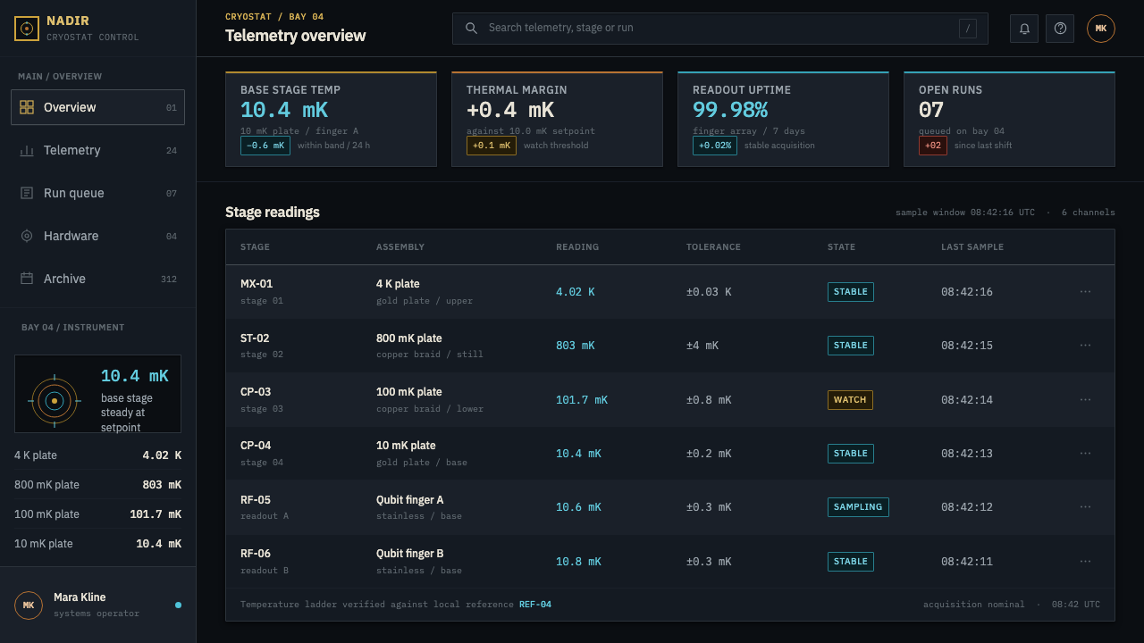
Cyan is the only colour allowed to say that something was measured. Traces, live values, stage temperatures and sensor readouts take it; links, buttons, decorative icons and headings do not. Because it is rationed, cyan becomes a reliable signal. Wherever the eye meets it, there is a real reading behind it.
Black Ground and Depth
The ground is near-black, evoking the dim bay and the dark interior of the enclosure. Depth is built by stacking surfaces of slightly different darkness, like plates, rather than by blur or glow. Separation comes from edges and tonal steps, so layered panels feel structural, as if each one could be unscrewed and lifted away.
Descending Stages
The cryostat's geometry is itself a hierarchy: the widest plate sits at the top, each stage is narrower than the one above, and the whole ends in a slender point. The layout logic carries that over. Broad, summary-level information sits at the top; content grows narrower and more specific as you move down; the most critical value lives at the narrow bottom, where the chip sits. Panels can taper or indent stage by stage, and every stage keeps its own label.
Typography and Numerals
Type is set in the IBM Plex family throughout, matching the maker of the hardware. Numerals are monospaced and tabular, so columns of readings align and digits never jitter as values update. Every temperature carries its unit and the stage it belongs to; a bare number is treated as an error. Labels are small, ordered and quiet, and the numerals are the loudest thing in the room.
No Glow, No Coolant Theatre
Because the working fluid is colourless, the system refuses the usual cold-tech effects: no neon bloom, no fog, no ice crystals, no glowing coolant. Where motion exists, it reports change, a value updating or a trace advancing, and does not decorate. The absence of effects is a statement of truthfulness: the interface shows only what the machine actually does.
Who shaped Quantum Datacenter Cryo?
A design studio named among the contributors to the physical presentation of IBM Quantum System One. In the system's logic the studio stands for the decision to show the machine as an object of care, composed, lit and framed, rather than hiding it. Designers borrowing from this lineage should treat hardware imagery as portraiture, not as a stock technology backdrop.
Another studio associated with System One's presentation. It represents the crossover between product design, exhibition design and scientific equipment, the territory where an instrument must be operable by engineers and also legible to visitors. The interface lesson is the same: a technical surface that can still be understood at a glance.
A specialist maker of display cases, known for museum-grade glazed enclosures. Its place in the lineage is the idea of the machine as an exhibit: protected, lit and visible from every angle. The design translation is the generous dark frame and the sense that content sits behind clear glass, with nothing smeared on top of it.
The engineers who build and maintain the actual machines and, through their choices, give the system its rules: leave the cryostat can unpainted so it reads as cold, plate the cold stages in gold, label everything. The design is a record of their decisions. Where a rule of this style seems arbitrary, the answer is usually found by asking what the hardware team did and why.
How do you use Quantum Datacenter Cryo today?
Quantum Datacenter Cryo is a specialist dark style, and it repays specificity. It suits any product whose main content is measured, monitored or technical: infrastructure, scientific tooling, hardware, cloud compute, AI and research. The key to applying it is discipline about which colour means what.
For slides, use a black ground with a gold stage motif on the cover: a stack of horizontal bands or plates narrowing downward, with the title in light type beside it. Content slides keep a quiet grey for body text and put gold only on headings or key structural elements. Data slides are where the system comes alive. Charts and big numbers take cyan, each with its unit and, where relevant, its stage or source; axes and gridlines stay steel grey; decorative fills are left out. A single labelled figure is usually stronger than a decorated chart.
For web interfaces the system is a natural fit for status dashboards, monitoring consoles, usage and billing views, developer tools and device-management panels. Use gold for primary actions and structural headings, grey for surfaces and text, and cyan exclusively for live, measured or computed values. Pricing pages translate well if each plan is a stage in a descending stack, with plan limits shown as tabular numerals with units. Keep tables dense but orderly, align numbers in columns, and avoid icons whose only job is decoration.
For editorial and marketing work, the style gives hardware stories an instant sense of seriousness. A product launch, technical whitepaper or research-lab page can use a dark field, a single gold-edged hero object (a render or photograph of the actual hardware, treated as a portrait), and body copy in steady, small, well-spaced type. Captions should carry units and context. Avoid the stock image of glowing blue circuitry; the point of this style is that the machine is allowed to look like what it is.
The most common mistake is using cyan as a general accent for links, buttons or glows. Once cyan stops meaning measured, the whole system collapses into generic tech styling. The second is adding bloom, mist or frost effects because the subject is cold, when the material logic says the opposite. The third is leaving numbers without units or formatting them inconsistently: if a reading has no unit, no stage, or changes width as it updates, the interface has broken its own premise.
Quantum Datacenter Cryo — FAQ
Why gold on black?
Because that is what the hardware looks like, and the pairing follows from it. The plates are gold-plated copper seen in a dark bay, so gold carries the structural identity of the machine. A black ground makes the metal read as metal and gives cyan readouts the contrast of instruments in a dim room. The pairing is documentary rather than decorative.
Can cyan be used for links and buttons?
No, and that restraint is what defines the style. Cyan is reserved for measured values: traces, live readings and stage temperatures. If it also colours links, buttons and headings, it loses its meaning. Use gold for primary actions and structural emphasis, and let grey carry everything else.
Does it only suit quantum computing products?
No. Quantum hardware is the source, but the grammar applies to any product whose content is measured: infrastructure monitoring, scientific software, hardware dashboards, observability tools, research platforms. It is less comfortable in consumer contexts that depend on warmth or playfulness, where its dark, instrumented seriousness can feel remote.
Why avoid glow and frost effects?
Because the cooling medium in the real machine is colourless, so any such effect would be invented. The system's premise is that colours and surfaces come from real materials: plated copper, unpainted steel, and measurements displayed as they are. An effect with no physical counterpart weakens that argument.
How should numbers and units be formatted?
Set every number in monospaced tabular numerals so columns line up and digits do not shift as values update. Always attach the unit, and when a reading belongs to a particular stage, state the stage beside it. Consistency matters more than style: the same precision for the same kind of reading, everywhere in the product.
Related design styles
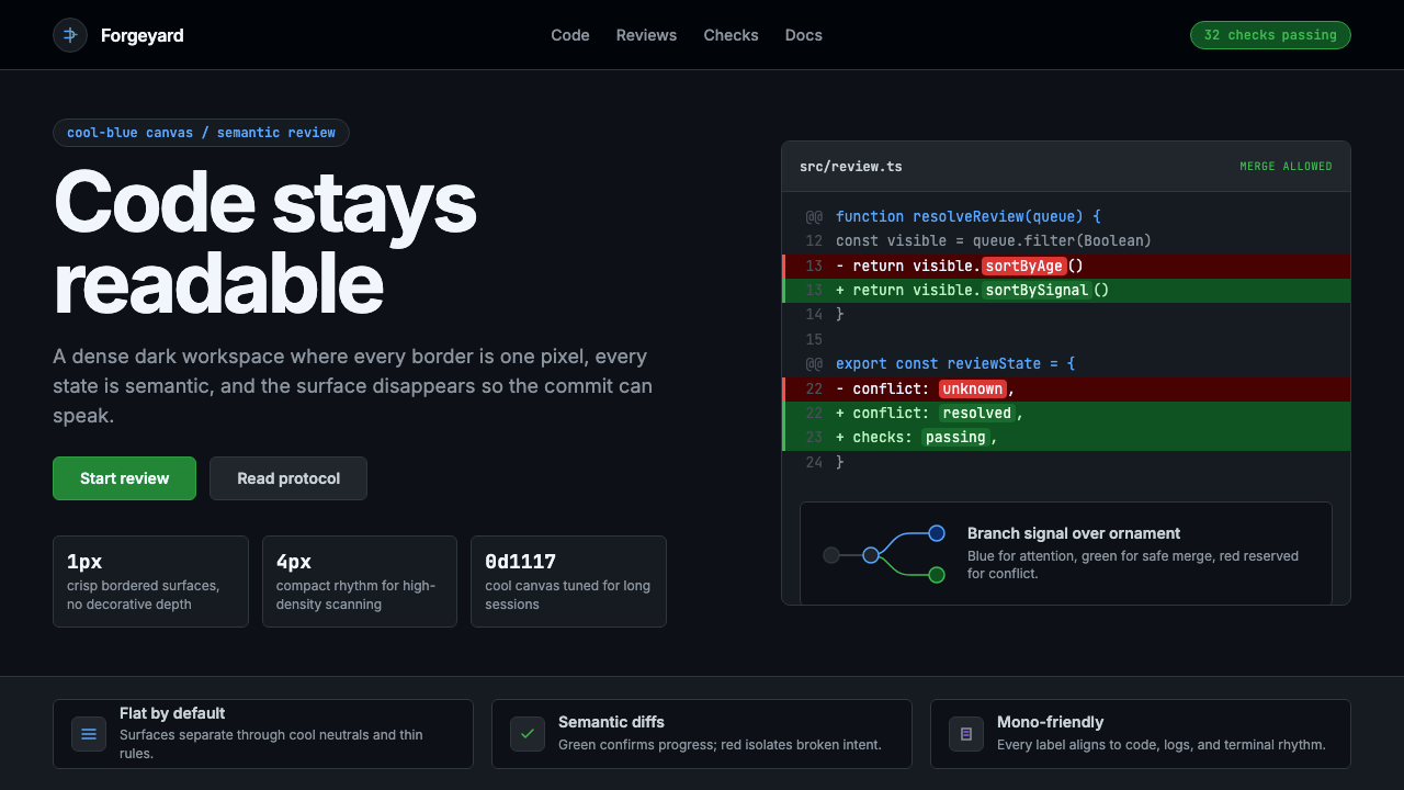 GitHub DarkCode-first darkness. Cool-blue canvas, 1px borders, green/red diff lines.
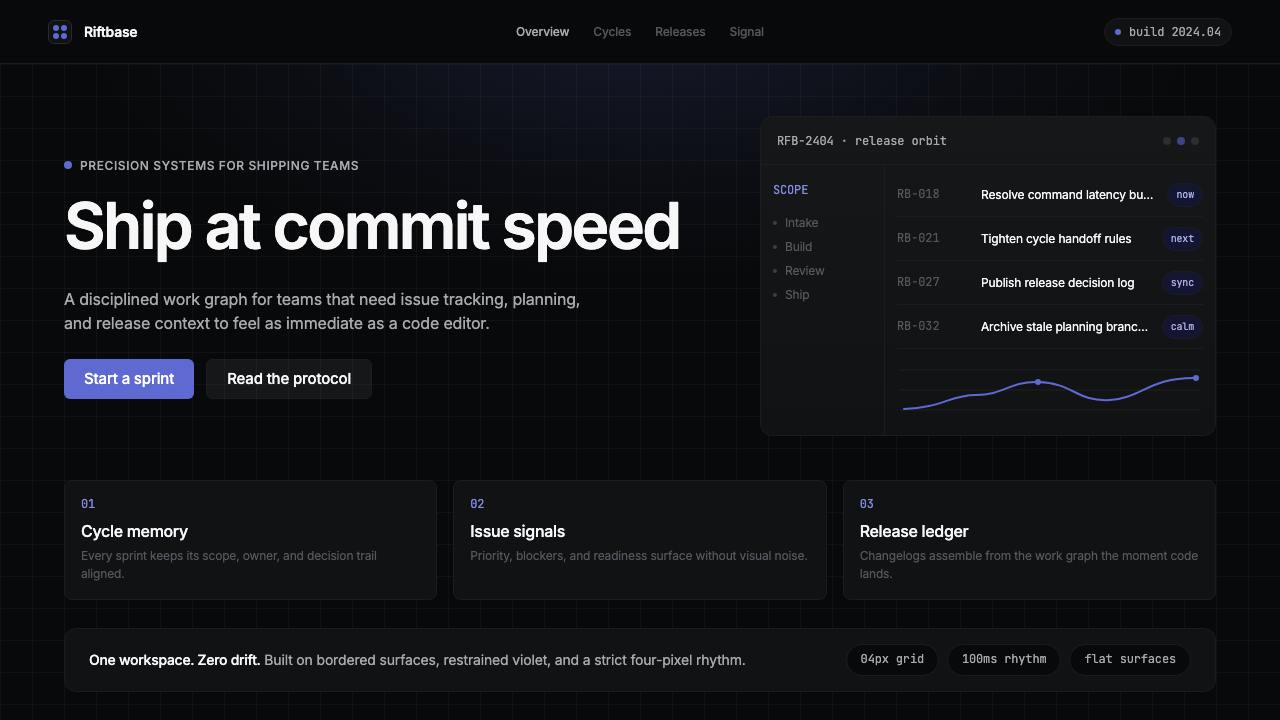 Linear 2024Precision down to the millisecond. Near-black, indigo-violet accents, Inter D…
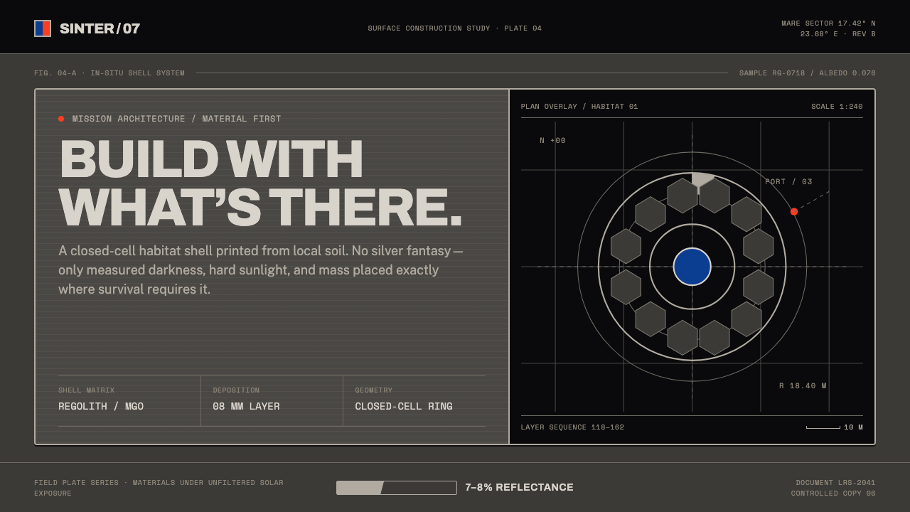 Lunar Regolith SettlementMoonlight without the myth. Regolith gray, hard terminators, and a strict tec…
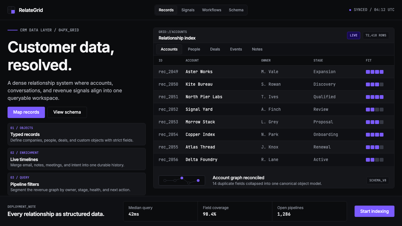 Attio CRMCRM stripped to its data layer. Single-pixel borders, monospaced IDs, violet…
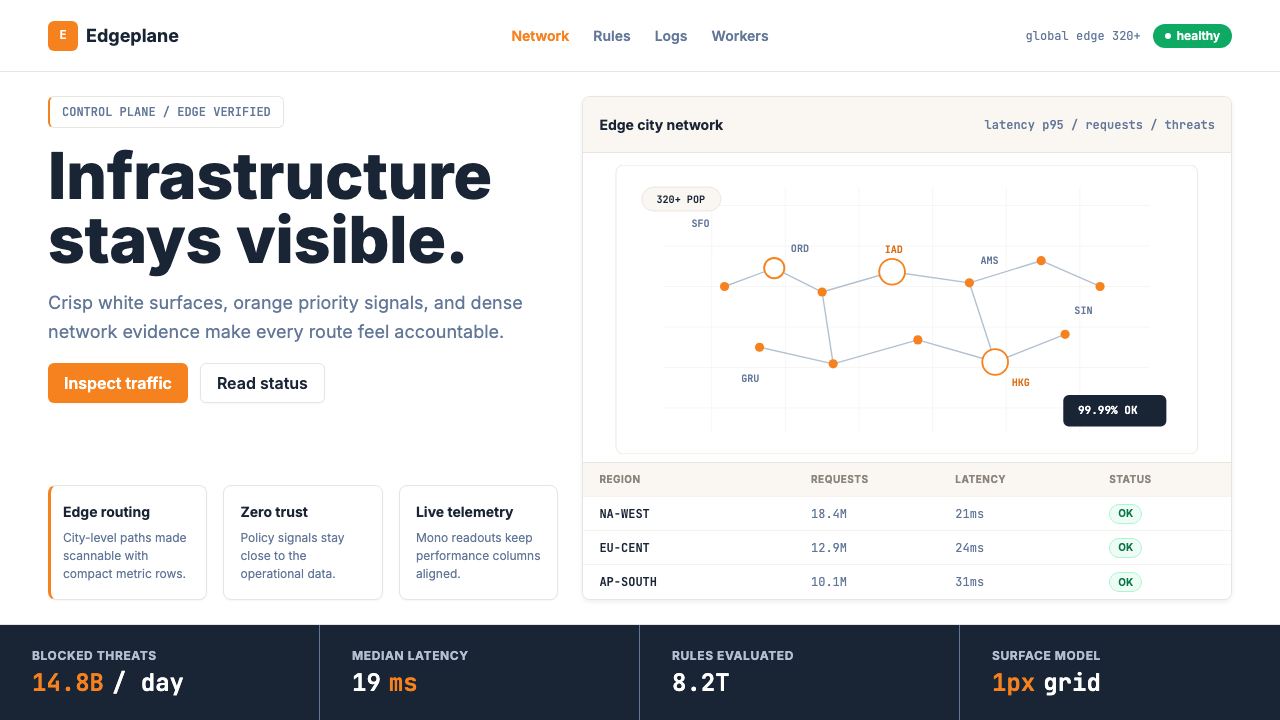 Cloudflare Orange EdgeOperational clarity wins. Orange accents, hairline grids, and mono metrics ma…
 Cron CalendarDesigner-tech restraint. Purple wash, ink grid, mono shortcuts, surgical even…