What is Punched Tin Hojalata?
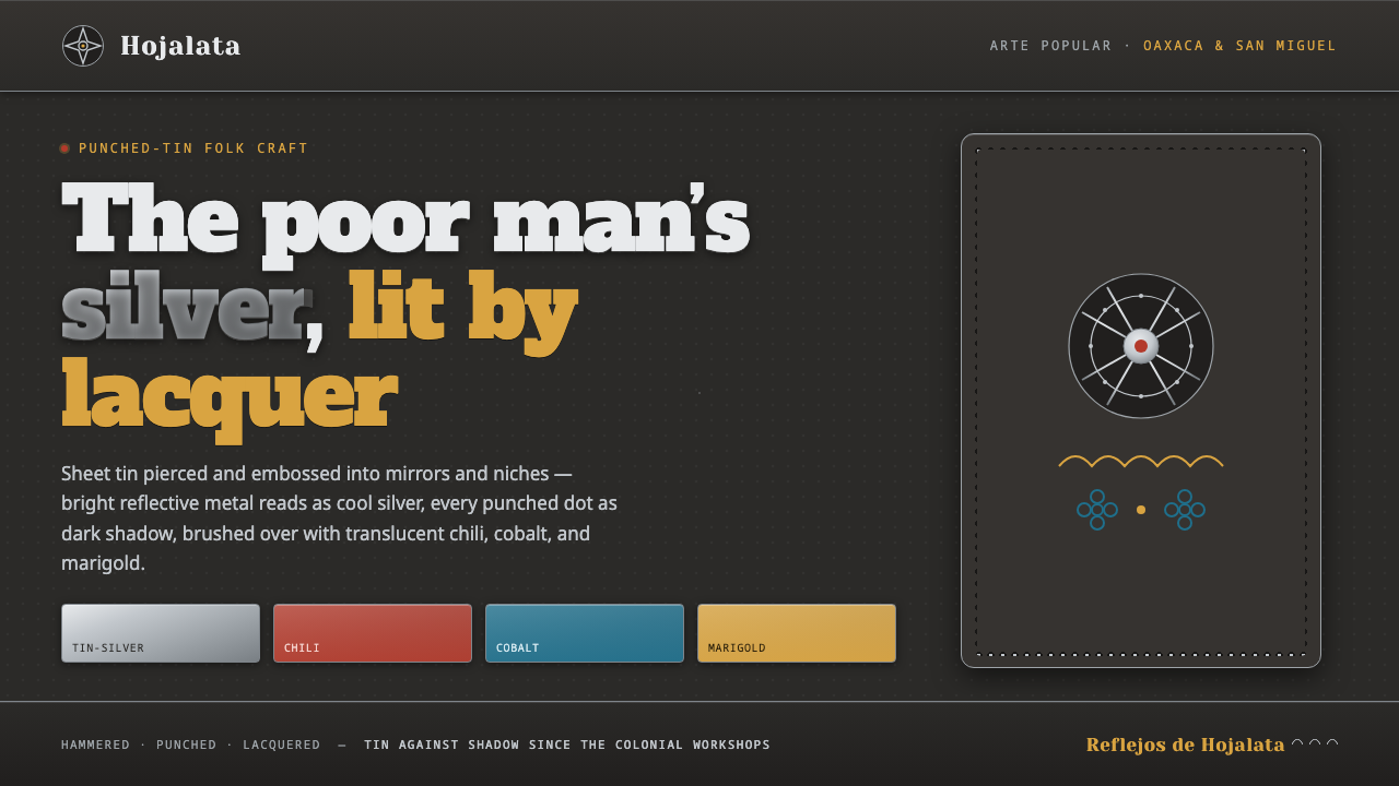
Punched Tin Hojalata turns the poor man’s silver into a dark, radiant screen language of pierced shadow, cool metallic light, and lacquered folk color.
Punched Tin Hojalata in brief
Mexican hojalata is a pre-1900 folk craft of shaping sheet tin into mirrors, frames, ornaments, and devotional objects. Practised in Oaxaca and San Miguel de Allende, it treats an inexpensive industrial metal as an expressive surface: tin can be pierced, embossed, recessed, polished, and painted until it catches light with the cool brightness associated with silver. Its enduring nickname, the poor man’s silver, describes both the material’s affordability and its visual ambition.
The visual logic depends on contrast between reflective metal and darkness. Bright tin surfaces read as silver highlights, while punched holes, recessed areas, and shadowed backing create depth without relying on painted realism. A border can become luminous through repeated dots; a flower can emerge through shallow relief; a star can be defined as much by the dark space around it as by the metal left intact.
As a digital style, Punched Tin Hojalata preserves this relationship rather than merely borrowing Mexican folk motifs. The background is an oxidized, nearly black tin field, never a clean white page. Silver-toned elements appear as reflective raised metal, while translucent chili red, cobalt blue, and marigold lacquer tint selected surfaces without erasing their metallic character. Stars, flowers, scallops, pierced dots, and repoussé borders give the system its handmade rhythm.
Where does Punched Tin Hojalata come from?
Punched Tin Hojalata belongs to the long continuity of Spanish-colonial tinworking in Mexico, a craft tradition already established before 1900 and still practised today. Its historical setting is not a single named school or manifesto but a network of working makers, inherited techniques, local materials, and objects made for domestic, decorative, and devotional life. The craft’s identity is inseparable from Mexican arte popular, where utility and ornament are not opposing categories.
Oaxaca is one of the central regions associated with hojalata. There, workshops turn sheet tin into framed mirrors, ornaments, and other objects whose appeal comes from hand-worked surface variation. Piercing is especially important: an opening in the tin is never simply empty. With a dark backing behind it, the opening becomes a visible mark, making shadow part of the pattern and allowing repeated dots to read as a border, halo, or field of texture.
San Miguel de Allende is another key center, sustained through tinsmith families and workshop practice. The family-based continuity matters because the style is carried through making rather than through a fixed, universal template. Repeated motifs can remain recognizable while their placement, density, and embossing vary from object to object. This prevents hojalata from becoming mechanically regular: its order is decorative, but it remains visibly worked by hand.
Mexican arte popular folk-art guilds provide the broader cultural frame for this tradition. Hojalata sits alongside other vernacular craft practices while retaining its own material signature: cool reflective tin, punched darkness, shallow relief, and painted lacquer. The digital adaptation should retain that signature. It should feel like a screen surface translated from pierced metalwork, not a generic dark interface decorated with stars or a metallic filter.
What defines the Punched Tin Hojalata look?
Oxidized Ground
The ground is dark, oxidized, and slightly recessive, like the shadowed backing that makes a pierced sheet legible. It is not an empty neutral background. It provides the visual depth against which tin, lacquer, and perforation can register. A pale ground breaks the craft analogy because pierced marks lose their shadow and metallic highlights lose their dramatic contrast.
Tin-Silver Highlight
Bright elements should read as cool sheet tin rather than polished chrome or liquid glass. Their value comes from appearing cut, raised, or burnished against the dark field. The highlight is strongest when it is shaped by edges, embossed relief, and neighboring shadow. Silver is therefore a material cue, not a decorative sparkle applied everywhere.
Piercing and Repoussé
Punched dots, repeated openings, and shallow embossed contours are the style’s primary drawing tools. Perforation creates rhythm through absence; repoussé creates a raised line through pressure and relief. Use them to build frames, halos, floral centers, and separators. Their irregular repetition should suggest hand tooling, avoiding the sterile perfection of a generic dot pattern.
Translucent Lacquer
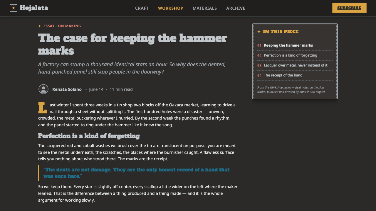
Chili red, cobalt blue, and marigold gold are lacquered accents laid over metal, not flat opaque fills detached from the surface beneath. Their role is to concentrate attention in selected motifs, headers, panels, or ceremonial details. The silver character must remain perceptible through the color, so lacquer feels applied to tin rather than substituted for it.
Folk Motif
Stars, flowers, and scalloped forms provide a recognizably hojalata vocabulary. They work best as constructed metal shapes: outlined by punctures, surrounded by dark recesses, or organized into a border. They should not become free-floating clip art. Each motif needs a relationship to frame, relief, shadow, or reflective surface.
Framed Density
Hojalata is especially effective at edges. Decorative density belongs around mirrors, panels, titles, and sacred-looking focal areas, while the center may remain dark and comparatively quiet. This creates the sensation of an object with a worked rim and a shadowed interior. The design should feel assembled from metal surfaces rather than spread evenly across a flat canvas.
Who shaped Punched Tin Hojalata?
Oaxacan hojalatero workshops represent the craft’s workshop-based making culture. Their importance is not tied to a single signature author but to the sustained practice of piercing, embossing, shaping, and finishing sheet tin into folk objects. In a design interpretation, they point toward visible making: repeated hand-worked marks, dark-backed perforation, and ornamental surfaces that still retain material discipline.
The tinsmith families of San Miguel de Allende embody continuity through inherited craft practice. Their presence explains why hojalata should not be treated as a rigid ornamental formula. Motifs can recur, but the work remains alive through variation in punching, relief, layout, and finish. The digital system should echo this continuity with disciplined repetition that never feels mechanically cloned.
Mexican arte popular folk-art guilds form the broader cultural context in which hojalata is understood. They place tinwork within a living field of vernacular craft rather than isolating it as a decorative trend. For designers, this means respecting the relationship between pattern and object: ornament has a surface, a border, a use, and a material history.
How do you use Punched Tin Hojalata today?
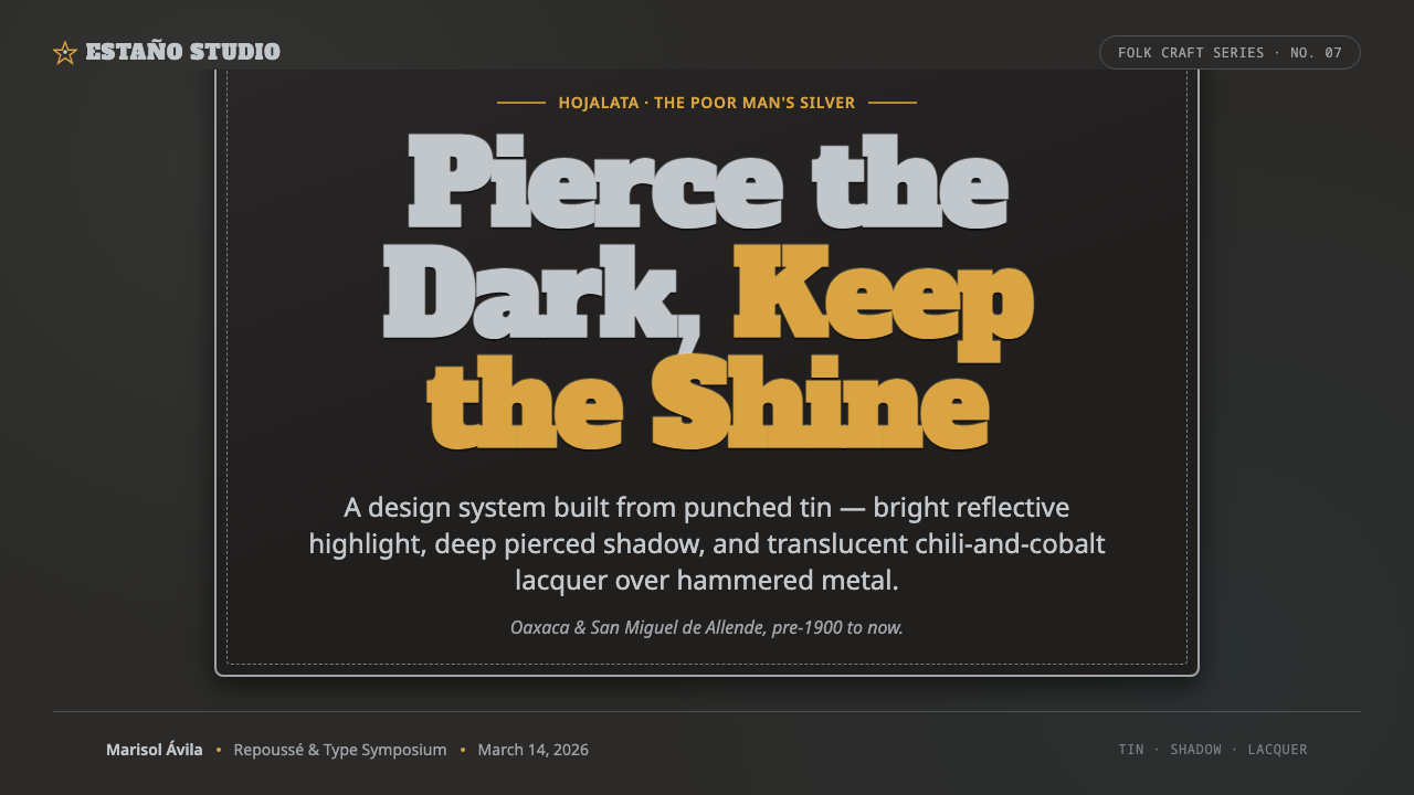
For presentation covers, treat the slide like a tin-framed object. Begin with an oxidized dark field, then establish one strong silver focal form: a title plate, mirror-like panel, flower, or star. Place lacquer color selectively over or beside that form, and let punched dots build a border rather than scattering as background decoration. Content slides should become calmer interiors, with a silver title hierarchy, dark negative space, and restrained perforated dividers.
Data slides benefit when the metal logic is used to separate information from ornament. Charts should remain legible first: silver can carry the primary series, while chili, cobalt, or marigold distinguish selected comparisons. Use dark recesses to group related values and perforated rules to mark transitions. Avoid turning every bar, label, and gridline into embossed decoration; the visual richness belongs in framing and emphasis, not in obscuring the evidence.
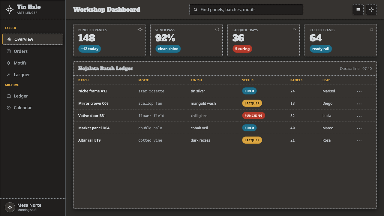
For web interfaces, the style suits dashboards, collections, and pricing pages that need a strong sense of crafted hierarchy. Use dark panels as recessed cavities and silver containers as raised tin pieces. Important actions can receive a lacquer accent, while navigation and data labels remain clear, calm, and material-conscious. A pricing page can frame each tier as a tin ornament, but comparison details should remain quieter than the decorative edgework.
For editorial and marketing pages, use the contrast between a rich border and a quiet center. An article opener can place a large title inside a pierced frame; pull quotes can sit on lacquered plaques; product stories can alternate dark recessed sections with silver-toned feature surfaces. The common mistake is to reduce the style to dark background plus random stars. Authentic Hojalata requires simultaneous readability of bright metal and deep shadow, plus motifs that appear punched, raised, bordered, or lacquered onto a surface.
Punched Tin Hojalata — FAQ
Is Punched Tin Hojalata just a metallic version of Mexican folk decoration?
No. The defining system is material and spatial: bright tin, dark backing, punched openings, recessed ground, relief, and translucent lacquer work together. Folk motifs matter, but a star or flower alone does not make a design hojalata. If it has no relationship to piercing, shadow, embossed surface, or a framed metal object, it is borrowing imagery without the craft logic.
Why must the background remain dark?
Because dark backing performs the role that shadow performs in punched tinwork. It gives pierced dots their visibility, separates reflective silver from the surface behind it, and makes recessed areas feel physically deeper. A bright page can still use tin-inspired accents, but it no longer communicates the central hojalata contrast of silver metal read against oxidized shadow.
How should chili, cobalt, and marigold be used together?
Treat them as lacquer accents, not as an even three-color distribution. Let one color lead a composition or identify its main action, then use another sparingly for contrast or hierarchy. The metallic silver layer should remain visually present beneath or alongside them. When all colors compete at equal intensity across the page, the lacquer effect disappears and the composition loses its tinwork structure.
Can the style work for dense information interfaces?
Yes, provided craft texture does not compete with reading. Dashboards can use dark recesses for grouping, silver surfaces for key values, lacquer accents for status or priority, and perforated borders for section identity. Keep tables, labels, and comparisons plainer than the surrounding frame. The style works when ornament directs attention toward information, not when it turns every piece of information into ornament.
Related design styles
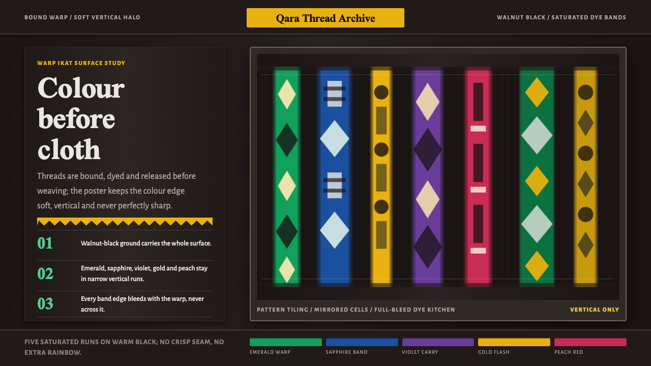 Atlas Silk (Etles)Soft before it is woven. Walnut-black silk holds vertical emerald and gold dy…
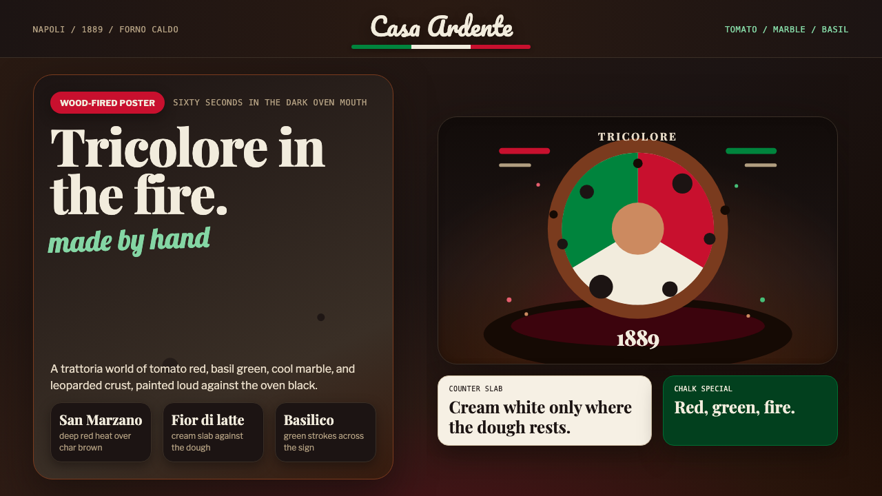 Neapolitan PizzaHot, handmade abundance. Tomato red and basil green flare on charred oven bro…
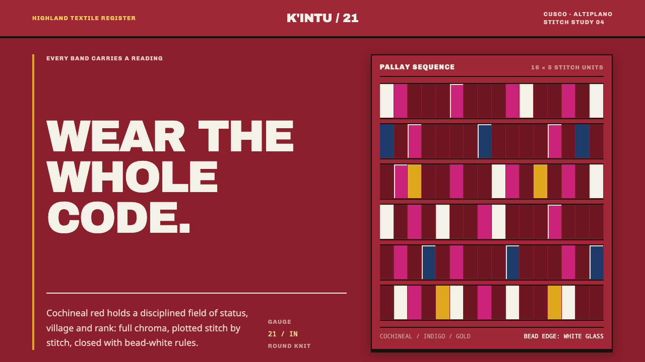 Andean ChulloOrnament carries a code. Cochineal red stacks strict stitch bands with bead-w…
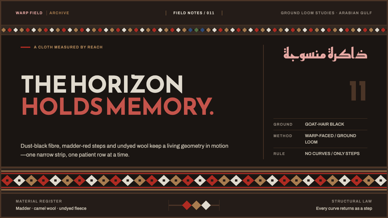 Emirati Sadu WeavingMemory runs in bands. Madder steps cross dusty goat-hair black with no curve…
 Mossi Burkina Plank MaskCarved, not rendered. Charcoal fields, dust-red cuts, and kaolin bands stack…
 Tatar Leather Mosaic IchigiJewel tones held by thread. Emerald leather blocks clash under raised gold se…