What is PSP XMB?
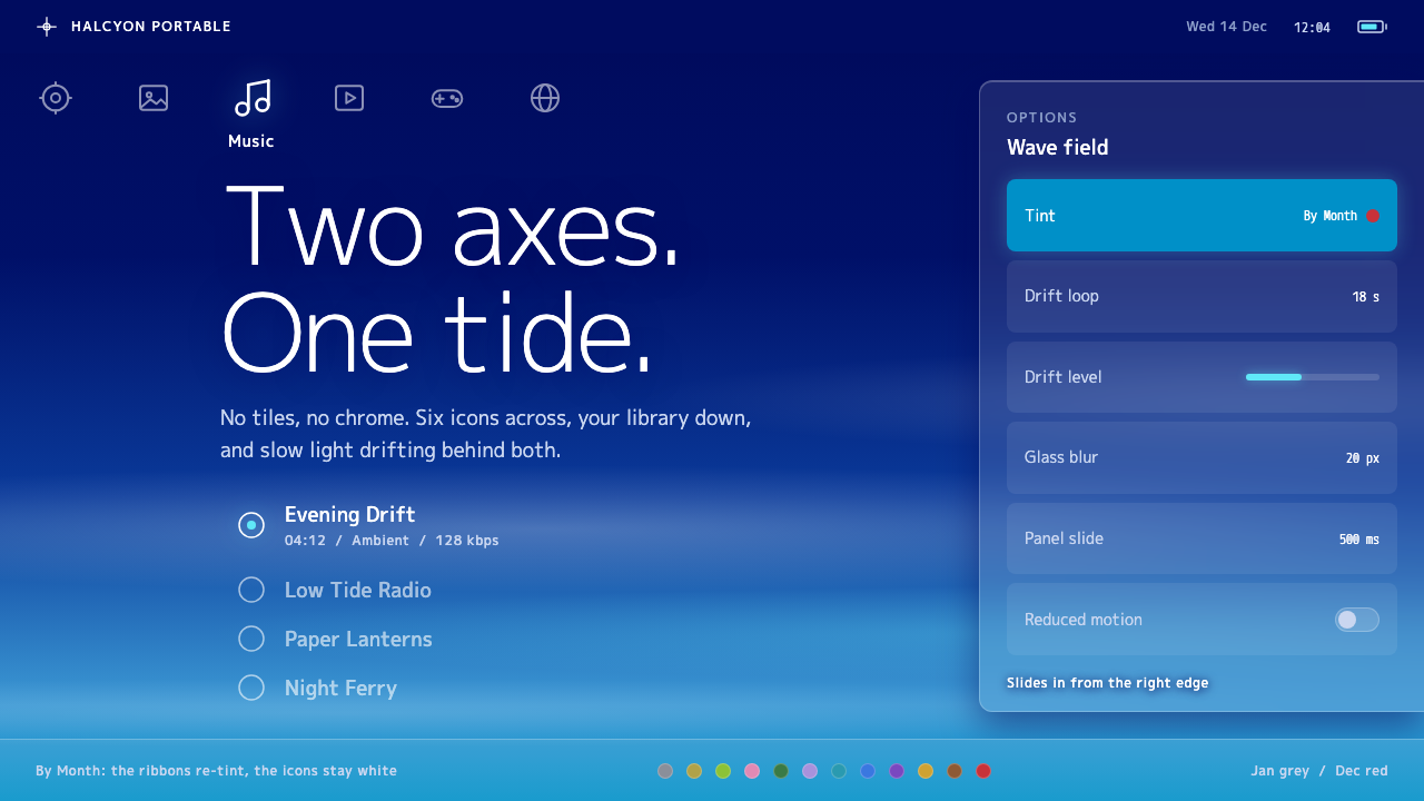
The XrossMediaBar replaced the menu grid with a cross of light: one row of icons, one column of items, and a sea of drifting navy and cyan.
PSP XMB in brief
The PSP XMB style is built on the XrossMediaBar, the main menu that Sony Computer Entertainment shipped with the PlayStation Portable in December 2004. It is a navigation structure with a very simple geometry: one horizontal row of category icons is crossed by one vertical column of items, and the two lines together form a cross. Everything floats over a background gradient that sinks from deep navy into cyan while soft white light waves drift slowly across it.
The style keeps that grammar rather than copying the surface. Navigation is a cross instead of a grid of cards. The focused item grows where the two axes meet, option panels are translucent and slide in from the right edge, and the background never stops moving. White line icons and white type are the only foreground voices, so the system looks luminous rather than boxed in.
For many people it was the first time a handheld system looked quiet. There were no button frames and no plastic texture, only white type, light and empty space. That calm is the lasting appeal of the style.

Where does PSP XMB come from?
The XrossMediaBar belongs to the mid-2000s, a period when handheld consoles, music players, phones and cameras were converging into single portable media devices. The PSP, which went on sale in Japan in December 2004, was designed to play games, music, video and photos and to connect to a network. A device that did all that needed a menu that treated each medium as a peer rather than as a sub-folder of games, and the cross answered the need: categories along one axis, the contents of the selected category along the other.
The interface had an earlier life. The record notes a debut on the PSX in 2003 before the PSP Home menu arrived in December 2004, and the visual period it covers runs from about 2004 to 2010. Ken Kutaragi is the figure named in the source in connection with this lineage of PlayStation hardware and software. The record does not credit specific interface designers, so the safest account is that the menu emerged from Sony's console and media-device culture of the time rather than from a single named author.
Stylistically the XMB sits between two eras. It inherits the glossy, luminous system interfaces of the Y2K period, with their enthusiasm for gradients, soft glow and translucent layers. Yet it is far more restrained than most of them. Where contemporary software often used chrome buttons and drop shadows, the XMB used almost nothing but light and white line drawing. That is the reason it has aged better than many of its peers.
The third current is cross-axis menu navigation. By putting category and content on perpendicular axes, the menu lets a user keep a sense of position in two dimensions with only a directional pad. The focus always sits at the crossing, so the eye never has to hunt. The background adds a gentle sense of time. In the original system a setting could change the hue of the waves according to the month, so that January was grey and December red, turning the passing of the year into a quiet visual event.
What defines the PSP XMB look?
Color
The background is a gradient that sinks from deep navy into cyan, like looking down into water. Foreground colour is nearly all white. There are no competing accent hues, so the whole interface feels like a single piece of light. In the monthly mode the tone of the waves shifts through the year.
Cross navigation
A horizontal row of category icons, such as settings, photos, music, video, games and network, crosses a vertical column of items. The user moves along one axis to choose a category and along the other to choose within it. The geometry is simple enough to learn immediately, and it keeps orientation clear using only a directional input.
Focus at the crossing
The selected item grows where the two axes meet, and neighbours recede in size and clarity. There is no highlight box. Focus is expressed by scale and brightness, so the interface stays free of borders and the eye is led naturally to one place.
Translucent panels
Option panels are frosted, translucent and slide in from the right edge. They let the moving background show through, so a submenu feels like a layer of glass laid over the scene, not a separate window. The effect keeps context visible and supports the sense of depth without hard edges.
Line icons and type
Icons are thin white line drawings, and text is white and unembellished. Because there are no fills, frames or textures on the foreground, the icons appear to hover over the background. Labels appear only where they are needed, most often under the focused item.
Motion
The background waves never stop. Light bands drift slowly across the gradient, and the interface responds to input with smooth, unhurried movement. Motion here is ambient, not instructional. It gives the system a living quality while avoiding anything abrupt.

Who shaped PSP XMB?
The figure named in the source in connection with the PlayStation hardware lineage that carried the XMB.
The company that shipped the XrossMediaBar with the PlayStation Portable in December 2004.
How do you use PSP XMB today?
For slides, the style is strongest on covers, section breaks and keynote-like openings. Use the navy-to-cyan gradient as the full-bleed background and set a single white title on it, perhaps with a few light waves behind. Content slides should keep the foreground sparse: white type, line icons and plenty of dark space. Data slides work when charts are drawn in white lines and translucent fills instead of solid bars.
For web interfaces, it suits media players, game launchers, dashboards for entertainment or streaming, kiosks and settings screens. A cross layout can replace a conventional sidebar and tab bar: categories run across the top and items run down from the focused category. Detail panels should be translucent and enter from the right. Keep focus expressed by scale and brightness, and avoid adding button frames.
For editorial and marketing work, the style evokes a specific moment in consumer technology, so it fits retrospectives, nostalgia campaigns, music and gaming features and product stories about convergence. Pair it with photography that is dark and atmospheric. The tone should be calm and slightly futuristic in the way the mid-2000s imagined the future.
The most common mistake is to keep the gradient and drop the cross, which leaves only a generic blue background. The grammar is the point. Another frequent failure is to fill the foreground with heavy buttons, strong shadows or saturated accent colours, which destroys the quiet. Finally, avoid making the waves loud or fast. They are ambient, and when they compete with the content the interface stops feeling calm.

PSP XMB — FAQ
What is the PSP XMB design style?
It is the style of the XrossMediaBar, the PSP main menu shipped in December 2004: a horizontal row of category icons crossed by a vertical column of items, white line icons and type, and a navy-to-cyan gradient with slowly drifting light waves.
Why is the navigation a cross and not a grid?
Putting categories and items on perpendicular axes lets users keep their place with just a directional input, and the focus always sits at the crossing. It also gave each medium, such as music, photos and video, equal standing beside games.
What do the monthly colors mean?
When the background is set to follow the calendar, the tone of the waves changes with each month, so that January is grey and December is red. It is an ambient way to show the passing of the year.
Is the style dark or light?
It is a dark style. Deep navy sinks into cyan and the foreground is white, so it works best in low light and for media, entertainment and atmospheric products.
Which projects suit it?
Media players, game launchers, streaming dashboards, kiosks, settings screens, nostalgic campaigns and keynote openings. It is less suited to dense forms, tables or text-heavy reading.
Related design styles
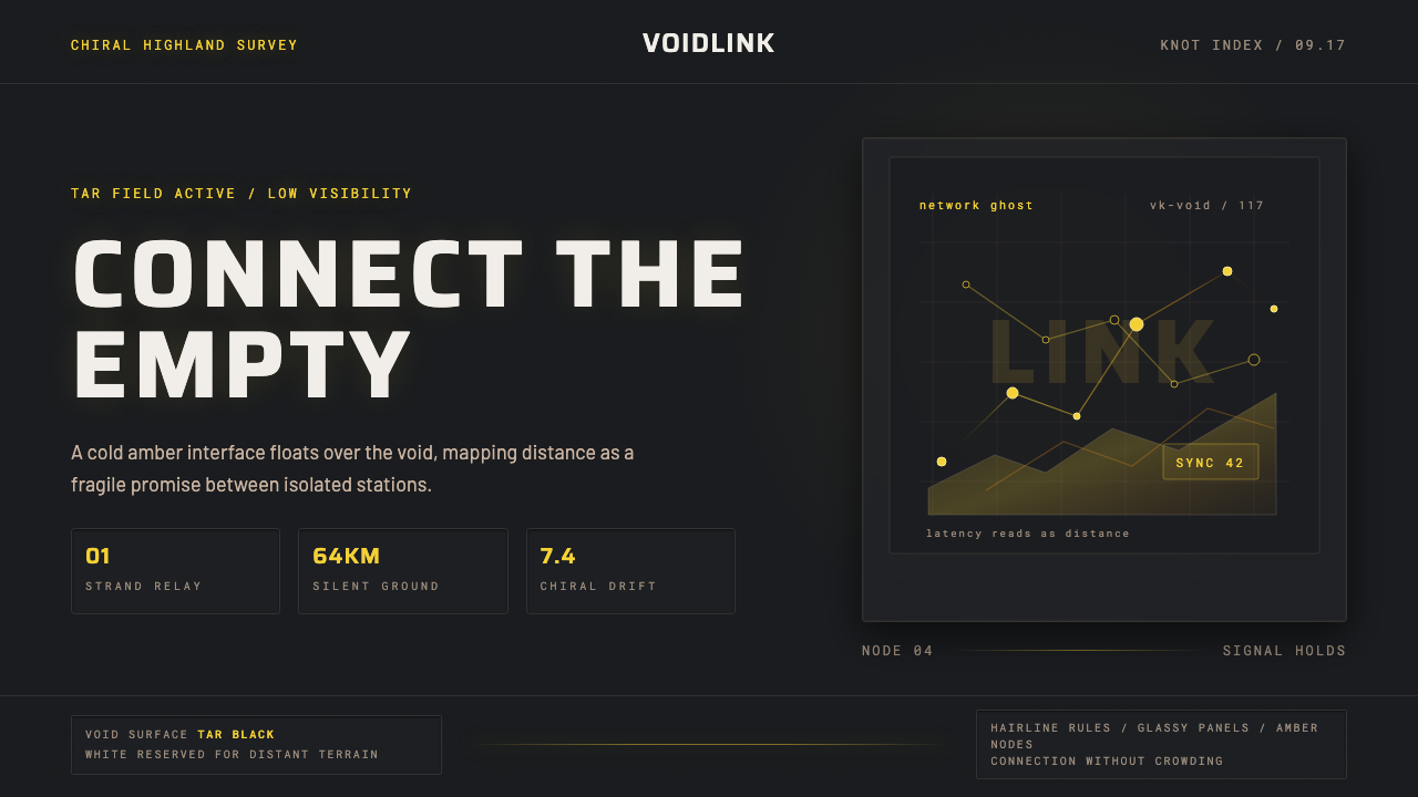 Death StrandingLonely connection, made visible. Amber HUD lines hover over a tar-black void.
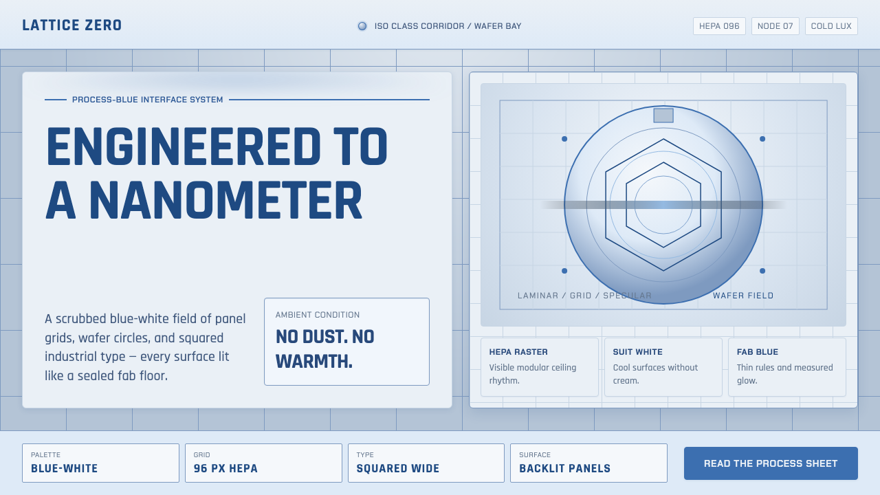 Semiconductor CleanroomCold precision, scrubbed clean. Blue-white grids, wafer circles, and squared…
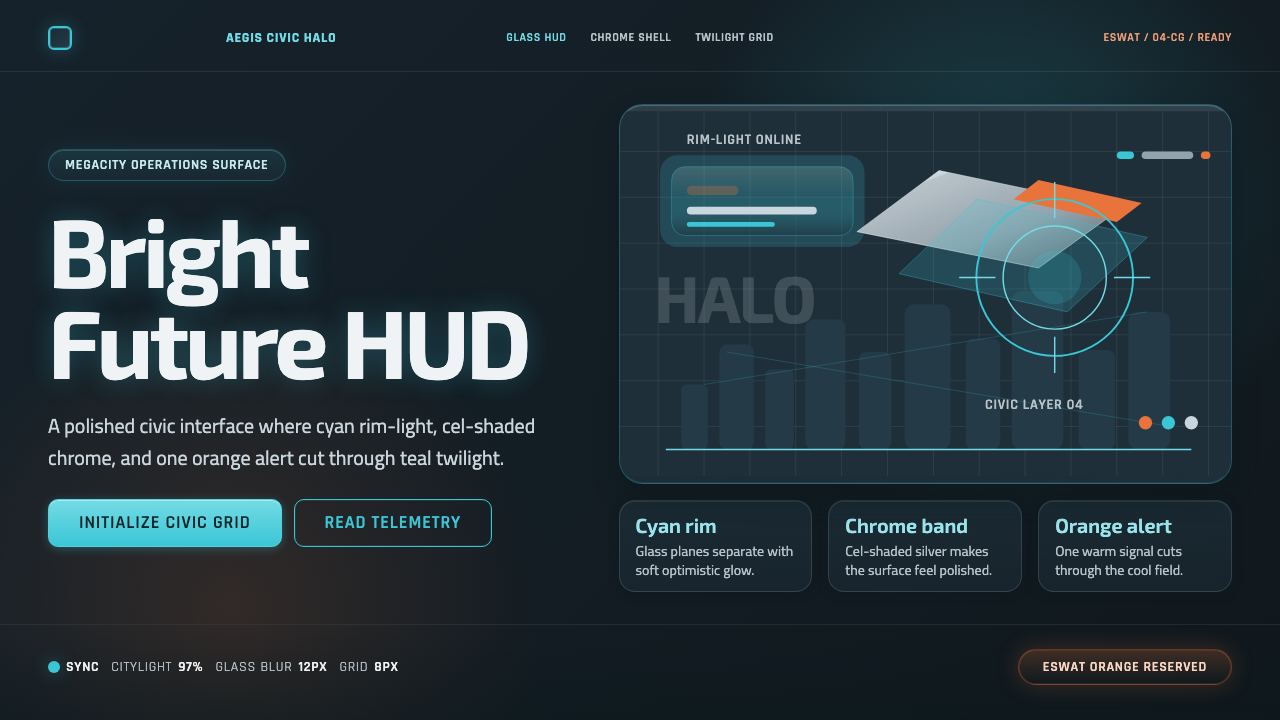 Appleseed (Olympus)Polished future, not noir. Cyan HUD glow and chrome panels float over teal tw…
 Black MirrorSterile tech turns accusatory. Screen-black, cold Montserrat, and a single gl…
 Estonia e-Residency Digital (2014)Trust without weight. Cornflower blue, 12-column grids, and cyan verified sig…
 EVE OnlineCold cockpit luxury. Cyan glass panels float over a black nebula void.