What is Premier League (1992)?
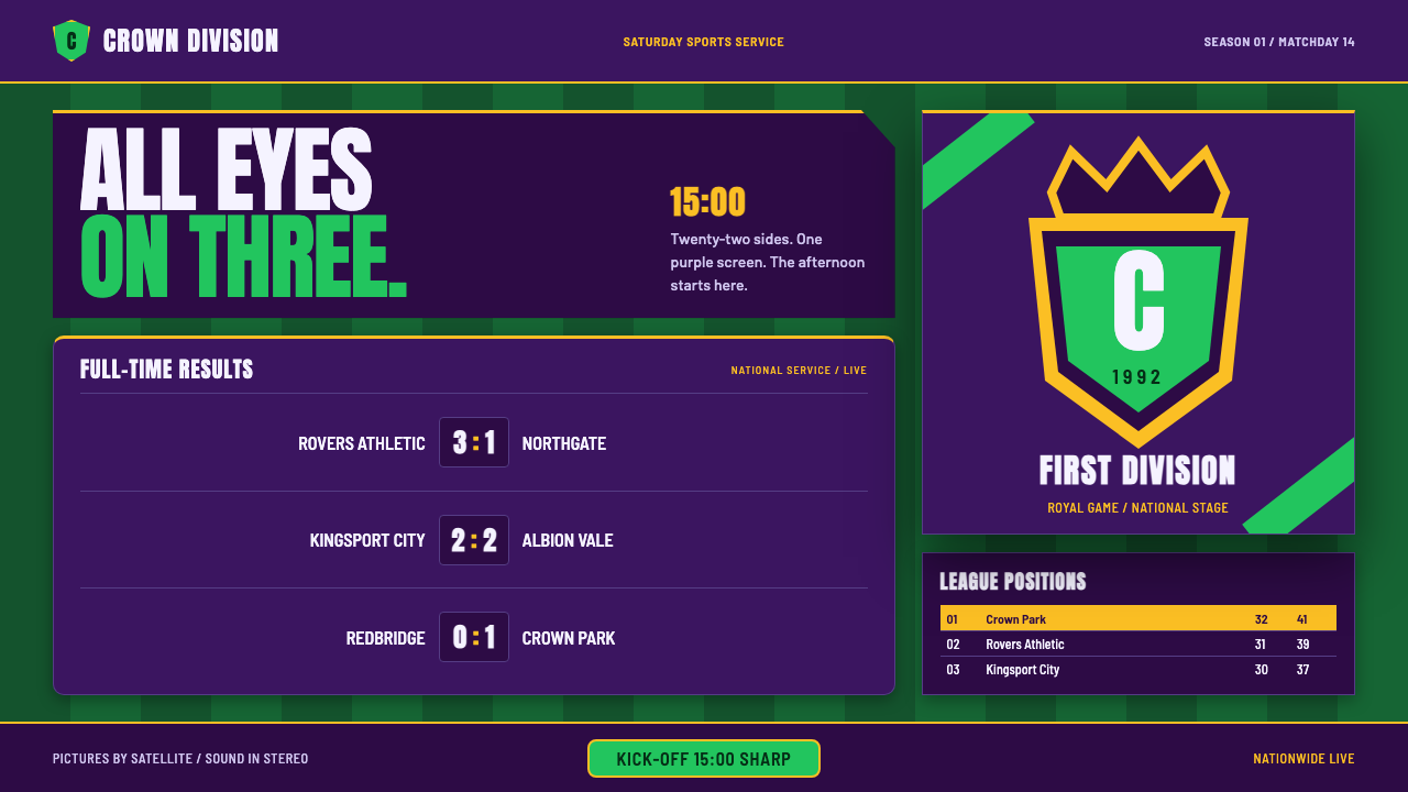
Premier League launch-season design fused heraldic ceremony with the hard clarity of a results page: aubergine screens, pitch-stripe green, gold trim, crowned lions, and scorelines built to be read across a room.
Premier League (1992) in brief
Premier League launch-season design is the visual language of English football’s breakaway top flight from its founding season in 1992 through the early sponsored years. It combines a crowned-lion crest with a purple-and-green broadcast palette, dense tabular scorelines, and the unmistakable atmosphere of early satellite sports television. The result feels neither like a conventional club programme nor like a neutral data interface. It is pageantry converted into information architecture.
The central tension is between heraldry and broadcast utility. Heraldry supplies the sense of institution: the crown, the lion, the gold trim, and the implication that a league table is not merely a list but a public order of rank. Broadcast graphics supply the discipline: condensed capitals, strong horizontal divisions, compact numerical fields, and layouts designed to remain legible while moving quickly across a television screen. Every element announces that football is both spectacle and administration.
Its emotional register is distinctly matchday. The deep aubergine ground creates a ceremonial field for the content, while pitch greens bring the physical grass of the stadium into the screen. Gold operates as a finishing line around important structures rather than as general decoration. Scorelines and tables sit with the density of a teletext or Ceefax results page, but the overall frame remains theatrical: the nation is watching, the fixtures are being counted, and the crowned lion presides over the grid.
Where does Premier League (1992) come from?
The style belongs to the founding season of the Premier League in 1992 and to the early years that followed, identified in the source material as spanning 1992–1997. Its geographic and institutional center was England, with London as the headquarters context and nationwide distribution through Sky and the BBC. That combination matters visually. The design was not made for a small local audience or a single club’s private archive; it was built for a shared national broadcast environment in which the same fixtures, tables, and identities reached viewers across the country.
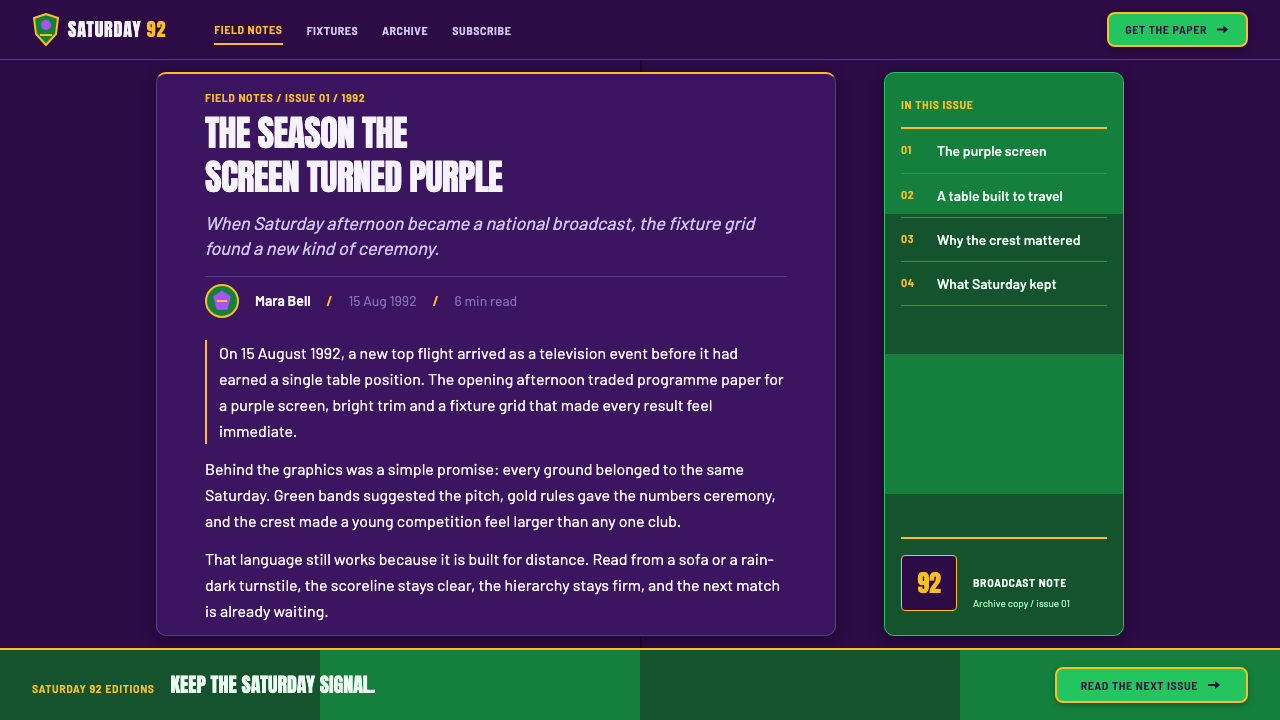
Its first major influence was early-1990s satellite sports broadcast graphics. Satellite television required a visual language that could establish authority quickly, organize live information, and remain legible inside a moving broadcast sequence. This encouraged heavy condensed capitals, strong contrast between ground and type, repeated rules, and compact data fields. The graphics had to behave like a lower-third, a title card, and a results service at once. Their authority came not from softness or polish but from speed, repetition, and unmistakable hierarchy.
The second influence was heraldic sports crest design. A league needed more than a name: it needed a mark capable of carrying institutional weight. The crowned lion supplies that mark with a compressed story of authority, competition, and national spectacle. In the broader visual system, the crest is not an isolated emblem placed on top of an otherwise generic interface. Its ceremonial logic spreads outward into the gold trim, the formal framing, the emphasis on rank, and the sense that every fixture belongs to a larger order.
The third influence was teletext and Ceefax results-page typography. Those systems treated sport as a dense, rapidly updated field of facts: teams, scores, positions, and fixtures arranged so that information could be scanned rather than contemplated. Premier League launch-season graphics retain that compression but place it inside a more dramatic broadcast shell. The result is a hybrid language: a cold numerical core wrapped in purple, green, gold, and heraldic symbolism. The founding season, the satellite broadcast era, and the early sponsored years therefore become inseparable from the look.
What defines the Premier League (1992) look?
Aubergine Ground
Aubergine is the dominant field rather than a minor accent. It gives the system a nocturnal, ceremonial depth and separates the graphics from the ordinary white page of a newspaper or fixture sheet. Against this dark ground, green, gold, and pale type gain immediate authority. The color should feel substantial and continuous, more like a broadcast environment than a decorative panel.
Pitch-Stripe Green
Green recalls the mown stripes of a football pitch, but it is not used as a naturalistic landscape color. It operates as a functional signal inside the aubergine field: a band, block, highlight, or directional marker that brings the physical game into the information system. The strongest use is controlled repetition, allowing green to create rhythm across tables and broadcast panels without becoming a general-purpose fill.
Gold Heraldic Trim
Gold belongs to edges, crests, separators, and moments of rank. It carries the formal richness of heraldry without turning the interface into luxury branding. A thin gold rule around a table or a gold outline around the lion can make the surrounding data feel institutional. Gold should frame importance, not compete with the scores themselves.
Crowned Lion Crest
The crowned lion is the emotional and institutional anchor. Its silhouette should read immediately, with the crown and animal profile carrying more weight than internal illustration detail. It works best as a seal, corner presence, or opening identifier. The crest creates a relationship between the cold grid and the ceremonial organization behind it: the table is numerical, but the competition it records is presented as a public institution.
Condensed Broadcast Capitals
Typography is heavy, condensed, and built for distance. Capitals give fixture names, team identifiers, and section labels the authority of a broadcast announcement. The letters should occupy space efficiently without becoming delicate or ornamental. Hierarchy comes through scale, weight, enclosure, and repetition, so that a viewer can distinguish a headline, a club name, and a scoreline at a glance.
Tabular Density
The information field is intentionally compact. Scores, positions, fixtures, and outcomes sit in aligned rows and columns that recall teletext results services. This density is not clutter when the structure is disciplined: repeated labels, consistent alignment, and clear separators turn many small facts into one legible object. The table should feel fast, comprehensive, and slightly impersonal.
Broadcast Framing
Every panel feels ready to enter a live sequence. Framing lines, lower-third proportions, title strips, and anchored corner marks create the impression that the page could slide directly onto television. The layout therefore favors horizontal movement and strong entry points. Even a static editorial composition should suggest an unseen announcer, a fixture about to be revealed, or a table being updated in public.
Who shaped Premier League (1992)?
Rick Parry is listed among the key figures of the Premier League launch context. In this design language, his presence belongs to the institutional side of the system: the part that turns a football competition into a recognizable national framework. The visual consequence is a preference for formal identity, ordered tables, repeatable broadcast elements, and a crest that can stand above individual fixtures.
Sam Chisholm appears in the source as one of the figures connected to the early Premier League environment. His inclusion reinforces the broadcast character of the style, where football is not only played in a stadium but packaged for a nationwide television audience. The resulting visual vocabulary favors screen authority, compact information delivery, and graphics that can hold their shape during a live sequence.
Greg Dyke is named as a key figure in the launch-era source material. Within the aesthetic, that name belongs to the meeting point between national visibility and media structure. The design accordingly avoids private-club intimacy in favor of a public system: bold identifiers, clear ranking, broadcast-ready panels, and a visual identity designed to be recognized before every detail is read.
Trevor East is also included among the source material’s key figures. His place in the collective launch context supports the style’s sense of coordinated presentation: the league, the broadcaster, the crest, and the results table all appear to belong to one managed visual event. That coordination is what keeps the dense numerical information from feeling like an anonymous spreadsheet.
How do you use Premier League (1992) today?
For presentation slides, use the style as a broadcast package rather than a generic sports theme. Covers should establish the crowned lion, the aubergine field, and one strong green or gold structural gesture before introducing detail. Content slides should behave like matchday panels: a clear fixture or topic label, dense but aligned information, and separators that organize rather than decorate. Data slides are the natural home of the language. League tables, score comparisons, rankings, and schedules should use repeated rows, strong columns, and a restrained gold frame so the information feels official and continuously updated.
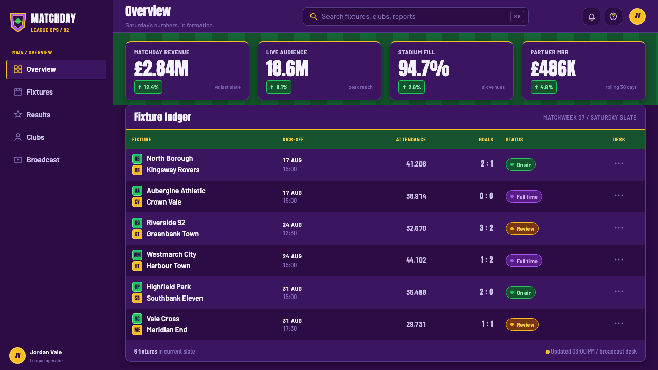
For web interfaces, the style suits dashboards, rankings, fixture tools, and pricing pages that need authority and rapid scanning. A dashboard can use the aubergine ground as a persistent environment, green for active or in-progress states, and gold for institutional emphasis or selected rank. Tables should remain central rather than being hidden behind ornamental cards. Pricing pages can borrow the league-table logic: plans become ranked positions, benefits become aligned fields, and the strongest call to action receives a framed broadcast treatment instead of a soft promotional glow.
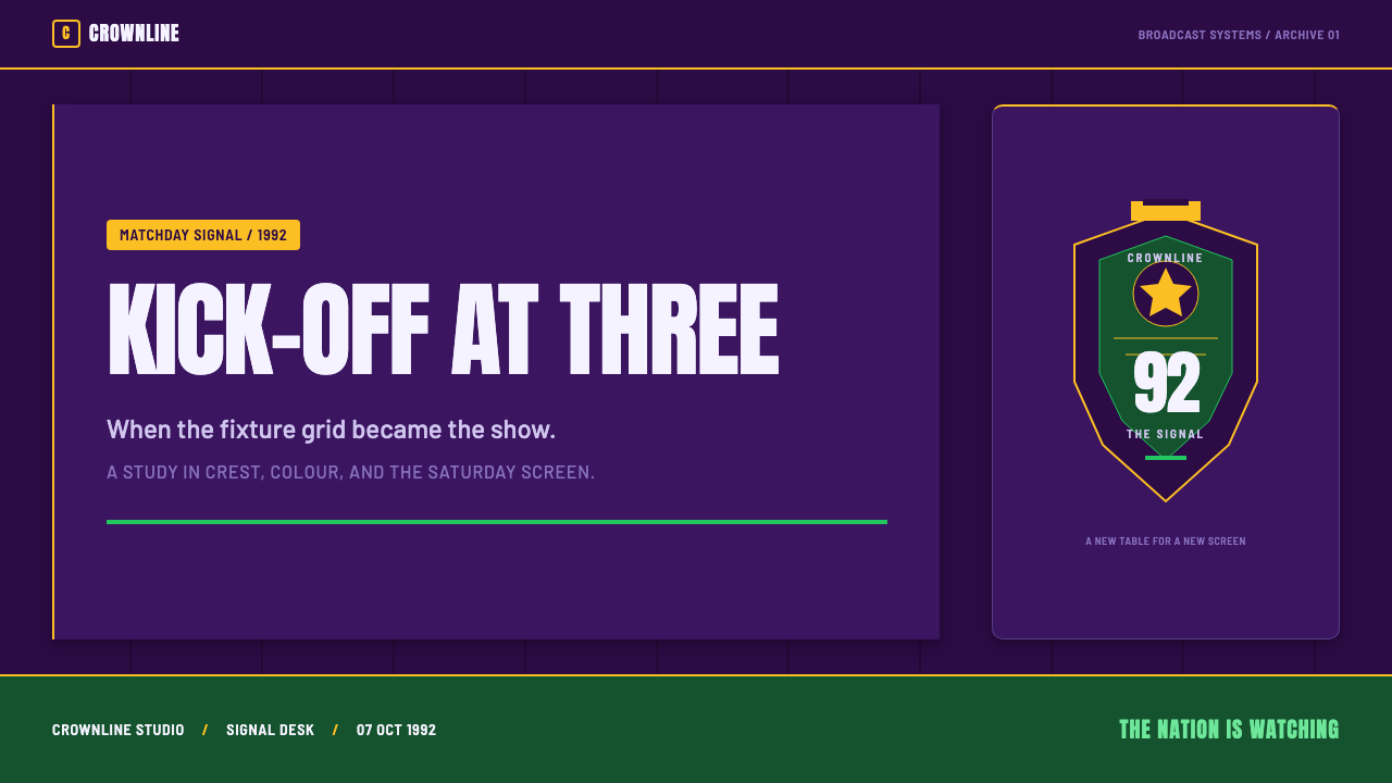
For editorial and marketing work, treat each page as a public announcement. Headlines should feel like fixture titles or broadcast straps, while body copy sits in compact blocks beside rules, score-like labels, or crest fragments. Campaign pages can alternate between deep aubergine fields and pale information panels, using pitch green to mark movement and gold to signal the principal message. The tone works especially well for launch announcements, reports, rankings, event recaps, and products that want to appear organized, competitive, and nationally visible.
The most common mistake is to make the work look like generic football merchandise. Adding a lion, a green field color, and a gold border is not enough. The distinctive quality comes from the relationship between ceremony and data: the crest must support the table, the gold must frame hierarchy, and the condensed type must remain readable under pressure. Another mistake is using green as a broad decorative background or gold as a luxury accent. Both colors work better when they serve the structure of the aubergine field and the information it contains.
Premier League (1992) — FAQ
Is this style simply a football version of a broadcast interface?
No. Broadcast logic is essential, but the defining quality comes from the collision between broadcast utility and heraldic ceremony. A neutral results interface could use aligned tables and condensed type without a crowned lion, gold trim, or institutional framing. Premier League launch-season design makes the data feel like a public order of rank. The scores are practical, but they are presented with the authority of a crest and the occasion of a national event.
Why is aubergine more important than ordinary football green?
Aubergine creates the ceremonial broadcast field. Green alone would pull the system toward a literal pitch or club-sport identity, while aubergine gives the screen depth, seriousness, and a distinctive national-era television character. Green then works as a controlled reminder of the grass rather than as the entire environment. The contrast lets the design contain both the physical match and the institutional screen that reports it.
Can the style work without the crowned lion?
It can, but the system will lose its clearest ceremonial anchor. If the lion is omitted, its responsibilities must be redistributed through formal framing, gold rules, strong institutional labels, and a consistent sense of rank. The result may still feel like the same design family if the aubergine field, condensed capitals, tabular density, and broadcast framing remain intact. However, the crest is what makes the numerical system feel like a league rather than an anonymous score service.
Does the teletext influence make the style feel outdated?
It can feel period-specific, but that is also its strength. The teletext influence provides a clear discipline: information is aligned, compressed, repetitive, and designed to be scanned. When combined with the crest, aubergine, green, and gold, it becomes a deliberate historical texture rather than a technical limitation. The style feels outdated only when the references are copied without the underlying hierarchy. When the structure is understood, its clarity remains useful in contemporary dashboards, rankings, and editorial systems.
What products are best suited to this visual language?
It is strongest for products that need to communicate competition, authority, public visibility, and organized information. Sports dashboards, event platforms, ranking tools, live results, editorial reports, and structured pricing pages are natural applications. It can also suit products that want a confident early-broadcast character without pretending to be neutral or minimal. It is less suitable when the desired values are softness, intimacy, organic calm, or handcrafted warmth. The system thrives when information should feel official, immediate, and shared.
Related design styles
 Manchester United (Red Devils)Heritage hits like a chant. Red-black blocks, Bungee type, and gold filigree…
 Super Bowl (1967)Athletic spectacle becomes ceremony. Chalk grids, silver rules and Roman type…
 Gill Sans British RailPublic authority, enamel-flat. Rail Blue bands, white humanist type, one red…
 Meccano Erector SetEngineering becomes tactile. Red perforations and brass bolts lock to a green…
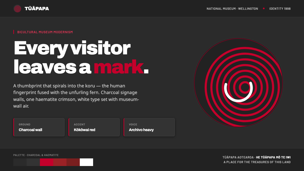 Te Papa Aotearoa ModernEvery visitor leaves a mark. Charcoal museum walls, one haematite crimson, a…
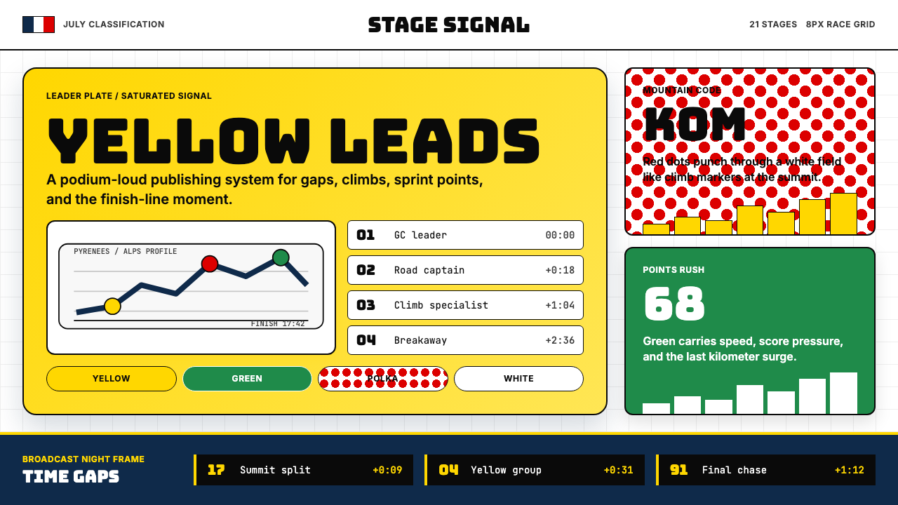 Tour de France (Yellow Jersey)Yellow owns the finish. Bungee type, polka dots, and navy tickers snap to an…